Metrics play an essential role in measuring performance and influencing decision-making.
However, relying on certain metrics alone can lead you to misguided conclusions and poor strategic choices. Potentially misleading metrics are often referred to as “pitfall metrics” in the world of Conversion Rate Optimization.
Pitfall metrics are data indicators that can give you a distorted version of reality or an incomplete view of your performance if analyzed in isolation. Pitfall metrics can even cause you to backtrack in your performance if you’re not careful about how you evaluate these metrics.
Metrics are typically split into two categories:
- Session metrics: Any metrics that are measured on a session instead of a visitor basis
- Count metrics: Metrics that count events (for instance number of pages viewed)
Some metrics can mesh into both categories. Needless to say, that’s the worst option for a few main reasons: no real statistical model is used when meshing into both categories. There is no direct/simple link to business objectives and these metrics may not need standard optimization.
While metrics are very valuable for business decisions, it’s crucial to use them wisely and be mindful of potential pitfalls in your data collection and analysis. In this article, we will explore and explain why some metrics are very not wise to use in practice in CRO.
Session-based metrics vs visitors
One problem with session-based metrics is that “power users” (AKA users returning for multiple sessions during the experimentation) will lead to a bias with the results.
Let’s remember that during experimentation, the traffic split between the variations is a random process.
Typically you think of a traffic split as very random but very even groups. When we talk about big groups of users – this is typically true. However, when you consider a small group, it’s very unlikely that you will have an even split in terms of visitor behaviors, intentions and types.
Let’s say that you have 12 power users that need to be randomly divided between two variations. Let’s say that these power users have 10x more sessions than the average user. It’s quite likely that you will end up with a 4 and 8 split, a 2 and 10 split, or another uneven split. Having an even split randomly occur is very unlikely. You will then end up in one of two very likely situations:
- Situation 1: Very few users may make you believe you have a winning variation (which doesn’t yet exist)
- Situation 2: The winning variation is masked because it received too few of these power users
Another problem with session-based metrics is that a session-based approach blurs the meaning of important metrics like transaction rates. The recurring problem here is that not all visitors display the same type of behavior. If average buyers need 3 sessions to make a purchase while some need 10, this is a difference in user behavior and does not have anything to do with your variation. If your slow buyers are not evenly split between the variations, then you will see a discrepancy in the transaction rate that doesn’t actually exist.
Moreover, the metric itself will lose part of its intuitive meaning over time. If your real conversion rate is around 3%, but counted by session and not by unique visitors, you will only likely only see a 1% conversion rate when switching to unique visitors.
This is not only disappointing but very confusing.
Imagine a variation urging visitors to buy sooner by using “stress marketing” techniques. Let’s say this leads to a one session purchase instead of three sessions. You will see a huge gain (3x) on the conversion per session. BUT this “gain” is not an actual gain since the number of conversions will have no effect on the revenue earned. It’s also good to keep in mind that visitors under pressure may not feel very happy or comfortable with such a quick purchase and may not return.
It’s best practice to avoid using session-based metrics unless you don’t have another choice as they can be very misleading.
Understanding count metrics
We will come back to our comparison of these two types of metrics. But for now, let’s get on the same page about “count metrics.” To understand why count metrics are harder to assess, you need to have more context on how to measure accuracy and where exactly the measure comes from.
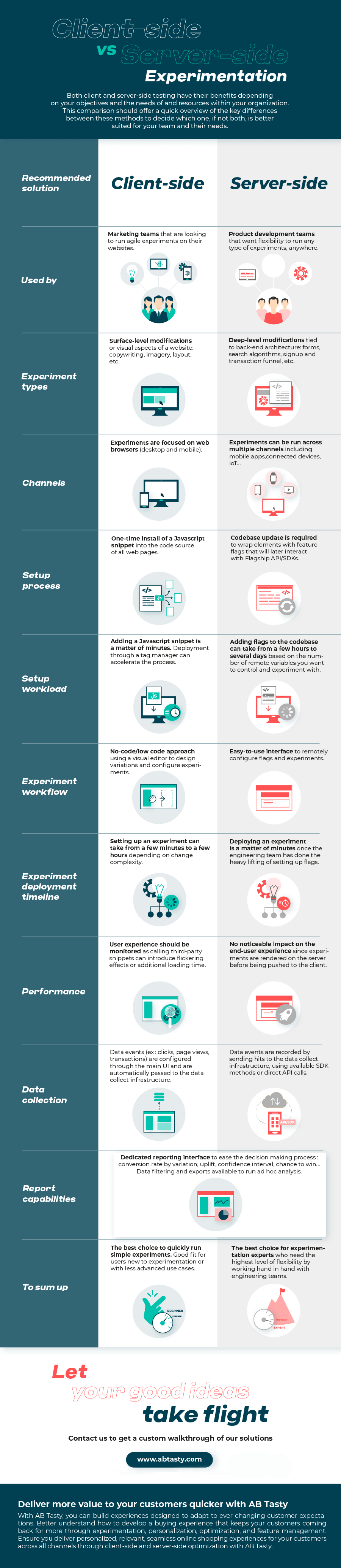
To model rate accuracy measures, we use beta distribution. In the graph below, we see the measure of two conversion ratios – one blue and one orange. The X-axis is the rate and Y-axis is the likelihood. When trying to measure the probability that the two rates are different, we implicitly explore the part of the two curves that are overlapping.
In this case, the two curves have very little overlap. Therefore, the probability that these two rates are actually different is quite high.
The more narrow or compact the distribution is, the easier it is to see that they’re different.
Want to start optimizing your website with a platform you can trust? AB Tasty is the best-in-class experience optimization platform that empowers you to create a richer digital experience – fast. From experimentation to personalization, this solution can help you activate and engage your audience to boost your conversions.

The fundamental difference between conversion and count distributions
Conversion metrics are bounded into [0:1] as a rate or [0%:100%] as a percentage. But, for count metrics the range is open, and the counts are in [0,+infinity].
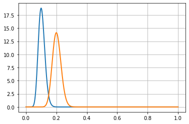
The following figure shows a gamma distribution (in orange) that may be used with this kind of data, along with a beta distribution (in blue).
These two distributions are based on the same data: 10 visitors and 5 successes. This is a 0.5 success rate (or 50%) when considering unique conversions. In the context of multiple conversions, it’s a process with an average of 0.5 rate conversion per visitor.
Notice that the orange curve (for the count metric) is non-0 above x = 1, this clearly shows that it expects that sometimes there will be more than 1 conversion per visitor.
We will see that comparisons between this kind of metric depend on whether we consider it as a count metric or as a rate. There are two options:
- Either we consider that the process is a conversion process, using a beta distribution (in blue), which is naturally bounded in [0;1].
- Or we consider that the process is a count process, using gamma distribution (in orange), which is not bounded on the right side.
On the graph, we see an inner property of count data distributions, they are dissymmetric: the right part goes slower to 0 than the left part. This makes it naturally more spread out than the beta distribution.
Since both curves are distributions, their surface under the curve must be 1.
As you can see, the beta distribution (in blue) has a higher peak than the gamma distribution (in orange). This exposes that the gamma distribution is more spread out than the beta distribution. This is a hint that count distributions are harder to get accurate than conversion distributions. This is also why we need more visitors to assess a difference when using count metrics rather than when using conversion metrics.
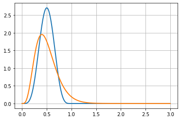
To understand this problem you have to imagine two gamma distribution curves, one for each variation of an experiment. Then, gradually shift one on the right, showing an increasing difference between the two distributions. (see figure below)
Since both curves are right-skewed, the overlap region will occur on at least one of the skewed parts of the distributions.
This means that differences will be harder to assess with count data than with conversion data. This comes from the fact that count data works on an open range, whereas conversion rates work on a closed range.
Do count metrics need more visitors to get accurate results?
No, it is more complex than that in the CRO context. Typical statistical tests for count metrics are not suited for CRO in practice.
Most of these tests come from the industrial world. A classic usage of count metrics is counting the number of failures of a machine in a given timeframe. In this context, the risk of failure doesn’t depend on previous events. If a machine already had one failure and has been repaired, the chance of a second failure is considered to be the same.
This hypothesis is not suited for the number of pages viewed by a visitor. In reality, if a visitor saw two pages, there’s a higher chance that they will see a third page compared to a visitor that just saw one page (since they have a high probability to “bounce”).
The industrial model does not fit in the CRO context since it deals with human behavior, making it much more complex.
Not all conversions have the same value
The next CRO struggle also comes from the direct exploitation of formulas from the industrial world.
If you run a plant that produces goods with machines, and you test a new kind of machine that produces more goods per day on average, you will conclude that these new machines are a good investment. Because the value of a machine is linear with its average production, each extra product adds the same value to the business.
But this is not the same in CRO.
Imagine this experiment result for a media company:
Variation B is yielding an extra 1,000 page views more than the original A. Based on that data, you put variation B in production. Let’s say that variation B lost 500 people that saw 2 pages and variation B also won 20 people that saw 100 pages each. That makes a net benefit of 1000 page views for variation B.
But what about the value? These 20 people, even if they spent a lot of time on the media, are maybe not the same value as 500 people that come regularly.
In CRO each extra value added to a count metric does not have the same value, so you cannot trust measured increment as a direct added value.
In applied statistics, one adds an extra layer to the analysis: a utility function, which links extra counts to value. This utility function is very specific to the problem and is unknown to most CRO problems. Even if you get some more conversions in a count metric context, you are unsure about the real value of this gain (if any).
Some count metrics are not meant to be optimized
Let’s see some examples where raising the number of a count metric might not be a good thing:
- Page views: If the count of page views rises, you can think it’s a good thing because people are seeing more of your products. However, you can also think that people get lost and need to browse more pages to find what they need.
- Items added to cart: We have the same idea for the number of products added to the cart. If you do not check how many products remain in the cart at the checkout stage, you don’t know if the variation helps to sell more or if it just makes the product selection harder.
- Product purchased: Even the number of products purchased may be misleading as a business objective alone if used alone in an optimization context. Visitors could be buying two cheaper products instead of one high-quality (and more expensive) product.
You can’t tell just by looking at these KPIs if your variation or change is good for your business or not. There is more that needs to be considered when looking at these numbers.
How do we use this count data then?
We see in this article how counterintuitive optimization based on sessions is. And even worse, we see how misleading count metrics are in CRO.
Unless you have both business and statistics expert resources, it’s best practice to avoid them, at least as a unique KPI.
As a workaround, you can use several conversion metrics with specific triggers using business knowledge to set the thresholds. For instance:
- Use one conversion metric for count is in the range [1; 5] called “light users.”
- Use another conversion metric in the range [6,10] called “medium users.”
- Use another one for the range [11,+infinity] called “heavy users”.
Splitting up the conversion metrics in this way will give you a clearer signal about where you gain or lose conversions.
Another piece of advice is to use several KPIs to have a broader view.
For instance, although analyzing the product views alone is not a good idea – you can check the overall conversion rate and average order value at the same time. If product views and conversion KPIs are going up and the average order value is stable or goes up, then you can conclude that your new product page layout is a success.
Counterintuitive Metrics in CRO
Now you see that except for conversions counted on a unique visitor basis, nearly all other metrics can be very counterintuitive to use in CRO. Mistakes can happen because of statistics that work differently, and also because the meaning of these metrics and their evolutions may have several interpretations.
It’s important to understand that CRO skill is a mix of statistics, business and UX knowledge. Since it’s very rare to have all this within one person, the key is to have the needed skills spread across a team with good communication.