When you’re running A/B tests, you’re making a choice—whether you know it or not.
Two statistical methods power how we interpret test results: Frequentist vs Bayesian A/B testing. The debates are fierce. The stakes are real. And at AB Tasty, we’ve picked our side.
If you’re shopping for an A/B testing platform, new to experimentation, or just trying to make sense of your results, understanding these methods matters. It’s the difference between guessing and knowing. Between implementing winners and chasing false positives.
Let’s break it down.
What is Inferential Statistics?
Both Frequentist and Bayesian methods live under the umbrella of inferential statistics.
Unlike descriptive statistics—which simply describes what already happened—inferential statistics help you forecast what’s coming. They let you extrapolate results from a sample to a larger population.
Here’s the question we’re answering: Would version A or version B perform better when rolled out to your entire audience?
A Quick Example
Let’s say you’re studying Olympic swimmers. With descriptive statistics, you could calculate:
- Average height of the team
- Height variance across athletes
- Distribution above or below average
That’s useful, but limited.
Inferential statistics let you go further. Want to know the average height of all men on the planet? You can’t measure everyone. But you can infer that average from smaller, representative samples.
That’s where Frequentist vs Bayesian methods come in. Both help you make predictions from incomplete data—but they do it differently, especially when applied to A/B testing.
What is the Frequentist Statistics Method in A/B Testing?
The Frequentist approach is the classic. You’ve probably seen it in college stats classes or in most A/B testing tools.
This is one of the main Frequentist vs Bayesian A/B testing comparisons: Frequentist statistics focus on long-run frequencies and fixed hypotheses.
Here’s how it works:
The Hypothesis
You start by assuming there is no difference between version A and version B. This is called the null hypothesis.
At the end of your test, you get a P-Value (probability value). The P-Value tells you the probability of seeing your results—or more extreme results—if there really is no difference between your variations. In other words, how likely is it that your results happened by chance?
The smaller the P-Value, the more confident you can be that there’s a real difference between your A/B testing variations.
| Frequentist Pros | Frequentist Cons |
|---|---|
| Fast computation: Frequentist models run quickly and are widely available in any stats library. | No peeking allowed: You can only estimate the P-Value at the end of a test. Looking at results early—called “data peeking”—creates misleading conclusions because it turns one experiment into multiple experiments. |
| Widely understood: It’s the standard approach taught in most statistics courses and used in many A/B testing tools. | No gain estimation: You’ll know which version won, but not by how much. That makes A/B testing business decisions harder. |
What is the Bayesian Statistics in A/B Testing?
The Bayesian approach takes a different route—and we think it’s a smarter one for many A/B testing scenarios.
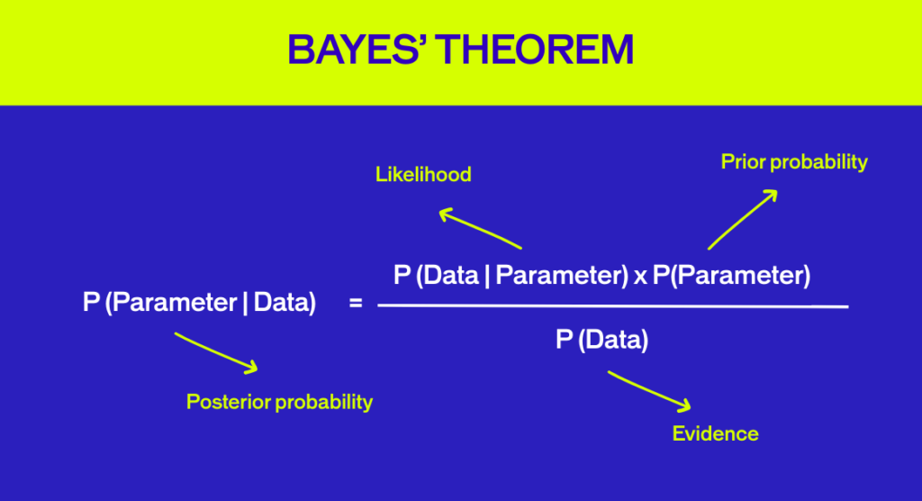
The Bayesian approach allows for the inclusion of prior information (‘a prior’) intNamed after British mathematician Thomas Bayes, this method lets you incorporate prior information into your analysis. It’s built around three overlapping concepts:
The Three Pillars of Bayesian Analysis
- Prior: Information from previous experiments. At the start, we use a “non-informative” prior—essentially a blank slate.
- Evidence: The data from your current experiment.
- Posterior: Updated information combining the prior and evidence. This is your result.
Here’s the game-changer: Bayesian A/B testing is designed for ongoing experiments. Every time you check your data, the previous results become the “prior,” and new incoming data becomes the “evidence.”
That means data peeking is built into the design. Each time you look, the analysis is valid.
Even better? Bayesian statistics let you estimate the actual gain of a winning variation—not just that it won—making Frequentist vs Bayesian methods in A/B testing very different from a decision-making perspective.
| Bayesian Pros | Bayesian Cons |
|---|---|
| Peek freely: Check your data during a test without compromising accuracy. Stop losing variations early or switch to winners faster. | More computational power: Requires a sampling loop, which demands more CPU load at scale (though this doesn’t affect users). |
| See the gain: Know the actual improvement range, not just which version won. | |
Fewer false positives: The method naturally rules out many misleading results in A/B testing. |
Frequentist vs Bayesian A/B Testing: The Comparison
Let’s be clear: both methods are statistically valid. But when you compare Frequentist vs Bayesian A/B testing, the practical implications are very different.
At AB Tasty, we have a clear preference for the Bayesian a/b testing approach.
Here’s why.
Gain Size Matters
With Bayesian A/B testing, you don’t just know which version won—you know by how much.
This is critical in business. When you run an A/B test, you’re deciding whether to switch from version A to version B.
That decision involves:
- Implementation costs (time, resources, budget)
- Associated costs (vendor licenses, maintenance)
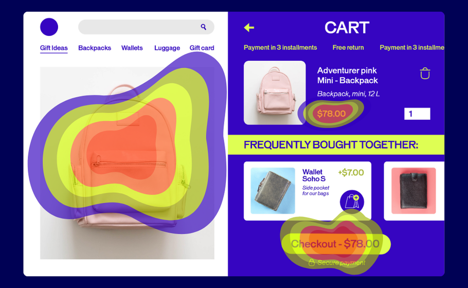
Example: You’re testing a chatbot on your pricing page. Version B (with chatbot) outperforms version A. But implementing version B requires two weeks of developer time plus a monthly chatbot license.
You need to know if the math adds up. Bayesian statistics give you that answer by quantifying the gain from your A/B testing experiment.
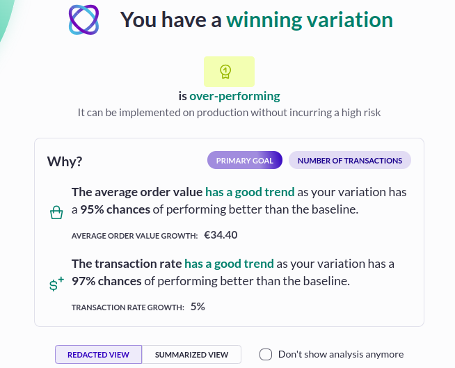
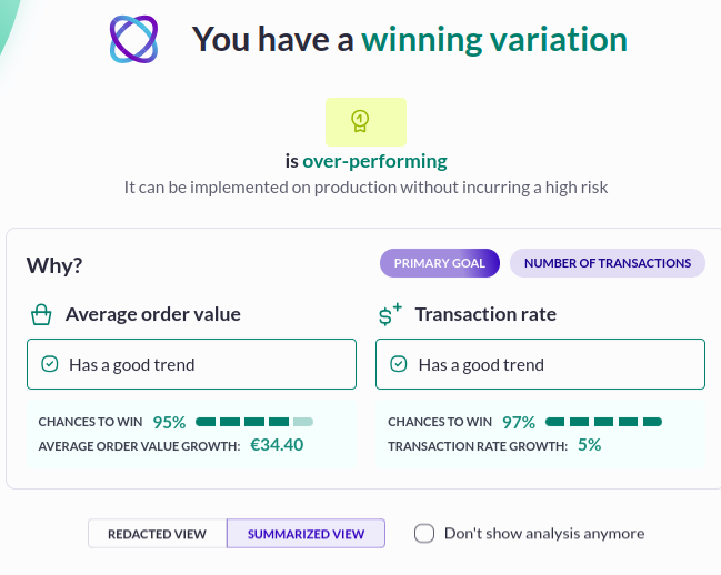
Real Example from AB Tasty Reporting
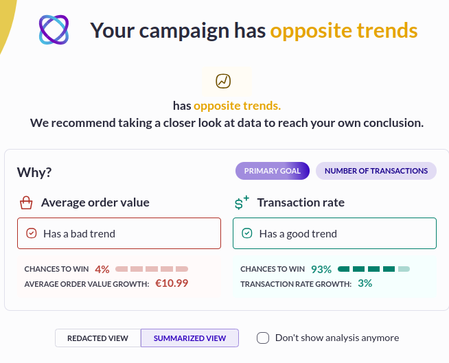
Let’s look at a test measuring three variations against an original, with “CTA clicks” as the KPI.
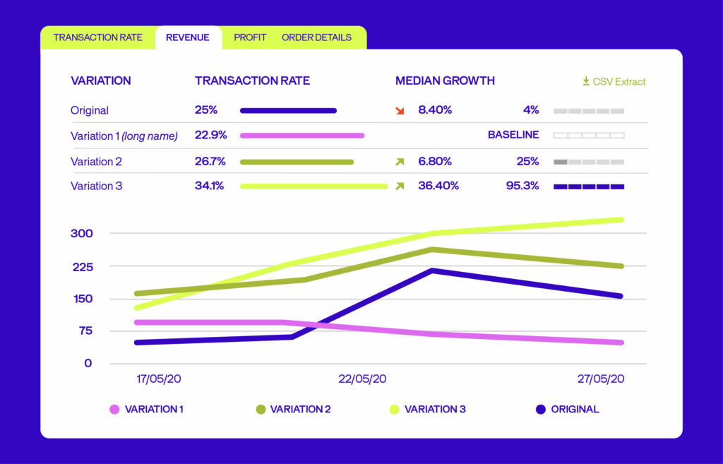
Variation 3 wins with a 34.1% conversion rate (vs. 25% for the original).
But here’s where it gets interesting:
- Median gain: +36.4%
- Lowest possible gain: +2.25%
- Highest possible gain: +48.40%
In 95% of cases, your gain will fall between +2.25% and +48.40%.
This granularity helps you decide whether to roll out the winner:
- Both ends positive? Great sign.
- Narrow interval? High confidence. Go for it.
- Wide interval but low implementation cost? Probably safe to proceed.
- Wide interval with high implementation cost? Wait for more data.
This is a concrete illustration of how Frequentist vs Bayesian methods in A/B testing lead to different levels of decision-making insight.
When to Trust Your Results?
At AB Tasty, we recommend waiting until you’ve hit these benchmarks:
- At least 5,000 unique visitors per variation
- Test runs for at least 14 days (two business cycles)
- 300 conversions on your main goal
These thresholds apply regardless of whether you use a Frequentist or Bayesian method, but Bayesian A/B testing gives you more interpretable outputs once you reach them.
Data Peeking: A Bayesian Advantage
Here’s a scenario: You’re running an A/B test for a major e-commerce promotion. Version B is tanking—losing you serious money.
With Bayesian A/B testing, you can stop it immediately. No need to wait until the end.
Conversely, if version B is crushing it, you can switch all traffic to the winner earlier than with Frequentist methods.
This is the logic behind our Dynamic Traffic Allocation feature—and it wouldn’t be possible without Bayesian statistics.
How Does Dynamic Traffic Allocation Work?
Dynamic Traffic Allocation balances exploration (gathering data) with exploitation (maximizing conversions).
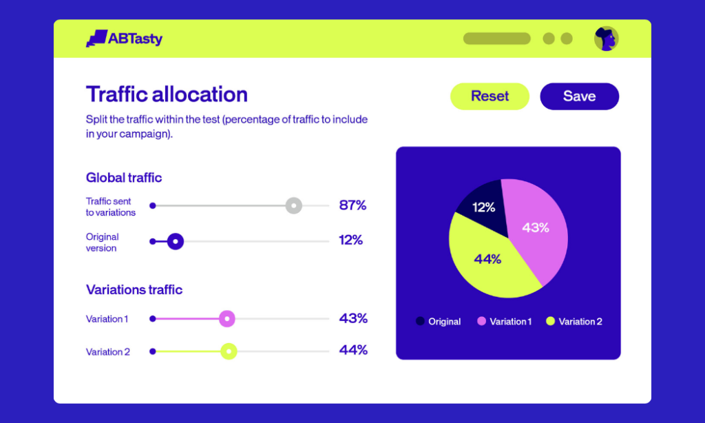
In practice, you simply:
- Check the Dynamic Traffic Allocation box.
- Pick your primary KPI.
- Let the algorithm decide when to send more traffic to the winner.
This approach shines when:
- Testing micro-conversions over short periods
- Running time-limited campaigns (holiday sales, flash promotions)
- Working with low-traffic pages
- Testing 6+ variations simultaneously
Again, this is where Frequentist vs Bayesian methods in A/B testing diverge: Frequentist statistics are not naturally designed for safe continuous monitoring and dynamic allocation in the same way.
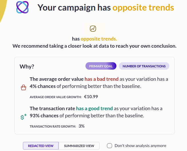
Bayesian False Positives Explained
A false positive occurs when test results suggest version B improves performance—but in reality, it doesn’t. Often, version B performs the same as version A, not worse.
False positives happen with both Frequentist and Bayesian methods in A/B testing. But here’s the difference:
How Does Bayesian Testing Limit False Positives?
Because Bayesian A/B testing provides a gain interval, you’re less likely to implement a false positive in the first place.
Example: Your test shows version B wins with 95% confidence, but the median improvement is only 1%. Even if this is a false positive, you probably won’t implement it—the resources needed don’t justify such a small gain.
With Frequentist methods, you don’t see the gain interval. You might implement that false positive, wasting time and energy on changes that bring zero return.
Gain probability using Bayesian statistics
The standard rule of thumb is 95% confidence—you’re 95% sure version B performs as indicated, with a 5% risk it doesn’t.
For most campaigns, 95% confidence works just fine. But when the stakes are high—think major product launches or business-critical tests—you can dial up your confidence threshold to 97%, 98%, or even 99%.
Just know this: whether you’re using Frequentist or Bayesian methods, higher confidence means you’ll need more time and traffic to reach statistical significance. It’s a trade-off worth making when precision matters most.
While this seems like a safe bet – and it is the right choice for high-stakes campaigns – it’s not something to apply across the board.
This is because:
- In order to attain this higher threshold, you’ll have to wait longer for results, therefore leaving you less time to reap the rewards of a positive outcome.
- You will implicitly only get a winner with a bigger gain (which is rarer), and you will let go of smaller improvements that still could be impactful.
- If you have a smaller amount of traffic on your web page, you may want to consider a different approach.
Conclusion
So which is better—Frequentist or Bayesian?
Both are sound statistical methods. But when you look at Frequentist vs Bayesian methods in A/B testing, we’ve chosen the Bayesian approach because it helps teams make better business decisions.
Here’s what you get:
- Flexibility: Peek at data without compromising accuracy.
- Actionable insights: Know the gain size, not just the winner.
- Maximized returns: Dynamic Traffic Allocation optimizes automatically.
- Fewer false positives: Built-in safeguards against misleading results.
When you’re shopping for an A/B testing platform, find one that gives you results you can trust—and act on.
Want to see Bayesian A/B testing in action? AB Tasty makes it easy to set up tests, gather insights via an ROI dashboard, and determine which changes will increase your revenue.
Ready to go further? Let’s build better experiences together →
FAQs
What’s the main difference between Bayesian and Frequentist A/B testing?
When you compare Frequentist vs Bayesian methods in A/B testing, Frequentist methods test whether there’s a difference between variations using a P-Value at the end of the experiment. Bayesian methods estimate the size of the gain and let you update results continuously as new data comes in.
Can I peek at my A/B test results early?
With Bayesian A/B testing, yes. The method is designed for ongoing analysis. With Frequentist methods, peeking early creates misleading results because it effectively turns one experiment into multiple experiments.
What is a false positive in A/B testing?
A false positive occurs when test results suggest version B improves performance, but in reality it doesn’t. Bayesian methods help limit false positives by showing the gain interval, making it less likely you’ll implement a variation with minimal or no real improvement.
What confidence level should I use for my A/B tests?
95% confidence is standard for most marketing campaigns. For high-stakes A/B testing, you can increase to 97%, 98%, or 99%—but this requires more time and traffic to reach statistical significance, regardless of whether you use Frequentist or Bayesian methods.
How long should I run my A/B test?
At AB Tasty, we recommend running tests for at least 14 days (two business cycles) and collecting at least 5,000 unique visitors per variation and 300 conversions on your main goal. These benchmarks help both Frequentist and Bayesian approaches produce reliable insights.
What is Dynamic Traffic Allocation?
Dynamic Traffic Allocation is an automated feature that balances data exploration with conversion maximization in A/B testing. Once the algorithm identifies a winning variation with confidence, it automatically sends more traffic to that version—helping you maximize returns while still gathering reliable data using Bayesian methods.

About the Author
Hubert Wassner
Hubert Wassner is Chief Data Scientist at AB Tasty with over thirty years of experience in AI and machine learning. He builds advanced statistical models, shares insights on the blog, and helps brands make confident, data-driven decisions. His most recent achievement is obtaining a patent for RevenueIQ.