It’s a competitive world online. In order to beat your competition, you need world-class customer experience (CX).
But what exactly does customer experience mean, anyway?
This is a non-technical guide to customer experience; we’ll cover what CX is, why it’s important, how it benefits your business, and how you can measure it.
By the end of the article, you’ll have everything you need to start measuring, improving, and delivering an exceptional experience for your customers.
The Definition of Customer Experience
Customer experience is a big deal.
So much so that a study by Econsultancy found that the number one priority for more than 2,000 marketers was customer experience when asked the question:
“Over the next five years, what is the primary way your organization will seek to differentiate itself from competitors?”
So what is customer experience?
Customer experience (CX for short) is the perception of your customers’ experience with your business or brand.
Every time a customer interacts with your brand and everything your business does, it has an impact on how your customers perceive your business.
Customer experience is the culmination of all of these experiences and interactions, impacting your decision whether to return to the business or make a purchase.
Simply put, the key to your success is epic customer experience.
The Importance of Customer Experience for Your Business
The core benefits of improving your customer experience include the following:
- Increase the loyalty of your customers
- Increase the happiness and satisfaction of your customers
- Increase positive reviews and recommendations
- Reduce returns
- Reduce complaints
- Reduce churn
There is no doubt that to be a successful business, you need to put your customers first. If you do, it’s not only good for them, but it’s also good for your business.
The Customer Journey and Customer Experience
As we’ve seen, customer experience is concerned with the holistic experience of your customers with your brand.
This means that every step of the customer journey has the potential to impact on your customer’s experience.
In terms of customer experience, the stages of a customer’s journey include discovery, research, purchase, and post-purchase customer support.
It should go without saying, but in terms of customer experience, there’s one extremely important caveat to the customer journey.
Instead of considering each stage of the journey from the business’s perspective, it’s imperative to consider these touchpoints from the perspective of the customer.
To improve customer experience at each stage, we need to understand how and why they are different, and what we can do to improve the experiences of your customers.
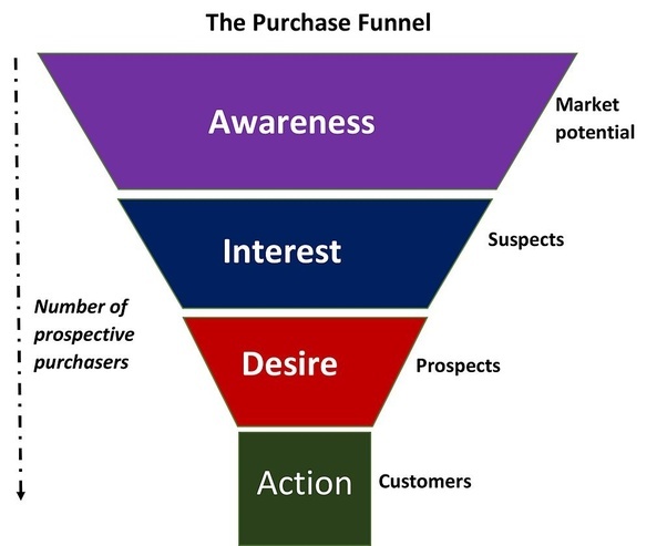
To better understand customer experience, let’s break down the customer journey into stages.
Stage One: Consideration
When a customer changes from an observer to a potential customer, they enter the “Consideration” phase.
It’s at this stage that a customer is making a choice whether to consider your brand or exclude it from their buying journey.

At this point, branding is hugely important. Well-known brands have the upper hand at this point, but if you own a smaller company, the best way you can make an impact is by having a clear message that solves a customer’s problem.
Stage Two: Evaluation
There are two ways in which a potential customer can enter the evaluation stage.
First, they may have “selected” your brand during the consideration stage or, interestingly, they may enter the cycle fresh in the evaluation stage.
While this may seem odd, it’s common sense. As a potential customer researches products similar to yours, it’s likely that they stumble across new brands, as well as the brands they’ve previously considered.
The way you advertise to customers at this stage of the cycle should, therefore, reflect both of these types of customers and you should take into account the fact that many people have not yet interacted with your brand at all.
Stage Three: Buying
Hooray! This is the stage we’ve all been waiting for. And it’s more than likely the stage that most marketers focus on.
Everything from the text on the ‘Buy’ button to the copy on the product page is A/B tested, iterated, and scrutinized.
Of course, this is highly important, but by placing too much emphasis on this one stage of the cycle, it could be detrimental to the customer experience overall.
Stage Four: Post-Purchase
Often overlooked, the post-purchase stage is an equally important part of the customer experience journey.
How you treat your customers after they have bought from you will affect whether they choose to repeat the process…or not.
The effect of customer satisfaction after a purchase can have a huge impact on your bottom line. Consider these statistics:
- It can cost up to 25 times as much to acquire a new customer than to retain an existing one
- If you increase retention rates by 5%, then you can increase profits by 25% to 95%
And here’s the punch line: only 18% of businesses focus on customer retention.
This represents a huge opportunity for you to beat your competition, increase your profits, and improve your customer experience. Win, win, win.
The Importance of Website Personalization
“Website personalization is the real-time individualization of a website to suit each visitor’s unique needs and guide them through a custom conversion funnel.”
And it goes hand in hand with customer experience.
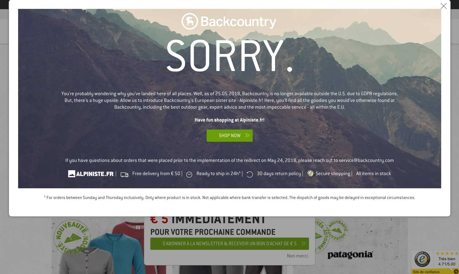
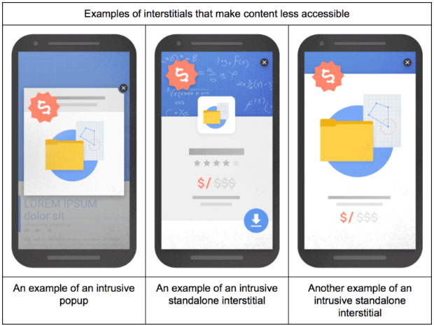
Personalization can be done at any stage of the funnel, from personalized email marketing to exit-intent popups and discount offers.
A well-targeted personalized message evokes an emotional response and creates a stronger, more memorable connection with your brand.
How to Measure Customer Experience
Instead of measuring the ROI of customer experience, which will likely take the focus off customer satisfaction, you should use one or more of the following industry-specific metrics:
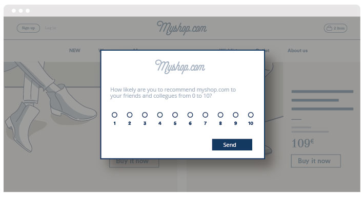
NPS (Net Promoter Score)
The Net Promoter Score, or NPS, measures customer experience and can also predict business growth.
It’s a simple measurement, but it’s been adopted around the world and is seen as one of the best ways to measure your customer’s experience.
To run the test, ask your customers on a scale of one to ten whether or not they would recommend your brand or business to a friend.
Respondents are then grouped into “Promoters” (score 9-10), “Passives” (score 7-8), or “Dectractors” (0-6).
Once you’ve collected your responses, subtract the percentage of Detractors from the percentage of Promoters, and you have your Net Promoter Score.
It’s simple, straightforward, and it works.
CES (Customer Effort Score)
Like the NPS, CES is another way to measure customer experience.
Also using a survey, it asks customers to rank their experience with the business ranging from “Very Difficult” to “Very Easy.”
The theory is, if you make it easy for your customers to make a purchase or solve their problem, then it’s more likely that they will continue to pay for your product or service.
The easiest way to increase customer loyalty is not through “wowing your customers,” but rather through making it easier to get their job done.
CSAT (Customer Satisfaction Score)
The final customer service metric is the Customer Satisfaction Score.
It’s a basic test and, due to the difference in opinion over what is classed as “satisfactory,” its validity can be questioned.
Nevertheless, it’s simple to do and can offer insight into how well your customers experience your brand.
The survey asks the question “How satisfied were you with your experience?” in order to gauge customer satisfaction with their purchase or interaction with your business.
The response should be on a scale from 1–3, 1–5, or 1–10.
TTR (Time to Resolution)
Time to Resolution, or TTR, is the average time it takes for your customer service team to resolve an issue raised by a customer.
One of the best ways to reduce customer frustration is to ensure the timely resolution of their issues.
Unfortunately, if you don’t measure your response times, it’s impossible to know whether or not you’re hitting the mark.
To test your TTR, simply add up all of the time it takes to resolve issues and divide the total by the number of tickets addressed.
TTR is the average length of time it takes for customer service teams to resolve an issue.
Conclusion
In a digital world, customer expectations are higher than ever, and word of good (or bad) service travels at the speed of light. Customer experience requires constant care and attention. Focus on a long-term customer experience strategy and always offer a customer-centric strategy.
By understanding your customer experience journey and testing your customers’ satisfaction levels, you can improve your customers’ perceptions of your brand and, in turn, improve brand loyalty, increase retention, and achieve higher profits.