We know how important data is to our clients. Understanding what people are doing on your website, app, or mobile site, is vital for businesses to create the best digital experiences. To meet customer demands for a more personalized experience, brands turn to AB Tasty to optimize at every stage of the digital customer journey.
And now we’re taking your data-driven optimization strategy even further with our GA4 integration.
What this integration means for marketing teams
By connecting AB Tasty and Google Analytics 4 (GA4), marketing teams have a clearer vision of how visitors interact with their site via advanced analytics on CPA, conversion rate, bounce rate, SEO and traffic. This integration means you can use data from either tool to better understand the effects of your experimentation during or post-rollout and drive more innovative ideas with data-backed hypotheses.
With this simplified integration, you can seamlessly connect Analytics with AB Tasty enabling you to leverage the robust reporting and intelligence features of Analytics, while taking advantage of our digital experience software.
The AB Tasty and Google collaboration offers businesses a powerful toolkit for optimizing their digital experiences and driving better results. By combining advanced analytics capabilities with sophisticated testing and personalization features, businesses can gain a competitive edge and deliver more value to their customers, deepen their understanding of users’ behavior and preferences, and use that knowledge to create more effective and engaging experiences.
With the ability to test and personalize every element of their digital experiences, businesses can ensure that their websites, apps, and campaigns are optimized for maximum engagement and conversion, ultimately leading to increased revenue and customer loyalty. In short, the AB Tasty and Google integration is essential for businesses looking to stay ahead of the curve in today’s fast-paced digital landscape.
AB Tasty partners with Google Cloud
As AB Tasty strengthens its partnership with Google, we are delighted to announce that we are an official Google Cloud Partner.
This means that clients and partners can access AB Tasty’s digital experience tools and Google’s secure platform. Engage and activate your clients through AB Tasty’s suite of products, testing and experimentation, personalization, server-side testing, feature flags, search and product recommendations, to create resilient digital products, make exceptional customer experiences, and deliver strong business results.
A continued partnership
This strategic alliance is crucial for businesses looking to offer exceptional products and services to their customers. By harnessing the advanced capabilities of AB Tasty’s platform and Google Cloud’s cutting-edge technologies in AI and ML, this partnership promises to empower companies in delivering optimized solutions that drive superior outcomes for their consumers.
Businesses with an annual commitment to Google Cloud can easily add AB Tasty solutions to their packages and quotes with ease. The partnership will also enable customers to access existing vendor relationships with Google Cloud, streamlining the deployment of AB Tasty on the platform.
Google Optimize Sunset
AB Tasty is excited to be a launch partner for Google Analytics newly released experimentation dimension and to help Google Optimize customers transition to new software.
By making the move to AB Tasty, you can gain access to top-of-the-line experience optimization tools to elevate your digital experiences to the next level. For companies that have progressed further in their CRO journey and require more extensive experimentation capabilities, AB Tasty provides a superior solution.
Discover the perks of our advanced solution that delivers a range of integrations with diverse providers, personalized features, pre-built widgets for optimizing the customer journey, and expert CSMs and account managers to offer personalized support throughout the entire contract period. This includes seamless transfer of your test history and data from Google Optimize.
The GA4 and AB Tasty integration levels up your ability to create highly personalized experiences for each step of the customer journey with a wide range of audience targeting options and in-depth data on user behavior.
Are you ready to make the move?
The post-Google Optimize world doesn’t have to be bleak.
As one of Google’s top picks as your new A/B testing platform, AB Tasty is a best-in-class A/B testing tool that helps you convert more customers by leveraging experimentation to create a richer digital experience – fast. This experience optimization platform embedded with AI and automation can help you achieve the perfect digital experience with ease.
In the digital age, companies can no longer only focus their efforts on optimizing for desktop especially as more and more consumers are using their mobile devices to visit websites and make purchases through apps.
However with millions of apps out there, competition and consumer demands and expectations are at an all-time high. This means your app needs to stand out in an overcrowded market.
It’s important to point out that deploying mobile apps doesn’t follow the same process as a website app.
In this article, we will investigate the challenges of mobile app deployment and release and how feature flags are the key to help you deliver optimized mobile apps that meet your consumers’ needs.
The challenges of mobile app deployment
Mobile development teams are particularly susceptible to bugs and long, tedious release cycles.
In short, there are two main problems when it comes releasing or updating features on mobile apps:
You have to wait until approval from app stores (which could take some time and significantly delay a release).
Afterwards, you have to wait for users to manually download the update from the store (which could also take a lot of time).
For example, let’s take a look at this scenario: you’re working on an update to your mobile app. You finally release it only to find out that there’s a bug you missed that’s causing your app to crash.
By the time you release a new update with a fix to the issue, wait for the release to the app store and watch for users to download the update, you might risk losing a significant number of users.
Mobile developers and engineers are all too familiar with such a scenario.
Therefore, it can be a painstakingly long process to get a release approved. Once approved, any buggy release will need to be fixed and put through the app store approval process all over again, leading to further delays.
Although the review time has improved in recent years, if your app fails to meet the app store review guidelines it may be further delayed. This means that you cannot push real-time updates to production as you would with web apps.
Put simply, the process of deploying mobile apps is not as straightforward as it might be for web apps.
Unlike web apps which are automatically updated once visitors access the site, users have to download an update of the mobile app in their store to get the latest version. As updates pile up after going through the review process, you have no control over whether users download the latest versions.
Therefore, it can take more time to deploy mobile app updates compared to web apps. And in an age where customers demand the best every time, it’s not feasible to have them wait that long for an update, especially when there’s a bug involved, much less having to wait to deploy a new app version once the bug is removed.
In modern software development, when continuous delivery is vital to retain competitiveness and meet fast-changing consumer demands, teams must turn to another solution to achieve a more frequent release cadence.
The value of feature flags in mobile app deployment and release
Unlike client-side testing where experiments are focused on web browsers, feature flags give teams the ability to carry out server-side experiments across multiple channels including mobile apps.
Feature flags allow teams to enable or disable features to users of their choosing to minimize risk and negative impact.
This is because feature flags allow you to decouple deployment from feature releases meaning you can turn functionality on or off remotely without redeploying code to app stores and waiting for its approval or having to wait for all changes to be ready at the same time to release your own changes. This way you can deploy code to whoever whenever you want.
Thus, you can upgrade your app continuously in real time based on feedback from your users without sending an app store update or waiting on its approval. You can also gradually release new features without users having to go through the hassle of always having to update their app version.
With feature flags, mobile developers can safely test in production on a pre-defined audience and disable any features with a kill switch should any issues come up, thereby reducing any negative impact. Developers can then work on pinpointing the issue and fixing it before releasing the feature to all users.
How can you use feature flags in mobile apps?
Feature flags can be used not only by developers but also by product and release managers to optimize mobile experiences in various ways.
Here are some examples of use cases for mobile feature flags:
A/B testing: With feature flags, you can divide your users into subsets with each set of users receiving a different variation of the feature. This allows you to test and determine which is the top-performing variation to roll out to all your users. Put simply, running A/B tests allow you to collect valuable live feedback from your users so you can make informed decisions about how to optimize your features and products.
Targeted rollouts: Teams can use feature flags to test out their ideas by progressively rolling out their feature, giving only a limited number of users ]early access to the app through beta testing for example. This helps generate buzz around your release and lets you monitor its impact on these select users. Targeted rollouts allow teams to make more informed decisions about what to optimize and fine-tune an app based on live user feedback.
Personalization: Feature flags are a great way to personalize experiences for different types of users rather than delivering a unified experience for all your users. By changing the features that certain users receive, you can tailor the user experience in mobile apps to individual users or user segments. For example, you can offer a unique experience based on the country the user is in.
Roll back/kill switch: What’s really unique about feature flags is that they enable teams to roll back any buggy updates quickly. By simply disabling the relevant feature flag, you can solve a bug without going through the lengthy app store review process.
Mobile feature flags: Use cases
We’ve talked mainly about how feature flags can be used in mobile app deployment but they’re also a great way to reduce risk when deploying and testing on mobile sites, especially when it comes to deep level modifications tied to back-end architecture such as testing new payment methods.
This can be easily done using a feature flagging platform, where teams can safely deploy frequent releases with an easy-to-use platform that can be used by all teams.
For example, let’s say you developed two payment features: one for desktop and one for mobile. Before doing a full release, you’re looking to test them on a small group of early adopters to monitor its impact and determine its usage rate.
Using AB Tasty, you can easily create a Feature Toggling use case on your AB Tasty account and choose the KPI you want to follow, in this case that would be the clicks on the “Proceed to checkout” button and then “conversion rate” as a sub KPI.
You can then define the two scenarios: one to enable the feature on desktop and another to enable it on mobile devices. You will then configure the flag that will turn on the new payment method for each scenario as seen in the image below in the “Scenario mobile” on the dashboard.
Next, let’s take a look at real-life examples of how AB Tasty clients use feature flags to carry out mobile testing:
Use case 1
Decathlon, a French sporting goods retailer with over 2,000 stores in 56 countries, wanted to test CTA placement to measure its impact across all devices, including mobile, and product listing pages (PLPs) with the help of feature flags.
In the original version, seen below, Decathlon APAC’s team was looking to test an earlier placement of the “add to cart” button on mobile on the main page below the product image to ensure a positive rollout and measure uplift. In the original version, users had to click on the product to go to the PDP before seeing this button.
With AB Tasty’s robust solution, the team was able to test the impact of this new feature on conversion. Changing the CTA placement proved to be a success, resulting in a 10.37% increase in transaction rate and an $11.27 increase in the average order value.
Use case 2
EDF (Electricité de France) is the largest electricity supplier in France for over 70 years. The team at EDF wanted to increase the number of online subscriptions and calls via their application.
In particular, they wanted to monitor the effect of changing the CTA design in the app. Using feature flags to increase the visibility of the CTAs, the team could then measure the impact on (and boost) clicks for online subscriptions and/or calls with EDF advisors respectively.
The team ran an A/B test with the subscription CTA against an orange background and the call CTA against a green background. They also added text to communicate hours of operation.
The call CTA was the one that yielded more positive results allowing the team to generate more qualified leads with an increase in calls with EDF advisors.
Thus, with a 20% increase in calls, the team could then confidently develop and roll out an adapted variation in the app where the new call CTA was more visible.
Use case 3
Often, A/B tests are a fool-proof way to eliminate potential bias and can save a company from investing in an optimization campaign that would otherwise take up a lot of valuable time and resources.
That was the case with Ornikar, a driving school platform in France with more than 2.5 million customers. The team was looking to revamp the home screen of their application and needed to identify which changes should be kept and which should be discarded.
The team set up an A/B test on AB Tasty to replace the existing carousel of four slides and two CTAs (left image) with a new screen featuring Ornikar benefits, a new CTA order and a more detailed carousel (right image).
The test was conducted for a duration of three weeks. After a week, they found that the new variation was not performing as wellas they expected so the team paused the test and adjusted the CTA and ran the test again for two weeks.
The results were still negative after two weeks and the team decided not to deploy the new home screen into production.
Due to the flexibility of the AB Tasty platform, the team was able to make quick iterations over a short period of time. Above all, Ornikar was able to avoid losing out on conversions and wasting time and resources as well as minimizing negative impact by testing the new home screen first before rolling it out to all its users.
Feature flags: The ultimate tool for better mobile experiences
As we’ve seen, feature flags are a powerful tool allowing teams across an organization to have more control over mobile testing and release while reducing risk.
Beyond giving you full control of new feature releases despite App and Play Store approval processes, feature flags enable teams to optimize their mobile apps and personalize the user experience. They also allow you to ship features more often and obtain quick feedback from your most relevant users.
With increasing mobile usage and millions of mobile apps to compete with, it’s essential to provide the very best user experience on mobile devices. Running experiments and using progressive rollouts with feature flags are key to delivering optimal and great mobile experiences.
Using a third-party feature flagging platform makes it easy to toggle features on and off and remotely configure your flags straight from the interface. By controlling all your feature flags in an easy to use web dashboard, it also ensures you’re keeping up with essential best practices to set you up for success and help you stand out from competitors.
This may not come as a surprise for experienced e-marketers, but the truth is that 7 people out of 10 will actually abandon their cart and end their shopping journey without making a purchase.
This is clearly a lot of lost revenue. So, how can you bring that percentage down?
This article aims to answer that question. We will cover best practices to help you diminish the abandonment rate and optimize your e-commerce shopping cart page for conversions.
Adopt clear UX parameters for shopping cart optimization
First of all, let’s start with a firm foundation. Your shopping cart page should adopt a clear, simple, and fast UX. This simple 3-step formula (CSF) is the cornerstone of any successful cart page:
Clear – There should be nothing messy, concerning, or misleading about your cart page. It should ideally display all the important information on a single page without the need to scroll too far or visit any other page.
Simple – Your cart page should display all the information using comprehensible, crystal-clear language and a design that leaves no room for misunderstanding.
Fast – The more time visitors spend on your cart page, the more likely they will leave it. If you apply the first two critical elements (simple+clear) to your page, the resulting cart page experience should also be fast.
As there are many elements on your page that you can optimize and run tests on to find the best solution, it’s important to follow this CSF framework for harmony.
Want to get started on A/B testing for your shopping cart page?AB Tasty is a great example of an A/B testing tool that allows you to quickly set up tests with low code implementation of front-end or UX changes on your web pages, gather insights via an ROI dashboard and determine which route will increase your revenue.
Knowing these 3 crucial elements, it’s high time we dive into our 10 best practices for e-commerce shopping cart pages.
10 best practices for your shopping cart pages
1. Create a detailed product summary
Just moments before your visitors proceed to checkout, they’ll land on your cart page which has one sole mission: lead your visitors to actually pay.
For most e-commerce buyers, the cart is a page used to review their order.
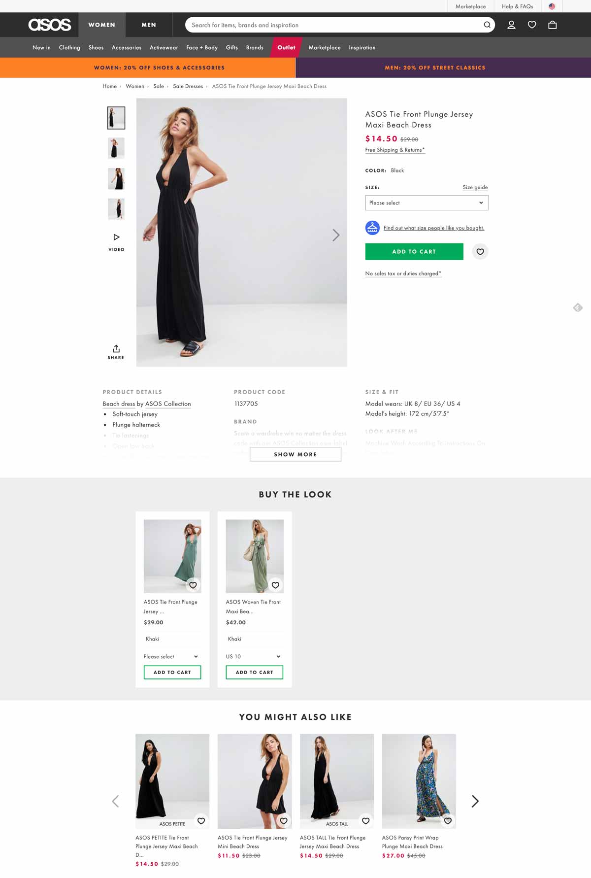
In order to help them do so, your mission is to clearly display all the relevant information regarding the product.
Below is a great example of a check-out page from ASOS that includes all the necessary details for a clear and easy review. Users know exactly which product they will purchase as well as the color, size, and quantity.
When crafting your cart page, be sure to follow this example and include these elements:
Having all these elements shown to your customers allows them to quickly review their order and have confidence in their purchase.
Including all relevant details will decrease the percentage of cart abandonment that is typically caused by the lack of precise information.
2. Choose a clear, user-friendly color code
There have been many studies about the psychology behind colors. However, there’s no single answer on which color will fit all websites and solve all abandonment rate problems.
One thing that we do know for sure is that visitors love harmony and clear designs when it comes to UX.
Let’s look at the luxury shoe brand Jimmy Choo. For their check-out page, they kept a simple design by using a black button that clearly stands out, making it straightforward to click.
Famous shoe-maker Jimmy Choo uses an elegant yet efficient black and white color code in order to clearly display the information on the cart page.
Notice that the checkout button efficiently stands out as the only black button on the page, making it extremely straightforward to click it.
3. Display explicit and detailed information about shipping and returns
What is the number one reason behind shopping cart abandonment in the US? Hidden shipping costs.
Online buyers despise hidden and last-minute shipping costs. As you can see in the image below from Baymard’s study, it’s by far the most popular reason for cart abandonment compared to others.
Displaying transparent shipping and return policies is a key factor in enhancing conversion and gaining customers’ trust.
4. Craft clever information hierarchy and non-competing CTAs
Information hierarchy is the structure used to display and rank information according to its importance.
While designing cart pages, pay attention to the logic behind buttons, columns and titles as they will heavily influence the users’ perception.
You can use various colors in your CTAs (preferably matching your brand) although we recommend a maximum of 3-4 colors at a time.
Colors do help you gain visitors’ attention, so use them wisely:
Highlight important information
Use a distinct color to distinguish the CTA
Use lines or columns to structure your page
In the image below, Zappos, a USA-based shoe marketplace, does a great job of providing an efficient and clean shopping experience.
The shopping cart page skillfully guides customers through the buying journey; we appreciate the neat layout emphasized by a simple 3-step color code (orange=very important; blue=important; grey=secondary).
5. Deploy payment options that your users love
Having different payment options is a necessity in today’s ultra-competitive e-commerce environment.
If you run an international e-commerce store, bear in mind that payment methods differ from one country to another: what’s used in North America isn’t necessarily the same as in Europe or in Asia.
To combat this, try to redirect customers based on their IP location to offer them a personalized experience based on the local currency and their preferred payment methods.
In the image above, Adidas provides 6 different payment methods including Paypal, VISA and Apple Pay. This is an absolute necessity for large and global stores.
6. Show security seals and reassuring elements
In the same report from Baymard, the lack of trust in the payment accounted for 18% of abandoned cart rates. Trust seals, or trust badges, are very important to show your users that your site is legitimate.
In fact, they actually matter more than peer recommendations or trustworthy design. According to Baymard, here are the badges that give visitors the highest perception of a safe and secure site:
7. Offer phone, chat or email assistance
Displaying a clear contact number and address details can impact your user’s level of trust. Shoppers want to make sure that your business is legitimate and not an online scam.
Furthermore, your visitors want to feel that there are actual humans behind your website.
Offering a live chat or phone assistance service right on the cart page is a great option to gain customers’ trust, legitimize your business and humanize your brand identity.
Wondering how to design your chatbox? Take a look at Victoria’s Secret’s page in the image below. They have chosen their most vibrant color, pink, to increase their call-to-action visibility.
8. Add a “continue shopping” option
A “continue shopping” option is a smart way to offer your visitors a way to abandon their cart without leaving your website. They’ll have the freedom to continue browsing after they’ve already added items to their cart.
As some online shoppers actually use carts as “wishlists,” they can store items that they intend on purchasing later on.
9. Display legible thumbnail images
There’s nothing more annoying than a tiny thumbnail that barely helps to identify a product.
When customers review a product, you should give them the opportunity to see it correctly in a convenient size and resolution on both mobile and desktop.
In the image above, Apple makes it very easy to distinguish the chosen product. The image used is bright and clear. Their customers will be absolutely certain that they’ve got the right item in their bag.
10. Push complementary products
Offering complementary product recommendations, or cross-selling, is nothing new in the e-commerce world.
However, displaying complementary products inside the shopping cart page is something worth testing if it could bring you a higher AOV.
An optimized shopping cart page is crucial to sales.
The shopping cart page is the last step your visitors take before their purchase. In this step of their digital user journey, it’s important to ease customer concerns in any way possible and promote a seamless checkout flow.
Every online e-commerce should be testing different elements of its cart page to find what works best for converting passive visitors into active customers.
A value proposition is a clear statement of the fundamentals that define your brand.
To create a value proposition, you need to clearly define your product or service and showcase how you are different from competitors. This is often referred to as a Unique Selling Point (USP).
So, how can you define and present your company’s USP? By crafting a value proposition canvas.
A value proposition canvas is a visual display that maps out your product or service and how it can meet the specific needs of your customers.
It’s essentially an extension of the frequently-used business model canvas and has become a widely popular method of presentation in all corners of the business world.
In this article, we will dive into the specifics of a value proposition, give you tips for creating your own and advice on how to develop it further with a value proposition canvas.
What is a value proposition?
At first glance, a value proposition seems like a very simple and broad concept. However, a particularly effective value proposition is exceptionally complex and loaded with details.
Here are some common questions at the heart of each value proposition:
Why should a customer use your service or buy your product over a competitor’s?
What are you offering that no one else can?
How can you serve the needs of each individual customer?
A value proposition is not a positioning statement designed to appeal to as many customers as possible, rather it’s very specific. To meet the specific needs of a specific customer, you need to be as niche as possible.
For example, a business might be looking for software that comes with customer support packages that are more encompassing than usual due to the fact that they have little experience with a particular product.
Suppose a software company highlights its top-rated customer service team and affordable ongoing support options that their competitors are unable to provide. In that case, it will likely attract businesses that will profit from (and be in need of) this type of support.
Let’s look at another example: Uber – a travel service provider that meets low-cost and on-demand needs. Immediacy, convenience and simplicity are at the heart of their value proposition.
Think about the unique benefit that you are providing. If you can define this simply, concisely and accurately, you have a value proposition of worth to your audience.
How to create a value proposition
Now that we’ve defined what a value proposition is, let’s move on to how you can start brainstorming to transform your thoughts and ideas into a clear statement.
Before we get too intense, start by drafting up a few phrases with this template: We help (Customer) to (Goal) by (Unique value proposition).
We should also keep in mind that value propositions don’t need to be subtle. In fact, they can be rather blunt instruments used to draw in new customers or clients.
Value propositions should not be loaded with jargon or complexities. They should be thought of more like a well-researched advertising jingle than a dissertation.
Let’s discuss a few points to keep in mind when developing your value proposition:
Define your target audience
Know your competition
Tell your customers how you meet their needs
Be prepared to combat stereotypes
Define your target audience
As value propositions are highly dependent on those that are being sold to, it’s essential to define your target audience.
This requires a great deal of research, but will undoubtedly pay off in the long run. Age, demographics, marital status, economic status and personal interests can all inform how a value proposition is designed.
Your message needs to be clearly personalized for your audience.
Know the competition
It’s hard to stand out from the crowd if you have little concept of what the crowd is offering.
If a larger competitor offers the same USP (Unique Selling Points), it’s likely that they will get a hold of your potential customers since they will rely on your differences: brand size and reputation.
This requires extensive research to define new and fertile ground. You need to know your competition well – not only to be aware of your similarities but also to let your audience know how you stand out.
Tell your customer how you meet their needs
To start with, it’s best to define exactly what your product or service offers. Then, you can move into what makes it unique:
Customer service?
Affordability?
A simpler design than the competitors?
Once you have defined what you will highlight, it’s time to get more specific with your word choice. Remember: specificity does not mean complexity.
If the customer service is highly rated, why?
Affordability is great, but does the quality of the product match or even improve on your competitor?
Simplicity is admirable, but how does this improve customer satisfaction?
If you can define this in simple, but effective terms, you will have a highly effective value proposition.
Be prepared to combat stereotypes
Every sector has its own negative stereotype that can be harmful even before they get started.
Delivery services are known for not turning up when agreed upon, car salesmen are known for being notoriously pushy and fast food is known for being convenient but unhealthy. These are all examples of initial reactions, or cognitive biases, that most people have before using a product or service.
One of the most powerful kinds of value propositions are those that go against the grain of expectations.
If your particular sector is known for a negative practice, ensuring that your brand is above the stereotype can provide a concise and enticing positioning statement.
Value proposition canvas
A value proposition canvas is a focused way of structuring the main components of the value proposition in order to provide the most concise solutions for potential customers.
Value proposition canvas segments
The value proposition canvas is made up of two segments: the customer segment and the value proposition.
Inside each segment are three sections. The customer segment (shown below in red) has the specific needs of the customer, while the value proposition segment (shown in green) has the corresponding solutions.
The three sections of the customer segment (red) in the value proposition canvas are:
Customer jobs – what tasks can your customer accomplish by using your product or service?
Customer pains – what problems, risks or negative experiences can the customer eliminate when using your product or service?
Customer gains – what unique benefit does the customer gain when
using your product or service?
The value proposition map (green) on the other side of the canvas seeks to address these factors while presenting unique solutions and unexpected gains.
Gain creators – this is where you detail the unique improvements and benefits that your product or service offers to your customers
Pain relievers – this is the area to address elements that eliminate a current frustration or pain point (such as undesired costs, accessibility, or negative stereotypes)
Products and services – this is the spot to list all of your products and service
How to create a value proposition canvas
Let’s start with the customer segment.
The first thing to consider when creating a value proposition canvas is the customer. The customer is the central part of the entire premise. Be sure to speak carefully to your specific audience and avoid making generalizations.
Customer pains are generally more straightforward; therefore, pain relievers are often easier to define.
It’s tempting to focus solely on the functional factors, such as how to get from A to B. However, while the function is important, the emotional and social aspects also need deep consideration when developing your value proposition canvas.
Customer gains are a more complex element of the value proposition canvas as they can be slightly more difficult to define. In essence, these cannot be discovered without a substantial understanding of the uniqueness of the business itself. Not only will you list what the customer will gain from your product, but also what the customer will gain by choosing you over the competition.
Now let’s move on to the value proposition portion of the canvas.
Listing the potential jobs, or tasks, that customers want to accomplish with the help of your product or service is a good place to start.
Once completed, you will move on to the pain relievers and gains.
The pain relievers will specifically target the pains listed in the customer segment and should remain consistent. Meanwhile, the gain creators will show where your product or service adds value.
It’s important to remember that gains aren’t the opposite of pains. They are different factors that ultimately encourage consumers to adopt the product or service.
In the gains section, you will address the lesser-known desires of the customers – these are things that the customer themselves may not even be aware of. The lesser-known customer needs can be considered the “bonuses” that your brand offers potential customers.
Let’s go back to Uber as an example. Uber’s customers need quick, accessible and affordable transportation. These are the customer’s first thoughts. In addition, their customers also need safety during their rides. Uber offers insurance during trips to their drivers and passengers to cover them in the case of an accident. Furthermore, they can provide passengers with more comfort by including driver ratings from previous passengers. Customers may not immediately think of these factors, but they address very important human needs.
After development, each part of the right side of the canvas should be balanced with solutions and gains on the left. Ultimately, a value proposition canvas seeks perfect alignment.
Finding your fit in the market
Creating a value proposition canvas is a great tool to help understand your product, where you fit in the market, how you stand against competitors and the best way to market your brand successfully.
Drawing conclusions from this canvas and analyzing your value proposition can help you improve your strategies, messaging and overall product. A unique and profound value proposition is the core of a strong business.
In modern software development, teams often have to prioritize speed and less than ideal solutions to put out products quickly to keep up with fast-changing consumer demands.
Unfortunately, taking such shortcuts could have dire consequences in the form of heavy costs or technical debt that could take a toll on your code quality and your whole software development and delivery processes if left unattended.
In this article, we’ll explore what technical debt is, the causes and different types of technical debt as well as how to manage it, largely through the use of feature flags.
What is technical debt?
The term “technical debt” was first coined by Ward Cunningham, one of the authors of the Agile Manifesto, in the early 1990s. Since then, the term has gained momentum and is a serious issue that many tech teams today still struggle to manage properly.
His reason for its name is that technical debt bears direct correlations with financial debt. Software development teams can take shortcuts to satisfy immediate business requirements, but the debt plus accrued interest will have to be paid at a later stage.
Technical debt is the consequence of action taken by software development teams to expedite the delivery of a software application or specific feature which later needs to be refactored or redeveloped.
Put simply, technical debt refers to the build up of technical issues during software development due to a number of causes which we’ll discuss in the next section.
If not attended to, technical debt can spiral out of control, resulting in the total breakdown of the software development and maintenance lifecycle.
Therefore, it is critical to ensure that DevOps and software development teams pay close attention to technical debt management and technical debt reduction methods.
Here are some warning signs to look out for:
Buggy, difficult to maintain code
Unstable production environments
Bug fixes introduce more bugs
Data inconsistency
Decreased development pace and bottlenecks
What causes technical debt?
We can deduce that technical debt comes mainly as a result of delivering a release quickly at the expense of “perfect” code.
In other words, it often comes as a consequence of ineffective and inadequate practices to build software for a short-term benefit in the interest of saving time.
That is one major cause but it’s also more complex than that as technical debt can be due to a number of other reasons.
Some causes behind technical debt include:
Time pressure: Teams today are under great pressure to deliver releases quicker than ever before to remain competitive and meet consumer demands fast.
Poor code: This could be due to a number of reasons including use of tools without proper documentation or training.
Insufficient software testing: Lack of QA support or automated testing means a lot of bugs could remain in the code undetected which gives rise to technical debt.
Outdated technology: Over time, many technologies become obsolete and are no longer supported and could become a source of debt.
Lack of skill: Teams can sometimes unknowingly incur debt because they lack the skills to write better code. For example, having junior developers working on building complex software beyond their skill and experience level is a sure way to accumulate debt fast.
Over time, all these factors could result in accumulation of debt that will need to be addressed. The real danger is not actually having the debt in the first place- as often that’s inevitable- but it’s allowing this debt to build up with no plan or strategy to pay it off in the future.
Types of technical debt
There are many ways to classify technical debt. One of the most popular ways comes from Martin Fowler’s technical debt quadrant.
The quadrant is based on the idea of not whether something should be considered debt per se but rather whether this debt can be considered prudent.
What does this mean exactly? Think of it as a way of answering the question of whether all technical debt is bad and the answer, according to the quadrant, would be “it depends.”
Generally speaking, there are two overarching types of technical debt: intentional and unintentional (deliberate vs inadvertent).
Intentional technical debt occurs when software development teams choose to leave their code as it is, without refactoring or improving it, to reduce the time-to-market metrics. In other words, they choose to incur technical debt.
Unintentional technical debt, for its part, occurs when poor code is written and so the code quality will need to be improved over time.
Suffice to say, as soon as these technical debt-causing issues are highlighted, it is imperative to fix them as quickly as possible.
Let’s take a closer look at the 4 main types of technical debt, according to Martin Fowler:
Reckless/deliberate: Teams possess the knowledge to carry out the task but decide to go for a “quick and poor quality” solution to save time and for quick implementation.
Prudent/deliberate: Teams are aware of the debt they’re taking on but decide that the payoff for an earlier release exceeds the costs. However, in this scenario unlike the above, teams have a plan on how to deal with the repercussions of taking on this debt.
Reckless/inadvertent: This is arguably the least desired form of debt where teams don’t have enough experience and blindly implement a solution without applying best practices. As a result, they’re unconscious of the fact that technical debt is being accumulated. Thus, no real plan to address this debt can be formulated.
Prudent/inadvertent: This occurs when teams apply best practices during software development but still accumulate debt due to unexpected coding mistakes. Thus, this type of debt is unintentional. Teams have the necessary skill and knowledge to identify and pay off the debt but the experience serves as a learning opportunity for developers to optimize and improve the code for future projects.
When it comes down to it, deciding what to classify as technical debt is not always black or white. It requires putting things into context first. This is especially important when you think of the pressure on teams to put out products quickly to meet consumer and market demands.
This means that they will constantly have to deal with the dilemma between taking on technical debt or delaying a release. However, it’s more of a matter of how to deal with and manage this debt rather than avoiding it completely- which may not always be possible- to minimize negative impact as much as possible.
Types of technical debt to avoid
At this juncture, it is reasonable to conclude that teams should avoid technical debt. Additionally, it is imperative to minimize and eliminate tech debt, particularly reckless and deliberate code debt.
Over time, technical debt could become too expensive to fix the longer it remains unfixed as “interest” builds up the same way that financial debt accrues interest. Eventually, technical debt can lead to a code becoming harder to maintain as the foundation of the codebase deteriorates. This will ultimately result in lower-quality products with the company reputation taking a major hit.
Prudent tech debt is the partial exception to this rule. This form of code debt can benefit software development organizations as part of the reducing time-to-value methodology.
In other words, the advantages of delivering a product to market as soon as possible can outweigh the cost incurred by technical debt. However, it is critical to monitor the tech debt to ensure that its value does not spiral out of control, negating the benefits of the reduced time-to-value exercise.
How feature flags can help with technical debt
Feature flags can help reduce the technical debt accumulated during the development, testing, and deployment of a software application.
However, if feature flags are not monitored and maintained, they can increase the application’s technical debt.
Before we look at how feature flags reduce technical debt, let’s take a quick look at what a feature flag is:
“Feature toggles [feature flags] are among the most powerful methods to support continuous integration and continuous delivery (CI/CD)… [They] are a method for modifying features at runtime without modifying code.”
One of the most common sources of technical debt is the pressure to release a version of the software application.
The business demands that the software be deployed, and they don’t care how the developers make it happen. Feature flags are a valuable tool to help manage the “pressure-cooker” release environment.
There are several benefits to the use of feature flags as a software release and deployment aid, including:
The risk of deploying a bug-ridden application is substantially reduced. Developers can simply switch off features that are not yet complete or thoroughly tested.
By implementing a CI/CD methodology (continuous integration/continuous delivery), developers can often use feature flags to deploy new features without waiting for the next release to be deployed. In summary, this functionality reduces the time-to-value and increases customer satisfaction: A win-win for all.
Implementing feature flags is also a means to negotiate with management about which functionality to complete before specified deadline dates, increasing the flexibility to develop and test features thoroughly before deploying them.
In summary, feature flags help manage and reduce technical debt by helping software development teams manage the development/testing/deployment lifecycle more effectively.
Testing in production is another form of dark launching. By utilizing this option, you can assess the application’s health, collect real-world app usage metrics, and validate that the software application delivers what your customers want.
Feature flags can also create technical debt. While they play a significant role in mitigating technical debt in all other areas of the software development lifecycle, implementing them is usually via a set of complex if-else statements.
Therefore, in practice, a feature flag is an if statement defining the path between at least two different code paths depending on one or more conditions.
The following simple scenario describes how to implement feature flags.
Let’s assume that an e-commerce site offers free shipping for all customers that spend more than a specified minimum amount at one time.
This code sample is an example of a feature flag. If the total amount paid is more than $50, then the shipping is free. Otherwise, the shipping amount is the amount spent multiplied by the rate (a percentage of the total amount).
Best practices using feature flags to avoid technical debt
As with all aspects of software development and deployment, it is vital to observe the following feature flag best practices:
1. Feature flag management
As your organization matures in its use of feature flags as an integral part of the software development/testing/deployment lifecycle, it is vital to be mindful of the fact that some of the feature flags are short-term and should be removed; otherwise, they will add to the application’s complexity, resulting in more technical debt.
Consequently, it is imperative to have a plan in place to remove the flags before even setting them.
It is also possible, and a good idea, to track and measure different metrics for each feature flag, such as how long it has been active, its states (on/off), different configurations, and how many code iterations it has been through.
Once your feature flag has been through the required number of iterations to code and test a feature, this flag must be removed and the code merged into your code repository.
Note: Before removing a feature flag, it is a good idea to evaluate its function and purpose; otherwise, there is a risk, albeit slight, that the flag might still be needed and is erroneously removed.
A vital part of the feature flag management process is to define and implement temporary and permanent flags.
1.1 Temporary feature flags
As highlighted above, if a feature is designed to be rolled out to every application user or you are using the feature as a short-term experiment, it is critical to attach a monitoring ticket to this flag to make sure it is removed once the feature has been deployed or the experiment is concluded.
Examples of these temporary flags which can last weeks, months, or even quarters, include:
Performance experiments: A performance experiment is similar to A/B testing, where two versions of the feature are deployed with the idea of determining which one performs better. A/B testing employs the same construct in that it deploys two versions of an element to the application’s user base to select which one users prefer.
Painted-door experiments: These experiments are only used in the early phases of the software development lifecycle and are User-Interface mock-ups to determine any customer interest. Once the consumer interest has been determined, these flags can be removed.
Large-scale code refactoring: It is a good idea to deploy code refactoring changes behind a feature flag until you are positive that the functionality has not been changed or broken. Once the refactoring exercise is complete, you can remove these feature flags.
1.2 Permanent feature flags
Permanent feature flags are used to implement different features or functionality for different groups of users.
As a result, it is reasonable to assume that these flags will remain in the software application indefinitely or at least for a very long time.
Therefore, it is vital to ensure that they are monitored, documented, and reviewed regularly. As with the temporary flags, there are several different types, including:
Permission flags: These feature flags are helpful when your product has different permission levels, such as the ability to create journal entries in an online financial general ledger or whether users can view a list of these entries. A second use case for these flags is your SaaS application has different subscription models like Basic, Professional, and Enterprise.
Promotional flags: These flags help implement regular promotions. For instance, let’s assume your e-commerce store offers a Mother’s Day promotion every year where specific products bought include the shipping costs.
Configuration-based software flags: Any software driven by config files will benefit from using feature flags to implement the different possible configurations. A typical use case for config flags is the layout of the User Interface.
Operational flags: These feature flags help manage a distributed cloud-based application. For example, additional compute engines can be spun up when the workload reaches a specific level.
2. Use a central code repository
Feature flags or toggles are most commonly stored in config files.
Another option is to keep them in a database table. However, let’s look at how to manage these config files. Large systems can have many if not hundreds of feature flag settings. Apart from using a database table, the only way to manage these settings is to store them in config files.
The best way to maintain the config files is to upload these files to a feature flag library in a central code repository like Git.
Not only is Git good for keeping control of these files, but it is also a valuable version control system. Developers can use it to create feature branches of config files used during the software development process without negatively affecting the production version of these files.
Once the config files have been updated and tested, they can be merged back into the Git master branch using a merge request.
Naming the feature flags, flag 1, flag 2… flag 100 will not help people who have to work with these flags in the future.
A good example of wisely named feature flags can be found in the scenario highlighted above.
It is reasonable to assume that the flag, AdvancedSearchYN, is one of hundreds of flags used in our eCommerce application. Even if they are the only two flags used, it is still advisable to give them intuitive, related names.
For more details on the best way to manage feature flags to keep technical debt at bay, download our feature flag best practices e-book.
4. Use a feature management system
Using a dedicated feature flagging system is a great way to manage flags in your code so you don’t find yourself with piles of technical debt from unused or stale flags.
AB Tasty’s server-side feature enables you to remotely manage feature flags and take control over how, when and to who features are deployed to mitigate risk while optimizing user experience.
To help with technical debt management, AB Tasty provides dedicated features to keep control over your feature flags. Two of them are especially useful in this regard:
The Flag Tracking dashboard lists all flags setup in the platform, with their current values (ex: on/off) and campaigns that reference them. This way, you can easily keep track of every single flag purpose (ex: flag 1 is used in progressive rollout campaign X, while flag 2 is used in feature experiment Y). When you manage hundreds of flags, it turns out to be a real time saver.
The Code Analyzer is an advanced Git integration to see where your flags are used in your repository. In conjunction with the flag tracking dashboard, you can quickly find flags in your code that are not referenced in any campaigns. It also deeply integrates with your current CI/CD pipeline. As a CLI and a Docker image, it analyzes your codebase and detects the usage of flags everytime code is pushed to a specific branch or tag. This way, your flag dashboard is always in sync with your codebase. On one hand, you can safely remove flags if they are not referenced in campaigns, and on the other hand you make sure that flags your campaign is relying on are indeed available in your code. View code on Github.
The Flag Tracking dashboard with flag references to the codebase
As described throughout this article, feature flags in DevOps and software development play a fundamental role in managing and reducing technical debt.
Consequently, it is vital to implement a feature flags framework as a foundational part of the software development lifecycle.
Cobbling it on afterward can increase the risk of incurring more technical debt, especially once the system grows in scale. Thus, these feature flags must be carefully maintained and monitored to ensure that they don’t amass additional technical debt.
Finally, it is essential to be mindful that, while technical debt is primarily seen as a negative, there are instances, as described by Martin Fowler’s technical debt quadrant, where incurring prudent and deliberate tech debt can be beneficial.
It is also worth noting that both Agile and Scrum use the concept of technical debt in a positive way to reduce the time-to-value of a new application or feature release, driving sustainable growth through customer satisfaction.
At AB Tasty, we have always put client feedback at the heart of our product roadmap. Listening to our clients’ needs and helping them achieve their goals is a top priority for us. We just don’t say it, we do it:
🎁 55 new features brought to users in 2022
📣 10 market releases per year
🤝 1545 feedback requests processed
To go one step further, we have decided to launch our User Club! 🎉
The AB Tasty User Club is a new opportunity for you to share your feedback, experiences, and needs with us. Being part of the Club means you’ll have exclusive access to:
Our new features
A way to interact directly with our Product Managers and Designers
Our product related events
A real community where you can share your usage and hear best practices from other users
A successful launchpad for our User Club
As a first step, we organized our first User Games of the year in January 2023 in Paris, France on the theme of data, monitoring and performanceanalysisin CRO activities.
This event was a great success for our Product teams and for the 5 customers who attended to discuss their data understanding and analysis needs. We welcomed participants from different industries, all interested in data analysis techniques and how to use them to improve products and services. We also invited experts in the field of data analysis to share their experience and knowledge.
Baptiste Deroche, Product Designer @AB Tasty:
“This event was the perfect opportunity to validate and challenge assumptions we have about the product. We learned a lot from our customers that day, and it’s a really good start to getting closer and closer to our end users.”
Stéphanie Duchemin, Product Design Team Leader @AB Tasty: “It was a pleasure to meet our users again in a real session and not remotely, and I think that the pleasure was shared. This reinforces my conviction that feedback is not the same in a face-to-face session as in a remote one. Through our discussions we learned and discovered some pain points that were not necessarily related to the initial topic and that will feed our roadmap for at least 6 months!”
“It was a collaborative and enriching moment where each participant presented their feedback, their experimentation process and their vision of the tool. It’s really reassuring to know that AB Tasty values its users’ feedback. I will gladly participate in this type of event again!”
The AB Tasty User Club was created to offer our customers a space to discuss and share their opinions and suggestions. We have received a lot of positive feedback from participants and this gives us even more motivation to create other similar projects and events where you will be at the forefront.
Stay tuned for the upcoming events or announcements! If you are not part of the Club yet, do not hesitate to talk about it with your dedicated Customer Success Manager!
In a highly competitive digital marketplace, optimizing your website for a unique and seamless digital customer journey is no longer just a competitive advantage — it’s a necessity.
It’s important to remember that the digital customer journey does not begin and end with a purchase – it’s a web of all customer interactions and touchpoints with your brand.
AB Tasty has mapped out seven customer phases that we consider crucial in the journey. To craft unique experiences, you’ll need to differentiate these seven phases customers pass through and understand how to animate their digital journey.
Once you have a better understanding of these phases, you will be better equipped to set your business goals and properly optimize your website for growth and impact.
Click to view the full-sized infographic in new tab
How exactly can you optimize each phase of the digital customer journey? Let’s dive right in and take a look at some examples.
Phase 1: Awareness
When visitors land on your website for the first time, a great first impression is crucial.
Your page needs to be both visually appealing and intuitive. A dynamic above the fold design is a great place to start.
In this first phase, it’s important to let your best ideas shine to capture and keep your visitors’ attention. You can accomplish this by creating personalized welcome messages for first-time visitors, displaying your value proposition and organizing high-impact elements for better visibility.
Let’s take a look at Just Over The Top’s experiment to modify the layout of their homepage. They used AB Tasty’s experience optimization platform to test if their users responded better seeing a layout with product categories rather than individual products.
Original:
Variation:
After creating a test variation to run against the original layout, they saw a 17.5% click increase on the three blocks below the hero image. This brought many more users into the second phase of their customer journey.
Phase 2: Discovery
When consumers reach the second phase, they’ve already discovered your brand and they’re getting curious.
To accommodate visitors during this phase, your website should be optimized for an excellent browsing experience. Whether this means making your search bar more visible, creating dynamic filters while searching, or using a virtual assistant to get to know your visitors’ interests with a series of questions, an easy browsing experience with intelligent search is key.
In this example, Claudie Pierlot focused on optimizing the customer browsing experience by testing the search bar visibility. In their variation, the small search icon was made more visible by adding the word “recherche” (or search in English) in the top right-hand corner.
Original:
Variation:
This clear above the fold design made it easier for visitors to identify the search bar to begin their browsing experience.
With this simple A/B test, they saw a 47% increase in search bar clicks and a 7% increase in conversion rates coming directly from the search bar.
In another example, Villeroy & Boch, a ceramic manufacturing company, wanted to leverage intelligent search on their website. With the help of AB Tasty, they implemented an AI search algorithm to navigate online shoppers.
With our solution, they designed a new and intuitive navigation complete with filters and a comprehensive autosuggestion feature.
By changing their search functions, Villeroy & Boch saw a 33% increase in search results clicks and a 20% increase in sales through the search function.
Phase 3: Consideration
Now is the time when your visitors are considering your brand and which products they are interested in. Showcasing your product pages in their best light during the consideration phase might be exactly what your visitor needs to continue moving down the funnel.
Let’s look at how Hanna Anderson optimized their product pages during this phase.
The clothing retail company wanted to experiment with the images on their product listing pages. Previously, their toddler line had only images of clothing sizes for an older child. They were convinced there was room for improvement and decided to run a test by changing their images to include toddler sizes.
Original:
Variation:
After implementing age-appropriate clothing images, the results were clear. During this test, the clicks on PLPs increased by almost 8% and the purchase rate on those items skyrocketed by 22%.
Phase 4: Intent
During the intent phase, your visitors are on the verge of becoming customers but need to be convinced to make a purchase.
Social proof, urgency messaging and bundling algorithms are a few ideas to lightly nudge visitors to add to cart or add more to cart.
Let’s take a look at the impact that urgency messaging can have: IZIPIZI, an eyewear retailer, decided to add a special message flag next to their product description to show viewers how many people have purchased this product. The idea of this message is to show viewers that this product is popular and to encourage them to take action.
With this simple sentence of social proof to validate a product’s desirability, they saw a 36% increase in add-to-basket rate.
In another scenario, you can see that adding a progress bar is a simple way to upsell. With a progress par, you are showing your customer how close they are to earning free shipping, which entices them to add more to their cart.
Vanessa Bruno experimented with this additive with the help of AB Tasty and saw a 3.15% increase in transactions and a €6 AOV uplift.
Phase 5: Purchase
Purchase frustration is real. If customers experience friction during checkout, you risk losing money.
Friction refers to any issues the visitors may encounter such as unclear messaging during the payment (did the payment actually go through?), confusing or expensive shipping options, discounts not working, double authentication check-in delays, difficult sign-in and more.
Optimizing your checkout sequence for your audience with rollouts and KPI-triggered rollbacks can help you find a seamless fit for your website.
Let’s look at an example for this phase: Galeries Lafayette, the French luxury department store, saw an opportunity to optimize their checkout by displaying default payment methods that do not require double authentication.
During this test, they saw a €113,661 increase in profit, a €5 uplift in average order value, and a 38% increase in the conversion rate by adding the CB (bank card) option for a quicker checkout.
Phase 6: Experience
Optimizing the buyer experience doesn’t end after the purchase. Now is the time to grow your customer base and stop churn in its tracks. So, how do you keep your customers interested? By maintaining the same level of quality in your messages and personalization.
Let’s look at how Envie de Fraise, a French boutique, leveraged their user information to transform a normal post-purchase encounter into a personalized experience.
One of their customers had just purchased a maternity dress and had been browsing multiple maternity dresses prior to their purchase. By knowing this information, they experimented with using the “you will love these products” algorithm to gently nudge their customer to continue shopping.
With a customized recommendation like this, Envie de Fraise saw a €127K increase in their potential profit.
As your customer spends more time with your brand, you will learn more about their habits and interests. The more time they spend with you, the more personalized you can make their experience.
Phase 7: Loyalty
In the final step of your customer’s journey, they move into the loyalty phase. To turn customers into champions of your brand, it’s important to remind them that you value their loyalty.
This can be done by sending emails with individual offers, social proof, product suggestions or incentives for joining a loyalty program to earn rewards or complete product reviews.
Another example of this is sending a personalized email displaying items that are frequently bought together that align with their purchase. This will remind the customer about your brand and give them recommendations for future purchases.
Why Optimizing the Digital Customer Journey is Essential to Boost Conversions
The fierce competition in the e-commerce marketplace is undeniable. In order to attract and retain customers, you have to focus on crafting personalized user experiences to turn passive visitors into active buyers.
Understanding their needs in each phase and optimizing your digital space is your best solution to nudge visitors down the purchasing funnel.
By personalizing the experience of your customers during each phase of the digital customer journey, you can ensure an optimal shopping experience, boost purchases, increase customer satisfaction and see more repeat customers.
Want to start optimizing your website?AB Tasty is the best-in-class experience optimization platform that empowers you to create a richer digital experience – fast. From experimentation to personalization, this solution can help you activate and engage your audience to boost your conversions.
With Google Optimize’s retirement on the horizon, companies are now faced with the daunting task of finding an alternative tool to carry out their tests and experiments after Google’s announcement that it will be sunsetting its web testing and personalization tool on September 30.
If you haven’t already, it’s time to start your research for a new tool as soon as possible to stay on track with your testing and CRO strategies. September will be here faster than you think, so you need to act soon for a smooth migration post-sunset.
Why the time to find a Google Optimize alternative is now
With roughly 6 months left, teams should already be thinking about the best way for them to carry out their experiments.
You may have to anticipate that some features on Google Optimize will no longer work properly. Not to mention that migrating from one tool to another — and the transferring of all the data — can be a complicated process.
Making an informed decision requires extensive research. Finding a platform that suits your experimentation needs is only the first step. You also need to factor in how long it will take the migration processes to be successfully completed and the learning curve of your new tool. In other words, time is of the essence if you want to make a smooth migration to a new platform.
Therefore, teams need to make sure that they have fully migrated onto their new tool well before the sunset date of September 30.
What’s next? The current and future state of your optimization journey
As a free or low-cost solution, Google Optimize is a great starting point for those at the beginning of their optimization journey.
However, in light of the sunset announcement, organizations should start rethinking their website optimization and experimentation strategies and looking ahead to anticipate their CRO needs.
This should start with evaluating your current and future CRO goals. In other words, you may look into the possibility of investing more resources to optimize your website that will enable you to turn your passive users into active ones by providing a more personalized customer journey.
Consequently, your team may want to delve into other features beyond A/B testing capabilities offered by more advanced solutions. This will enable them to better optimize the website. For example, you may consider venturing beyond surface-level modifications and running more sophisticated tests tied to back-end architecture.
This will ultimately allow teams to provide the best customer experience possible so visitors can turn into customers with the click of a button.
Put simply, engaging your visitors along the entire customer journey up until the point of purchase or conversion should be a central part of your CRO strategy.
Taking into account all these factors will help you understand the current state of your CRO and whether it’s time to take your optimization roadmap to the next level.
How to prepare for a successful migration post-sunset
Selecting the right tool will take considerable time in terms of research and set-up. Therefore, early on, teams will need to follow some crucial steps to take them on the right track to a seamless transition from Google Optimize and to ensure successful implementation of the new tool.
Here’s a checklist for a successful migration:
Evaluating your experimentation program: Analyzing your CRO strategy and results is important to help you set the requirements for your next testing tool.
Considering your CRO strategy and budget: This will help you determine what kind of features you need and how scalable it is and the kind of budget you need to execute it.
Selecting the tool: Evaluating alternative testing tools to suit your budget and needs (you may consider looking into Google-preferred partners for a smoother transition).
Setting up and installing the tool on your website: This will include migrating all your data and tests from Google Optimize. You should consider if you will need coding experience and if you have sufficient developer resources for that. Otherwise, you should consider opting for low-code/no-code solutions instead. Additionally, you will need to run A/A tests to get acquainted with the new platform and ensure that it’s working as expected when it comes to data accuracy and level of significance.
Integrating the tool with your stack: Take into account the tools you’re currently using and how they will fit together with the new tool.
Offering internal training for the new tool: Depending on the kind of support you’ll be receiving from your new tool, you need to make sure that your teams can easily and efficiently use the tool.
Evaluating your experimentation program means taking stock of all the tests you’ve run on Google Optimize to understand what went well with the tool and where it fell short. This will give you an indication of your current situation and how you’d like to evolve when it comes to your testing strategy so you can pick your new tool accordingly.
Each step can take a considerable amount of time to complete so we recommend starting as early as possible.
How AB Tasty fits into your post-Optimize world
As a Google-preferred partner, AB Tasty provides you with best-in-class experience optimization tools to continue optimizing your digital experiences.
While Google Optimize also offered a 360 version with more advanced features, it had its limitations, especially for companies further along their CRO journey and looking for deeper experimentation capabilities.
Here are a few reasons why AB Tasty is the right choice post-Google Optimize to empower you to animate the entire digital consumer journey and take your testing to the next level:
AB Tasty offers a variety of integrations that will fit seamlessly into your existing tech stack including seamless integrations with Google Analytics and other analytics providers to help you stay on top of your data.
Explore endless possibilities with a library of widgets to optimize the customer journey. Activate your audience and engage users with banners and pop-ups among other flexible, visually appealing and impactful components.
Worried about support during your switch? AB Tasty has dedicated CSMs and account managers to provide you with 1:1 support throughout the contract, including transferring your test history and data over from Google Optimize.
Take the next big step with AB Tasty
Are you still on the fence on whether AB Tasty is the right pick for you? Below you will find the answers to all your burning questions about our platform to help make your decision easier:
We’re here to answer your questions
What is AB Tasty’s take on privacy and security?
AB Tasty is GDPR compliant and committed to respecting the principles of this legislation, which consists of regulating data collection.
Can I use AB Tasty to target Google ads campaigns?
Yes, campaigns from Google ads can be easily triggered. With AB Tasty’s granular targeting capabilities, customers can target their visitors based on the campaign source in conjunction with any other events or metrics they see fit to provide the most personalized end-user experience possible.
What type of support do you offer in setting up and migrating to your tool?
Our in-house Customer Success team is on hand to support new and existing clients. If you need assistance setting up new campaigns or transferring existing ones then we can take on the heavy lifting for you to ensure a smooth transition.
Can you link Google Analytics with AB Tasty?
Yes, you can link Google Analytics with AB Tasty to be able to analyze your campaigns or you can have them sent to an in-house tool. You can find more information about our Google Analytics integration here.
How can we set up segmentation and personalization campaigns?
AB Tasty has a wide range of extremely granular targeting capabilities. This allows customers to target their visitors based on any other criteria/events/metrics of their choice to provide a more personalized user experience. This can all be set up in a matter of seconds with no code required.
How does AB Tasty differ from Google Optimize in terms of speed and performance?
AB Tasty has the lightest tag on the market available today that still offers complete functionality. Alongside our detailed performance centre which highlights where improvements can be made, customers can expect greater performance from AB Tasty than they ever had with Google Optimize. Find out more about how we compare here.
How many tests can I run and can they be run concurrently?
With our user-friendly experimentation suite, you can create an unlimited number of A/B tests and you can also run multiple tests simultaneously if needed.
Are you ready to make the move?
The post-Google Optimize world doesn’t have to be bleak.
As one of Google’s top picks as your new A/B testing platform, AB Tasty is a best-in-class A/B testing tool that helps you convert more customers by leveraging experimentation to create a richer digital experience – fast. This experience optimization platform embedded with AI and automation can help you achieve the perfect digital experience with ease.
Let’s face it, continuous delivery can put a lot of pressure on technical teams.
Release cycles are short, workloads are heavy, yet the results must perform optimally.
A small but powerful technique can help tech teams avoid delivery bottlenecks and safely release new features and that’s through feature flags.
Let’s talk more about feature flagging and how a feature management solution for tech teams can help streamline release processes.
What are feature flags, and why use them?
Feature flags are part of feature management and enable tech teams to manage a feature throughout its entire lifecycle.
You can use feature flags to separate feature release from code deployment and to turn features on and off at any time. This gives you full control over the release process allowing you to ship features to subsets of users and avoid the risky big bang release.
Therefore, there are many benefits to using feature flags, among them include the following three key benefits:
They are emergency switches. Have you ever seen the red buttons on big machinery labeled “Emergency Stop”? Feature flags are like these buttons for your software. Let’s say a new feature causes damage to your server. The solution: Deactivate the function using its feature flag without having to deploy any code.
They help reduce risks. Do you have a new idea for a feature but don’t know whether your users will like it? Use a feature flag to enable the feature only for a defined set of users. But there’s more you can do as feature flags can be used alongside a number of deployment strategies, such as canary deployments, beta programs, and A/B testing. They all help ensure a feature’s quality and performance before releasing it to your user base.
They support continuous delivery. Suppose your next release is imminent. Yet, one of the features is still under development. Sure, you could use complex feature branching and make sure they don’t go into production. But it would be a lot easier to only have the main branch, wrap the unfinished feature in a feature flag, disable it and still deliver your new release.
The role of feature flags in the bigger picture of product development
Some tech teams aren’t sure if the time invested in creating and maintaining feature flags is worth it.
Yet, feature flags reveal their true potential only when you combine them with other techniques. Thanks to progressive rollouts and server-side experimentation, you can ensure that your product meets users’ needs in the right way.
In the end, they allow tech teams to do their jobs more efficiently. Developers don’t need to worry about unpleasant surprises and the final ramifications of a release.
Other teams besides development teams can also reap their benefits as feature flags can be used across a number of use cases to suit each teams’ needs.
This is especially the case when you have an advanced feature management solution which gives all teams more control and flexibility over the release process.
Why is the need for dedicated feature management solutions rising?
More and more people around the world rely on software for their personal and professional lives.
The increasing demand also means that more software companies jump into existence, and the market is becoming denser.
You aim to continuously deliver products, updates, and new features to stay relevant and keep up with your niche competition. However, tech teams need reliable workflows and tools to get the desired results in this fast-paced environment.
While many companies did not have organized release processes in place a few years ago, the situation has changed since then. Today, many use continuous development and delivery to respond to rapidly changing consumer demands.
By integrating feature management techniques, you can further optimize these processes. But how can you use feature flags for your purposes? And how can you combine them with experimentation and progressive rollouts?
Yes, you guessed it: invest in a dedicated feature management solution. You have three options depending on your needs and resources:
1) Build a tool yourself from scratch
2) Create a platform based on adequate open-source projects
3) Use an existing third-party solution
In theory, you could build the platform yourself. But do you want to burden your tech teams with this complicated task?
You also need to consider whether you have the right expertise and resources available, and you will have to worry about ongoing maintenance. There’s a lot you have to think about, including the points highlighted below when it comes to the build vs buy debate.
The next section will look into how opting for an advanced third-party solution can help streamline your teams’ delivery and release processes.
Tackle the challenges of continuous delivery with a feature management platform
The challenges that tech teams have to face on a daily basis are manifold. But what difficulties do these teams meet in their day-to-day work with feature management? And how can a dedicated solution like AB Tasty help them? Let’s find out!
AB Tasty’s flagging functionality eliminates the risks of future releases by separating code deployments from feature releases so you can safely deploy new features anytime to anyone you choose. The platform is packed full of features and was especially built to cater to the needs of both development and product teams.
Product teams
Product managers often have great ideas but often, such ideas come with great risk. Feature flags are a great way for product managers and their teams to test out these ideas safely while collecting valuable feedback from real-world users.
In particular, feature flags provide value for product managers in two key ways:
Since the tests produce good results, you push the new component into production. Unfortunately, the feature and your server configuration don’t play well together. Your server crashes. As a result, you may break SLA agreements with customers, lose money, and damage your reputation.
This is where feature flags can come to the rescue.
Once you notice the damage, you can disable the malfunctioning feature in seconds – without deploying any code – to avoid any major negative impact.
However, keep in mind that progressive rollouts can actually prevent this situation from happening in the first place.
With progressive rollouts, as the name implies, you can progressively release a feature to a specific audience directly from the AB Tasty dashboard by choosing each deployment step and the proportion of traffic allocated to your users.
This way, teams can identify any problems earlier when the feature is still being served to a limited number of users. Then they have the chance to react to this malfunction and avoid application downtime.
Feature flags & experimentation
Let’s imagine another situation. Your customers and stakeholders have a lot of feature requests and feedback on your product.
But even after you’ve categorized these inputs and boiled them down to a minimum, there are still plenty of different ways to turn them into reality. You’re also not quite sure which solutions will bring the best results. But, you are under pressure to act and have to deliver.
Experimentation helps you master this challenge.
With experimentation, product teams can compare different variations of features with users to reveal which one has the best positive impact. Afterwards, the better performing variation can be rolled out to the rest of your users.
Thus, experiments are a great way to help product teams to learn and prioritize resources allowing them to focus on what to optimize for the best outcomes.
Feature flags give you more control over the release process by running experiments on developed or modified features with a small subset of live users in order to see whether they’re performing as intended before going for a big bang release.
AB Tasty, in particular, offers server-side experimentation allowing you to run more sophisticated tests and advanced experiment capabilities. You can then conduct safe experiments for your features by setting up user-targeting and KPIs to track putting you on the road to quicker and safer releases.
CTOs & IT teams
CTOs want high-performing development teams to continuously deliver high-quality software. They likely have several teams under their wings that they expect to act independently and ensure release quality.
Modern software contains many feature flags that must be maintained over a long time. But how can CTOs keep track of things? A tool to collaborate with tech teams on release management would help CTOs save time and diminish costly misunderstandings.
Yet, the successful implementation and integration of such a complex tool into the IT landscape can represent a significant hurdle.
IT teams must have enough resources and expertise. In the long term, they have to spend a lot of time monitoring and maintaining the platform. Apart from that, IT teams already have their hands full with tasks for their company’s digital transformation.
A dedicated feature management tool brings all teams together on a common platform.
In this way, you can optimize the release times and minimize risks thanks to more efficient and effective collaboration and feature management.
Since AB Tasty is a managed SaaS, IT professionals don’t need to spend resources on maintenance. We take care of things for you and develop our server-side solution further so that you can always work with a secure and state-of-the-art solution.
Data teams
For data-driven product development, teams need to access relevant analytics data to check a feature’s performance.
For example, they need to analyze and assess user behavior in detail after a new feature has been integrated into a product. When testing new features, they need to activate and deactivate them and control what to test when and with whom.
Unfortunately, it is often impossible to simulate an identical copy of the production environment. This leads to inaccurate results, and lets teams make imprecise data-driven decisions.
With AB Tasty, data teams can comfortably analyze feature performance in a visual dashboard, set goals, and track them with real-time reports.
This way, they can ensure that the results align with business goals and find new ways to improve the product.
Finally, feature flags and progressive rollouts eliminate the need for staging servers and prevent inaccurate data. As a result, data teams can fruitfully improve the software by making appropriate data-driven decisions.
Development teams
Software developers should focus on building functionality, not fixing bugs from previous versions, and doing rollbacks.
Working with feature flags can also be very time-consuming, as software engineers shouldn’t lose track of the flags’ status. Moreover, the risk of unnecessary errors creeping into the software increases when working with large teams. As a result, developers may be discouraged from using feature flags due to the time pressure and perhaps no longer use them at all.
Additionally, bottlenecks in development can affect release times. Poorly structured release processes can also hinder development by preventing engineers from developing new features.
Finally, if there’s no suitable solution, these issues can affect the duration and regularity of release cycles.
Hence, development teams need a framework that allows them to enforce feature flag best practices, stay in control, and collaborate effectively with team members.
We understand that feature development and feature releases are two sides of the same coin. As a result, AB Tasty aims to bring teams closer together by collaborating on common matters in a shared tool.
To do this, they have access to all essential feature management tools by default. So there’s no need to invest manpower in building a solution themselves. We also make things easier for them by providing a visual dashboard for creating and managing feature flags with simple clicks – no code deployments required.
And since we have developed our server-side tool for developers, we offer them everything they need to work with the tool including:
Easy-to-use SDKs
Comprehensive documentation
API references
Other useful developer resources like this blog
QA & release teams
Without proper workflows, tech teams struggle to conduct controlled releases and experiments. DevOps spend a lot of time managing staging servers and keeping their configurations similar to production. Nevertheless, there’s a higher risk that tests run on staging servers will yield inaccurate results that lead to incorrect conclusions.
Yet, QA specialists and DevOps teams rely on A/B tests, canary releases, and beta programs to ensure that they deploy high-quality features securely. Often they don’t know about the current status or the use of a feature flag in the code either. Especially if they don’t have access to an overview of existing feature flags. As a result, it gets trickier to keep track of ongoing tests and deployments, and who can see which features at what times.
We designed our feature flagging platform to meet today’s demands for fast and continuous delivery. Our solution enables tech teams to collaborate in one place, monitor issues, and control each deployment in a visual dashboard. Release teams can thus keep full control over deployments and take full advantage of progressive rollouts.
Additionally, DevOps teams can focus on more important things than managing staging servers. That’s because AB Tasty eliminates the need to use these environments in the first place. Using feature flags in production, QA can always see how a feature works in its real-world environment and get accurate test results to work with.
The power of feature flags is at your fingertips
Feature flags are an integral part of modern product development, including experimentation and progressive rollouts. This simple technique is vital if you want to provide stable, high-quality functionality to your users.
Using a feature management solution, your tech teams can use a single tool to streamline workflows and communication. Regardless of a team’s tasks or focus, our feature management service has everything it takes to deliver the right features in the right way.
The conversion rate on e-commerce homepages is around 2-2.5% on average, according to a study from Adobe Business, while the conversion rate for visitors who land directly on a product page is around 7%.
Can you see the difference between these two types of pages?
Product pages are one of the most essential pages to continually optimize if you want to focus on boosting your e-commerce conversions.
In this article, we will be touching on what a successful e-commerce page looks like, five elements to focus on while optimizing your pages, and ten examples of effective product pages in action.
Let’s dive in.
What does a successful e-commerce product page look like?
Across all industries, the average user spends less than 54 seconds on any given page, according to a digital report from Contentsquare.
You have less than one minute to create a memorable experience and clearly display your information. For product pages, it’s clear to see why they need to be captivating.
The truth is that every second matters in the conversion journey.
So in order to capture your visitors’ attention, you’ll have to capitalize on five elements. Perfecting these elements will require testing and patience.
Want to get started on A/B testing for your product pages?AB Tasty is a great example of an A/B testing tool that allows you to quickly set up tests with low code implementation of front-end or UX changes on your web pages, gather insights via an ROI dashboard, and determine which route will increase your revenue.
The 5 mandatory elements of an effective e-commerce product page.
1. Eye-catching, engaging visuals
It’s no secret that our brains love visuals since they process images much easier and faster than text. Images give us more context.
In fact, visuals are so deeply entrenched in our decision-making mechanisms that they should be a priority for any e-commerce website.
In order to provide your visitors with some eye-catching visuals for your products, here are a few tips:
Humanize the product
People love to envision themselves wearing or using a product. It gives them an idea of whether or not the product is a good fit for them. Thus, it’s important to remember to humanize the product to allow visitors to see themselves as potential customers.
Use whitespace
Whitespace has many uses in graphic design, but most importantly, it helps the eye focus on what matters the most.
Adding whitespace strategically around your picture will help reduce noise and increase clarity when it comes to showcasing a complex product.
Less can be more.
Only use HD
It goes without saying that high-definition visuals are incredibly important.
Your potential customers should be able to fall in love with your product on any screen resolution. Give them your best!
Allow for zoom-in and zoom-out features
Many people are interested in details, especially when it comes to complex or expensive products.
Whether they’re looking for a closer glance at that little button on the side of the jacket, the texture, or the matte finish – allow your potential customers to zoom in and out on your products.
Add videos
More engaging than photos, videos also help you tell your customers a story.
Videos can help depict why your product is superior and what they get for $200. With that being said, video-making can be costly and time-consuming, so focus your efforts on your best-sellers.
An astounding average of 56% of web traffic worldwide comes from mobile devices.
Mobile optimization has shifted from just an idea to a top priority. It’s essential to make sure that your product images and descriptions are responsive on all mobile devices.
2. A unique, awesome product description
A study led by Shotfarm showed that “detailed descriptions” ranked first in the top 3 factors that influence a customer’s decision to buy, higher than “reviews” (in the 2nd position) and “price” (in the 3rd position).
Simply put, your product descriptions should focus on their unique value proposition, i.e. their main benefit.
As you already know, an average visitor doesn’t spend too long on one page, so it’s important to be impactful.
As Neil Patel puts it, you have to sell benefits, not just features. This means that you have to emphasize the result, not the product.
Clearly, buyers are expecting to gain something from your product, and it’s your task to convince them that they will.
Let’s look at an example from Innocent:
In their product descriptions, Innocent emphasizes the few elements that make their smoothies “great” and “healthy.”
In the image above, you can see that they even highlighted in green that their smoothie is, “a source of vitamins C, B2, B3 and B6 which can help reduce tiredness and fatigue…”
3. Viral social proof
Social proof comes in many forms: reviews, customer testimonials, videos, ratings, etc.
It doesn’t matter what type of social proof you use, as long as it’s relevant to your audience.
Reviews and classic star ratings typically work well for most e-commerce websites as long as they are real and genuine, as most internet buyers are able to spot fake reviews.
4. Addictive product suggestions
Product suggestions are a great way to increase the average order value, cross-sell, upsell, and allow users to explore your products.
Therefore, it’s extremely important to display additional products on your product pages in case your visitors want to see something else.
Otherwise, you may land unqualified visitors on your product pages without giving them the opportunity to discover other products that would fit their needs.
In the image below, you can see that Pandora does a great job of suggesting related products for its customers. The outline is clear and evocative.
Jewelry maker Pandora does a great job at suggesting related products for its customers. The outline is clear and evocative.
5. Resourceful guidance & help
Can you guess the number one source of frustration for online buyers?
Not being able to touch or interact with the product.
To help overcome this lack of physical touch in an online buyer journey, your website should display clear information about:
Size guides
Specific materials
Refund policy
Shipping fees
Prices and VAT
Knowing this stumbling block for many online shoppers, it’s recommended for e-commerce brands to implement a live chat feature, or at least a very detailed Q&A, to help increase conversion rates and decrease abandon cart rates.
Now that you’ve been through the best practices of e-commerce product pages, it’s time to get inspiration by browsing our selection of effective e-commerce product pages.
Note: we’ll cover examples from various industries so that you, as a leader or marketer, can find inspiration for your field.
Let’s dive into our top picks for inspiring successful e-commerce product pages.
10 of the most successful e-commerce product pages
1. Apple – Technology Industry
When it comes to technology, Apple is a world-class example of best practices for e-commerce product pages.
What we love:
Clean and refined design
The use of whitespace and large pictures
Lovely CSS animations
Good emphasis on benefits as you scroll down (not pictured above)
2. Transavia – Travel Industry
Transavia is a Dutch low-cost airline that is a subsidiary of the Air France-KLM group.
Their website showcases a lot of best practices to be applied to travel and airline companies.
While they’re many websites on the market, Transavia does a great job of converting visitors into travelers. Their website uses clever paths and UX design to lead you through your buyers’ journey.
What we love:
Engaging “3 parts” structure for clarity’s sake
Simple visual brand identity (green and blue)
Smart information hierarchy
User-friendly simplified search engine
TripAdvisor’s reviews integration
3. Bonnegueule – Fashion / Retail
BonneGueule is a French company specializing in men’s fashion.
While the company is still fairly young, it has rapidly grown into a 1M+ visitors/month e-commerce website, thanks to its amazing content marketing strategy and jaw-dropping e-commerce product pages.
Simply put, they use extremely long product pages where they cleverly use storytelling techniques, photos, and videos to justify the hefty price at which they sell their products.
What we love:
They display in-store availability
The clever size guide
The use of “context” photos
Amazing storytelling and videos
4. Peak Design – Fashion / Travel Accessories
Peak Design is an American e-commerce company that has successfully raised over $14M since 2011 thanks to its clever bags, pouches and travel kits made famous on Kickstarter.
Notice how clear and detailed their photos are, enhanced by the use of white space and a clear color code on the product page (black/red combo).
What we love:
A clear and clever layout
Generous photo gallery
In-depth, 6-minute-long product video
The emphasis put on benefits
What could be improved:
Large text paragraphs
Unclear information hierarchy
5. Luxyhair – Beauty
Luxyhair is an e-commerce website specializing in hair extensions – and it nails it.
The team cleverly uses a 3-step funnel prior to landing on their product page: First, you’ll start by choosing your collection, then your hair thickness, and finally your hair color.
This 3-step mechanism is a brilliant way to increase conversions by offering just the right product for any visitor.
What we love:
Seamlessly integrated product pictures
Useful information about shipping/return policy
Effective use of product video
Smooth integration of additional content (tutorials)
Complete FAQ
Amazon-like customer reviews and Q&A
Live-chat
6. Made.com – Home / Furniture
Made.com is a British home furniture e-commerce website renowned for its bold designs and web-to-store experience.
At first glance, you can tell that their visuals flawlessly blend with the product page. They’ve also added context-related pictures so that you can immerse yourself in the product.
What we love:
Clear shipping/return policy
Stunning visuals
Size comparison
Smart product video
Pictures from customers
What could be improved:
Adding instructions for product maintenance
7. Birchbox – Beauty / Makeup
This famous, subscription-based French-American website sells monthly beauty boxes delivered to your home with personalized products based on your preferences inside.
What we love:
Simple and clean visuals
Attractive layout and colors
Free gift offered with subscription
Complete FAQ
Instagram integration: good social proof
8. Asos – Fashion / Apparel
Asos is a UK-based company that also operates in the US and in Europe.
Their pledge to provide affordable designs and fashion helped them reach significant market shares in the fashion industry in several countries.
They opted for a rather simple but neat outline that successfully conveys their brand image.
What we love:
Distinctive, stary green call-to-action
Sober yet effective design
Plenty of context photos and a video
Product recommendations
Information about shipping & returns
Size guide
What could be improved:
Adding customer reviews on their product pages
9. Salesforce – Software, CRM, Business Solutions
We couldn’t end this article without mentioning at least one notable business solutions provider.
Salesforce is undoubtedly one of the most commonly used, famous CRM and sales management tools.
Their small business solutions product page quickly emphasizes the benefits over the features, such as: “Drive faster sales and simpler service with Salesforce Essentials.”
They also display actual results for their customers so as to convince them, even more, to subscribe: “+26% more deals, +32% happier customers.”
What we love:
Catchy, original designs
Real emphasis on actual benefits
Free trial
Video demo
Clear, straightforward pricing plans
Online chat + phone assistance
Genuine customer testimonials
10. Airbnb – Travel / Hotel / Accommodation
Airbnb remains a masterclass of UX design and product page efficiency from which a lot of travel or tourism-related websites can seek inspiration.
First of all, they kept an insanely simple and efficient page layout that makes it really intuitive to browse.
Then, notice how they’ve put the photo gallery at the top of the page? Airbnb knows that photos are the most important aspect of any travel website: visitors need to envision themselves swimming in that paradisiac pool.
Finally, Airbnb successfully mastered the art of utilizing customer reviews: they are deeply integrated into each product page (except when there are no reviews, of course…) so that their role as social proof is maximized: people just love to read reviews.
What we love:
Clear design, good information hierarchy
Flashy call-to-action
Seamless integration of travelers’ reviews
Convenient map at the bottom of the page
Similar listings to jump from one house to the other
Conclusion
After reading through this article, you see why e-commerce product pages are such a big deal. What works well in one industry may not have the same success rate in others. Due to this, it’s essential to know your customers and test different UX designs to see what gives you optimal results.
Optimizing these types of pages to suit your customers’ needs better is the best way to increase your conversions.


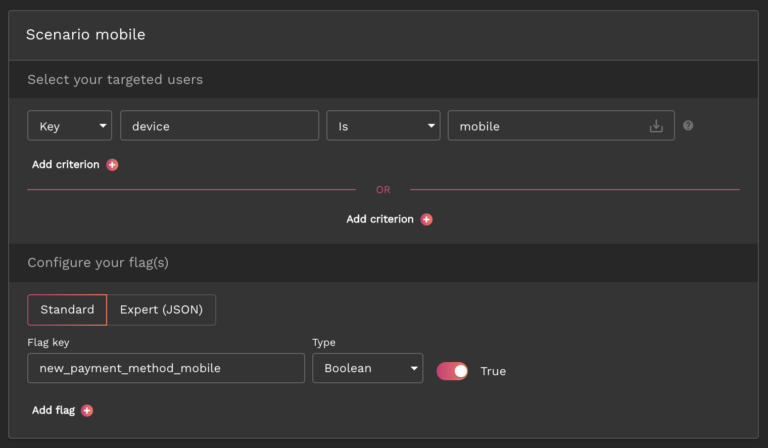
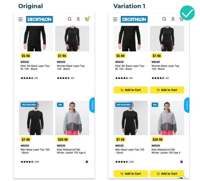
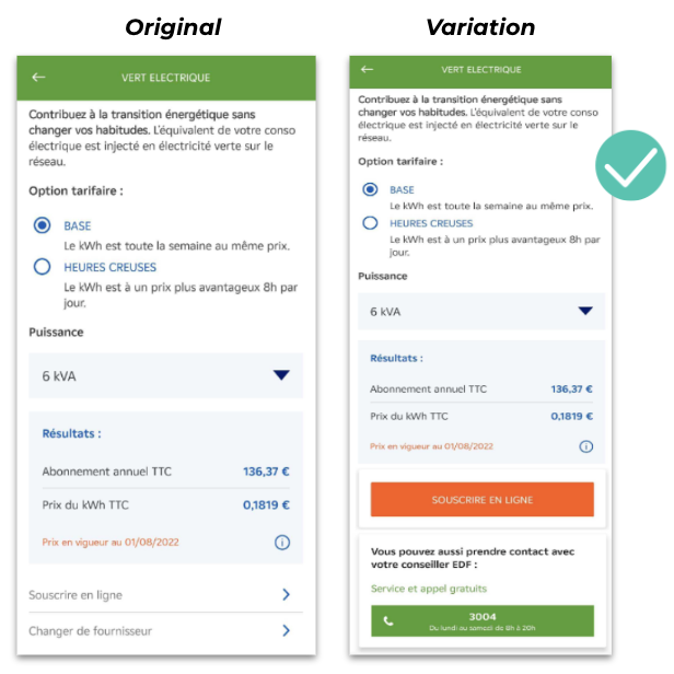


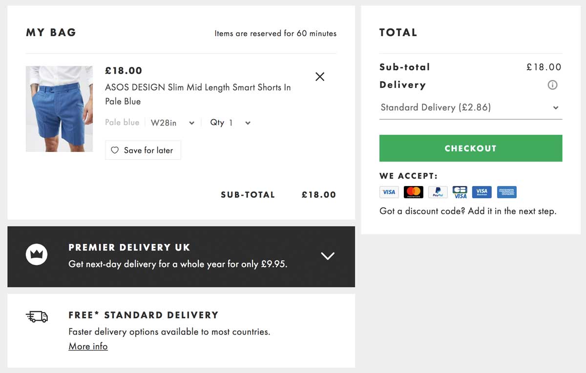
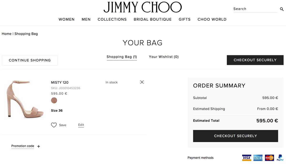
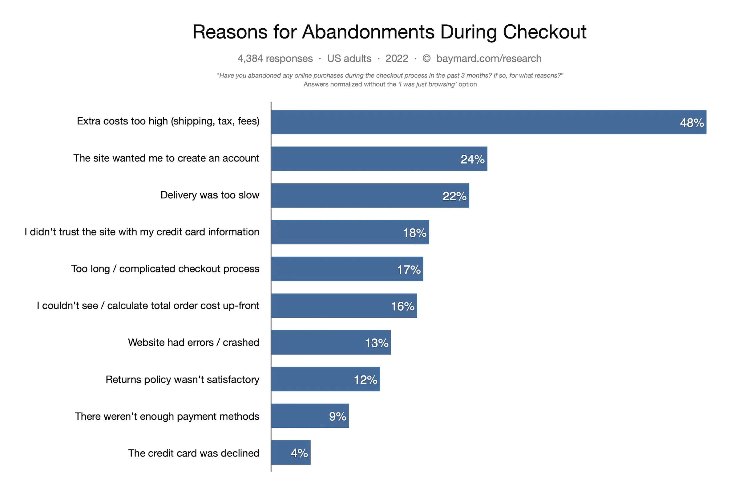
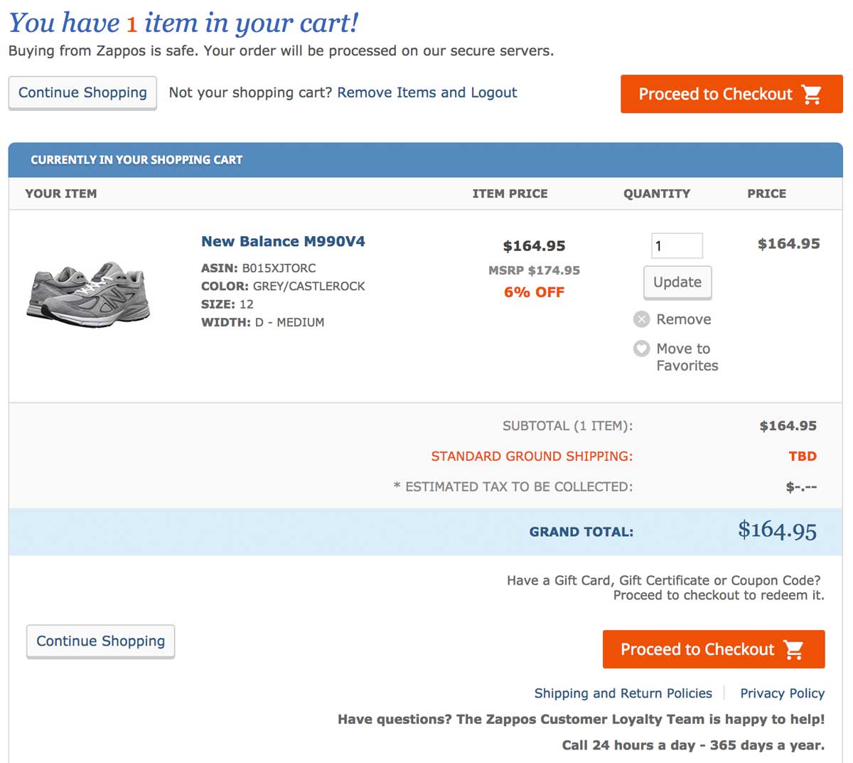
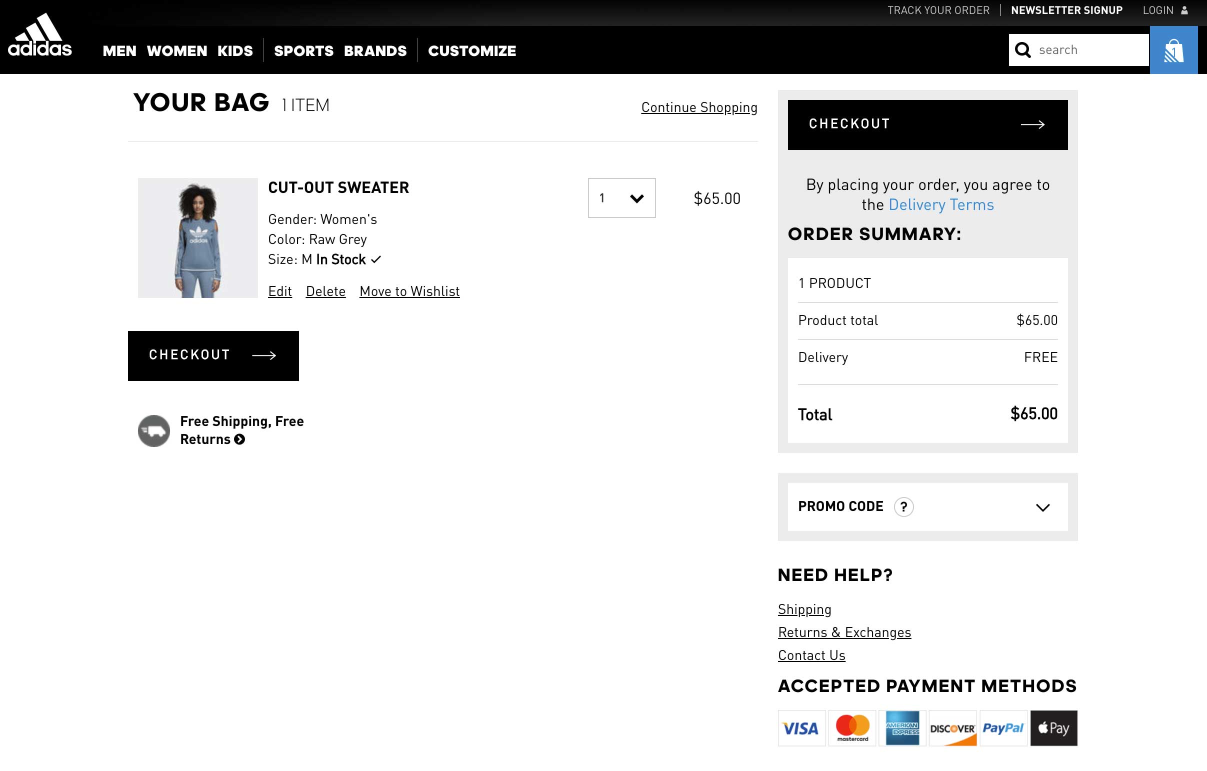
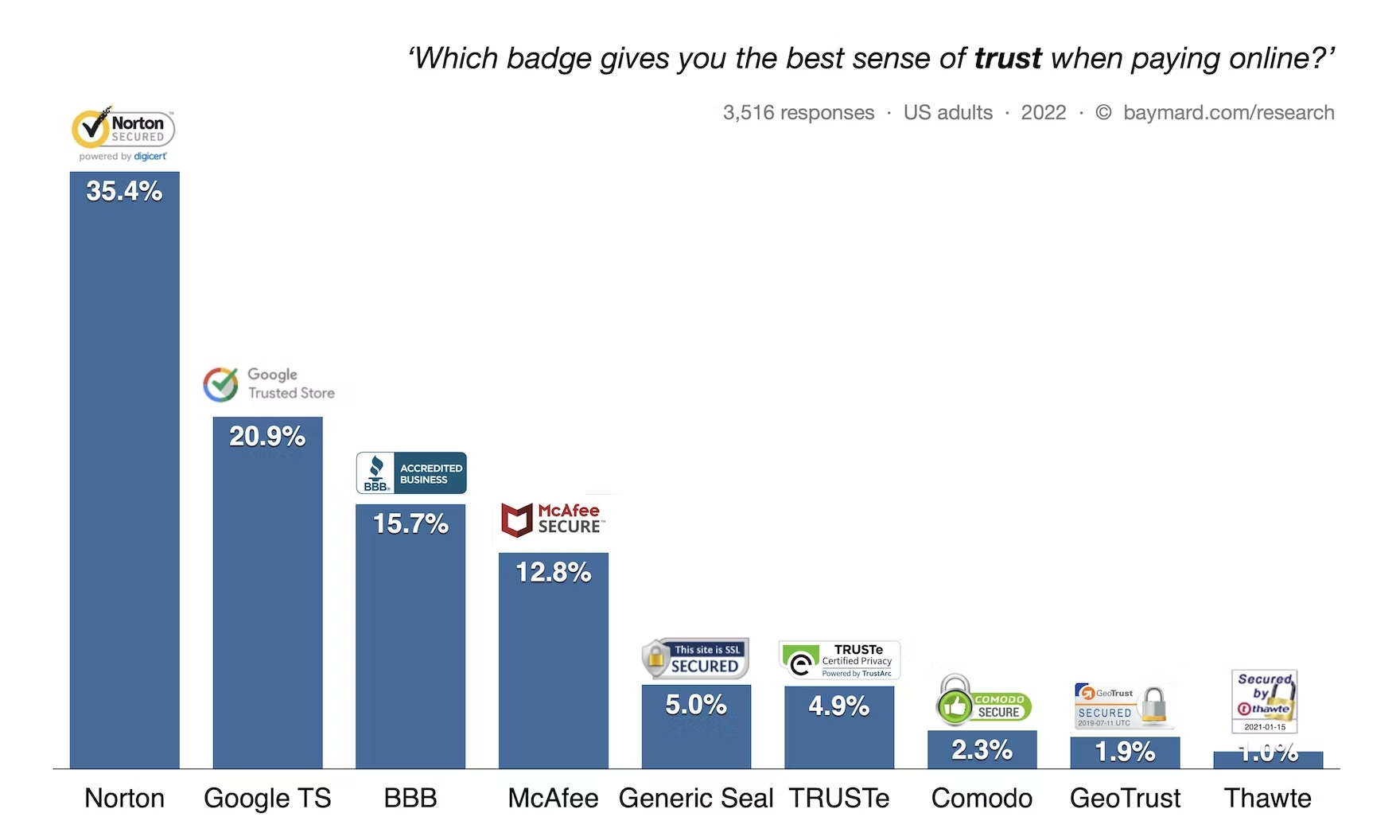
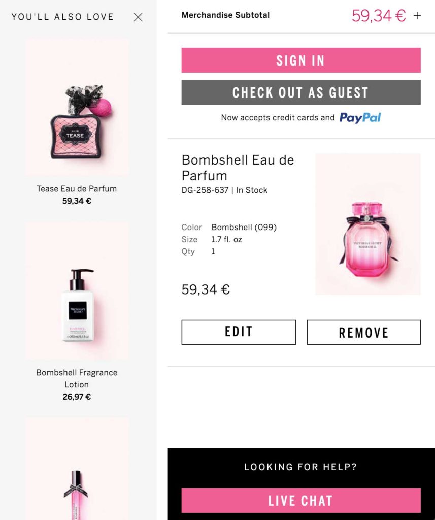
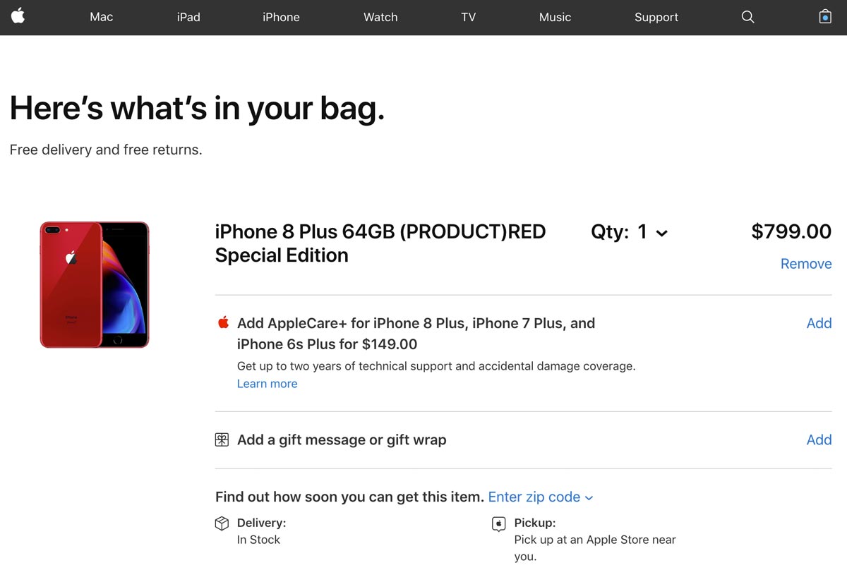
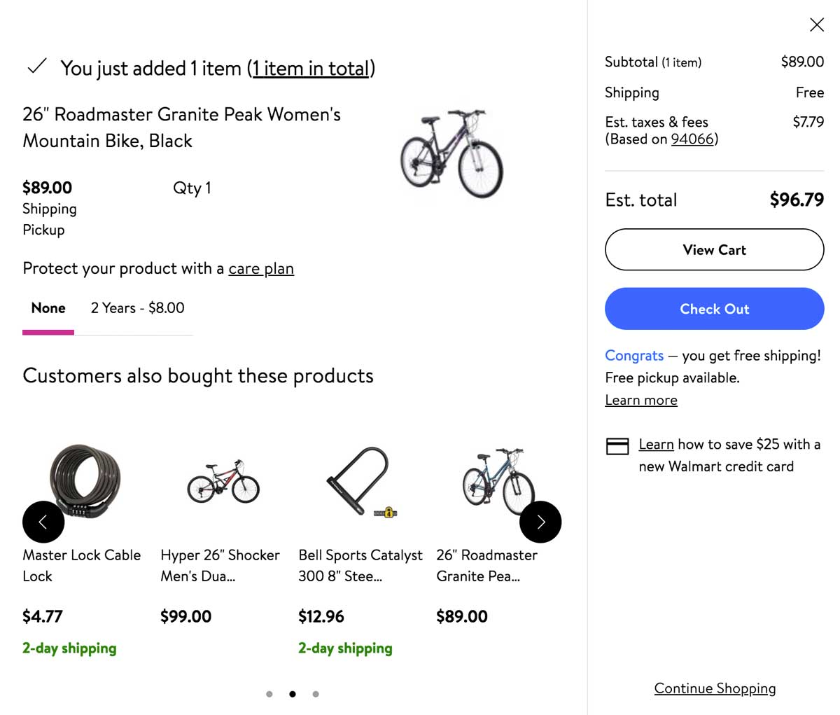
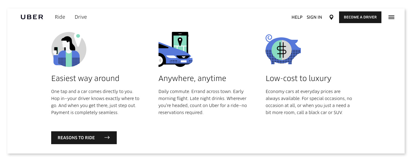
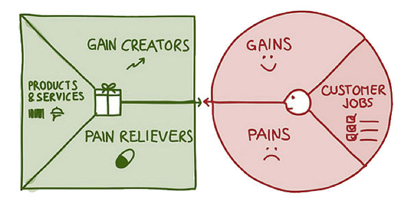
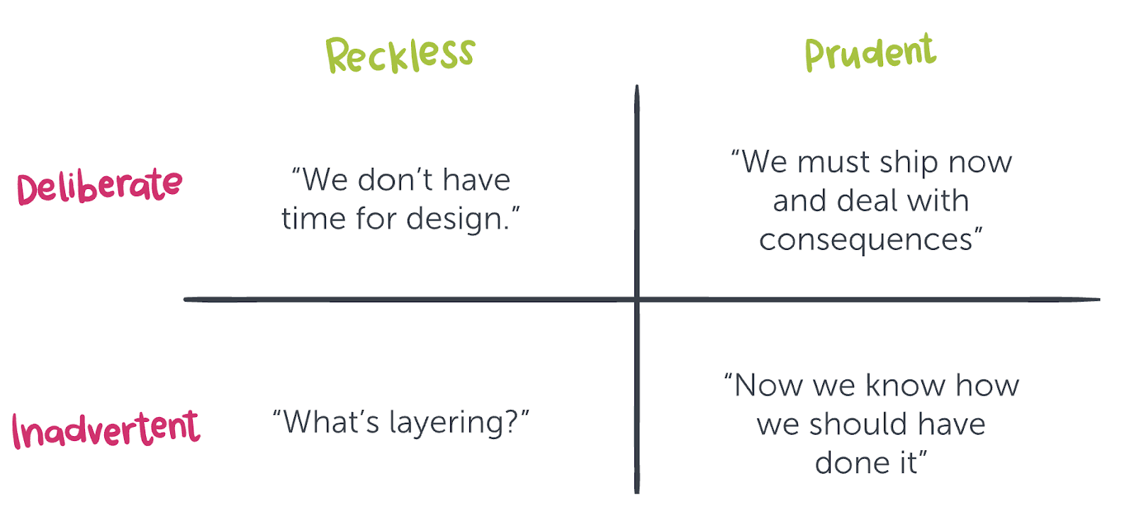
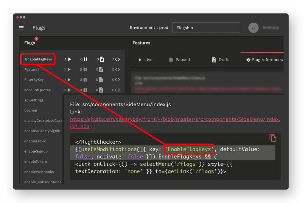


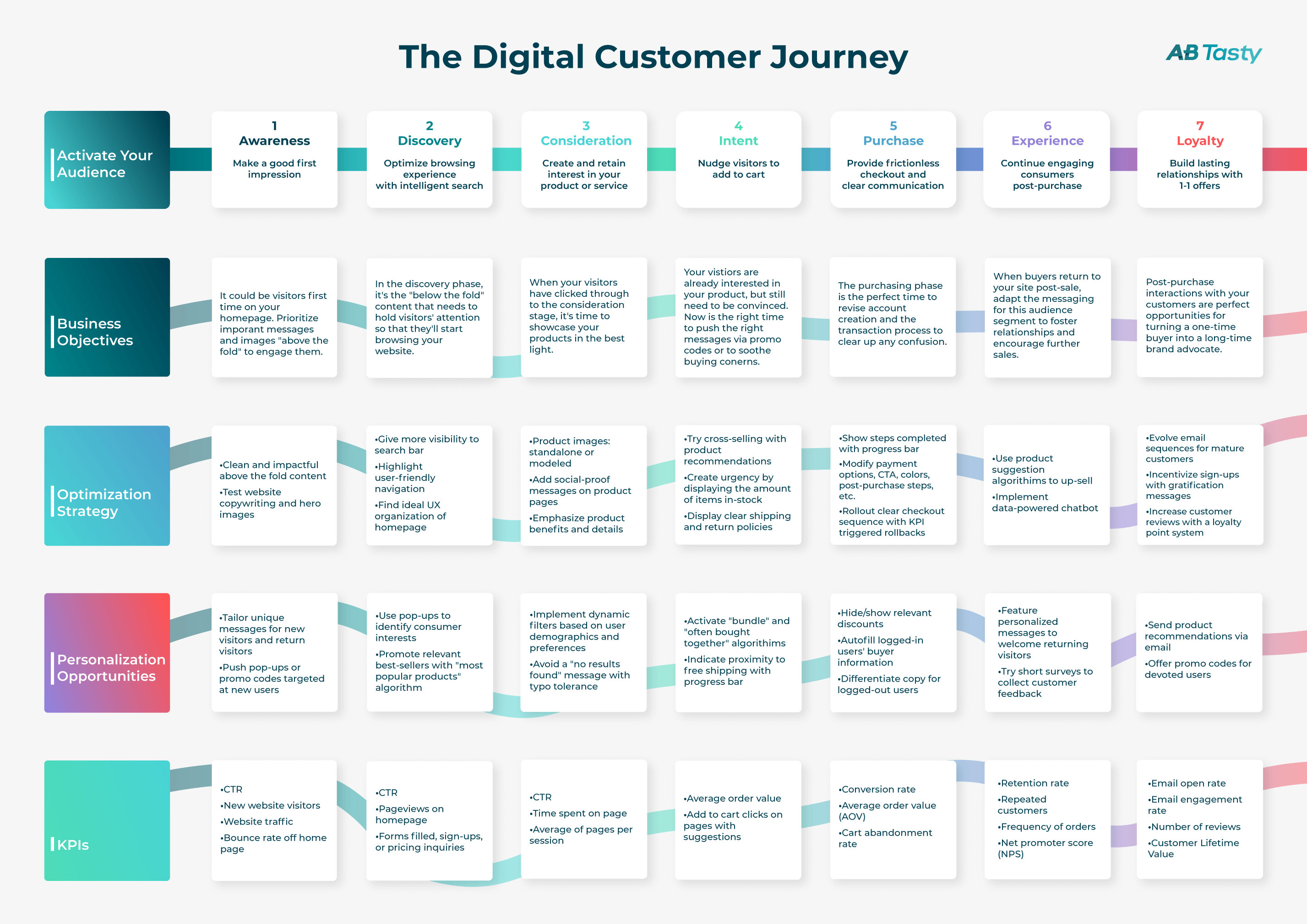
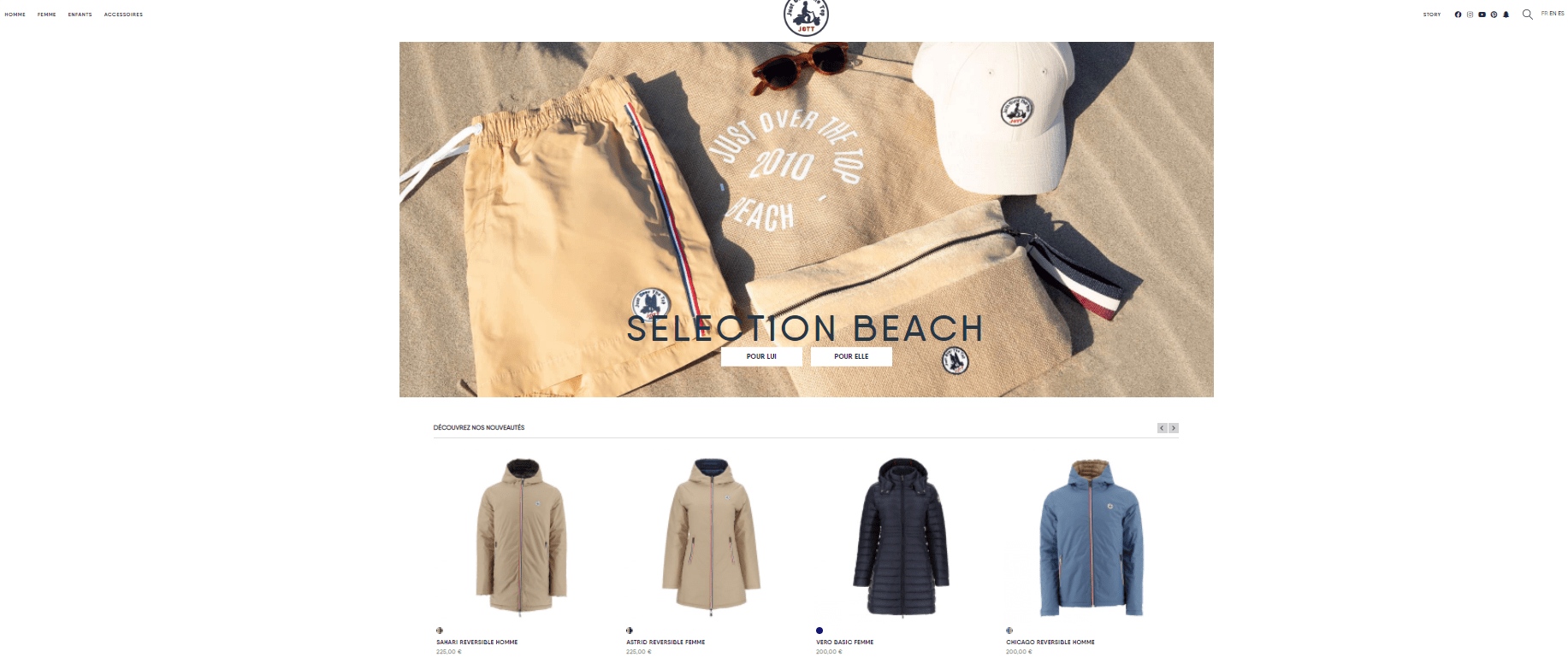
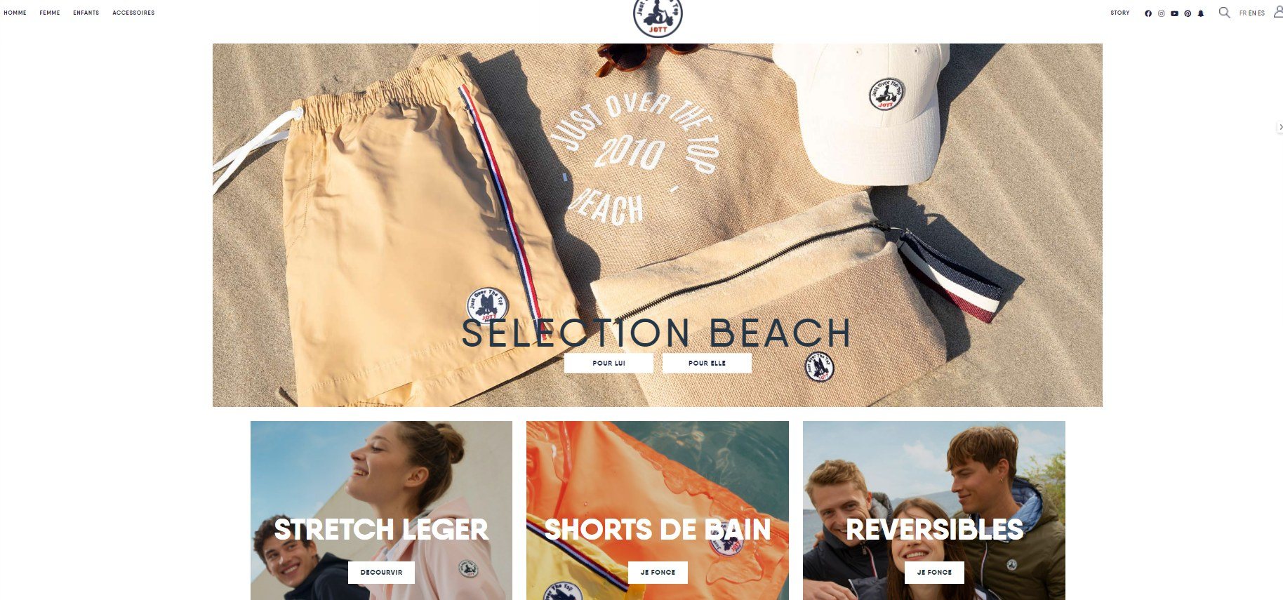


 Variation:
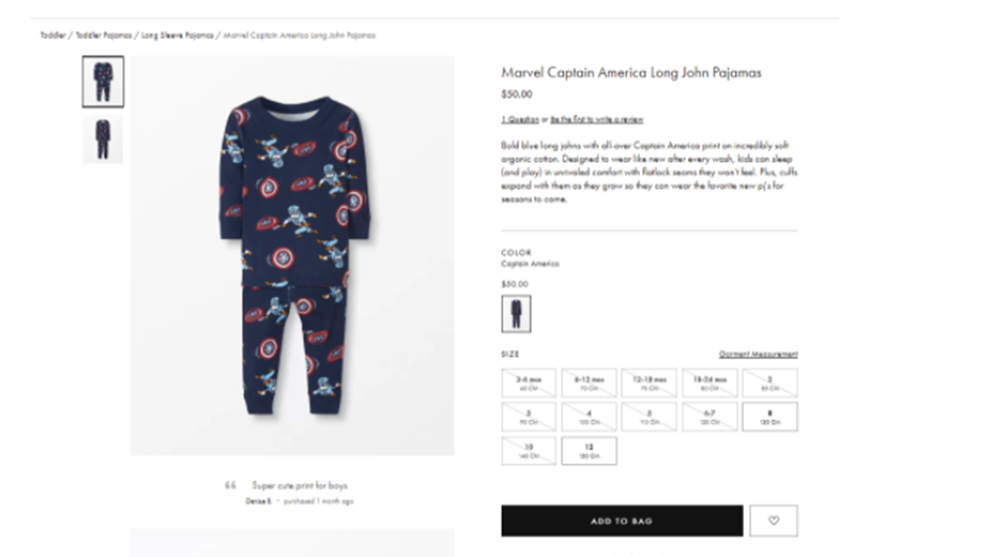
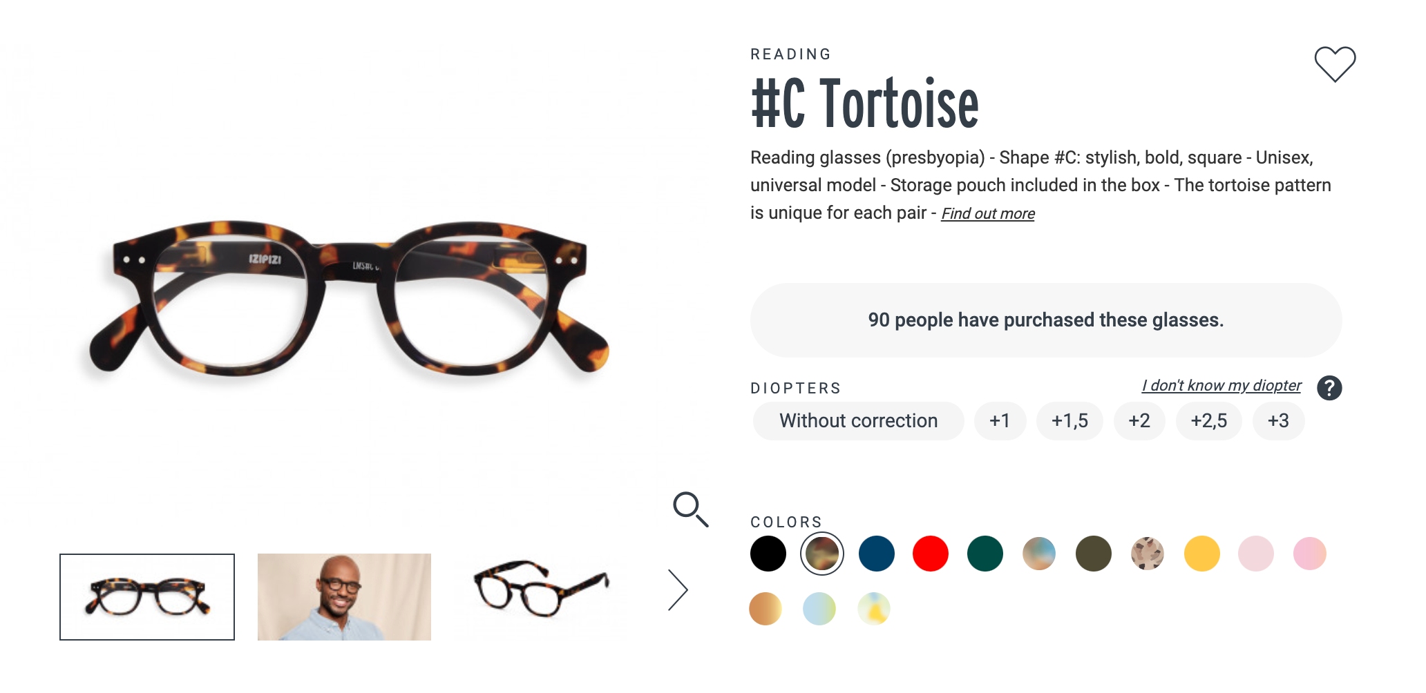
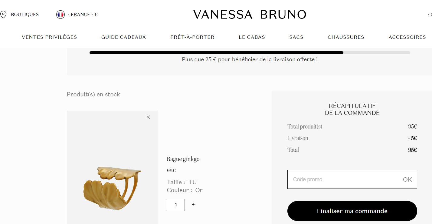
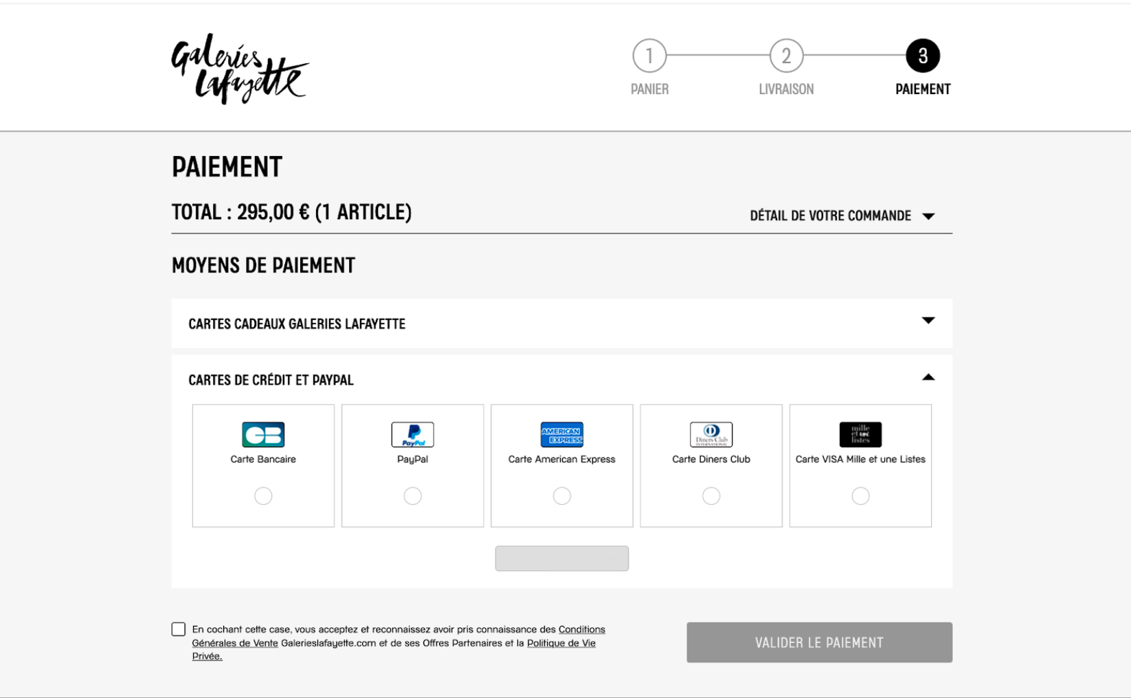

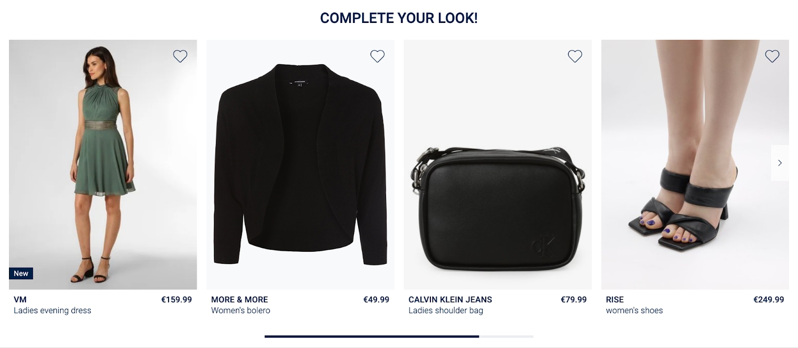


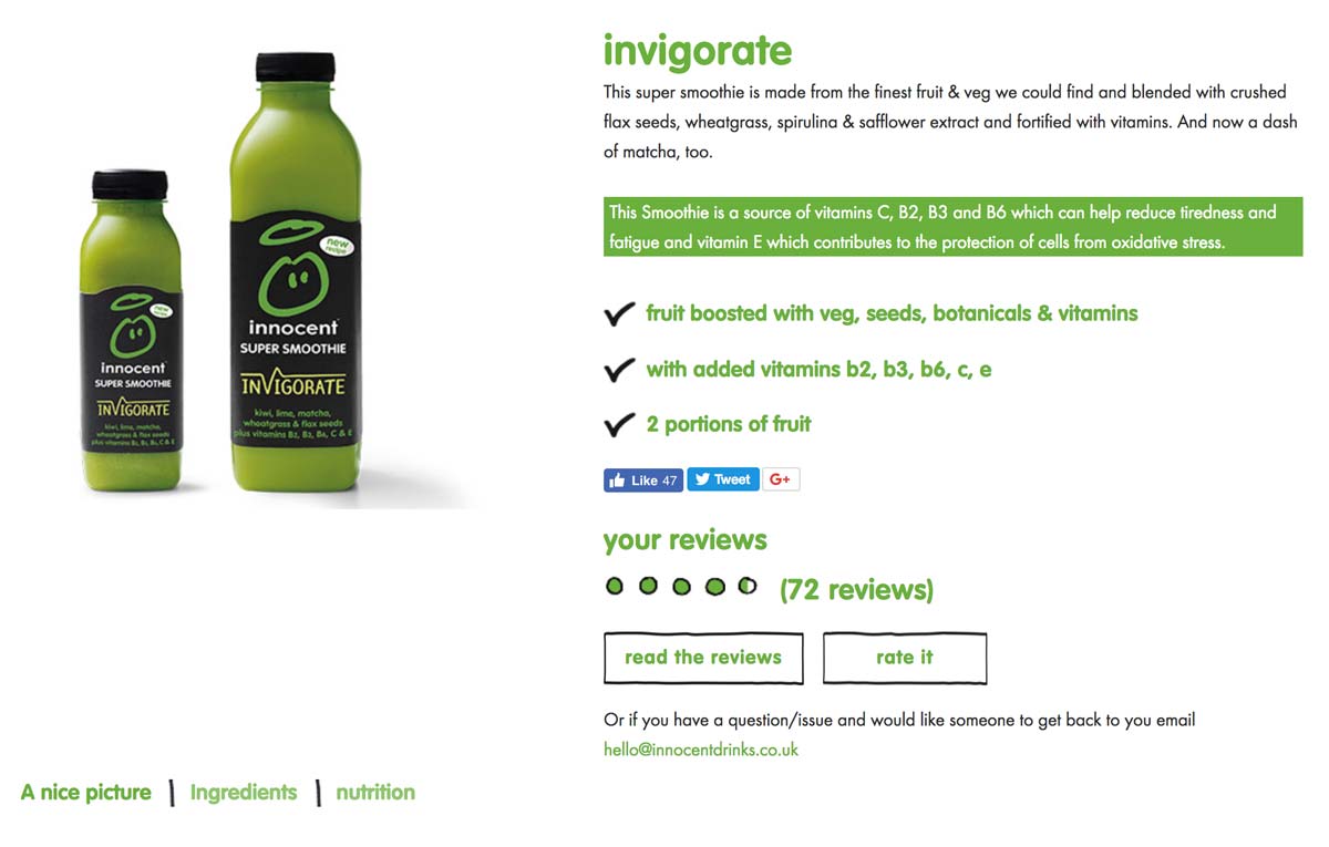 In the image above, you can see that they even highlighted in green that their smoothie is, “a source of vitamins C, B2, B3 and B6 which can help reduce tiredness and fatigue…”