Key Performance Indicators are one of the most important tools a business has at its disposal.
While the principle has existed for centuries, KPIs have taken off and reached their full potential thanks to the internet. This is particularly the case in measuring online engagements, such as sales or customer acquisition.
From free tools, such as Google Analytics, to highly complex software, there are many different types of KPIs measuring immensely diverse metrics.
What are key performance indicators (KPI)?
KPI, or Key Performance Indicators, are performance metrics that measure specific goals for businesses across all sectors.
Sometimes referred to as KSI (Key Success Indicators), when designed and implemented properly, they can define the direction of a business, provide essential feedback and help organize individuals, teams, projects or entire businesses to optimize performance.
A common theme throughout this article will be pointing out how KPIs differ vastly in how they are designed and what they measure. This is crucial to understanding their effectiveness and how they should be implemented and interpreted.
For example, high indicators might measure the overall performance of an E-commerce business (profits), while low indicators might measure sales of a specific product or output of a specific department.
In other words, KPIs can be helpful for departments, employees, managers, processes and even customer support teams.
Common things Key Performance Indicators might track are:
- Revenue: average profits, total revenue, and new customers
- Employment statistics: employee turnover, employee performance, and vacancies
- Customer service: average call time, efficiency and customer satisfaction
- Marketing: sales generation and overall effectiveness
- Efficiency: overall efficiency, departmental processes and individual efficiency
How do you calculate a KPI?
Knowing how to measure a KPI is a matter of defining specific goals from the beginning. Focusing on the right KPI is vital and requires you to design it with a narrow scope.
A startup is likely to be more interested in tracking how many new customers are coming in rather than an established public company, which might be more focused on tracking share price and profit.
The most common tool for tracking KPIs is web analytics. Google Analytics is able to track a large quantity of data, from website performance to new subscribers, to sales. However, the issue with such hard data is that sometimes the metric that you want to specifically track is somewhat intangible or open to individual interpretation.
This may also become harder to measure when dealing with aspects of customer satisfaction. Typically, these types of metrics will require more than one key performance indicator, but it is important not to get carried away, as too much data can quickly become confusing.
One of the most important ways of tracking metrics through KPIs is related to presentation.
Google Analytics is a perfect example of how to present complex data in a clear way. Visualizations that can provide deep insights and deepen your understanding of the metrics will help make better sense of otherwise complex data.
Visual representations of data are a far better way of getting across important data instead of a dense presentation that provides no interactivity. The ease of viewing and digesting becomes particularly important when dealing with multiple KPIs.
It’s important to keep in mind that KPIs require constant evaluation to ensure they remain relevant and focused on the important parts of the business that need tracking.
How do you define a KPI?
Now let’s move on to two important questions:
- What makes a KPI effective?
- How do you define a KPI and cultivate metrics that provide insightful information?
An effective KPI depends on what you need to accomplish based on your current circumstance.
While it’s true that KPIs differ from sector to sector, they also vary from company to company. In fact, competitors with many of the same needs might differ wildly in their use of KPIs depending on philosophy and strategy.
The best place to start would be to understand the common use of KPIs, their philosophy, and their strategy within your own company and in your specific industry.
From here it is essential to define your goals. Before diving head first into the specifics of the KPI, you might want to look at it from a larger point of view.
For example, you can ask yourself where you might need to increase efficiency. This may take more time than originally accounted for, but the better the research, the more likely the KPI will harvest insightful results.
In the same manner, it’s also very important to set goals that are achievable.
KPIs are about focused data, not setting ambitious targets that can skew performance away from cohesive strategies.
One of the most effective ways of evaluating the effectiveness and appropriateness of a KPI is the SMART criteria. SMART stands for Specific, Measurable, Attainable, Relevant, Time-Bound:
- How SPECIFIC is the goal?
- Is it clearly MEASURABLE?
- How ATTAINABLE is it?
- Is it RELEVANT to the business?
- What is the TIME Frame to achieve the objective?
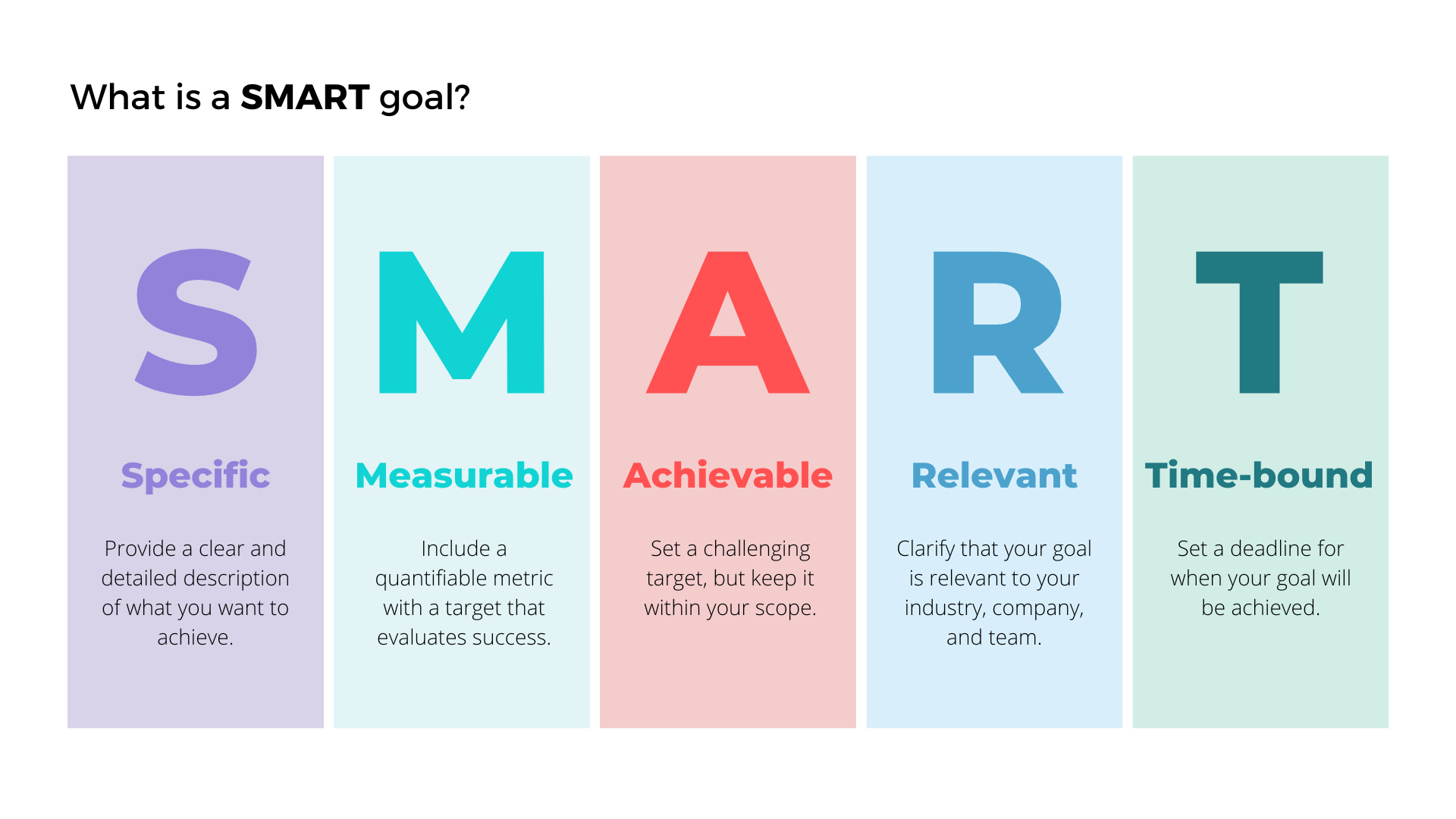 Once all these criteria have been met, a KPI can be properly designed and implemented with confidence. However, it will need monitoring and adjustment as time goes on once the KPI has been fully integrated.
Different types of KPIs
As KPIs can be employed to measure deeply diverse metrics across a myriad of sectors and processes, types of KPIs also differ in how they are designed and implemented.
The core purpose might remain the same: provide concise data on various aspects of a business. However, the similarities often end there.
Three of the most common types of KPIs are designed for:
- Companies
- Teams
- Projects
Company KPIs
Although company KPIs might sound rather broad in their ambitions, they typically should be focused on specific areas of company performance. For customer metrics, these can be as diverse as acquisition, lifetime value of customers, retention, or customer loyalty.
On the employee side, KPIs are often used to measure certain business goals and performance – including measuring the strengths of specific employees.
For example, well-being is increasingly an important issue related to employee retention rates. Both well-being and employee retention rate can be gauged with the right tools to track their performance.
Team KPIs
KPIs for marketing require vastly different insights than KPIs for sales. In the same way, human resources, the finance team, legal, or any other department track and measure different KPIs. For this reason, key performance indicators for teams are one of the most unique.
A sales team will be likely to track customer capture, average deal size or revenue targets. On the other hand, the customer support team will likely focus on customer satisfaction by tracking results from various surveys or caller wait times. These two departments have some degree of crossover in their day-to-day work life, but they often have different KPIs they’re looking to measure that are more relevant for them.
In a different sense, the financial team will likely be tracking revenue, expenses, profit, and cash flows, which is a very different set of metrics compared to those of the sales team or customer support team.
Marketing teams, for their part, often require some of the most complex KPIs, with generated sales and brand awareness at the heart of their focus. This might include gathering quantitative data from an analytics source or gathering qualitative data.
KPIs for Human Resources (HR) teams have a less easily defined set of metrics to measure, such as the previously mentioned employee happiness and turnover. They may also measure how long it takes to fill a position and the number of responses to a given vacancy.
Project KPIs
The first thing that needs to be defined for a project is its goals, and this will define the KPI from the outset.
Measuring the value of a project is key to understanding how successful it is in a broad sense, which aspects are performing well, which elements are underperforming and how to cultivate fruitful and realistic goals.
KPIs for websites are the most numerous spanning across lead generation, sessions, bounce rates, e-commerce conversion rates, and sales all concisely presented on the platform.
It should be noted that employing too many KPIs for any aspect of a business can dilute its focus and confuse matters greatly. This is where careful preplanning and clearly defined goals can help.
KPIs vs OKRs
OKRs (Objectives and Key Results) are a newer and very commonly used variation of KPIs. In recent years, these have become increasingly popular, partly due to Google making the tracking process very simple and thorough.
There is a lot of overlap between the two, but the main difference is in their ambition.
OKRs are not defined as obtainable goals based on previous data, rather they are ambitious goals with clearly defined steps to achieve those goals. They should not be seen as unreachable targets but as motivational ones.
It would be wrong to compare the usefulness of KPIs and OKRs as they are designed with different outlooks on goals.
The main thing to keep in mind is that KPIs assess clear goals based on previous data while OKRs are better implemented for entirely new goals that require a broader vision.
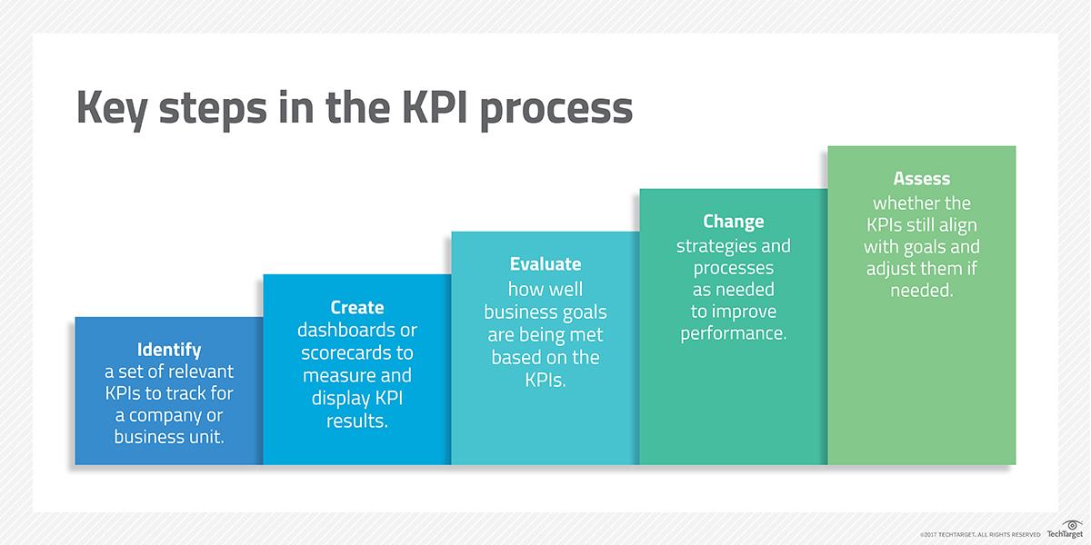
Measuring and tracking KPIs
KPIs are only as successful as the template and interface they present. As previously mentioned, these are typically unique to the types of data they are measuring.
Website KPI examples tend to be well encapsulated by Google Analytics, with its drill-down data on broad, but related, topics such as conversion rates and returning visitors.
There are some types of metrics that you need to be aware of, such as vanity metrics.
Vanity metrics are one of the traps that businesses often fall into. This is where a superficial reading of positive data is seen as success alone, such as a growing number of visitors. With Google Analytics or any other measuring platform, it is essential to drill down further to find out what these numbers mean. For example, are these visitors the right type of visitors the business is looking for?

Social media KPI examples are typically well-designed and defined by in-depth on-site analytics. Twitter, for example, has a very effective template that offers the type of drill-down data that Google provides. Combined with other software, these can offer great insights regarding customer reach, acquisition and brand awareness.
Creating a strong KPI Strategy
Now that we have a clear picture of what KPIs mean and how to track them, you can start tracking your performance, aligning your team, and creating a KPI-focused culture.
Based on your organization’s objectives and the goals of your specific team, you’ll have to select the most important KPIs to track your success.
Once the KPIs are strategically chosen and implemented, keep note of their progress and downfalls and make adjustments as needed to get optimal results.
For a strong KPI strategy, it’s important to have your whole team aligned on organizational KPIs, team KPIs, and individual KPIs.
Having everyone on the same page will allow for transparency in tracking and performance reporting in the future. If no one understands the KPIs and how they are going to be tracked on any level, it will be difficult to build and implement a successful strategy.
Keep your team members clued in, educate them, assign them KPIs as needed, and use a user-friendly platform aligned with your goals to track your efforts.
As the market is constantly advancing, it’s important to be flexible and change your KPIs accordingly.
This is why it’s important to regularly meet and review your KPIs, the changing environment, and company policies. With any changes, it’s important to update your team accordingly to strengthen your strategy.
The importance of KPIs
There’s a reason why these performance indicators are known as the “keys.” KPIs are one of the most essential tools for performance measurements and have been around for a long time.
The implementation of KPIs is important to measure your success and follow your organization’s overall journey, but keep in mind that continuous tracking and measuring of KPIs is even more crucial to evaluate performance as you go along.
As they are customizable in many ways, key performance indicators are the best way to give you a quantifiable measure of a specific objective and give you and your team goals to aim for.


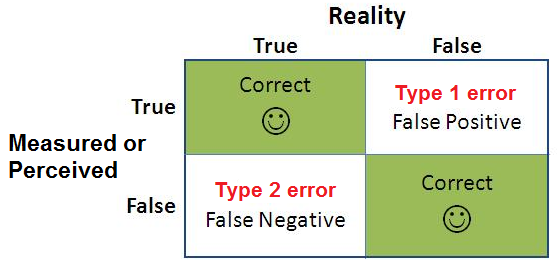
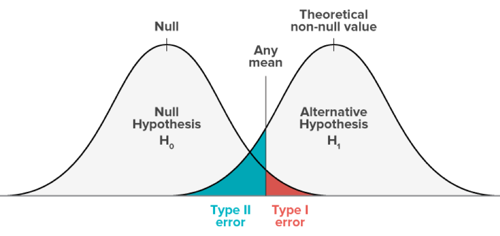
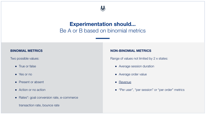
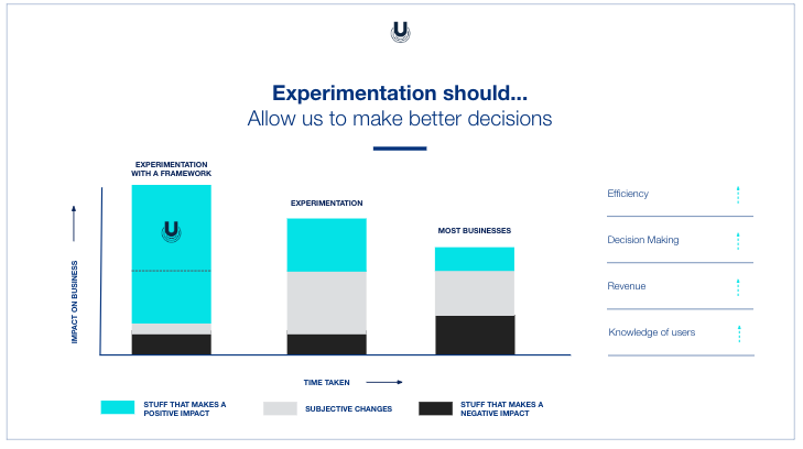
 You launch an A/B test to see if the variation (B) could outperform your control version (A).