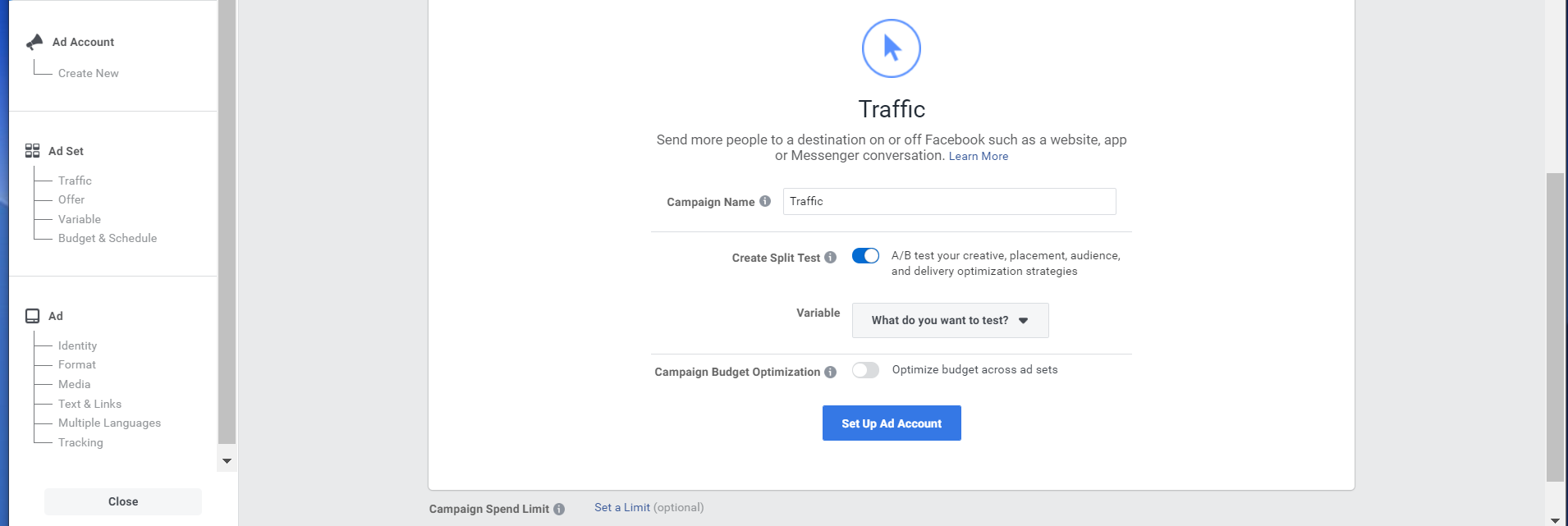
Sample Ratio Mismatch: What Is It and How Does It Happen?
Emily Healy
A/B testing can bring out a few types of experimental flaws.
Yes, you read that right – A/B testing is important for your business, but only if you have trustworthy results. To get reliable results, you must be on the lookout for errors that might occur while testing.
Sample ratio mismatch (SRM) is a term that is thrown around in the A/B testing world. It’s essential to understand its importance during experimentation.
In this article, we will break down the meaning of sample ratio mismatch, how to spot SRM, when it is and is not a problem, why it can happen and how to detect SRM.
Sample ratio mismatch overview
Sample ratio mismatch is an experimental flaw where the expected traffic allocation doesn’t fit with the observed visitor number for each testing variation.
In other words, an SRM is evidence that something went wrong.
Sample ratio mismatch is crucial to be aware of in A/B testing.
Now that you have the basic idea, let’s break this concept down piece by piece.
What is a “sample”?
The “sample” portion of SRM refers to the traffic allocation.
Traffic allocation refers to how the traffic is split toward each test variation. Typically, the traffic will be split equally (50/50) during an A/B test. Half of the traffic will be shown the new variation and the other half will go toward the control version.
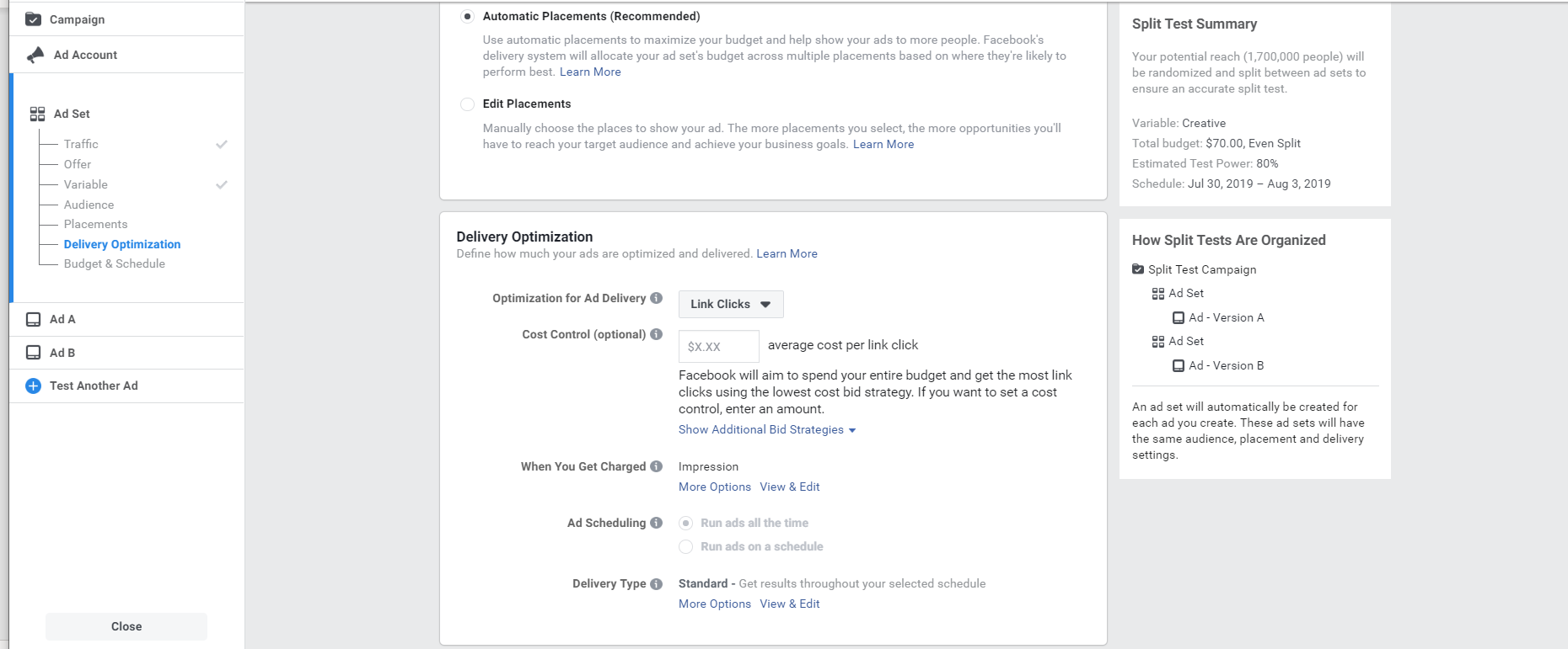
This is how an equal traffic allocation will look for a basic A/B test with only one variant:
If your test has two variants or even three variants, the traffic will still be allocated equally to each test to ensure that each version receives the same amount of traffic. An equal traffic allocation in an A/B/C test will be split into 33/33/33.
For both A/B and A/B/C tests, traffic can be manipulated in different ways such as 60/40, 30/70, 20/30/50, etc. Although this is possible, it is not a recommended practice to get accurate and trustworthy results from your experiment.
Even by following this best practice guideline, equally allocated traffic will not eliminate the chance of an SRM. This type of mismatch is something that can still occur and must be calculated no matter the circumstances of the test.
Define sample ratio mismatch (SRM)
Now that we have a clear picture of what the “sample” is, we can build a better understanding of what SRM means:
SRM happens when the ratio of the sample does not match the desired 50/50 (or even 33/33/33) traffic allocation
SRM occurs when the observed traffic allocation to each variant does not match the allocation chosen for the test
The control version and variation receive undesired mismatched samples
Whichever words you choose to describe SRM, we can now understand our original definition with more confidence:
“Sample ratio mismatch is an experimental flaw where the expected traffic allocation doesn’t fit with the observed visitor number for each testing variation.”
Is SRM always a problem?
To put it simply, SRM occurs when one test version receives a noticeably different amount of visitors than what was originally expected.
Imagine that you have set up a classic A/B test: Two variations with 50/50 traffic allocation. You notice at one point that version A receives 10,000 visitors and version B receives 10,500 visitors.
Is this truly a problem? What exactly happened in this scenario?
The problem is that while conducting an A/B test, an extremely strict respect of the allocation scheme is not always 100% possible since it must be random. The small difference in traffic that is noted in the example above is something we would typically refer to as a “non-problem.”
If you are seeing a similar traffic allocation on your A/B test in the final stages, there is no need to panic.
A randomly generated traffic split has no way of knowing exactly how many visitors will stumble upon the A/B test during the given time frame of the test. This is why toward the end of the test duration, there may be a smaller difference in the traffic allocation while the majority (+95%) of traffic is correctly allocated.
When is SRM a problem?
Some tests may have SRM due to experimental setup.
When the SRM is a big problem, there will be a noticeable difference in traffic allocation.
If you see 1,000 directed to one variant and 200 directed to the other — this is an issue. Sometimes, spotting SRM does not require a particular mathematical formula dedicated to calculating SRM as it is evident enough on its own.
However, an extreme difference in traffic allocation can be very rare. Therefore, it’s essential to check the visitor counts in an SRM test before each test analysis.
Does SRM occur frequently?
Sample ratio mismatch can happen more often than we think. According to a study done by Microsoft & Booking, about 6% of experiments experience this problem.
Furthermore, if the test includes a redirect to an entirely new page, SRM can be even more likely.
Since we heavily rely on tests and trust their conclusions to make strategic business decisions, it’s important that you are able to detect SRM as early as possible when it happens during your A/B test.
Can SRM still affect tests using Bayesian?
The reality is that everyone needs to be on the lookout for SRM, no matter what type of statistical test they are running. This includes experiments using the Bayesian method.
There are no exemptions to the possibility of experiencing a statistically significant mismatch between the observed and expected results of a test. No matter the test, if the expected assumptions are not met, the results will be unreliable.
Sample ratio mismatch: why it happens
Sample ratio mismatch can happen due to a variety of different root causes. Here we will discuss three common examples that cause SRM.
One common example is when the redirection to one variant isn’t working properly for poorly connected visitors.
Another classic example is when the direct link to one variant is spread on social media, which brings all users who click on the link directly to one of the variants. This error does not allow the traffic to be properly distributed among the variants.
In a more complex case, it’s also possible that a test including JS code is crashing a variant and therefore some of the visitor configurations. In this situation, some visitors that are being sent to the crashing variant won’t be collected and indexed properly, which leads to SRM.
All of these examples have a selection bias: some non-random visitors are excluded. The non-random visitors are arriving directly from a link shared on social media, have a poor connection, or are visiting a crashing variant.
In any case, when these issues occur, the SRM is an indication that something went wrong and you cannot trust the numbers and the test conclusion.
Checking for SRM in your A/B tests
Something important to be aware of when doing an SRM check is that the priority metric when checking needs to be “users” and not “visitors.” Users are the specific people that are allocated to each variation, meanwhile, the visitors metric is counting the number of sessions that each user makes.
It’s important to differentiate between users and visitors because results may be skewed if a visitor comes back to their variation multiple times. SRM detected with “visitors” may not be the most reliable metric, but using the “users” metric is evidence of a problem.
SRM in A/B testing
Testing for sample ratio mismatch may seem a bit complicated or unnecessary at first glance. In reality, it’s quite the opposite.
Understanding what SRM is, why it happens, and how it can affect your results is crucial in A/B testing. Running an A/B test to help make key decisions is only helpful for your business if you have reliable data from those tests.
Want to get started on A/B testing for your website?AB Tasty is a great example of an A/B testing tool that allows you to quickly set up tests with low code implementation of front-end or UX changes on your web pages, gather insights via an ROI dashboard, and determine which route will increase your revenue.
In the next installment of our series on a data-driven approach to customer-centric marketing, we spoke with our partner Raoul Doraiswamy, Founder & Managing Director of Conversionry to understand the flow of a customer-centric experimentation process, and why it is critical to tap into insights from experimentation processes to make better decisions.
What do you find is the biggest gap in the marketing & growth knowledge among brands right now?
Many brands today have the right set of tools such as technology investments, or the right people with marketing expertise. However, brands often face the issue of not knowing how to meet customer needs/how to give their customers what they want whether on their website, app or through digital advertising on the website, app or digital advertising – in other words, how can these brands increase conversions? Raoul identifies the lack of customer understanding to be at the core of this gap and suggests that brands should adopt a customer-centric, customer-driven process that enables a flow of customer insights, complemented by experimentation.
Which key activities deliver the best insights into customer problems?
Raoul believes that to start a strategy that puts the customers at the core, it is important to have the right data-gathering approach to get insights. It’s the foundation of any experimentation program, but can be applied to all marketing channels.
“Imagine you are an air traffic controller. You have multiple screens constantly feeding you where the planes are, or when they might crash into each other. From all these constant insights, the person in front of the screens will have to make the right decisions,” he shares. “However, there are also inconsequential insights such as baggage holders being full – and it is up to the decision-makers to pick out the critical data and make use of them.”
Raoul provides this analogy to liken it to the role of marketing decision-makers, who normally have a dashboard with metrics like revenue, conversion rate, abandoned cart and more. An insights dashboard helps marketers better understand their customers, combining this real-time data with customer feedback from sources like analytics, heatmaps, session recordings, social media comments and user testing. Solid research can be done through a critical analysis of session recordings and user poll forms, and the main takeaways can be fed to this dashboard. How empowering is that for a marketing decision-maker?
Where are the best sources for experimentation ideas?
Raoul asserts that a combination of quantitative and qualitative analysis is key. Heuristic analysis and competitor analysis are also gold when coming up with experimentation ideas. He continues, “Don’t limit yourself to looking at competitors, look at other industries too. For example, for a $90M trade tools client we had to solve the problem of increasing user sign-ins to their loyalty program. By researching Expedia and Qantas, we got the idea to show users points instead of cash to pay for items.” Raoul shares, “Do heat map analysis, look at session recordings, user polls, run surveys to email databases, and user testing. User testing is critical in understanding the full picture.”
After distilling customer problems and coming up with some rough experimentation ideas, the next step is to flesh out your experiment ideas fully. “Going back to the analogy of the Air Traffic Controller, one person on the team is seeing a potential crash but might have limited experience in dealing with this situation. That’s when more perspectives can be brought in by, let’s say, a supervisor, to make a more well-rounded decision. In the same way, when you are ideating, you do not want to just limit it to yourself but rather have a workshop where you discuss ideas with your internal team. If you are working with an agency, you can still have a workshop with both the agency and the client present, or have your CRO team and product team come together to share ideas. This way, you can get multiple stakeholders involved, each of them being able to provide expertise based on their experience with customers,” says Raoul.
Is there value in running data-gathering experiments (as opposed to improving conversion / driving a specific metric)?
“Yes, absolutely,” replies Raoul. “Aligning growth levers with clients every quarter while working with CRO and Experimentation teams on the experimentation process is important. When working towards the goal of increasing conversions, there are KPIs and predictive models to project the goals.
“On the other hand, if the focus of the program is on product feature validation or reducing the risk of revenue due to untested features, there will be a separate metric for that,” he continues. “It is key to have specific micro KPIs for the tests that are running to generate a constant flow of insights, which then allows us to make better decisions.”
In running data-gathering experiments, features such as personalization can be applied which can have a positive impact on the conversions on the website.
What do brands need to get started?
“To begin, you need to start running experiments. Every day without a test is a day lost in revenue!” heeds Raoul. “For marketing leaders who have yet to start running experiments, you can start by pinpointing customer problems, and the flow of insights. To get the insights, you can gather them from Google Analytics, more specifically, by looking at your funnel. Through these insights, identify the drop-off point and observe the Next Page Path, to see where users go next.
“Take for example an eCommerce platform. If the users are dropping off at the product page instead of adding to the cart and moving on to the shipping page, this shows that they are confused about the shipping requirements. This alone can tell you what goes through the user’s mind. Look at heat maps and session recordings to understand the customer’s problems. The next step then is to solve the issue and to do that, you will need an A/B testing platform. Use the A/B testing platform to build tests and launch them as quickly as possible.”
As for established marketing teams who are already doing some testing, Raoul recommends gathering insights and customer problems as they come in every month. “Then to make sense of the data you’ve collected, you need conversion optimization analysts like our experts at Conversionry who are experienced in distilling data down to problems.”
Identifying customer problems is key. If some of the issues your customers encounter stay unaddressed, it could lead to the initiatives flatlining despite months of experimentation. Instead by keeping customer feedback top of mind, you can start designing, development, testing, speak to experience optimization platforms like AB Tasty to build the experiments, then gather insights, and repeat the cycle to see what wins and what doesn’t.
Get started building your A/B tests today with the best-in-class software solution, AB Tasty. With embedded AI and automation, this experimentation and personalization platform creates richer digital experiences for your customers, fast.
“Failure” can feel like a dirty word in the world of experimentation. Your team spends time thinking through a hypothesis, crafting a test, and finally when it rolls out … it falls flat. While it can feel daunting to see negative results from your a/b tests, you have gained valuable insights that can help you make data-driven, strategic decisions for your next experiment. Your “failure” becomes a learning opportunity.
Embracing the risk of negative results is a necessary part of building a culture of experimentation. On the first episode of the 1,000 Experiments Club podcast, Ronny Kohavi (formerly of Airbnb, Microsoft, and Amazon) shared that experimentation is a time where you will “fail fast and pivot fast.” As he learned while leading experimentation teams for the largest tech companies, your idea might fail. But it is your next idea that could be the solution you were seeking.
“There’s a lot to learn from these experiments: Did it work very well for the segment you were going after, but it affected another one? Learning what happened and why will lead to developing future strategies and being successful,” shares Ronny.
In order to build a culture of experimentation, you need to embrace the failures that come with it. By viewing negative results as learning opportunities, you build trust within your team and encourage them to seek creative solutions rather than playing it safe. Here are just a few benefits to embracing “failures” in experimentation:
Encourage curiosity: With AB Tasty, you can test your ideas quickly and easily. You can bypass lengthy implementations and complex coding. Every idea can be explored immediately and if it fails, you can get the next idea up and running without losing speed, saving you precious time and money.
Eliminate your risks without a blind rollout: Testing out changes on a few pages or with a small audience size can help you gather insights in a more controlled environment before planning larger-scale rollouts.
Strengthen hypotheses: It’s easy to fall prey to confirmation bias when you are afraid of failure. Testing out a hypothesis with a/b testing and receiving negative results confirms that your control is still your strongest performer, and you’ll have data to support the fact that you are moving in the right direction.
Validate existing positive results: Experimentation helps determine what small changes can drive a big impact with your audience. Comparing negative a/b test results against positive results for similar experiments can help to determine if the positive metrics stand the test of time, or if an isolated event caused skewed results.
In a controlled, time-limited environment, your experiment can help you learn very quickly if the changes you have made are going to support your hypothesis. Whether your experiment produces positive or negative results, you will gain valuable insights about your audience. As long as you are leveraging those new insights to build new hypotheses, your negative results will never be a “failure.” Instead, the biggest risk would be allowing a status quo continuing to go unchecked.
“Your ability to iterate quickly is a differentiation,” shares Ronny. “If you’re able to run more experiments and a certain percentage are pass/fail, this ability to try ideas is key.”
Below are some examples of real-world a/b tests and the crucial learnings that came from each experiment:
Lesson learned: Removing “Add to Basket” CTAs decreased conversion
In this experiment, our beauty/cosmetics client tested removing the “Add to Basket” CTA from their product pages. The idea behind this was to test if users would be more interested in clicking through to the individual pages, leading to a higher conversion rate. The results? While there was a 0.4% increase in visitors clicking “Add to Basket,” conversions were down by 2%. The team took this as proof that the original version of the website was working properly, and they were able to reinvest their time and effort into other projects.
Lesson learned: Busy form fields led to decreased leads
A banking client wanted to test if adjusting their standard request form would drive passage to step 2 and ultimately increase the number of leads from form submissions. The test focused on the mandatory business identification number field, adding a pop-up explaining what the field meant in the hopes of reducing form abandonment. The results? They saw a 22% decrease in leads as well as a 16% decrease in the number of visitors continuing to step 2 of the form. The team’s takeaways from this experiment were that in trying to be helpful and explain this field, their visitors were overwhelmed with information. The original version was the winner of this experiment, and the team saved themselves a huge potential loss from hardcoding the new form field.
The team at this beauty company designed an experiment to test whether displaying a message about product availability on the basket page would lead to an increase in conversions by appealing to the customer’s sense of FOMO. Instead, the results proved inconclusive. The conversion rate increased by 1%, but access to checkout and the average order value decreased by 2% and 0.7% respectively. The team determined that without the desired increase in their key metrics, it was not worth investing the time and resources needed to implement the change on the website. Instead, they leveraged their experiment data to help drive their website optimization roadmap and identify other areas of improvement.
Despite negative results, the teams in all three experiments leveraged these valuable insights to quickly readjust their strategy and identify other places for improvement on their website. By reframing the negative results of failed a/b tests into learning opportunities, the customer experience became their driver for innovation instead of untested ideas from an echo chamber.
Jeff Copetas, VP of E-Commerce & Digital at Avid, stresses the importance of figuring out who you are listening to when building out an experimentation roadmap. “[At Avid] we had to move from a mindset of ‘I think …’ to ‘let’s test and learn,’ by taking the albatross of opinions out of our decision-making process,” Jeff recalls. “You can make a pretty website, but if it doesn’t perform well and you’re not learning what drives conversion, then all you have is a pretty website that doesn’t perform.”
Through testing you are collecting data on how customers are experiencing your website, which will always prove to be more valuable than never testing the status quo. Are you seeking inspiration for your next experiment? We’ve gathered insights from 50 trusted brands around the world to understand the tests they’ve tried, the lessons they’ve learned, and the successes they’ve had.
How to Create a Modern Data Foundation for Experimentation
AB Tasty
Staying ahead of the game to deliver seamless brand experiences for your customers is crucial in today’s experience economy. Today we’ll dip our toe into the “how” by looking at the underlying foundation upon which all of your experiences, optimization and experimentation efforts will be built: data.
Data is the foundation experimentation is built on (Source)
Data is the technology that can power the experiences you build for your customers by first understanding what they want and how it’ll best serve your business to deliver this. It’s the special sauce that helps connect the dots between your interpretation of existing information and trends, and the outcomes that you hypothesize will address customer needs (and grow revenue).
If you’ve ever wondered whether the benefits of a special offer are sufficiently enticing for your customer or why you have so many page hits and so few purchases, then you’ve asked the questions the marketing teams of your competitors are both asking and actively working to answer. Data and experimentation will help you take your website to the next level, better understand your customers’ preferences, and optimize their purchasing journey to drive stronger business outcomes.
So, the question remains: Where do you start? In the case of e-commerce, A/B testing is a great way to use data to test hypotheses and make decisions based on information rather than opinions.
A/B testing helps brands make decisions based on data (Source)
“The idea behind experimentation is that you should be testing things and proving the value of things before seriously investing in them,” says Jonny Longden, head of the conversion division at agency Journey Further. “By experimenting…you only do the things that work and so you’ve already proven [what] will deliver value.”
Knowing and understanding your data foundation is the platform upon which you’ll build your knowledge base and your experimentation roadmap. Read on to discover the key considerations to bear in mind when establishing this foundation.
Five things to consider when building your data foundation
Know what data you’re collecting and why
Knowing what you’re dealing with when it comes to slicing and dicing your data also requires that you understand the basic types and properties of the information to which you have access. Firstly, let’s look at the different types of data:
First-party data is collected directly from customers, site visitors and followers, making it specific to your products, consumers and operations.
Second-party data is collected by a secondary party outside of your company or your customers. It’s usually obtained through data-sharing agreements between companies willing to collaborate.
Third-party data is collected by entirely separate organizations with no consideration for your market or customers; however, it does allow you to draw on increased data points to broaden general understanding.
Data also has different properties or defining characteristics: demographic data tells you who, behavioral data tells you how, transactional data tells you what, and psychographic data tells you why. Want to learn more? Download our e-book, “The Ultimate Personalization Guide”!
ㅤ
Gathering and collating a mix of this data will then allow you to segment your audience and flesh out a picture of who your customers are and how to meet their needs, joining the dots between customer behavior and preferences, website UX and the buyer journey.
Chad Sanderson, head of product – data platform at Convoy, recommends making metrics your allies to ensure data collection and analysis are synchronized. Knowing what your business leaders care about, and which metrics will move the business forward, will ensure that your data foundation is relevant and set up for success.
ㅤ
Invest in your data infrastructure
Data is everywhere, in its myriad of forms and gathered from a multitude of sources. Even so, if you’re going to make use of it, you need a robust system for gathering, storing and analyzing it in order to best put it to work. Start by understanding how much first-party data you have the capacity to gather by evaluating your current digital traffic levels. How many people are visiting your site or your app? You can get this information using Google Analytics or a similar platform, and this will help you understand how sophisticated your data-leveraging practices can be and identify gaps where you might need to source supplementary data (second- and third-party).
Next, you’ll need to evaluate your infrastructure. Companies that are further on their data analytics journey will invest in customer data platforms (CDPs) that allow them to collect and analyze data – gathered from a variety of sources and consolidated into a central database – at a more granular level. Stitching together this data via a CDP helps you bring all the pieces together to form a complete picture of your customers and identify any gaps. This is a critical step before you leap into action. Chad Sanderson concurs. “[Start] with the business and what the business needs,” he advises. “Tailoring your… solution to that – whatever that is – is going to be a lot more effective.”
ㅤ
Get consent to build consumer trust
Data security is rightly of foremost concern to consumers. The very users from whom you want to gather that first-party data want to ensure that their private information remains secure. Getting their consent and being transparent about the inherent benefit to them if they agree to your request – be it through giveaways, exclusive offers, additional information or services – will give you the best chance of success. Demonstrating that you adhere to, and take seriously, various data compliance laws (such as GDPR) and good governance will also build trust in your brand and give you the opportunity to make it worth their while through improved UX and personalized experiences.
Build trust in your brand by respecting your users’ private information (Source)
ㅤ
Collect and discover insights to upgrade your customer strategy
We’ve already covered the fact that data is everywhere. As Chad Sanderson highlighted above, identifying immediate business needs and priorities – as well as focusing on quick wins and low-lift changes that can have a quick and high-level impact – can help you navigate through this minefield. It’s best to think of this section as a four-step process:
ㅤㅤ•Collect data as it flows into your CDP ㅤㅤ• Transform or calibrate your data so that it can be compared in a
ㅤ ㅤlogical manner ㅤㅤ• Analyze the data by grouping and categorizing it according to
ㅤ ㅤthe customer segments you’ve identified and benchmarking ㅤ ㅤagainst business priorities ㅤㅤ• Activate your insights by pushing the learnings back into
ㅤ ㅤyour platforms and/or your experimentation roadmap and really ㅤ ㅤput this data to work
ㅤ
Turn your data into actions
It’s crunch time (no pun about numbers intended)! We’ve examined the different types of data and where to source them, how to be responsible with data collection and how to set up the infrastructure needed to consolidate data and generate insights. We’ve also covered the need to understand business priorities and core strategy to drive data collection, analysis and activation in the same direction. Now we need to put that data and those insights to work.
In the experience economy, where constant evolution is the name of the game, innovation and optimization are the key drivers of experimentation. Taking the data foundation that you’ve built and using it to fuel and nourish your experimentation roadmap will ensure that none of the hard work of your tech, marketing and product teams is in vain. Testing allows you to evaluate alternatives in real time and make data-driven decisions about website UX. It also ensures that business metrics are never far from reach, where conversion and revenue growth take center stage. Use the data you’ve gathered to fuel your experimentation roadmap (Source)
Invest in a solid data foundation to maximize and scale
At AB Tasty, we apply the Bayesian approach to interpreting data and test results because in A/B testing, this method not only shows whether there is a difference between the tested options but also goes beyond that by calculating a measure of that difference. Being able to identify what that variance is allows you to best understand what you will gain by adopting a permanent change.
Collecting and analyzing data, and then leveraging the insights that you glean, are key to unlocking the next level of experience optimization for your customers and your business. An experimentation roadmap grounded in real-time responsiveness and long-term, server-side improvements will have a solid data foundation approach at its core, where understanding who you want to target and how to act drives success. Furthermore, if you invest in your data foundation – and the five core drivers we’ve explored above – you’ll be equipped to scale your experimentation and allow optimization to become a key business maximizer.
The Impact of Experimentation on Cumulative Layout Shift (CLS)
John Hughes
We teamed up with our friends at Creative CX to take a look at the impact of experimentation on Core Web Vitals. Read our guest blog from Creative CX’s CTO Nelson Sousa giving you insights into how CLS can affect your Google ranking, the pros and cons of experiments server and client side, as well as organisational and technical considerations to improve your site experience through testing, personalisation and experimentation.
What are Core Web Vitals?
Core Web Vitals (CWV) are a set of three primary metrics that affect your Google search ranking. According to StarCounter, the behemoth search engine accounts for 92% of the global market share. This change has the potential to reshape the way we look at optimising our websites. As more and more competing businesses seek to outdo one another for the top spots in search results.
One notable difference with CWV is that changes are focused on the user experience. Google wants to ensure that users receive relevant content and are directed to optimised applications. The change aims to minimise items jumping around the screen or moving from their initial position. The ability to quickly and successfully interact with an interface and ensure that the largest painted element appears on the screen in a reasonable amount of time.
What is CLS?
Let’s imagine the following scenario:
You are navigated to a website. Click on an element. It immediately moves away from its position on the page. This is a common frustration. It means you click elsewhere on a page, or on a link, which navigates you somewhere else again! Forcing you to go back and attempt to click your desired element again.
You have experienced what is known as Cumulative Layout Shift, or for short, CLS; a metric used to determine visual stability during the entire lifespan of a webpage. It is measured by score, and according to Core Web Vitals, webpages should not exceed a CLS score of 0.1
CLS within Experimentation
When working with client-side experimentation, a large percentage of A/B testing focuses on making experimentation changes on the client side (in the browser). This is a common pattern, which normally involves placing a HTML tag in your website, so that the browser can make a request to the experimentation tool’s server. Such experimentation tools have become increasingly important as Tech teams are no longer the sole entities making changes to a website.
For many, this is a great breakthrough.
It means marketing and other less technical teams access friendly user interfaces to manipulate websites without the need of a developer.It also frees up time for programmers to concentrate on other more technical aspects.
One drawback for client-side, is certain elements can be displayed to the user before the experimentation tool has had a chance to perform its changes. Once the tool finally executes and completes its changes, it may insert new elements in the same position where other elements already exist. Pushing those other elements further down the page. This downward push is an example of CLS in action.
Bear in mind that this only affects experiments above the fold. Elements initially visible on the page without the need of scrolling.
So when should you check for CLS and its impact upon the application? The answer is up for debate. Some companies begin to consider it during the design phase, while others during the User Acceptance Testing phase. No matter what your approach is, however, it should always be considered before publishing an experiment live to your customer base.
Common CLS culprits
According to Google’s article on optimising CLS, the most common causes of CLS are:
Actions waiting for a network response before updating DOM
Overall CLS Considerations
Team awareness and communication
Each variation change creates a unique CLS score. This score is a primary point in your prioritisation mechanism. It shapes the way you approach an idea. It also helps to determine whether or not a specific experiment will be carried out.
Including analysis from performance testing tools during your ideation and design phases can help you understand how your experiment will affect your CLS score. At Creative CX, we encourage weekly communication with our clients, and discuss CLS impact on a per-experiment basis.
Should we run experiments despite possible CLS impact?
Although in an ideal world you would look to keep the CLS score to 0, this isn’t always the case. Some experiment ideas may go over the threshold, but that doesn’t mean you cannot run the experiment.
If you have data-backed reasons to expect the experiment to generate an uplift in revenue or other metrics, the CLS impact can be ignored for the lifetime of the experiment. Don’t let the CLS score to deter you from generating ideas and making them come to life.
Constant monitoring of your web pages
Even after an experiment is live, it is vital to use performance testing tools and continuously monitor your pages to see if your experiments or changes cause unprecedented harmful effects. These tools will help you analyse your CLS impact and other key metrics such as First Contentful Paint and Time to Interactivity
Be aware of everyone’s role and impact
For the impact of experimentation on Web Core Vitals, you should be aware of two main things:
What is the impact of your provider?
What is the impact of modifications you make through this platform?
Experimentation platforms mainly impact two Web Vitals: Total Blocking Time and Speed Index. The way you use your platform, on the other hand, could potentially impact CLS and LCP (Largest Contentful Paint).
Vendors should do their best to minimize their technical footprint on TBT and Speed Index. There are best practices you should follow to keep your CLS and LCP values, without the vendor being held liable.
Here, we’ll cover both aspects:
Be aware of what’s downloaded when adding a tag to your site (TBT and Speed Index)
When you insert any snippet from an experimentation vendor onto your pages, you are basically making a network request to download a JavaScript file that will then execute a set of modifications on your page. This file is, by its nature, a moving piece: based on your usage – due to the number and nature of your experimentations, its size evolves.
The bigger the file, the more impact it can have on loading time. So, it’s important to always keep an eye on it. Especially as more stakeholders in your company will embrace experimentation and will want to run tests.
To limit the impact of experimenting on metrics such as Total Blocking Time and Speed Index, you should download strictly the minimum to run your experiment. Providers like AB Tasty make this possible using a modular approach.
Dynamic Imports
Using dynamic imports, the user only downloads what is necessary. For instance, if a user is visiting the website from a desktop, the file won’t include modules required for tests that affect mobile. If you have a campaign that targets only logged in users to your site, modifications won’t be included in the JavaScript file downloaded by anonymous users.
Every import also uses a caching policy based on its purpose. For instance, consent management or analytics modules can be cached for a long time. While campaign modules (the ones that hold your modifications) have a much shorter lifespan because you want updates you’re making to be reflected as soon as possible. Some modules can also be loaded asynchronously which has no impact on performance. For example, analytics modules used for tracking purposes.
To make it easy to monitor the impact on performance, AB Tasty also includes a tool, named “Performance Center”. The benefit of this is that you get a real time preview of your file size. It also provides on-going recommendations based on your account and campaign setup:
to stop campaigns that have been running for too long and that add unnecessarily weight to the file,
to update features on running campaigns, that have benefited from performance updates since their introduction (ex: widgets).
How are you loading your experimentation tool?
A common way to load an A/B testing platform is by inserting a script tag directly into your codebase, usually in the head tag of the HTML. This would normally require the help of a developer; therefore, some teams choose the route of using a tag manager as it is accessible by non-technical staff members.
This is certainly against best practice. Tag managers cannot guarantee when a specific tag will fire. Considering the tool will be making changes to your website, it is ideal for it to execute as soon as possible.
Normally it’s placed as high up the head tag of the HTML as possible. Right after any meta tags (as these provide metadata to the entire document), and before external libraries that deal with asynchronous tasks (e.g. tracking vendors such as ad networks). Even if some vendors provide asynchronous snippets to not block rendering, it’s better to load synchronously to avoid flickering issues, also called FOOC (Flash of Original Content).
Best Practice for flickering issues
Other best practice to solve this flickering issue include:
Make sure your solution uses vanilla JavaScript to render modifications. Some solutions still rely on the jQuery library for DOM manipulation, adding one additional network request. If you are already using jQuery on your site, make sure that your provider relies on your version rather than downloading a second version.
Optimize your code. For a solution to modify an element on your site, it must first select it. You could simplify this targeting process by adding unique ids or classes to the element. This avoids unnecessary processing to spot the right DOM element to update. For instance, rather than having to resolve “body > header > div > ul > li:first-child > a > span”, a quicker way would be to just resolve “span.first-link-in-header”.
Optimize the code auto generated by your provider.When playing around with any WYSIWYG editors, you may add several unnecessary JavaScript instructions. Quickly analyse the generated code and optimize it by rearranging it or removing needless parts.
Rely as much as possible on stylesheets. Adding a stylesheet class to apply a specific treatment is generally faster than adding the same treatment using a set of JavaScript instructions.
Ensure that your solution provides a cache mechanism for the script and relies on as many points of presence as possible (CDN)so the script can be loaded as quickly as possible, wherever your user is located.
Be aware of how you insert the script from your vendor. As performance optimization is getting more advanced, it’s easy to mess around with concepts such as async or defer, if you don’t fully understand them and their consequences.
Be wary of imported fonts
Unless you are using a Web Safe font, which many businesses can’t due to their branding, the browser needs to fetch a copy of the font so that it can be applied to the text on the website. This new font may be larger or smaller than the original font, causing a reflow of the elements. Using the CSS font-display property, alongside preloading your primary webfonts, can increase the change of a font meeting the first paint, and help specify how a font is displayed, potentially eliminating a layout shift.
Think carefully about the variation changes
When adding new HTML to the page, consider if you can replace an existing element with an element of similar size, thus minimising the layout shifts. Likewise, if you are inserting a brand-new element, do preliminary testing, to ensure that the shift is not exceeding the CLS threshold.
Technical CLS considerations
Always use size attributes for the width and height of your images, videos and other embedded items, such as advertisements, and iframes. We suggest using CSS aspect ratio properties for images specifically. Unlike older responsive practices, it will determine the size of the image before it is downloaded by the browser. The more common aspect ratios out there in the present day are 4:3 and 16:9. In other words, for every 4 units across, the screen is 3 units deep, and every 16 units across, the screen is 9 units deep, respectively.
Knowing one dimension makes it possible to calculate the other. If you have an element with 1000px width, your height would be 750px. This calculation is made as follows:
height = 1000 x (3 / 4)
When rendering elements to the browser, the initial layout often determines the width of a HTML element. With the aspect ratio provided, the corresponding height can be calculated and reserved. Handy tools such as Calculate Aspect Ratio can be used to do the heavy lifting math for you.
Use CSS transform property
The CSS transform property is a CSS trigger which will not trigger any geometry changes or painting. This will allow changing the element’s size without triggering any layout shifts. Animations and transitions, when done correctly with the user’s experience in mind, are a great way to guide the user from one state to another.
Move experiment to the server-side
Experimenting with many changes at once is considered against best practice. The weight of the tags used can affect the speed of the site. It may be worth moving these changes to the server-side, so that they are brought in upon initial page load. We have seen a shift in many sectors, where security in optimal, such as banking, to experiment server-side to avoid the use of tags altogether. This way, once a testing tool completes the changes, layout shift is minimised.
Working hand in hand with developers is the key to running server-side tests such as this. It requires good synchronisation between all stockholders, from marketing to product to engineering teams. Some level of experience is necessary. Moving to server-side experiments just for the sake of performance must be properly evaluated.
Server-side testing shouldn’t be confused with Tag Management server-side implementation. Some websites that implement a client-side experimentation platform through tag managers (which is a bad idea, as described previously), may be under the impressions that they can move their experimentation tag on the server-side as well and get some of tag management server-side benefits, namely reducing the number of networks request to 3rd party vendors. If this is applicable for some tracking vendors (Goggle Analytics, Facebook conversions API…), this won’t work with experiment tags that need to apply updates on DOM elements.
Summary
The above solutions are there to give you an overview of real life scenarios. Prioritise the work to be done in your tech stack. This is the key factor in improving the site experience in general. This could include moving requests to the server, using a front-end or server-side library that better meets your needs. All the way to rethinking your CDN provider and where that are available versus where most of your users are located.
One way to start is by using a free web tool such as Lighthouse and get reports about your website. This would give you the insight to begin testing elements and features that are directly or indirectly causing low scores.
For example, if you have a large banner image that is the cause of your Largest Contentful Paint appearing long after your page begins loading, you could experiment with different background images and test different designs against one another to understand which one loads the most efficiently. Repeat this process for all the CWV metrics, and if you’re feeling brave, dive into other metrics available in the Lighthouse tools.
While much thought has gone into the exact CWV levels to strive for, it does not mean Google will take you out of their search ranking as they will still prioritise overall information and relevant content over page experience. Not all companies will be able to hit these metrics, but it certainly sets standards to aim for.
Written by Nelson Sousa, Chief Technology Officer, Creative CX
Nelson is an expert in the field of experimentation and website development with over 15 years’ experience, specialising in UX driven web design, development, and optimisation.
Bayesian vs. Frequentist: How AB Tasty Chose Our Statistical Model
Hubert Wassner
The debate about the best way to interpret test results is becoming increasingly relevant in the world of conversion rate optimization.
Torn between two inferential statistical methods (Bayesian vs. frequentist), the debate over which is the “best” is fierce. At AB Tasty, we’ve carefully studied both of these approaches and there is only one winner for us.
There are a lot of discussions regarding the optimal statistical method: Bayesian vs. frequentist (Source)
But first, let’s dive in and explore the logic behind each method and the main differences and advantages that each one offers. In this article, we’ll go over:
[toc]
What is hypothesis testing?
The statistical hypothesis testing framework in digital experimentation can be expressed as two opposite hypotheses:
H0 states that there is no difference between the treatment and the original, meaning the treatment has no effect on the measured KPI.
H1 states that there is a difference between the treatment and the original, meaning that the treatment has an effect on the measured KPI.
The goal is to compute indicators that will help you make the decision of whether to keep or discard the treatment (a variation, in the context of AB Tasty) based on the experimental data. We first determine the number of visitors to test, collect the data, and then check whether the variation performed better than the original.
There are two hypotheses in the statistical hypothesis framework (Source)
Essentially, there are two approaches to statistical hypothesis testing:
Frequentist approach: Comparing the data to a model.
Bayesian approach: Comparing two models (that are built from data).
From the first moment, AB Tasty chose the Bayesian approach for conducting our current reporting and experimentation efforts.
What is the frequentist approach?
In this approach, we will build a model Ma for the original (A) that will give the probability Pto see some data Da. It is a function of the data:
Ma(Da) = p
Then we can compute a p-value, Pv, from Ma(Db), which is the probability to see the data measured on variation B if it was produced by the original (A).
Intuitively, if Pv is high, this means that the data measured on B could also have been produced by A (supporting hypothesis H0). On the other hand, if Pv is low, this means that there are very few chances that the data measured on B could have been produced by A (supporting hypothesis H1).
A widely used threshold for Pv is 0.05. This is equivalent to considering that, for the variation to have had an effect, there must be less than a 5% chance that the data measured on B could have been produced by A.
This approach’s main advantage is that you only need to model A. This is interesting because it is the original variation, and the original exists for a longer time than B. So it would make sense to believe you could collect data on A for a long time in order to build an accurate model from this data. Sadly, the KPI we monitor is rarely stationary: Transactions or click rates are highly variable over time, which is why you need to build the model Ma and collect the data on B during the same period to produce a valid comparison. Clearly, this advantage doesn’t apply to a digital experimentation context.
This approach is called frequentist, as it measures how frequently specific data is likely to occur given a known model.
It is important to note that, as we have seen above, this approach does not compare the two processes.
Note: since p-value are not intuitive, they are often changed into probability like this:
p = 1-Pvalue
And wrongly presented as the probability that H1 is true (meaning a difference between A & B exists). In fact, it is the probability that the data collected on B was not produced by process A.
What is the Bayesian approach (used at AB Tasty)?
In this approach, we will build two models, Ma and Mb (one for each variation), and compare them. These models, which are built from experimental data, produce random samples corresponding to each process, A and B. We use these models to produce samples of possible rates and compute the difference between these rates in order to estimate the distribution of the difference between the two processes.
Contrary to the first approach, this one does compare two models. It is referred to as the Bayesian approach or method.
Now, we need to build a model for A and B.
Clicks can be represented as binomial distributions, whose parameters are the number of tries and a success rate. In the digital experimentation field, the number of tries is the number of visitors and the success rate is the click or transaction rate. In this case, it is important to note that the rates we are dealing with are only estimates on a limited number of visitors. To model this limited accuracy, we use beta distributions (which are the conjugate prior of binomial distributions).
These distributions model the likelihood of a success rate measured on a limited number of trials.
Let’s take an example:
1,000 visitors on A with 100 success
1,000 visitors on B with 130 success
We build the model Ma = beta(1+success_a,1+failures_a) where success_a = 100 & failures_a = visitors_a – success_a =900.
You may have noticed a +1 for success and failure parameters. This comes from what is called a “prior” in Bayesian analysis. A prior is something you know before the experiment; for example, something derived from another (previous) experiment. In digital experimentation, however, it is well documented that click rates are not stationary and may change depending on the time of the day or the season. As a consequence, this is not something we can use in practice; and the corresponding prior setting, +1, is simply a flat (or non-informative) prior, as you have no previous usable experiment data to draw from.
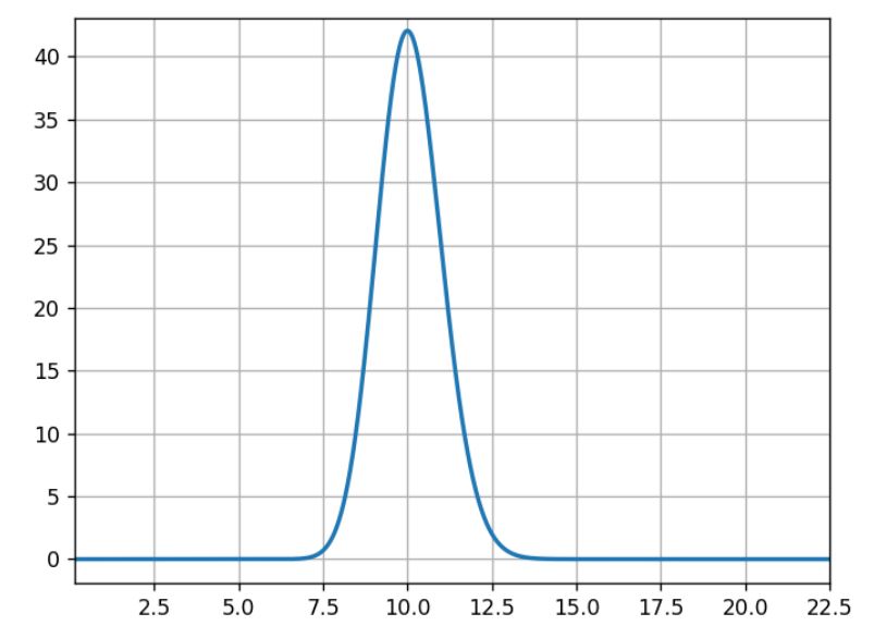
For the three following graphs, the horizontal axis is the click rate while the vertical axis is the likelihood of that rate knowing that we had an experiment with 100 successes in 1,000 trials.
(Source: AB Tasty)
What usually occurs here is that 10% is the most likely, 5% or 15% are very unlikely, and 11% is half as likely as 10%.
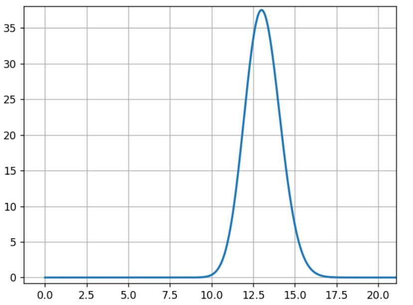
The model Mb is built the same way with data from experiment B:
Mb= beta(1+100,1+870)
(Source: AB Tasty)
For B, the most likely rate is 13%, and the width of the curve’s shape is close to the previous curve.
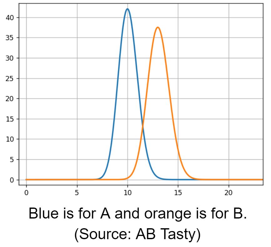
Then we compare A and B rate distributions.
Blue is for A and orange is for B (Source: AB Tasty)
We see an overlapping area, 12% conversion rate, where both models have the same likelihood. To estimate the overlapping region, we need to sample from both models to compare them.
We draw samples from distribution A and B:
s_a[i] is the i th sample from A
s_b[i] is the i th sample from B
Then we apply a comparison function to these samples:
the relative gain: g[i] =100* (s_b[i] – s_a[i])/s_a[i]for all i.
It is the difference between the possible rates for A and B, relative to A (multiplied by 100 for readability in %).
We can now analyze the samples g[i] with a histogram:
The horizontal axis is the relative gain, and the vertical axis is the likelihood of this gain (Source: AB Tasty)
We see that the most likely value for the gain is around 30%.
The yellow line shows where the gain is 0, meaning no difference between A and B. Samples that are below this line correspond to cases where A > B, samples on the other side are cases where A < B.
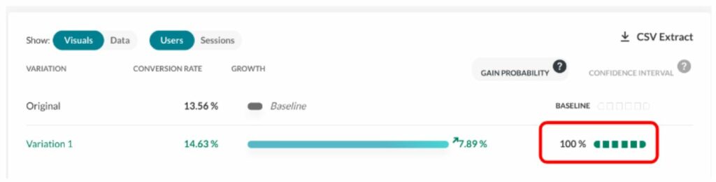
We then define the gain probability as:
GP = (number of samples > 0) / total number of samples
With 1,000,000 (10^6) samples for g, we have 982,296 samples that are >0, making B>A ~98% probable.
We call this the “chances to win” or the “gain probability” (the probability that you will win something).
The gain probability is shown here (see the red rectangle) in the report:
(Source: AB Tasty)
Using the same sampling method, we can compute classic analysis metrics like the mean, the median, percentiles, etc.
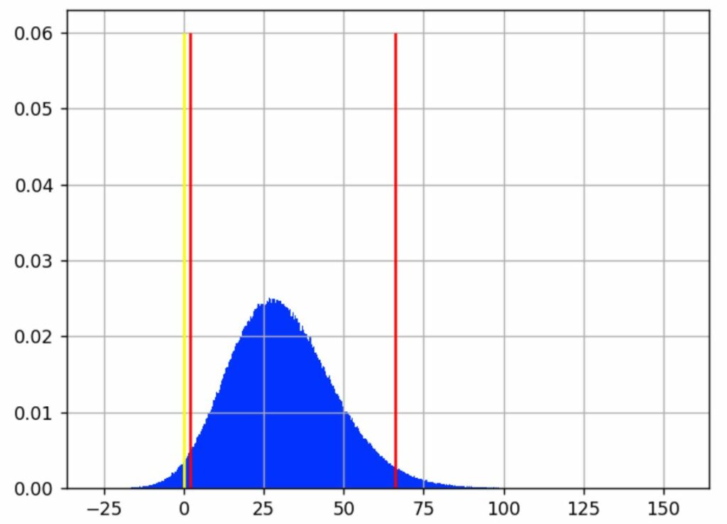
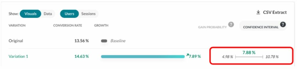
Looking back at the previous chart, the vertical red lines indicate where most of the blue area is, intuitively which gain values are the most likely.
We have chosen to expose a best- and worst-case scenario with a 95% confidence interval. It excludes 2.5% of extreme best and worst cases, leaving out a total of 5% of what we consider rare events. This interval is delimited by the red lines on the graph. We consider that the real gain (as if we had an infinite number of visitors to measure it) lies somewhere in this interval 95% of the time.
In our example, this interval is [1.80%; 29.79%; 66.15%], meaning that it is quite unlikely that the real gain is below 1.8 %, and it is also quite unlikely that the gain is more than 66.15%. And there is an equal chance that the real rate is above or under the median, 29.79%.
The confidence interval is shown here (in the red rectangle) in the report (on another experiment):
(Source: AB Tasty)
What are “priors” for the Bayesian approach?
Bayesian frameworks use the term “prior” to refer to the information you have before the experiment. For instance, a common piece of knowledge tells us that e-commerce transaction rate is mostly under 10%.
It would have been very interesting to incorporate this, but these assumptions are hard to make in practice due to the seasonality of data having a huge impact on click rates. In fact, it is the main reason why we do data collection on A and B at the same time. Most of the time, we already have data from A before the experiment, but we know that click rates change over time, so we need to collect click rates at the same time on all variations for a valid comparison.
It follows that we have to use a flat prior, meaning that the only thing we know before the experiment is that rates are in [0%, 100%], and that we have no idea what the gain might be. This is the same assumption as the frequentist approach, even if it is not formulated.
Challenges in statistics testing
As with any testing approach, the goal is to eliminate errors. There are two types of errors that you should avoid:
False positive (FP): When you pick a winning variation that is not actually the best-performing variation.
False negative (FN): When you miss a winner. Either you declare no winner or declare the wrong winner at the end of the experiment.
Performance on both these measures depends on the threshold used (p-value or gain probability), which depends, in turn, on the context of the experiment. It’s up to the user to decide.
Another important parameter is the number of visitors used in the experiment, since this has a strong impact on the false negative errors.
From a business perspective, the false negative is an opportunity missed. Mitigating false negative errors is all about the size of the population allocated to the test: basically, throwing more visitors at the problem.
The main problem then is false positives, which mainly occur in two situations:
Very early in the experiment: Before reaching the targeted sample size, when the gain probability goes higher than 95%. Some users can be too impatient and draw conclusions too quickly without enough data; the same occurs with false positives.
Late in the experiment: When the targeted sample size is reached, but no significant winner is found. Some users believe in their hypothesis too much and want to give it another chance.
Both of these problems can be eliminated by strictly respecting the testing protocol: Setting a test period with a sample size calculator and sticking with it.
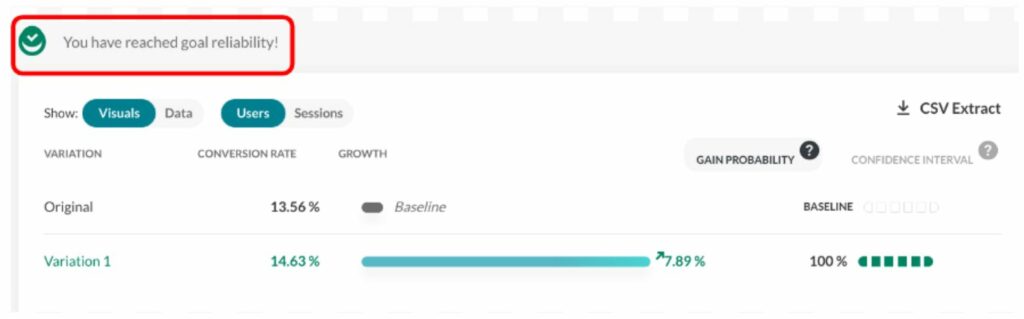
At AB Tasty, we provide a visual checkmark called “readiness” that tells you whether you respect the protocol (a period that lasts a minimum of 2 weeks and has at least 5,000 visitors). Any decision outside these guidelines should respect the rules outlined in the next section to limit the risk of false positive results.
This screenshot shows how the user is informed as to whether they can take action.
(Source: AB Tasty)
Looking at the report during the data collection period (without the “reliability” checkmark) should be limited to checking that the collection is correct and to check for extreme cases that require emergency action, but not for a business decision.
When should you finalize your experiment?
Early stopping
“Early stopping” is when a user wants to stop a test before reaching the allocated number of visitors.
A user should wait for the campaign to reach at least 1,000 visitors and only stop if a very big loss is observed.
If a user wants to stop early for a supposed winner, they should wait at least two weeks, and only use full weeks of data. This tactic is interesting if and when the business cost of a false positive is okay, since it is more likely that the performance of the supposed winner would be close to the original, rather than a loss.
Again, if this risk is acceptable from a business strategy perspective, then this tactic makes sense.
If a user sees a winner (with a high gain probability) at the beginning of a test, they should ensure a margin for the worst-case scenario. A lower bound on the gain that is near or below 0% has the potential to evolve and end up below or far below zero by the end of a test, undermining the perceived high gain probability at its beginning. Avoiding stopping early with a low left confidence bound will help rule out false positives at the beginning of a test.
For instance, a situation with a gain probability of 95% and a confidence interval like [-5.16%; 36.48%; 98.02%] is a characteristic of early stopping. The gain probability is above the accepted standard, so one might be willing to push 100% of the traffic to the winning variation. However, the worst-case scenario (-5.16%) is relatively far below 0%. This indicates a possible false positive — and, at any rate, is a risky bet with a worst scenario that loses 5% of conversions. It is better to wait until the lower bound of the confidence interval is at least >0%, and a little margin on top would be even safer.
Late stopping
“Late stopping” is when, at the end of a test, without finding a significant winner, a user decides to let the test run longer than planned. Their hypothesis is that the gain is smaller than expected and needs more visitors to reach significance.
When deciding whether to extend the life of a test, not following the protocol, one should consider the confidence interval more than the gain probability.
If the user wants to test longer than planned, we advise to only extend very promising tests. This means having a high best-scenario value (the right bound of the gain confidence interval should be high).
For instance, this scenario: gain probability at 99% and confidence interval at [0.42 %; 3.91%] is typical of a test that shouldn’t be extended past its planned duration: A great gain probability, but not a high best-case scenario (only 3.91%).
Consider that with more samples, the confidence interval will shrink. This means that if there is indeed a winner at the end, its best-case scenario will probably be smaller than 3.91%. So is it really worth it? Our advice is to go back to the sample size calculator and see how many visitors will be needed to achieve such accuracy.
Note: These numerical examples come from a simulation of A/A tests, selecting the failed ones.
Confidence intervals are the solution
Using the confidence interval instead of only looking at the gain probability will strongly help improve decision-making. Not to mention that even outside of the problem of false positives, it’s important for the business. All variations need to meet the cost of its implementation in production. One should keep in mind that the original is already there and has no additional cost, so there is always an implicit and practical bias toward the original.
Any optimization strategy should have a minimal threshold on the size of the gain.
Another type of problem may arise when testing more than two variations, known as the multiple comparison problem. In this case, a Holm-Bonferroni correction is applied.
Why AB Tasty chose the Bayesian approach
Wrapping up, which is better: the Bayesian vs. frequentist method?
As we’ve seen in the article, both are perfectly sound statistical methods. AB Tasty chose the Bayesian statistical model for the following reasons:
Using a probability index that corresponds better to what the users think, and not a p-value or a disguised one;
Providing confidence intervals for more informed business decisions (not all winners are really interesting to push in production.). It’s also a means to mitigate false positive errors.
At the end of the day, it makes sense that the frequentist method was originally adopted by so many companies when it first came into play. After all, it’s an off-the-shelf solution that’s easy to code and can be easily found in any statistics library (this is a particularly relevant benefit, seeing as how most developers aren’t statisticians).
Nonetheless, even though it was a great resource when it was introduced into the experimentation field, there are better options now — namely, the Bayesian method. It all boils down to what each option offers you: While the frequentist method shows whether there’s a difference between A and B, the Bayesian one actually takes this a step further by calculating what the difference is.
To sum up, when you’re conducting an experiment, you already have the values for A and B. Now, you’re looking to find what you will gain if you change from A to B, something which is best answered by a Bayesian test.
Building an ROI-Driven Testing Plan with AB Tasty Partner, Roboboogie
Mary Kate Cash
After our amazing digital summit at the end of 2020, we wanted to sit down with Matt Bullock, Director of Growth at Roboboogie to learn more about ROI-driven design.
Tell us about Roboboogie and your session. Why did you choose this topic?
Matt: Our session was titled Building an ROI-Driven Testing Plan. When working with our existing clients, or talking with new potential clients, we look at UX opportunities from both a data and design perspective. By applying ROI-modeling, we can prioritize the opportunities with the highest potential to drive revenue or increase conversions.
What are the top 3 things you hope attendees took away from your session?
Matt: We have made the shift from “Design and Hope” to a data-backed “Test and Optimize” approach to design and digital transformation, and it’s a change that every organization can make.
An ROI-Driven testing plan can be applied across a wide range of conversion points and isn’t exclusive to eCommerce.
Start small and then evolve your testing plan. Building a test-and-optimize culture takes time. You can lead the charge internally or partner with an agency. As your ROI compounds, everyone is going to want in on the action!
2021 is going to be a transformative year where we hope to see a gradual return to “normalcy.” While some changes we endured in 2020 are temporary, it looks like others are here to stay. What do you think are the temporary trends and some that you hope will be more permanent?
Matt: Produce to your doorstep and curbside pickup were slowly picking up steam before 2020. Before the end of the year, it was moving into the territory of a customer expectation for all retailers with a brick-and-mortar location. While there will undoubtedly be nostalgia and some relief when retailers are able to safely open for browsing, I do think there will be a sizable contingent of users who will stick with local delivery and curbside pickup.
There is a lot of complexity that is added to the e-commerce experience when you introduce multiple shipping methods and inventory systems. I expect the experience will continue evolving quickly in 2021.
We saw a number of hot topics come up over the course of 2020: the “new normal,” personalization, the virtual economy, etc. What do you anticipate will be the hot topics for 2021?
Matt: We’re hopeful that we’ll be safely transitioning out of isolation near the end of 2021, and that could bring some really exciting changes to the user’s digital habits. We could all use less screen time in 2021 and I think we’ll see some innovation in the realm of social interaction and screen-time efficiency. We’ll look to see how we can use personalization and CX data to create experiences that help users efficiently use their screen time so that we can safely spend time with our friends and family in real life.
What about the year ahead excites the team at Roboboogie the most?
Matt: In the last 12 months, the consumer experience has reached amazing new heights and expectations. New generations, young and old, are expanding their personal technology stacks to stay connected and to get their essentials, as they continue to socialize, shop, get their news, and consume entertainment from a safe distance. To meet those expectations, the need for testing and personalization continues to grow and we’re excited to help brands of all sizes meet the needs of their customers in new creative ways.
Better Understand (And Optimize) Your Average Basket Size
Hubert Wassner
When it comes to using A/B testing to improve the user experience, the end goal is about increasing revenue. However, we more often hear about improving conversion rates (in other words, changing a visitor into a buyer).
If you increase the number of conversions, you’ll automatically increase revenue and increase your number of transactions. But this is just one method among many…another tactic is based on increasing the ‘average basket size’. This approach is, however, much less often used. Why? Because it’s rather difficult to measure the associated change.
A Measurement and Statistical Issue
When we talk about statistical tests associated with average basket size, what do we mean? Usually, we’re referring to the Mann-Whitney-U test (also called the Wilcoxon), used in certain A/B testing software, including AB Tasty. A ‘must have’ for anyone who wants to improve their conversion rates. This test shows the probability that variation B will bring in more gain than the original. However, it’s impossible to tell the magnitude of that gain – and keep in mind that the strategies used to increase the average basket size most likely have associated costs. It’s therefore crucial to be sure that the gains outweigh the costs.
For example, if you’re using a product recommendation tool to try and increase your average basket size, it’s imperative to ensure that the associated revenue lift is higher than the cost of the tool used….
Unfortunately, you’ve probably already realized that this issue is tricky and counterintuitive…
Let’s look at a concrete example: the beginner’s approach is to calculate the average basket size directly. It’s just the sum of all the basket values divided by the number of baskets. And this isn’t wrong, since the math makes sense. However, it’s not very precise! The real mistake is comparing apples and oranges, and thinking that this comparison is valid. Let’s do it the right way, using accurate average basket data, and simulate the average basket gain.
Here’s the process:
Take P, a list of basket values (this is real data collected on an e-commerce site, not during a test).
We mix up this data, and split them into two groups, A and B.
We leave group A as is: it’s our reference group, that we’ll call the ‘original’.
Let’s add 3 euros to all the values in group B, the group we’ll call the ‘variation’, and which we’ve run an optimization campaign on (for example, using a system of product recommendations to website visitors).
Now, we can run a Mann-Whitney test to be sure that the added gain is significant enough.
With this, we’re going to calculate the average values of lists A and B, and work out the difference. We might naively hope to get a value near 3 euros (equal to the gain we ‘injected’ into the variation). But the result doesn’t fit. We’ll see why below.
How to Calculate Average Basket Size
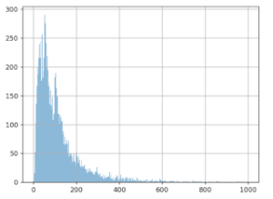
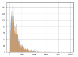
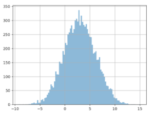
The graph below shows the values we talked about: 10,000 average basket size values. The X (horizontal) axis represents basket size, and the Y (vertical) axis, the number of times this value was observed in the data.
It seems that the most frequent value is around 50 euros, and that there’s another spike at around 100 euros, though we don’t see many values over 600 euros.
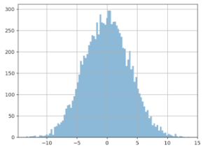
After mixing the list of amounts, we split it into two different groups (5,000 values for group A, and 5,000 for group B).
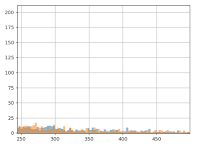
Then, we add 3 euros to each value in group B, and we redo the graph for the two groups, A (in blue) and B (in orange):
We already notice from looking at the chart that we don’t see the effect of having added the 3 euros to group B: the orange and blue lines look very similar. Even when we zoom in, the difference is barely noticeable:
However, the Mann-Whitney-U test ‘sees’ this gain:
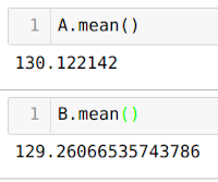
More precisely, we can calculate pValue = 0.01, which translates into a confidence interval of 99%, which means we’re very confident there’s a gain from group B in relation to group A. We can now say that this gain is ‘statistically visible.’
We now just need to estimate the size of this gain (which we know has a value of 3 euros).
Unfortunately, the calculation doesn’t reveal the hoped for result! The average of group A is 130 euros and 12 cents, and for version B, it’s 129 euros and 26 cents. Yes, you read that correctly: calculating the average means that average value of B is smaller than the value of A, which is the opposite of what we created in the protocol and what the statistical test indicates. This means that, instead of gaining 3 euros, we lose 0.86 cents!
So where’s the problem? And what’s real? A > B or B > A?
The Notion of Extreme Values
The fact is, B > A! How is this possible? It would appear that the distribution of average basket values is subject to ‘extreme values’. We do notice on the graph that the majority of the values is < 500 euros.
But if we zoom in, we can see a sort of ‘long tail’ that shows that sometimes, just sometimes, there are values much higher than 500 euros. Now, calculating averages is very sensitive to these extreme values. A few very large basket size values can have a notable impact on the calculation of the average.
What’s happening then? When we split up the data into groups A and B, these ‘extreme’ values weren’t evenly distributed in the two groups (neither in terms of the number of them, nor their value). This is even more likely since they’re infrequent, and they have high values (with a strong variance).
NB: when running an A/B test, website visitors are randomly assigned into groups A and B as soon as they arrive on a site. Our situation is therefore mimicking the real-life conditions of a test.
Can this happen often? Unfortunately, we’re going to see that yes it can.
A/A Tests
To give a more complete answer to this question, we’d need to use a program that automates creating A/A tests, i.e. a test in which no change is made to the second group (that we usually call group B). The goal is to check the accuracy of the test procedure. Here’s the process:
Mix up the initial data
Split it into two even groups
Calculate the average value of each group
Calculate the difference of the averages
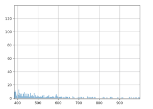
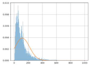
By doing this 10,000 times and by creating a graph of the differences measured, here’s what we get:
X axis: the difference measured (in euros) between the average from groups A and B.
Y axis: the number of times this difference in size was noticed.
We see that the distribution is centered around zero, which makes sense since we didn’t insert any gain with the data from group B. The problem here is how this curve is spread out: gaps over 3 euros are quite frequent. We could even wager a guess that it’s around 20%. What can we conclude? Based only on this difference in averages, we can observe a gain higher than 3 euros in about 20% of cases – even when groups A and B are treated the same!
Similarly, we also see that in about 20% of cases, we think we’ll note a loss of 3 euros per basket….which is also false! This is actually what happened in the previous scenario: splitting the data ‘artificially’ increased the average for group A. The gain of 3 euros to all the values in group B wasn’t enough to cancel this out. The result is that the increase of 3 euros per basked is ‘invisible’ when we calculate the average. If we look only at the simple calculation of the difference, and decide our threshold is 1 euro, we have about an 80% chance of believing in a gain or loss…that doesn’t exist!
Why Not Remove These ‘Extreme’ Values?
If these ‘extreme’ values are problematic, we might be tempted to simply delete them and solve our problem. To do this, we’d need to formally define what we call an extreme value. A classic way of doing this is to use the hypothesis that the data follow ‘Gaussian distribution’. In this scenario, we would consider ‘extreme’ any data that differ from the average by more than three times the standard deviation. With our dataset, this threshold comes out to about 600 euros, which would seem to make sense to cancel out the long tail. However, the result is disappointing. If we apply the A/A testing process to this ‘filtered’ data, we see the following result:
The distribution of the values of the difference in averages is just as big, the curve has barely changed.
If we were to do an A/B test now (still with an increase of 3 euros for version B), here’s what we get (see the graph below). We can see that the the difference is being shown as negative (completely the opposite of the reality), in about 17% of cases! And this is discounting the extreme values. And in about 18% of cases, we would be led to believe that the gain of group B would be > 6 euros, which is two times more than in reality!
Why Doesn’t This Work?
The reason this doesn’t work is because the data for the basket values doesn’t follow Gaussian distribution.
Here’s a visual representation of the approximation mistake that happens:
The X (horizontal) axis shows basket values, and the Y (vertical) axis shows the number of times this value was observed in this data.
The blue line represents the actual basket values, the orange line shows the Gaussian model. We can clearly see that the model is quite poor: the orange curve doesn’t align with the blue one. This is why simply removing the extreme values doesn’t solve the problem.
Even if we were able to initially do some kind of transformation to make the data ‘Gaussian’, (this would mean taking the log of the basket values), to significantly increase the similarity between the model and the data, this wouldn’t entirely solve the problem. The variance of the different averages is just as great.
During an A/B test, the estimation of the size of the gain is very important if you want to make the right decision. This is especially true if the winning variation has associated costs. It remains difficult today to accurately calculate the average basket size. The choice comes down soley to your confidence index, which only indicates the existence of gain (but not its size). This is certainly not ideal practice, but in scenarios where the conversion rate and average basket are moving in the same direction, the gain (or loss) will be obvious. Where it becomes difficult or even impossible to make a relevant decision is when they aren’t moving in the same direction.
This is why A/B testing is focused mainly on ergonomic or aesthetic tests on websites, with less of an impact on the average basket size, but more of an impact on conversions. This is why we mainly talk about ‘conversion rate optimization’ (CRO) and not ‘business optimization’. Any experiment that affects both conversion and average basket size will be very difficult to analyze. This is where it makes complete sense to involve a technical conversion optimization specialist: to help you put in place specific tracking methods aligned with your upsell tool.
To understand everything about A/B testing, check out our article: The Problem is Choice.
How to A/B Test Your Facebook Ads and Skyrocket Engagement
AB Tasty
Facebook’s Ads Manager is a marketing powerhouse. Even with a $5 daily budget, you could reach hundreds of thousands of people in your target audience. A report by Buffer estimated that as many as 91% of marketers use Facebook ads. Facebook marketing continues to push full steam ahead.
Although Facebook ads can be great for drumming up brand awareness, knowing how to A/B test your ads is the secret to long term success. Without it, you’re just guessing at what works instead of rigorously analyzing and improving your approach. Consistent A/B testing (also known as split testing) provides the analytics you need to improve your strategy, boost engagement, and increase your click-through rate.
Read on for a step-by-step guide on how to A/B test your Facebook ads. By the end, you’ll know how to set up your own A/B ads on Facebook, and the best presets to choose for each option along the way.
But First, What is an A/B Test?
A/B testing your Facebook ads can teach you more about your audience’s preferences.
A and B refer to the versions of the ad. Your A version acts as the control. It’s the ad version you’ve seen work in the past or believe will work best. Your B ad version implements a variable. It’s a variation of A and is meant to compete with your A version.
If A beats out B, then you keep running the A ad and make a different change to B to try again.
Once the B version performs better than A, B becomes your new control – your new A. Your original A is discarded or archived. The new A now acts as the baseline to beat when you split test again in the future.
Split testing is meant to help identify which variables pull the most weight and altering the parts that don’t support conversions.
Before you begin split testing, be sure you’re clear on what specific goal you have for that ad. Usually, you’ll be looking for post engagement, such as a click-through to the website or increasing sign-ups.
Don’t forget to check that the click-through destination matches the promise of the ad. If you were offering a discount on a pair of sneakers, make sure that’s precisely where your audience ends up.
Three Options to Get Started in Facebook’s Ad Manager
Facebook gives you three options to create a split test.
Guided creation: Facebook will walk you through the process of creating a split test. Once you complete their questions, your ads will be ready to go. This method works best if you’re new at Facebook advertising or prefer a step-by-step guide. The screenshots below show walkthrough this method.
Quick creation: Facebook lets you design the structure for a split test. This structure can be saved and deployed at a later time. This can be helpful if you know what you plan to test, but your campaign doesn’t start for another week.
Duplication: If you’ve run Facebook Ads before, the Duplication method allows you to add a new ad set or alter an existing campaign for your split test. We’d recommend this if you want to test one variable in an ad you’ve already run.
There’s no wrong choice since it’ll depend on your preference and history of running Facebook ads. For more detailed steps on each option, review their Help page here.
Select Your Ad’s Objective & Variable
Select the objective that you decided on earlier. Once you choose one of these options, a menu will appear. Select “Create Split Test”, then select the variable you plan to change. The dropdown menu options are creative, delivery optimization, audience, and placement.
Creative: Design changes such as video, image, description, etc.
Delivery Optimization: Delivers ads to the Audience that is most likely to do your desired action (landing page views, link clicks, impressions, daily unique reach).
Audience: Change the target audience for the ad.
Placement: Changing which platforms your ad appears.
Once you choose that, Facebook will walk you through the next several decisions you need to make. This includes deciding where you want to drive traffic, creating an offer, choosing an audience, optimize for ad delivery, and setting a budget. Here are menu screenshots of each. As you can see, there’s a high-level of customizability available for each ad set you run.
Variable
Although you selected this already, you have the option to change it again here. In Facebook’s Ads Manager, you’re only allowed to select one variable at a time. Like we recommended earlier, this is the best way to know which variables caused which change.
Audience & Placements
The next two sections are audience and placement. These will both depend on your specific brand and location, so you’ll need to navigate this on your own. Audience can be narrowed down by location, sex, age, and even by past engagement with your page. Consider your target audience’s personality, including their hobbies, interests, and lifestyle. Once you determine a target audience, you can save that cohort and alter it in the future.
Because Facebook placements cover such a broad range of formats and platforms (think everything from Instagram stories to Messenger Inbox), it’s probably best to leave it on recommended. Facebook’s Ads Manager uses its database of ad analytics to determine the best combination of placements for your ad. As you continue to analyze your results, you can create custom placements in the future.
Delivery Optimization
In this section, you can optimize your ad delivery for specific conversions such as link clicks, landing page views, impressions, and daily unique reach. This should reflect the original goal you set out for your ad. You also have a choice between getting charged per impression, or per click.
For ad scheduling, we recommend narrowing your time to when your audience is most likely to be interested in your ad, or at the very least awake. For example, if you’ve seen that your ads tend to convert in the morning, that’s when you should schedule your ads, you get the best chance at ROI.
Split Test Budget & Schedule
This is where you can determine how much to spend, and the runtime of your ads. Here you have the choice of a daily budget vs. a lifetime budget. For example, if you decide to spend $70 a day for a 4-day campaign, your daily budget would be $70, and your lifetime budget would be $280.
If you choose daily budget, Facebook will spend up to that amount per day, regardless of performance on the account. Daily budgets don’t allow for ad scheduling since it’ll be working to spend that set amount.
Facebook is more budget and result-conscious with the lifetime budget option. Choosing lifetime budget means Facebook will alter daily spend levels in response to campaign results.
Don’t forget to keep an eye on the “Estimated Test Power”. This percentage is the likelihood of detecting a difference in your ad sets if there is one to detect. Facebook recommends you keep this test power at 80% or above for a worthwhile split test.
Once you’ve made your selections, you can click continue to upload and design your ad control.
Design Two Versions of your Ad
A/B Test of the Same Ad: Photo Credit to Jeff Bullas
To split test, you’ll need to create one control (A), and one variable (B). Regardless of which variable you’re testing, it’s best only to change one so the results are clear. Some audience-facing variables you might switch could include changing your call-to-action, using a different image, or remove the image entirely.
Regardless of which you choose, be sure the final ad is noticeably different than before and is an aspect that’s broad enough to be applied in the future.
For example, if you’re marketing a winter holiday, don’t A/B test between two different photos of a decorative table setting. Choose a photo with a person, add text to the image, or remove the image entirely. That way if you’re advertising a summer holiday in the future, you’ll be able to paint a more generalized picture of what sparks interest in your audience.
Once you’re ready, input your ad into Facebook’s platform. Be sure to preview your ad (top right) and create URL parameters (bottom left) so you can track which engagement came from where.
When you’re ready, click the “Continue to ad B” button in the bottom right corner. This page auto-fills with the same information as ad A. It’s here that you introduce any variables, such as changing the audience, ad format, or other specs.
Finally, you click the green “Confirm” button to finalize and purchase the ad.
Review the Results
Once your ads are finished running, it’s time to review the results of your A/B test. Drawing actionable conclusions is the most important step in increasing your ad’s CTR. Thankfully, Facebook Ads Manager makes this easy.
First, apply a filter so that only relevant campaigns and ad sets that were part of the split tests will show in the reporting table. To do this, click Filter and choose Split Test from the menu.
For a quick initial result, ads Manager puts a star next to the winning ad set. Facebook determines the winning set by comparing the cost per result of each ad set and other variables.
Facebook Ads Manager will also send you a detailed email report, that includes:
Their Winning Ad Determination
Your A/B Test Settings
Results
Cost
Amount Spent
From these results, you can determine what worked and what changes you’d like to make for your next Facebook campaign.
—
Understanding Facebook advertising and split test marketing is a worthwhile investment for any marketer worth their salt. 80% of all internet users have a Facebook Account, meaning that you’re practically guaranteed to reach your target audience on the platform.
Using their Ads Manager, you can build a robust and ever-improving marketing strategy using their analytics. Over time, you’ll see an increase in revenue, sales, and lead generation. Once you have everything prepared, it only takes minutes to set up a Facebook Ad, so get started today!
7 Tips for Implementing A/B Testing in your Social Media Campaigns
AB Tasty
A/B testing has been around for decades, even before the advent of the internet or social media. In fact, it actually spans back to the time when James Lind first conducted an A/B test in a clinical trial over 300 years ago.
Many years later, Google famously used an A/B test to decide which shade of blue to use in its campaigns, showing each shade to 1% of their users. Some time in between James Lind and Google, marketers would run tests on TV or newspaper ads. They would then assess the results and make changes accordingly, and then conduct more tests, and so forth. These tests started weeks – or even months – before the campaign launch, making for a time-consuming and tedious process.
Fortunately, testing is an easier process nowadays, and marketers are able to test virtually all elements of a campaign. More specifically, A/B testing has found a special importance in social media. Digital marketers introduce two slightly different posts, testing various elements to see which one gets a better response.
Although testing has become easier, it has certainly become more complex as well. The issue that many marketers now face is knowing where and how to introduce testing in their social media campaigns. To help, we’ve compiled a list of the elements of a social campaign that you should be testing, and how you can start executing these tests right away.
1. Find Your Target Audience
Before you start a campaign, you have to get to know your target audience. This process for testing is unique, in that you won’t be changing the actual contents of the campaign. Instead, you will show the same advertisement or post to various segments to see which one will react best.
For instance, when testing Facebook ads, you will generally want to segment by location, age, gender, device, platform, or interests.
2. Experiment with Hashtags
While using too many hashtags might annoy your audience, just the right amount could get your post more attention. Having said that, you should avoid simply testing a post with hashtags versus a post without hashtags. Companies tend to test posts with multiple hashtags against those with just one, posts with different hashtags, as well as hashtag placement within the post.
3. Test Various Ad Formats
When using social media advertising, you should definitely be testing different ad formats. Specifically, in the case of Facebook, some formats will work best for certain types of posts. Edith McClung, a Digital Marketer at Academized, gives a great example: “While a carousel ad might work for a product launch – viewers will be able to see multiple pictures of your product – an advertisement with ‘Get Directions’ might work better with a restaurant launch”. Keep in mind that different advertisement types will have varied results based on your target audience and the content you are promoting.
4. Change Up the Post Text
This is perhaps the most common practice when it comes to social media split testing, as there are various elements of your post text might affect your success differently.
Here are some things that you could test:
Length of the post
Style
Use of emoji
Tone of voice
Use of numbers and lists
Remember, you always want to always proofread your posts. Even though we live in the age of texting and abbreviations, readers still expect your posts to be flawless. Even the smallest mistakes can be off-putting to the reader. Using tools such as AcademAdvisororVia Writing can help.
5. Use Different Images and Videos
While it’s generally the case that social media users prefer posts that feature images and videos, it’s still important to test this on your own audience for each specific platform. For example, split testing often shows that Twitter users prefer GIFs to regular images, so companies present on this social media platform tend to use GIFS more often than other types of graphics.
The testing possibilities are endless, as you can try posts with no images or videos versus text with images and videos, posts with gifs versus posts with images, the length of the video in posts, etc.
Just be sure to balance informative text out with visual content and use an appealing format. Tools like likeBoom Essays orEssay Roo can help.
6. Play Around With Your CTAs
Your Call-To-Action is another crucial, yet often overlooked component to your post. Users have varied responses to different CTAs, and you need to find the one that will work best for your audience. Test several CTAs in your posts and use the one that is most relevant yet also gets you the most clicks.
7. Try Out Different Headlines
Headlines are one of the most important aspects to your posts, as they are often the most prominent component. Test the same factors that you normally would in post content – length of the headline, use of numbers, style, etc. If writing headlines aren’t your strength, it might be a good idea to use a guide – websites likeStateOfWriting orUK Writings can help you.
Wrapping Up
Split testing is one of the best methods out there for getting things right on social media. The same post can get a different response based on the title, CTA, advertisement type, etc. By continuing to test, you will be able to optimize your social media strategy by finding what works best with your audience.
In this day and age, it has become so apparent how much social media can impact the success of a business or brand, and by adding A/B testing to your repertoire, you could be seeing even more of a benefit from platforms that you are already using. So get creative, have fun with it, and watch your business grow.
Freddie Tubbs is a digital marketing strategist at Paper Fellows. He regularly takes part in online marketing conferences and contributes expert articles to the Vault, Australian Help and Big Assignments blogs.


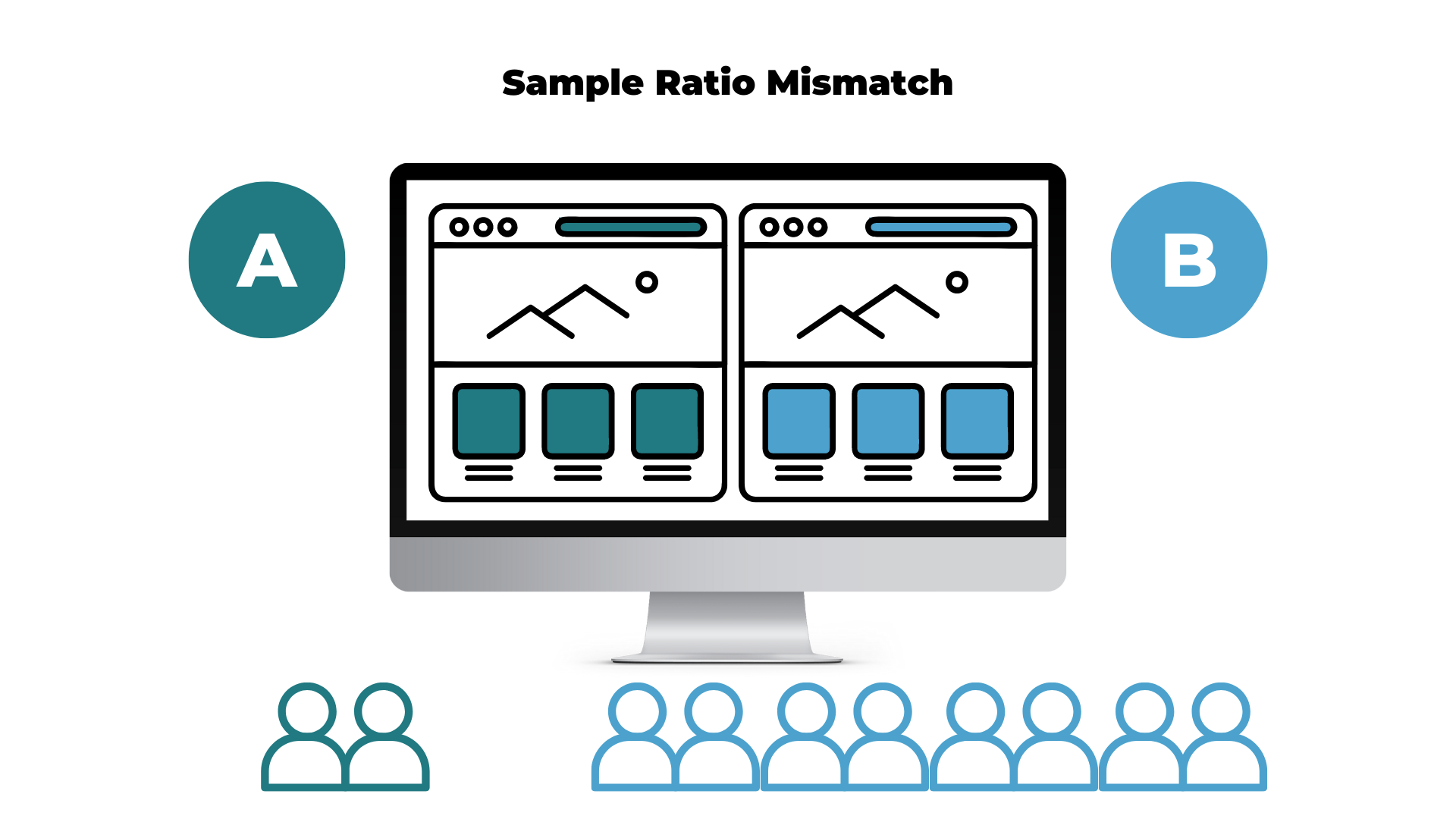


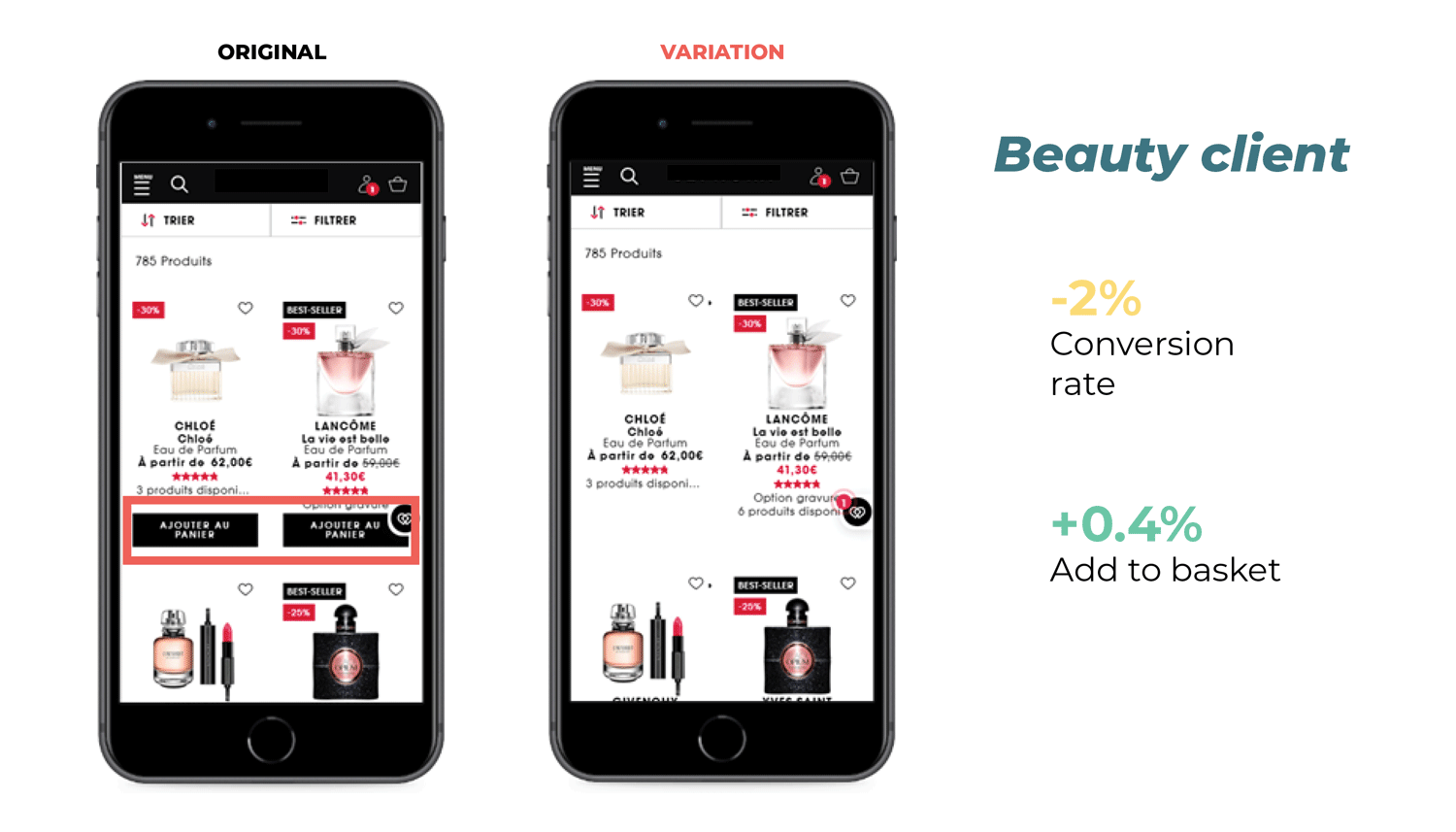
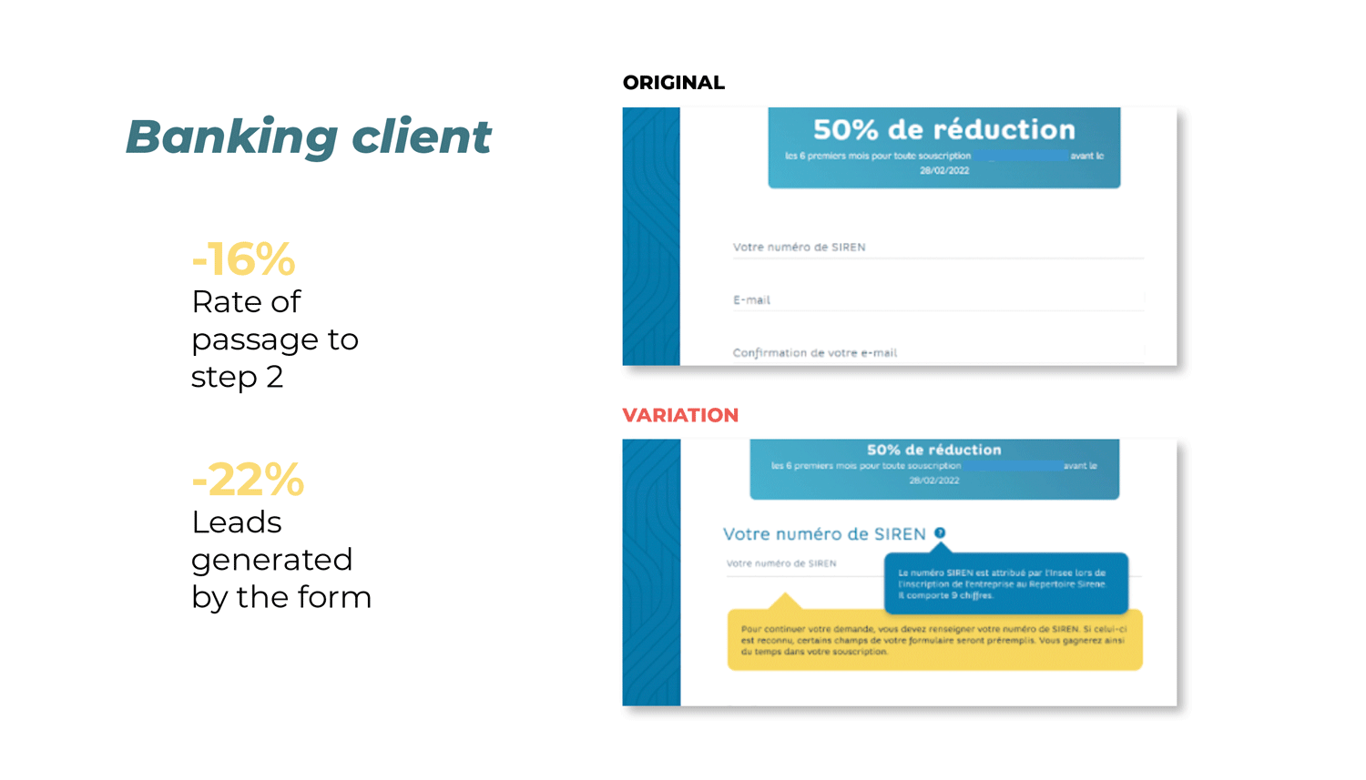
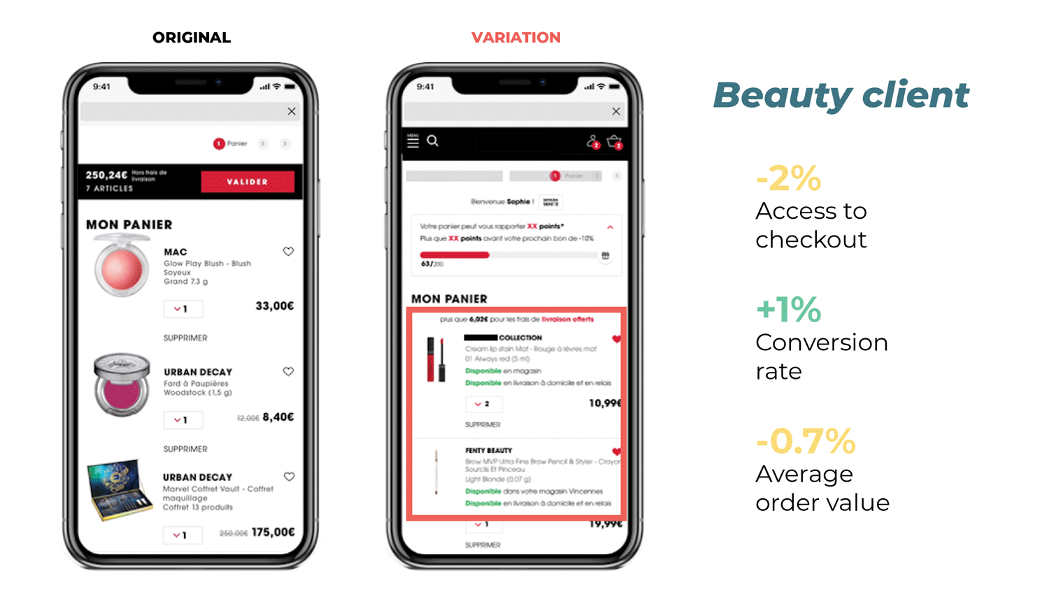


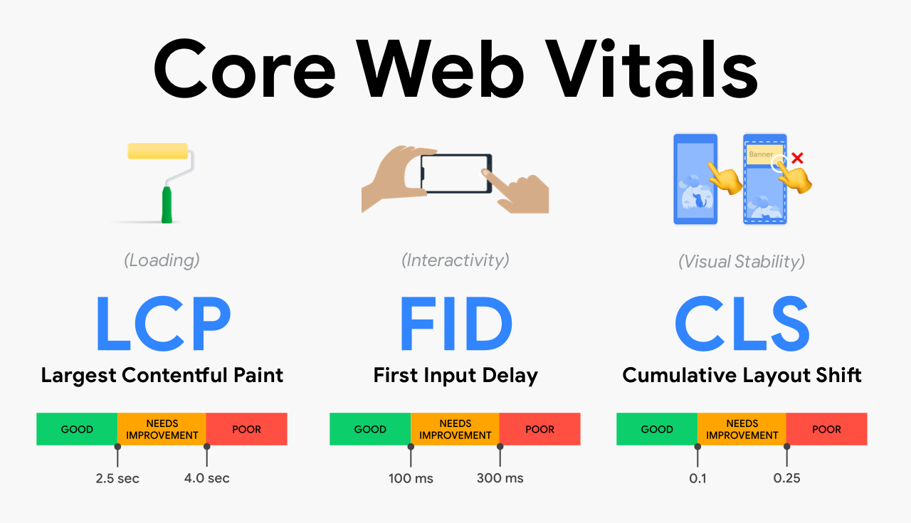
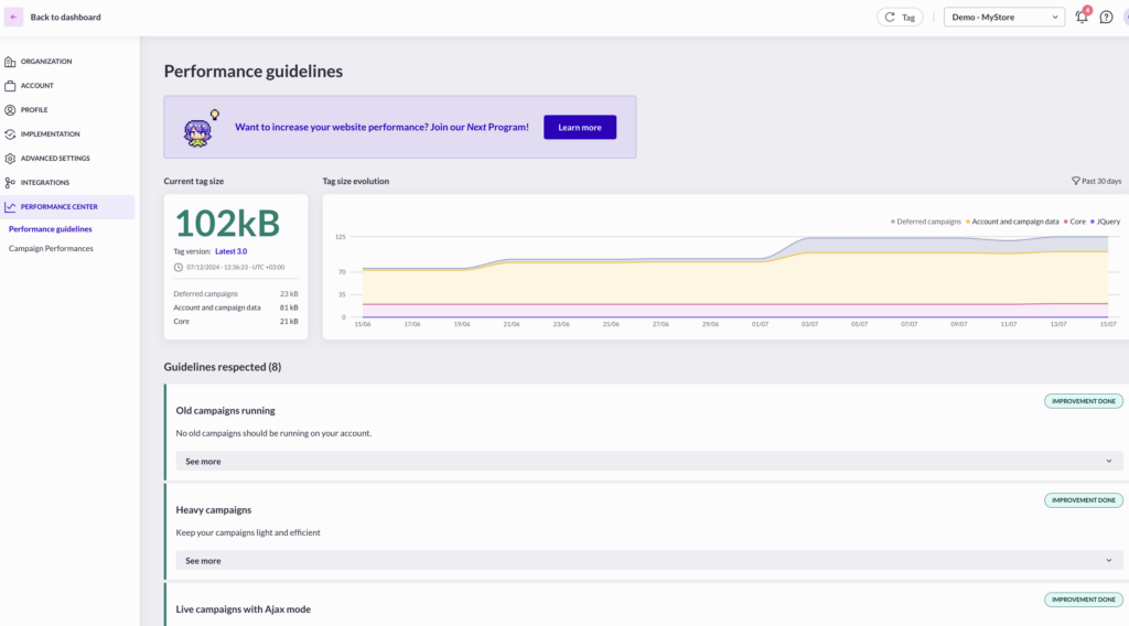
 Knowing one dimension makes it possible to calculate the other. If you have an element with 1000px width, your height would be 750px. This calculation is made as follows: