In the fast-paced world of digital marketing, settling for anything less than the best user experience is simply not an option.
Every marketing strategy has room for improvement and unlocking more comes from recognizing hidden opportunities.
With analytics data and a little bit of creativity, you can uncover some valuable insights on how to optimize your conversion rate on your website or campaign landing pages. However, achieving structured and streamlined data from your assumptions requires diligent testing.
Marketing professionals have steadily used different testing methodologies such as A/B testing, split testing, multivariate testing and multipage testing to increase conversion rates and enhance digital performance.
Experimenting and testing are essential as they eliminate opinions and bias from the decision-making process, ensuring data-driven decisions.
With the availability of many diverse testing options, it can be challenging to find your starting point. In this article, we’ll dive into the specifics of different forms of testing to help you navigate this testing landscape.
What is A/B testing?

A/B testing is a method of website optimization where you are comparing two versions of the same page: variation A and variation B. For the comparison, it’s common to look at the conversion rates and metrics that matter to your business (clicks, page views, purchases, etc) while using live traffic.
It’s also possible to do an A/B/C/D test when you need to test more than two content variations. The A/B/C/D method will allow you to test three or more variations of a page at once instead of testing only one variation against the control version of the page.
When to use A/B tests?
A/B tests are an excellent method to test radically different ideas for conversion rate optimization or small changes on a page.
A/B testing is the right method to choose if you don’t have a large amount of traffic to your site. Why is this? A/B tests can deliver reliable data very quickly, without a large amount of traffic. This is a great approach to experimentation to maximize test time to achieve fast results.
If you have a high-traffic website, you can evaluate the performance of a much broader set of variations. However, there is no need to test 20 different variations of the same element, even if you have adequate traffic. It’s important to have a strategy when approaching experimentation.
Want to start testing? AB Tasty is the best-in-class experience optimization platform that empowers you to create a richer digital experience – fast. From experimentation to personalization, this solution can help you activate and engage your audience to boost your conversions.
Split testing vs A/B testing
A/B tests and split tests are essentially the same concept.
“A/B” refers to the two variations of the same URL where changes are made “live” using Javascript on the original page. SaaS tools that provide you with a visual editor, like AB Tasty, allow you to create these changes quickly without technical knowledge.
Meanwhile, “split” refers to the traffic redirection towards one variation or another, each hosted on its own URL and fully redesigned in the code.
You can consider A/B tests to work the same as split tests.
The variation page may differ in many aspects depending on the testing hypothesis you put forth and your industry goals (layout, design, pictures, headlines, sub-headlines, calls to action, offers, button colors, etc.).
In any case, the number of conversions on each page’s variation is compared once each variation gets enough visitors.
In A/B tests, the impact of the design as a whole is tracked, not individual elements – even though many design elements might be changed on variations simultaneously.
TIP: Keep in mind that testing is all about comparing the performances of variations. It’s recommended not to make too many changes between the control and variation versions of the page at the same time. You should limit the number of changes to better understand the impact of the results. In the long term, a continuous improvement process will lead to better and lasting performance.
What is multivariate testing?

Multivariate tests or multi-variant tests are the same as A/B tests in their core mechanism and philosophy. The difference is that multivariate testing allows you to compare a higher number of variables and the interactions between each other. In other words, you can test and track changes to multiple sections on a single page.
For multivariate testing, you need to identify a few key page sections and then create variations for those sections specifically. You aren’t creating variations of a whole page as you do while A/B testing.
TIP: Use multivariate testing when several element combinations on your website or landing page are called into question.
Multivariate testing reveals more information about how these changes to multiple sections interact with one another. In multivariate tests, website traffic is split into each possible combination of a page – where the effectiveness of the changes is measured.
It’s very common to use multivariate testing to optimize an existing website or landing page without making a significant investment in redesign.
Although this type of testing can be perceived as an easier way of experimentation – keep in mind that multivariate testing is more complicated than traditional A/B testing.
Multivariate tests are best suited for more advanced testers because they give many more possibilities of combinations for visitors to experience on your website. Too many changes on a page at once can quickly add up. You don’t want to be left with a very large number of combinations that must be tested.
Multivariate test example
Let’s say that you’ve decided to run a multivariate test on one of your landing pages. You choose to change two elements on your landing page. On the first variation, you swap an image for a video, and on the second variation, you swap the image for a slider.
For each page variation, you add another version of the headline. This means that now you have three versions of the main content and two versions of the headline. This is equal to six different combinations of the landing page.
| Image | Video | Slider | |
| Headline 1 | Combination 1 | Combination 2 | Combination 3 |
| Headline 2 | Combination 4 | Combination 5 | Combination 6 |
After only changing two sections, you quickly have six variations. This is where multivariate testing can get tricky.
When to use multivariate testing?
Multivariate tests are recommended for sites with a large amount of daily traffic. You will need a site with a high volume of traffic to test multiple combinations, and it will take a longer time to obtain meaningful data from the test.
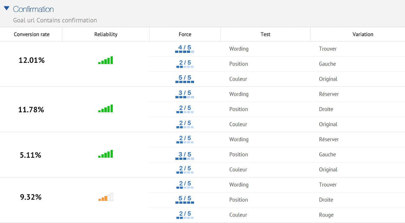
The multivariate testing method will allow you to incrementally improve an existing design, while the test results can be used to apply to a larger website or landing page redesign.
What is multipage testing?
Multipage testing is an experimentation method similar to standard A/B testing. As we’ve discussed, in A/B testing, changes can be made to one specific page or to a group of pages.
If the changed element appears on several pages, you can choose whether or not to change it on each page. However, if the element is on several pages but it’s not identical, appears at a different place or has a different name, you’ll have to set up a multipage test.
Multipage tests allow you to implement changes consistently over several pages.
This means that multipage tests allow you to link together variations of different pages and are especially useful when funnel testing.
In multipage tests, site visitors are funneled into one funnel version or the other. You need to track the way visitors interact with the different pages they are shown so you can determine which funnel variation is the most effective.
You must ensure that the users see a consistent variation of changes throughout a set of pages. This is key to getting usable data and allows one variation to be fairly tested against another.
Multipage test example
Let’s say you want to conduct a multipage test with a free shipping coupon displayed in the funnel at different places. You want to run the results of this test against the original purchase funnel without a coupon.
For example, you could offer visitors a free shipping coupon on a product category page – where they can see “Free shipping over €50” as a static banner on the page. Once the visitor adds a product to the shopping cart, you can show them a new dynamic message according to the cart balance – “Add €X to your cart for free shipping”.
In this case, you can experiment with the location of the message (near the “Proceed to checkout” button, near the “Continue shopping” button, near the shipping cost for his order or somewhere else) and with the call-to-action variations of the message.
This kind of test will help you understand visitors’ purchase behavior better – i.e. how does the placement of a free shipping coupon reduce shopping cart abandonment and increase sales? After enough visitors come to the end of the purchase funnel through the different designs, you will be able to compare the effect of design styles easily and effectively.
How to test successfully?
Remember that the pages being tested need to receive substantial traffic so the tests will give you some relevant data to analyze.
Whether you use A/B testing, split testing, multivariate testing or multipage testing to increase your conversion rate or performance, remember to use them wisely.
Each type of test has its own requirements and is uniquely suited to specific situations, with advantages and disadvantages.
Using the proper test for the right situation will help you get the most out of your site and the best return on investment for your testing campaign. Even though testing follows a scientific method, there is no need for a degree in statistics when working with AB Tasty.
Related: How long you should run a test and how statistics calculation works with AB Tasty


