Everyone hates tests. Ever since our school days, just hearing the word ‘test’ puts us on high alert and brings nothing but dread.
It seems we cannot escape the word even in software development. And it’s not just any test but a ‘test in production’.
Yes, it is the dreaded phrase that leaves you sweating and your heart pounding. Just reading the phrase may make you envision apocalyptic images of the inevitable disaster that could occur in its wake…
“Test in production” they said. “What could go wrong.” they said
We, too, hate tests but even we have to admit that testing in production is a pretty big deal now. Let us tell you why before you run away in horror…
I don’t always test my code. But when I do, I do it in production.
If it helps, think of it more as an essential part of your software development process and less as an actual ‘test’ where the only two options are pass or fail but for the sake of consistency and clarity, we’ll refer to it here as testing in production and who knows? Maybe by the end of this article, it won’t be so scary anymore!
There is no TEST. PRODUCTION only there is.
So here’s the low-down…
First things first, what is testing in production? Testing in production is when you test new code changes on live users rather than a staging or testing environment.
It may sound downright terrifying when you think about it. So what? You have a feature that is brand new and you’re supposed to unleash it to the wild just like that?
Let us break it down for you with the help of our finest selection of memes about test in production…
At this point, you’re probably vehemently shaking your head. The risks are simply too high for you to consider, especially in this day and age of fickle customers who might leave you at the drop of a hat if you make any simple mistake.
I see you test your code in production. I too like to live dangerously.
You may have a well-established product and you cannot risk upsetting your customers, especially your most loyal customers, and damaging your well-crafted reputation by releasing a potentially buggy feature.
Or you might even just be starting out and you simply cannot afford to make any amateur mistakes.
One does not simply test in production!
Why, oh why, should I test in production?
We’re here to tell you that you should absolutely test in production and here’s your answer as to why:
Testing in production allows you to generate feedback from your most relevant users so that you can adjust and improve your releases accordingly. This means that the end-result is a high-quality product that your customers are satisfied with.
There are no finer QA testers than the clients themselves
Additionally, when you test in production, you have the opportunity to test your ideas and even uncover new features that you had not considered before. Plus, it’s not just engineers who get to do this but your product teams can test out their ideas leading to increased productivity.
I’m just a project manager but sure, I’ll do QA
So now you’re thinking, great but there’s still the issue of it all leading to disaster and disgruntled customers.
But really, it’s not as terrifying as it sounds.
Stand back, we’re trying this in production
Wrap up in a feature flag
When you use feature flags while testing in production, you can expose your new features to a certain segment of your users. That way, not everyone will see your feature and in case anything goes wrong, you can roll back the feature with a kill switch.
What if I told you, you could have both speed and safety
Therefore, you have a quick, easy, and low-risk way to roll out your features and roll back any buggy features to fix them before releasing them to everybody else, lessening any negative impact on your user base if any issues arise.
Be the king (or queen) of your software development jungle
With feature flags, you are invincible. You are in complete control of your releases. All you need to do is wrap up your features in a feature flag and you can toggle them on and off like a light switch!
Gave that switch a flick. Switches love flicks
Still confused? Still feeling a bit wary? If you want to find out more about testing in production, read our blog article and let us show you why it’s very much a relevant process and a growing trend that you need to capitalize on today.
We’ll do it live
With AB Tasty’s flagging functionality, it’s easier than ever to manage testing in production. All you need to do is sit back and reap the benefits.
One of the pioneers of experimentation shares a humbling reality check: Most ideas will fail (and it’s a good thing)
Few people have accumulated as much experience as Ronny Kohavi when it comes to experimentation. His work at tech giants such as Amazon, Microsoft and Airbnb — just to name a few — has laid the foundation of modern online experimentation.
Before the idea of “build fast, deploy often” took hold across tech companies, developers followed a waterfall model that saw fewer releases (sometimes every 2-3 years). The shortening of development cycles in the early 2000s thanks to the Agile methodology and an uptick in online experimentation created the perfect storm for a software development revolution ― and Ronny was at the center of it all.
AB Tasty’s VP Marketing Marylin Montoya set out to uncover the early days of experimentation with Ronny and why failure is actually a good thing. Here are some of the key takeaways from their conversation.
.
Progressive deployments as a safety net
A typical cycle of experimentation involves exposing the test to 50% of the population for an average of two weeks before a gradual release. But Ronny suggests coming at it from a different vantage point: Starting with a small audience of just 2% before ramping up to 50%. The slower ramp-up gives you the time to detect any egregious issues or a degradation in metric values in near real time.
In an experiment, we may focus on just two features, but we have a large set of guardrails that suggest we shouldn’t be degrading X, Y or Z. Statistical data that you’re collecting could also suggest that you’re impacting something you didn’t mean to. Hence, the usage of progressive deployments in which you can identify external factors and easily rollback your test.
It’s like if you’re cooling water: You may realize you’re changing the temperature, but it’s not until you reach 0ºC (32ºF) that ice forms. You suddenly realize that when you get to a certain point, something very big happens. So, deploying at a safe velocity and monitoring the results can lead to huge improvements.
Your great idea? It will most likely fail.
Nothing gives you a better reality check than experimentation at scale. Everyone thinks they’re doing the best stuff in the world until it’s in the hands of their users. That’s when the real feedback kicks in.
Over two-thirds of ideas actually fail to move the metrics that they were designed to improve — a statistic Ronny shares from his time at Microsoft, where he founded the experimentation platform team of more than 100 data scientists, developers and program managers.
Don’t be deterred, however. In the world of experimentation, failing is a good thing. Fail fast, pivot fast. Being able to realize that the direction you’re going in isn’t as promising as previously thought enables you to use those new findings to enrich your next actions.
At Airbnb, Ronny’s experimentation team deployed a lot of machine learning algorithms to improve search. Out of 250 ideas tested in controlled experiments, only 20 of them proved to have a positive impact on the key metrics — meaning over 90% of ideas failed to move the needle. On the flip side, however, the 20 ideas that did succeed in some form? Those resulted in a 6% improvement in booking conversion, worth hundreds of millions of dollars.
The starter kit to experimentation
It’s easier today to convince leadership to invest in experimentation because there are plenty of successful use cases out there. Ronny’s advice is to start with a team that has iteration capital. If you’re able to run more experiments and a certain percentage are pass/fail, this ability to try ideas is key.
Pick a scenario where you can easily integrate the experimentation process into the development cycle and then work your way on to more complex scenarios. The value of experimentation is clearer because deployments are happening more often. If you’re working in a team that deploys every six months, there’s not a lot of wiggle room because everyone has already invested their efforts into this idea that the feature cannot fail. Which, as Ronny pointed out earlier, has a low probability of success.
Is experimentation for every company? The short answer is no. A company has to have certain ingredients in order to unlock the value of experimentation. One ingredient you need is being in a domain where it’s easy to make changes, such as website services or software. A second ingredient is you need enough users. Once you have tens of thousands of users, you can start experimenting and doing it at scale. And lastly, make sure you have trustworthy results from which you are taking your decisions.
What else can you learn from our conversation with Ronny Kohavi?
How experimentation becomes central to your product build
Why experimentation is at the root of top tech companies
The role leaders play in evangelizing an experimentation culture
How to build an environment for true experimentation and trustworthy results
About Ronny Kohavi
Ronny Kohavi is an authority in experimentation, having worked on controlled experiments, machine learning, search, personalization and AI for nearly three decades. Ronny previously was vice president and technical fellow at Airbnb. Prior to that, Ronny led the Analysis and Experimentation at Microsoft’s Cloud and AI group and was the director of data mining and personalization at Amazon. Ronny has also co-authored “Trustworthy Online Controlled Experiments : A Practical Guide to A/B Testing.,” which is currently the #1 best-selling data-mining book on Amazon.
About 1,000 Experiments Club
The 1,000 Experiments Club is an AB Tasty-produced podcast hosted by Marylin Montoya, VP of Marketing at AB Tasty. Join Marylin and the Marketing team as they sit down with the most knowledgeable experts in the world of experimentation to uncover their insights on what it takes to build and run successful experimentation programs.
Statistical significance is a powerful yet often underutilized digital marketing tool.
A concept that is theoretical and practical in equal measures, you can use statistical significance models to optimize many of your business’s core marketing activities (A/B testing included).
A/B testing is integral to improving the user experience (UX) of a consumer-facing touchpoint (a landing page, checkout process, mobile application, etc.) and increasing its performance while encouraging conversions.
By creating two versions of a particular marketing asset, both with slightly different functions or elements, and analyzing their performance, it’s possible to develop an optimized landing page, email, web app, etc. that yields the best results. This methodology is also referred to as two-sample hypothesis testing.
When it comes to success in A/B testing, statistical significance plays an important role. In this article, we will explore the concept in more detail and consider how statistical significance can enhance the A/B testing process.
But before we do that, let’s look at the meaning of statistical significance.
What is statistical significance and why does it matter?
According to Investopedia, statistical significance is defined as:
“The claim that a result from data generated by testing or experimentation is not likely to occur randomly or by chance but is instead likely to be attributable to a specific cause.”
In that sense, statistical significance will bestow you with the tools to drill down into a specific cause, thereby making informed decisions that are likely to benefit the business. In essence, it’s the opposite of shooting in the dark.
Make informed decisions with testing and experimentation
Calculating statistical significance
To calculate statistical significance accurately, most people use Pearson’s chi-squared test or distribution.
Invented by Karl Pearson, the chi (which represents ‘x’ in Greek)-squared test commands that users square their data to highlight possible variables.
This methodology is based on whole numbers. For instance, chi-squared is often used to test marketing conversions—a clear-cut scenario where users either take the desired action or they don’t.
In a digital marketing context, people apply Pearson’s chi-squared method using the following formula:
Statistically significant = Probability (p) < Threshold (ɑ)
Based on this notion, a test or experiment is viewed as statistically significant if the probability (p) turns out lower than the appointed threshold (a), also referred to as the alpha. In plainer terms, a test will prove statistically significant if there is a low probability that a result has happened by chance.
Statistical significance is important because applying it to your marketing efforts will give you confidence that the adjustments you make to a campaign, website, or application will have a positive impact on engagement, conversion rates, and other key metrics.
Essentially, statistically significant results aren’t based on chance and depend on two primary variables: sample size and effect size.
Statistical significance and digital marketing
At this point, it’s likely that you have a grasp of the role that statistical significance plays in digital marketing.
Without validating your data or giving your discoveries credibility, you will probably have to take promotional actions that offer very little value or return on investment (ROI), particularly when it comes to A/B testing.
Despite the wealth of data available in the digital age, many marketers are still making decisions based on their gut.
While the shooting in the dim light approach may yield positive results on occasion, to create campaigns or assets that resonate with your audience on a meaningful level, making intelligent decisions based on watertight insights is crucial.
That said, when conducting tests or experiments based on key elements of your digital marketing activities, taking a methodical approach will ensure that every move you make offers genuine value, and statistical significance will help you do so.
Using statistical significance for A/B testing
Now we move on to A/B testing, or more specifically, how you can use statistical significance techniques to enhance your A/B testing efforts.
Testing uses
Before we consider its practical applications, let’s consider what A/B tests you can run using statistical significance:
Emails clicks, open rates, and engagements
Landing page conversion rates
Notification responses
Push notification conversions
Customer reactions and browsing behaviors
Product launch reactions
Website calls to action (CTAs)
The statistical steps
To conduct successful A/B tests using statistical significance (the chi-squared test), you should follow these definitive steps:
1. Set a null hypothesis
The idea of the null hypothesis is that it won’t return any significant results. For example, a null hypothesis might be that there is no affirmative evidence to suggest that your audience prefers your new checkout journey to the original checkout journey. Such a hypothesis or statement will be used as an anchor or a benchmark.
2. Create an alternative theory or hypothesis
Once you’ve set your null hypothesis, you should create an alternative theory, one that you’re looking to prove, definitively. In this context, the alternative statement could be: our audience does favor our new checkout journey.
3. Set your testing threshold
With your hypotheses in place, you should set a percentage threshold (the (a) or alpha) that will dictate the validity of your theory. The lower you set the threshold—or (a)—the stricter the test will be. If your test is based on a wider asset such as an entire landing page, then you might set a higher threshold than if you’re analyzing a very specific metric or element like a CTA button, for instance.
For conclusive results, it’s imperative to set your threshold prior to running your A/B test or experiment.
4. Run your A/B test
With your theories and threshold in place, it’s time to run the A/B test. In this example, you would run two versions (A and B) of your checkout journey and document the results.
Here you might compare cart abandonment and conversion rates to see which version has performed better. If checkout journey B (the newer version) has outperformed the original (version A), then your alternative theory or hypothesis will be proved correct.
5. Apply the chi-squared method
Armed with your discoveries, you will be able to apply the chi-squared test to determine whether the actual results differ from the expected results.
To help you apply chi-squared calculations to your A/B test results, here’s a video tutorial for your reference:
By applying chi-squared calculations to your results, you will be able to determine if the outcome is statistically significant (if your (p) value is lower than your (a) value), thereby gaining confidence in your decisions, activities, or initiatives.
6. Put theory into action
If you’ve arrived at a statistically significant result, then you should feel confident transforming theory into practice.
In this particular example, if our checkout journey theory shows a statistically significant relationship, then you would make the informed decision to launch the new version (version B) to your entire consumer base or population, rather than certain segments of your audience.
If your results are not labelled as statistically significant, then you would run another A/B test using a bigger sample.
At first, running statistical significance experiments can prove challenging, but there are free online calculation tools that can help to simplify your efforts.
Statistical significance and A/B testing: what to avoid
While it’s important to understand how to apply statistical significance to your A/B tests effectively, knowing what to avoid is equally vital.
Here is a rundown of common A/B testing mistakes to ensure that you run your experiments and calculations successfully:
Unnecessary usage: If your marketing initiatives or activities are low cost or reversible, then you needn’t apply strategic significance to your A/B tests as this will ultimately cost you time. If you’re testing something irreversible or which requires a definitive answer, then you should apply chi-squared testing.
Lack of adjustments or comparisons: When applying statistical significance to A/B testing, you should allow for multiple variations or multiple comparisons. Failing to do so will either throw off or narrow your results, rendering them unusable in some instances.
Creating biases: When conducting A/B tests of this type, it’s common to apply biases to your experiments unwittingly—the kind of which that don’t consider the population or consumer base as a whole.
To avoid doing this, you must examine your test with a fine-tooth comb before launch to ensure that there aren’t any variables that could push or pull your results in the wrong direction. For example, is your test skewed towards a specific geographical region or narrow user demographic? If so, it might be time to make adjustments.
Statistical significance plays a pivotal role in A/B testing and, if handled correctly, will offer a level of insight that can help catalyze business success across industries.
While you shouldn’t rely on statistical significance for insight or validation, it’s certainly a tool that you should have in your digital marketing toolkit.
We hope that this guide has given you all you need to get started with statistical significance. If you have any wisdom to share, please do so by leaving a comment.
In this article, we’ll cover how to implement feature flags in Java using our Java SDK and also discuss other open-source Java frameworks available on Github. If your are using the Spring framework, this article will suit you well.
Overview of the feature flag pattern
Feature flags are a powerful software development tool that turns certain functionalities on and off without the need to deploy new code, and without any service disruptions. Feature flags can be used for a wide range of purposes, from kill switch to targeted releases (ex: ring deployments, canary deployments), through feature testing. Thus, a feature flag ranges from a simple IF statement to more complex decision trees, which act upon different variables.
As its core, it provides a Decision API to assign and retrieve feature flag values for your users (e.g. what value a flag should be for a specific user), so you don’t have to mess with complex configuration files or manage a dedicated infrastructure to store all the different flag values.
The “Decision” part in the name refers to built-in intelligence that is key to maintain flag values consistency between different user sessions or for instance when an anonymous users gets authenticated to your application.
White this REST API is language-agnostic by design, we provide several server and client-side SDKs. Here, we’ll discuss the Java SDK that includes preconfigured methods to implement the Decision API. Refer to our developer documentation for more details.
Setting feature flags with AB Tasty Java SDK
Using our cloud-based feature management service is a 2- step process. First, in your codebase, you wrap your features once with flags using methods from the Java SDK. Once this is done, you remotely configure your flags (values, segments…) from the dashboard. Let’s see both steps in details.
Setting up the Java SDK
Installation and initialization
First, you need to add the Java repository to your dependency manager. You can use Maven or Gradle build tools to do so:
To initialize and start the SDK, simply call the start function of the class, in the most appropriate location for your application. You need to pass two parameters: your environment id and your API authentication key. Both values are available from the user interface (UI), once you are logged in.
The visitor instance is a helper object that lets you manage the context and campaigns for a user identified by a unique ID.
The user context is a property dataset which defines the current user of your app. This dataset is sent and used by the Decision API as targeting criterias for campaign assignment.
For example, if you want to enable or disable a specific feature based on a VIP status, you would pass this attribute as a key-value pair in the user context so that the Decision API can enable or disable the corresponding feature flag for the user.
The first parameter of the method is the Unique visitor identifier, while the second is the initial user context.
You can also update the visitor context when required. The following method from the Visitor instance allows you to set new context values matching the given keys.
The synchronizeModifications() method of the visitor instance automatically calls the Decision API to run feature flag assignments according to the current user context.
<pre><code class="language-java line-numbers"><!--
Visitor visitor = Flagship.newVisitor("YOUR_VISITOR_ID")
visitor.updateContext("isVip", true)
visitor.synchronizeModifications().whenComplete((instance, error) -> {
    // Asynchronous non blocking call
    // Synchronization has been completed. Do stuff here...
});
--></code></pre>
Once the campaign has been assigned and synchronized, all the modifications are stored in the SDK. You can retrieve these modifications using the getModification method from the Visitor instance. It retrieves a modification value by its key. If no modification matches the given key or if the stored value type and default value type do not match, default value will be returned.
The getModification method accepts a third argument, that, if set to true will automatically report on our server that the current visitor has seen this specifc variation. It is also possible to call activateModification() later.
Our Universal Collect protocol provides a unified hit format to send data back to our server-side solution for reporting purposes. The format of the hit is based on the Google Analytics measurement protocol. By sending hits to our platform, you can measure the impact of a feature on different metrics such as pageviews, screenviews, transactions or generic events.
To send hits, you must call the sendHit method from the Visitor instance:
<pre><code class="language-java line-numbers"><!--
// Pageview hit
Page page = new Page("https://www.my_domain_com/my_page")
visitor.sendHit(page);

// Sreenview hit
Screen screen = new Screen("screen location")
    .withResolution(200, 100)
    .withLocale("fr_FR")
    .withIp("127.0.0.1")
    .withSessionNumber(2);
visitor.sendHit(screen);

// Transaction hit
Transaction transaction = new Transaction("#12345", "affiliation")
    .withCouponCode("code")
    .withCurrency("EUR")
    .withItemCount(1)
    .withPaymentMethod("creditcard")
    .withShippingCosts(9.99f)
    .withTaxes(19.99f)
    .withTotalRevenue(199.99f)
    .withShippingMethod("1day");
visitor.sendHit(transaction);

// Generic Event hit
Event event = new Event(Event.EventCategory.ACTION_TRACKING, "action")
    .withEventLabel("label")
    .withEventValue(100);
visitor.sendHit(event);
--></code></pre>
To create a feature flag from the dashboard, apply the following steps:
Go to the dashboard.
Click the + button.
Choose an existing project or create a new one
Click the “Add a use case” button.
You are presented with a list of different templates or use cases (ex: progressive rollout, A/B test…)
Choose the “Feature toggling” template.
Entering the basic information
First, you need to enter the basic information of your feature flag use case:
The feature name: use the most representative name for your feature, because this is the one you’ll need to remember in case you want to find it later.
The feature description: explain exactly what your feature deployment is about and what its purpose for your business is.
The primary/secondary metric to follow (optional) which will serve as a point of reference to analyze performance. For more information, refer to Configuring KPIs.
Defining flags
This is where you configure the flags and their values based on your different scenarios. Think of it as the config file mentioned in the first method, but that you manage remotely from the cloud. Important: flag names you specify here should match the ones used in your codebase.
Defining targeting
During this step, you can define which users will be assigned to your different flag values. This is a segmentation engine built into the platform that makes it easy to assign flags conditionally based on user traits (or attributes) that you have access to in your codebase. Refer to this article about feature flag targeting for more information. The 3 following options are available:
All Users if you want all your users to progressively see your feature.
Users by ID if you want only users with a specific ID to see your feature.
Key if you only want users matching this key value to see your feature.
Enabling your feature
Once you have configured your feature, it is OFF by default to allow you to check that it is correctly configured. Back to the dashboard, you can activate your feature ON when you are ready!
And that’s it. Now, provided changes to your codebase have been deployed, you can activate/deactivate feature flags, remotely change their values and have your Java Application react instantly to these changes.
Open-source feature flag frameworks for Java
For the sake of completeness, we list here open source alternatives if you are using Java. While there are pros and cons to each approach, the third-party vendor option is probably the most efficient method for large teams with evolving use cases that don’t want to deal with the challenges of an in-house system.
Keep reading: The Journey of Feature Flag Implementation (Build vs. Buy) where we discuss the pros and cons of different options when it comes to choosing between to build, use an open-source project or buy a feature flag management solution.
FF4J – Feature Flipping for Java
FF4j, is an implementation of the Feature Toggle pattern for Java. It provides a rich set of features:
Enable and disable features at runtime – no deployments.
Enable features not only with flag values but also drive access with roles and groups.
Implement custom predicates to evaluate if a feature is enabled.
Keep your code clean and readable: Avoid nested if statements but use annotations.
Each action (create, update, delete, toggles) can be traced and saved in the audit trail for troubleshooting.
Administrate FF4j (including features and properties) with the web UI.
Wide choice of databases technologies to store your features, properties and events.
(Distributed) Cache Evaluating predicates may put pressure on DB (high hit ratio).
Togglz is another implementation of the Feature Toggles pattern for Java.
Modular setup. Select exactly the components of the framework you want to use. Besides the main dependency, install specific integration modules if you are planning to integrate Togglz into a web application (Servlet environment) or if you are using CDI, Spring, Spring Boot, JSF.
Straight forward usage. Just call the isActive() method on the corresponding enum to check if a feature is active or not for the current user.
Admin console. Togglz comes with an embedded admin console that allows you to enable or disable features and edit the user list associated with every feature.
Activation strategies. They are responsible for deciding whether an enabled feature is active or not. Activation strategies can, for example, be used to activate features only for specific users, for specific client IPs or at a specified time.
Custom Strategies. Besides the built-in default strategies, it’s easy to add your own strategies. Togglz offers an extension point that allows you to implement a new strategy with only a single class.
Feature groups. To make sure you don’t get lost in all the different feature flags, Togglz allows you to define group for feature that are just used for a visual grouping in the admin console.
Unleash is an open-source feature management platform. It provides an overview of all feature toggles/flags across all your applications and services. You first need to setup an Unleash server that you self-host, and then use a client SDK to connect your application to the server. A Java Client SDK is available and provides features such as:
Boolean feature toggles (on/off)
Canary release (Gradual rollout)
Targeted release
Experimentation (A/B testing)
Kill switches
Custom activation strategies
Privacy first (GDPR) where end-user data never leaves your application
Audit logs
Addons integrating with other popular tools (Slack, Teams, Datadog, etc.)
Feature flags, or toggles, as described by Martin Fowler are a “powerful technique, allowing teams to modify system behavior without changing code.” In other words, implementing feature flags as a set of patterns is a robust way to manage code complexity and deliver new features to users using CI/CD (continuous integration/continuous delivery) pipelines, reducing the time to value and decreasing the risk of deploying buggy, error-ridden code to production.
Feature flags are an integral part of deploying software updates via CI/CD pipelines without disrupting existing functionality. There are several ways to implement feature flags in your React apps. Let’s consider three of the most popular and common ways:
The do-it-yourself method where the developer writes the feature flag code from scratch.
The use of open-source libraries that are integrated into the React Single-Page Application (SPA).
Signing up with a cloud based solution (feature flag as a service).
Do it yourself: A simple and free solution
This method requires you to write code, switching feature flags on and off directly in JavaScript. By expanding on this method, let’s consider a simple use case, including code samples from a feature flag React app project, before looking at the primary pros and cons of this method.
1. Setting up the React project
If you already have your React project set up, you can skip to the next section, “Adding new feature flags” otherwise, here is a step-by-step guide to setting up a new project.
The reactjs.org website notes that the create-react-app is the easiest way to develop a new single-page application with React.
Therefore, use the following code to create a new boilerplate app:
npx create-react-app my-app
cd my-app
npm start
2. Adding new feature flags
Now that we have the project created and an empty app template, let’s look at how to add a feature flag in React.
The first step is to create a React js feature flag file with the following format used to create new features. This will act as your config file that you’ll update every time you want to turn on/off a specific feature.
Each feature flag must have a unique name that we can later call or reference in React. A short description is also needed to describe the functionality it adds and an active flag to determine whether the toggle is on or off.
As seen from the code snippet for creating a banner flag, our flags are stored inside an array.
To store these flags in local storage, add the following function to your app.js file and call it at the top of your feature component file.
Note: This will create 3 new feature flags if there are no feature flags created in local storage (localStorage). You also need to use the JSON.stringify () method to convert the JavaScript objects into strings as localStorage can only handle strings.
3. Adding the feature component
In order to reference these feature flags in React and show/hide features based on these feature flags, you need to create a new React component <Feature />. Define it in a file called feature.js and store it in your src folder.
This component accepts 2 props:
the flag name to check against,
the child content to be used (children prop).
The first step is to get the feature from localStorage and see if it is set to active or not. If the feature is active, we can render the feature; otherwise, we return null.
This component will handle the toggling of feature flags on and off. Finally, you just import and render the component where you need.
Pros
There are several advantages to using this method. The most obvious being the fact that when writing your own feature flag code, it is free, easily accessible, and highly available for small React feature toggle projects.
Cons
However, what happens when your application grows in scale, and you need to create and manage several different feature flags, both long- and short-lived?
This is where this method’s disadvantages come to the fore. Succinctly stated, this method is difficult to scale where lots of flags are utilized. And as you can see from the code samples highlighted above, advanced features require more development work which can be challenging and complicated to maintain.
Feature flag open-source libraries for React
The second method is to use existing libraries that you can find on Github. A simple search will lead you to multiple open-source libraries or packages to do feature flagging. Here are a few examples of these packages for React:
Flagged, for instance, provides nice features such as:
Hooks API
High Order Component API
Render Props API
TypeScript Support
Zero Dependencies
Nested Flags
Pros
The advantages of using these open-source libraries are that they are freely available, easy to use, and quick to set up. As described above, all you need to do is consume the libraries into your application and then call the functions created in the library files, passing in variables as required and reading returned variables to understand the state of your feature flags.
Cons
However, as with everything, there are also disadvantages to using open-source feature flag libraries. The most prominent includes the fact that maintenance and evolution are not guaranteed, and the library’s functional scope might not suit your app’s specific requirements. In both cases, a fair amount of refactoring and new code development will have to take place to maintain the existing code and add the features specific to your application.
Feature flag management platforms
The third and last way to implement feature flags in a single-page application is using a dedicated feature flag management 3rd-party service that provides a React integration.
By way of expanding on this statement, let’s look at a step-by-step guide on how to set up feature flags in our server-side solution with the React SDK. As an alternative, you can also directly call the Decision API (REST API), but for the sake of simplicity we’ll use the dedicated SDK that provides additional capabilities out of the box (ex: bucketing). The platform also provides additional SDKs for Java, Python, PHP, .Net, Go, iOS, Android, Flutter…
Using our cloud-based feature management service is a 2- step process. First, in your codebase, you wrap your features once with flags using methods and providers from the React SDK. Once this is done, you remotely configure your flags (values, segments…) from the dashboard.
1. Set up the React SDK in your SPA project and wrap features with flags
Let’s use the same project that we created in the first method (Setting up the project) using our create-react-app boilerplate app.
Install the SDK using NPM or yarn.
npm install @flagship.io/react-sdk
Import the our provider from the React SDK which makes the tool’s features available to the rest of your app. You can wrap your app directly within the app.js file.
The envID and apiKey props are required. You access them from the UI under the “Settings” section. For more information on the different props available, please refer to the API references.
Then, from the React component you want to get access to your flags, import and use one of our React Hook. It gets modifications assigned to the current user as well as further functionalities, such as sending hit tracking, checking the SDK status…
You can refer to this short video that goes through all the process of a feature flag setup or read the detailed instructions below.
Creating your feature flag use case
To create a feature flag from the dashboard, apply the following steps:
Go to the dashboard.
Click the + button.
Choose an existing project or create a new one
Click the “Add a use case” button.
You are presented with a list of different templates or use cases (ex: progressive rollout, A/B test…)
Choose the “Feature toggling” template.
Entering the basic information
First, you need to enter the basic information of your feature flag use case:
The feature name: use the most representative name for your feature, because this is the one you’ll need to remember in case you want to find it later.
The feature description: explain exactly what your feature deployment is about and what its purpose for your business is.
The primary/secondary metric to follow (optional) which will serve as a point of reference to analyze performance. For more information, refer to Configuring KPIs.
Defining flags
This is where you configure the flags and their values based on your different scenarios. Think of it as the config file mentioned in the first method, but that you manage remotely from the cloud. Important: flag names you specify here should match the ones used in your codebase (“btnColor” in your code example above).
Defining targeting
During this step, you can define which users will be assigned to your different flag values. This is a segmentation engine built into the platform that makes it easy to assign flags conditionally based on user traits (or attributes) that you have access to in your codebase. Refer to this article about feature flag targeting for more information. The 3 following options are available:
All Users if you want all your users to progressively see your feature.
Users by ID if you want only users with a specific ID to see your feature.
Key if you only want users matching this key value to see your feature.
Enabling your feature
Once you have configured your feature, it is OFF by default to allow you to check that it is correctly configured. Back to the dashboard, you can activate your feature ON when you are ready!
And that’s it. Now, provided changes to your codebase have been deployed, you can activate/deactivate feature flags, remotely change their values and have your React App react instantly to these changes.
Last thoughts
This article describes three ways of implementing feature flags in a React SPA (single-page application):
the do-it-yourself method,
using open-source libraries,
signing up with a dedicated feature management platform.
While there are pros and cons to each approach, the third-party vendor option is probably the most efficient method for large teams with evolving use cases that don’t want to deal with the challenges of an in-house system. For more details, read our article The Journey of Feature Flag Implementation.
Any business selling products or services online has a conversion funnel — but not everyone realizes it. If you’re unsure what a conversion is or how you can refine yours to sell more online, you’re in the right place. In this post, we’re going to take you through everything you need to know about conversion funnels. We’ll start with the basics — what conversion funnels are and the three key stages — before moving on to some of the most effective strategies to improve your funnels to increase sales. Let’s get stuck in!
In this article, we’ll cover:
[toc]
What is a conversion funnel?
A conversion funnel is a process that takes potential customers on a journey towards buying your products or services. They’re the cornerstone of all e-commerce business models, guiding potential customers from the moment they first become aware of your brand to the moment they make a purchase and beyond.
If you’re new to conversion funnels, think about the shape of a funnel — it’s wider at the top and narrower at the bottom. This represents the flow of people through your marketing strategy. Not everyone who becomes aware of your business will go on to become a paying customer. It’s like brewing coffee using a drip filter — a large volume of coffee grounds go into the top of the brewing equipment and then the funnel filters the high-quality stuff out of the bottom into your mug. A sales funnel works in the same way. The goal is to get as many relevant leads into the top of the funnel as possible, filtering out unsuitable prospects to leave your ideal customers ready to buy from you.
When you optimize your conversion funnel, you maximize the impact of your online marketing strategy and boost sales. This isn’t a once-and-done exercise, but something you need to continually refine throughout your business life. Do you want to know how to do it?
What’s the difference between a conversion funnel and a sales funnel?
The terms conversion funnel and sales funnel are often used interchangeably, but are they the same thing? The answer to this question is no, although they are closely related. A sales funnel typically starts when a potential customer enters the sales pipeline. This can happen online (in an e-commerce environment) as well as offline. However, a prospect typically doesn’t enter your sales funnel until they’re already familiar with your brand and your products or services.
It can take a while to get to this point in the online world, particularly if you’re targeting people who have never heard of your brand before. It takes time to build a connection and trust with your audience.
This is where a conversion funnel comes in. Here, the focus isn’t just on making a sale. It’s about making a connection with your audience, generating leads, and then taking those leads on a journey with your company. Potential customers might come into your funnel cold, without much awareness of who you are or what you do. Over time, your funnel will warm them up, build trust in your offer, and get them ready to buy. It encapsulates the whole process — from the first contact through to purchasing.
The three conversion funnel stages
There are many different conversion funnel models out there. All of them broadly suggest the same thing: breaking the process down into several conversion funnel stages the leads must travel through before making a purchase. Although a customer may enter or exit the funnel at any stage, your personalized model sets out how you intend customers to connect with your business.
The exact model will look different for every organization, but here are the three stages we suggest you follow.
Stage 1: Building awareness at the top of the funnel
The top of the funnel is all about making people aware of your brand and capturing leads. This stage is arguably the most crucial. If you don’t get people into your funnel, how are you going to sell to them? This critical step is often referred to as the awareness stage, and the exact strategy you use to do this will depend on your ideal customer. Who are they? Where do they hang out? What are their fundamental problems and challenges? Why would they be interested in what you have to offer them? The answers to these questions can provide useful directions during the awareness stage. Remember: this isn’t about you; it’s about the customer. Here are a few things that should be happening at the top of the funnel.
Content marketing
To grab attention online, you’re going to need content. This content can take many forms, so it’s essential to think about the types of content your audience is most likely to consume. For example, TikTok videos will likely appeal to 18 to 24-year-olds, but they might not be the best option if you’re targeting an older demographic.
You should consider both onsite and offsite content when outlining your content marketing strategy. An effective conversion funnel needs both. Offsite content helps capture attention and attract people to your website. In contrast, onsite content engages your audience and encourages them to take the next step, such as signing up for your mailing list.
Marketing campaigns
Alongside your content marketing strategy, you should also consider the marketing campaigns you will be running to get people to engage with this content. How will you get your content seen? How will you capture users’ attention? Are you only operating online, or will you use offline marketing to generate leads?
Often, e-commerce businesses are quick to dismiss offline marketing campaigns as irrelevant. However, highly targeted offline campaigns can be extremely useful. The online marketplace is crowded! If you can think of innovative ways to reach your audience offline and direct them to your online content, it could turn out to be a cost-effective way to generate leads for your conversion funnel.
You could also consider how you might automate some of your marketing campaigns. Creating evergreen campaigns that can run in the background while you and your employees focus on other tasks is useful to maximize profits. In essence, it means you can be generating leads for your business while you sleep.
Lead capture
Lead capture is the final step of the awareness stage. It’s where you move your prospects from the top of your conversion funnel to the middle. Once you’ve directed a potential customer to your website and encouraged them to engage with your content, what’s next? Each piece of content your audience engages with on your website should have a call to action — something that tells them what action to complete next.
To achieve this, you might want to consider a lead magnet. This can be something as simple as a discount code. But, for maximum results, you could develop something that helps solve a problem directly related to the product or service you’re offering.
Not only does this ensure you’re capturing highly qualified leads, but it also means people are likely to sign up even when they’re not ready to make a purchase. Given the point of a conversion funnel is to get them ready to buy from you, this is a vital point to consider when outlining your content marketing strategy.
Once you have that email address, it’s time to move on to the second stage of the conversion funnel: nurturing your audience to build desire for your products or services.
To maximize the number of leads you’re capturing, you should focus your stage one activities across a range of digital marketing channels. Here are some of the most popular options:
Social media
Given there are almost 4 billion social media users worldwide (over half the world’s population), it’s no surprise social media marketing is one of the most popular ways to generate leads. That said, it’s important to note it isn’t an easy option! Many business owners expect social media to be a fast and cheap way to grow an audience. Still, it takes time and persistent effort to get results — just like any other marketing strategy.
Work with a professional to develop a social media marketing plan that helps you stand out from the crowd. Many businesses use social media to attract people into their conversion funnel, but few do it well.
Paid search
What’s the first place you turn to when you need information? It’s estimated there are around 2 trillion Google searches every year — so advertising your content on Google could potentially be very lucrative! Unlike social media marketing, people using search engines are actively looking for the information you’re providing. To get the best click-through rate, make sure the phrases you’re targeting are directly relevant to the content. And test campaigns with a small budget before increasing your spending.
Organic search
It’s also a good idea to optimize your content for organic search. While this isn’t a short-term strategy, Search Engine Optimization (SEO) can deliver large volumes of traffic to your website over time. Focus on creating evergreen content — content that doesn’t become irrelevant or outdated and can appear in organic searches for many years to come. When you gain website visitors organically from search engines, you improve your ability to build a list of qualified leads, improving the quality of people entering your conversion funnel.
Stage 2: Nurturing your audience
Many online businesses make the fundamental mistake of pushing for a sale too soon. While you can (and should) always have an option for potential customers to buy from you on their terms, you should design your conversion funnel to nurture your leads, building trust with your brand before moving them into the sales pipeline.
Staying in contact
Once a potential customer has told you they want to hear more from you, it’s essential to stay in touch with them. If you can, you should aim to use multiple channels to do this. Encourage them to follow you on social media, re-target them with relevant online content, and send them regular emails. Research consistently shows the more opportunities a potential customer has to engage with your brand online, the more likely they will buy from you.
In short, it’s not enough to let people know you exist. If you want to sell to them, you need to put in the work to keep them engaged!
Positioning your products and services
As you stay in touch and nurture your audience, you should also ensure each lead is familiar with your products and services. This step isn’t about pushing for the sale — we’ll come back to this in the next stage — but you should be introducing your offering interestingly and engagingly. Essentially, we need your leads to be ready to make a purchase when you deliver your sales pitch. To get to this stage, they need to know what you’re selling.
Building a desire to buy
And finally, throughout the nurturing stage, you should be gearing up your audience to perform the desired action. In most cases, this is completing a purchase. How do you do this? Use emotion.
Humans are emotional beings. Remember earlier when we discussed the problems and challenges your product or service can solve for your customers? What are the emotions behind that problem? Aim to appeal to these emotions when engaging with your audience, and make it clear that you’re here to help them overcome these feelings to foster more positive and desirable emotions. How will your product or service make them feel? Can you impart some of these feelings with your content?
As well as feeling emotion, people have an inbuilt desire to be understood. The more you can show them you understand them, the more they will connect with your brand, and the more desire they will have to do business with you.
Throughout this step, you should be keeping your competitors in mind, especially if you’re operating in a competitive niche. Why should your audience choose you above your competition?
Stage 3: Convert potential customers into paying customers
Stage three is what it’s all about — securing the sale. Without this stage, your business is nothing — without paying customers, you have no profits. But we hope you now appreciate why it’s important to take your audience on a journey through the preceding stages before you attempt to convert them. Once you’ve optimized your funnel, your leads will now be ready to buy from you.
Continue to nurture leads
It’s crucial to be aware of this: you don’t stop nurturing your prospects once you get them to the end of your funnel. This stage should continue as long as your leads — and eventual customers — are in contact with your business.
Work at your potential customer’s pace
It’s also important to remember your potential customers will all travel at their own pace. Some will be ready to make a purchase sooner than others. For this reason, you should think of your conversion funnel as a process. It isn’t about throwing leads in at one end and spitting them out at the other side but about fostering connections that will help your organization thrive over time.
If you attempt to trigger a sale, but your customers aren’t ready, you should continue to engage and nurture them — and try again further down the line. Similarly, if none of your prospects are buying from you at this stage in your conversion funnel, it’s a sign something needs tweaking — we’ll get back to this in a little while.
Trigger a Sale
Now it’s time to encourage your leads to become paying customers, but how should you do it? As always, there are many options here. Finding the right approach will likely involve some trial-and-error. It’s a good idea to test out a few sales tactics and see what works. For some, a simple email or retargeting campaign on social media might do the trick. But for other businesses, you might need to come up with something more personal or creative.
What makes a good call-to-action?
Calls-to-action are the lifeblood of any effective conversion funnel. But how can you make sure yours are effective? Here are some tips to get you started.
Be clear and concise
Your call-to-action shouldn’t be too wordy. It would be best if you were direct. Use short sentences and tell your audience exactly what you want them to do. Use verbs like “buy,” “shop,” or “download.” Telling someone to “shop the new collection” is likely to result in more sales than something like “our new collection is now live on our website.”
Ask yourself why
As you develop your call-to-action, put yourself in your potential customer’s shoes. Why should they do what you’re asking them to? This is where the copy in the rest of your sales pitch comes in. The call-to-action is the final piece of the puzzle. By the time your lead gets to this part of your content, they should already be ready to hit that button. Make it a no-brainer for them.
The role of the shopping cart
The shopping cart on your website can be one of your biggest assets for driving sales. Did you know you can follow up on abandoned carts with your email subscribers? If not, you’re missing out on one of the most effective conversion tools available to e-commerce businesses. Research suggests around 70% of all shopping carts are abandoned online. Think about it: these are leads that have been through the conversion funnel and are almost ready to make a purchase. What is it that stopped them? It might have been something as simple as an interruption. Get back in touch and ask them if they’re ready to complete their purchase. The results may surprise you.
Evaluating your funnel with conversion funnel metrics
As we mentioned at the start of this post, a conversion funnel isn’t something you can create and then forget about. It’s an ongoing, interactive process that you must refine over time. The digital marketing world is dynamic and ever-changing — and your conversion funnel will need to evolve alongside industry trends and technological advances. Evaluating your funnel is an essential part of this, enabling you to improve each stage of the process to generate more qualified leads and convert more of them into paying customers.
Your first step should be to set up Google Analytics to track your conversion funnel. When you do this, you can track a lead from the moment they join your funnel until they make a purchase. This gives you an overview of how well your funnel is performing, as well as helping you access some of the key conversion funnel metrics that help you decide what to focus on next, such as:
Cost per acquisition (CPA)
Marketing costs money and the expenses associated with your conversion funnel can quickly mount up. It’s vital to understand the benefit these investments bring. What is the return on investment (ROI) associated with your conversion funnel? To understand this, you need to calculate your cost per acquisition. To calculate this, divide the costs associated with your conversion funnel by the number of paying customers the funnel generated in the same time period. For example, if you invested $500 and generated 10 paying customers, your CPA would be $50.
You can then compare this with the average spend to figure out whether your conversion is profitable or not. Using the example above, if the average customer spends $200, your funnel is profitable. On the other hand, if the average lifetime spend is $20, the funnel is operating at a loss.
Conversion rate
Google Analytics calculates your funnel’s conversion rate by working out how many of the visitors went to the goal page (e.g., “thank you for your purchase”) as well as one of the pages associated with the earlier stages of your conversion funnel. This provides you with useful insight into how well your funnel is working over time, which can help you evaluate any changes that you make to optimize the funnel.
Are you ready to optimize your funnel?
In summary, conversion funnels are an essential asset to all e-commerce businesses. If you want to improve sales, optimizing your funnel is often the best place to start. What steps will you take after reading this post?
You may not be aware of this, but it’s likely that you’ve come across the serial position effect on more than one occasion.
A concept coined by renowned psychologist, Hermann Ebbinghaus, the serial position effect refers to how the location of an item in a sequence influences a person’s memory or recall.
The concept dictates that people usually remember items at the beginning or the end of a list or sequence with greater accuracy than those in the middle.
User experience (UX) designers leverage the serial position effect to improve their designs and create a richer, more seamless experience for consumers. This approach to digital design is present in the websites, apps or landing pages of iconic brands such as Apple, Nike or Electronic Arts (EA).
Here we’re going to explore the serial position effect in more detail, explore some notable design examples, and consider how you can use this powerful principle to improve your brand’s UX offerings.
What is the serial position effect?
When it comes to UX optimization, the order of things matter. As humans, we do indeed tend to remember the items near the start or end of a list — much like our brains respond well to storytelling.
Hermann Ebbinghaus coined the phrase based on in-depth studies on the short as well as long term memory and its impact on how we remember or perceive information. These studies were further developed by psychologists B.Murdock in 1962 and Glanzer & Cunitz in 1966.
These extensive studies resulted in the two vital serial position effect concepts: the primacy effect and the recency effect.
Primacy effect
The primacy effect is based on the discovery that an individual is likely to recall items, assets or information from the start of a list.
For instance, when someone attempts to remember something from a long list of words, they are likely to recall the terms words listed at the beginning, rather the middle.
As such, the primacy effect helps a user to remember the information they absorb first better than the information they see later on in their journey (further down a landing page, for example).
Recency effect
Essentially, the recency effect is a concept contrary to the primary effect. Rather than recalling information absorbed earlier on, the recency effect is based on the notion of people remembering the information they see last with more clarity. This model is dependent on short-term memory.
A mix of studies suggests that the recency effect is prevalent in thecourtroom. In many cases, jurors are more likely to recall, and agree with, the argument or conclusion they hear last.
In a UX design context, for instance, a potential customer will recall the last two items they saw on a personalized product recommendation carousel and purchase one of these products as a result.
The primacy and recency effect combined make up key elements of the serial position effect, which brings us onto our next point.
Applying the serial position effect to design
Now that you understand the fundamental concepts of the serial position effect, we’re going to consider how you can apply it to design — or more specifically, to user design interfaces.
Both the primacy and recency effect can have a significant impact on the design of user interfaces. Extensive lists of information put a strain on the human memory, often hindering perception and recall; and, by utilizing both ends of the serial position effect spectrum (primacy and recency), you can enhance your designs significantly.
By understanding that items or assets in the middle of a sequence are usually absorbed the least, it’s possible to leverage the serial position effect to minimize the loss of information. In doing so, it’s possible to create interface designs that are richer, more valuable, and easier to navigate.
Considering that 38% of consumers will bounce off a web page if its layout is poor or unattractive, getting your design right will prove critical to your long term success.
Applying the serial position effect to your interface design process is at its core, down to ensuring that users can navigate the items or information on your page intuitively.
If your design is digestible, fluid, and seamless, users will recall vital information with more clarity while taking desired actions like signing up to a newsletter or buying a specific product.
Here are four essential principles of applying the serial position effect to interface design:
1. Provide practical, task-relevant information
Adding and maintaining task-relevant information to your interface will not only make your design more engaging, but it will reduce the strain on users’ focus or recall.
Publishing platform Medium, for instance, has designed its user interface to simplify its interactions from a reader’s as well as a writer’s perspective.
With a host of visual tools tailored to the users’ preferred topics or interests, you gain a visual snapshot of information that offers access to relevant content and to your reading list, and allows you to create a new piece of content with swift, seamless actions.
2. Add recognizable cues
Adding dynamic cues to your user interface design minimizes cognitive strain while facilitating informational recall.
Audible notifications (e.g. pings when you receive a message) or textual cues (e.g. small informational pop-up boxes) create a real sense of recognition. Video games like ‘Need For Speed’ or ‘Broken Sword’ are excellent examples of cue-based design for user interfaces.
EA Games’ once popular ‘Plants vs Zombies’ game, for instance, utilizes a multitude of recognizable visual and audio cues to help players navigate their way through the game and remain ‘in the moment’ without pushing them to their cognitive limits.
Foley-style sounds unique to each move the player makes (planting sounds, digging sounds etc.), text-based captions that tell the player what to expect next, and visual icons at the top of the screen all work cohesively to make the user experience feel as natural as possible. You can apply similar cues to e-commerce sites to enrich your designs and make them more intuitive.
3. Reduce the level of recall required
The human attention span has its limits and, typically, can only retain five pieces of information at any one time.
If you prioritize limiting the necessity for recall, you will guide users through their journey in a way that helps them remember relevant information as and when required.
Technology colossus Apple utilizes a visual grid system with informational titles and scannable dropdown boxes to help its customers comprare models with ease and pick a product that suits their specific needs. At any one point in the interface journey, users are only presented with the information they need — details including essential specs, main comparisons, and price.
This simple yet effective design prioritizes the most valuable information, minimizing the need for recall in the process.
4. Emphasize essential information at the start and end
Playing directly into the hands of the primacy and recency effect, highlighting or placing the most essential information at the start and the end (or the top and bottom) of your interface, placing the less important items in the center.
World-renowned e-commerce leader Amazon, for example, displays digestible personalized prompts, commands, and information at the top of its homepage.
In the center of the page, you gain access to trending products and deals. At the bottom of the page, or interface, you’re presented with personalized suggestions based on your shopping history or browsing behavior:
This design technique maximizes the potential for users to recall the information that offers the most value or is likely to prompt further engagement. An effective approach that enriches the user experience while increasing the chances of regular consumer conversions.
“Design used to be the seasoning you’d sprinkle on for taste; now it’s the flour you need at the start of the recipe.”
— John Maeda, design & UX expert
Serial position effect for landing page UX
From the user interface design methods we’ve explored, it’s clear that the order, as well as the way you present information, have a significant impact on how people interact with your brand or business.
In today’s hyper-connected digital age, your UX offerings count more than ever. 88% of users are unlikely to return to a website or landing page after a poor user experience.
To enhance your landing page UX and create an experience that will increase engagement while encouraging customer loyalty, you should consider implementing the serial position effect.
To reiterate the impact the serial position effect can have on landing page UX, here’s a visualization of the serial position curve.
From a digital marketing perspective, the serial position curve clearly demonstrates that people recall information towards the start and end of an informational sequence, with items or messaging in the middle of a landing page absorbed least. It’s a steady consistent curve that can offer a practical framework for your landing pages’ UX designs.
Russian e-commerce brand, Marc Cony, uses the serial effect methodology to increase new user engagement through its primary landing page.
Marc Cony homepage highlighting discount information(Source)
Here, you can see that the landing page design is clean and minimal to simplify user navigation while highlighting its most engagement-driving messaging as soon as you visit.
As you navigate your way down the landing page, there is a clear hierarchy of information. Scroll down and you’re presented with the opportunity to personalize your shopping experience, before viewing content surrounding the brand’s blog and social media pages.
Finally, there is a clean, concise call to action (CTA) button that prompts you to sign up to the brand’s newsletter and ‘convert.’ This is an excellent example of how using serial effect principles can create a seamless user experience while guiding consumers towards a desired action — in this case, viewing sale items or becoming an email subscriber.
Online retail innovator, Thread, offers an interactive and visually-rich approach to reduce consumer recall and optimize its landing page for increased brand engagement.
Thread’s clean, grid-based design is easy to scan and it’s above the fold messaging prompts the user to take action without having to second-guess themselves.
Thread homepage visually-rich approach
This interactive approach offers personal value while offering an incentive to interact. Clicking on preferred styles requires minimal recall and, as such, keeps the information at the top of the page fresh in the mind of the consumer.
Thread website, subheadings navigation
Once you’ve selected your preferred styles, you’re directed to a new landing page. Clear subheadings help you navigate your way through the page with minimal cognitive strain, and once you reach the bottom, the ‘Next’ CTA tells you what to do.
This approach to the serial position effect helps to streamline the user experience while keeping consumers engaged in the brand at all times.
A well-crafted informational hierarchy and interactive visual approach is a testament to the power of presenting information effectively without overwhelming the user with unnecessary data. This is definitely a driving force behind the startup’s ongoing success!
Whether you’re selling goods or services, applying the serial position effect will help you improve your landing pages’ UX and increase your conversion rates.
The Digital Marketing Institute, primacy and recency effect on Homepage (Source)
Digital marketing course provider, the Digital Marketing Institute, utilizes both the primacy and recency effect to UX optimize many of its landing pages.
The DMI’s homepage, for example, includes a clearly labelled ‘Download Brochure’ button at the very top of the page. The main banner tells the user exactly what the brand does and how they will benefit from enrolling (using a second ‘Download Button’ to prompt action), thus leveraging the primacy effect to encourage conversions.
At the bottom of the landing page, the Digital Marketing Institute includes graphics showcasing its top-level clients to create a sense of brand authority that sticks in the consumers’ mind while providing clear, concise FAQs in a clean dropdown format.
This recency effect-style approach ensures that visitors can recall essential details about the courses the DMI provides while remembering the impressive clients that brand has served.
Applying the serial position effect to your landing pages will give your UX design and content concepts definitive direction, improving navigation and boosting engagement in the process.
To build on the examples we’ve explored, here are some additional tips based on the serial position effect to help you improve your landing page UX:
Place your most expensive items or services at the top of your landing page to make your mid-range items or services appear less expensive and increase your average order value (AOV).
Add an alluring image, strapline, and CTA button to your top of page banner to deliver important information in a way that minimizes cognitive strain and increases consumer conversions.
Break up the text in the middle of the page with subheadings, images, bolded or italicized font, bullet points and small chunks of text to make your UX design more navigable. Doing so will also increase your chances of leading consumers to important information further down the page.
Position valuable information and USPs towards the bottom of the page and use informational CTA buttons to tell the user what to do next.
Always ensure that your landing page design is clean, logical, and easy to navigate. If you don’t put functionality first, it’s likely that your UX offerings will be poor and your visitors will not retain any information.
How to use experimentation in design
Applying effective design and copywriting principles to your various digital touchpoints while leveraging the serial position effect to deliver valuable information to your consumers will accelerate your commercial success.
But, in an increasingly saturated digital age where the consumer has a wealth of their fingertips, how do you know if your design and serial position effect-based efforts are working as they should?
A range of factors including color, layout, design elements, and even a consumer’s cognitive bias can impact landing page browsing behavior. So, the best way to understand if your initiatives are working and experiment with design effectively is though A/B testing. With a combination of effective data and the right A/B testing platform, it’s possible to pinpoint a specific landing page or user interface’s strengths or weaknesses.
By developing two versions of the same landing page, you can drill down into specific page elements and discover which performs best.
For example, you might find that version ‘A’ of a landing page is earning more engagement above the fold due to the design or placement of a ‘Shop Now’ button. Through testing, you might also find that version ‘B’ is converting more email subscribers as a result of a particular piece of copy or messaging.
If you hone in on this wealth of comparative information, you will gain the power to experiment with every design element imaginable, taking the best-performing elements to create a fully-optimized version of a specific page or touchpoint.
A/B testing will give your design experimentation activities shape while protecting your marketing budget.
If you understand which messaging or design elements to focus on, you can get to the root of the issue and make tweaks for optimizations that are likely to offer the best possible return on investment (ROI).
Concerning the serial position effect, through A/B testing and experimentation you will be able to flatten the serial position curve to balance the information on your interfaces or landing pages.
By balancing the information elements on your interfaces or landing pages, you can make your UX designs easier to navigate while improving brand engagement. You will also gain the ability to experiment with design elements to emphasize the information or assets featured at the top or bottom of your digital touchpoints.
Essentially, if users aren’t engaging with the information at the top or bottom of a specific page, it will become clear that your serial position effect-centric efforts aren’t working. From there, you can experiment with the hierarchy of your information in addition to design elements including buttons, color combinations, imagery, copy formatting, and text boxes.
At this point, it’s worth noting that in our ever-evolving commercial landscape, experimentation never stops. What works today may not tomorrow — and to optimize your digital touchpoints for sustainable growth, constant testing and evolution is essential.
“Design creates culture. Culture shapes values. Values determine the future.” — Robert L. Peters, Graphic Designer
Final thoughts
We’ve outlined the fundamentals of the serial position effect and looked at how to apply the concept to UX and landing page design while outlining the importance of experimentation and testing.
Reflecting on our journey, what is crystal clear is that, in order to deliver the very best designs and UX offerings to your consumers, you need to reduce cognitive strain as much as possible.
The serial position effect helps us to understand human limitations in terms of both long term and short term memory, as well as the importance of ordering your information effectively.
As designers, when applying the serial position effect, it’s critical to empower the user by providing task-relevant information on the screen where possible, sharing concise prompts or cues, reducing the level of recall needed across the user journey, and highlighting the most valuable information at the start and end of a sequence where necessary.
When interacting with your digital touchpoints or interfaces, your users shouldn’t be overwhelmed with information. They should be able to navigate every aspect of your interfaces or landing pages intuitively, with little additional thought, while understanding what to do next and why they are doing it.
Your UX and design offerings should deliver relevant, valuable information to your users in a way that is completely seamless — and, by using the serial position effect to guide your decision, you will set yourself apart from the competition.
At AB Tasty, security is fundamental to delivering the best-in-class customer experiences. This is not only a belief that we share with our clients but have also woven into the fabric of our company operations.
AB Tasty’s firm footing in the world of tech innovation entails upholding the highest standards of security and data protection. To that end, the company has successfully completed ISO 27001 certification — a feat that not only cements our level of excellence in information security but as well points to a strong privacy ecosystem.
The ISO 27001 certification, alongside our GDPR compliance as well as PCI-DSS and SOC 2 practices, is among the many layers of AB Tasty’s ambitious security program — designed for continuous review of how we handle sensitive data in our procedures and systems.
A people-first approach to security
Prior to establishing any policy or systematic implementation, the team knew they had to evangelize the central role of security. With that in mind, Chief Information Security Officer (CISO) Matthieu Chaignot united the IT, infrastructure and legal teams to be fervent defenders of security before all else.
“The truth is we are only as strong as our weakest link so we need to make sure that everyone understands the importance of security and be conscious of how they are coming across data or assets. It wasn’t enough to design the best processes or implement new tools, we needed to turn everyone into security addicts.”
Matthieu Chaignot, Chief Information Security Officer
The cross-functional approach to security ensured that while the tech and engineering experts were behind the deployment of all critical domains, the employees were the frontline protectors.
The road to ISO 27001 certification
The highly sought-after ISO 27001:2013, created by the International Organization for Standardization (ISO), represents the global standard in information security. Specifically, the group establishes guidelines on how companies manage their information systems and secure their assets.
AB Tasty’s client- and server-side experiments enable businesses to launch better products faster and drive more conversions, engagement and revenue across multiple platforms. The ISO 27001 certification of both products was fundamental to building on the trust we have with our customers.
The certification confirms that we have not only identified all the potential risks, but we have implemented the right information security practices to address those risks. The ISO 27001 certification ensures that we have:
Implemented IT security policies and procedures to uphold business continuity;
Mitigated risks through formalized security controls and countermeasures; and
Maintained and continually improved ISMS (Information Security Management System).
Building a reliable security infrastructure
When it comes to security, it’s more than a set of measures. It’s a mindset. The data protection of employees and clients is crucial to any successful business relationship. From our information security management systems to our products, they are built with the highest standards of protection. It also means that as our company continues to scale in volume, the security controls we have in place will become more robust over time.
“From the very beginning, AB Tasty has effortlessly worked to ensure privacy and compliance. The accreditations and industry-wide recognitions do not change our approach, but rather highlight our commitment to the security of external and internal data on a daily basis”.
As digital practices have evolved, the ability to personalize and target messaging to the individual consumer has become increasingly accurate and powerful.
If a brand can understand their audience and deliver the right message through the right channel at the right time, they can introduce their products to exactly the person who is intended to use them without cluttering the screens of users who will never be relevant (hence why the algorithms know to venture away from my screens with their sports balls and hockey merch).
But this advertising strategy has a dark side effect: The increased ability to personalize could provide for personal data compromise. Constant updates to privacy regulations has led to many advertisers taking two steps forward and one step back in the granularity of their marketing campaigns over the last few years.
Obstacles Increasing for Ecommerce Brands: New Privacy Initiatives Complicate Tracking
The latest privacy initiative from Apple calls on users to provide explicit permission for apps to collect and share data by enforcing a Tracking Transparency Prompt (ATT) in the App Store. Apps that do not adopt the prompt will be blocked from the App Store. Long-term impacts will include reduced tracking capabilities and reduced personalization opportunities for users.
It is expected that this major privacy initiative means that the percentage of iPhone users sharing their unique Identifier for Advertisers with apps will drop from 70% to as low as 10%.
Right now, the core area of the customer journey that will be affected is at the top of the funnel. The limitations that will be put in place most aggressively affect our ability to retarget consumers and to receive data back about demographic targeting. There is still a lot of uncertainty around the impact that it will drive.
Apple isn’t the only company taking steps to give users more control over how their data is used, Google announced earlier this month that they will not be exploring a third-party cookie alternative with the depreciation of the cookie next year. Third-party cookies will be phased in 2022. Instead, interest-based advertising cohorts and privacy-preserving APIs will “Prevent individual tracking while still delivering results for advertisers”.
With consumers’ paths to brands becoming more restricted, it’s more important than ever to deliver a great experience to users on your site. At ROI, we often use the adage that a rising tide lifts all boats when it comes to implementing a conversion optimization strategy for websites.A site that converts well will not only make each dollar you spend on advertising more effective but also help your brand turn visitors into brand fans so you can earn more first-party data.
On April 21st at 2pm, join conversion experts from AB Tasty and ROI Revolution as they unravel the complexities of elevating your customer experience through conversion rate optimization. In this live webinar, you’ll uncover:
Key personalization tactics to help you stay ahead of changing consumer behaviors.
How to structure your optimization strategy to fuel brand growth.
3 ways to improve the user experience on your website.
Optimizing your website for conversions takes time, effort, and the right strategic partners. Register today for this webinar to kickstart your optimization journey.
2 Strategies for Testing Personalization
The brands that will thrive in data privacy compliance will be the brands that are able to earn trust and deliver great customer experiences – a process that can only be accomplished through an intentional customer experience strategy.
Because site personalization relies on first-party cookies to understand who is viewing the webpage, AB Tasty is currently already in compliance with the new regulations and protected from the hurdles that advertisers face. As a shopper, my path to purchase becomes easier when that ad takes me to a new site and I’m able to easily find what I’m looking for. Conversion optimization has never been a more important part of your advertising strategy than today. Thankfully, there are a number of ways to introduce a spirit of testing and personalization into your customer acquisition strategy.
Strategy 1: Add a prominent “Email Cart” feature for high consideration purchases. This will help you earn that email address for multi-channel marketing. When we tried this with one of our clients at ROI, we saw a 19.2% lift in conversion rate at a 93.8% confidence level.
Strategy 2: Try a featured testimonial on your mobile cart. Adding a future customer for marketing purposes is a great way to improve conversions someday, but improving conversions is a great way to improve revenue from your advertising today. By improving customer confidence with a strong testimonial at the cart layout, ROI increased one brand’s conversion rates by 6.43% at a 96.5% confidence level.
While advertisers still have opportunities to be relevant and respect user privacy restrictions, it is expected that changes will continue to roll out with relatively no end in sight. But who ever got into the ecommerce business because they didn’t like change?
After our amazing digital summit at the end of 2020, we wanted to sit down with Matt Bullock, Director of Growth at Roboboogie to learn more about ROI-driven design.
Tell us about Roboboogie and your session. Why did you choose this topic?
Matt: Our session was titled Building an ROI-Driven Testing Plan. When working with our existing clients, or talking with new potential clients, we look at UX opportunities from both a data and design perspective. By applying ROI-modeling, we can prioritize the opportunities with the highest potential to drive revenue or increase conversions.
What are the top 3 things you hope attendees took away from your session?
Matt: We have made the shift from “Design and Hope” to a data-backed “Test and Optimize” approach to design and digital transformation, and it’s a change that every organization can make.
An ROI-Driven testing plan can be applied across a wide range of conversion points and isn’t exclusive to eCommerce.
Start small and then evolve your testing plan. Building a test-and-optimize culture takes time. You can lead the charge internally or partner with an agency. As your ROI compounds, everyone is going to want in on the action!
2021 is going to be a transformative year where we hope to see a gradual return to “normalcy.” While some changes we endured in 2020 are temporary, it looks like others are here to stay. What do you think are the temporary trends and some that you hope will be more permanent?
Matt: Produce to your doorstep and curbside pickup were slowly picking up steam before 2020. Before the end of the year, it was moving into the territory of a customer expectation for all retailers with a brick-and-mortar location. While there will undoubtedly be nostalgia and some relief when retailers are able to safely open for browsing, I do think there will be a sizable contingent of users who will stick with local delivery and curbside pickup.
There is a lot of complexity that is added to the e-commerce experience when you introduce multiple shipping methods and inventory systems. I expect the experience will continue evolving quickly in 2021.
We saw a number of hot topics come up over the course of 2020: the “new normal,” personalization, the virtual economy, etc. What do you anticipate will be the hot topics for 2021?
Matt: We’re hopeful that we’ll be safely transitioning out of isolation near the end of 2021, and that could bring some really exciting changes to the user’s digital habits. We could all use less screen time in 2021 and I think we’ll see some innovation in the realm of social interaction and screen-time efficiency. We’ll look to see how we can use personalization and CX data to create experiences that help users efficiently use their screen time so that we can safely spend time with our friends and family in real life.
What about the year ahead excites the team at Roboboogie the most?
Matt: In the last 12 months, the consumer experience has reached amazing new heights and expectations. New generations, young and old, are expanding their personal technology stacks to stay connected and to get their essentials, as they continue to socialize, shop, get their news, and consume entertainment from a safe distance. To meet those expectations, the need for testing and personalization continues to grow and we’re excited to help brands of all sizes meet the needs of their customers in new creative ways.


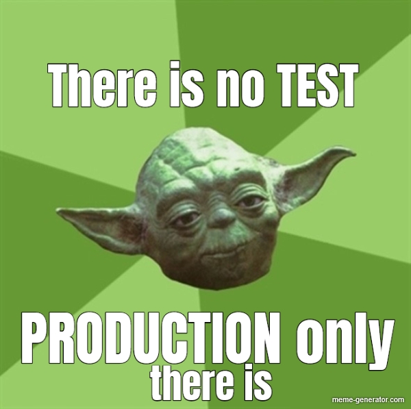


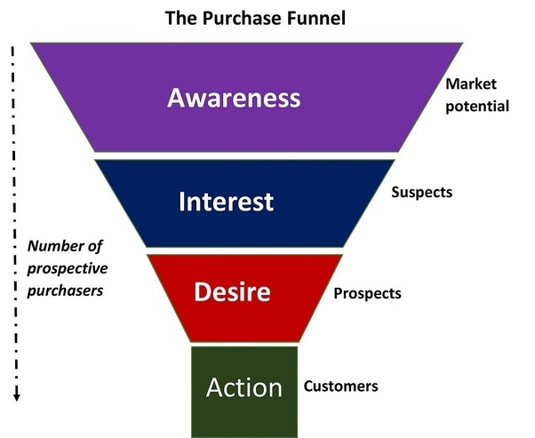


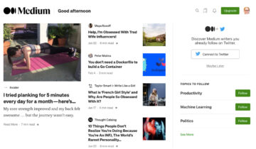
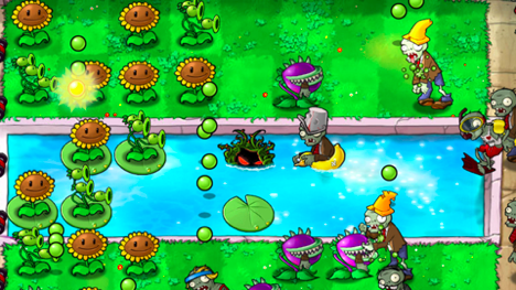


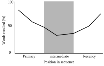


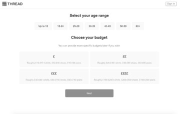

 Sarah Davis