“Oh man, sorry, my big thumbs!” my friend says, half laughing next to me. “Oh my god, now I’ve lost it!” I peer over my shoulder to glance at her screen – the film we want to see is starting in two minutes, and we’ve spent the last 10 trying to buy the tickets on her phone.
“We’re definitely going to miss the previews -” I start to say. “Sorry, walking and scrolling is hard!” She says huffily.
I see her scrolling and pinching the screen, presumably trying to find the ‘confirm payment’ button she’d been having trouble with earlier.
“Ok seriously, where is the stupid button?” She hits the back arrow.
“Oh nooo, don’t do that!” I say. “You’re going to have to enter your card details all over again!” “Let’s just buy the tickets when we get there at the counter. I know there’ll be a line, but this site is useless.”
“Ok fine,” my friend says, pocketing her phone. We both sprint to the cinema.
This little scenario begs the question – could that user experience have been better by simply adding a stick-to-scroll CTA? The short answer: Yes.
The Mobile Mind Shift, Thumb Zone and Thinking Contextually
“Our lives have become a collection of mobile moments in which we pull out a mobile device to get something done immediately wherever we are.”
Forrester Research’s Ted Schadler wrote these words when describing his idea of the ‘mobile mind shift’ back in 2014.
He was describing the impact of mobile technology on our daily lives, and what people all over the world have come to expect from their tablets and smartphones – and brands at large – namely:
Usability, accessibility, availability
Convenience and agility
Contextuality
These are big concepts that need to be applied to an entire business model, of course.
Zooming in on the micro-context of UI design, applying the principles of the ‘mobile mind shift’ can mean something as simple as making a main CTA easy-to-use, accessible and contextual.
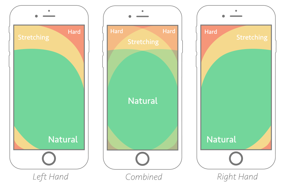
Above is an illustration of Steven Hoober’s notion of ‘the thumb zone’, or “the most comfortable area for touch with one-handed use.”
Chances are, if your main CTA doesn’t fall within the ‘natural’ reach zone, it’s going to cause frustration.
What’s worse is when your website or mobile app visitor starts scrolling and actually loses sight of your CTA – as we know, real estate on mobile is hard to come by, and every millimeter needs to be carefully thought through.
Browsing or goal-oriented searching on mobile is not the same as on desktop. When we’re looking to buy a movie ticket on mobile, we’re very likely walking around, multitasking or in a hurry. When we’re buying one on desktop, we’re likely to be less distracted, and can take our time.
On mobile, we’re in the moment. The UX and UI needs to take into account this context. Enlarged, stick-to-scroll CTAs – at least the main ones – can help an end user who’s in a hurry, distracted, using their phone with one hand while buying a metro ticket with the other, and who’s phone screen is a fraction of the size of their laptop’s.
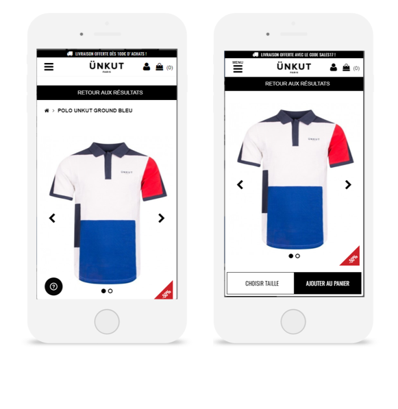
The French fashion retailer Ünkut saw the effectiveness of a sticky CTA firsthand after running an A/B test on its mobile product pages. From this test, CTA clicks increased by 55%, and transactions grew by 7%.
The French fashion retailer Ünkut saw the effectiveness of a sticky CTA firsthand after running an A/B test on its mobile product pages. From this test, CTA clicks increased by 55%, and transactions grew by 7%.
That’s why, by and large, the usefulness of stick-to-scroll CTAs on mobile for increasing conversions is no myth – we’ve collected countless use cases, from e-commerce to telecommunications, that prove its effectiveness. So we’re ready to label this ‘myth’ true – and if you have questions on how to apply a stick-to-screen element, don’t hesitate to reach out.
CRO Myth Busters is a mini series for conversion rate optimization professionals. We take a quick look at commonly held CRO beliefs and determine if they’re true, sometimes true, or simply CRO myths!
A recent study by Orbis Research projects that the global cosmetics market will reach 805.61 billion dollars by 2023.
That’s a huge potential for beauty brands to tap into.
It also begs the question – by 2023, what will shoppers expect these brands to deliver? What does the future of the digital customer experience look like?
What’s Working Today
To figure out what might work tomorrow, it’s best to start with what’s working well today.
To that end, here are a few of our most successful tests from our clients in the cosmetics industry.
Freebies
Many of the brands we work with have experienced big gains through better showcasing freebies – whether it’s a complimentary gift, free shipping or a discount.
Let’s take the iconic beauty brand, Sephora. They ran a test on their Portuguese website in which they added a progress bar to their basket pages and pop-ins, indicating how much more a shopper would need to spend before getting free shipping. This little nudge definitely motivated their audience! Average order value shot up by 8%, with 16% more clicks to ‘Continue to Purchase’.
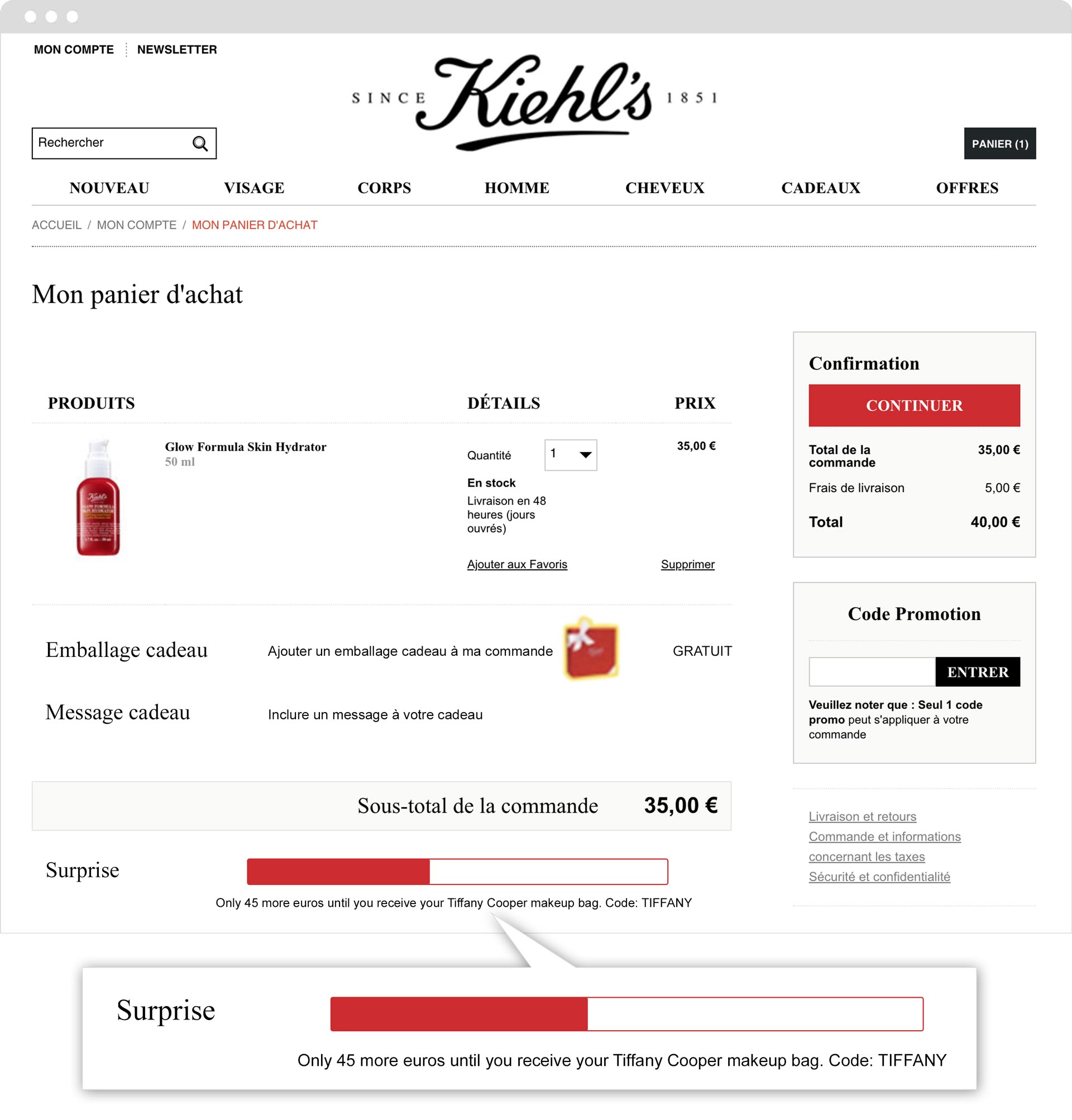
Kiehl’s ran a similar test on their French site, with equally impressive results. By adding a progress bar showing how much more a shopper needed to spend to get a free gift, they increased revenue by 31%.
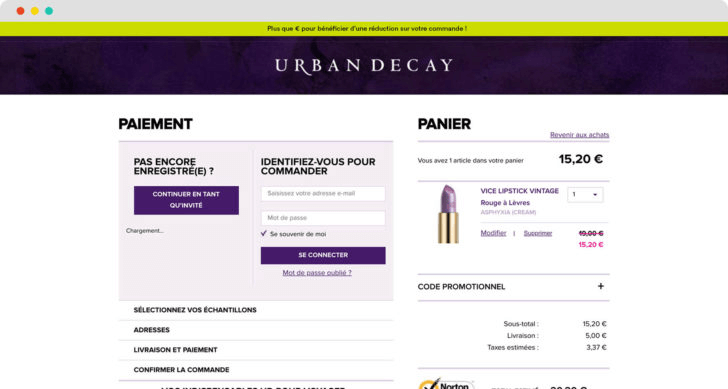
Still not convinced? Check out this example from Urban Decay. By simply pushing a banner on their basket pages showing how much more shoppers needed to spend before getting a discount, they increased their revenue by 7% during the duration of the test.
Social Proof
Along with gifts, discounts and free shipping, the use of social proof messaging is especially powerful when it comes to cosmetics. After all, there’s a big element of ‘following the herd’ when it comes to beauty products. If 100 other people bought this mascara in the past hour, it couldn’t possibly be clumpy! If 130 people are looking at this bright red lipstick, it must be flattering.
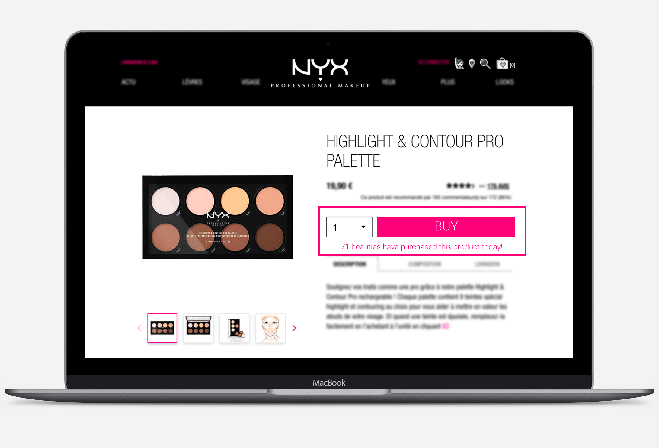
NYX Professional Makeup put this idea to the test – and doubled their transactions.
Emerging Trends
Virtual Try-Ons
The flip side of the ‘social proof’ coin is the idea of personalization. Yes, consumers want to be ‘in vogue’, and knowing what their peers are shopping for can stimulate trends and reassure browsers. But beauty products are also extremely personalitems. They tap into our feeling of being unique, of our desire to express ourselves. Of the thousands of shades of red lipstick, shoppers want to find the one that will look the best on them.
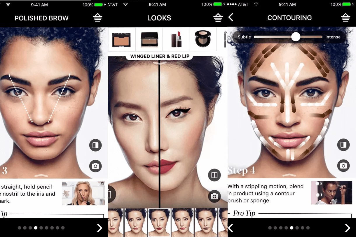
Virtual try-ons – the ability to use AR technology to simulate what a particular cosmetic will look like on you – is a fast-emerging trend that addresses this need.
The allure of a virtual try-on is multifaceted: not only can you experiment with looks at home or on the go, you don’t have to bother with endless cotton balls and makeup remover, like when you actually try them on physically in a store.
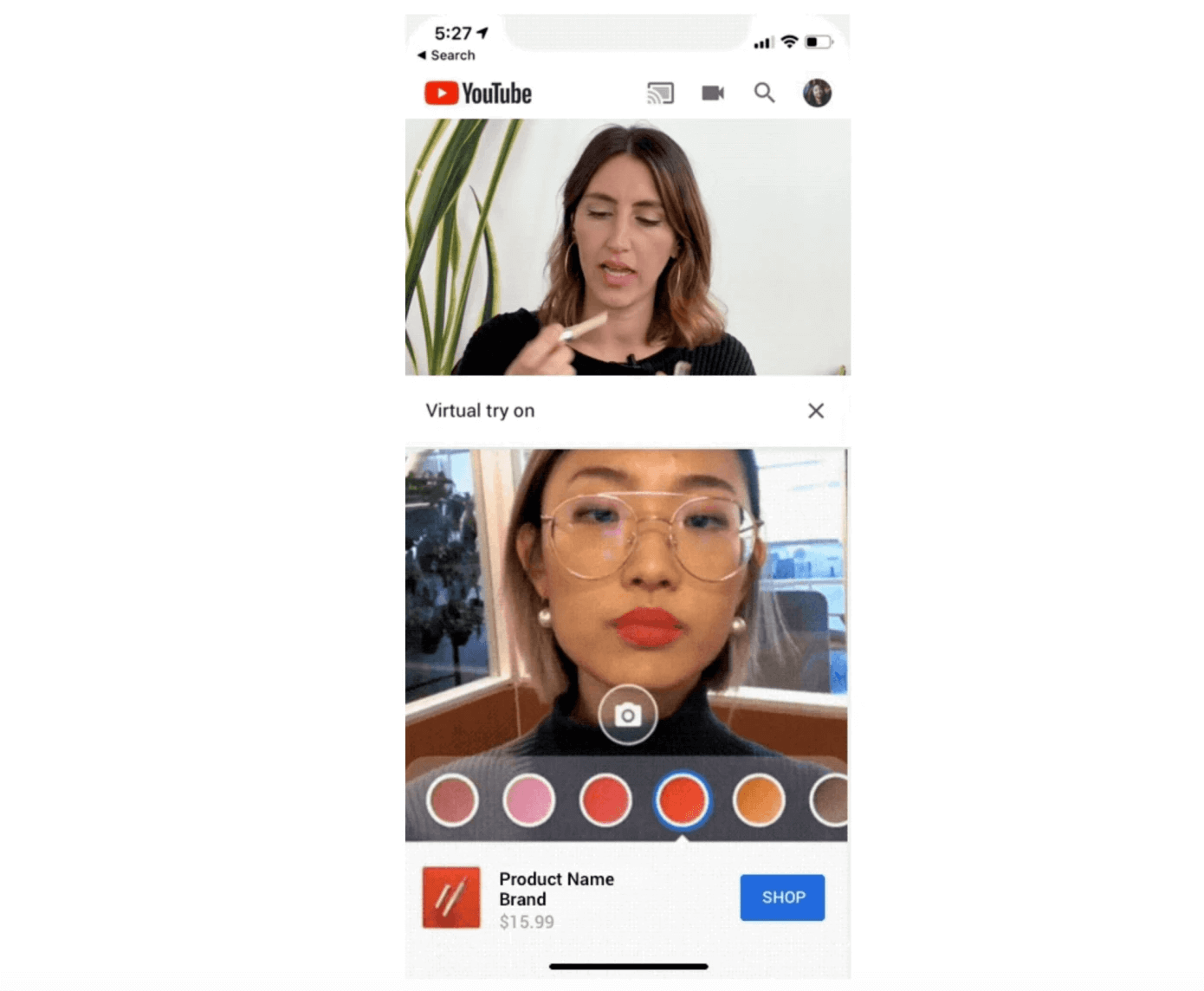
YouTube is currently experimenting with their own AR beauty try-on capability:
“Called AR Beauty Try-On, the feature is designed to be used in a split-screen experience while YouTube viewers watch the makeup tutorial. When available, the YouTube makeup review or tutorial video plays at the top of the screen, with a stream from your own front-facing camera below. Here, a YouTube viewer could access a palate of colors — like new lipstick shades, for example — and tap to apply them to their own face while the video plays above.” TechCrunch
Virtual try-ons continue to blur the lines between the physical and digital, in-store and online customer experiences, offering more flexibility, personalization and ‘on-demand’ experiences for consumers.
Beauty Tech
“According to Jean-Paul Agon, president and CEO of L’Oréal, the impact of new technologies, AI and the consumer experience will be stronger within the beauty industry than in any other consumer sector.” Peclers Paris
Many beauty brands already harness the notion of ‘science’ to legitimize and empower their products. Now, they’re going a step further to innovate technology that addresses their customers’ pain points.
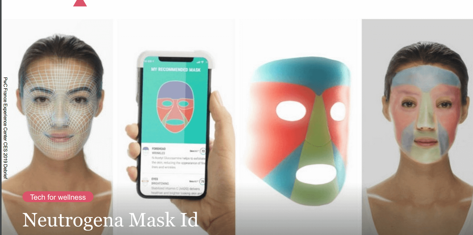
Neutrogena, for example, showcased their ‘Mask ID’ at this year’s CES event. After you scan your facial skin in order to have an in-depth understanding of your skin type, Neutrogena then sends you your hyper-personalized mask.
CareOS even taps into the realm of fairytale with their smart (magic?) mirror. The aim? “Help people meet their personal health and wellness goals, experiment with new products and practices.”
Takeaway
The cosmetics industry is booming, and is only slated to grow. Beauty brands are already improving the customer experience – and business results – through freebies, social proof messaging and other tried-and-true tactics. For these brands, the future of customer experience will be based on even more novel ways to personalize the user experience, harness emerging technology and blur the lines between physical and digital experiences.
Want more tips and experimentation ideas? Download our beauty book based on our client success stories.
There are several elements that go into creating a successful marketing plan for our digital era—with two important tactics being lead generation and SEO.
Lead generation is the process of cultivating an interest in your business to build an ongoing list of potential clients (or ‘leads’). As I mentioned in a previous article on B2C and B2B lead generation—all businesses need a steady stream of leads to grow and survive.
SEO, or search engine optimization, is the practice of refining web pages to ultimately improve their ranking on search engine results pages. The goal here is to have search engines (like Google) return links to your website when a user types in a relevant question or query. The higher your website ranks, the higher the likelihood that users will click, which not only increases the organic traffic to your website but your company’s online visibility.
At this point, you may be wondering what the connection is between these two strategies. First, it’s important to clarify that SEO and lead generation are not one and the same. SEO is focused on increasing web traffic. Lead generation is focused on increasing the number of clients/potential clients for your business. However, SEO can complement lead gen efforts by driving awareness for your company via organic traffic to the site.
In this guide, we’ll cover the ways in which you can effectively utilize SEO to help with your lead generation efforts, as listed below:
Audit Your Website
Perform Keyword Research
Update Existing On-page Content
Benchmark Your Competitors Performance
Create An Ongoing Content Strategy
Create a Backlink Strategy
Let’s begin.
Audit Your Website
Auditing your website is necessary to know which web pages are performing well and which need improvement. Which is why we suggest crawling your site as the first step. Luckily, there are various tools available to help with this.
For instance, Screaming Frog is a UK based search marketing agency that offers a free version of its website crawler. This tool can crawl your website and find broken links (404 errors), titles and meta descriptions that are over the recommended character limit (or even worse: missing), duplicate content, and so on—so you can fix these issues that are negatively impact ranking.
Check for Speed
Fast-loading pages aren’t just important for the user experience. Slow load times on desktop and mobile devices can negatively impact a site’s ranking as well, and contribute to high bounce/exit rates.
Try usingGoogle’s PageSpeed test to analyze specific web pages on your site for speed. It’s a free tool that also offers suggestions on how to improve the performance of those pages—a win-win.
Perform Keyword Research
As mentioned above, a central element of SEO is having your content surface for relevant keywords. Which is why keyword research is so important for steering SEO strategy and understanding topics of interest for your target audience.
Don’t create content based on assumptions or abstract terminology that people aren’t searching for—it’s a shot in the dark that more often than not, won’t work.
Identify the main keyword(s) for your business and build out a list of related terms and queries from there. These keywords should be the building blocks for an SEO content strategy. SEMRush Magic Keyword finder is a great tool, or there are free options like UberSuggest that analyze keywords and generate similar terms to help with this.
The relevant keyword for an article or blog post should be one of the first (if not the first) word in the titles and meta-description of your content so it’s recognized by search engine crawlers.
Update Existing On-Page Content
People want to read content that’s useful, engaging, and accessible. While SEO helps drive people to your website, it’s the quality of the content and the user experience that will get people to stay.
So, take a look at the existing content on your website. Is the language clear and concise? Does it offer insight or value to readers? A few SEO tips for website content: organize sections with headers and focus on a healthy blend of context and scannability (bullet points, numbered lists, etc.) and include images with alt descriptions, which will help search engines crawling.
Also, analyze page performance with your analytics tool (e.g. Google Analytics) and identify areas of your site that have high bounce rates (anything over 60%). These are the areas that should be prioritized when refining existing content.
Benchmark Your Competitors Performance
It may seem like a rather complicated task—analyzing your competitors’ performance with SEO lead generation—but it doesn’t have to be.
Keep a record of your competitor’s positions in search for the same or similar queries and analyze how well that page performs. If a competitor is performing better than you for the same search terms, dig into why this may be. Consider the structure of their posts, how they’re written, backlinks, and so on in this evaluation.
Understanding how similar content performs will help you parse out effective strategies for your own efforts—and can highlight aspects of your current strategy that may be dated and need updating, or even technical issues that are hindering your ranking.
Create an Ongoing Content Strategy
A steady stream of content that provides value to your target audience is key for lead generation. Once visitors realize that your insight can be of use to them in their day-to-day, they’ll be more willing to sign up for regular newsletters or fill out forms to access gated content.
This is why it’s important to create a content calendar to help your team stay organized and on a regular publishing schedule. Organize articles and topics by theme based on your keyword research. This will make sure you’re putting out content that people are looking for, which means a larger, more engaged audience.
An ongoing content strategy, combined with keyword research, will significantly assist any SEO lead generation campaign as creating content people are looking for will increase brand presence in search and bring in those all-important leads.
Create a Backlink Strategy
Backlinks are created when different websites link to one another. These links are crucial in improving ranking, as it’s seen as a vote of credibility for your content by search engines. However, not all backlinks are ranked the same. These inbound links need to make sense (not just linking to a random, unrelated piece of content). Getting a backlink from a trustworthy site with a high domain authority is key.
Also, for a backlink to have a positive impact on your web page ranking, it needs to have the tag ‘rel=follow.’ This essentially is a signal to site crawlers that they should follow this link to the corresponding website. No follow links (that have the tag ‘rel=nofollow’) tell search engine crawlers the opposite, and prevent the link equity from being passed through.
While backlinks are a huge component of SEO, building these inbound links can be tougher than it sounds. Remember that Google is highly suspicious of any artificial linking activities and will penalize sites that have backlinks that don’t appear to be organic or link to irrelevant content—we do not recommend buying links or resorting to shady strategies when it comes to inbound links. More likely than not, it will backfire and hurt your ranking.
Instead, look at your website’s current backlink profile and see if there are any broken links that need to be fixed—this is an easy way to improve SEO while you work on getting high domain authority backlinks from other sites. On that end, consider existing relationships your brand has and if there are any opportunities for there to gain a backlink—perhaps with a guest post or if you spot an article of theirs that could benefit from linking to one of your site’s articles (to provide additional context to the topic).
Key Takeaways
Creating an SEO lead generation campaign is not only going to ensure your ongoing marketing efforts stand a great chance of succeeding in an oversaturated market, but it will also help future-proof your web content by maximizing the opportunities to gain new leads with a strong online presence and a great user experience.
As well as simply conveying the core message of the email, adding “video” to the subject line piques a reader’s interest, compelling them to open the email.
Simply put, they want to know what’s in the video.
#3 Build Trust and Authenticity
Using videos is a great way to build trust and to establish a connection with your audience.
It puts a face and a personality to your brand, allowing your audience to get a feel for the person or team it is dealing with.
You can establish trust by sharing tips, insight into your business operations, or just fun videos to build rapport. It’s also a great way to warm up your audience to a product or service.
To build trust using videos, consider implementing the following tips:
Have the same person present the videos consistently: Over time your audience will start to feel like they know that person. This helps to establish a personal connection to and trust of your brand.
Create useful and free video content for your target audience: You’re perceived as a credible and authoritative expert in your industry, which builds deeper trust and creates a (future) desire to pay for your expertise.
Create videos that show positive and negative brand experiences: Consider using personal stories or a sneak peek of your office. Be genuine and human and you’ll earn people’s respect and trust.
#4 Social Media Shares and Boosts to SEO
A huge bonus of using video email marketing is its indirect effect on your search engine rankings.
This increases your social engagement, which in turn boosts your brand in the search engines.
While social media engagement itself is not a ranking factor for Google (it is for Bing, however), it does amplify other ranking factors that Google does use.
Social sharing increases the visibility of your content. The more people that view your content, the more likely it is to get shares.
Nowadays people live busy (and distracted) lives. Plenty of people would rather watch a one-minute video than spend 15 minutes reading a long-form article.
A benefit of videos is that they can quickly and easily get across your core message and grab the attention of viewers. Even complex subjects can be made easier to understand.
Videos are more interesting and engaging (when compared to text alone) and can have a bigger impact on your readers.
Videos can go viral quickly and viewers respond more positively to a product after watching related videos.
#6 Stay Out of the Trash
There’s nothing worse than spending hours of your valuable time building an email campaign for it not to be read, chucked unceremoniously in the trash, or worse still, marked as spam.
Luckily, good-quality, interesting, and engaging videos capture the attention of the reader and reduce the likelihood that your email will go straight into the trash.
When done well, it’s also a valuable opportunity to give an excellent impression of your service or product.
How to Incorporate Video Content into Emails
Now you know the benefits of using videos in your emails, here’s how to add videos to your email marketing campaigns.
Technique 1: Embed Videos into Emails
You can embed videos directly into emails.
The reader should be able to view a playing video without leaving their inbox, which, in theory, sounds like a great user experience.
But despite the fact this technology has been around since the ‘90s, videos embedded into emails come with a host of serious flaws.
Due to spam and security precautions, many email clients do not support embedded videos.
Not all email clients (even the big guys like Gmail, Hotmail, or Outlook) can support the more recent video format, HTML5.
In other words, when you embed a video directly into an email, there’s a chance that the reader won’t be able to view it as you intended.
Does that mean you should abandon using videos in your emails? No, the benefits of using them are too high.
Rather, you need to use a technique that is guaranteed to work, every time.
Technique 2: Use a Video Thumbnail Image
To counter the inherent downsides of videos embedded into emails, marketers often use a video thumbnail image within the email which links to a landing page where the video lives.
Inside the email, create an image that looks like a video. When the image is clicked the reader is taken to your website or YouTube to view the video.
The video isn’t hosted in the email, which actually comes with some powerful benefits:
The video will definitely work (unlike Technique 1)
The video can be set to autoplay on YouTube or your website, meaning as soon as the user clicks the video, it plays
More traffic is converted from your email to your website, meaning more page views and more website interactions
By adding CTAs on the video landing page, you can move the reader through the sales funnel
Types of Video Email Marketing Campaigns
Data shows that video in email is effective and hosting a video on YouTube or your website is so easy to set up, what are you waiting for?
Here are some effective ways to start incorporating more video content into your marketing emails today.
Personalized Emails for Sales
Creating personalized videos is an excellent way for sales teams to convert leads. Plus, with tools like Wistia, it only takes a minute or two to record, edit, and send a video.
Wistia’s Google Chrome extension allows you to record your screen and yourself at the same time, edit the video, and then easily send it over to your customer or prospect.
You can add a personal greeting to the recipient, allowing you to personalize your sales efforts and significantly increase your response rates.
Plus, with companies finding a 36.9% higher close rate when using personalized videos with email, it’s got to be worth a try.
Use Videos to Tell Customer Stories
Take a moment to consider what is more genuine:
your brand telling a customer why they should buy, or
a customer talking about their positive experience with the brand.
It’s a no-brainer. Potential customers are far more likely to trust customers than the brand itself.
Some 76% of people believe that content posted by customers is more trustworthy than brand content.
Using an existing customer to explain their experience on video is an excellent way to sell your services or products. It’s genuine, personal, and highly trustworthy.
To increase conversion rates, go one step further and include these videos in your email marketing campaigns.
Consider Using GIFs As Well As Videos
In general, videos perform best when they are short and sweet.
Consider your audience and your product or service. Is your audience younger and tech savvy?
If so, it could be worth considering using a short GIF instead of a full-blown video.
GIFs are easy to insert into emails, quicker than videos to make, and can be equally engaging.
Consider these questions before adding GIFs to your campaigns:
Does it reinforce your message?
Does it highlight the most important parts of your email?
Does it emphasize the features of your product or service?
Does it add some fun or excitement to your message?
Does it offend your audience?
If you do decide to use GIFs, make sure you don’t overdo it. They can be distracting and annoying, so a general rule of thumb is to only include one or two per email.
In the example below, the GIF makes the email design more interesting, grabs the attention of the reader, and delivers emotions in a more personal way.
Over to You
Now we’d like to hear from you.
Are you going to use embedded videos or send readers to your website?
Either way, let me know by leaving a comment right now.
But, appealing to the modern consumer has become increasingly difficult. Lead generation needs to be personalized, innovative and focused on providing value to your target audience. It’s about cultivating a relationship with people that gradually convinces them that your product or service is exactly what they’ve been looking for.
That is how brands will stand out against the competition and pique interest among consumers who’ve become quite good at glazing over messages and advertisements that aren’t immediately recognized as being relevant.
Unlike B2B lead generation, which is generally marked by longer sales cycles and involves multiple decision-makers, B2C lead generation deals with the individual consumer. This means the lifespan of a sales cycle is generally shorter, and is more prone to decision-making that’s rooted in emotion.
We outlined four great strategies to kickstart your B2C lead generation strategy below. (If you’re more focused or interested in B2B lead generationclick here.)
1. Connect Your Email Marketing and Social Channels
When it comes to creating an innovative strategy for B2C lead generation, a great place to start is your company’s social channels and email marketing.
Social media and email have the ability to reach a large audience or customer base with relevant messaging that appeals to user interests. Work on connecting these two ecosystems to ensure that regular visitors to your site are following you on social media (and vice versa).
When it comes to generating some great new leads in an over-saturated consumer market, having a water-tight content strategy is the key to success. Any content you create—whether it’s email marketing, social posts, blog articles-—needs to be of the highest-quality to really help accelerate your lead gen strategy.
Informative, polished, content helps build trust in your brand among current and potential clients. Using personalization to put the right content in front of the right person will elevate your efforts even further.
Be sure to incorporate SEO into your strategy to make sure your content is surfacing on top Google search results pages for increased visibility. Perform keyword research to understand what your customers and target audience are looking for, and build out content topics from there. These keywords should be present in the title and throughout the body of the article (when appropriate), and content should be organized into sections with headers for better indexing.
And above all, focus on creating informational and engaging content, not something that’s overly promotional or pushy, as this may put off users in the early stages of interacting with your brand. The goal here is visibility, establishing your company as a leader in its field, and showing how you’re a resource for customers’ needs.
3. Invest In Your Website
To ensure your brand stays relevant and engages the modern consumer, your website needs to be optimized to create a seamless customer journey. Remember to design with the user in mind.
Consumer behavior has shifted dramatically in recent years with the growing advancement of digital platforms. People are increasingly reliant on their smartphones to research products (at home and in-store) and expect to have the same quality experience as they would on a desktop or tablet. Fast loading times (across devices) and a responsive website are necessities for B2C lead gen. In fact, according to Think With Google, once web pages take more than 3 seconds to load, the bounce rate spikes dramatically.
Continued testing will ensure your website remains aligned with visitor interest and is easy to navigate. Even small changes (e.g. reordering or renaming headers in the navigation bar) can have a huge impact on the overall user experience—and your lead generation.
4. Cross-Channel Paid Adverts
Cross-channel advertising is when a company runs paid advertisements that appear across channels and on various devices (you’ve likely seen paid adverts from companies on social media, search results pages, and even on third-party sites).
Social media channels such as Instagram and Facebook are great channels for reaching customers with targeted based on user interests. Personalized adverts use artificial intelligence gathered from social media channels, allowing companies to then create customer profiles for more precise targeting. By funneling a potential lead through an advert that appeals to them, the brand can then gain more details about the user through a simple form, sign-up notification or email pop-up box, before the person continues on their journey to the site.
Google paid adverts, also known as PPC ads, ‘buy’ a place at the top of relevant search results which means: high-visibility. Again, paid traffic can be funneled directly through to a landing page with a form or some kind of email capture, before the visitor is redirected to the website.
Paid campaigns are quite effective, even on the smaller budgets, but they do rely on as much data as possible to better target high-quality leads that have a greater likelihood of becoming customers. The ‘cost per click’ vs. the ‘cost per lead’ will need to be closely monitored to ensure you aren’t paying high advertising costs for a lower return on investment. If you’re considering using paid advertising for your next lead generation strategy, invest in a campaign tool to help obtain details from potential customers and target them with highly-relevant content to help them remember (and continue to interact) with your brand.
Conclusion
Whilst these strategies work really well in isolation when it comes to gaining some great new leads for any B2C brand, they also complement each other’s strategy and can work really well as a combined approach too. When it comes to improving your brand presence and attracting new contacts, being creative with your approach is imperative. As B2C marketing becomes more personalized, driven by data obtained from the user and their behavior online, there is more emphasis on brands to come up with new and clever campaigns to engage with consumers.
As with any marketing campaign, we are always in favor of A/B testing each of these strategies as it will give you much more insight into what potential leads respond best to. Whether it’s A/B testing your paid social adverts, changing the language in your email campaigns or creating versions of the same landing pages and A/B testing language, colors and even the positions of the call to actions- the possibilities are endless when it comes to testing. Gaining as much data about your unknown leads will help your brand appeal to their interests, allowing you to target them on platforms they frequent with personalized content that is likely to generate a lead.
Combining marketing tools with your next lead generation campaign strategy will ensure your brand stays ahead of the competition and keeps up with marketing, using a data-led approach in a digitally-focused industry.
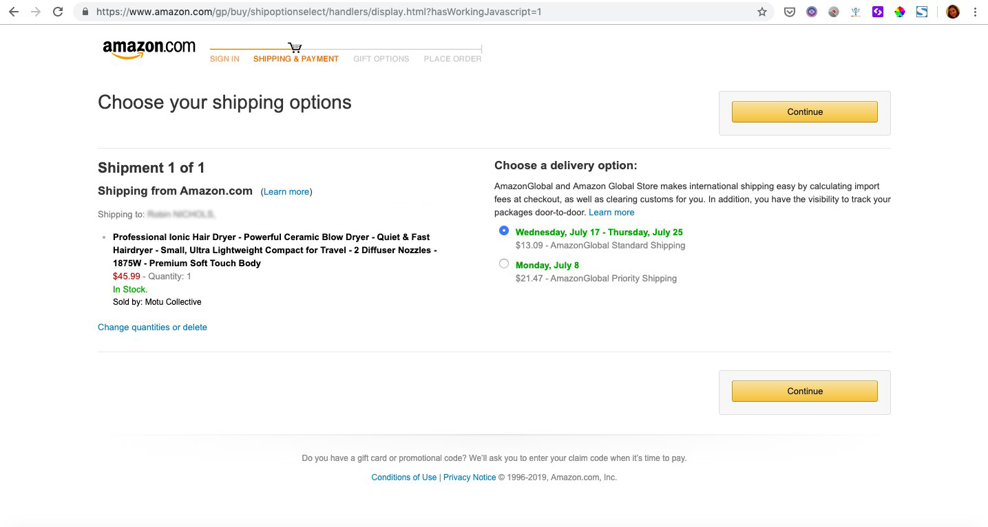
You’re browsing on a typical e-commerce website, looking for a new hair dryer. You poke around a few product pages until you find what you’re after, and add your product (Power Dry 500) to your basket.
Once at the checkout page, you realize you forgot to see if the appliance comes with a diffuser – the last thing you want are dried out locks. You decide to go back to the product page to be sure. You move your mouse confidently to the top of the screen to the navigation bar to make your way back – but lo and behold, it’s disappeared!No nav bar in site on the checkout page.
Slightly annoyed, you exit the site entirely – you’re late for drinks with friends anyway – and tell yourself you’ll buy it over the weekend. But Friday night, you pass by a department store on the way home. You pop in and find the perfect Pro Dryer Soft and Smooth appliance. The e-commerce site is out a purchase.
So, as a Conversion Rate Optimization professional, now you’re wondering – should that site have kept the navigation bar on the checkout page?
Let’s see if it’s CRO myth, fact, or fiction.
The Navigation Bar: Problematic Distraction or Useful Cross and Upsell Enabler?
There are generally two schools of thought when it comes to the question of whether to include a navigation bar on the checkout page. The first school argues that it’s important to keep the visitor oriented, and that it can increase upsell and cross-sell opportunities, like in the example vignette above. The second school argues it’s mainly a hindrance, distracting the visitor from the immediate goal of finalizing the purchase already underway.
At AB Tasty, we’re generally of the second school – a navigation bar on the checkout page is usually a distraction.
Navigation Bars on Checkout Pages are Distracting
Why? Because we’ve rarely seen an experiment where adding the nav bar has helped, and not hindered, finalizing a transaction. And you don’t have to take our word for it – Amazon, the e-commerce page design expert par excellence, was the pioneer of throwing the checkout page nav bar to the curb.
Amazon was one of the first e-commerce sites to ditch the navigation bar during checkout.
Just look at the example above – as soon as you put an item in your basket and proceed to check out, the standard navigation bar, plus the search bar, vanish. They’re replaced by a short, focused (and unclickable) progression bar to tell them just where they are in the checkout process, and some very visible next step CTAs.
And really, this makes sense. There are a fair amount of steps to go through before finalizing a purchase – confirming your address, payment info, shipping times. At this stage, a navigation bar is just one more glittery object that could pull a website visitor out of a ‘buy now’, goal-oriented mindset and back into browsing mode. And while browsing can obviously lead to sales, when you have someone so close to converting, you want to focus on closing the deal at hand.
Breadcrumb Compromise
Now, we’re not saying to drop your visitors on a desert island with no escape route, of course. Keeping your company logo, say in the corner of the page, will at least enable them to get back to the homepage.
And if you still think your website visitors need a bit more orientation, you can compromise by adding a breadcrumb navigation path to your checkout page. This way, they can at least easily backtrack, to say, double check they chose the right mailing address or payment option. This still keeps them in the goal-oriented ‘buy now’ mindset, and enables them to convert the current opportunity.
We saw this type of compromise work very well for our client Sephora. In part by adding a breadcrumb style navigation (Your Basket – Your Delivery – Your Payment) to their purchase pages, they were able to increase transactions by 12%.
Sephora launched a multivariate test to determine the best checkout page design. The winning variation included a breadcrumb navigation bar, shown above.
So, final conclusion? The idea that it’s better to keep a navigation bar on your checkout page is a MYTH, with the caveat that a breadcrumb navigation system can be an effective compromise.
CRO Myth Busters is a mini series for conversion rate optimization professionals. We take a quick look at commonly held CRO beliefs and determine if they’re true, sometimes true, or simply CRO myths!
Facebook’s Ads Manager is a marketing powerhouse. Even with a $5 daily budget, you could reach hundreds of thousands of people in your target audience. A report by Buffer estimated that as many as 91% of marketers use Facebook ads. Facebook marketing continues to push full steam ahead.
Although Facebook ads can be great for drumming up brand awareness, knowing how to A/B test your ads is the secret to long term success. Without it, you’re just guessing at what works instead of rigorously analyzing and improving your approach. Consistent A/B testing (also known as split testing) provides the analytics you need to improve your strategy, boost engagement, and increase your click-through rate.
Read on for a step-by-step guide on how to A/B test your Facebook ads. By the end, you’ll know how to set up your own A/B ads on Facebook, and the best presets to choose for each option along the way.
But First, What is an A/B Test?
A/B testing your Facebook ads can teach you more about your audience’s preferences.
A and B refer to the versions of the ad. Your A version acts as the control. It’s the ad version you’ve seen work in the past or believe will work best. Your B ad version implements a variable. It’s a variation of A and is meant to compete with your A version.
If A beats out B, then you keep running the A ad and make a different change to B to try again.
Once the B version performs better than A, B becomes your new control – your new A. Your original A is discarded or archived. The new A now acts as the baseline to beat when you split test again in the future.
Split testing is meant to help identify which variables pull the most weight and altering the parts that don’t support conversions.
Before you begin split testing, be sure you’re clear on what specific goal you have for that ad. Usually, you’ll be looking for post engagement, such as a click-through to the website or increasing sign-ups.
Don’t forget to check that the click-through destination matches the promise of the ad. If you were offering a discount on a pair of sneakers, make sure that’s precisely where your audience ends up.
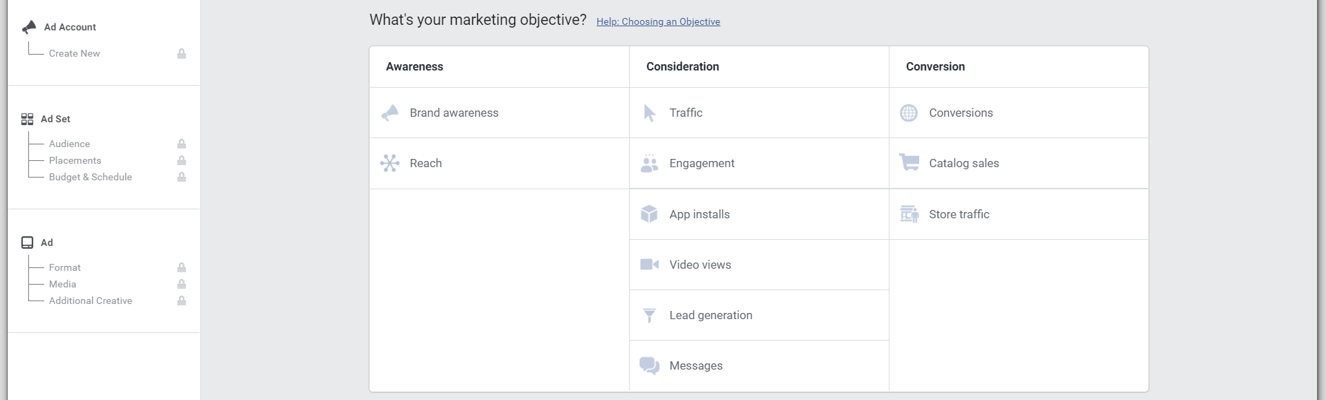
Three Options to Get Started in Facebook’s Ad Manager
Facebook gives you three options to create a split test.
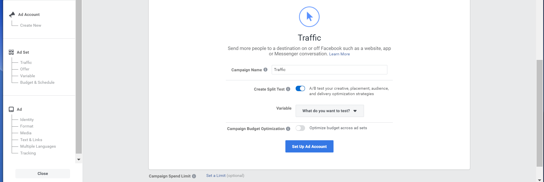
Guided creation: Facebook will walk you through the process of creating a split test. Once you complete their questions, your ads will be ready to go. This method works best if you’re new at Facebook advertising or prefer a step-by-step guide. The screenshots below show walkthrough this method.
Quick creation: Facebook lets you design the structure for a split test. This structure can be saved and deployed at a later time. This can be helpful if you know what you plan to test, but your campaign doesn’t start for another week.
Duplication: If you’ve run Facebook Ads before, the Duplication method allows you to add a new ad set or alter an existing campaign for your split test. We’d recommend this if you want to test one variable in an ad you’ve already run.
There’s no wrong choice since it’ll depend on your preference and history of running Facebook ads. For more detailed steps on each option, review their Help page here.
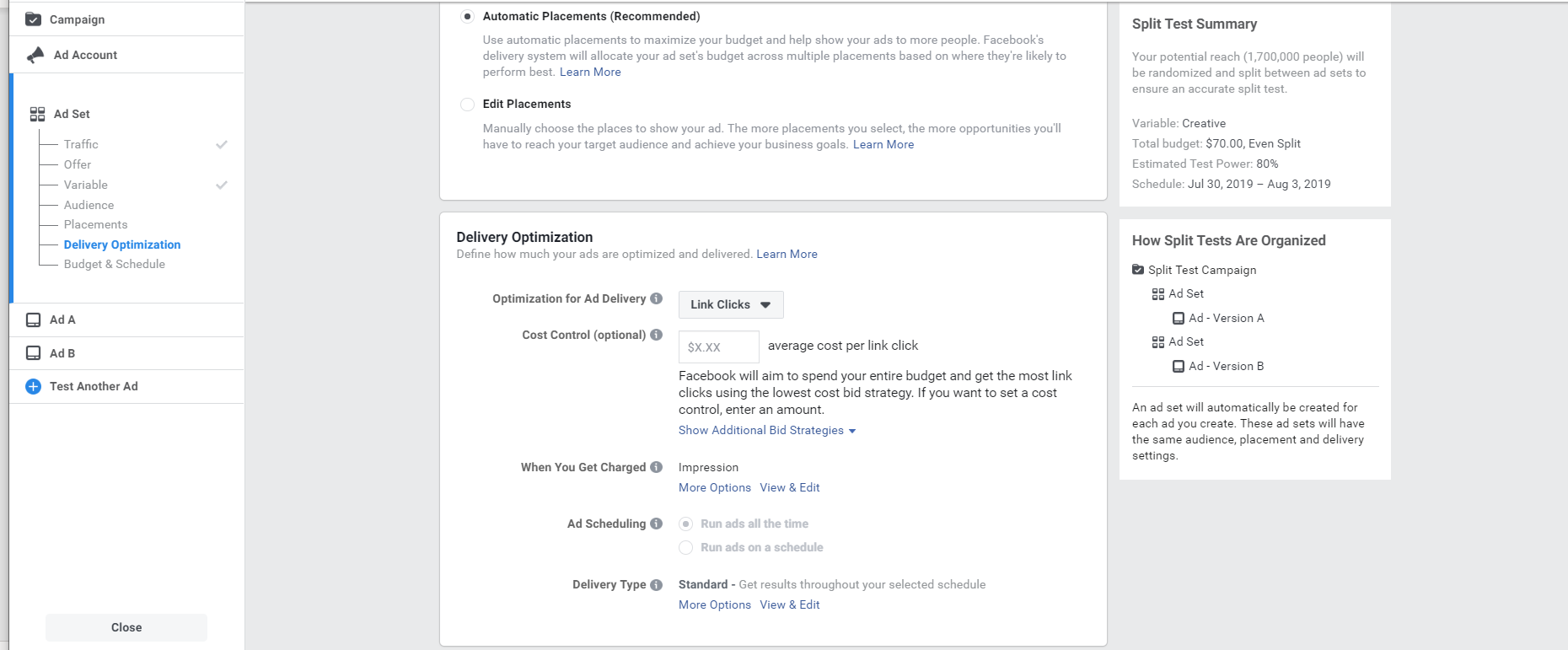
Select Your Ad’s Objective & Variable
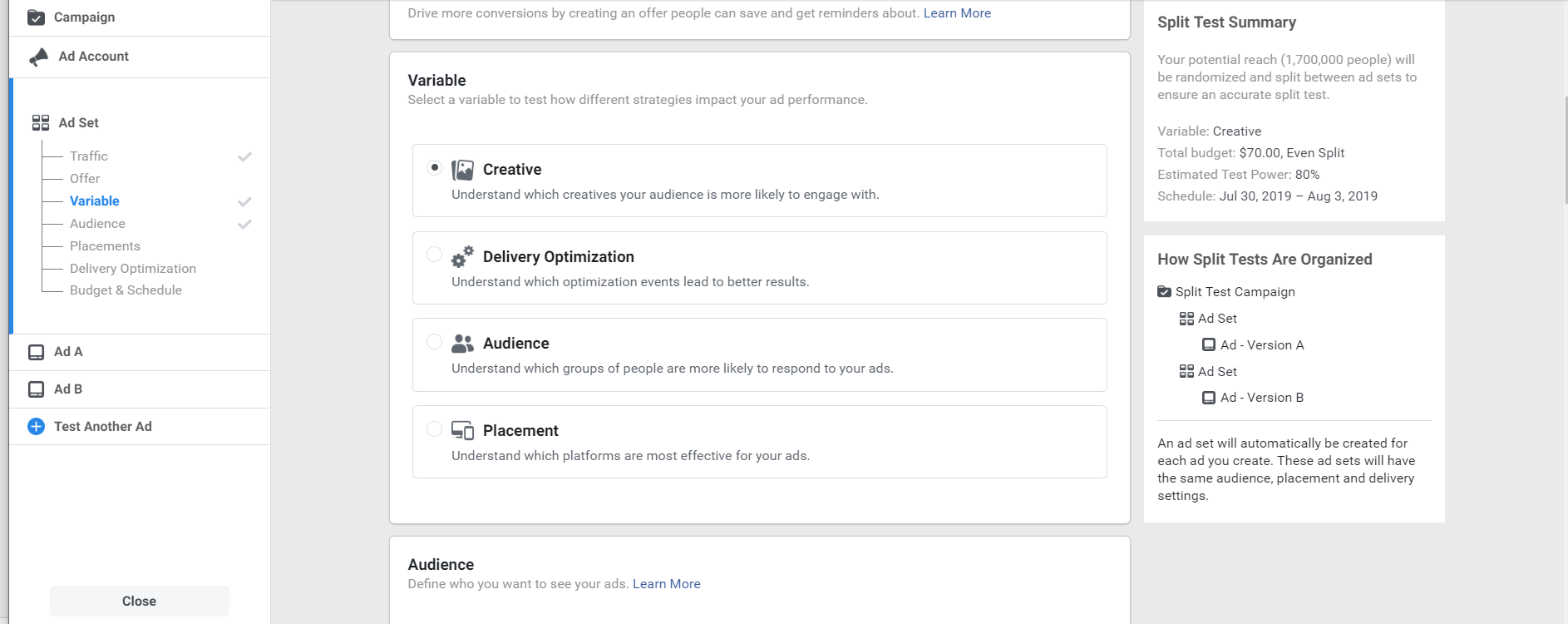
Select the objective that you decided on earlier. Once you choose one of these options, a menu will appear. Select “Create Split Test”, then select the variable you plan to change. The dropdown menu options are creative, delivery optimization, audience, and placement.
Creative: Design changes such as video, image, description, etc.
Delivery Optimization: Delivers ads to the Audience that is most likely to do your desired action (landing page views, link clicks, impressions, daily unique reach).
Audience: Change the target audience for the ad.
Placement: Changing which platforms your ad appears.
Once you choose that, Facebook will walk you through the next several decisions you need to make. This includes deciding where you want to drive traffic, creating an offer, choosing an audience, optimize for ad delivery, and setting a budget. Here are menu screenshots of each. As you can see, there’s a high-level of customizability available for each ad set you run.
Variable
Although you selected this already, you have the option to change it again here. In Facebook’s Ads Manager, you’re only allowed to select one variable at a time. Like we recommended earlier, this is the best way to know which variables caused which change.
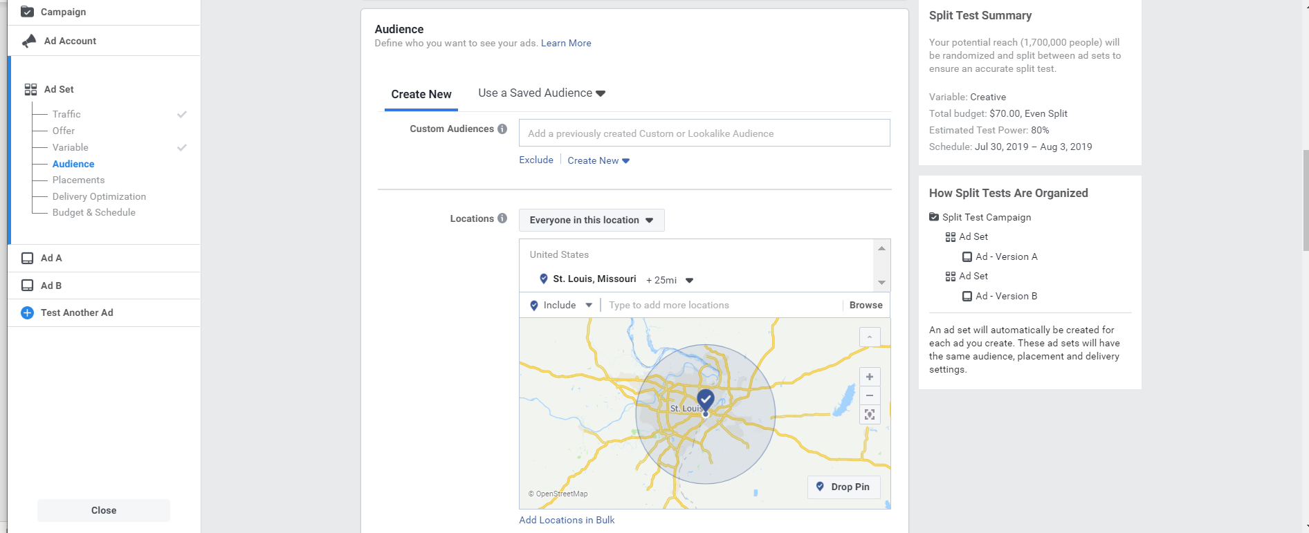
Audience & Placements
The next two sections are audience and placement. These will both depend on your specific brand and location, so you’ll need to navigate this on your own. Audience can be narrowed down by location, sex, age, and even by past engagement with your page. Consider your target audience’s personality, including their hobbies, interests, and lifestyle. Once you determine a target audience, you can save that cohort and alter it in the future.
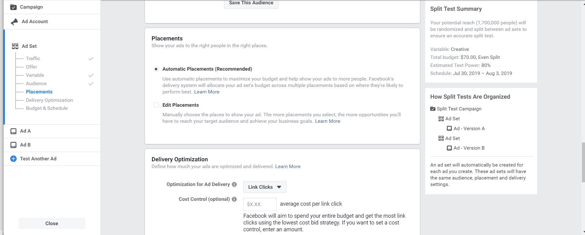
Because Facebook placements cover such a broad range of formats and platforms (think everything from Instagram stories to Messenger Inbox), it’s probably best to leave it on recommended. Facebook’s Ads Manager uses its database of ad analytics to determine the best combination of placements for your ad. As you continue to analyze your results, you can create custom placements in the future.
Delivery Optimization
In this section, you can optimize your ad delivery for specific conversions such as link clicks, landing page views, impressions, and daily unique reach. This should reflect the original goal you set out for your ad. You also have a choice between getting charged per impression, or per click.
For ad scheduling, we recommend narrowing your time to when your audience is most likely to be interested in your ad, or at the very least awake. For example, if you’ve seen that your ads tend to convert in the morning, that’s when you should schedule your ads, you get the best chance at ROI.
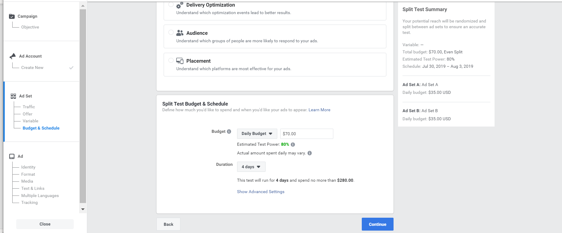
Split Test Budget & Schedule
This is where you can determine how much to spend, and the runtime of your ads. Here you have the choice of a daily budget vs. a lifetime budget. For example, if you decide to spend $70 a day for a 4-day campaign, your daily budget would be $70, and your lifetime budget would be $280.
If you choose daily budget, Facebook will spend up to that amount per day, regardless of performance on the account. Daily budgets don’t allow for ad scheduling since it’ll be working to spend that set amount.
Facebook is more budget and result-conscious with the lifetime budget option. Choosing lifetime budget means Facebook will alter daily spend levels in response to campaign results.
Don’t forget to keep an eye on the “Estimated Test Power”. This percentage is the likelihood of detecting a difference in your ad sets if there is one to detect. Facebook recommends you keep this test power at 80% or above for a worthwhile split test.
Once you’ve made your selections, you can click continue to upload and design your ad control.
Design Two Versions of your Ad
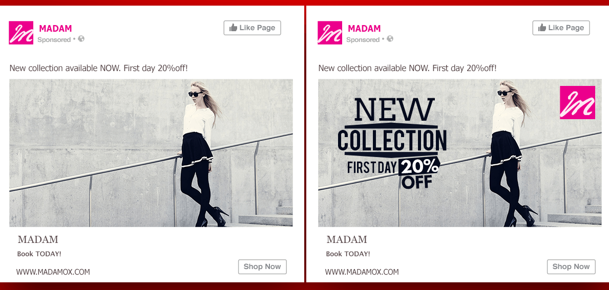
A/B Test of the Same Ad: Photo Credit to Jeff Bullas
To split test, you’ll need to create one control (A), and one variable (B). Regardless of which variable you’re testing, it’s best only to change one so the results are clear. Some audience-facing variables you might switch could include changing your call-to-action, using a different image, or remove the image entirely.
Regardless of which you choose, be sure the final ad is noticeably different than before and is an aspect that’s broad enough to be applied in the future.
For example, if you’re marketing a winter holiday, don’t A/B test between two different photos of a decorative table setting. Choose a photo with a person, add text to the image, or remove the image entirely. That way if you’re advertising a summer holiday in the future, you’ll be able to paint a more generalized picture of what sparks interest in your audience.
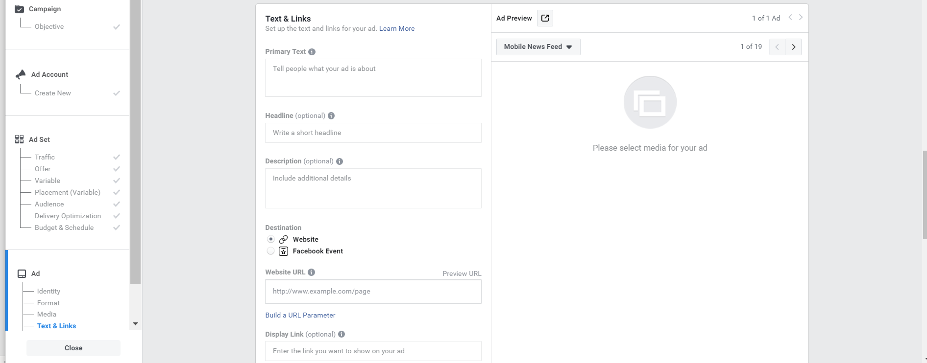
Once you’re ready, input your ad into Facebook’s platform. Be sure to preview your ad (top right) and create URL parameters (bottom left) so you can track which engagement came from where.
When you’re ready, click the “Continue to ad B” button in the bottom right corner. This page auto-fills with the same information as ad A. It’s here that you introduce any variables, such as changing the audience, ad format, or other specs.
Finally, you click the green “Confirm” button to finalize and purchase the ad.
Review the Results
Once your ads are finished running, it’s time to review the results of your A/B test. Drawing actionable conclusions is the most important step in increasing your ad’s CTR. Thankfully, Facebook Ads Manager makes this easy.
First, apply a filter so that only relevant campaigns and ad sets that were part of the split tests will show in the reporting table. To do this, click Filter and choose Split Test from the menu.
For a quick initial result, ads Manager puts a star next to the winning ad set. Facebook determines the winning set by comparing the cost per result of each ad set and other variables.
Facebook Ads Manager will also send you a detailed email report, that includes:
Their Winning Ad Determination
Your A/B Test Settings
Results
Cost
Amount Spent
From these results, you can determine what worked and what changes you’d like to make for your next Facebook campaign.
—
Understanding Facebook advertising and split test marketing is a worthwhile investment for any marketer worth their salt. 80% of all internet users have a Facebook Account, meaning that you’re practically guaranteed to reach your target audience on the platform.
Using their Ads Manager, you can build a robust and ever-improving marketing strategy using their analytics. Over time, you’ll see an increase in revenue, sales, and lead generation. Once you have everything prepared, it only takes minutes to set up a Facebook Ad, so get started today!
A central element of digital marketing is conversion rate optimization (or refining the user experience on webpages, campaigns, and so on) so visitors are more likely to complete a desired action. This action, which is often referred to as a conversion, could be completing a form, downloading a white paper or even making a purchase, depending on what goal a company is focused on measuring at that point in time.
If you’re new to the world of conversion rate optimization, the digital marketing industry, or just want to brush up on your knowledge of CRO, we’ve listed nine great books from industry professionals and thought leaders in this field to help.
These books are fantastic resources packed with guidance and tips that can help create successful campaigns that ultimately increase the number of conversions for your business.
Time to update your reading list.
1. Landing Page Optimization: The Definitive Guide To Testing and Tuning for Conversions by Tim Ash
Considered a voice of authority when it comes to landing pages, SEO, and all things search marketing, the author and marketer Tim Ash has put pen to paper to share his knowledge on creating high-converting landing pages. Despite originally being published in 2008, Tim’s advice has stood the test of time and remains highly relevant for anyone reading it today. It’s a top recommendation from us.
Get the book here, or check out this dedicated section of our blog for more on refining landing pages.
2. Making Websites Win by Dr. Karl Blanks and Ben Jesson
This book is a collaboration between two well-known marketing whizzes—Dr Karl Blanks and Ben Jesson—who have spent their professional lives deeply involved in the world of digital marketing and run a company called Conversion Rate Experts. It’s safe to say that reading this will place you in great hands. The two marketers decided to write down their very own customer-centric methodology they’ve spent years applying with excellent CRO results. This book is bursting with tips and suggestions they’ve learned along the way, along with reflections on mistakes they made (so you can avoid them). This is a great book to consult when it comes to defining CRO strategy or when looking for mentorship on how to succeed in this field.
While this book incorporates some great advice on improving conversion rates, Don’t Make Me Think is a must-read for designers, user experience specialists, and digital marketers. Steve Krug examines how users navigate websites and the science behind creating a web page that converts. Steve says the secret to success is giving users all the information they need upfront and removing the need for them to think, which in turn creates more intuitive interfaces and overall easier user experience.
This is a great read for anyone wanting to improve their UX and gain more insight into how people typically browse.
4. Website Optimization: An Hour a Day – A Conversion Rate Optimization and A/B Testing Guide by Rich Page
Rich Page outlines all the basics when it comes to improving conversion rates and optimizing your web campaigns. This book breaks down CRO tools, metrics, and important elements on a webpage to test, referencing an hour a day approach for professionals looking to deepen their understanding. Rich dives in to email marketing, search optimization, and personalization, imparting his own wisdom from spending years in this industry.
This book is a great investment for anyone who may be new to the world of conversion rate optimization and is looking to get up to speed.
5. Conversion Optimization: The Art and Science of Converting Prospects to Customers by Khalid Saleh and Ayat Shukairy
Another collaborative success on the topic of conversation optimization, this time from the co-founders of Invesp: Khalid Saleh and Ayat Shukairy. Both Khalid and Ayat have spent many years working in the digital marketing sphere and come together to help other professionals work out the science behind a well-performing, high-converting webpage. The Art and Science of Converting Prospects to Customers covers everything from establishing customer personas, how to understand your current web usability, and how to spot and overcome current issues that may be staving off conversions.
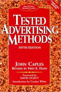
One of the defining features of AB Tasty is our dedication to experimentation. We are strong advocates of testing, and have seen time-and-again the precision it brings to optimization. Which is why we highly recommend reading John Caples’ Tested Advertising Methods.
While it was originally released in 1932, this book has been revised many times throughout the years, with Fred Hahn providing the latest version for marketers in the digital sphere. Testing Advertising Methods is more content-focused, honing in on what copy engages consumers and ultimately convinces them to act. Reading this book will certainly incentivize you to start A/B testing your messaging (if you haven’t already) while also shedding light on some timeless principles for effectively reaching your target audience.
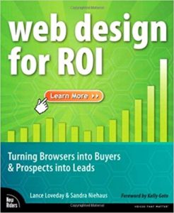
7. Web Design for ROI: Turning Browsers Into Buyers and Prospects Into Leads by Lance Loveday and Sandra Niehaus
This book dives into the role of design in sales and lead generation (with the authors saying the right design can increase these two metrics by 10—50%, potentially). Both Lance and Sandra have a wealth of experience when it comes to creating high-performing websites, and the pair have come together to share their wisdom.
This book covers a range of tips and tricks that look specifically at improving conversions online as well as increasing a digital presence—explaining how design needs to go beyond aesthetics and also take into account metrics and business goals.
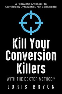
8. Kill Your Conversion Killers with The Dexter Method™ by Joris Bryon
The nod to fictional TV serial killer Dexter in the title gives a glimpse into Joris Byron’s style of writing and overall intent: to talk about the common pitfalls of conversion rate optimization in an engaging, conversational tone.
Joris quickly gives readers a framework for applying great conversion rate optimization tactics, and highlights common practices that could actually be a detriment to your strategy. Joris spent three months on a sabbatical writing his books, Kill Your Conversion Killers offers great insight into his own experiences while working agency-side. If you’re looking to expand your knowledge on conversion rate optimization (and want to be able to prioritize which tests to run, for one example) this is the book for you!
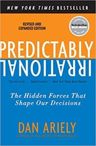
Last (but by no means least) on our list of top CRO books to read is Predictably Irrational—a book that looks at the sometimes irrational way humans make decisions and applies these insights to the world of marketing. Author Dan Ariely intended to help his readers change the way they thought about marketing and their understanding of what consumers want.
While this book was released in 2008, it’s still very relevant to anyone wanting to better understand (and communicate with) their target audience with Ariely’s fun, experimental approach making the material a fun, thought-provoking, read!
Developing your professional skill-set is essential for growth, and these books promise to provide key learnings and important perspectives on the multi-faceted discipline of conversion rate optimization. Whether you’re an experienced marketer or new to the industry, it’s important to be open to continuous learning, and even revisiting the basics through the lens of your real-life experience. These books are a great place to start.
Gone are the days when shops and retailers could measure sales conversions by counting the physical customers in their shop and dividing it by the number of sales that went through the till, as the change in shopping behaviors and the huge shift to online shopping has meant retailers need to adapt, too.
The one major online retail site that sellers are eager to have a presence on, and as one of the most visited websites in the world, Amazon Marketplace offers great exposure to 12 markets around the globe. Whether you’ve just started selling or you’re an established presence in the marketplace, conversion rates are a very important metric for any retailer, as it is often considered a measure of how successful their business is. With more retailers looking to understand the secret to increasing their conversions on the e-commerce giant, we explore what a ‘good’ Amazon conversion rate looks like, and how you can optimize your listings to increase conversion rates – something all budding Amazon sellers will be keen to invest in!
First, let’s cover conversion rates and what ‘good’ looks like:
What is Conversion Rate?
Conversion rate is calculated by dividing the number of sales by the number of times people have visited a product. Conversion rates apply to any sales made – both on and offline- and they are often affected by things like the volume of people clicking through to the advert or from visiting the store, the competition level from other sellers as well as price comparison and seasonal discounts, etc.
What is an Amazon Conversion Rate?
Amazon conversion rate is the same, but focuses just on sales made through the platform. It is automatically calculated by the retail giant and can be accessed by logging into your ‘Sellers Central Business Reports’, under the header ‘Business Report’. Within this section, there is a row called ‘Order Item Session Percentage’, which is the conversion rate Amazon attributes to each item.
Amazon breaks conversion rate down for sellers to see the conversion rate of each product, by viewing the ‘By ASIN’ reports.
Whilst those figures look impressive, there are a few other factors at play to help increase conversion rates on Amazon. Our tips look to optimize Amazon listings to help increase conversion as well as improve the ranking of listings on the digital marketplace.
Strengthening Your Amazon SEO
When looking to improve conversion rates on Amazon, the first thing to review is the keywords you are targeting and the placement of these words within your product listing. Amazon SEO is a relatively new concept for online retailers but is a very important part of achieving success on the world’s biggest-selling site. Conduct keyword research before writing any listing, make sure you are aware of what people are looking for when it comes to your products and target the most relevant search terms. In a previous article, we cover how to conduct keyword research using some free tools that are widely available – so there’s no excuse for poorly performing listings. There are several opportunities to use keywords when creating a product listing, so make sure these terms feature in the product title, features, description as well as the URL of the item.
Write Accurate and Engaging Product Descriptions
In order to potentially increase conversion rate, you need to increase the click-throughs on a listing, which means creating engaging and descriptive titles that encourage users to click and learn more. Remember, conversion rates are calculated based on the number of people viewing, or clicking your listing, so get writing those ‘click-worthy’ headings. Make sure to accurately describe your product too, don’t be vague or mislead potential customers, as this will affect your opportunity to rank higher in search on Amazon which will directly affect your conversion rates, too.
Offer Competitive Pricing and Other Perks
This is particularly important for sellers who are in a highly competitive market, as offering competitive pricing can make the difference between people clicking through or not. If you are able to do this, offer reduced shipping – or even free delivery. If you are the only seller offering free delivery, people will be far more likely to convert. Often, sellers who have sales on products or offer discount codes see an increase in conversions, so try experimenting with a sale or offering money off for returning customers. Of course, the most prominent perk for Amazon sellers is joining the FBA, as this automatically makes your products eligible for Prime; the next-day subscription delivery service Amazon offers paid subscribers. As one of the most successful subscription models online, Amazon Prime significantly increases conversions as Prime members are much more likely to convert each time they visit the website.
Trial Amazon Pay Per Click
Another great way to potentially increase conversion rates is to secure the top spot, by paying for an advert. Amazon pay per click, or PPC, is identical to search giant’s Google in that sellers can pay to secure the top spot with relevant adverts. By targeting known search terms, sellers have the opportunity to buy the search space and appear in relevant results, with listings that are marked as ‘sponsored’.
Upsell Relevant Items
Upselling items by offering related or complementary products that people may find useful when they are looking to buy will increase the potential of selling further products. By making ‘suggested’ or related items visible at the ‘add to basket’ stage, customers will be more inclined to add more products. Upselling relevant items will not only have a positive impact on conversion, but it will also encourage repeat purchases and indicates your online store has further products to explore.
Link to Products From Other Online Places
Be sure to share your products on other online channels such as social media and websites. Featuring products on other selling sites such as eBay and Gumtree will target a wider audience. If you are exclusively selling on Amazon Marketplace, consider using targeted adverts across relevant websites online, using cookie data to retarget people who have viewed or previously purchased from you. Increasing the exposure of your products via banner adverts and sponsored listings on social feeds can significantly increase conversion rates.
Trial and Error Testing!
These tips are some great options to help improve conversion rates whilst making sure listings are well optimized, however, there is no real magic ingredient to producing high-converting product listings on the world’s biggest marketplace. We highly recommend testing what works well for you as an individual seller. From tweaking product descriptions, using shorter or longer titles and even including emoji’s to entice readers to click through- try testing subtle differences with product listings to find something that works for you.
Key Takeaways
Whilst there are many ways to optimize your Amazon listings with the view to increase conversion rates, there is no real magic recipe that fits for every business. Some optimization techniques may work really well for some retailers, whilst others have found their success through trial and error. Applying just one change won’t make a difference to conversion rate so try to work on a few different elements of your product listings. For this, A/B tests are an excellent way to find out what does and doesn’t work.
Conversion rates are an excellent way to measure success, and by looking to make some or all of the changes listed above, sellers will also automatically benefit from increased visibility on the platform, as the Amazon A9 algorithm appears to consider sales velocity and conversion rate as two of the most important factors when it comes to ranking well on the digital marketplace. With the opportunity to rank your products higher in Amazon search, potentially increase click-through rates and ultimately increase conversions, there are some great reasons to optimize on Amazon and reap the rewards via a better click-through rate and hopefully higher conversions.
Neuromarketing is a very science-oriented aspect of marketing. It aims to investigate why people respond to and remember certain products or elements of an advert, compared to others. Applying neuroscience – i.e. the assessment of how our brain responds to stimuli, such as TV adverts and posters – avoids any vague or bias feedback from consumers, as no-one can control how they immediately respond to things. The response is tracked using two methods; either an MRI or functional magnetic resonance imaging, and electroencephalography, which is also known as EEG. Both of these methods track and measure the impulses and activity in the brain that are both subconscious and conscious, as we are only in control our conscious reaction and feelings. As you can imagine, both options come with a hefty price tag, but companies often justify the high costs if it means securing more sales!
So, how is it used in marketing?
Well, the process of neuromarketing is basically put in place by brands to get a much better and more in-depth understanding of just how powerful their message or product is, by studying the reaction it causes in consumers. Brands can also get a far better understanding of the potential market available to them, by looking at the influential factors and then designing their packaging or product accordingly. In fact, there’s every chance your favorite brand has done just that when it comes to creating the ideal product that appeals to you!
We explore five examples of neuromarketing research conducted and what the findings have meant for the world of marketing in 2019.
#1 – Chips Ahoy and Their Boring Biscuits
America’s favorite cookie company decided to conduct some neuromarketing research when it came to creating the perfect packet to sell their cookies. Nabisco, the owners of Chips Ahoy, decided to test their old packaging and found people were actually having a negative response when looking at it. Consumers said it was too difficult to read the wording due to the colors used and the picture of the cookie made them feel bored or neutral towards the brand. So the makers behind Chips Ahoy took to the drawing board for their next draft and re-designed the package to include a resealable tub, better wording and colors. The most obvious change was the cookie image was more engaging and fun!
Key takeaway: Nabisco used the eye-tracking element from electroencephalography, or EEG, to identify how customers were reacting visually to their packaging. This kind of research is really popular among other food brands, which use it to design crisps, confectionery and other cookie packaging. In fact, chances are, your favorite brands have carefully chosen the packaging you’re so familiar with and that may be why you buy them!
#2 – A Sticky Situation With Jam and Decision-Making
Do you feel suddenly overwhelmed and incapable of making decisions when it comes to browsing a wide selection in a shop? Well, you’re not alone, as a study conducted by Sheena Iyengar, a professor of business at Columbia University, discovered. The author, Professor Iyengar, and her researchers chose to use Wilkin & Son’s jam jars at a sampling booth and regularly mixed the selection of jams available, between 24 jars to just six. Whilst 60% were drawn to the sampling booth when 24 different jars were available, compared to just 40% when there were just 6 to choose from, nearly all customers sampled just two flavors. Here’s the interesting bit; whilst 40% of people came to try the smaller selection of jams, 30% then decided to buy some, compared to just 3% of people who bought when there were 24 flavors to choose from!
#3 – Why Counting Cans Mattered for Campbell’s Soup
Here we have another example of decision-making under pressure, but this time due to a seemingly limited supply of soup! A study by Wansink, Kent, and Hoch, was conducted to understand the concept of ‘anchoring’ in marketing; the process of comparing products or services against similar products to create a sense of superiority or importance. Using the well-known soup brand Campbell’s, Wansink et al created one display of cans with a price of $0.79 and a sign that said ‘No Limit’, and another that said ‘Limit of 12 per person’. The result showed that shoppers who had no limit only bought an average of 3 cans, whereas the shoppers who saw the limited shelf ended up buying 7! The results support the ‘anchoring’ concept within marketing, where the brain fixates or ‘anchors’ on the key message, in this case, the fact that the soup is limited to 12, making consumers think ‘I can only have 12 – it must be good!’.
Key takeaway: This approach is definitely still alive and present in modern-day marketing tactics, with so many brands using the ‘comparison’ approach to create a feeling of limited availability when it comes to a product or service, creating a simulated sense of urgency and making consumers think it must be a great product or service because it’s really popular!
#4 – PayPal And Speed – The Modern Way to Handle Money
Another fan of using EEG, or electroencephalography, to understand how consumers respond visually to their brand, is money transfer site, PayPal. PayPal has spent a lot of time researching how best to position their product online, and in particular what will make their consumers’ experience with them easy. Users of their services online will be familiar with their quick, convenient money transfer system and the reason behind this slick service is PayPal have discovered e-shoppers expect an almost-instant payment service that is convenient to use. Whilst PayPal thought their ‘high security’ approach was appealing to online customers, it turned out their one-click payment model was the real attraction!
Key takeaway: This example shows just how effective neuromarketing can be to refocus a large brand like PayPal, on what really matters for their customers; convenience when buying online. Changing the business focus can be a real challenge for large corporations and PayPal is a shining example of how using marketing as a science can help them understand their audiences far better than feedback forms and reviews.
#5 – Even Search Engines Lean On Science
A slightly more surprising use of neuromarketing in modern marketing is that of Yahoo and their use of EEG to encourage more people in the US to use their search engine instead of their competitors’. Yahoo created a 60 second TV commercial that featured people around the world celebrating an ambiguous occasion, dancing and generally looking very happy. They played it to a selection of people who agreed to wear EEG caps so their brainwave activity could be measured. The study proved Yahoo’s theory of evoking positive emotions and even stimulating the memory part of the brain, indicating to their researchers that the ad would be highly memorable to anyone who then watched the advert, therefore making Yahoo top of mind, encouraging people to use their search engine next time they were browsing online. And it worked! The advert became their best performing piece of marketing to date.
Key takeaway: Yahoo recognized they had a huge obstacle to overcome when it came to being top of mind compared to other search engine giants, so they decided to create something that would make them hard to forget – and using neuromarketing science, it worked! The key to success for this campaign was to make the viewer feel positively towards it, prompting them to think of Yahoo in a positive light, as well as making them a more memorable brand.