Article

19min read

Examples of the Best Landing Page Designs in 2019

If you run a website, then you know how difficult it can be to convince a visitor to stay on your page and even more to convince them to buy! Your landing page’s design plays an important role.

How to choose your landing page’s design?

Designed to convert your visitors into leads or customers, landing pages focus visitors’ attention on your value proposition in order to get them to perform an action that you have previously determined: purchasing a product, filling out a form or participating in a free trial.

But with all the offers available and all the competitors that exist on the market, it can be hard to stand out from the crowd. For this, you must create a striking, persuasive landing page adapted specifically to your business.

Because we know it can be difficult to find inspiration before sitting down to design your future landing page, we have selected for you ten modern and efficient landing pages that convert in 2018.

If you have questions about landing pages and would like to learn more before you get started, check out our articles on landing pages with best practices and concrete examples.

These examples are taken from real sites; see for yourself! Of course, none of these landing pages is perfect: perfection does not exist, and it is up to you to adapt your design to your customers’ requirements. We also recommend you A/B test your landing pages.

10 examples of the best landing page design

LeadQuizzes

LeadQuizzes is a company specialized in selling “quizzes” designed to capture “leads”. We immediately notice the (very well designed) explanatory video of the service that answers basic questions such as:

  • What is it for?
  • Is it relevant to me?
  • What does it offer me?

Secondly, the orange call-to-action stands out from the rest of the page and very clearly invites you to click: “Try it Free” reassures us that we will not pay immediately and that there is a free trial. Find out more about the optimization of calls to action.

The social proof is obvious and well developed: the references are well-known market players, and the text indicates that more than 3 million leads have been generated via LeadQuizzes: it makes you want it!

Design Landing Page Lead Quizzes

Design Landing Page Social Proof

The rest of the landing page does not disappoint either: it is built around educating the visitor of the product’s usefulness. The goal: use a (big) page to convince visitors that LeadQuizzes’s service is powerful and used by the big players in digital technologies.

Design Landing Page Lead Quizzes Social Proof

Social proof is strongly highlighted on the LeadQuizzes landing page. It answers concrete and tangible questions that concern potential buyers:

  • How many more sales will I make?
  • How many new prospects can I capture?

GrowthHackers

GrowthHackers is a company that markets software to increase marketing teams’ productivity and coordinates business development actions and new ideas from innovative teams.

Similar to LeadQuizzes, the orange call-to-action stands out nicely from the rest of the page’s colors and invites action. We are also invited to a “free trial” to reassure a large number of visitors who would not be willing to pay until they have been convinced of the service’s usefulness.

Landing Page Design Growth Hackers

The landing page continues with navigation in the form of a drop-down menu that answers the main questions asked by potential GrowthHackers Project users.

  • “Why should I use the service? “
  • “Why do managers love the software? “
  • “Who is this service for? “

We also notice that a “chat” bubble is there to ask questions: a useful feature when we are undecided or have questions.

Landing Page Design Growth Hackers

As for social proof, it is highlighted in two ways:

  • We see that a “community” exists around the service.
  • We see that many people use the service and are active in the community.

One could criticize, however, that the numbers may not be visible enough.

Landing Page Design Growth Hackers

ElegantThemes

ElegantThemes is a company specializing in selling WordPress templates or “themes” and also markets a “builder” called Divi, which allows users to create pages in WordPress visually. On this topic, see our examples of landing page templates for WordPress.

We immediately see the social proof: it is the first element put forward that reassures the visitor about the service’s popularity: more than 400,000 users according to the site.

Landing Page Design Elegant Themes

We then notice that the value proposition is twofold and that two separate call-to-actions were created for the occasion: one to discover the ready-made templates and another to discover the brand’s plugins.

Another interesting element: on the lower right side a conversation bubble appears, ready to answer questions that a visitor might ask.

The chat module is especially interesting since it also allows the user to send attachments, emojis, and GIFs which can only enhance the richness of the interaction.

Design Landing Page Divi Builder

While browsing the landing page, visitors are offered the opportunity to try a “live” demonstration of the Divi Builder. This is a significant and compelling value proposition as users can discover the product directly without paying or even registering.

Example Landing Page Design

Further down on the landing page, the social proof is reiterated, and the paragraph contains an element intended to reassure potential buyers: a 30-day refund.

Additionally, the red-pink call-to-action contrasts with the blue background of the page, reinforcing our curiosity: we are visually attracted to the button placed in the center of the page.

Shopify

Shopify is a CMS that allows you to quickly and easily create e-commerce sites without programming knowledge. They stand out with their numerous resources available to users (guides, videos, podcasts, forums) as well as additional services that complement their core business: a store of ready-to-use “themes”, a library of free photos, etc.

Design Landing Page Shopify Hero Image

On the landing page, the value proposition is immediately put forward: “the e-commerce platform made for you”. The idea is therefore to address a large, often independent audience as evidenced by the photo illustration.

The special feature of this landing page is that the call-to-action contains a field for an e-mail address. This field is required to access the 14-day free trial offered just below that specifies that no credit card is required for the test: it is a major argument.

Design Landing Page Shopify Value Proposition

Design Landing Page Shopify Value Proposition

The rest of the landing page focuses on the features of the Shopify service.

With unique illustrations and short paragraphs, the company presents Shopify’s features and benefits to convince visitors to take advantage of the free trial or purchase a monthly subscription.

A major argument in the CMS sector, the widespread use of the service is highlighted with two elements:

  • The graphical representation of the number of users and the income generated
  • Testimonials from real customers whose sites are online.

Design Landing Page Shopify Social Proof

The idea is to create a feeling of mimicry in the minds of visitors: “If 1,000,000 people use Shopify to create real shops without programming, so can I”.

Salesforce

Salesforce needs no introduction. The king of “CRM” (Customer Relationship Management), the American company has several particularly well-developed landing pages that are worth a look.

Design Landing Page Salesforce

The first thing that jumps out is the illustrations and colors. An overview of solutions on Computer-Tablet-Mobile is presented on a background that inspires calm and serenity.

We also note that two calls to action are present on the upper left part above the fold: one for a demonstration and a second for a free trial.

Salesforce also offers a solution for large companies whose call to action is placed to the right of the free trial: great for capturing potential leads from large companies.

Subscription Form Design Landing Page Salesforce

When a visitor clicks on a call-to-action, they go from the home page to a landing page created specifically to convince as many people as possible to sign up for the free trial.

Among the elements that stand out, we can see:

  • The reminder of value proposition, “30-day free trial”
  • A telephone support hotline
  • The statement “no download, no software” in capital letters
  • Social proof by including logos of well-known references
  • Easy sign-up with Google+, Facebook, and LinkedIn

Neil Patel

Neil Patel is a digital marketing consultant with a big reputation in the United States and around the world. His site receives several million hits a month thanks to an accessible content strategy and a variety resources created for visitors: blog articles, YouTube videos, practical guides, etc.

Neil Patel Design Landing Page

What strikes us first on Neil Patel’s site is its uninhibited and straightforward approach to the issue.

The color theme is extremely simple and plays on the contrast between the orange background and the white text. The idea: ask visitors a direct, simple and short question to build engagement to a maximum.

We also notice that the landing page offers a field (above the fold) designed to perform a live analysis of your site: it is a show of force that leads the visitor to discover by him or herself what could be improved on their own site.

Design Landing Page Benefits Neil Patel

The particularity of Neil Patel’s site is that almost all pages are designed as landing pages each with one goal: to convert a maximum number of visitors.

The “Services” page, for example, (shown above) shows a long set of text that acts as a proof of authority for visitors. It explains what Neil can do for you, but also what he has done (see below) and the clients he has worked for.

Design Landing Page Proof Neil Patel

The approach is always very direct and focused on results and benefits.

Neil’s idea is to prove by A + B that he has the skills to help you improve your SEO.

Neil Patel Call to Action Design Landing Page

On the same “Services” page, the call to action comes at the end (and one can wonder, is it a good idea?). It is structured in several stages that invite visitors to enter their information in order to be contacted later.

UpWork

UpWork is a world-renowned freelance platform. It allows companies to find skilled labor quickly for various assignments and allows the self-employed to register on the platform to offer their services.

Design Landing Page Upwork

On the homepage, we can see from the outset that the graphical design is clear and that it is the “professional” aspect that is highlighted. Interestingly, the chosen tagline is not for freelancers but for companies.

The tone is direct, effective, and clear; we immediately understand the value proposition: to subcontract work efficiently.

The call to action is placed on the left side above the fold. Its green color sets it apart from the rest of the landing page and consists of a search bar used to indicate the type of work that visitors want to outsource. If we pay attention to details, we can see that the background is actually a customer testimonial and we can watch the story: it has a lot of impact!

Design Landing Page Upwork

The rest of the landing page is classic: it details the various services offered by freelancers and shows the paid offers for users.

CodeCombat

CodeCombat is an interesting example. It is an educational game that allows children (and adults) to learn to program using a video game. The concept is simple: you program to progress in the game.

Code Combat Landing Page

The first interesting point of CodeCombat’s landing page is that the audience is twofold: it targets both teachers (who wish to use it in class) and children (who discover it by themselves or through by word of mouth).

The landing page’s focus is therefore on teaching and the program’s ease of use. Thus, we can see two calls to action: one for teachers and one for children/players.

Design Landing Page Code Combat

The rest of the landing page presents the benefits of using CodeCombat as well as screenshots to make the service “tangible”.

Testimonial Design Landing Page Code Combat

In a fairly traditional way, the rest reiterates the service’s strengths and includes a customer testimonial adapted to the target: that of a school principal.

Plated

Plated is a company specializing in delivering recipe ingredients: you select inspirations for recipes, and the company delivers all the ingredients needed to make the dish.

Plated Landing Page

The first thing that strikes us about the Plated landing page is the graphic design; the colors are studied, and the company has a real visual identity. The photos of dishes stand out well, and the illustrations are well chosen.

Words are chosen carefully and are well suited to a target of “food lovers”: we would get hungry just looking at the site!

The call-to-action is clear, well placed above the fold; its green color clearly distinguishes it from the rest of the page.

Call to Action Landing Page Plated

The Plated landing page is long: you have to scroll for a long time to reach the end. However, each paragraph of the home page is thought of as an argument or a benefit in order to convince:

  • Save time
  • Large range of choice
  • No more shopping
  • Quality products
  • Save money

Design Landing Page Plated

We can also see a particularly attractive instant discount coupon in the header and whose color stands out.

By offering 50% off the first order, Plated encourages the undecided to take action by decreasing the financial commitment.

Social proof is highlighted at the end of the landing page. Although it could have been placed higher, it remains visible and relevant.

Live Chat Landing Page Plated

Plated offers chat support, something we find more and more on landing pages.

By offering this service, the idea is to make up for the lack of human interactions that one would find in stores and to provide help to undecided visitors.

Plated’s strengths are highlighted successfully using simple, soothing images that convey simplicity and serenity to show that Plated makes your life easier.

MailChimp

MailChimp is an extremely popular automated marketing and emailing company. Their services are used by many to create e-mail, marketing and newsletter campaigns for e-commerce sites.

Design Landing Page Mailchimp

As direct as Neil Patel, this landing page is extremely clear and straightforward: it addresses visitors in a frank manner while remaining vague: “Build your brand, Sell more stuff.”.

This allows MailChimp to address visitors globally by avoiding excluding too many users from the outset.

The value proposition is as simple as possible: build your brand, sell more.

This straightforward and uninhibited approach is prevalent in Software as a Service (SaaS) solutions: the goal is to speak directly to business leaders of all sizes and get straight to the point.

Note that the call to action is very visible: it is located in the central position above the fold and offers a free trial (another one?!).

Call to Action Landing Page Mailchimp

As on Plated, the rest of the landing page details the benefits of using the service. This allows visitors to quickly “visualize” the service’s added value and get a clear idea of the following question: “Is this service for me?”.

By building a long landing page, you allow your visitors to “scroll” as much as they want: this allows them to answer as many questions as possible while acting as a commercial brochure to highlight your added value.

Design Landing Page Mailchimp

By using screenshots, MailChimp allows visitors to project themselves more easily. The idea is to help visitors better understand the service by viewing a sample. This technique can be adapted to video or even in the form of a live demonstration as ElegantThemes does.

We note that the free trial’s call-to-action is always accessible, wherever you are on the page, here at the top right.

Register Form Mailchimp

Once in the conversion funnel, visitors land on the form page needed to activate the free trial. In order to maximize conversions, the MailChimp registration form is intentionally:

  • Short
  • Clear
  • Specific

By limiting the number of fields to three, MailChimp allows hesitant visitors to take the plunge more easily. The commitment requested is kept to a minimum: an e-mail, a username, and a password.

If it were to be improved, we could consider adding quick signup via Facebook or Google that would encourage even more conversions.

Did you like this article? If you are inspired and want to take the plunge, read our article dedicated to Bootstrap landing page templates. It’s the perfect asset for a successful landing page.

Subscribe to
our Newsletter

bloc Newsletter EN

We will process and store your personal data to send you communications as described in our  Privacy Policy.

Article

7min read

AB Tasty Reaches a New Milestone in Optimizing UX for Dynamic Websites

AB Tasty once again pushes the boundaries of tech, making it that much easier to optimize user experience on all types of sites

We’re very proud to announce the roll-out of an A/B testing and personalization platform that’s fully compatible with ReactJS, Angular.js and other popular JavaScript frameworks.  The best part? Running campaigns on any Single Page Application (SPA) doesn’t require you to write a single line of code!

We would be remiss if we didn’t thank our extraordinary R&D team – many of whom were hired specifically for their skills working with these frameworks – who toiled tirelessly to make this new functionality possible.

Current AB Tasty users don’t have to change anything about how they use the interface since this innovation is seamlessly integrated into the platform.  This evolution allows us to stay true to our values of simplicity and efficiency, while at the same time bringing a host of advantages to our users, including:

  • Compatibility with all current or future frameworks
  • A boost in performance with a faster page load time and a lighter JavaScript tag
  • No more flickering effect

An overview of 6 years of constant innovation…
all so we can better serve our clients

AB Tasty Innovation Timeline

Some technical background

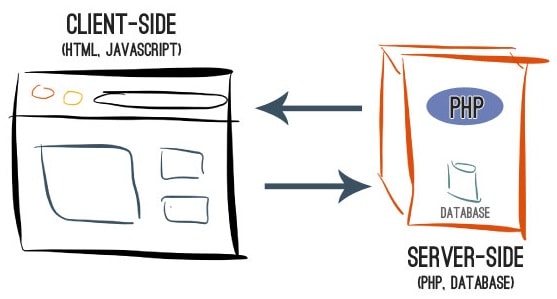
A/B testing softwares that work on the client side, such as AB Tasty, rely heavily on JavaScript. To clearly understand what new JavaScript frameworks bring to the table and what implications they have, we need to first clarify how traditional A/B testing usually works. When an Internet user requests a page from a website (“server”), the former sends the requested content as a static page that includes all the HTML code and assets that the user browser (“client”) will interpret and render.

Part of this content is the A/B testing solution code, that automatically executes on every page load in order to modify the DOM (Document Object Model). The DOM is the representation of the page content and can be manipulated, using jQuery. For instance, changing or deleting page elements such as text, imagery, layout, etc. That’s what A/B testing does, at its core.

What’s changed with new JavaScript frameworks?

Javascript frameworks or libraries such as React JS, Vue.js, Ember.js have gained popularity over the past few years due to the streamlined user experience they offer: no page refresh, highly interactive navigation, less data transfer, and so on. They have become part of any modern web development stack and are used by an increasing number of websites such as Facebook (its creator), Airbnb, American Express, Spotify, and many more.

React and JavaScript Frameworks

But the way these frameworks behave pose one major issue for traditional A/B testing client-side tools: there is no page reload when a user interacts with the page/content, which means that the A/B testing code is loaded once, and is not aware of state changes induced by these frameworks. Any user interactions generally trigger a change in the state of the application: meaning, what’s displayed to the user at any given time, depending on the data available and the trigger. For React JS applications, one common issue is that UI components are re-rendered every time the state is changed. So, traditional A/B testing tool changes won’t stick, as they’re removed by React 🙁

How can you run A/B tests on single page applications?

If you’re running a single page application or using one of the aforementioned JavaScript frameworks, running A/B tests can be messy and involve a lot of development work. Some solutions require you to identify the states you want to target and conditionally activate your experiment code through API calls once a visitor enters the desired state. Other solutions hardcode test modifications in your application or even require a custom deploy for every new A/B test.

A/B testing tools need custom developments to work with React

These solutions may fit with your organization and development team’s knowledge, but make things difficult for users (product managers, marketers, etc) who want to launch tests without having to involve their dev team. All the solutions mentioned above require collaboration with developers to write the needed code. This is far from ideal if you’re looking for agility!

AB Tasty, the game changing testing software for the modern web

Since AB Tasty’s creation, our mission has remained unchanged: to make it easy to run A/B tests and accessible to all teams, regardless of their level of technical knowledge. This mission is at the forefront of everything we do and we consider it our role to adapt to innovation and development trends, rather than making our users adapt.

We foresaw the emergence of new JavaScript frameworks and the impacts they’d have on traditional A/B testing a while ago and started working on a truly innovative solution to make AB Tasty compliant with modern web development stacks while keeping it easy to use. As these frameworks are here to stay (even if there are a lot of them, some with specific flavors) we put all of our efforts and resources into providing you with the best solution possible.

[clickToTweet tweet=”You can now easily A/B test sites with #reactjs or #angularjs using @ABTasty. ” quote=”You can now easily A/B test sites with #reactjs or #angularjs using @ABTasty. “]

By that we mean, we hired an army of highly proficient front-end developers to focus on this specific topic (12 to be precise!) After months of hard work, they’ve come up with a pretty darn good solution (if we do say so ourselves).

It relies on our ability to check and apply modifications in modern browsers 60 times per second. Every 16ms, before the browser starts to render its display, we hook in, check if there are modifications to apply, and, if so, apply them. This is a totally independent framework. So, if a user interaction triggers a React component to be re-rendered, we apply the modification before the browser starts to render whatever React is sending back to them. It works the same way for Vue.js, Ember.js, or any other JavaScript frameworks.

[clickToTweet tweet=”The dev team at @ABTasty developed a meta-language to make #abtesting possible on #reactjs!” quote=”The dev team at @ABTasty developed a meta-language to make #abtesting possible on #reactjs!”]

To make this possible, our engineers also wrote a new meta-language to describe the content of the variations and interpret it. This allows us to not store this content as JavaScript (even if we still do it for backward compatibility), keep a history of all modifications, and apply them on-demand, like when a state change occurs. This makes your tests possible on any single-page applications.

What are the benefits of this new approach?

Finally, a solution that doesn’t require jQuery and entirely gets rid of the flickering effect

Framework agnostic

It works with React JS and all other JavaScript frameworks and libraries (Ember.js, Vue.js, AngularJS, Meteor.js, etc.). It doesn’t matter if you use one of them for your whole site or just specific areas like your shopping cart or sales funnel.

Zero chance of having a flicker effect

Everything is now managed in an asynchronous way and we apply modifications every 16ms so they won’t be visually noticed.

Ability to use the AB Tasty WYSIWYG editor, as usual

Backwards compatibility

By using our new framework (v2.3), you can be confident that your existing campaigns will deliver correctly, even if you don’t use any of these JavaScript frameworks or use older versions.

Want to try it?

Are you an experiment addict, frustrated with not being able to run tests on these popular Javascript frameworks? Are you looking for more agility? Are you tired of the flickering effect? If so, request your custom demonstration.