Article

5min read

15 Ways to Drastically Improve Your B2B Conversion Rates

Selling to a business isn’t drastically different from selling to a consumer. They’re both people after all.

The big difference is that businesses may have more than one decision maker, are likely more savvy in regards to how they spend business money, and won’t be sucked into weak offers as easily.

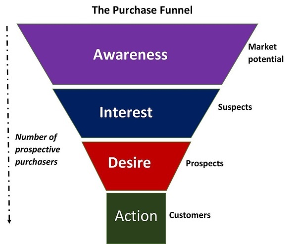
If you’re looking to increase your B2B conversions, here’s a list of things that will help you out. check out our ultimate guide to conversion rate optimization for more best practices.

Rework Your Offer

Take a hard look at your offer. See if there’s anything you can do to sweeten the deal. You can also look at how you position the offer. Are you highlighting the best parts of the deal? Is there anything more you can do? Don’t be afraid to change pricing, incentives or product amounts to achieve better conversion. A small decrease in product price can actually lead to more overall profit.

Talk About Benefits, Not Features

Too often we list the features of a product or service instead of how it will benefit us. The features aren’t the real selling point; it’s how it will benefit the business. A feature is ā€œfast serviceā€. The benefit of the speed is ā€œyou’ll have more time to focus on salesā€. Use the benefits to gain more traction.

Target High-Quality Leads

Casting a wide net could be costing you more than it actually helps. Whatever methods you’re currently using to attract leads, ensure that it’s targeting the right people. Your conversion rate can jump just by funneling more high quality leads in, and not changing anything else. If you haven’t analyzed your target market in a while, take another look. See if you can be more efficient.

Retarget Your Audience

There’s always the temptation to throw as much money at as many leads as possible, but your best chance at a conversion may be someone who’s already traveled down the sales funnel a bit. Retargeting ads can help keep you top of mind, and give your landing page a second life.

Watch The Competition

See what your competitors are doing. Keeping a close eye on them might give you some insight into changing a couple things to help conversions. Pay close attention to how they walk you down the sales funnel, any pricing, landing page copy, and marketing efforts. Following them on social media and signing up for the newsletter will keep you in the loop.

Have Credibility

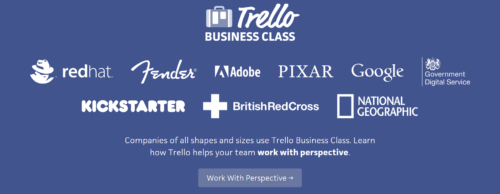
Trust is a hard thing to achieve with strangers. Try adding some credibility to your page with testimonials, listing other clients that use your product or service, and consider offering some money back or satisfaction guarantees. A little trust goes a long way.

Use Email and Automation

Put technology to work for you. By using email and automated marketing, you can work leads down the funnel without having to track them yourself. Email out exclusive offers, nudge them to finish the transaction, sweeten the deal, or just remind them you exist. Email is a powerful tool that you don’t have to spend a lot of time on once it’s set up.

Personalize The Content

Dynamic content is easier than ever. If you know where they came from, tailor the content to that audience. You can dynamically change location information, personalize name information or add their business into the landing page. The possibilities are endless. Personalization can go a long way to finalizing the transaction.

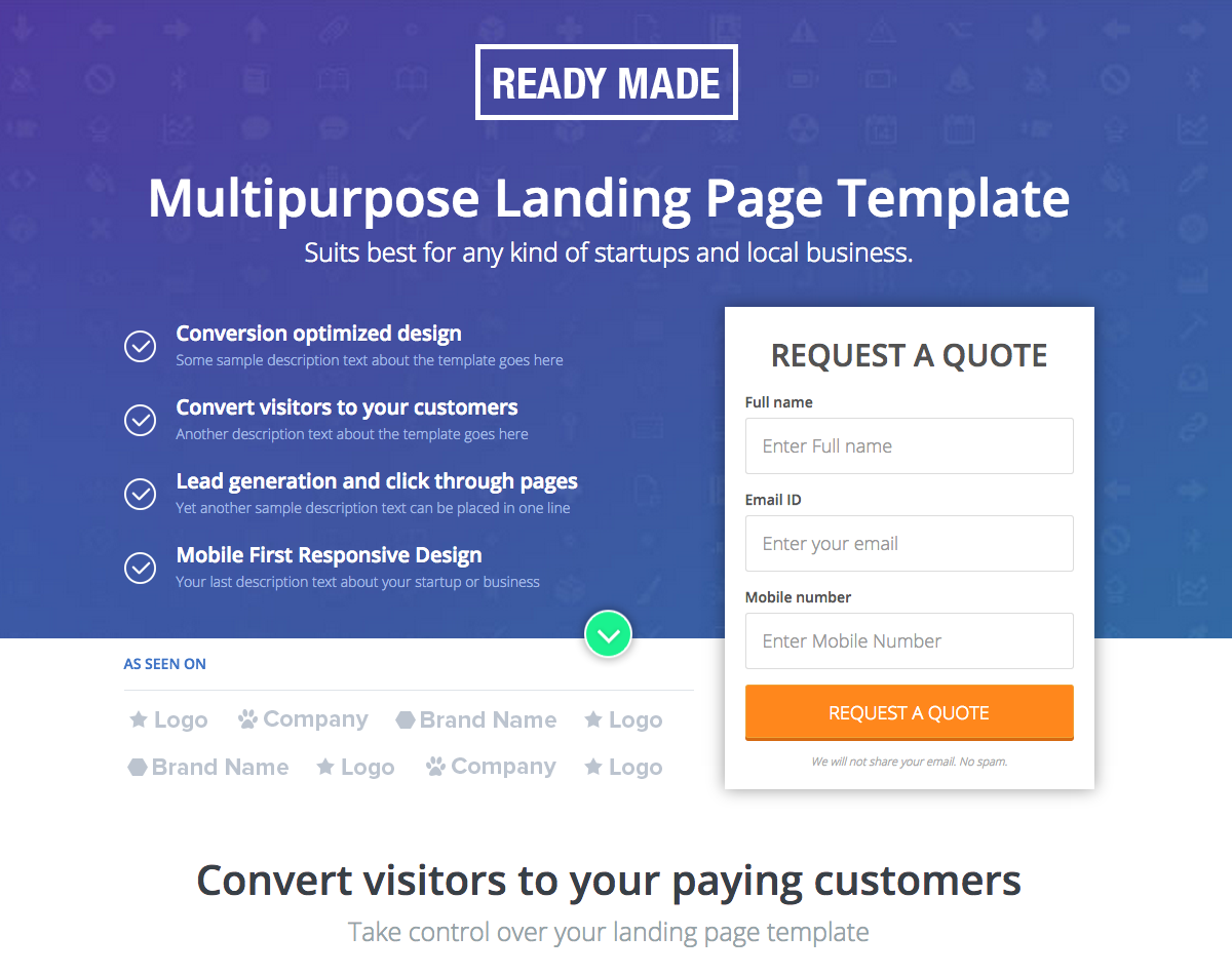
Make Your CTA’s Obvious

Far too often the call to action is hidden, too far down, or not clear enough. Try moving your call to action higher up on the page for more clicks. Is it visible? How big is it? It is clear what you want the user to do? You can also try different language in the CTA to increase conversions.

Test Everything

Marketing messages, call to action buttons, emails, landing page copy – test it all. Maybe not all at once, but over time do split testing and try new things. Language, visuals, and offers can make a difference in response. Testing will allow you to find out what works the best in all cases, and bring it together.

Don’t Trick People with Ads

If your ad promises something your landing page doesn’t deliver, you just wasted your time. Getting a click on an ad isn’t not nearly as important as getting a relevant click on an ad. If you want to increase conversions, you need to make sure your advertising isn’t tricking people into visiting your site. Only solicit qualified leads.

Target Pain Points

Every business has pain points. You just need to locate them. Is it cash flow? Staffing? Find the pain points that you’re able to solve, and push those buttons. If you can solve a pain point, you’ll have a sale.

Make Your Offer Easy to Read

Don’t confuse things. Keep them easy to understand and read. If you can’t do it, find someone good at content writing. Your offer needs to be easily understandable. Your landing page should be something the business owner can skim. They don’t need every little detail in order to make a decision, and if you waste their time with a hard to read page, they’ll leave before you even get to your pitch.

Simplify The Experience

What can you cut out of your sales funnel? What can you cut out of your landing page? How much are you asking the potential buyer to do before they count as a conversion? The more forms and fields you ask them to fill out, the more your conversions will drop. Cut out anything you can, and make the process as simple as possible.

Answer All Objections

Try to think up all of the major reasons the business owner could object to making the conversion. Once you have them, crush them. If you can remove all objections, you’ve pushed some pretty big obstacles out of the way. The path to converting them just became a whole lot easier.

The best way to increase conversions is to constantly be trying new ways to attract potential clients, new ways of talking to them, and new ways to close the deal. Try a few of the points above and see if you can increase your B2B conversions. Small changes can make a big difference.

About the author:Ā Kerry CreaswoodĀ is a young and ambitious writerĀ from Savannah, GA.Ā She is interested in self-development, design and marketing. To find more about Kerry – check herĀ Twitter

Article

6min read

7 Tips for Implementing A/B Testing in your Social Media Campaigns

A/B testing has been around for decades, even before the advent of the internet or social media. In fact, it actually spans back to the time when James Lind first conducted an A/B test in a clinical trial over 300 years ago.

Many years later, Google famously used an A/B test to decide which shade of blue to use in its campaigns, showing each shade to 1% of their users. Some time in between James Lind and Google, marketers would run tests on TV or newspaper ads. They would then assess the results and make changes accordingly, and then conduct more tests, and so forth. These tests started weeks – or even months – before the campaign launch, making for a time-consuming and tedious process.

Fortunately, testing is an easier process nowadays, and marketers are able to test virtually all elements of a campaign. More specifically, A/B testing has found a special importance in social media. Digital marketers introduce two slightly different posts, testing various elements to see which one gets a better response.

Although testing has become easier, it has certainly become more complex as well. The issue that many marketers now face is knowing where and how to introduce testing in their social media campaigns. To help, we’ve compiled a list of the elements of a social campaign that you should be testing, and how you can start executing these tests right away.

1. Find Your Target Audience

Before you start a campaign, you have to get to know your target audience. This process for testing is unique, in that you won’t be changing the actual contents of the campaign. Instead, you will show the same advertisement or post to various segments to see which one will react best.

For instance, when testing Facebook ads, you will generally want to segment by location, age, gender, device, platform, or interests.

2. Experiment with Hashtags

While using too many hashtags might annoy your audience, just the right amount could get your post more attention. Having said that, you should avoid simply testing a post with hashtags versus a post without hashtags. Companies tend to test posts with multiple hashtags against those with just one, posts with different hashtags, as well as hashtag placement within the post.

3. Test Various Ad Formats

When using social media advertising, you should definitely be testing different ad formats. Specifically, in the case of Facebook, some formats will work best for certain types of posts. Edith McClung, a Digital Marketer at Academized, gives a great example: ā€œWhile a carousel ad might work for a product launch – viewers will be able to see multiple pictures of your product – an advertisement with ‘Get Directions’ might work better with a restaurant launchā€. Keep in mind that different advertisement types will have varied results based on your target audience and the content you are promoting.

Ā 4. Change Up the Post Text

This is perhaps the most common practice when it comes to social media split testing, as there are various elements of your post text might affect your success differently.

Here are some things that you could test:

  • Length of the post
  • Style
  • Use of emoji
  • Tone of voice
  • Use of numbers and lists

Remember, you always want to always proofread your posts. Even though we live in the age of texting and abbreviations, readers still expect your posts to be flawless. Even the smallest mistakes can be off-putting to the reader. Using tools such as AcademAdvisorĀ or Via Writing can help.

5. Use Different Images and Videos

While it’s generally the case that social media users prefer posts that feature images and videos, it’s still important to test this on your own audience for each specific platform. For example, split testing often shows that Twitter users prefer GIFs to regular images, so companies present on this social media platform tend to use GIFS more often than other types of graphics.

The testing possibilities are endless, as you can try posts with no images or videos versus text with images and videos, posts with gifs versus posts with images, the length of the video in posts, etc.

Just be sure to balance informative text out with visual content and use an appealing format. Tools like like Boom Essays or Essay Roo can help.

6. Play Around With Your CTAs

Your Call-To-Action is another crucial, yet often overlooked component to your post. Users have varied responses to different CTAs, and you need to find the one that will work best for your audience. Test several CTAs in your posts and use the one that is most relevant yet also gets you the most clicks.

7. Try Out Different Headlines

Headlines are one of the most important aspects to your posts, as they are often the most prominent component. Test the same factors that you normally would in post content – length of the headline, use of numbers, style, etc. If writing headlines aren’t your strength, it might be a good idea to use a guide – websites like StateOfWriting or UK Writings can help you.

Wrapping Up

Split testing is one of the best methods out there for getting things right on social media. The same post can get a different response based on the title, CTA, advertisement type, etc. By continuing to test, you will be able to optimize your social media strategy by finding what works best with your audience.

In this day and age, it has become so apparent how much social media can impact the success of a business or brand, and by adding A/B testing to your repertoire, you could be seeing even more of a benefit from platforms that you are already using.Ā  So get creative, have fun with it, and watch your business grow.

_________________________________________________________________________________________________

Freddie Tubbs is a digital marketing strategist atĀ Paper Fellows. He regularly takes part in online marketing conferences and contributes expert articles to the Vault,Ā Australian HelpĀ andĀ Big AssignmentsĀ blogs.

Article

6min read

The Science Behind Purchasing Anxiety

Note: This is a guest post byĀ Anand Srinivasan, founder of Hubbion


There are dozens of concerns a prospective customer might have when they are shopping on your website.

Would the product actually do what it promises to do? Can they trust you with their credit card details? Would you actually ship the product and not run away with their money? Can your company be trusted on your shipment and return guarantees?

ā€˜Purchasing anxiety’ is the term used to refer to these thoughts, and is many times the reason why a customer might abandon their cart midway through the buying process. Not surprisingly then, such anxieties are more common on startup and small business websites than for big retailers like Amazon. So what’s really causing this anxiety? Let us look at the science behind this.

In 2013, filmmaker and author Errol Morris, in association with the New York Times, conducted an experiment to study the link between reader perception and typefaces. His study showed that readers are more likely to agree with an essay if it were written with the Baskerville font instead of Comic Sans or Helvetica.

Purchase anxiety

It is not difficult to see why. The Baskerville font shown above demonstrates a level of authority that Comic Sans does not. If you were a buyer who is just about to spend a hundred dollars on a product, it is easy to trust a sales copy written with Baskerville over one written in Comic Sans.

Morris’ experiments are thus relevant not only for newspapers but also for eCommerce stores trying to persuade visitors to buy their products. Sometimes, even seemingly trivial elements like the font or your brand name can have an impact on the way visitors engage with your website. This is because such elements influence your perception of the product and the brand. A brand that does not exude credibility often sees their ecommerce conversions go down.

Even seemingly trivial elements like the font or your brand name can have an impact on the way visitors engage with your website.

But before we look at ways to bring a visitors’ anxiety down, it is important to know what makes them convert in the first place.

Dr. BJ Fogg from Stanford University coined what is now known as the Fogg Behavior Model (FBM). According to this theory, the trigger for any behavior comes from three specific elements – Motivation, Ability, and Trigger (B=mat).

Fogg Behavior Model (FBM)

Applying the FBM theory to eCommerce conversions, you can say that for conversion to happen, the prospective buyer must have sufficient motivation, ability and must be exposed to the right trigger. Your motivation to buy a gift for your spouse, for instance, dramatically increases when you get closer to their birthday. At the same time, no amount of motivation is enough to gift your husband his favorite car if you cannot afford it. The trigger to convert can come in the form of a rightly worded ad copy or CTA.

A highly motivated visitor who is exposed to the right triggers and has the ability to buy could convert even if you do not demonstrate adequate trustworthiness. This is the reason why a lot of scams still work – people who fall for the ā€˜get rich quick’ schemes are sufficiently motivated and do not stop due to their purchasing anxieties. That is however not true for regular product purchases where there are dozens of rival stores vying for the customer’s attention. Conversion in these cases only happens if the store demonstrates adequate credibility to reassure potential customers.

According to clinical psychologist Dr. Elvira Aletta, anxiety thrives on ignorance. By educating a prospective customer and addressing their concerns, you help fend off the anxiety that they may have before placing an order. The bad news, however, is that there is no foolproof method to fend off all kinds of purchasing anxieties. It depends to a great extent on your industry, the products you sell, the pricing and the buyer in question.

Product Details

A buyer deserves to know everything about the product, not just the advertised claims. This means that in addition to providing the complete specifications and details about the product, you should also includeĀ feedback and reviews from other customers and any third party product ratings. If you are an apparel store, you may also encourage past customers to share pictures of them wearing these accessories – this further helps a prospective buyer with their purchasing decision and brings their anxiety levels down.

Pricing And Shipping Details

The one thing that holds a customer back even after they are convinced about the quality of the product is the price. This, of course, does not apply to all businesses and some industries are more price-elastic than the others. Convincing customers that they are indeed getting a good deal is thus paramount for some stores. There are a couple of ways to do this – you could either offer a discount coupon to reduce sticker shock or you could make shipping free. It is a good idea to have a dedicated shipping page where you explicitly mention the shipping options, cost of shipping, shipment duration, handling time and restrictions. No matter what you do, make sure that the customer is not made to pay more than what they think they would be paying.

Business Details

The other most important thing that worries a buyer is your business credibility. Many online stores regard pages like ā€˜About Us’ and ā€˜Contact’ as a mere after-thought. In reality, though, a lot of visitors look these pages up to assess your business credibility. A good ā€˜About Us’ page should include your company history, photos, and profile of your team members and well-made visuals to highlight your business achievements, clientele and so on. Do not make the mistake of merely including a web form in your ā€˜Contact’ page. Make it a point to offer multiple channels of communication (like email, snail mail, phone support, and so on). This demonstrates that you are here to stay and are not going to run away with the customers’ money.

Author Bio: Anand Srinivasan is the founder of Hubbion, a free project management tool for small businesses. Hubbion has been ranked in the top 20 in its category by Capterra.

Article

4min read

The Pros and Cons of Multivariate Tests

Wait! New to multivariate testing? If so, we recommend you first read ourĀ article, Multivariate Testing: All you need to know about multivariate testing


During an A/B test, you must only modify one element at a time (for example, the wording of an action button) to be able to determine the impact. If you simultaneously change this button’s wording and color (for example, a blue “Buy” button vs. red “Purchase” button) and see an improvement, how do you know which of the wording or the color changes really contributed to this result? The contribution of one may be negligible, or the two may have contributed equally.

The benefits of multivariate tests

A multivariate test aims to answer this question. With this type of experiment, you test a hypothesis for which several variables are modified and determine which is the best combination of all possible ones. If you change two variables and each has three possibilities, you have nine combinations between which to decide (number of variants of the first variable X number of possibilities of the second).

Multivariate testing has three benefits:

  • avoid having to conduct several A/B tests one after the other, saving you time since we can look at a multivariate test as several A/B tests conducted simultaneously on the same page,
  • determine the contribution of each variable to the measured gains,
  • measure the interaction effects between several supposedly independent elements (for example, page title and visual illustration).

Types of multivariate tests

There are two major methods for conducting multivariate tests:

  • Full Factorial“: this is the method that is usually referred to as multivariate testing. With this method, all combinations of variables are designed and tested on an equal part of your traffic. If you test two variants for one element and three variants for another, each of the six combinations will be assigned to 16.66% of your traffic.
  • Fractional Factorial“: as its name suggests, only a fraction of all combinations is actually subjected to your traffic. The conversion rate of untested combinations is statistically deduced based on that of those actually tested. This method has the disadvantage of being less precise but requires less traffic.

While multivariate testing seems to be a panacea, you should be aware of several limitations that, in practice, limit its appeal in specific cases.

Limits of multivariate tests

The first limit concerns the volume of visitors to subject to your test to obtain usable results. By multiplying the number of variables and possibilities tested, you can quickly reach a significant number of combinations. The sample assigned to each combination will be reduced mechanically. Where, for a typical A/B test, you are allocating 50% of your traffic to the original and the variant, you are only allocating 5, 10, or 15% of your traffic to each combination in a multivariate test. In practice, this often translates into longer tests and an inability to achieve the statistical reliability needed for decision-making. This is especially true if you are testing deeper pages with lower traffic, which is often the case if you test command tunnels or landing pages for traffic acquisition campaigns.

The second disadvantage is related to the way the multivariate test is brought into consideration. In some cases, it is the result of an admission of weakness: users do not know exactly what to test and think that by testing several things at once, they will find something to use. We often find small modifications at work in these tests. A/B testing, on the other hand, imposes greater rigor and better identification of test hypotheses, which generally leads to more creative tests supported by data and with better results.

The third disadvantage is related to complexity. Conducting an A/B test is much simpler, especially in the analysis of the results. You do not need to perform complex mental gymnastics to try to understand why one element interacts positively with another in one case and not in another. Keeping a process simple and fast to execute allows you to be more confident and quickly iterate your optimization ideas.

Conclusion

While multivariate tests are attractive on paper, note that carrying out tests for too long only to obtain weak statistical reliability can make them a less attractive option in some cases. In order to obtain actionable results that can be quickly identified, in 90% of cases, it is better to stick to traditional A/B tests (or A/B/C/D). This is the ratio found among our customers, including those with an audience of hundreds of thousands or even millions of visitors. The remaining 10% of tests are better reserved for fine-tuning when you are comfortable with the testing practice, have achieved significant gains through your A/B tests, and are looking to exceed certain conversion thresholds or to gain a few increments.

Finally, it is always helpful to remember that, more than the type of test (A/B vs. multivariate), it is the quality of your hypotheses – and by extension that of your work of understanding conversion problems – which will be the determining factor in getting boosts and convincing results from your testing activity.

Article

5min read

A/A Testing: A Waste of Time or Useful Best Practice?

A/A Testing
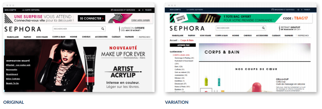
A/A testing is little known and subject to strong discussions on its usefulness, but it brings added value for those who are looking to integrate an A/B testing software with rigor and precision.

But before we begin…

What is A/A testing?

A/A testing is a derivative of A/B testing (check out A/B testing definition). However, instead of comparing two different versions (of your homepage, for example), here we compareĀ two identical versions.

Two identical versions? Yes!

The main purpose of A/A testing is simple: verify that the A/B testing solution has been correctly configured and is effective.

We use A/A testing in three cases:

  • To check that an A/B testing tool is accurate
  • To set a conversion rate as reference for future tests
  • To decide on an optimal sample size for A/B tests

Checking the accuracy of the A/B Testing tool

When performing an A/A test, we compare two strictly identical versions of the same page.

Of course, the purpose of an A/A test is to display similar values in terms of conversion. The idea here is to prove that the test solution is effective.

Logically, we will organize an A/A test when we set up a new A/B test solution or when we go from one solution to another.

However, sometimes a “winner” is declared on two identical versions. Therefore, we must seek to understand “why” and this is the benefit of A/A testing.

  • The test may not have been conducted correctly
  • The tool may not have been configured correctly
  • The A/B testing solution may not be effective.

Setting a reference conversion rate

Let’s imagine that you want to set up a series of A/B tests on your homepage. You set up the solution but a problem arises: you do not know to which conversion rate to compare the different versions to.

In this case, an A/A Test will help you find the “reference” conversion rate for your future A/B tests.

For example,Ā you begin an A/A Test on your homepage where the goal is to fill out a contact form. When comparing the results, you get nearly identical results (and this is normal): 5.01% and 5.05% conversions. You can now use this data with the certainty that it truly represents your conversion rate and activate your A/B tests to try to exceed this rate. If your A/B tests tell you that a “better” variant achieves 5.05% conversion, it actually means that there is no progress.

Finding a sample size for future tests

The problem in comparing two similar versions is the “luck” factor.

Since the tests are formulated on a statistical basis, there is a margin of error that can influence the results of your A/B testing campaigns.

It’s no secret how to reduce this margin of error: you have to increase the sample size to reduce the risk that random factors (so-called “luck”) skew the results.

By performing an A/A test, you can “see” at what sample size the test solution comes closest to “perfect equality” between your identical versions.

In short, an A/A test allows you to find the sample size at which the “luck” factor is minimized; you can then use that sample size for your future A/B tests. That said, A/B tests generally require a smaller sample size.

A/A testing: a waste of time?

The question is hotly debated in the field of A/B Testing: should we take the time to do an A/A test before doing an A/B test?

And that is the heart of the issue:Ā time.

Performing A/A tests takes considerable time and traffic

In fact, performing A/A tests takes time, considerably more time than A/B tests since the volume of traffic needed to prove that the two “identical variants” lead to the same conversion rate is significant.

The problem, according to ConversionXL, is that A/A testing is time-consuming and encroaches on traffic that could be used to conduct “real tests,” i.e., those intended to compare two variants.

Finally, A/A testing is much easier to set up on high traffic sites.

The idea is that if you run a site that is being launched or has low traffic, it is useless to waste your time doing an A/A test: focus instead on optimizing your purchase tunnel or on your Customer Lifetime Value: the results will be much more convincing and, especially, must more interesting.

An interesting alternative: data comparison

To check the accuracy of your A/B Testing solution, there is another way that is easy to set up. To do this, your A/B Testing solution needs to integrate another source of analytic data.

By doing this, you can compare the data and see if it points to the same result: it’s another way to check the effectiveness of your test solution.

If you notice significant differences in data between the two sources, you know that one of them is:

  • Either poorly configured,
  • Or ineffective and must be changed.

Did you like this article? We would love to talk to you more about it.

Article

8min read

Client and Server-Side A/B Testing – The Best of Both Worlds

We’re enriching our conversion rate optimization platform with a server-side A/B testing solution. What is server-side A/B testing, you ask? It’s the subject of an announcement of ours that will make anybody who’s passionate about experimentation pretty excited…because it means they can now test any hypothesis on any device.

No matter if you want to test visual modifications suggested by your marketing team or advanced modifications tied to your back office that are essential in the decision-making process of your product team, we’ve got the right tool for you.

What’s the difference between A/B testing client-side, and A/B testing server-side?

Client-side A/B testing tools help you create variations of your pages by changing the content sent by your server to internet users in the web browser. So, all the magic happens at the level of the web browser (called ā€˜client’ in the IT world), thanks to JavaScript. Your server is never called, and never intervenes in this process: it still sends the same content to the internet user.

Server-side A/B testing tools, on the other hand, offload all of this work from the web browser. In this case, it’s your server that takes on the task of randomly sending the internet user a modified version.

4 reasons to A/B test, server-side

Running an A/B test server-side has many advantages.

1. Dedicated to the needs of your product team

Client-side A/B testing is often limited to surface-level modifications. These refer to visual aspects, like the page’s organization, adding or deleting of blocks of content or modifying text. If you’re interested in deeper-level modifications related to your back office – for example, reorganizing your purchase funnel, or the results of your search or product sorting algorithm – it’s a bit more complicated.

With server-side testing, you have a lot more options to work with, since you can modify all aspects of your site, whether front-end or back-end. With server-side testing, you have a lot more options to work with, since you can modify all aspects of your site, whether front-end or back-end.

All of this is possible because you remain in control of the content sent by your server to your website visitors. Your product team will be overjoyed since they’ll gain an enormous amount of flexibility. They can now test all kinds of features and benefit from a truly data-driven approach, to make better decisions. The price of this increased flexibility is the fact that server-side testing requires your IT team to get involved in order to implement modifications. We’ll get back to this later.

Your product team will be overjoyed to test all kinds of features

2. Better performance

Poor performance – loading time or the flickering effect – is often the first criticism made about client-side A/B testing solutions.

In the most extreme cases, some sites only add the JavaScript tag to the footer of the page to avoid any potential impact on their technical performance. This policy automatically means excluding using any client-side A/B testing tools, since a ā€˜footer’ tag is often synonymous with flickering effect.

When using a server-side A/B testing tool, you don’t have any JavaScript tag to insert on your pages, and you’re in control of any potential performance bottlenecks. You also remain responsible for your company’s security policy and the adherence to internal technical procedure.

3. Adapted to your business’s rules

In some cases, your A/B test might be limited to design-related modifications, but you have to deal with profession-specific constraints that make it difficult to interpret a classic A/B test.

For example, an e-commerce merchant might understandably wish to take into account canceled orders in their results, or else exclude highly unusual orders which skew their stats (the notion of outliers).

With a client-side A/B test, a conversion is counted as soon as it occurs on the web browser side when the purchase confirmation page loads or a transaction event type is triggered. With a server-side A/B test, you remain in complete control of what is taken into account, and you can, for example, exclude in real time certain conversions or register others after the fact, by batch. You can also optimize for more long-term goals like customer lifetime value (LTV).

4. New omnichannel opportunities

Server-side A/B testing is inseparably linked to omni-channel and multi-devices strategies.

With a client-side solution – which relies on JavaScript and cookies – your playing field is limited to devices that have a web browser, whether it’s on desktop, tablet or mobile. It’s therefore impossible to A/B test on native mobile apps (iOS or Android) or on connected objects, those that already exist and those still yet to come.

On the other hand, with a server-side solution, as soon as you can match up the identity of a consumer, whatever the device used, you can deploy A/B tests or omnichannel personalization campaigns as part of a unified client journey. Your playing field just got a lot bigger šŸ™‚ and the opportunities are numerous. Think connected objects, TV apps, chatbots, beacons, digital stores…

Use cases for server-side A/B testing

Now, you’re probably wondering what you can concretely test with a server-side solution that you couldn’t test with a client-side tool?

Download our presentation: ā€œ10 Examples of Server-side Tests That You Can’t do With a Client-side Solutionā€

Included are tests for sign up forms, tests for order funnels, tests for research algorithms, feature tests…

How can you put in place a server-side A/B test?

To put a server-side A/B test in place, you’ll need to use our API. We’ve described below in general terms how it works. For more information, you can contact our support team, who can give you the complete technical documentation.

When an internet user lands on your site, the first step is to call our API to get a unique visitor ID from AB Tasty, which you then store (ex: cookie, session storage). If a visitor already has an ID from another visit, you’ll use this one instead.

On pages where a test needs to be triggered, you’ll then call our API passing in parameters the visitor ID mentioned above and the ID of the test in question. This test ID is accessible from our interface when you create the test.

As a response to your API request, AB Tasty sends the variation ID to be displayed. Your server then needs to build its response based on this variation ID. Lastly, you need to inform our data servers as soon as a conversion takes place, by calling the API with the visitor ID, and data relevant to the conversion, like its type (action tracking, transaction, custom event…) and/or its value.

Don’t hesitate to use our expertise to analyze and optimize your test results thanks to our dynamic traffic allocation algorithms, which tackle the so-called ā€˜multi-armed bandit’ issue.

As you’ve seen, putting in place a server-side A/B test absolutely requires involvement from your tech team and a change in your work routine.

While client-side A/B testing is often managed and centralized by your marketing team, server-side A/B testing is decentralized at the product team or project level. While client-side A/B testing is often managed and centralized by your marketing team, server-side A/B testing is decentralized at the product team or project level.

Should you stop using client-side A/B tests?

The answer is no. Client and server-side A/B testing aren’t contradictory, they’re complementary. The highest performing businesses use both in tandem according to their needs and the teams involved.

  • Client-side A/B testing is easy to start using, and ideal for marketing teams that want to stay autonomous and not involve their head of IT. The keyword here is AGILITY. You can quickly test a lot of ideas.
  • Server-side A/B testing is more oriented towards product teams, whose needs involve more business rules and which are tightly linked to product features. The keyword here is FLEXIBILITY.

By offering you the best of both worlds, AB Tasty become an indispensable partner for all of your testing and data-driven, decision-making needs.

Don’t hesitate to get in touch to discuss your testing projects – even the craziest ones!

Article

10min read

Customization and Personalization: Two Sides of the Same (Millennial) Coin

Whether you believe Millennials are narcissistic, ā€˜special snowflake’ generation orĀ an economically squeezed, misunderstood cohort, most agree they deserve a marketing strategy all their own. Ā Digitally savvy, uncompromisingly mobile, participants in the sharing and gig economies, owners of ā€˜networked selves’…Millennials’ formative experiences are distinctive enough to warrant a closer look when trying to understand their consumer habits.

This is where we come to our double-sided coin: customization and personalization.

Strategies that have come into their own since the advent of the internet, customization, and personalization are perhaps two of the best marketing ideas that Millennials actually respond to. Here’s why:

First: Let’s Define Customization and Personalization

To the untrained ear, customization and personalization sound more or less the same. In fact, they refer to two distinct processes. (Also, if we’re getting technical, we really should refer to our first term as ā€˜mass customization’.) First identified in 1987 in the book, Future Perfect by Stan Davis, ā€˜mass customization’ has come to mean, ā€œthe process of delivering wide-market goods and services that are modified to satisfy a specific customer need.ā€ Distinct from mass production – mass customization’s homogenous, less evolved precursor – mass customization allows consumers to assemble their own, unique product according to their particular tastes and needs. Ā Think of picking out colors, patterns, and designs to craft your very own Nike shoe or Burberry coat. It’s still branded Nike or Burberry – but it’s also distinctly you. Mass customization is a practice driven by the consumer that allows them to become ā€˜co-producers’ with the brand of their own uniquely personal product and is a process that must be reproduced at scale by the company.

Burberry Bespoke
The high-end brand Burberry launched their mass customization option, Burberry Bespoke, in 2011.

Source: The Wall Street Journal

Personalization, on the other hand, is a marketing strategy driven by the company, based on consumer data, that aims to create personalized, or ā€˜one-to-one’ communication with a single consumer or consumer segment. We might date the idea back to the 1993 book, TheĀ One to One Future, by Don Peppers and Martha Rogers. When you receive an email that uses your first name in the subject line or see product recommendations algorithmically chosen ā€˜just for you’, or if a website’s homepage changes to reflect your past purchase history, location or gender…you’ve experienced personalization. The company in question is trying to create a hyper-relevant message designed specifically for you, in the hopes that it will cut through marketing noise to grab your attention and bring you through the sales funnel.

Sephora personalization
Our client Sephora saw a 16% increase in transactions after personalizing their website according to whether visitors were loyalty card members or not

Customization Deep Dive

There is a premium on individuality, especially with millennials and gen Z.Ā The customization thing is like the ā€˜you but better’ movement, but almost the reverse. It’s like ā€˜this thing but better, because it’s about me.’

– Ā Jackie Chiquoine, Racked 2016

You can certainly see the similarities between the two strategies. Both aim to make consumers feel uniquely understood and marketed to as individuals. Both put a high value on self-expression and personal tastes and experiences. Both create the illusion that consumers are being given bespoke treatment and have a one-on-one relationship with the brand. And both, in a way, involve the consumer as a co-producer of value – for customization, it means relying on their predilections to craft the product, and for personalization, it’s sharing their data (unbeknownst to them or not) to create personalized marketing messages.

You can see how those who dramatize Millennials’ navel-gazing tendencies certainly favor these two strategies for targeting them. But customization and personalization also speak to Millennials’ ability to see right through traditional marketing, their distracted viewing habits (customization and personalization more easily grab attention), and their penchant for social networks. Ā Burberry, for example, savvily allowed anyone to share their customized Burberry creation on social networks, even if they couldn’t actually afford to buy the product.

Burberry share my design
Even if the consumer can’t afford their Ā£1,295 creation, note the ā€˜share my design’ buttons on the bottom right: they can still express themselves through their customized creation – and promote the brand – on social networks.

Source: Luxury Society

Why Does Customization Work?

If we want to dig a bit deeper as to why customization techniques work – for Millenials or anyone else – Customer Experience Psychologist Liraz Margalit has a few ideas. She explained to TechCrunch that two general principles are at stake: ā€œI Built It, Therefore I Own Itā€, and ā€œI Own It, Therefore It Is Superbā€.

ā€œI Built It, Therefore I Own Itā€ refers to the idea that participating in the elaboration of an item – even virtually, as on a website – leads to a sense of ownership of that item. In Margalit’s words, ā€œThe opportunity to take part in a process and influence the end result promotes emotional attachment that leads to psychological ownership, the feeling that something is ā€œmineā€ even without legal ownership.ā€ She then referred to work by Dan Ariely and his so-called ā€˜Ikea Effect’, which shows that people put a higher value on objects they have actually worked to produce.

Similarly, ā€œI Own It, Therefore It Is Superbā€ refers to the Endowment Effect or the finding that, ā€œconsumers value an object more once they have taken ownership of it.ā€ Margalit talks about a study at Cornell University in which students favored objects they had ā€˜owned’, even for a short time, over those they had never had a claim to.

Basically, when you customize an item, you pour a little part of yourself into it, you feel that it already belongs to you, and you value it more – and are therefore motivated to finalize your purchase, and even pay a premium.

These psychological underpinnings, in addition to Millenials’ particular need to be wrenched from constant multitasking and their penchant for self-expression, makes customization a good choice for this age bracket. Throw in the idea that co-creating a product with a brand approximates what Pine and Gilmore call ā€˜an experience’ (Ć  la, The Experience Economy), and you’ve got yourself a winning hand.

Joseph Pine BBC
Joseph Pine explains how Mass Customization led to the Experience Economy – and what’s next in line in terms of virtual experiences.

Personalization Deep Dive

Millennials want a customer-centric experience in which they feel wanted and valued. Whether it is in-store or through social media channels, showing interest in these shoppers creates loyalty. In order to do this, retailers need to closely examine what they’re currently doing with customer data, and ensure this information is being utilized to deliver a more personalized in-store experience.

– Tom McGee, Forbes 2017

Ultimately, though a product strategy on the part of the company, mass customization is driven by the consumer. Especially appealing to Millennials, it’s a way of validating their own sense of self through ā€˜build-a-bear’ style product production.

With personalization, the onus is much more on the company to bring value and deliver meaning to the consumer audience they’re targeting.

Because of their ā€˜digital native’ status, and possibly due to some kind of ā€˜me me me’ generational fluke, Millenials are more receptive to personalization techniques. Salesforce noted in their State of the Connected Consumer report that, ā€œSixty-three percent of Millennial consumers and 58% of GenX consumers are willing to share data with companies in exchange for personalized offers and discounts.ā€

Salesforce personalization
Source: Salesforce

This is, of course, a boon for marketers, since data is the backbone of any personalization strategy. It opens up many avenues for creating relevant – and therefore high converting – experiences for consumers. Personalization strategies can go from relatively simple campaigns, like segmenting emails by industry and inserting someone’s first name into the text, to more sophisticated onsite personalization campaigns to complex multi-device operations. Finding the kinds of scenarios and messaging that will resonate with Millennials will probably take some brainstorming sessions, inspirational reads and inevitably some trial and error – and will, of course, depend on your industry and product. Here’s a quick look at what some marking executives are using for personalization efforts:

eMarketer Personalization
Source: eMarketer

Aside from the platitude of, ā€˜the more relevant, the better’, is there any psychological data to explain why personalization strategies lead to higher conversion rates?

The quick answer is ā€˜yes’ – namely a study conducted at the University of Texas that was picked up a few years ago by HubSpot. As they explain, this research admitted the efficacy of digital personalization techniques and boiled its success down to the human desire for control and information saturation. Ā 

People naturally crave to be in control of their surroundings (and their own fate, free will…) and personalization techniques create a cherry-picked environment that feeds into that need. Bargain hunting for low-priced kitchenware from your favorite outlet? If ads for the very items you’re looking for suddenly appear all over the internet, it somehow creates a feeling of empowerment, as if in some impossible way, your wishes and needs automatically manifest.

As for information overload, this is the classic argument that contemporary consumers are exposed to a dizzyingly high number of marketing messages, far too many to ever register consciously, let alone remember or act on. Personalization strategies both (hopefully) limit the number of marketing messages a consumer is exposed to in the first place, as well as stimulate the brain to recognize these stand-out strategies, as opposed to letting them sit in the background of our consciousness. Ā This is the idea of selective attention or the fact that your brain will automatically pick up on potentially important stimuli – i.e. those most relevant to you.

The Takeaway

Though not the same, (mass) customization and personalization strategies revolve around people’s deep-seated desires for self-expression and recognition – as well as their limited attention spans. Ā Particularly relevant for the Millenial age bracket, successful customization strategies will make the consumer a co-producer of value alongside the brand, and successful personalization techniques will identify valuable data and use them to create and deploy ultra-relevant marketing messages.

Article

8min read

The Ecommerce Conversion Funnel Survival Guide

What is a conversion funnel?

All online businesses are comprised of a certain number of steps that transform visitors into clients. With that in mind, if you’re reading this article, it’s probably because you’re interested in the thorny questions, How can I convert my visitors into clients, and, even more importantly, How can I make them loyal clients?

Whether you want your website visitors to leave their email address, download an ebook or buy your products, they’ll pass through a certain number of steps before this objective is realized. These steps make up your site’s conversion funnel.

Purchase Funnel

The idea behind the conversion funnel (or ā€˜purchase funnel’, ā€˜sales funnel’…) is the funnel metaphor: many people will land on your site, and only a small percentage will actually end up buying.

To optimize your conversion funnel, download our ebook on limiting shopping cart abandonment.

Why? Your visitors go through several decisive steps during the purchasing process, which is often described using the AIDA model: Attention, Interest, Desire, and Action.

  • Attention. This is the first step of your conversion funnel. You attract visitors by increasing your site’s visibility in the hope they’ll get to know your products. Ā You’ll achieve this thanks to ads, social networks, content marketing, etc.
  • Interest. Once you’ve attracted visitors to your site, the real work begins. You have to spark interest in your products. How? Relevant content, attractive visuals, and special offers are good ways to start. The idea is to entice engagement between you (the website), and your visitors, who probably don’t know you yet. Suggesting they subscribe to your newsletter is another good way of building interest.
  • Desire. This next step involves creating a relationship of trust and the desire to buy. The idea is to create a reassuring and relevant environment that will help pull your prospect further and further along the sales funnel. Personalized, interesting email campaigns will help you: you can offer special promotions, case studies or client testimonials that reassure your visitors and make them want to take action.
  • Action. This is the heart of the matter, the final, crucial step of your sales funnel. By this step, your visitors have passed through the conversion funnel and have begun engaging with your brand (they’ve downloaded something, subscribed to something or even called someone). Now, your goal is to convince your prospects to convert by purchasing something or completing another desired action. You’ll want to keep your payment pages clean and simple, only displaying relevant, convincing information that will help turn your prospects into clients.

Because the end goal of your ecommerce site is to convert, ecommerce professionals use the sales funnel to analyze how well a site converts visitors into clients at each step of the process.

Why is a conversion funnel useful?

A conversion funnel is a very powerful tool that’s easy to put in place that allows you to understand what problems your visitors bump up against the buyer journey, and how to fix them.

Let’s take a look at this:

Fitzroy's Flower London

On this London flower delivery site, half of the products shown on the right have a display issue: it’s impossible to see or click on the CTA ā€˜buy’ – this isn’t good!

The idea behind using a conversion funnel is to better understand the steps that a visitor to Ā your website has to go through:

  • What pages have problems?
  • What is the conversion rate of each step?
  • How many people leave the site after one, two or three steps?
  • What step or page has high drop off?

By analyzing these issues, you quickly get a better idea of the strong and weak points of your site.

Even better: you know what step(s) you have to work on in your sales funnel to get more orders, emails or inbound calls.

By taking a look at your conversion funnel, you’ll see that only a very small percentage of your visitors will actually get to the last step (ā€˜Action’). That’s why even small changes at each phase of the sales funnel can greatly increase the number of your conversions. You can use A/B testing to test and measure the effects of these modifications.

How can you measure and improve the performance of your conversion funnel?

At this point, you’ve understood the importance of the conversion funnel in ecommerce. The goal behind analyzing the conversion funnel is to improve conversion rates on your site (and therefore to increase sales), all the while analyzing visitor behavior to limit drop off at each stage of the sales funnel.

Depending on the kind of site you want to analyze, you can establish conversion funnels of varying size.

Decathlon
A wide funnel is a good choice for a product-oriented ecommerce site that wants to have a global view of how visitors navigate the site from the home page up to the basket, like on the above Decathlon site.
Tunnel de conversion pour Ebook
A narrow funnel is a good idea for sites that don’t have many pages (and therefore fewer steps) or for sites that only want to analyze one single step of their buying process, like in the above example of a (French) gardening site that also proposes an ebook.

In general, there are many best practices that can help you make your conversion funnel smoother and increase sales.

The main idea is simple: Make the customer journey as easy as possible and get rid of any roadblocks that stop your prospects from converting or from abandoning their cart.

Be clear and simplify navigation

A complicated or unclear navigation hinders conversions. Your visitors should be able to intuitively find what they’re looking for, and be guided through the sales process. This means highlighting useful links and sections of your website and deleting secondary or even useless sections.

Payplug
On PayPlug, navigation is clean and the value proposition is simple: ā€˜try’ or ā€˜find out more’

Avoid information overload

Information overload is information’s worst enemy. Try to order the information you present to your visitors by importance. Concentrate essential information at the beginning of a visitor’s navigation, and let the really curious ones dig for more info deeper in the site.

H&M Home
On H&M Home, information is classed according to a few categories so a visitor can easily get their bearings: they can choose how they want to explore products and ignore categories that aren’t relevant to them.

Offer help

Many visitors like to ask a few questions before finalizing their purchase, and an even larger number of visitors don’t finalize their purchase because they couldn’t get help at the right time. Putting in place services or a help desk type of chat can help increase conversions while reassuring your visitors.

HubSpot chat
Even when there isn’t anyone to man the ship, HubSpot makes sure there is always a chat option open on their site so that eager visitors can ask questions and get quick answers.

Highlight reassuring elements

ā€˜Social proof’ is a powerful tool for improving conversions. Putting up client testimonials, client ratings or reviews can reassure visitors as to the legitimacy of the site that they’re on, which can have a big impact on increasing conversion rates.

Trello references
Trello displays a lot of well-known references on their home page. This reassures prospects and creates a feeling of trust.

To go even further with the optimization of your site, read our advice about limiting card abandonment.

Article

7min read

AB Tasty Reaches a New Milestone in Optimizing UX for Dynamic Websites

AB Tasty once again pushes the boundaries of tech, making it that much easier to optimize user experience on all types of sites

We’re very proud to announce the roll-out of an A/B testing and personalization platform that’s fully compatible with ReactJS, Angular.js and other popular JavaScript frameworks. Ā The best part? Running campaigns on any Single Page Application (SPA) doesn’t require you to write a single line of code!

We would be remiss if we didn’t thank our extraordinary R&D team – many of whom were hired specifically for their skills working with these frameworks – who toiled tirelessly to make this new functionality possible.

Current AB Tasty users don’t have to change anything about how they use the interface since this innovation is seamlessly integrated into the platform. Ā This evolution allows us to stay true to our values of simplicity and efficiency, while at the same time bringing a host of advantages to our users, including:

  • Compatibility with all current or future frameworks
  • A boost in performance with a faster page load time and a lighter JavaScript tag
  • No more flickering effect

An overview of 6 years of constant innovation…
all so we can better serve our clients

AB Tasty Innovation Timeline

Some technical background

A/B testing softwares that work on the client side, such as AB Tasty, rely heavily on JavaScript. To clearly understand what new JavaScript frameworks bring to the table and what implications they have, we need to first clarify how traditional A/B testing usually works. When an Internet user requests a page from a website (ā€œserverā€), the former sends the requested content as a static page that includes all the HTML code and assets that the user browser (ā€œclientā€) will interpret and render.

Part of this content is the A/B testing solution code, that automatically executes on every page load in order to modify the DOM (Document Object Model). The DOM is the representation of the page content and can be manipulated, using jQuery. For instance, changing or deleting page elements such as text, imagery, layout, etc. That’s what A/B testing does, at its core.

What’s changed with new JavaScript frameworks?

Javascript frameworks or libraries such as React JS, Vue.js, Ember.js have gained popularity over the past few years due to the streamlined user experience they offer: no page refresh, highly interactive navigation, less data transfer, and so on. They have become part of any modern web development stack and are used by an increasing number of websites such as Facebook (its creator), Airbnb, American Express, Spotify, and many more.

React and JavaScript Frameworks

But the way these frameworks behave pose one major issue for traditional A/B testing client-side tools: there is no page reload when a user interacts with the page/content, which means that the A/B testing code is loaded once, and is not aware of state changes induced by these frameworks. Any user interactions generally trigger a change in the state of the application: meaning, what’s displayed to the user at any given time, depending on the data available and the trigger. For React JS applications, one common issue is that UI components are re-rendered every time the state is changed. So, traditional A/B testing tool changes won’t stick, as they’re removed by React šŸ™

How can you run A/B tests on single page applications?

If you’re running a single page application or using one of the aforementioned JavaScript frameworks, running A/B tests can be messy and involve a lot of development work. Some solutions require you to identify the states you want to target and conditionally activate your experiment code through API calls once a visitor enters the desired state. Other solutions hardcode test modifications in your application or even require a custom deploy for every new A/B test.

A/B testing tools need custom developments to work with React

These solutions may fit with your organization and development team’s knowledge, but make things difficult for users (product managers, marketers, etc) who want to launch tests without having to involve their dev team. All the solutions mentioned above require collaboration with developers to write the needed code. This is far from ideal if you’re looking for agility!

AB Tasty, the game changing testing software for the modern web

Since AB Tasty’s creation, our mission has remained unchanged: to make it easy to run A/B testsĀ and accessible to all teams, regardless of their level of technical knowledge. This mission is at the forefront of everything we do and we consider it our role to adapt to innovation and development trends, rather than making our users adapt.

We foresaw the emergence of new JavaScript frameworks and the impacts they’d have on traditional A/B testing a while ago and started working on a truly innovative solution to make AB Tasty compliant with modern web development stacks while keeping it easy to use. As these frameworks are here to stay (even if there are a lot of them, some with specific flavors) we put all of our efforts and resources into providing you with the best solution possible.

[clickToTweet tweet=”You can now easily A/B test sites with #reactjs or #angularjs using @ABTasty. ” quote=”You can now easily A/B test sites with #reactjs or #angularjs using @ABTasty. “]

By that we mean, we hired an army of highly proficient front-end developers to focus on this specific topic (12 to be precise!) After months of hard work, they’ve come up with a pretty darn good solution (if we do say so ourselves).

It relies on our ability to check and apply modifications in modern browsers 60 times per second. Every 16ms, before the browser starts to render its display, we hook in, check if there are modifications to apply, and, if so, apply them. This is a totally independent framework. So, if a user interaction triggers a React component to be re-rendered, we apply the modification before the browser starts to render whatever React is sending back to them. It works the same way for Vue.js, Ember.js, or any other JavaScript frameworks.

[clickToTweet tweet=”The dev team at @ABTasty developed a meta-language to make #abtesting possible on #reactjs!” quote=”The dev team at @ABTasty developed a meta-language to make #abtesting possible on #reactjs!”]

To make this possible, our engineers also wrote a new meta-language to describe the content of the variations and interpret it. This allows us to not store this content as JavaScript (even if we still do it for backward compatibility), keep a history of all modifications, and apply them on-demand, like when a state change occurs. This makes your tests possible on any single-page applications.

What are the benefits of this new approach?

Finally, a solution that doesn’t require jQuery and entirely gets rid of the flickering effect

Framework agnostic

It works with React JS and all other JavaScript frameworks and libraries (Ember.js, Vue.js, AngularJS, Meteor.js, etc.). It doesn’t matter if you use one of them for your whole site or just specific areas like your shopping cart or sales funnel.

Zero chance of having a flicker effect

Everything is now managed in an asynchronous way and we apply modifications every 16ms so they won’t be visually noticed.

Ability to use the AB Tasty WYSIWYG editor, as usual

Backwards compatibility

By using our new framework (v2.3), you can be confident that your existing campaigns will deliver correctly, even if you don’t use any of these JavaScript frameworks or use older versions.

Want to try it?

Are you an experiment addict, frustrated with not being able to run tests on these popular Javascript frameworks? Are you looking for more agility? Are you tired of the flickering effect? If so, request your custom demonstration.

Article

5min read

Top 15 of the Best Landing Pages for Lead Generation

If you have a website, then you are most likely looking for a specific outcome such as generating new leads. Having an optimized landing page is crucial in order to maximize your chances of converting those visitors into prospects.

However, it is sometimes worth A/B testing an entirely different landing page. It may sound drastic but the potential outcome is worth the effort! So this week we decided to give you a head start by selecting 15 beautiful yet effective templates fromĀ ThemeForest, which will help you build the perfect optimized landing pageĀ for lead generation.

The template library from ThemeForest has a wide selection of modern and well-coded pages for you to choose, at an affordable price (typically between $8 and $15). Both the implementation and personalization of the page can be made very quickly (within a day). Once your new page is ready, you can easily set up a test using our A/B testing tool, which will allow you to split your traffic between your original page and the new landing page.

Find your own template below and happy testing!

1. Approach Landing Page

High conversion landing page template

2. Ā All-in-One

Home landing page template

3. Plaza Education/Hotel/Dating

Online course landing page template

4. Crossway Startup

Simple landing page template

5. Converting Landing Page

Converting landing page template

6. Attraction Responsive

Mobile application landing page template

7. xLander Premium

Design landing page template

8. Car Rental

Car rental landing page template

10. Bivio Startup ResponsiveĀ 

Startup landing page template

11. Condio Real EstateĀ 

Real estate landing page template

12. Paidjoo Business & List Builder

Business landing page template

13. Wealth ResponsiveĀ 

Health & medical landing page template

14. Diploma Education Bootstrap

Education landing page template

15. Multipurpose LandingĀ 

Multipurpose landing page template
Additional resources:Ā on the blog you can find more examples of landing page designs, as well as WordPress templates andĀ Bootstrap landing pages to create high converting landing pages.