It’s hard to go on the web without stumbling across an eye-catching page that asks for our email address, a subscription, or a contact.
Because landing pages are everywhere, it’s hard to know which solutions offer the quickest and best way to create successful bootstrap landing page templates.
Landing pages have been and will always be one of the best ways to generate qualified leads. This is why it’s so important to find the right solution.
As a reminder, a landing page is a page of your website on which your visitors “land” and it is specially designed to convert for a particular purpose: a sale, giving an email address, registration, watching a video, etc. This is why it’s so important to find the right solution.
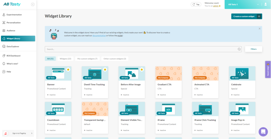
AB Tasty is a great example of a tool that allows you to test elements of your web page from headline CTA, to hero image, to web copy. With AB Tasty’s low-code solution, you can get these tests launched with ease and start increasing your conversions.
At a time when A/B testing has become essential to quickly test your ideas and concepts to immediately see if visitors’ responses are good, landing pages have become a vital tool for generating sales quickly.
Because we want to save you time, here is a selection of 15 free bootstrap landing page templates to build your landing pages quickly and easily.
If you use a CMS, we have also set up a selection of WordPress landing page templates and listed other landing page designs.
Multi-Purpose Landing Page Template: Regna
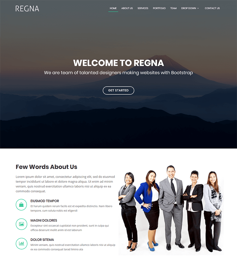
Regna is a bootstrap-based landing page template that is clean and easy to customize.
Ideal for all types of agencies and business services, it is an easy-to-use one-page site. The already-built menu can be quickly customized according to your business.
The general presentation of this template is clear and direct which is perfect for companies that want an accessible site that goes straight to the point to present its services, customers, team, etc.
As a bonus, browsing is smooth and perfectly responsive on all devices.
Corporate Landing Page Template: Sailor
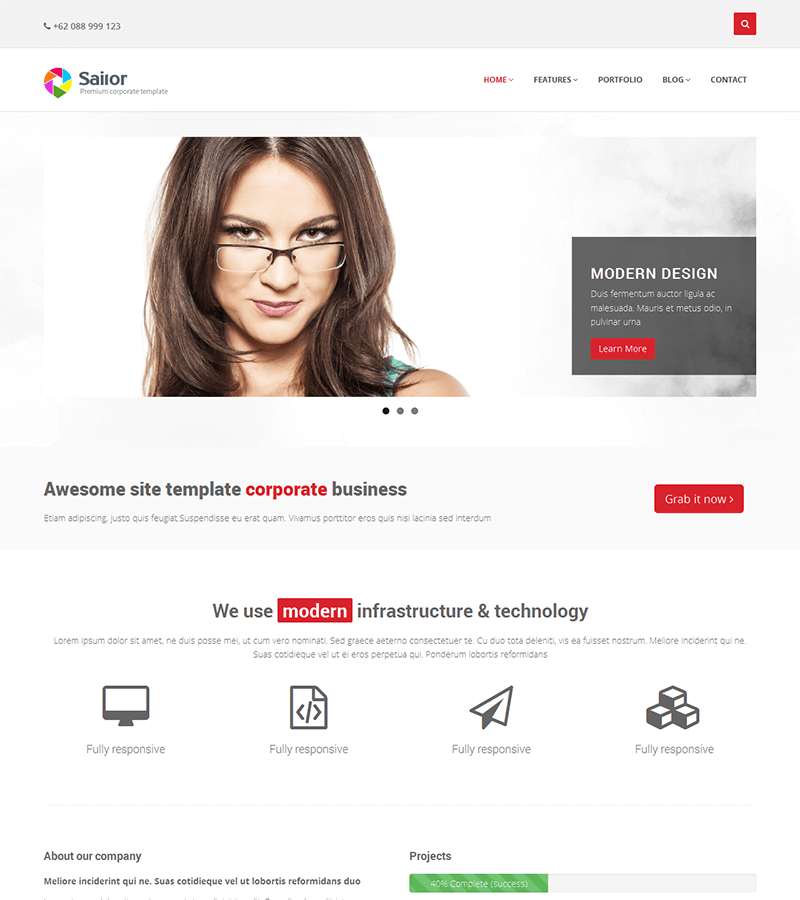
Sailor is a perfect bootstrap template for corporate business landing pages.
The design is customizable, and it has many easy-to-use features such as transition animations, pre-integrated color palettes, etc.
Perfectly responsive on all platforms, it is the ideal template to introduce your company, your client portfolio, your history and more!
Multi-Purpose Landing Page Template: Bell
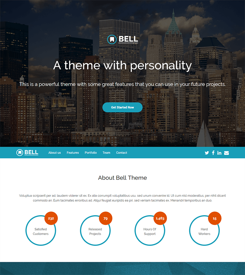
Bell is the ultimate all-around template to get you started on creating your new landing page quickly.
Easy to manage and 100% mobile-friendly, it adapts to almost all types of projects (excluding e-commerce) such as agencies, real estate, industry, construction, finance, consulting, household services, etc.
The design is modern and elegant, with finely tuned transitions and scroll animations. In summary, it’s a must-have!
Medical Landing Page Template: MediLab
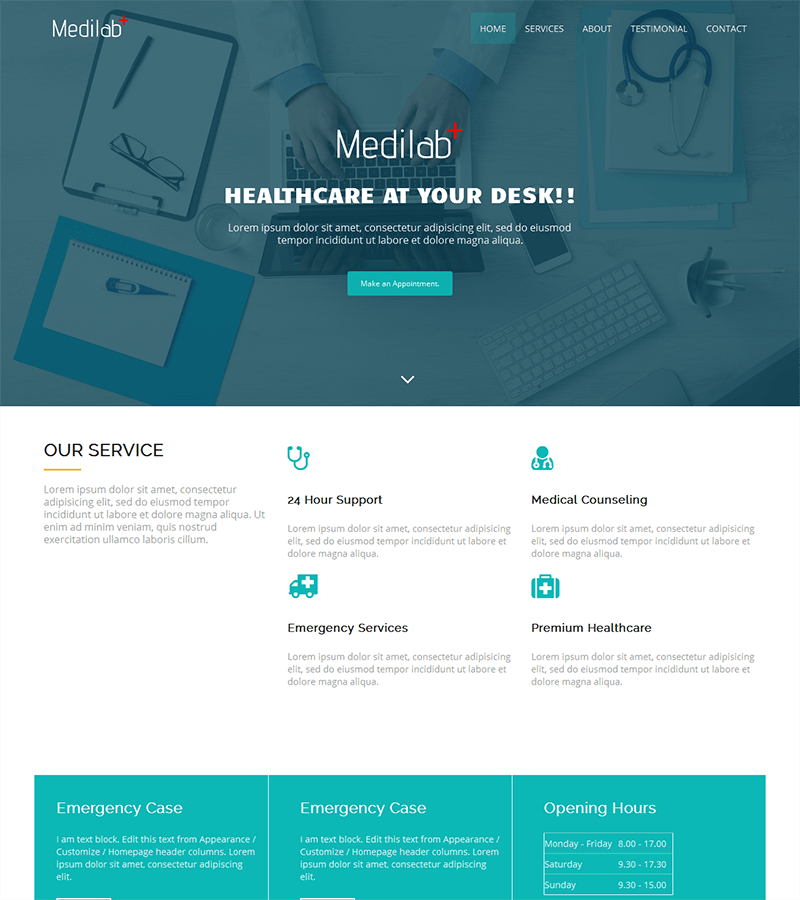
MediLab is a worthwhile landing page for companies in the medical sector, clinics, and all activities related to healthcare and medicine.
Easy to customize, this bootstrap template is 100% responsive and contains all the functionalities the medical sector needs: making appointments, displaying patient testimonials, displaying maps, opening hours, etc.
Photography Landing Page Template: Laura
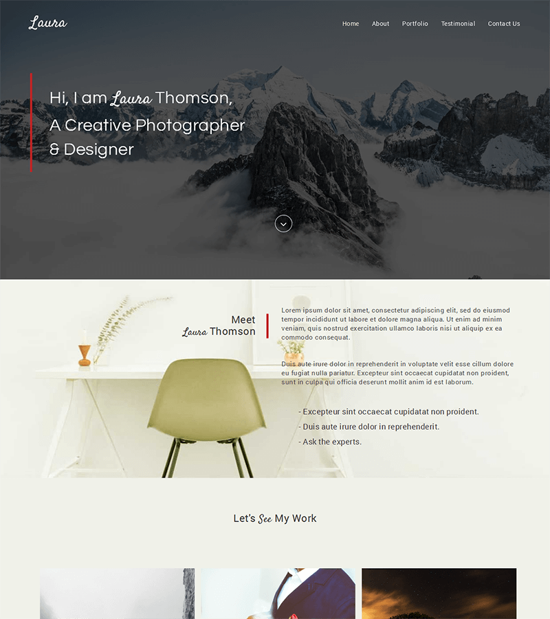
Laura is a particularly interesting template for photographers, web designers, start-ups, and companies who want to communicate visually by incorporating storytelling on their landing pages.
The bootstrap template is easy to learn, customizable, and mobile-friendly, no matter the device.
The customizable color schemes and smooth navigation make this landing page easy to browse and clear in its value proposition.
Upcoming Product Landing Page Template: Maundy
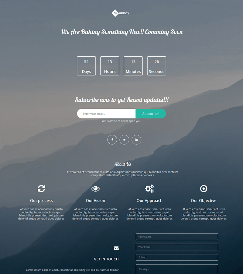
Maundy is a simple landing page template specially designed for anything “Coming Soon.”
It’s a perfect option for when you are working on an upcoming product (for example, a crowdfunding campaign) but you still want to have a landing page to collect email addresses, registrations, etc.
Clear, simple, and elegant, this template has the perfect countdown feature to announce an upcoming event or the release of your future service/product to the general public.
Minimalist Landing Page Template: Bethany
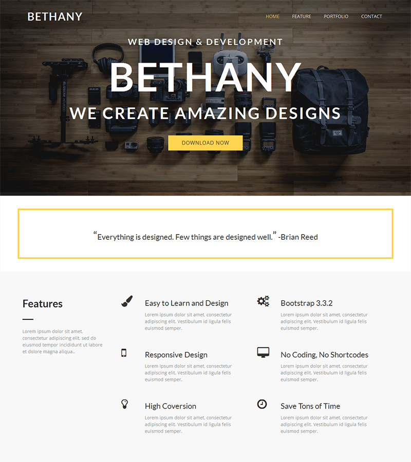
Bethany is an easy-to-use, modern and minimalist bootstrap template.
It is ideal for web designers, creative agencies, content creators, and professionals in industries related to photography or development.
It is compact, 100% responsive, and integrates internal templates to create forms, buttons, and custom navigation.
Freelancer Landing Page Template: Instant
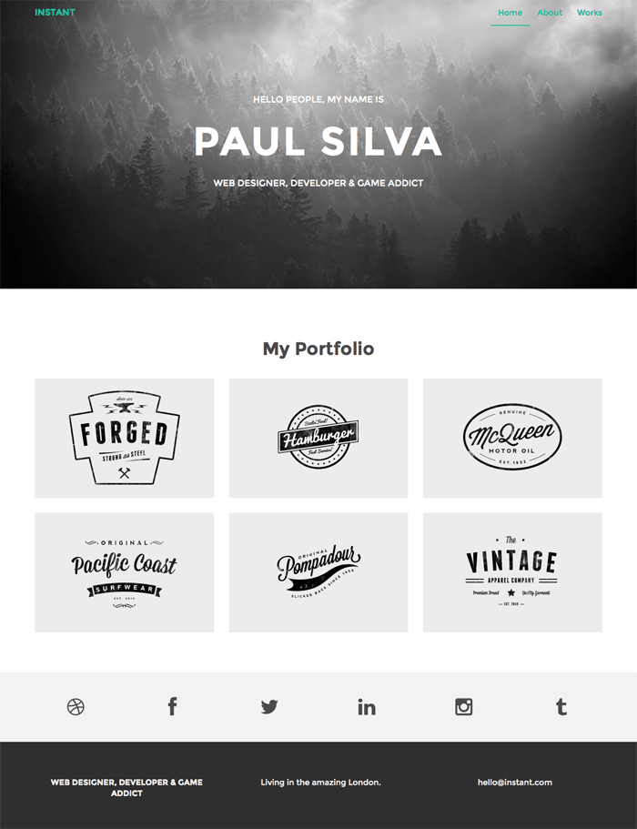
Instant is a perfect bootstrap WordPress theme for freelancers.
Simple and elegant, it contains 3 pages that allow you to quickly create a homepage, a contact page for information, and a portfolio page to present your creations.
It is easy to customize and allows freelancers to have a site to showcase their activities.
Freelancer Landing Page Template: Stylish Portfolio
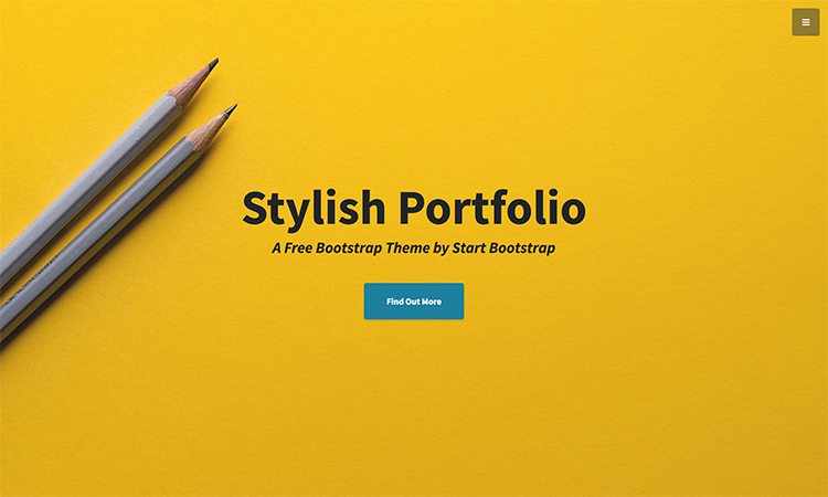
Stylish Portfolio is an ultra-modern template and design to present your creations.
Smooth and clear, this landing page template is ideal for agencies and freelancers of all kinds (web, photography, design, etc.) wanting to have a showcase for their creations.
100% responsive, it has a scroll improved by jQuery. Another benefit to this template is that its footer includes a Google Maps module– perfect for showing your location to your customers.
Mobile App Landing Page Template: New Age
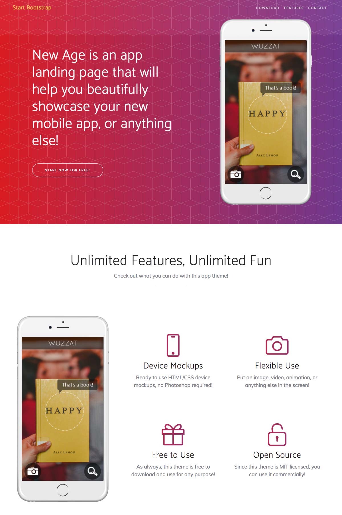
New Age is the perfect bootstrap template for all mobile app creators.
Specifically designed to present an app’s features, the template is 100% mobile-friendly, and the browsing function is smooth and intuitive.
It contains ready-made “App Store” and “Play Store” buttons as well as calls to action to encourage your visitors to download the application.
The sleek and modern design can be easily customized to fit your app’s colors, company logo, and other custom features quickly.
All in all: a must-have for any mobile-based business.
Blogger Landing Page Template: Clean Blog
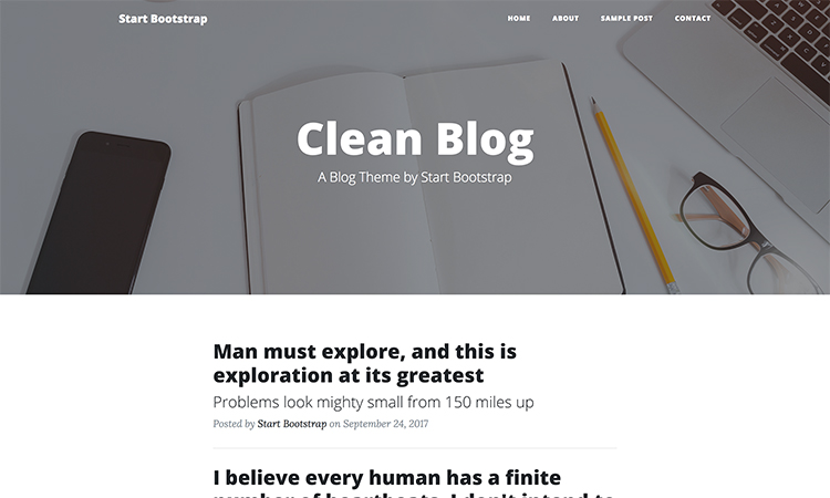
Clean Blog is a template created with Bootstrap 4.
Perfect for starting a blog, Clean Blog has easily customizable elements and is 100% responsive.
This template is easy to use, edit, and is the perfect asset for bloggers who want a reliable and highly editable base to start their blog.
It contains a contact form in PHP with a sending confirmation function and a footer with links to social networks already integrated.
SaaS Landing Page Template: Butterfly
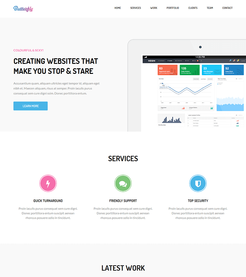
Butterfly is an ultra-complete template for start-ups and companies that offer software or SaaS solutions.
In addition to its smooth and serious navigation, the template includes sub-pages of services and a presentation of the portfolio, the team, and customer testimonials all on one page.
It contains ready-made contact forms and powerful call-to-action designs to attract future customers.
Its modern and elegant design makes presenting your offer ultra-clear and precise.
Multi-Purpose Template: Tempo
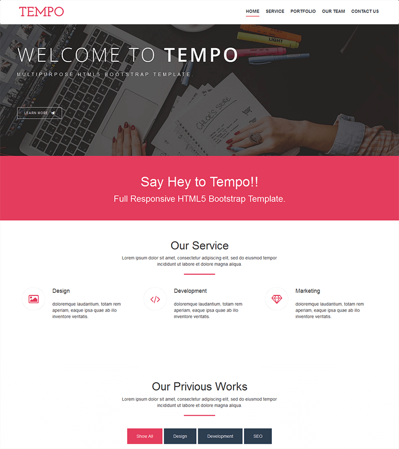
Tempo is a simple but effective landing page template.
Tempo contains easy-to-change color schemes and all the features expected of a user-friendly landing page to present your solution and services to customers and to make contact with prospects.
Completely responsive, it adapts well to tablet and mobile platforms and includes advanced features like image sliders, etc.
Multi-Purpose Template: Company
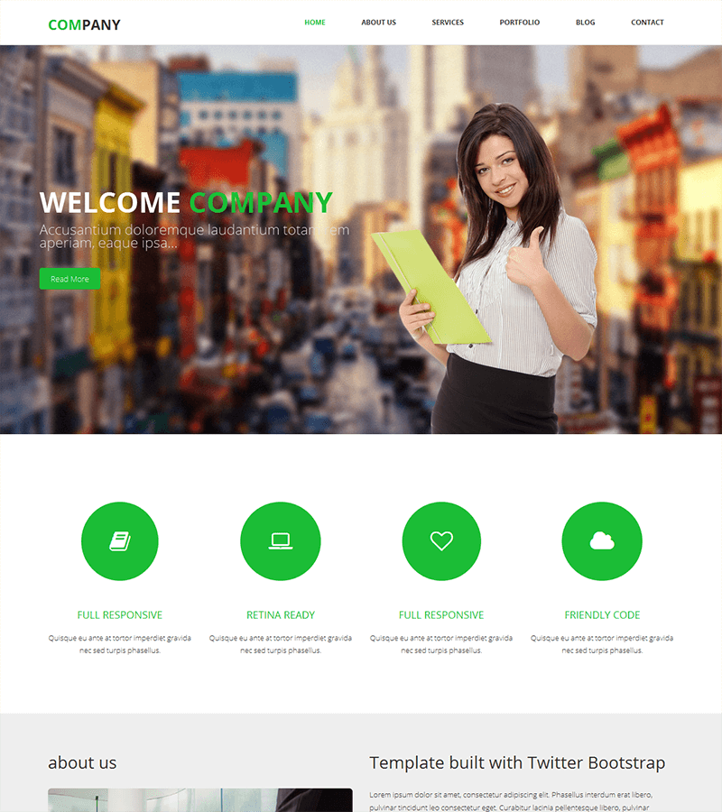
Company is a generalist template perfectly suited to small and medium businesses in all industries.
Easy to edit, it is 100% responsive and allows you to present your services easily and with great impact.
It’s an ideal choice for industries like plumbing, law, and personal services.
It includes advanced contacting features and allows you to create an in-house blog and a news page. These features are perfect for acquiring new customers or talking about your brand.
Restaurant Landing Page Template: Delicious
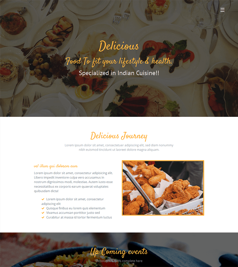
We could not finish this article without leaving a reliable and easy-to-set-up solution for restaurant owners!
Delicious is the perfect template for restaurants, bars, catering, and wine businesses.
The Delicious template works in HTML 5, CSS 3, and bootstrap 3 and includes advanced features to create dynamic effects.
Creative and modern, its elegant design recreates your restaurant’s atmosphere and easily presents your menus.
A paid option, at €9 for life, allows you to integrate a reservation module that works perfectly in PHP/Ajax.
Choosing Your Bootstrap Landing Page
As far as free landing page templates go, you have a variety of well-chosen templates listed above that are sure to help you find a format that can generate leads.
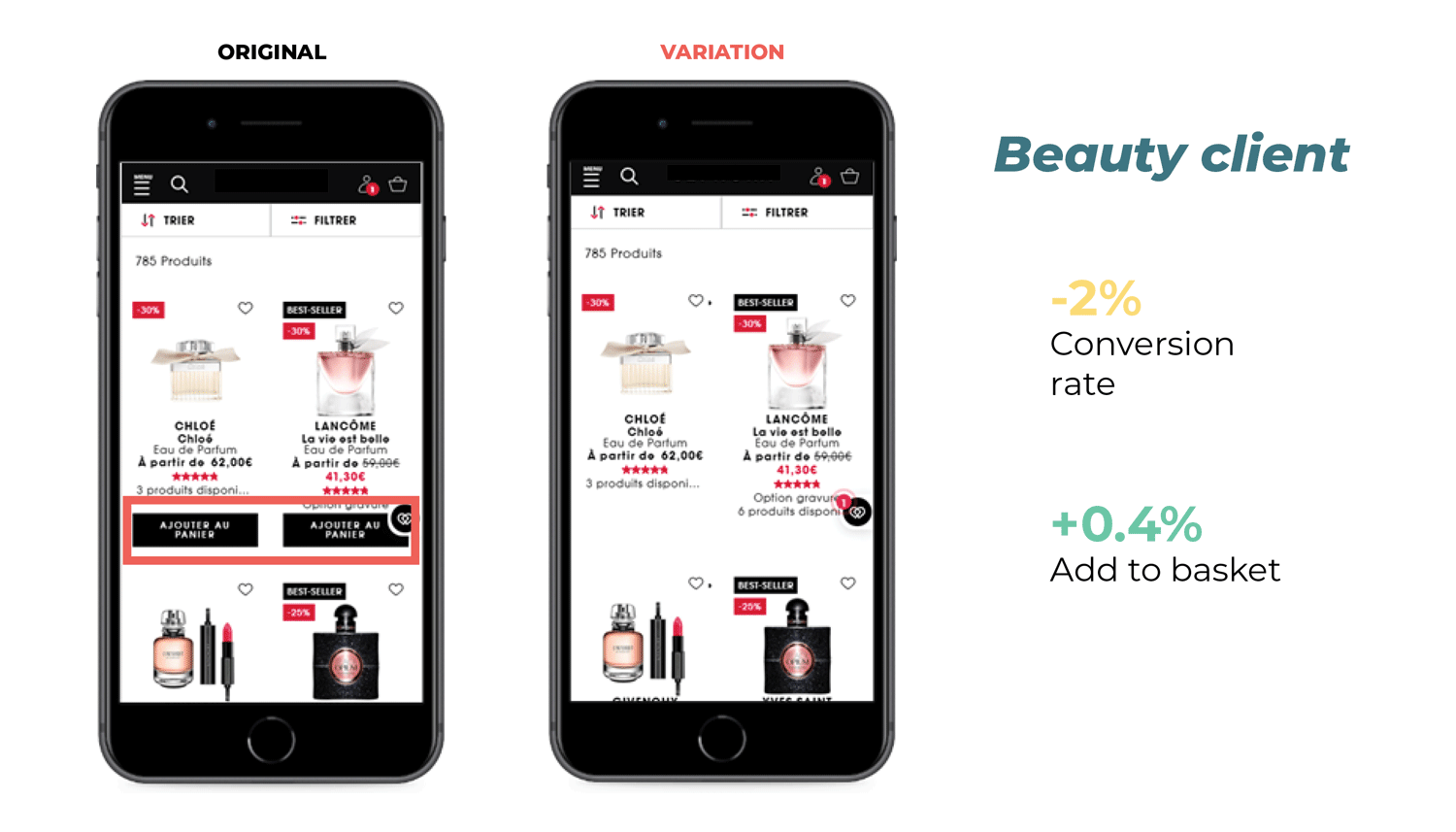
Don’t forget that no matter which template you choose, it’s vital to test your bootstrap landing page to see if there is a positive impact on your conversions. If you are not familiar with A/B testing, check out our complete guide to A/B testing.
Have you found your ideal landing page template yet? Let us know in the comments below!