Did you know that it takes about 50 milliseconds for users to form an opinion about your website? Or that 88% of online consumers are less likely to return to a website after a bad experience?
Well, now you do. And what these statistics imply is that you can no longer push user experience design to the back burner. Rather, know who your target audience is and involve them in the design process. Ask them questions to understand their struggles and desires. Eventually, you’ll begin to notice patterns in their answers that you can then use to identify design solutions.
But it isn’t as easy or straightforward a process as it seems.
When you test your website with users, a cognitive bias called the Framing Effect can interfere. If you remember, we’d talked about it at length with respect to loss aversion. If not, give it a read. In the meantime, let’s go over its Wikipedia definition:
Framing Effect is where people decide on options based on if the options are presented with positive or negative semantics; e.g. as a loss or as a gain.
Put simply, people’s responses are influenced by the way a piece of information is presented to them. In your case, as a UX researcher and designer, it means that led by your own biases, you may frame questions that confirm your hypothesis instead of finding the objective truth. And that’s a major fail because if you don’t recognize it early on, you’ll end up with a website designed for yourself.
With that in mind, let’s figure out how you can you keep this bias in check.
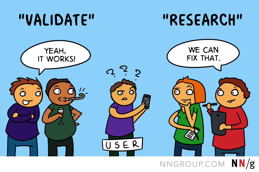
Don’t Ask Leading/Manipulative Questions
…for the simple reason that they can prime users and influence their answers. They will say what you want to hear instead of giving you honest responses.
To understand this better, read the following questions out loud. Which of them, according to you, will provide more reliable feedback:
- I saw that you were confused when navigating the website. What was the issue?
- What was easy or difficult about navigating the website?
- You were having difficulty navigating the website. Why so?
My guess is that you’re going to pick #2 because #1 and #3 are leading questions. They encourage a certain type of answer that can result in inaccurate feedback and bad decisions. Wondering how? Let’s break down all three questions.
- I saw that you were confused when browsing the website. What was the issue?
The problem: First, the interviewer assumes the user was confused. What if they were not? But now that they’ve said it, the user may believe they were having trouble browsing the website. Second, they use the word issue, which seems to imply that there must be an issue. What if there was none?
- What was easy or difficult about browsing the website?
This is a good question because there’s no pressure to answer a particular way. Left to their own devices, the user will stay true to their experience. In fact, the interviewer may even get surprising insights that enable them to see problems and solutions from a completely different point of view.
- You were having difficulty browsing the website. Why so?
The problem: Like in the first question, here too, the interviewer assumes that the user was having troubles navigating. This leads them to believe that they were indeed browsing with great difficulty. The outcome? A biased and unhelpful response that may not necessarily truly reflect their actual experience and thought process.
But how do you get around to not writing leading questions?
- You purge them out of your system and out on the paper. Forget about whether they serve your confirmation bias or not. #NoFilter
- Leave them on the table for a day or two.
- Next, edit and re-frame questions until they are neutral and don’t stick out like a sore thumb.
- Run the list past your peers because two pairs of eyes are better than one.
Et voilà! You have successfully made it to the other side of the fence. That being said, you may still make mistakes because the Framing Effect isn’t easy to overcome. So let’s move on to know what more you can do to stop it from messing with your efforts.
Watch Your Words
When a user asks a question, Kara Pernice, Senior Vice President at Nielsen Norman Group recommends you try the Echo, Boomerang, or Columbo techniques. Here’s a summary of what she says in the article:
Echo
Repeat the last phrase or word the user said in a slight interrogatory tone. This will naturally put the user in the mindset of answering the question by elaborating on what he meant by those exact words. For example:
- User: This table is weird, well, hmmm, not sure what, uh…
- Facilitator: Not sure what? Or, Table is weird?
Boomerang
Bounce user’s questions and comments right back at them to make them solve the issue by imagining they aren’t in a research environment. For example:
- User: Do I buy without creating an account?
- Facilitator: What would you do if you were doing this on your own?
Colombo
Ask only a part of the question so that the user helps you by answering their question. It’s effective because fewer words mean that you’re less likely to influence their answer. For example:
- User: If I close here will I lose my work?
- Facilitator: Uhm, you are wondering if [pause] you might [pause.]
- User: I am just not really sure if I should pick “close” or “cancel” or “ok.” I guess I don’t know the difference between these buttons.
Kara concludes the article by saying that these techniques aren’t a ‘license to interrupt the user any time he makes a sound’. Determine:
- Whether the user was thinking out loud or if it really was a question that must be answered.
- Whether the comment made was audible to you to get talking with them.
- Whether there’s any real benefit from probing them, or you have enough information.
Bonus advice: Record usability sessions to analyze your non-verbal behavior because that can be leading, too. Check if you were you smiling and nodding to get a response, or were you poker-faced?
When all is said and done, let’s not completely discredit framing. It can be useful, especially when you want to elicit a user’s true behavior. Let me illustrate this with an example.
Imagine you want to know a user’s path on your website. Frame your question in a manner that introduces context and focus without being suggestive at all. How do you do that? Instead of saying, ‘You are here to buy a bookcase. Now find one, add it to your shopping cart and checkout’, you say:
‘You have 50 books lying stray in your house. Please look for a suitable product to stack them, add it to your cart and complete the checkout process.’
Doing this, you’ll have your hands on rich insights because neither did you instruct nor prime users to search for a bookcase. Had you done that, they would have straightaway used the search functionality on your website instead of acting on their own.
In short, framing allows you to establish boundaries. You become more focused to form research questions that support your research goals. Everything else gets excluded.
Moving on, let’s talk about how design decisions are vulnerable before the framing effect.
How the Framing Effect Affects Design Choices
The way test findings are framed can heavily influence how it’s interpreted. NN Group tested this and found out that decision frames do affect design choices.
About 1037 UX practitioners participated in a quiz and were randomly shown a version of a hypothetical study’s findings: Half of them saw the negative frame and the other half saw the positive frame. In the end, both groups were asked the same question: ‘Should the search function be redesigned?’ Practitioners that saw the findings expressed as a failure rate were 31% more likely to believe the design needed an overhaul.
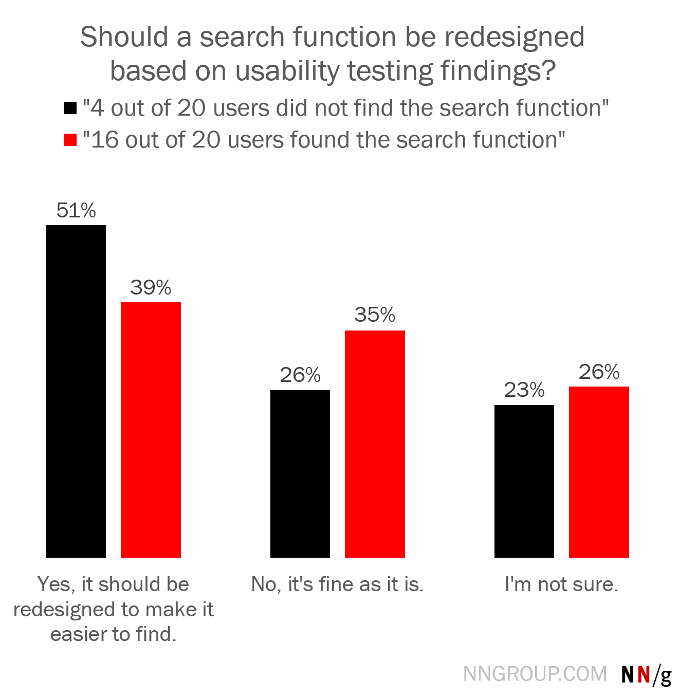
Then, there were a few of them who said they weren’t sure or that the design needed no change at all. And, that’s quite interesting because whether a website needs to be redesigned depends on a range of factors, such as the type of website, the overall importance of the search function and implementation costs to the participants. Since none of this was mentioned in the quiz, it’s clear that these participants were more critical of their choice and didn’t want to make snap judgments.
Much like these practitioners, you, too, can make reason-backed decisions. Here’s how:
- Critically analyze decision frames rather than jumping to conclusions. Refuse to pick one frame over another in case there isn’t enough data. Find out what’s amiss to support your argument.
- Re-frame the findings and look at it from a success/failure or gain/loss perspective. You should then have a fair idea if you were being framed.
Connecting The Dots
We can all agree that the Framing Effect is like mercury that can slip through the tiniest crack. You can’t pull a trick from under your hat to banish this deep-seated bias, but you can definitely become more mindful of the trap.
Ask if the question is framed to yield a response you want, or will it motivate the user to be unbiased. What if you word the question differently? Will it change the answer? Point being, once you are more critical you will have more confidence in your choices that will reflect in your research practice as well as your website and products.
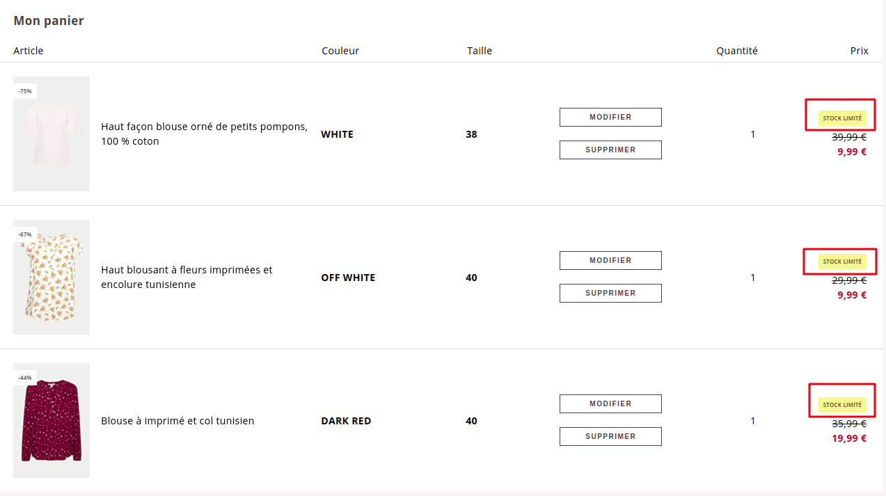
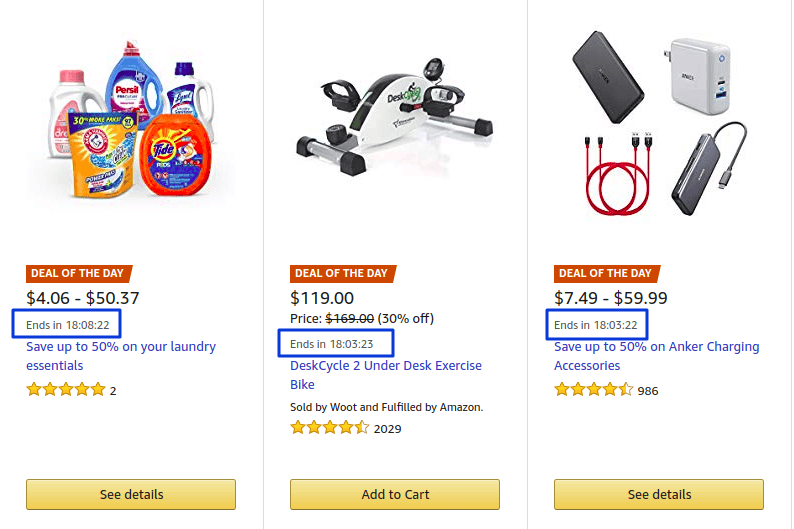
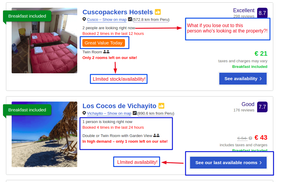
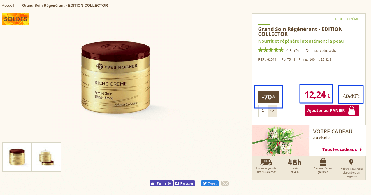
Remember, you can use this bias to work for you, especially to support research goals and help boost e-commerce conversions through loss aversion tactics.