Article

9min read

The Rise of the Experience Economy and How It’s Shaping the Future of E-Commerce

What is the experience economy?

Let’s say you have an online shop and in that online shop you have a product. Your product is designer eyewear and prescription glasses. A customer visits your online shop to learn about your product. That customer needs to determine which frames will suit their face and what size to order. A similar shop that sells similar products to yours offers free shipping and free returns of up to 3 pairs at no charge, or the use of a virtual reality assistant, via their mobile app, to help their customers make purchasing decisions without needing to visit a store. Your shop, though well-intentioned and bug-free, does not. The customer’s experience researching and selecting their product is what ultimately drives their decision-making process, and they purchase from the other shop. And the next time they need glasses, they purchase from that other shop again. That’s the experience economy.

What is the experience economy

In the experience economy, finding a differentiating edge is crucial for brands (Source)

Expressed in more academic terms, the experience economy is the packaging of goods and services into a bundle such that the experience of acquiring or consuming is the key selling point – it’s the reason the customer came into your shop in the first place.

In 1998, two Harvard researchers published an article detailing the concept of the experience economy for the first time, using a birthday cake analogy to eventually draw out the definition we see above. These days, the concept is more important than ever, as the rapidly evolving digital transformation of the way we consume information and goods creates a never-ending, multi-channel interaction between brands and consumers. And it’s key to your overall business success.

How e-commerce brands can succeed in the experience economy

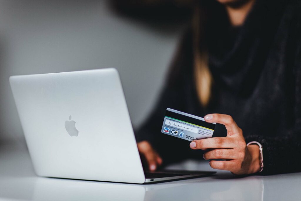
In the age of digitalization, not only do all brands have websites, incorporating an e-commerce platform for online sales, but they also have Facebook, Instagram, TikTok and Snapchat accounts, more than likely a YouTube channel, a web browser adapted to mobile devices and an app to sit alongside it. In short, multiple channels and touchpoints for their customers to interact and engage with them, and multiple opportunities to create experiences to acquire new customers and drive sales. This all makes for a non-linear shopping experience, and requires careful examination of what customers expect on which channel and at which time.

How the experience economy is shaping the future

A customer-first mindset is crucial for businesses that are looking to win the digital CX game (Source)

How can brands adapt to shifting consumer preferences

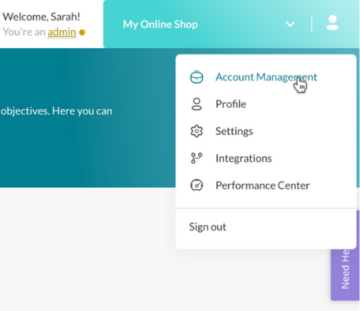
At AB Tasty, we’re convinced that the brands opting for a “business as usual” approach will quickly be left in the dust. Customers expect better servicing, more meaningful interactions and suggest that they’ll spend more when brands deliver. This means having a strategy that considers multiple channels, across physical, digital and social touch points, and adapts to the preferences of each individual so that interactions remain authentic and personal. If you’re engaging with customers without being able to have in-person contact, experience matters even more, because consumers still want to be seen as individuals with their own unique needs. Ultimately, their experience will influence their buying decisions and according to Salesforce, 66% of consumers expect companies to understand their unique needs and preferences.

The shift in brand-consumer interactions

Create a personalized, relevant shopping experience for each customer (Source)

Figuring out what your customers want doesn’t just need to be a guessing game, experimentation is standard practice for the experience economy. In B2C environments, marketing teams test website performance using a range of experiments that examine layout, colors, purchase journeys, product information and visual features to ensure no stone is left unturned in maximizing transactions and revenue. And adopting an experimentation mindset really is a win-win. On the one hand, you’re identifying the best way to interact with your customers – identifying what they respond to and what they want – and on the other, you’re maximizing every opportunity to drive purchases and serve your bottom line.

Why prioritizing customer experiences matters

That’s all very well and good, you might say, but what difference does it really make? Plenty, in fact. Relevant and personalized consumer experiences are key to keeping your brand ahead of its competitors. Let’s explore some of the reasons for this.

  1. Loyalty is hard-earned and easily lost
    PWC’s 2021 Global Consumer Insights Survey found that 84% of shoppers trust brands that provide exceptional customer service, but one in three will walk away after just one negative shopping experience. In a similar vein, Qualtrics’ 2022 Global Consumer Trends survey reported that 60% of consumers would buy more if businesses treated them better, and also determined that 9.5% of your overall revenue is at risk from negative shopping experiences. These statistics still haven’t convinced you? Read on!
  1. Seamlessness is synonymous with success
    You can design any number of gimmicks to attract attention, but it’s the seamless ones that stick. Take the Clarins Singles Day Wheel of Fortune promotion, where any customer landing on the brand’s desktop or mobile site in EMEA saw a pop-up to spin the wheel. They were then rewarded with one of six special offers, which was automatically added to their basket via a promo code at the checkout. This automatic add proved crucial: Results were strong across all key territories, with Ireland particularly notable, seeing a 495% increase in orders and a 585% increase in revenue. Clarins uncovered a clever, engaging offer and coupled it with a seamless UX process for their shoppers, delivering simply stunning results.Clarins case study
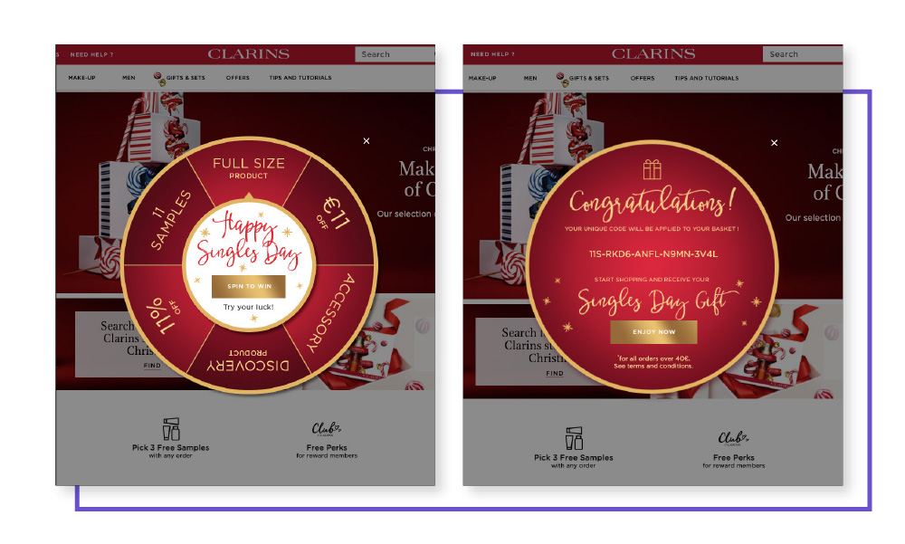
Clarins delivered a customer experience on par with their clients’ expectations (Source)
  2. Stagnate and you’ll be left behind
    To innovate or not to innovate, is it even a question? If you’re thinking about it, then your competitors almost certainly are too. And if you’re not trying something new, you almost certainly risk falling behind. While bug-free websites and a smooth journey through the purchase funnel is great, it’s also the bare minimum that you should be doing. Salesforce found that 91% of customers are more likely to make a repeat purchase from a company after a positive customer experience. Delivering a seamless, multichannel experience across all business interactions is integral to staying ahead and it’s clear there is still scope for brands to optimize.

4 examples of brands that are excelling in the experience economy

As we’ve seen in the above section, brands that embrace the experience economy are best-positioned to see increased loyalty, repeat business, and convert their customers into advocates for their products. Pushing beyond experiences into memorable interactions for their consumers has allowed some of the best-known brands in the world to gain further ground on their direct competitors, all while staying true to their core values. Let’s take a look at the best-in-class trends and examples of the experience economy model.

Nike

Nike is driven by delivering innovative products, services and experiences to inspire athletes. One such experience is their Nike Fit solution: an AI-driven app that allows you to virtually measure and fit your foot to ensure you choose the right pair of Nike shoes, no matter the style nor the shape of your foot, and without having to leave your living room.

Nike Fit

Nike introduces innovative solutions to their clients’ biggest point of friction (Source)

Sephora

In 2019, Sephora pioneered their intelligent digital mirror in the brand’s Madrid flagship, using the power of AI to deliver hyper-personalized experiences and product recommendations to shoppers. The mirror not only allows consumers to “test” products by displaying how they’ll render when applied, it also provides personalized product recommendations and suggestions based on an analysis of the customer’s features.

Sephora

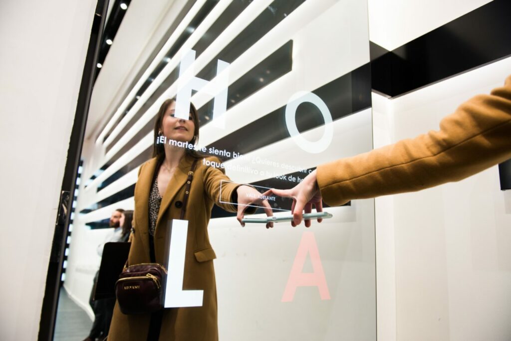
Sephora develops new ways to offer their customers personalized recommendations (Source)

Starbucks

Starbucks has revolutionized their physical footprint by opening pickup-only stores in key, high-traffic locations where rental space is at a premium and busy lives mean in-and-out transactions are the order of the day. This store concept allows coffee lovers to order and pay ahead of time, via the Starbucks mobile app, and nominate the pickup location, for a speedy service that saves tedious, peak-hour queues. Not to mention a boost to sales per square foot, a key metric in the brick-and-mortar retail space.

Starbucks

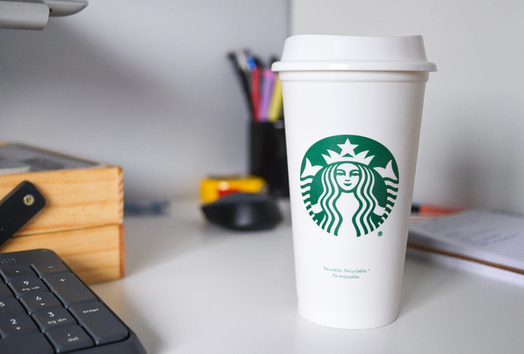
Starbucks identifies their customers’ needs and delivers an optimal shopping experience (Source)

Asos

This online fashion retailer was founded in London in 2000, and now sells over 850 brands around the world. In identifying one of the key barriers to online shopping for clothes – choosing the correct size – Asos developed their Fit Assistant tool to ensure customers could navigate the online shopping experience hassle-free. Available on both desktop and mobile, Fit Assistant delivers personalized recommendations according to shoppers’ individual shapes and sizes.

Fit Assistant Technology - Recommend

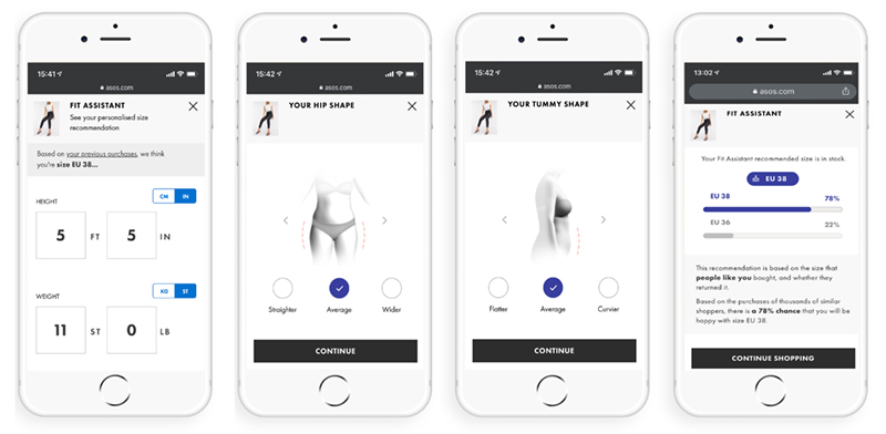
Asos optimizes their customers’ online shopping experience (Source)

Why the experience economy is here to stay

Through a combination of rapid digital transformation, technological innovation of smart devices (phones, tablets, watches and more), and the increasing pace of our daily lives, the manner in which we consume products has evolved beyond mere acquisition. How we consume the product matters. How we feel about how we consume the product matters. How the brand ensures we enjoy our consumption of the product matters. And if your brand is not up for the challenge and staying ahead of the game, consumers will find one that is. It’s as simple as that. Evolve, innovate, and deliver seamless brand experiences, and you’ll lead the competition, win market share and generate growth.

If you’re looking for some guidance on how to deliver impactful brand experiences that will “wow” your customers, draw inspiration from the first-ever digital customer journey that maps out how to drive optimization and innovation to take your customer experience to the next level.

Subscribe to
our Newsletter

bloc Newsletter EN

We will process and store your personal data to respond to send you communications as described in our  Privacy Policy.

Article

14min read

Everything You’ve Ever Wanted to Know About Landing Page Design

You’ve spent months building your brand and getting your website just right, but it’s all for nothing if you can’t turn your hard work into sales. And landing pages are one of the best resources you can use to optimize your conversions. Well-designed landing pages can lead customers to specific products or services, encourage them to take immediate action and capture contact details to build your customer base.

Landing pages are highly effective conversion tools
Landing pages are highly effective conversion tools (Source)

Landing pages have conversion rates ranging from 3% to 11.45% and higher, depending on the features they include. How well your page performs depends entirely on how well you’ve designed it and running tests on your page can help you continuously find the winning formula.

What is a landing page?

Landing pages are website pages designed to target a specific visitor according to a particular demographic, interest, or buying behavior. Your landing page should attract leads in the most effective way possible and then convert your visitors into buyers or nudge them towards taking another kind of action.

Landing pages are designed to encourage exploration and could have a number of goals. Technically, any page on your website can become a landing page for a campaign, but this could distract your customers and send them down a rabbit hole instead of focusing on the action you want them to take. Good landing pages have a singular focus or call to action (CTA), making them excellent marketing and lead generation tools.

Why is landing page design so important?

Landing pages let you nudge your leads straight towards a conversion through strategically placed call to action elements like links, forms, buttons, and others. A well-designed landing page lures visitors through a message that piques their interest, like a discount, a piece of content they’d like to read, or a free trial to test a product.

Continuously testing your pages
Landing pages target customers based on specific demographics, like browsing behavior (Source)

While it doesn’t fully show off your brand’s personality, it does lay the groundwork for getting to know it better. When a customer clicks on a call to action, they want to find more information about whatever has caught their eye, and that’s when you’ll convert them from a visitor to a solid lead or even a paying customer.

Aside from optimizing your users’ actions, landing pages make it easy to track visitors and modify your pages as required. Through A/B testing, one item on your landing page is changed on the variation to determine the impact of the change.

The importance of lead capture landing pages

Lead capture landing pages (sometimes called squeeze pages) can also gather important customer details (such as names, email, phone numbers). Lead capture landing pages offer your customers something of interest (e.g., a free trial or e-book) in exchange for completing a short form that collects their personal information.

You can use these personal details to target them in the future, with email campaigns, social media advertising, or follow-up calls by your sales representatives. Targeting potential customers strengthens the likelihood of a conversion down the line.

The essential elements of a landing page

A landing page should always have one conversion goal. From headlines to images to buttons, every element should bring you closer to that objective.

Clear and effective copywriting

An excellent landing page needs punchy, clear copywriting to convert. You should describe the benefits of your product/service and what your company does as concisely as possible. Don’t overstuff your landing page with copy that doesn’t add value!

A few copywriting tips to bear in mind:

  • Always direct your visitors to the primary call to action with your copy.
  • Keep sentences short and to the point.
  • Avoid using too many adverbs (quickly, obviously, actually).
  • Instead of passive voice, use active voice to inspire action.
  • Edit your work to delete anything that adds more detail than necessary.

Visually attractive and clear CTAs

Your call to action (CTA) is the most important element on your landing page. When you create your CTA, use copy that inspires the visitor to continue along their journey with you. Compare generic calls to action like “Click Here” or “Submit” to powerful statements like “Yes, I want to save money” or “Update my wardrobe.” The latter sounds better!

Always make sure that your CTA button stands out from the other elements on the page. Follow the example set by the Dutch watch brand Cluse: When their team noticed the bounce rate for their landing pages was high and that not many users advanced to the product display pages, it became evident that the CTA on the page wasn’t clear enough.

By changing the call to action used in their landing page design to best match practice guidelines, they instantly saw an uplift in conversions and sales. The winning variation increased the click-through rate to their product display page by 2.39% and realized a 1.12% uplift in transactions.

Eye-catching headers

Good landing pages have simple, compelling and uncluttered headers. If you include an image, make sure it’s related to your product or service. Keep all the action above the fold and use directional cues to steer visitors to that all-important CTA button. Additionally, you should avoid including distracting elements like links or phone numbers.

Social proof

People will conform to the majority in order to be accepted or liked. This is known as social proof. If a prospect sees that another person likes a product or has had a positive experience with your company, your odds of conversion go up.

When you’re browsing a landing page and see a testimonial from an industry expert you respect, that’s social proof. When you’re cruising a pricing page and you see that an industry giant is already using the tool, that’s social proof. When you sign up for a demo because you know the tool solved the exact problem you have for a similar company, that’s social proof.

Think of it as borrowing third-party influence to sway potential customers. Brightlocal found that the average consumer reads at least ten reviews before trusting a business. Your odds of converting goes up when you see that others had used the product before them and were happy with the end result.

Social proof may include customer reviews, a list of existing customers, user testimonials and awards you may have earned. Take a page from Decathlon’s playbook: By testing different options, you can also identify which works best for winning over your customers!

A unique selling proposition (USP)

What makes you different from everyone else? You don’t need to be more advanced or offer huge discounts; you just need a convincing brand promise. Are you the fastest? Most reliable? Most knowledgeable? You only have a few lines of copy and limited visuals to get your point across, so be short and sharp.

Hero images

First impressions are essential — and when it comes to website optimization, they’re more important than ever! A hero image is a large banner that appears at the top of your page, usually occupying the full length of the screen. Look for an image that represents (or is relevant) to your product or company. You can even include a call to action and/or a text overlay to guide your users down the conversion funnel.

Additional information in the footer

Remember that even though you never want to distract customers from the call to action, you’ll still want them to find more information about your company if they don’t convert immediately.

Keep your calls to action and more compelling arguments above the fold, but include additional information like newsletter sign-ups, links to your social media pages, or ‘About us’ pages in the footer for customers that need to know a little more about you before proceeding.

Landing pages should be simple and focus on the call to action
Landing pages should be simple and focus on the call to action (Source)

How to design and optimize your landing pages

Now that you understand some of the best practices for designing high-converting landing pages, let’s dig into the nitty-gritty of your landing pages’ design. Here are ten best practices to design a landing page that converts successfully:

1. Identify your target audience and their needs

Designing a visually stunning landing page doesn’t necessarily mean it’s effective. Truly great landing pages understand what visitors are looking for and provide quality content tailored to your target audience. Before designing your page, establish who it’s for and what they would like to know. Keep testing variations of the page to see which elements resonate the most with your audience and your landing page can become a powerful conversion tool.

2. Use strategic and relevant hero images

There should be a clear connection between your brand and the hero image you display on your landing page. Misplaced images can confuse visitors or create a poor impression of the brand. Make sure that the image you use fosters an instant connection between you and your users by either answering a question, nudging them to advance down the conversion funnel, or just encouraging them to find out more about you.

3. Refine your headlines

We’ve already spoken about the role copywriting plays in conversion, so make sure that you continually test and refine your headlines. Landing page headlines promote your value proposition, while the subheadings provide further explanations. Keep these short, sharp and to the point. If you aren’t sure which value proposition to promote, try testing different versions to see which version resonates the most with visitors and results in the most click-throughs.

4. Keep navigation simple

Landing pages have to be optimized to create the best user experience possible. Keeping navigation simple, intuitive and straightforward will boost user retention and lead generation while driving your core message home. ECCO Shoes are a great example of this: By making their call to action button larger and repositioning it above the fold, cutting a few visual distractions and adding icons highlighting special offers like free delivery, their new landing page was able to outperform the original by over 17%!

5. Harmonize your colors

Colors can evoke powerful emotions or cause confusion. Use color strategically and sparingly on your landing page so it highlights the most important elements like your call to action, add-to-cart button or contact forms. You can also use negative space to break up the page and make it easier to digest the most important information.

6. Place your important elements above the fold

The ‘above the fold’ section is the part of your website that’s visible in the browser without scrolling down. It’s the first thing people see, so make sure you grab their attention with compelling imagery, copy and headers.

7. Make sure it displays properly across devices

Today’s consumers are using a host of different devices and operating systems. This means your website has to display properly across all of them if you want their business. Ensure that your landing pages are optimized to display correctly on all available platforms.

8. Optimize your site’s load times

Your site’s loading time affects your user experience and your Google ranking. Slow websites contribute to high bounce rates and cart abandonment. You can optimize your load times by enabling compression, using web-friendly imagery and keeping redirects to a minimum.

9. Improve your SEO to increase traffic and conversions

SEO (Search Engine Optimization) is a complex subject, but anyone can make small tweaks to their landing page to improve their ranking. Ensure that your title tags and meta-descriptions are accurate and relevant to what visitors will find on your page. Always include the main keywords you want to rank for, but don’t overstuff your page with them; it will negatively affect your user experience and Google may penalize you for it.

Effective landing pages can lead to increased sales (Source)

10. Perform testing on your landing pages

A/B testing allows you to compare two versions of the same page to see which version resonates the most with your users. By changing an element on one page, you can compare the two to see which changes will increase conversions. You can learn more about testing on your landing page in this article, or try our A/B testing tool.

A/B testing has numerous benefits for your landing pages and your business because it reveals incredible insights that can be used to:

  • Improve user engagement by learning which messages/images resonate with customers;
  • Present more relevant messages and content that customers actively respond to;
  • Reduce bounce rates by improving relevance;
  • Increase conversion rates;
  • Deliver quick results and improvements that provide a return on investment.

Common landing page mistakes

We’ve covered what you should do when you are designing your landing page, but there are also a few things you should avoid doing:

  • Multiple CTAs: Too many calls to action dilute your message and decrease the likelihood of performing a conversion.
  • Broken CTAs: If your call to action doesn’t link to the right page or function properly, all of your efforts are wasted.
  • Low-resolution images/no images: Copy alone won’t sell your product or service. Use high-resolution, web-optimized images to boost your brand and convey your message visually.
  • Poorly written copy: Spelling mistakes and grammatical errors impact the trust that consumers have in your brand.
  • Lengthy forms: If your lead capture forms are too long, your customers will get frustrated and may give up halfway through. You’ll lose the information — and their business.

Examples of great landing page design

While landing page design is an ongoing process and you need to keep constantly optimizing it, there are a few brands with really great landing pages to inspire your own.

Coinbase

Coinbase example

Coinbase uses a stylish and focused lead generation page with a clear message and unique value proposition. While trading cryptocurrency is a complex topic, the landing page simply asks you to enter your email address to get started. This example works because the call to action is clear, the copy is straightforward and the design is uncluttered.

Xero

Xero example

Xero uses negative space and compelling copy to get its message across. There are two call to action buttons (with the same message) to steer visitors in the right direction. Xero’s page is attractive and colorful, uncluttered and emphasizes the call to action button, making it highly effective.

monday.com

Monday example

Monday.com uses colorful buttons to encourage visitors to create their free account. They’ve also added compelling social proof messages by mentioning the number of visitors to the site. This use of social proof and a clear, uncluttered layout — coupled with direct, pointed copy — increases their landing page’s ability to convert.

Astra

Astra example

Astra uses compelling copy in their click-through button that assures users that they can secure your website against hackers in just three minutes. They’ve also added some big-name logos in their footer to build trust in the brand. The tagline, ‘Are you next?’ is compelling, with a solid and distinct call to action leading prospects to the sign-up page.

Take your landing pages to the next level

These tips provide a great starting point for designing a high-converting landing page, but no one gets it right the first time. Building an effective landing page requires ongoing optimization and innovation to determine what resonates with your audience.

Continuously testing your pages leads to new insights and continual improvements
Continuously testing your pages leads to new insights and continual improvements (Source)

Experimentation can help your brand improve the performance of your landing pages. Continuously testing your pages leads to new insights and improvements that’ll help you constantly adapt to new customer preferences even as they are being formed.

Looking for inspiration to take your landing pages to the next level? Check out our e-book, “50 Tests You Should Know For Website Optimization”: It contains 50 successful experiments from e-commerce businesses who have continuously optimized their websites to offer relevant and personalized experiences.