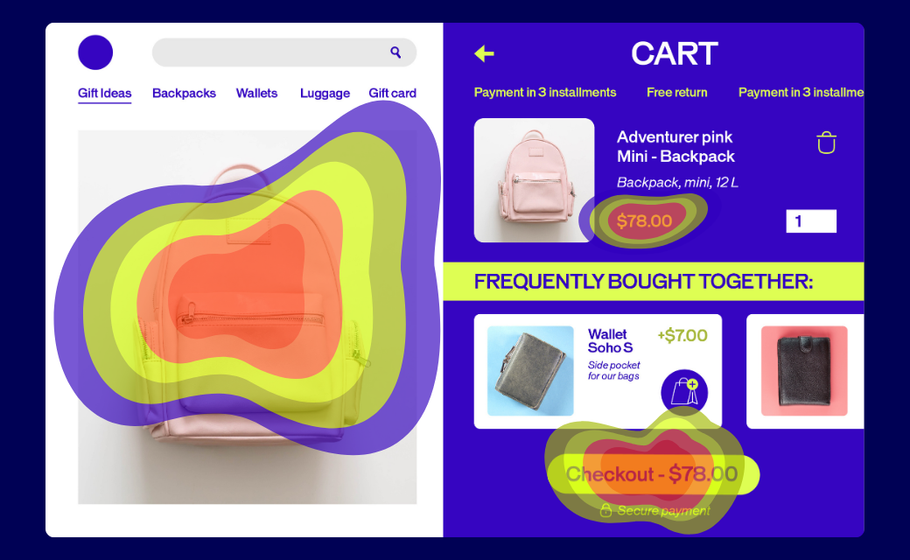
Think of heatmaps as your website’s truth-teller. They’re visual snapshots showing exactly where visitors click, scroll, and linger. No guesswork required.
Here’s how they work: Warm colors (reds, oranges) highlight the hotspots where users engage most. Cool colors (blues, greens) reveal the overlooked zones that might need attention.
The best part? Your visitors do all the heavy lifting. They show you what’s working and what’s not, so your team can make changes that actually move the needle.
Spot the signals: When to bring heatmaps into play
Heatmaps aren’t just pretty pictures—they’re your optimization toolkit’s MVP. Here’s how they deliver the biggest impact:
Measuring real engagement
Writing content that no one reads? Heatmaps show you exactly where readers drop off. If only 10% of visitors reach your CTA, it’s time to shake things up.
Tracking what matters: Actions
Are people clicking where you want them to? Heatmaps reveal if visitors complete your desired actions—or where they’re getting stuck instead.
Highlighting where attention sticks (and slips)
What grabs your attention first? What images distract from your main message? Heatmaps answer these questions so you can double down on what works.
Once you have these insights, bigger questions become easier to tackle:
Where should we place our most important content?
How can we use images and videos more effectively?
What’s pulling attention away from our goals?
The essential heatmap lineup every team needs
Most modern heatmap tools offer multiple views of user behavior. We partner closely with some of the major players already. Let’s break down the most common ones you’ll come across.
Click Heatmaps: The Action Tracker
These maps show every click on your page, with dense concentrations appearing as bright white areas surrounded by warm colors. Think of them as your conversion reality check.
What it tells you: Whether people click where you want them to—or if they’re trying to click non-clickable elements that look interactive.
How to use it: Look for clicks scattered around non-interactive text or images. These “frustrated clicks” signal design problems. If users are clicking on underlined text that isn’t a link, or images they expect to be clickable, you need to either make those elements functional or redesign them to look less interactive.
Pro tip: Compare click density on your primary CTA versus other page elements. If secondary elements are getting more clicks than your main conversion button, it’s time to redesign your visual hierarchy.
Scroll Heatmaps: The Attention Meter
See how far down visitors scroll and what percentage of users reach each section of your page. This is crucial for understanding whether your important content is actually being seen.
What it tells you: If users actually see your important content or bail before reaching your CTA. Most importantly, it shows you the “fold line”—where 50% of users stop scrolling.
How to use it: Identify the scroll percentage where you lose half your audience, then ensure all critical elements (value propositions, CTAs, key benefits) appear above that line. If your main CTA is only seen by 20% of visitors, move it higher or add secondary CTAs above the fold.
Pro tip: Use scroll maps to optimize content length. If 80% of users stop reading halfway through your blog post, either shorten the content or add more engaging elements (images, subheadings, interactive elements) to keep them scrolling.
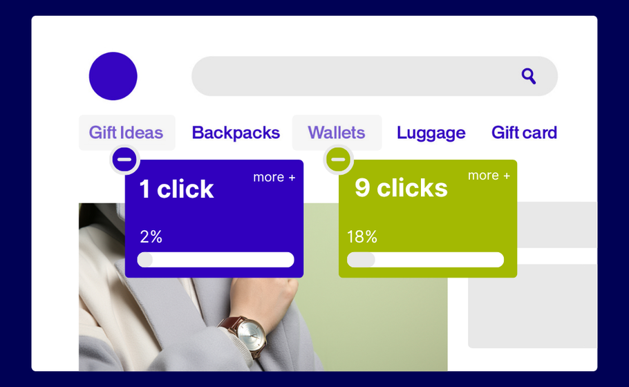
Click Percentage Maps: The Element Analyzer
This view breaks down clicks by specific elements, showing exactly how many people clicked each button, image, or link as a percentage of total visitors.
What it tells you: Which elements deserve prime real estate and which ones are dead weight. You’ll see precise engagement rates for every clickable element on your page.
How to use it: Rank your page elements by click percentage to understand what’s actually driving engagement. If your newsletter signup gets 15% clicks but your main product CTA only gets 3%, you might need to redesign your primary call-to-action or reconsider your page goals.
Pro tip: Use this data to inform A/B tests. If one button consistently outperforms others, test applying its design (color, size, copy) to underperforming elements.
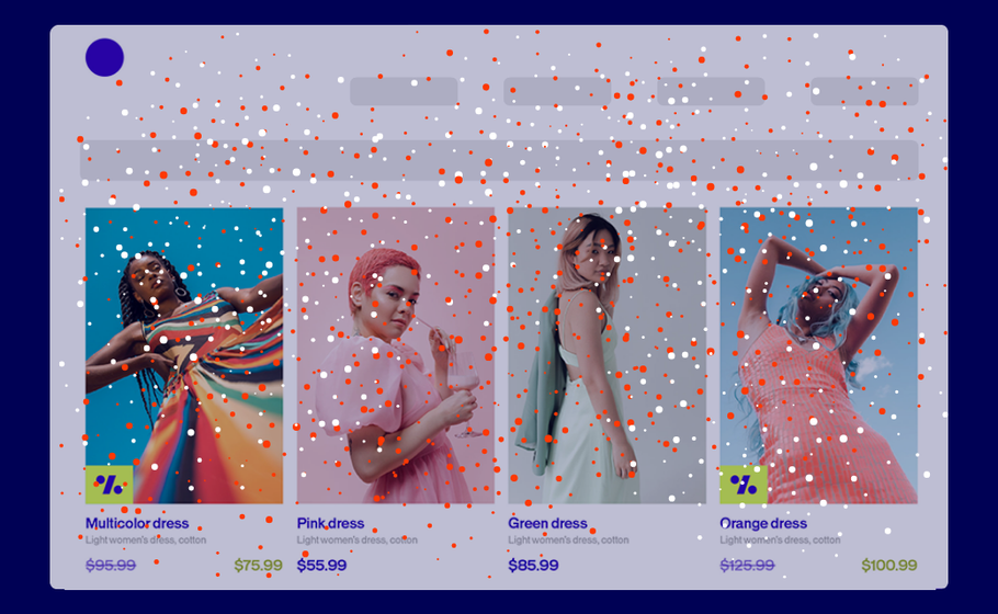
Confetti Maps: The Individual Click Tracker
Instead of showing click density, these maps display each individual click as a colored dot. Perfect for spotting users trying to click non-clickable areas or understanding click patterns in detail.
What it tells you: Where to add functionality or remove confusion. Each dot represents a real user’s intent to interact with something on your page.
How to use it: Look for clusters of dots over non-interactive elements—these represent frustrated users trying to click things that don’t work. Also watch for dots scattered far from any actual buttons or links, which might indicate responsive design issues or accidental clicks.
Pro tip: Filter confetti maps by traffic source or user segment. Mobile users might have different click patterns than desktop users, and organic traffic might behave differently than paid traffic.
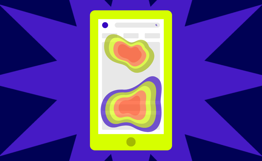
Mobile-Specific Heatmaps: The Touch Tracker
Modern tools capture mobile-specific actions like taps, swipes, pinches, and multi-touch gestures—because mobile behavior is fundamentally different from desktop.
How to use it: Create separate heatmaps for mobile and desktop traffic. Mobile users typically scroll faster, have shorter attention spans, and interact differently with buttons and forms. Use this data to optimize button sizes, reduce form fields, and adjust content layout for mobile-first experiences.
Pro tip: Pay special attention to thumb-reach zones on mobile heatmaps. Elements that are easy to tap with a thumb (bottom third of screen, right side for right-handed users) typically get higher engagement rates.
Learn more about best practices for designing for mobile experiences with our Mobile Optimization Guide.
Eyes vs. clicks: Understanding the key differences
While heatmaps track mouse movements and clicks, eye-tracking follows actual gaze patterns. Eye-tracking gives deeper insights but requires specialized equipment most teams don’t have.
The good news? AI-powered tools like Feng-Gui and EyeQuant now simulate eye-tracking through algorithms, making this technology more accessible.
Bottom line: Start with heatmaps. They’re easier to implement and give you actionable insights right away.
Features that make or break your heatmapping game
Not all heatmap tools are created equal. Here’s what your team should prioritize:
Must-have features:
Audience Segmentation: Create maps for specific user groups (new vs. returning visitors, mobile vs. desktop)
Map Comparison: Easily compare results across different segments
Page Templates: Aggregate data for similar page types (crucial for e-commerce sites)
Mobile Optimization: Track touch, scroll, and swipe behaviors
Export Capabilities: Share results with your team effortlessly
Dynamic Element Tracking: Capture interactions with dropdowns, sliders, and AJAX-loaded content
Historical Data: Preserve old heatmaps even after design changes
Test smarter with heatmap insights
Here’s where things get exciting. Heatmaps show you the problems, but how do you know if your fixes actually work?
Enter A/B testing.
This three-step approach turns insights into results:
Identify problems with heatmaps
Test potential solutions with A/B testing
Choose the highest-performing solution based on data
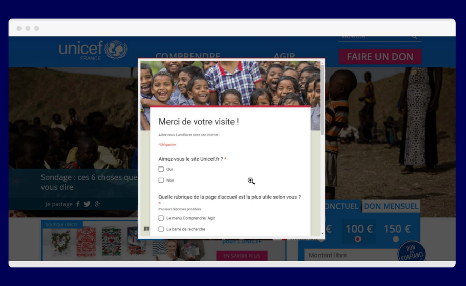
Real Example:
Nonprofit UNICEF France wanted to better understand how visitors perceived its homepage ahead of a major redesign.
Their move: UNICEF France combined on-site surveys with heatmapping to gather both qualitative feedback and visual behavioral data.
The result: Heatmaps showed strong engagement with the search bar, while surveys confirmed it was seen as the most useful element. Less-used features, like social share icons, were removed in the redesign—resulting in a cleaner, more user-focused homepage.
Ready to put heatmaps to work? Here’s your game plan:
Start small. Pick one high-traffic page and run your first heatmap analysis.
Look for patterns. Are users clicking where you expect? Scrolling to your key content? Getting stuck somewhere?
Test your hunches. Use A/B testing to validate any changes before rolling them out site-wide.
Iterate forward. Heatmaps aren’t a one-and-done tool but part of your ongoing optimization process.
Remember: every click tells a story. Every scroll reveals intent. Your visitors are already showing you how to improve—you just need to listen.
Ready to see what your visitors are really doing? Heatmaps give you the insights. A/B testing helps you act on them. Together, they’re your path to better conversions and happier users.
E-commerce has completely changed the way shoppers interact with their favorite brands.
From the continued rise of mobile commerce to virtual-reality try-on tools and AI customer service, some consumer trends have proven to be evergreen while others fall out of fashion in a season. As e-commerce marketers, it can be hard to know when to chase a trend or stick to being consistent.
To help you better understand the mind of today’s consumers, we’ve broken down 10 key insights for e-commerce from our 2025 global report. Based on feedback from 4,000 consumers across the U.S., U.K., France, Italy, and Australia, this snapshot reveals how people discover new products, engage with AI, make purchase decisions, and much more.
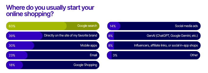
1. Google Search is the first place for discovery
When it comes to starting an online shopping journey, Google Search is still king. Nearly two-thirds (63%) of global shoppers begin their hunt for a new product or service with a Google search.
This underscores the ongoing importance of SEO for e-commerce brands. If your product pages aren’t optimized, you risk missing out on a massive audience at the very first step of their journey.
2. Mobile takes over, but desktop still matters
By the end of 2024, smartphones accounted for nearly 80% of global retail site traffic and over two-thirds of online orders. Mobile is now the primary device for browsing and purchasing in categories like clothing, cosmetics, and entertainment.
However, desktop still plays a significant role in sectors such as travel and utilities, especially among older generations. Brands should continue to prioritize mobile-first design, but not neglect the desktop experience—especially for high-consideration purchases.
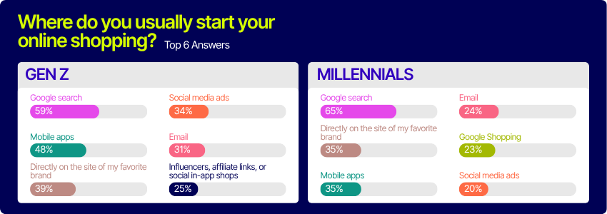
3. Millennials vs. Gen Z: Mobile app habits
Generational differences are shaping the future of e-commerce. For Gen Z, mobile apps are the second most popular starting point for shopping (48%), just behind Google. Millennials, on the other hand, split their preference between apps and brand websites (both at 35%). This means younger shoppers are more likely to use apps for discovery, while Millennials are equally comfortable with apps and direct website visits.
Brands need more than just a mobile presence to capture Gen Z’s attention. They need apps built for exploration, speed, and flexibility. With Feature Experimentation and Rollouts from AB Tasty, teams can continuously test and optimize in-app experiences without a full redeploy, ensuring their app evolves alongside user expectations.
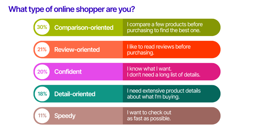
4. Comparison shoppers lead the pack
Not all online shoppers are the same. Our research found that the most common shopper persona is “comparison-oriented”—30% of respondents compare multiple products before making a purchase. Only 11% identify as “speedy” shoppers who want to check out as quickly as possible. The rest fall somewhere in between, with 21% being “review-oriented,” 20% “confident,” and 18% “detail-oriented.” This diversity highlights the need for flexible site experiences that cater to different decision-making styles.
If one size doesn’t fit all, then understanding your audience is the first step to building experiences that truly convert.
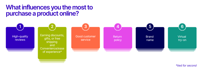
5. Reviews are more influential than discounts or brand names
When it comes to influencing purchase decisions, high-quality reviews top the list globally. Shoppers trust peer validation more than discounts, convenience, or even brand names. Written testimonials and customer photos are especially valued, providing the authenticity and detail shoppers crave.
Make sure your reviews are visible, filterable, and packed with real customer insights to boost trust and conversions.
E-commerce moves fast. Get the insights that help you move faster. Download the 2025 report now.
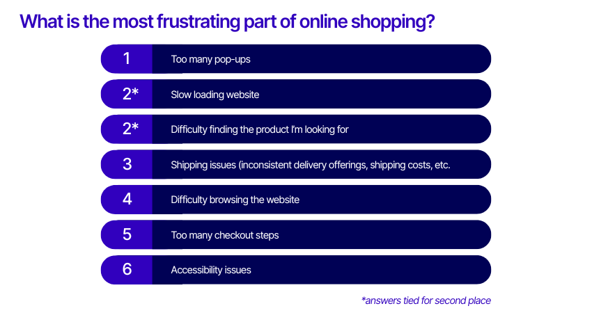
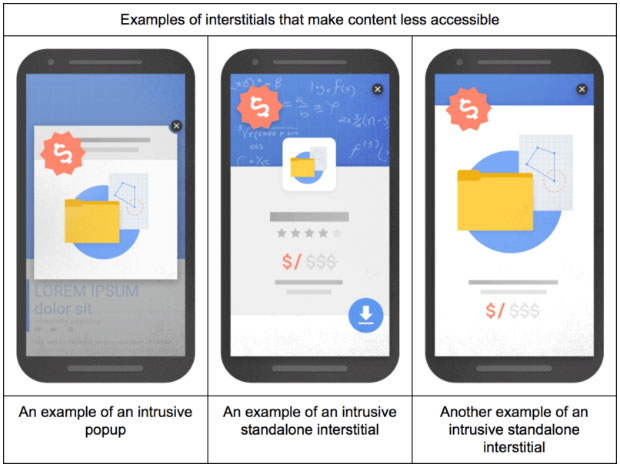
Think you’re converting more by hitting new visitors with an email sign-up pop-up right away? Think again.
Too many pop-ups are the number one frustration for online shoppers worldwide, followed closely by slow-loading websites and difficulty finding products. While pop-ups can be effective for capturing leads or promoting offers, overuse can drive customers away. Use them strategically and ensure your site is fast and easy to navigate to keep shoppers engaged.
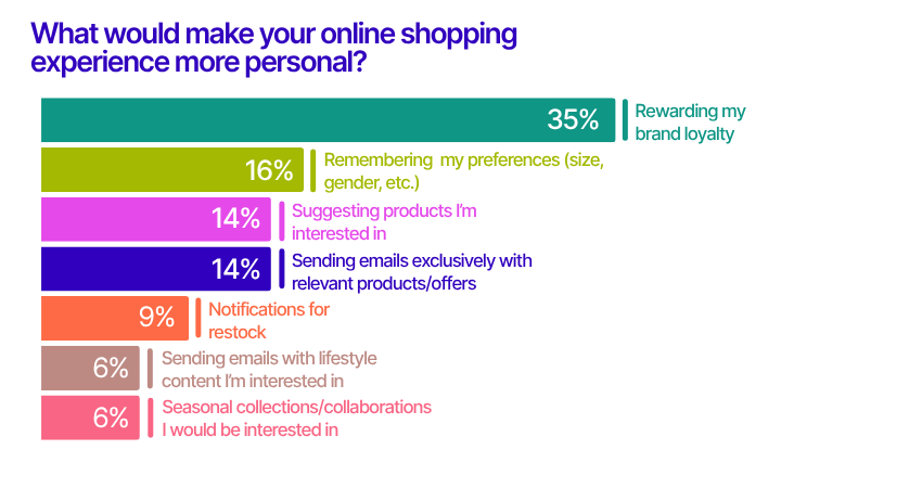
7. Loyalty is the key to better personalization
Personalization is more than just a buzzword—it’s a key driver of customer satisfaction and loyalty. The top way to make online shopping feel more personal, according to 35% of respondents, is by rewarding brand loyalty. Remembering preferences and suggesting relevant products also rank highly.
Brands that recognize and reward repeat customers with exclusive perks or early access to new products can turn shoppers into advocates.
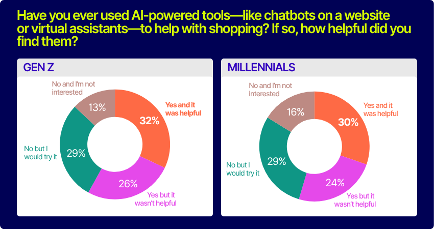
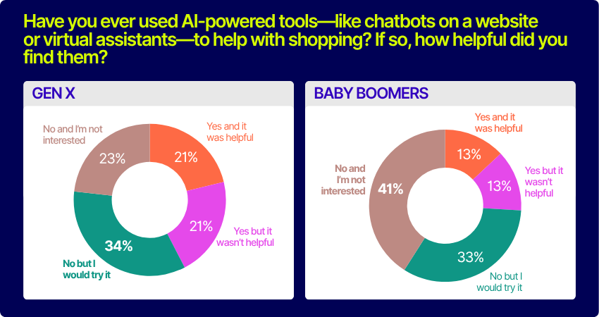
8. AI adoption is growing, especially among younger shoppers
AI-powered tools like chatbots and virtual assistants are gaining traction, but there’s still room for improvement. Just under a quarter (23%) of shoppers have used AI tools and found them helpful, while 32% haven’t tried them but are open to it. Younger generations are more receptive: 32% of Gen Z and 30% of Millennials found AI tools helpful, compared to just 13% of Baby Boomers.
To win over skeptics, brands need to ensure AI support is fast, relevant, and seamlessly integrated with human assistance.
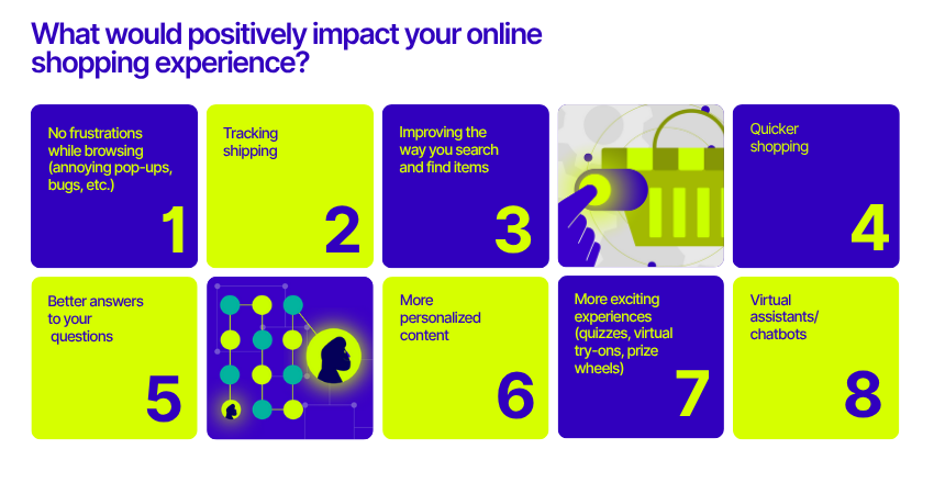
9. Shoppers just want frictionless experiences
When asked what would most improve their online shopping experience, the top answer was simple: removing frustrations like pop-ups, bugs, and broken pages. Tracking shipping, improving product search, and speeding up the shopping process were also highly valued.
Before investing in flashy features, brands should focus on getting the basics right—smooth, intuitive journeys are what keep customers coming back.
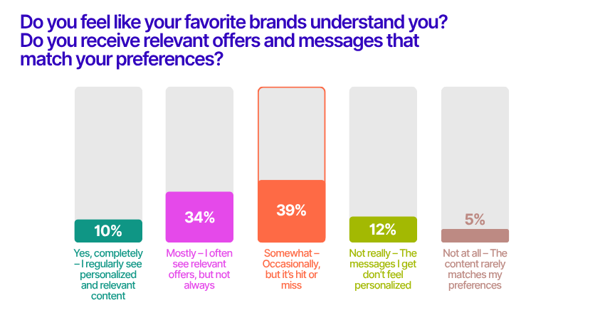
10. The gap between personalization and perception
Personalization is supposed to make shoppers feel seen—but only 1 in 10 consumers say their favorite brands truly “get” them. In fact, the most common answer was “somewhat,” as 39% of respondents said the messages and offers they receive are hit or miss. Another 34% said brands mostly deliver relevant content, but not always. For the majority, the digital experience feels inconsistent.
When personalization doesn’t land, it can come off as surface-level or even off-putting. The takeaway? Personalization isn’t just about using data—it’s about using it meaningfully, so relevance feels intentional, not accidental.
Conclusion
The bar for digital shopping experiences keeps rising, and today’s consumers are quicker than ever to click away when expectations aren’t met.
From discovery to checkout, each step in the customer journey has the potential to shape customer loyalty and long-term value. Our 2025 E-commerce Consumer report dives even deeper into generational trends, regional differences, and actionable strategies for optimizing your digital experience.
Understanding your customers’ paths is no easy task. Each user has their own unique reason for visiting your site and an individual route that they take as they explore your pages.
How can you gain insights about your customers to improve your website’s usability and understand buying trends?
The answer is simple: build a customer journey map.
In this blog, we’ll dive into a few things: what is a customer journey, a customer journey map, how to map the customer journey visually, templates of different customer journeys, a step by step guide for how to create them, and examples of customer journeys in action. Let’s get started
What is a customer journey?
A customer journey is a combination of all the interactions customers have with your brand before reaching a specific goal.
Creating a compelling journey helps you stand out and shows customers that you care about their experience. An enjoyable customer journey promotes positive engagement, making for more satisfied customers that are more likely to return for repeat purchases.
By better understanding your customers, you’ll be able to provide them with the best possible user experience every time they visit your online store. The best way to do this is by creating visual customer journey maps that present all this information about customers at a glance.
What is a customer journey map?
A customer journey map is a visual representation of a customer’s interaction with your business or website. It’s used to define which parts of this process might not be working as smoothly as they should be, thus improving the customer’s experience.
The customer journey map is a (mostly) visual tool that helps businesses understand what a customer goes through when buying a product or service from them. It maps out in clear, concise, visual terms, the journey each customer is likely to experience through buyer personas and user data.
The best customer journey map is a story, brought to life visually, of the customer’s experience. In essence, the best customer journey map is a story, brought to life visually, of the customer’s experience. It should be noted, however, that more complex information on the map may require text.
The map itself highlights “touchpoints, which are specific elements of the customer’s interaction with a business. Each of these touchpoints – for example, seeking a product, researching its content, buying the product, waiting for delivery, and returning it if unsatisfied – can be judged as negative, neutral, or positive from the customer’s perspective.
Customer journey maps require various research techniques that include hard data, customer feedback, and creative thinking. As such, no two maps are the same and each one will depend on many different factors that can’t be simplified or stereotyped as a matter of course.
The heart of customer journey maps: Buyer personas
Buyer personas are at the heart of a customer journey map tool and are broad representations, presented as fictional characters, based on real-life data and customer feedback. Typically, each project will create between three and seven buyer personas, each of which will require its own customer journey map.
The point of the customer journey map is to understand, as clearly as possible, what a customer will encounter when using your service. It will also help you improve the elements that are not functioning properly, are not easy to navigate, and show you how to make the entire experience more satisfying.
Each persona, and therefore the journey map itself, is not meant to be a perfect illustration of actual interactions. Rather, it’s a broad representation of the experience from the persona’s perspective.
Who Can Benefit From A Customer Journey Map?
There are many reasons why a customer journey map can be useful to a business. Customer satisfaction is more important than ever to a business, and it’s tied to loyalty to an extent that has not previously existed. Customers are more demanding, aware of their options, and willing to shop around.
By mapping each of the previously mentioned touchpoints, a well-designed customer journey map template can highlight any problems that clients might experience in the process of interacting with a business and help foster a relationship with an organization, product, service, or brand. This can occur across multiple channels and over a long period of time.
Once a customer journey map template has been designed, the entire enterprise can keep the customer at the forefront of the decision-making process. With a focus on the customer and their experience, or user experience (UX), any kinks, holes, or brick walls within the timeline’s touchpoints can be ironed out.
Bringing Together All Aspects Of The Business
Customer journey maps can help a business by bringing together departments with a focus on customer experience. To begin with, all departments can be engaged to discuss issues that customers may face when dealing with them. This is no small thing as many departments may not be used to dealing with customers, yet the decisions they take may have a profound effect on UX. By creating an understanding of how each touchpoint affects UX across the entire business, decisions can be made from an empathetic perspective.
Traditional marketing stops at the point of purchase, but customer experience does not necessarily end there. For example, perhaps the purchase was not to their satisfaction and they want to return the goods. Departments that might not typically be involved in touchpoints before purchase now have a central role to play. How easy is it for the customer to find the return information on a website? If they need information on delivery or collection times, how likely are they to get a response that will satisfy them? This all requires forethought and a policy that keeps customer experience central to design and organization.
How to map the customer journey visually
A customer journey map is a visual representation that helps you gain better insight into your customers’ experiences (from start to finish) from their point of view.
There are two vital elements to creating a customer journey map:
Defining your customers’ goals
Understanding how to map their nonlinear journey
By mapping out a customer’s digital journey, you are outlining every possible opportunity that you have to produce customer delight. You can then use these touchpoints to craft engagement strategies.
According to Aberdeen Group (via Internet Retailer), 89% of companies with multi-channel engagement strategies were able to retain their customers, compared to 33% of those who didn’t.
To visually map every point of interaction and follow your customer on their journey, you can use Excel sheets, infographics, illustrations, or diagrams to help you better understand.
Customer journey maps also help brands with:
Retargeting goals with an inbound viewpoint
Targeting a new customer group
Forming a customer-centric mindset
All of these lead to better customer experiences, which lead to more conversions and an increase in revenue.
Want more information on the digital customer journey? Check out our digital customer journey resource kit for a detailed e-book, an editable workbook, a use case booklet, and an infographic.
Examples of Customer Journey Map Templates and Which to Choose
There are four different types of customer journey maps to choose from. Each map type highlights different customer behaviors as they interact with your business at different points in time. Choosing the right template is essential based on your goals.
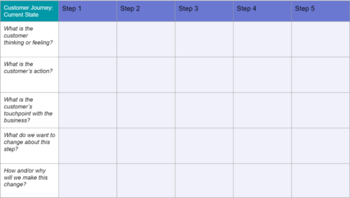
Current state template
The current state template is the most commonly used journey map that focuses on what customers currently do, their way of thinking, and how they feel during interactions.
It’s great for highlighting existing pain points and works best for implementing incremental changes to customer experiences.
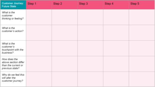
2. Future state template
The future state template focuses on what customers will do, think, and feel during future encounters. It’s useful for conveying a picture of how customers will respond to new products, services, and experiences.
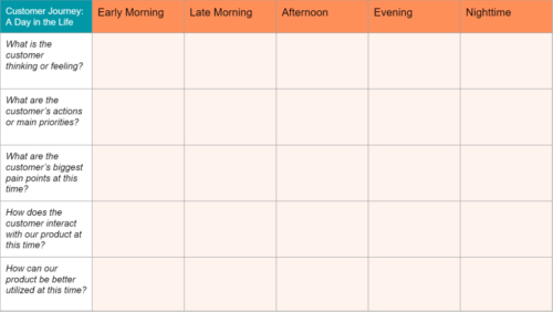
3. Day in the Life Template
This template is similar to the current state template because it visualizes present-day customer behaviors, thoughts, and feelings. However, this template assesses how customers behave both with your organization and with peers in your area.
This type of journey map works best for spurring new initiatives by examining unfulfilled needs in the market.
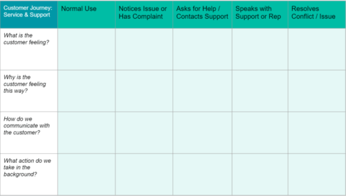
4. Service Blueprint Template
When creating a service blueprint template, you typically begin with an abridged version of a current or future state journey map. Then you add a network of people, methods, procedures, and technologies responsible for giving a simplified customer experience, either in the present or in the future.
Current state blueprint maps are beneficial for recognizing the source of current pain points, whereas future state blueprint maps help create an environment that will be necessary for providing a planned experience.
How to Create a Customer Journey Map (7 Steps)
Creating customer journey maps may feel repetitive, but the design and application you choose will vary from map to map. Remember: customer journeys are as unique as your individual customers.
Step 1: Create Buyer Personas
Before creating a journey map, it’s important to identify a clear objective so you know who you’re making the map for and why. Building personas is the most time-consuming part of the process. It requires detailed research, including qualitative and quantitative data, and is the foundation of the entire process. A persona is a highly relatable and rounded fictional character, generalized, but not stereotyped.
Buyer personas help define customer goals, providing a deeper understanding of their needs and topics of interest. More detail makes for more realistic personas, which means you’ll need to do a fair amount of market research to acquire this data.
Start by creating a rough outline of your buyer’s persona with demographics like age, gender, occupation, education, income, and geography. When you have that in place, you’ll need to get psychographic data on your customers. This kind of information may be harder to collect compared to demographic data, but it is worthwhile to understand customer preferences, needs and wants.
In short, demographics tell you who your customers are and psychographics provide insights into the why behind their behavior. Collecting concrete data on your customers helps you serve them better and deliver a more personalized user experience.
After making several customer personas, it’s time to do a “deep dive” into each to build a more accurate reflection of their experience.
Start by analyzing their first interaction with your brand and mapping out their movements from there.
What questions are they trying to answer? What is their biggest priority?
Step 3: List Customer Touchpoints
Any interaction or engagement between your brand and the customer is a touchpoint.
List all the touchpoints in the customer journey, considering everything from the website to social channels, paid advertisements, email marketing, third-party reviews, or mentions.
Which touchpoints have higher engagement? Which touchpoints need to be optimized?
All customer journey mapping examples are unique. Therefore, touchpoints on one map are unlikely to work for another. In fact, every business needs to update its buyer personas and customer journey maps as their business changes. Even quite subtle changes can have profound effects on the customer journey map template.
Step 4: Identify Customer Actions
Once you have identified all your customer touchpoints, identify common actions your customers make at each step. By dividing the journey into individual actions, it becomes easier for you to improve each micro-engagement and move them forward along the funnel.
Think of how many steps a customer needs to reach the end of their journey. Look for opportunities to reduce or streamline that number so customers can reach their goals sooner. One way to do this is by identifying obstacles or pain points in the process and creating solutions that remove them.
This is a great time to use the personas you created. Understanding the customer will help you troubleshoot problem areas.
Anticipating what your customer will do is another important part of mapping the customer journey. Accurate predictions lead to you providing better experiences, which ultimately leads to more conversions.
Step 5: Understand your available resources
Creating customer journey maps presents a picture of your entire business and highlights every resource being used to build the customer experience.
Use your plan to assess which touchpoints need more support, such as customer service. Determine whether these resources are enough to give the best customer experience possible. Additionally, you can correctly anticipate how existing or new resources will affect your sales and increase ROI.
Step 6: Analyzing the Customer Journey
An essential part of creating a customer journey map is analyzing the results.
Now you have your data, customer journey mapping template, touchpoints, and goals, it’s time to put it all together and define where the UX is meeting expectations and where things can be improved. It is important to note that mapping where things are going well is almost as important as defining what isn’t. Some elements of the journey can be spread to other areas.
As you assess the data, look for touchpoints that might drive customers to leave before making a purchase or areas where they may need more support. Analyzing your finished customer journey map should help you address places that aren’t meeting customers’ needs and find solutions for them.
Take the journey yourself and see if there’s something you missed or if there is still room for improvement. Doing so will provide a detailed view of the journey your customer will take.
Follow your map with each persona and examine their journeys through social media, email, and online browsing so you can get a better idea of how you can create a smoother, more value-filled experience.
One of the best ways of pinpointing where things are not going to plan is through customer feedback. This is typically done through surveys and customer support transcripts.
Step 7: Take Business Action
Having a visualization of what the journey looks like ensures that you continuously meet customer needs at every point while giving your business a clear direction for the changes they will respond to best.
Any variations you make from then on will promote a smoother journey since they will address customer pain points.
A great way to test your variations to find out what better serves your customers throughout their user journey is by leveraging A/B testing.
AB Tasty is a best-in-class A/B testing solution that helps you convert more customers by leveraging experimentation to create a richer digital experience – fast. This experience optimization platform embedded with AI and automation can help you achieve the perfect digital experience with ease.
Analyzing the data from your customer journey map will give you a better perspective on changes you should make to your site to reach your objective.
Once you implement your map, review and revise it regularly. This way, you will continue to streamline the journey. Use analytics and feedback from users to monitor obstacles.
Customer Journey Map Examples
Customer journey map templates are varied, some appear like works of art, while others are the work of a child, but as long as they are clear and concise, they can be effective.
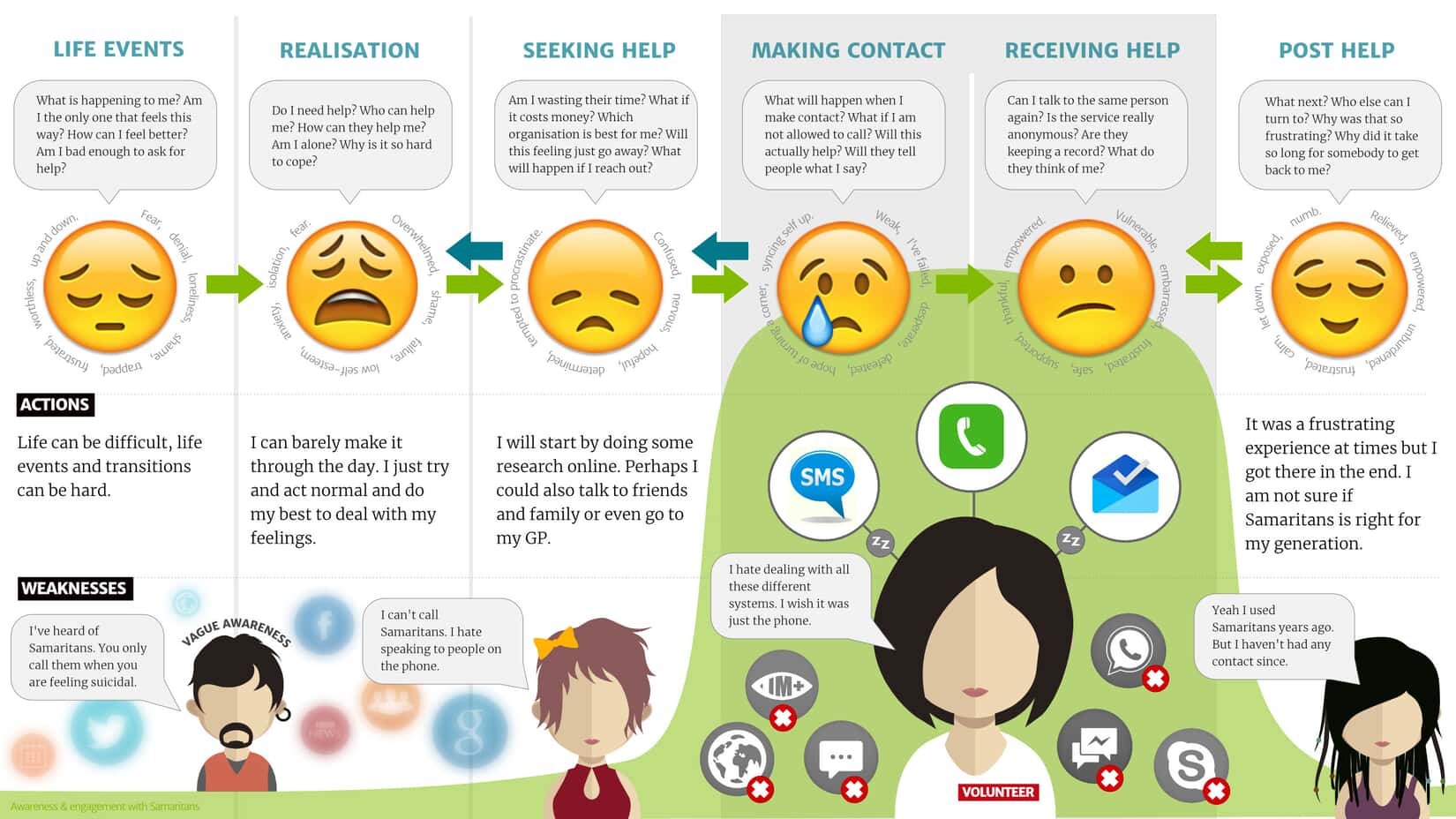
This customer journey map for the charity ‘The Samaritans’ is a highly empathetic map, focused on the purpose of the charity itself. Note how the text is highly visual and therefore makes it easy to relate to the image of the map itself.
This is an example of a map that gives the impression of a journey, rather than a linear UX. This can help push home the point that customer experience is rarely easy to define as a journey from A to B.
The Truth about Customer Journeys
Customer journeys are ever-changing. Journey maps help businesses stay close to their customers and continuously address their needs and pain points. They provide a visual of different customers which helps to understand the nuances of their audience and stay customer-focused.
Customer journey maps can vary widely, but all maps share the same steps. With regular updates and the proactive removal of roadblocks, your brand can stand out, provide meaningful engagement, improve customer experiences, and see positive business growth.
We’ve all been through the pain of filling out never-ending forms where we eventually gave up because it was so complicated.
Simple or complex, sign-up forms are everywhere. You are either the one creating the forms or the one filling them out. From e-commerce to SaaS and media platforms, there is no way to escape them. They’re a part of our everyday digital life.
Because consumers are used to filling out sign-up forms, the smallest mistakes in design or the information you’re asking for can have huge consequences on your conversions.
In this article, we’ll cover the basics, the different types of sign-up forms, and 10 best practices for designing powerful sign-up forms that convert.
What is a sign-up form?
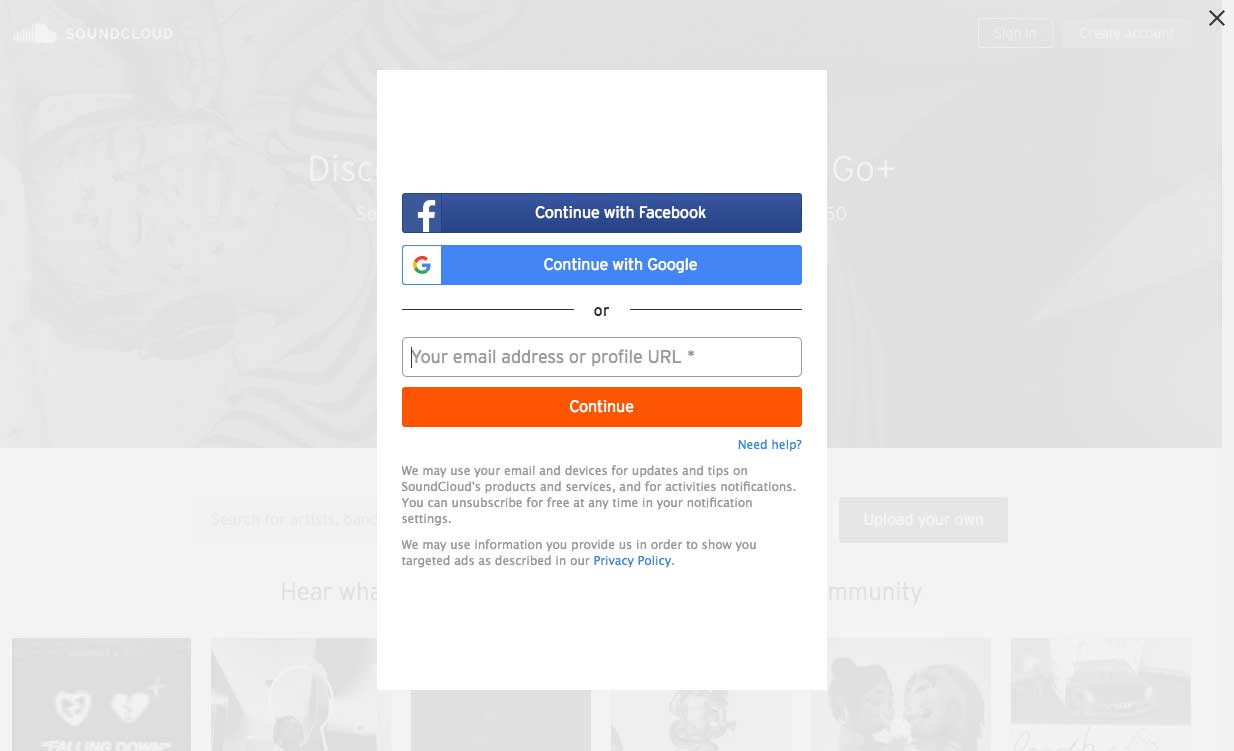
A sign-up form is a webpage, questionnaire, document or popup that visitors must fill out with their personal data in order to access specific content or subscribe to a service.
Source: SoundCloud
Sign-up forms can have multiple purposes, but typically share a common goal: acquire personal consumer information, such as their name and email, in exchange for access to top-notch information or services.
For many websites, sign-up forms can also represent the entry point that makes all further conversions possible. This is particularly true for freemium or subscription-based models.
E-commerce websites also rely heavily on these forms because they’re a mandatory step prior to any purchase.
Why do sign-up forms matter so much?
Sign-up forms are where conversions happen. In other words, sign-up forms create business.
In our digital era, forms are how companies can get up close and personal with their potential customers. This is the beginning of their interactions where they collect emails, basic user information, leads and deliver content.
In short, forms are at the center of many digital interactions:
For the service industry, forms are where leads are made.
For the e-commerce industry, forms are where purchases are made.
For the SaaS industry, forms are where you acquire customers.
As you can see, sign-up forms are the central piece of the puzzle.
Knowing this, it’s no surprise that neglecting forms is detrimental to any business. In fact, even a single mistake can promptly cost big companies millions in lost revenues.
Finding out what’s wrong with a form takes time. It requires your team to test out your sign-up forms using A/B testing to see what is the most appealing for your users.
AB Tasty is an example of an A/B testing tool that allows you to quickly test elements of your sign-up form or different portions of your web page. With AB Tasty’s low-code solution, you can get these tests launched with ease, gather insights via an ROI dashboard, and start increasing your conversions.
4 main types of sign-up forms
1. Email sign-up forms
Emails are a precious touchpoint that shouldn’t be neglected.
These are forms aimed at harvesting email addresses to enhance your email list and generate potential leads.
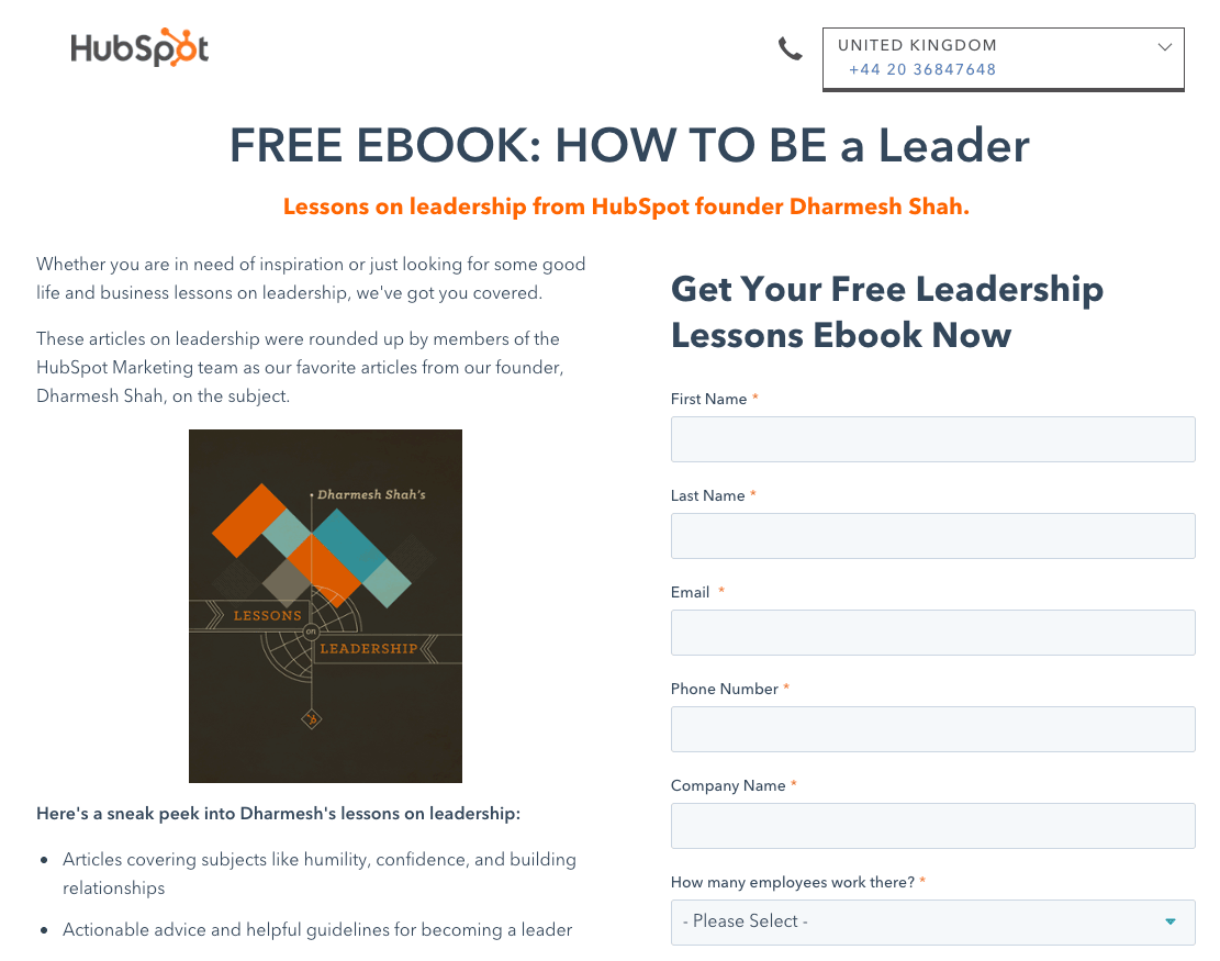
In the image below, we can see an example of Hubspot using FOMO (fear of missing out) to promote their Service Blog by asking for only one email address.
By keeping the sign-up simple and offering some value through your email content, you’re encouraging your prospects to engage in a short, informational exchange.
Source: HubSpot
2. Product sign-up forms
Product sign-up forms are crucial to e-commerce websites because they’re the last barrier before any purchase is made.
For product sign-up forms, it’s best practice to show the actual product, be very clear, and display security elements to give your customer peace of mind.
While there’s no consensus around the question, we think that e-commerce product forms should be reduced to the bare minimum to decrease the shopping cart abandonment rate.
In any case, delivery and payment options can be separated in order to streamline the checkout process.
3. Subscription sign-up forms
Subscription sign-up forms are a central piece of any subscription-based digital business; it’s where the conversions happen.
However, converting someone into a paying user isn’t always so simple.
Typically, SaaS and subscription-based businesses need time to educate their potential customers, which is why their subscription forms are key for them.
For subscription forms, it’s always important to remember the key information that you’re looking for and to provide value by offering a demo or a free trial.
Service sign-up forms differ from subscription forms as they do not necessarily bind the user through a subscription.
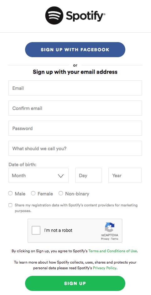
Service sign-up forms, like Spotify in the image below, are typically aimed at converting a maximum number of visitors into users. For that to happen, one of the best tools that you can use is a social media sign-up process.
Source: Spotify
Offering users a quick alternative way to register with social media or Google could multiply your conversion rate.
10 Expert Sign-up Forms Best Practices
1. Make it contextual and obvious
Your forms only serve one purpose: to be filled out by your visitors.
For that reason alone, make sure that your forms are easily found on your website with distinctive colors.
However, it’s great to keep in mind that making your sign-up forms obvious doesn’t mean that you should display them everywhere. Context really matters when it comes to asking your visitors for their personal data.
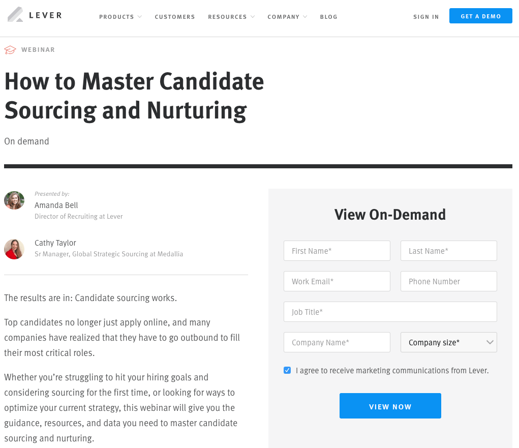
Let’s take a look at Lever in the example below. Lever offers gated content on specific HR subjects that requires you to register. It uses a clear call-to-action and offers a brief summary that helps them “sell” their content before visitors fill out their personal information.
Source: Lever.co
2. Multi-Step vs Single-Step forms
According to VentureHarbour, multi-step forms tend to outperform single-step forms when it comes to lead generation.
Multi-step forms leave a less intimidating impression on visitors because they only ask for sensitive information at the very end of the form. This method generally leads to better results.
However, when it comes to product and subscription sign-up forms, we’d recommend a clear single-step sign-up form as long forms can discourage even the bravest visitors.
3. Keep your forms simple and easy
There’s a lot of debate when it comes to measuring our online attention span but one thing’s for sure: if your online content isn’t attractive and sharp, you’ll lose potential customers.
In fact, your form length mostly depends on the context. Some industries benefit from longer forms because it gives their websites more credibility, while others see a better return from shorter forms.
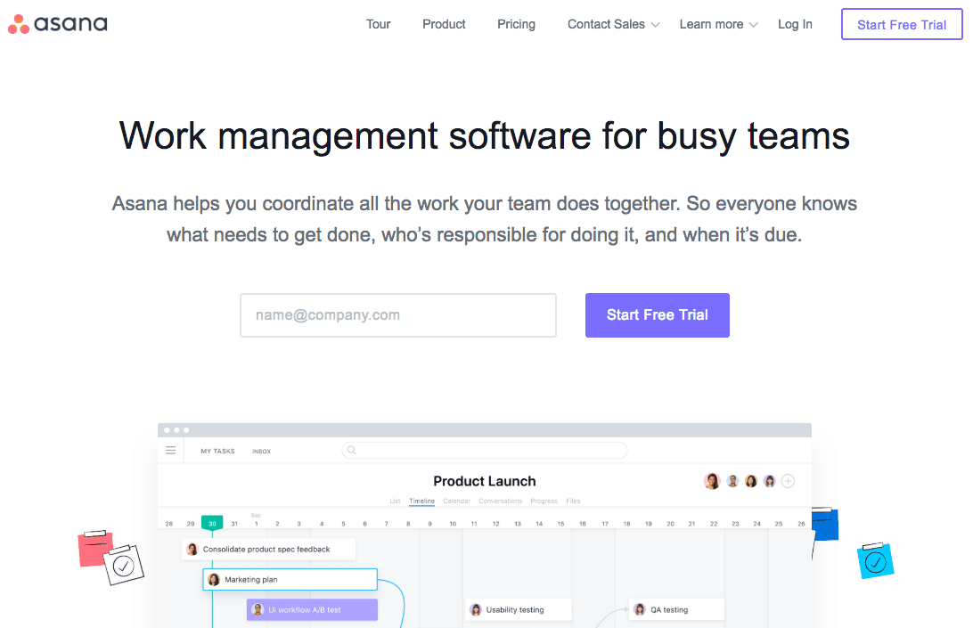
Here is one example of a truly simple sign-up form:
Source: Asana
Asana does an awesome job at keeping the registration process easy – they only ask for your email address in exchange for a free subscription. Of course, Asana’s team knows that more information is required to properly use their solution. However, they wait until the onboarding process to ask for more user information later on.
On a larger scale, several studies report that shorter forms (fewer fields) tend to yield better results (more conversions).
With every additional field, there’s more of a potential to lose leads or customers. For e-commerce stores, our advice is to reduce the number of fields to the bare minimum. Your goal is to offer a slick and swift buying process.
It’s important to keep in mind that a simple form doesn’t mean removing all fields. A simple form means that you only focus on mandatory information that helps you meet your business objectives like the users’ name and email address.
4. Provide some real value
Visitors are asked about their personal information almost everywhere, and data privacy is becoming a prominent concern for many internet users.
With this issue in mind, it’s important to design your sign-up forms in a way that provides value for your visitors in exchange for them filling out the form.
To accomplish this goal, the most popular option is to craft a powerful value proposition to sell your form. This value proposition doesn’t have to be long and detailed – it can be effective by getting straight to the point.
In the example below, outdoor gear specialists REI keeps it very simple with a clear value proposition in their email subform: “co-op offers, events & cool new gear.” When you put your email in the box, you have a very clear idea of what you’re signing up for.
Source: Rei.com
5. Leverage your social proofs
Social proofs help you sell your services and products because it plays on our deeply rooted social nature.
Showing your visitors that many people did the same before gives them comfort in trusting your product or service. This also enhances your brand credibility and helps you achieve higher conversion rates.
It’s all about convincing your visitors to go through the next steps.
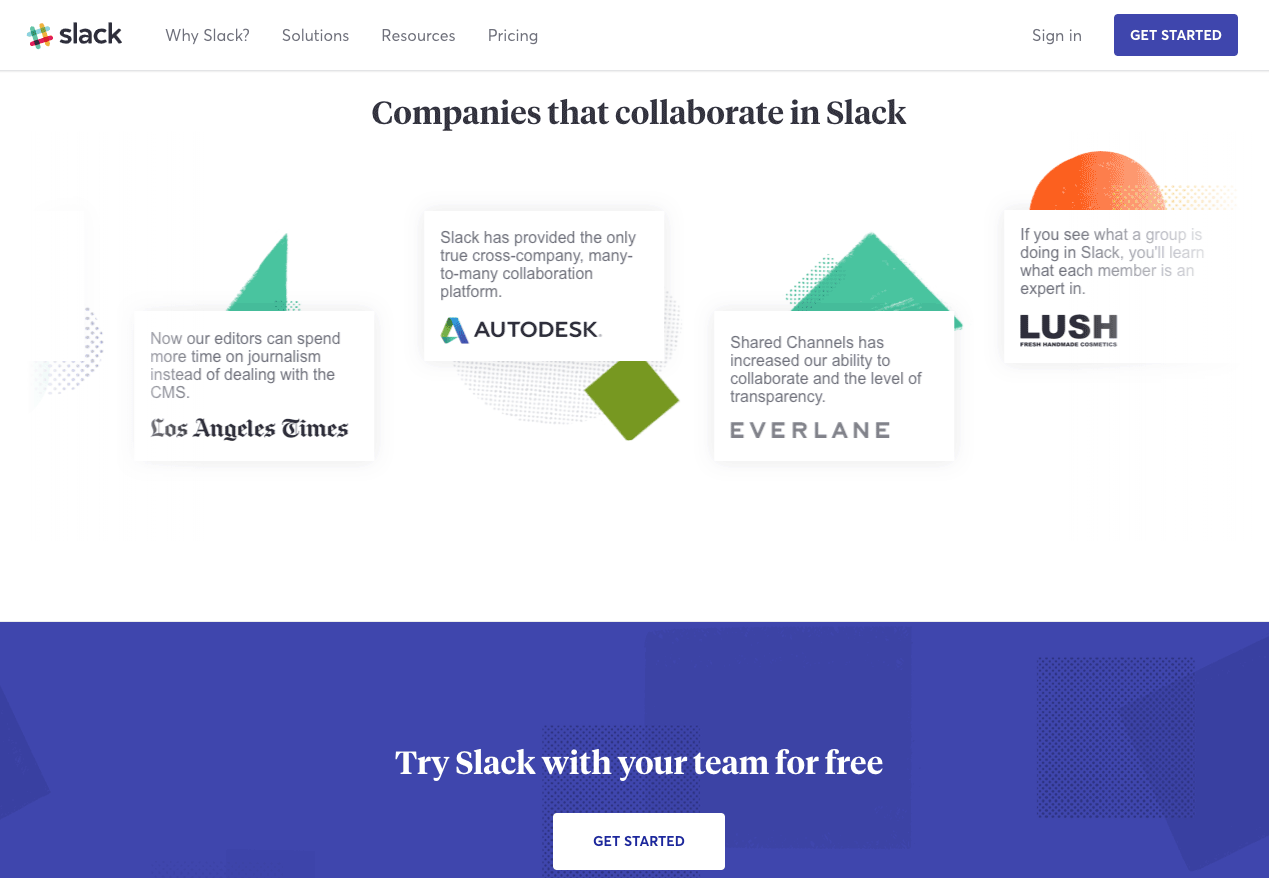
In the example below, you can see how Slack leverages social proof by displaying customer testimonials from famous tech companies just above their sign-up form.
Source: Slack
6. Make it mobile friendly
As more than half of web traffic comes from mobile devices, mobile friendliness is becoming more important each year.
Knowing that more than half your visitors browse your website with their smartphone, you need to ensure that you pay close attention to your sign-up forms’ mobile layout.
The screen size adaptability of your form could play a decisive role in improving your conversion rate.
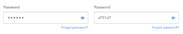
7. Don’t ask for password confirmation
Password confirmation typically doesn’t help with conversions. In fact, it slows down the process and actually increases the chances of a user misspelling their password.
Rather than asking for confirmation, allow your visitors to see what they just typed with an icon that unmasks their password. This will give them peace of mind knowing that their password is correct without the frustration of misspelling it.
8. Avoid using Captchas
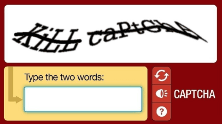
Although spam is a real issue, you might want to consider avoiding the addition of an anti-spam solution on your visitors’ shoulders.
Captchas, like the one displayed in the image below, can sometimes get messy and irritating, which is why they shouldn’t be overused when it comes to building efficient sign-up forms.
However, if your team feels more comfortable having an anti-spam solution, there are better alternatives to captchas to prevent spam.
9. Allow for social sign-ups
As we’ve mentioned a few times in this article, social sign-ups significantly reduce the time it takes for visitors to sign-up thanks to Google or Facebook’s auto-fill.
Implementing social sign-ups makes it easy to subscribe and gives your brand some much-needed credibility. People generally assume that Facebook and Google sign-ups are more secure.
With just one click, it’s an excellent tool to quickly generate leads and improve sign-up conversions.
10. Optimize and test your sign-up forms
Implementing best practices is a good practice in itself. But measuring the changes and their improvements is even better.
Do three fields perform better than six? Is implementing a social media sign-up worth it? Does social proof really give visitors the extra push to fill out your form? Tracking your sign-up form experimentation is the only way to find out.
Your marketing team should test several variations. Using an A/B testing solution, you’ll be able to:
Want to get started on A/B testing for your website? AB Tasty is a great example of an A/B testing tool that allows you to quickly set up A/B tests with low code implementation of front-end or UX changes to sign-up forms on your web pages, gather insights via an ROI dashboard, and determine which route will increase your revenue.
Conclusion
As the conversion opportunities for the subscription service industry continue to skyrocket, so does the competition. Online customers are overwhelmed with choices – and often many good ones.
To convert online visitors to your website, you have to have a very consumer-friendly and optimized page. To find what turns your visitors into subscribers, get started on A/B testing your sign-up forms today.
Above the fold remains an important part of website design, even though it’s become more and more complex with each passing year.
While it may not be seen as consequential as it once was before it became a digital standard, it still requires understanding and consideration for all websites seeking to present an engaging experience for their visitors.
What is above the fold?
The concept of above the fold goes back to the beginning of the printing press. Due to the way they were printed on large sheets of paper, newspapers were folded in half once they hit the newsstands. This led to only the top half of the paper being visible to anyone passing by.
The newspaper industry quickly concluded that in order to attract an audience, they must present attention-grabbing headlines, content, and imagery on the top half of the page.
If no one could see the hidden content below the fold– above the fold content needed to be the most eye-catching story hot off the press.
This basic principle also applies to digital content.
Of course, websites do not have a physical fold like newspapers; the fold in this regard relates to the scrollbar. We could also consider a website’s “above the fold” as above the scroll.
Anything that isn’t visible immediately and requires scrolling is considered below the fold. Unfortunately, the digital version of the “above the fold” concept isn’t quite as simple as the print version.
Where is the “fold” on a webpage?
The “fold” of a website is considered to be at the bottom of the screen. Anything above the fold is immediately visible to the reader as soon as the page loads and anything below the fold requires scrolling.
The exact location of the fold will depend on the device that the visitor is using to load the page. As we all know too well, desktops, tablets, and mobile devices have different screen sizes and resolutions, so all content must be formatted differently to be appealing to all users.
Online tools for defining above the fold placement
There are many free online tools you can use to visually test and place different aspects of your website relating to its “Fold”.
While these are extremely helpful to help you get a physical idea of the layout, they can only provide a superficial presentation of the website and not an in-depth analysis. For this reason, it is recommended that a full website optimization is carried out.
Testing above the fold designs
It’s important to know what designs will work best for your audience. How will you know if you are displaying the right information in the right place or if your design is attractive and clear enough to convert visitors? The easy answer is to implement experimentation.
One of the best ways to be sure that your above the fold content is getting you the best conversions is to use software to test the performance of your content and compare it to the original versions or perform an AB Test.
AB Tasty is a great example of a tool that allows you to test elements of your web page from headline CTA, to hero image, to web copy to see the best outcome. With AB Tasty’s low-code solution, you can get these tests launched with ease and start increasing your conversions.
Best practices
While it is true there are no hard and fast rules for above the fold placement, some best practices often work as helpful guidelines.
The number one best practice when it comes to above the fold content is to make sure that the most engaging content is above the fold.
It is also important to never assume that following the best practices means one size fits all.
For many years, websites have been designed like newspaper front pages in a sense. By this, we mean that there has been a “templatization” methodology that leaves the majority of sites looking the same.
Having the same layout on every webpage you visit will lead visitors to experience some fatigue. Having a unique and innovative landing page template will help the digital experience feel a lot more natural as opposed to all websites following a cookie-cutter structure.
Some websites have done away with the fold altogether, designing pages with no below the fold content and eliminating the problem entirely. These “compact” designs are aesthetically pleasing to the eye and are able to fit all screen sizes.
On the contrary, one of the worst things a website can do is present a “false bottom” to the page. This is where a site has further information that requires scrolling, but it seems like there is nowhere else to scroll. In other words, its existence is not apparent to the visitor.
A fold shouldn’t be an obstacle; it should flow naturally and draw the visitor in to look for more information.
Above the fold tendencies have changed
User habits have changed enormously from the early days of the Internet and they will continue to change as technology evolves.
During the 90s, it was common for most visitors to rarely read anything below the fold due to slow connection speeds and ponderously slow websites. But now, users are far more likely to use the scroll function to get more information.
This had some companies resort to cramming information above the fold and over-stuffing the visitor with too much content. Thankfully, now it’s far more common to be greeted with minimalist and elegant designs that allow the visitor to discover what the site has to offer.
Before 2010, there were no iPhones, Samsung Galaxy phones, Google Pixels phones, tablets, etc. This means that over 10 years ago, the above the fold line was more consistent due to the lack of variation in screen size.
However, we are now seeing more devices on the market every year and need to pay close attention to the responsiveness of above the fold UX designs to be compatible with different devices.
Call to actions above or below the fold?
One of the myths about above the fold designs is that it is always best practice to have a clear Call To Action (CTA) viewed instantly. This is an oversimplification of the concept.
Where you place the call to action depends on several factors:
“Certain” visitors (visitors with a clear intent to convert)
Uncertain visitors that are familiar with your product
Uncertain visitors that are presented with a complex proposition
“Certain” visitors are those who are likely to react to the call to action as they have largely made their minds up about purchasing, signing up, or downloading content before visiting the site.
This is where known brands have an advantage because there is little for this type of visitor to learn about their product or service. In these cases, placing a call to action above the fold is only a matter of convenience.
For visitors who are not certain of their intent, placing the call to action above the fold is generally the best practice. It’s also important here to provide as much informative and relevant content as possible.
For uncertain visitors that are presented with a complex proposition, such as a product or service that isn’t obviously beneficial to them, placing the call to action above the fold will not suffice. For these situations, you’ll need to provide a more in-depth explanation of why your call to action should be acted upon. In fact, placing your call to action up front can appear a little pushy.
In any case, the call to action should be placed in a position where the visitor is most likely to convert and perform the desired action.
Placement of Ads
No matter how tactically you design your site, most of the attention will still be focused above the fold. It’s human nature to focus your attention on the first thing that is presented to you. Therefore, shouldn’t you maximize your engagement and flood the area with ads?
Unfortunately, the answer isn’t so simple.
Google algorithms (2014 release) pay close attention to the balance between the amount of content above the fold in relation to the number of advertisements in this area. If your advertisement content is clearly overpowering normal content in the directly visible area of your webpage, Google can severely penalize this practice and harm your website’s ranking if you’re not careful.
Ad placement is a complex balance that requires knowledge of the bounce rate, engagement analysis, and user behavior. Ad placement decisions are best made when considering the right data, the balance of content, and your audience.
The importance of above the fold
The importance of above the fold design is not only essential for getting your most relevant content seen but very complex to properly show content to all users.
As a result, it’s wise to be wary of any advice that deals with absolute truths and strict instructions. Maximizing above the fold UX design and content to make your visitors convert is not a simple equation as visitors have different intents and needs depending on the site they are visiting.
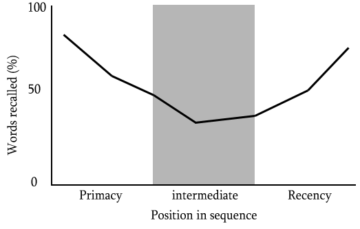
You may not be aware of this, but it’s likely that you’ve come across the serial position effect on more than one occasion.
A concept coined by renowned psychologist, Hermann Ebbinghaus, the serial position effect refers to how the location of an item in a sequence influences a person’s memory or recall.
The concept dictates that people usually remember items at the beginning or the end of a list or sequence with greater accuracy than those in the middle.
User experience (UX) designers leverage the serial position effect to improve their designs and create a richer, more seamless experience for consumers. This approach to digital design is present in the websites, apps or landing pages of iconic brands such as Apple, Nike or Electronic Arts (EA).
Here we’re going to explore the serial position effect in more detail, explore some notable design examples, and consider how you can use this powerful principle to improve your brand’s UX offerings.
What is the serial position effect?
When it comes to UX optimization, the order of things matter. As humans, we do indeed tend to remember the items near the start or end of a list — much like our brains respond well to storytelling.
Hermann Ebbinghaus coined the phrase based on in-depth studies on the short as well as long term memory and its impact on how we remember or perceive information. These studies were further developed by psychologists B.Murdock in 1962 and Glanzer & Cunitz in 1966.
These extensive studies resulted in the two vital serial position effect concepts: the primacy effect and the recency effect.
Primacy effect
The primacy effect is based on the discovery that an individual is likely to recall items, assets or information from the start of a list.
For instance, when someone attempts to remember something from a long list of words, they are likely to recall the terms words listed at the beginning, rather the middle.
As such, the primacy effect helps a user to remember the information they absorb first better than the information they see later on in their journey (further down a landing page, for example).
Recency effect
Essentially, the recency effect is a concept contrary to the primary effect. Rather than recalling information absorbed earlier on, the recency effect is based on the notion of people remembering the information they see last with more clarity. This model is dependent on short-term memory.
A mix of studies suggests that the recency effect is prevalent in thecourtroom. In many cases, jurors are more likely to recall, and agree with, the argument or conclusion they hear last.
In a UX design context, for instance, a potential customer will recall the last two items they saw on a personalized product recommendation carousel and purchase one of these products as a result.
The primacy and recency effect combined make up key elements of the serial position effect, which brings us onto our next point.
Applying the serial position effect to design
Now that you understand the fundamental concepts of the serial position effect, we’re going to consider how you can apply it to design — or more specifically, to user design interfaces.
Both the primacy and recency effect can have a significant impact on the design of user interfaces. Extensive lists of information put a strain on the human memory, often hindering perception and recall; and, by utilizing both ends of the serial position effect spectrum (primacy and recency), you can enhance your designs significantly.
By understanding that items or assets in the middle of a sequence are usually absorbed the least, it’s possible to leverage the serial position effect to minimize the loss of information. In doing so, it’s possible to create interface designs that are richer, more valuable, and easier to navigate.
Considering that 38% of consumers will bounce off a web page if its layout is poor or unattractive, getting your design right will prove critical to your long term success.
Applying the serial position effect to your interface design process is at its core, down to ensuring that users can navigate the items or information on your page intuitively.
If your design is digestible, fluid, and seamless, users will recall vital information with more clarity while taking desired actions like signing up to a newsletter or buying a specific product.
Here are four essential principles of applying the serial position effect to interface design:
1. Provide practical, task-relevant information
Adding and maintaining task-relevant information to your interface will not only make your design more engaging, but it will reduce the strain on users’ focus or recall.
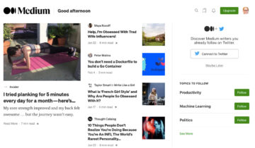
Publishing platform Medium, for instance, has designed its user interface to simplify its interactions from a reader’s as well as a writer’s perspective.
With a host of visual tools tailored to the users’ preferred topics or interests, you gain a visual snapshot of information that offers access to relevant content and to your reading list, and allows you to create a new piece of content with swift, seamless actions.
2. Add recognizable cues
Adding dynamic cues to your user interface design minimizes cognitive strain while facilitating informational recall.
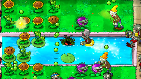
Audible notifications (e.g. pings when you receive a message) or textual cues (e.g. small informational pop-up boxes) create a real sense of recognition. Video games like ‘Need For Speed’ or ‘Broken Sword’ are excellent examples of cue-based design for user interfaces.
EA Games’ once popular ‘Plants vs Zombies’ game, for instance, utilizes a multitude of recognizable visual and audio cues to help players navigate their way through the game and remain ‘in the moment’ without pushing them to their cognitive limits.
Foley-style sounds unique to each move the player makes (planting sounds, digging sounds etc.), text-based captions that tell the player what to expect next, and visual icons at the top of the screen all work cohesively to make the user experience feel as natural as possible. You can apply similar cues to e-commerce sites to enrich your designs and make them more intuitive.
3. Reduce the level of recall required
The human attention span has its limits and, typically, can only retain five pieces of information at any one time.
If you prioritize limiting the necessity for recall, you will guide users through their journey in a way that helps them remember relevant information as and when required.
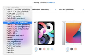
Technology colossus Apple utilizes a visual grid system with informational titles and scannable dropdown boxes to help its customers comprare models with ease and pick a product that suits their specific needs. At any one point in the interface journey, users are only presented with the information they need — details including essential specs, main comparisons, and price.
This simple yet effective design prioritizes the most valuable information, minimizing the need for recall in the process.
4. Emphasize essential information at the start and end
Playing directly into the hands of the primacy and recency effect, highlighting or placing the most essential information at the start and the end (or the top and bottom) of your interface, placing the less important items in the center.
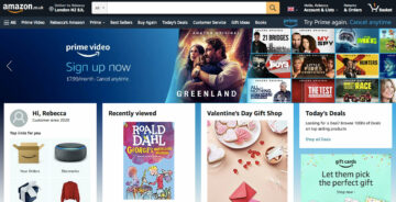
World-renowned e-commerce leader Amazon, for example, displays digestible personalized prompts, commands, and information at the top of its homepage.
In the center of the page, you gain access to trending products and deals. At the bottom of the page, or interface, you’re presented with personalized suggestions based on your shopping history or browsing behavior:
This design technique maximizes the potential for users to recall the information that offers the most value or is likely to prompt further engagement. An effective approach that enriches the user experience while increasing the chances of regular consumer conversions.
“Design used to be the seasoning you’d sprinkle on for taste; now it’s the flour you need at the start of the recipe.”
— John Maeda, design & UX expert
Serial position effect for landing page UX
From the user interface design methods we’ve explored, it’s clear that the order, as well as the way you present information, have a significant impact on how people interact with your brand or business.
In today’s hyper-connected digital age, your UX offerings count more than ever. 88% of users are unlikely to return to a website or landing page after a poor user experience.
To enhance your landing page UX and create an experience that will increase engagement while encouraging customer loyalty, you should consider implementing the serial position effect.
To reiterate the impact the serial position effect can have on landing page UX, here’s a visualization of the serial position curve.
From a digital marketing perspective, the serial position curve clearly demonstrates that people recall information towards the start and end of an informational sequence, with items or messaging in the middle of a landing page absorbed least. It’s a steady consistent curve that can offer a practical framework for your landing pages’ UX designs.
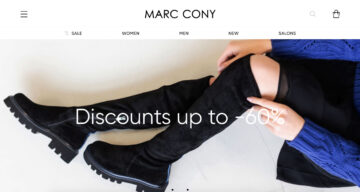
Russian e-commerce brand, Marc Cony, uses the serial effect methodology to increase new user engagement through its primary landing page.
Marc Cony homepage highlighting discount information(Source)
Here, you can see that the landing page design is clean and minimal to simplify user navigation while highlighting its most engagement-driving messaging as soon as you visit.
As you navigate your way down the landing page, there is a clear hierarchy of information. Scroll down and you’re presented with the opportunity to personalize your shopping experience, before viewing content surrounding the brand’s blog and social media pages.
Finally, there is a clean, concise call to action (CTA) button that prompts you to sign up to the brand’s newsletter and ‘convert.’ This is an excellent example of how using serial effect principles can create a seamless user experience while guiding consumers towards a desired action — in this case, viewing sale items or becoming an email subscriber.
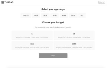
Online retail innovator, Thread, offers an interactive and visually-rich approach to reduce consumer recall and optimize its landing page for increased brand engagement.
Thread’s clean, grid-based design is easy to scan and it’s above the fold messaging prompts the user to take action without having to second-guess themselves.
Thread homepage visually-rich approach
This interactive approach offers personal value while offering an incentive to interact. Clicking on preferred styles requires minimal recall and, as such, keeps the information at the top of the page fresh in the mind of the consumer.
Thread website, subheadings navigation
Once you’ve selected your preferred styles, you’re directed to a new landing page. Clear subheadings help you navigate your way through the page with minimal cognitive strain, and once you reach the bottom, the ‘Next’ CTA tells you what to do.
This approach to the serial position effect helps to streamline the user experience while keeping consumers engaged in the brand at all times.
A well-crafted informational hierarchy and interactive visual approach is a testament to the power of presenting information effectively without overwhelming the user with unnecessary data. This is definitely a driving force behind the startup’s ongoing success!
Whether you’re selling goods or services, applying the serial position effect will help you improve your landing pages’ UX and increase your conversion rates.
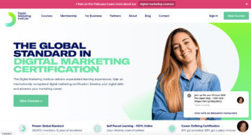
The Digital Marketing Institute, primacy and recency effect on Homepage (Source)
Digital marketing course provider, the Digital Marketing Institute, utilizes both the primacy and recency effect to UX optimize many of its landing pages.
The DMI’s homepage, for example, includes a clearly labelled ‘Download Brochure’ button at the very top of the page. The main banner tells the user exactly what the brand does and how they will benefit from enrolling (using a second ‘Download Button’ to prompt action), thus leveraging the primacy effect to encourage conversions.
At the bottom of the landing page, the Digital Marketing Institute includes graphics showcasing its top-level clients to create a sense of brand authority that sticks in the consumers’ mind while providing clear, concise FAQs in a clean dropdown format.
This recency effect-style approach ensures that visitors can recall essential details about the courses the DMI provides while remembering the impressive clients that brand has served.
Applying the serial position effect to your landing pages will give your UX design and content concepts definitive direction, improving navigation and boosting engagement in the process.
To build on the examples we’ve explored, here are some additional tips based on the serial position effect to help you improve your landing page UX:
Place your most expensive items or services at the top of your landing page to make your mid-range items or services appear less expensive and increase your average order value (AOV).
Add an alluring image, strapline, and CTA button to your top of page banner to deliver important information in a way that minimizes cognitive strain and increases consumer conversions.
Break up the text in the middle of the page with subheadings, images, bolded or italicized font, bullet points and small chunks of text to make your UX design more navigable. Doing so will also increase your chances of leading consumers to important information further down the page.
Position valuable information and USPs towards the bottom of the page and use informational CTA buttons to tell the user what to do next.
Always ensure that your landing page design is clean, logical, and easy to navigate. If you don’t put functionality first, it’s likely that your UX offerings will be poor and your visitors will not retain any information.
How to use experimentation in design
Applying effective design and copywriting principles to your various digital touchpoints while leveraging the serial position effect to deliver valuable information to your consumers will accelerate your commercial success.
But, in an increasingly saturated digital age where the consumer has a wealth of their fingertips, how do you know if your design and serial position effect-based efforts are working as they should?
A range of factors including color, layout, design elements, and even a consumer’s cognitive bias can impact landing page browsing behavior. So, the best way to understand if your initiatives are working and experiment with design effectively is though A/B testing. With a combination of effective data and the right A/B testing platform, it’s possible to pinpoint a specific landing page or user interface’s strengths or weaknesses.
By developing two versions of the same landing page, you can drill down into specific page elements and discover which performs best.
For example, you might find that version ‘A’ of a landing page is earning more engagement above the fold due to the design or placement of a ‘Shop Now’ button. Through testing, you might also find that version ‘B’ is converting more email subscribers as a result of a particular piece of copy or messaging.
If you hone in on this wealth of comparative information, you will gain the power to experiment with every design element imaginable, taking the best-performing elements to create a fully-optimized version of a specific page or touchpoint.
A/B testing will give your design experimentation activities shape while protecting your marketing budget.
If you understand which messaging or design elements to focus on, you can get to the root of the issue and make tweaks for optimizations that are likely to offer the best possible return on investment (ROI).
Concerning the serial position effect, through A/B testing and experimentation you will be able to flatten the serial position curve to balance the information on your interfaces or landing pages.
By balancing the information elements on your interfaces or landing pages, you can make your UX designs easier to navigate while improving brand engagement. You will also gain the ability to experiment with design elements to emphasize the information or assets featured at the top or bottom of your digital touchpoints.
Essentially, if users aren’t engaging with the information at the top or bottom of a specific page, it will become clear that your serial position effect-centric efforts aren’t working. From there, you can experiment with the hierarchy of your information in addition to design elements including buttons, color combinations, imagery, copy formatting, and text boxes.
At this point, it’s worth noting that in our ever-evolving commercial landscape, experimentation never stops. What works today may not tomorrow — and to optimize your digital touchpoints for sustainable growth, constant testing and evolution is essential.
“Design creates culture. Culture shapes values. Values determine the future.” — Robert L. Peters, Graphic Designer
Final thoughts
We’ve outlined the fundamentals of the serial position effect and looked at how to apply the concept to UX and landing page design while outlining the importance of experimentation and testing.
Reflecting on our journey, what is crystal clear is that, in order to deliver the very best designs and UX offerings to your consumers, you need to reduce cognitive strain as much as possible.
The serial position effect helps us to understand human limitations in terms of both long term and short term memory, as well as the importance of ordering your information effectively.
As designers, when applying the serial position effect, it’s critical to empower the user by providing task-relevant information on the screen where possible, sharing concise prompts or cues, reducing the level of recall needed across the user journey, and highlighting the most valuable information at the start and end of a sequence where necessary.
When interacting with your digital touchpoints or interfaces, your users shouldn’t be overwhelmed with information. They should be able to navigate every aspect of your interfaces or landing pages intuitively, with little additional thought, while understanding what to do next and why they are doing it.
Your UX and design offerings should deliver relevant, valuable information to your users in a way that is completely seamless — and, by using the serial position effect to guide your decision, you will set yourself apart from the competition.
After our amazing digital summit at the end of 2020, we wanted to sit down with Matt Bullock, Director of Growth at Roboboogie to learn more about ROI-driven design.
Tell us about Roboboogie and your session. Why did you choose this topic?
Matt: Our session was titled Building an ROI-Driven Testing Plan. When working with our existing clients, or talking with new potential clients, we look at UX opportunities from both a data and design perspective. By applying ROI-modeling, we can prioritize the opportunities with the highest potential to drive revenue or increase conversions.
What are the top 3 things you hope attendees took away from your session?
Matt: We have made the shift from “Design and Hope” to a data-backed “Test and Optimize” approach to design and digital transformation, and it’s a change that every organization can make.
An ROI-Driven testing plan can be applied across a wide range of conversion points and isn’t exclusive to eCommerce.
Start small and then evolve your testing plan. Building a test-and-optimize culture takes time. You can lead the charge internally or partner with an agency. As your ROI compounds, everyone is going to want in on the action!
2021 is going to be a transformative year where we hope to see a gradual return to “normalcy.” While some changes we endured in 2020 are temporary, it looks like others are here to stay. What do you think are the temporary trends and some that you hope will be more permanent?
Matt: Produce to your doorstep and curbside pickup were slowly picking up steam before 2020. Before the end of the year, it was moving into the territory of a customer expectation for all retailers with a brick-and-mortar location. While there will undoubtedly be nostalgia and some relief when retailers are able to safely open for browsing, I do think there will be a sizable contingent of users who will stick with local delivery and curbside pickup.
There is a lot of complexity that is added to the e-commerce experience when you introduce multiple shipping methods and inventory systems. I expect the experience will continue evolving quickly in 2021.
We saw a number of hot topics come up over the course of 2020: the “new normal,” personalization, the virtual economy, etc. What do you anticipate will be the hot topics for 2021?
Matt: We’re hopeful that we’ll be safely transitioning out of isolation near the end of 2021, and that could bring some really exciting changes to the user’s digital habits. We could all use less screen time in 2021 and I think we’ll see some innovation in the realm of social interaction and screen-time efficiency. We’ll look to see how we can use personalization and CX data to create experiences that help users efficiently use their screen time so that we can safely spend time with our friends and family in real life.
What about the year ahead excites the team at Roboboogie the most?
Matt: In the last 12 months, the consumer experience has reached amazing new heights and expectations. New generations, young and old, are expanding their personal technology stacks to stay connected and to get their essentials, as they continue to socialize, shop, get their news, and consume entertainment from a safe distance. To meet those expectations, the need for testing and personalization continues to grow and we’re excited to help brands of all sizes meet the needs of their customers in new creative ways.
Call to actions (CTAs) count. In fact, more than 90% of consumers who read your headline will also read your CTA copy.
A well-crafted call to action will result in more click-throughs, which typically translates to more conversions.
Your CTA should inspire action, telling your audience what to do next in a way that’s clear, direct, and offers real personal value. If you fail to make an impact with your CTA messaging, then more often than not, the rest of your content will be rendered redundant (or at least become diluted).
So, to help you increase your call to action click-through rate (CTR) and boost your bottom line, here are 15 practical tips.
1) Make your CTA buttons appear ‘clickable’
While this may sound glaringly obvious (making your CTA buttons clickable is the aim of the game, after all), it’s vital.
To ensure that your CTA messaging stands out on the page and appears clickable to your audience, here are some fundamentals you must consider:
Make sure that your CTA button doesn’t clash with other visual elements on the page.
Opt for a rounded or rectangular button.
Create text and button colors that have a clear contrast. If prospects can’t see your text, it’s unlikely they will take action.
2) Put your CTA buttons in the right places
When it comes to boosting the click-through rate of CTA buttons, placing them in the right place is essential.
An eye-tracking study discovered that most users follow an F-shaped pattern when browsing web pages. That said, there are areas of a webpage where your CTA button will perform better.
Placing your CTA button above the fold will often prove effective, but it’s certainly not compulsory. Providing you place your CTA button in a logical place somewhere in that ‘F browsing shape, you will entice more click-throughs.
Look at your page as if you were a consumer. Follow the browsing pattern and it should become clear (within the context of your content) where to place your CTA button.
3) Focus on your short button copy
Most effective CTAs are concise yet impactful. So, if you focus on your short button copy, you will increase your CTA click-through rate.
Your CTA button will have limited room for text, so you have to make your copy count. Here are some solid short copy examples for inspiration:
Get started
Subscribe
Try for free
Join us
Join the family
Let’s work together
The time is now
Start your journey
4) Evoke emotion or a sense of enthusiasm
Concerning your CTA click-through rate, the more urgency you create, the more influential the result.
If you create a sense of urgency or generate enthusiasm with your CTA, you will prompt people to click-through.
For instance, if your landing page is focused on selling a brand new product, then once you’ve told your story and highlighted the USPs, you could sign off with, ‘…but they’re selling like hotcakes. Order yours now before it’s too late.’
This level of urgency will prompt click-throughs.
5) Use action words
Certain words or phrases will encourage action. Known as marketing action words, these particular terms are punchy, impactful, and will encourage consumers to click-through.
FOMO (fear of missing out) is an approach that will help you boost your CTA click-through rate exponentially. If you’re running a promotion or marketing a new product, the FOMO trick will work wonders.
By producing a CTA that makes your audience feel like they’re going to miss out on something worthwhile (or be the only one left out), you will motivate them to click-though and, potentially, convert.
Phrases like ‘don’t miss out’ work well when it comes to FOMO marketing, as does letting your audience know how many people have bought your product or signed up to your service. And, considering that 69% of millennials have severe FOMO, the fear of missing out card is certainly worth trying.
7) Customize your CTA according to device
The concept here is simple: to ensure a healthy click-through rate for your CTA, you must make sure that it’s optimized for every device.
Whether you’re talking about a CTA button or a powerful text-based sign-off, you must always test your call to action across every device (desktop, mobile, tablet, etc.) to ensure that it’s functional, legible, and creates maximum impact.
If you fail to do so, your CTA click-through rate is likely to dwindle, fast.
8) Use numbers where you can
There is a science related to numerics and the human brain. It appears that we can process numbers more intuitively than words at a glance.
That said, if appropriate, use a number rather than a word as this is likely to help with your click-through rates.
For instance, rather than ‘Shop now: only two days left,’ you should try ‘Shop now: only 2 days left.’
9) Step outside the box
This is a phrase that is used so frequently it’s become a cliche. But regarding your CTA CTRs, stepping outside the box will yield positive results.
What we mean here is that when it comes to a call to action, getting a little creative will encourage more engagement.
Here are some tips that will help you step outside the (CTA) box:
Hit your reader with a hint of unexpected messaging. PointBlank SEO’s ‘Be Awesome’ CTA is an excellent example.
Experiment with conversational language or regional phrasing (tailored to your target audience).
Weave your brand name into your CTA copy. Greetings card brand, GiftRocket, did this well with the CTA copy: ‘Send a GiftRocket.’
In addition to creating a sense of urgency or taking the FOMO approach, generating suspense will also benefit your CTA CTR.
By creating an air of mystery or somewhat of a cliffhanger with your CTA messaging, you will encourage your readers to click-through and find out more.
As humans, we’re a curious bunch with an affinity for storytelling. Create suspense, sign off with a cliffhanger, and people will have no choice but to click through.
11) Add images where appropriate
Using a powerful or striking image in conjunction with your CTA will help to encourage click-throughs.
But if you want your image to boost your CTA success rather than hinder it, you should follow these best practices:
Choose an image that aligns with your call to action goal.
Avoid imagery that is too bright or busy as this will detract from your CTA message.
Select images that are likely to evoke the emotion you want your reader to feel. For instance, if you’re a wellness service provider, looking to make people feel uplifted, then using a more animated image of smiling faces might work well.
12) Experiment with colors
When it comes to CTA buttons or text, experimenting with colors will help you increase your click-through rate.
Studies suggest that bold, bright colors are effective for CTAs, so start experimenting with a vibrant palette and see what fits best with your blog post, landing page, or product page.
13) Use white space
Another click-through rate-boosting design tip comes in the form of white space.
By placing a healthy amount of white space around your call to action text or button, you will grab the reader’s attention on the page.
As a result, your readers will focus more on your messaging, in turn prompting them to click through. This approach will prove especially effective for mobile screens.
14) Follow a natural progression
As we touched on earlier, the human brain responds well to storytelling. To give your CTA a click-worthy punch, your page elements should follow a natural progression or narrative.
When you’re creating your page content, consider the F-shaped scanning pattern, using this logic to tell a story that ultimately flows towards your CTA.
But whatever you do, make sure that this natural progression doesn’t jar the reader and make them bounce off the page. For example, you wouldn’t put a ‘register now’ CTA button above your event or webinar details.
Follow a natural progression that focuses on strong storytelling and the rest will follow.
15) Don’t forget to A/B test
If you want to optimize your CTA performance and maintain consistently high click-through rates, then A/B testing is essential.
By testing two versions of a web or landing page, you can gain a wealth of performance-related insights that will help you make the best possible decisions based on CTA design, copy, and placement.
If you know which elements best resonate with your audience, you will be empowered to create CTAs that will boost your click-through rate time after time.
Regardless of your niche or industry, creating a strong call to action is essential to your ongoing business success. Follow these tips, test your choices, and you will boost your click-through rate sooner than you think. You can do it!
The internet has come a long way since we last saw flashy, super intrusive popping banners packed with sound that tried to convince us to download a dodgy software.
In fact, many users and marketers have forged pop-ups a bad reputation over the last 10 years, encouraged by new digital marketing trends that promote smoother, user-friendly funnels using Facebook Ads, content marketing or landing pages.
Over the years, pop-ups (that would typically open in a new window) have been largely replaced by “boxes” that open in the same window. In fact, it’s no surprise that pop-ups still work and deliver good results if they provide real value for users.
Here are our expert tips to create pop-ups that actually work. Interested in more conversion optimization tips? Read our complete guide to CRO.
Wait: should we still use pop-ups in 2020?
Over the last five years, internet users and web browsers have fought sketchy third-party banners that would basically ruin any website’s user experience.
Besides, ad blockers have emerged as a popular option to shield visitors from being overwhelmed by flashy, dodgy pop-ups: Business Insider reports that 30% of all internet users now use ad-blockers on a daily basis.
At this point, you may think that pop-ups have become irrelevant and that no one would click them in 2020.
But it’s not true.
In fact, BlogMarketingAcademy reports that pop-ups can deliver decent click-through-rates of around 2% if used correctly; which is above some of the most commonly used channels.
Whether or not your pop-ups campaign will succeed will depend on many factors including your website content and your personas.
If you also believe that pop-ups still deliver good results, check out these tips to implement a pop-up strategy that works.
Define your marketing objectives
Implementing pop-ups on your website has to fulfill a goal: otherwise it’s just pure unnecessary noise that will distract your visitors away from your content.
Depending on your website, pop-ups can be used to achieve a variety of goals.
Drive more sales
Pop-ups are a convenient tool to drive more sales using well-known marketing techniques such as up-selling, cross-selling and cart abandonment reduction.
For ecommerce websites, pop-ups can be timed around an “exit intent” (i.e they are triggered when a user wants to leave) in order to promote a last-second offer to re-engage your visitors.
Using pop-ups, you can offer your visitors a last chance and eventually convert them into additional customers, which is excellent news if you’re trying to increase your ecommerce conversion rate.
Harvest emails
Growing your email list is a tricky task that just became even harder under the European GDPR regulation that yielded unprecedented changes in the data privacy policies that websites now have to abide by.
Whether you have activities in Europe or not, collecting email addresses generally requires your visitors to opt-in, which can conveniently be achieved using pop-ups.
Made.com uses a central pop-up to grow their email list by offering 10£ in exchange for a newsletter subscription: this is a good incentive to grow your email list. Because you can easily click away, the pop-up doesn’t disturb visitors that much: they can simply close it and keep on shopping.
Generate leads
On that matter, pop-ups can be used as a complementary tool to your content marketing efforts, just like HubSpot does by displaying pop-ups in their articles.
While their visitors read, Hubspot displays a “fake” pop-up chat box that redirects you to an ebook landing page which ultimately asks for your email address: this is a smart strategy that provides value in exchange for an email address.
Improve customer experience
Getting feedback and improving user experience is a major challenge faced by most serious ecommerce and lead generation websites.
Although they weren’t specifically created for that purpose, pop-ups can play a great role in harvesting feedback and improving user experience.
For instance, using AB Tasty’s Net Promoter Score tool (i.e how likely are your visitors to recommend you), you can instantly generate feedback for your ecommerce or services while analyzing real-time data in order to run further optimization tests based on your discoveries.
Choose the right pop-ups for your audience
There are many types of pop-ups that are more or less efficient depending on your strategy. In fact, some industries require more aggressive practices than others: it all depends on your marketing personas and price range.
Here are the 5 main types of pop-ups that you could use:
Entry pop-ups
These are pop-ups that are triggered at the moment your visitors land on your website. Although they might work in some cases (language selection, age restriction, disclaimer, exceptional offer, major news…), they’re generally not happily welcomed by your visitors because of their intrusive nature.
Scroll-based pop-ups
Scroll-based pop-ups are typically activated after a visitor has scrolled to a certain depth (e.g 25% of the page for example). Because these pop-ups only activate after a proof of engagement, they tend to yield slightly better results and work particularly well on articles and blog posts although some ecommerce websites may use them as well.
Delayed pop-ups
Delayed pop-ups are triggered after a visitor has spent a certain amount of time on your website. Similarly to scroll-based pop-ups, they’re only activated after a proof of engagement.
Interaction-based pop-ups
These pop-ups come in handy for marketing teams interested in personalized experiences. Basically, interaction-based pop-ups are triggered once a visitor has clicked or hovered over a specific element. Contrary to delayed or entry pop-ups, they allow your team to create personalized experience based on your visitors’ behavior.
Exit intent pop-ups
Exit pop-ups are triggered once a visitor is about to leave your page. These pop-ups are famous in the ecommerce industry as an effective tool to reduce cart abandonment rate. They can also be used to generate leads or collect email addresses.
You can easily run all these pop-ups using a customer activation platform like AB Tasty. Our
Provide value to your audience
Perhaps the most important rule to bear in mind while implementing a pop-up strategy: always provide value to your audience. Creating and displaying pop-ups on your website that don’t deliver any kind of useful information or value to your visitors is extremely risky.
Backcountry – a famous outdoor equipment ecommerce – uses a large pop-up to indicate that their website isn’t available for European customers. It then redirects you to another website that is GDPR compliant.
Remember: mobile users are extremely demanding when it comes to mobile experience.
Before launching any new pop-ups on your website, take some time to check your mobile version and see if anything could be improved.
Optimize your mobile pop-ups for SEO
After Google announced its mobile-first indexing, the firm also updated its algorithm to penalize intrusive mobile interstitials that would hide the main content on a mobile website.
As a rule of thumb, keep this in mind: do not display pop-ups that cover the main content or hamper the user experience.
Based on these guidelines, your mobile pop-ups should complement the user experience rather than restrain it.
Here’s a diagram from Google that summarizes it quite clearly:
With that in mind, you have all the information to carefully run pop-up campaigns that will drive conversions without hurting user experience or your search rankings.
You’ve clicked on a CTA before. Whether it was adding an item to a shopping cart, opting in to an email list, or submitting a form, you were guided by a succinct but clear button that served as a call to action.
These calls to action, or CTAs, are peppered throughout the customer journey. They appear on web pages, social posts, emails, etc. and are like gold for marketers because—when they have the right wording, design, and placement—they secure conversions and/or move visitors forward through the funnel.
We gathered 14 examples of convincing CTAs to examine the elements that go into creating an effective call to action. Keep reading to see how brands tackled these short but essential phrases to gain an upswing in clicks and conversions.
1. Amazon’s Audible
Amazon’s Audible entices users with a free trial, using the all-important buzzword (free) for CTA success. They also eliminate any hesitancy or skepticism that could come with signing up—like the possibility of hidden fees—by making the timeframe clear from the get-go.
2. Netflix
Netflix also uses a free trial to appeal to audiences. The language is conversational, clear, and accompanied by explanatory text that gives users a quick rundown of how the trial works. Any fears of being charged during the trial, or forgetting to cancel the subscription before the trial ends, are dissuaded by Netflix’s promise to send an email reminder and that users can cancel at any time (without incurring a fee) during the allotted 30 days.
3. Meditation app Calm
The meditation app Calm also uses the word free to encourages clicks, further highlighting this popular and effective trend. Unlike Netflix and Amazon, Calm doesn’t include a timeframe in its CTA, which isn’t necessarily a bad thing. In fact, it could be more of sway to get interested users to click and learn more about trying the app without having to commit to a payment (just yet).
Paired with their message of happiness guaranteed, as seen above, Bloom&Wild includes the CTA, “Send Joy,” that brings visitors to the pages that display their flower collections.
This is a catchy and unique CTA that has an emotional appeal for users. It isn’t just a matter of buying or sending flowers, but brightening people’s day with a beautiful bouquet and sweet gesture.
5. Ancestry
The world-renowned DNA and genealogy site Ancestry uses actionable and informative language to encourage people to sign up. Like Netflix, they include an explanation above the CTA that succinctly tells visitors what they’re able to do with the service: explore your family history.
6. AB Tasty
Not to blow our own horn here at AB Tasty, we are quite proud of the CTA used on our own homepage. As a company that specializes in creating personalized customer experiences, we wanted to be clear that a demo of our platform would be tailored to each business interested in using our services.
7. Zoom
Screen-sharing and conference call company Zoomuses a combination of two tried-and-tested phrases for its homepage CTA. It is simple and direct which is a major element of any well-performing call to action, while also taking on a confident tone that doesn’t come across as too pushy.
8. HelloFresh
Food delivery company, HelloFresh, use their business model as a clever CTA on their homepage, to showcase their tasty-looking food options in a ‘no strings attached’ manner. HelloFresh are confident their food will do all the talking when it comes to actual subscriptions, as their fun, non-committal CTA shows!
9. Graze
UK-based snack company graze opt for a simple prompt on their CTA, get started, which takes visitors to a landing page that shows the different box options available to them.
10. Homesense
TK Maxx’s home and furniture company, Homesense, recently ran a campaign to increase sales of their gift cards online. The CTA, buy now, was straight to the point and the only call to action on the homepage during the entire campaign.
11. Go Ape
The UK-based adventure park Go Ape used just two words for their effective homepage CTA, to ensure visitors are guided to their one and only conversion measure- booking tickets!
12. Space NK
Make-up company Space NK recently ran a campaign for visitors in which they offered money off. Their main CTA simply being ‘shop now’ which definitely speaks to their target audiences.
13. Buzzfeed
Buzzfeed, ran a recent campaign to increase subscribers to its newsletter on the upcoming 2020 election in the US. The CTA is paired with a field that’s faded text tells users to enter their email address to start receiving updates—making the entire process fast and simple, two essential elements in any user interaction with your brand.
14. TransferGo
Money-transfer site TransferGo also adopt the simple-but-effective approach when it comes to their CTA, to encourage users to act quickly. While the company offers a couple of services, the main draw is the money transfer, which is tactfully reflected in the CTA.
Conclusion
What were the common threads between the CTAs listed above? For one, they were written with a clear intent as to what the desired conversion was for the brand. These calls to action were quickly recognizable, with colors often contrasting the page, email, or post they were presented in. Some implicitly appealed to a sense of urgency, (telling visitors to shop now, buy now, start now) —an effective marketing tactic. Others recognized the importance of price among users and offered free trials.
While there are many other variations to consider when creating a great call to action, the trick is to find what works for your individual business. As always, testing variants for a CTA will give a much better understanding of what works for your target audience.
Tweaking small elements of a CTA such as the language, colors and even placement will give the best insight on creating an irresistible CTA.