20 years ago, tech companies were hit with the ‘Agile Revolution’. The idea? Shipping working software every week or two would help teams deliver better products, even if this method implied more risk. In other words, the ‘move fast and break things’ mentality reigned.
But that was two decades ago. Today, agile is mainstream, and new philosophies, building on the agile movement, have come to the fore; namely, Continuous Integration, Delivery and Deployment, largely geared towards DevOps teams. Their big draw is that these processes and tools automate quality assessment, assuring that when code is merged in piecemeal fashion – and not on one big bang release day – it works. Even better, software can be deployed to the product environment at any time, by anyone. Now, your product manager can take the reins.
Today, the market is ready to go a step further. From Agile to Continuous Integration, Delivery and Deployment comes a thirst for Continuous Development. Continuous Development – we could even call it Continuous Activation – encompasses all of these ideas, but takes the logical next step. It puts even more control and autonomy in the hands of Product Managers. It allows them to not only deploy software themselves, (with mitigated risk), but also to pick and choose according to their own prerogatives which audiences are exposed to a given feature. In other words, they can run experiments, personalize the user experience, and exercise complete rollback control based on real-time data.
Continuous Development platforms and processes transform the Product Manager into a Chief Experimentation Officer, and there are many reasons to embrace this new paradigm shift:
Move Fast, Risk Less
‘Move fast and break things’ only works if you’re willing to accept the consequences of what you’ve broken. Most software developers would still like to move fast, but without the risk.
Continuous Development and the tools that support it factor in risk assessment. By avoiding code merges on one big release day, and by enabling progressive rollout techniques (canary deployment, ring deployment), developers can avoid putting all of their metaphorical eggs in one basket. If your system has a feature flagging or rollback KPI embedded in the platform, switching off a defective or negative feature can be done instantaneously and painlessly.
Your Customers, Not Your HIPPOs, Decide
How do decisions get made in your tech company? Chances are, HIPPOs, new bosses, vocal salespeople, consulting groups or the noisiest Product Manager in the room dominate that discussion, letting their personal experience, gut feeling or intuition determine the road map.
With Continuous Development platforms, the focus shifts from subjective ideas to customer feedback and data. Early adopter programs, beta testing, progressive deployment, A/B tests… all of these methods, enabled by feature flagging and other Continuous Development techniques, make your main measurement of success the behavior and opinions of your customers.
In a B2B context, this might look like extensive interviews with early adopters. In B2C, it’s likely your support teams or community manager who will pick up on positive or negative feedback around a new feature launch. Either way, Product Managers get direct access to the Voice of the Customer and can form data-driven arguments for why to rollback, stick with or modify a new feature.
Get off the Ford Line
If your team is project-driven, chances are your Product Managers and developers feel they need to keep their heads down and noses to the grindstone, working on their piece of the software production puzzle. They might be productive, they might be agile, but they might also not really feel the business impact of what they’re working on 40+ hours of the week.
When you can experiment with and test the features you’re developing; when you can get direct user feedback and adjust your work accordingly; when you have clear, measurable KPIs that determine success, your work all of a sudden feels a lot more meaningful. This keeps teams motivated, fresh and loyal.
Marketing and Product Manager Alignment
When you give your Product Managers more control, it’s easier for them to align with the teams around them, especially the Marketing and Communication departments. A new feature release, especially depending on the size and importance of your company, can mean a big web of marketing and communications campaigns. Emailings, press releases, articles, social network posting, corporate website updates…retroplannings and shifting deadlines are much easier to manage when your Product Managers are in the driver’s seat and not beholden to developer teams that have other priorities and are even more far removed from your marketing and communications personnel.
Developers Focus on Core Business Objectives
If you have a robust developer team, there’s a chance you could set up these types of feature management systems in-house, without the need for a dedicated platform. But this is time-consuming, and one could argue that it diverts skills and resources away from your core business objectives.
I believe that the time is now for Continuous Development. By turning our Product Managers into Experimenters, we’re able to build a better product and bring it to market faster, with less risk; we continue in the vein of ‘customer obsession’; we keep our teams creative and motivated; and we generally build up what, at AB Tasty, we’ve been advocating for since our founding – a test and learn, experimentation culture.
According to a PWC survey, one in three customers would leave a brand after just one bad experience. Hence, your company may invest a lot of time and money optimizing your digital product to stay relevant in today’s often crammed markets.
A critical part of the overall product experience is user onboarding: get it right and win loyal customers, but get it wrong and lose those users forever.
So it makes sense to continuously tweak the user onboarding process – the perfect job for a product team. Such a team often consists of 5 to 8 people, including product managers, designers, and developers. Different companies work with various product team sizes and configurations – whatever is best for their use case. However, we rarely see DevOps engineers in these teams because many view DevOps as just a vehicle for successful feature releases.
Ultimately, however, these DevOps engineers have to get up at night to fix a newly deployed feature that crashes the app every time a user navigates through the onboarding process.
We want to ask you: Can an app whose onboarding process doesn’t work technically be successful, and do release teams significantly impact UX after all? Let’s find out.
In this article, we’ll be exploring how to:
[toc content=”.entry-content”]
Make users feel right at home with a great onboarding experience
Most apps require an onboarding process to show new users how to achieve their goals as efficiently and conveniently as possible.
For this, we need to keep in mind that the onboarding experience can affect your relationship with prospects – both positively and negatively.
No matter how good your app actually is, the first impression counts!
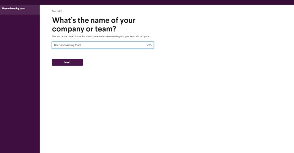
Large companies like Slack or Dropbox also frequently overhaul their user onboarding to ensure users have a comfortable, fun, and productive start to their product. But see for yourself. The following images show an excerpt from Slack’s onboarding process from 2014 and 2021. Of course, the design has changed drastically, but you can also see that instead of reading where the team name comes up in the Slack interface, we actually see the user interface and our team name on it. These improvements are certainly not the results of guesswork but of meticulously coordinated optimization workflows.
–
The evolution of Slack’s onboarding process (Source)
As even big enterprises invest in optimizing their onboarding processes, we realize that we should do the same and not rest on our laurels. The question remains, how do you make sure you are building the right onboarding experience in the right way?
And this is where cross-functional product teams and Flagship come into play!
Leverage Flagship to unite product teams and ensure great UX
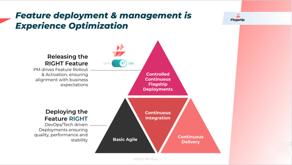
At AB Tasty, when we work towards a great user experience, we focus on two main themes:
Release the right feature: We step into our users’ shoes and conduct experiments and tests to ensure that the feature delivers value and looks and feels good.
Deploy the feature right: It’s not just about functionality and looks. We utilize feature management to ensure that what we’ve created works flawlessly at all times and on different platforms. –
Flagship provides a shared environment for experimentation and feature management
–
Flagship gives you the means to get the most out of both: data-driven experimentation and feature management to create and release features for great customer experiences. So we see release teams as an integral part of creating value for our users. This may not be the most popular opinion. Still, now we’d like to tell you more about why we think DevOps should be more closely integrated with product teams.
It’s no secret that teams that work toward a common goal are more likely to reach their true potential than those that don’t. By isolating DevOps from product teams, you probably can’t count on the positive effects of unity and passion necessary to create and release great products. For this reason, we encourage product teams to work more closely with DevOps. Release teams also care about delivering value and great experiences to users. And they bring the skills required to do so to the table.
Flagship provides product managers, developers, and DevOps engineers with a shared environment for experimentation and feature management. You get easy access to all the data and tools needed to have a productive conversation about the product optimization process in a common data-driven language. Simultaneously, instead of isolating specific roles and responsibilities in silos, each member of the product team can focus on doing their job while continuing to work as a collective force.
Now, let’s take a look at how Flagship’s experimentation and feature management capabilities enable product teams to deliver outstanding user experiences.
Deploy the feature right with feature management
First, let’s talk about a few examples of how feature management and releasing a feature right can positively impact your users’ onboarding experience.
Suppose you want to add tooltips to your onboarding process to help users navigate your product’s dashboard confidently. The product team prepares the new feature accordingly and thoroughly tests the functionality on the test servers. After everything seems to be working, they roll out the new feature for all users in one fell swoop. Hopefully, it’s not Friday afternoon, as the changeover could cause unforeseen problems on the production server, like:
Your user is stuck in an infinite loop that they can’t exit
User input isn’t saved, e.g., in a form
The app crashes repeatedly
The user is sent back to the start for no apparent reason
Just imagine what such behavior means for users going through your onboarding process and looking forward to finally using your product when it suddenly stops working. Poof, the magic moment has passed. The user has most likely lost confidence in your app due to bad UX.
Flagship makes code deployments stress-free
With Flagship’s feature management capabilities, your product teams can publish new features with ease – even on Friday afternoons.
Feature management enables release teams to provide the new tooltips feature to a selected target group before continually rolling it out to everyone. This way, you can be sure that the new feature works under realistic conditions, i.e., on production servers with real users.
Through controlled and monitored rollouts, DevOps teams immediately know whether something isn’t working correctly. This enables them to react on time and be glad that only a few users have noticed the error.
For example, suppose the developers wrapped the tooltip feature in a feature flag (which they really should be doing). In that case, they can quickly deactivate it via the flagship dashboard if a problem occurs. Of course, they can also configure automatic code rollbacks based on KPIs to react even faster.
Proper feature management can de-stress your release teams: Gone are the sleepless nights spent dealing with damage control! If you want to learn more about the benefits of feature management for tech teams, we recommend our blog post here.
Release the right feature with experimentation
Perhaps you have great empaths on your product teams and feel like you know your users pretty well. Still, it is wise to experiment and test to create an onboarding process that your users will love.
Let’s look at the tooltip example from before again. Suppose that after your product team successfully integrated the tooltips into user onboarding, your analytics data shows that something must be wrong. Many users still don’t know how to use your app and abandon the process midway through. If you can’t identify and resolve the problem right away, you need to leverage other means to improve the tooltip’s user experience.
First, make sure that everything is fine from a technical point of view. Next, your product team should start working on possible variants to improve the tooltips’ presentation and functionality. You can then experiment and test with Flagship to determine which of these variants and ideas offer the best user experience.
For example, you could utilize A/B tests to see if showing a how-to video before displaying the tooltips helps users get started with your product. Or experiment with different tooltips sequences – perhaps the process is easier to understand if you change the tooltips’ order.
You’re also free to experiment with different colors, copy, UI elements, call to action, and so on. To make your experiments as meaningful as possible, you can define which users see which feature variant and track user acceptance, test results, and KPIs in the Flagship dashboard.
Another advantage of Flagship is that you can utilize 1-to-1 personalization based on audience segments to provide users with unique experiences. For example, after a user registered for a paid subscription, show them a customized welcome message and add more value to their onboarding experience.
… What about client-side tools for experimentation?
Many client-side experience optimization tools, such as our AB Tasty, can also perform most of these experiments – without code deployments. However, the advantage of coding your experiments for a critical process such as user onboarding is that you don’t potentially slow it down with automatically generated UI overlays. Instead, tests and experiments with Flagship are fast, secure, and flicker-free, as they come directly from the server and don’t have to be calculated in the user’s browser. Of course, client-side tools still have their justification and unique uses – Flagship is a great tool to complement your client-side strategy.
Wrapping up
If you want to provide users with the best possible onboarding experience, you need cross-functional teams who know how to release the right feature and how to release a feature right. One of our goals is to advocate the importance of release teams to great UX – whether a product technically works is as important as how it looks and behaves.
Using Flagship’s experimentation and feature management capabilities, product teams can benefit from a shared platform to collaborate on improving the onboarding experience in a productive and data-driven way.
Would you like to try Flagship for your product teams? Book a demo and see how experimentation and feature management can transform your users’ onboarding experience from okay to Yay.
In a perfect world, you release a product that is bug-free and works exactly as it should and so there is no need for further testing.
However, both product managers and developers know that it’s not as simple as that. They need a way to make sure that there is a process in place that reveals any issues in code in a live production environment.
This is where testing in production comes in.
But it’s also one of the highly debated topics out there with those who say you should always test in production, and those who are more wary of the concept and say you never should.
In this article, we’ll look into these two different perspectives and share our own point of view on this controversial topic and we’ll guide you through the best ways to reap the benefits of this type of testing.
What is testing in production?
To keep it short and simple, testing in production is a software development practice of running different tests on your product when it’s in a live environment in real time.
This type of testing is not meant to be a replacement for your QA team or eliminating a unit test or integration test. In other words, it is not supposed to replace testing before production but to complement these tests.
To do or not to do: That is the real question
These are big benefits, and they are enough to create consensus among many developers and product managers who say “Yes, always!” to the practice.
But there’s also another group of developers and product managers who say “No, never!” to testing in production.
On the one hand, they admit all of the great benefits that testing in production can deliver. On the other hand, they also believe that the practice carries too many potential downsides and that its benefits just aren’t worth taking on the risks the practice can bring.
Which side are we on?
We believe testing in production is a cornerstone practice for anyone in the software development world. And we believe it is particularly important for Product Managers, as it gives them a powerful method to generate real-world feedback and performance data they need to make sure they are always building a viable pipeline of products.
But even though we are great advocates of this practice, we still want to consider the point of view of those who are “No, never!” when it comes to this type of testing.
Once we acknowledge these issues, we can start to map out some ways to mitigate the practice’s potential downsides and focus on its benefits instead.
What are the big risks of testing in production?
To be blunt: a lot of things can go wrong when you test in production.
You risk deploying bad code
You may accidentally leak sensitive data
It can possibly cause system overload
You can mess up your tracking and analytics
You risk releasing a poorly designed product or feature
The list goes on and on. Anything that can go wrong, could go wrong.
Worst of all— if something does go wrong when you are testing in production, your mistake will have real-world consequences. Your product might crash at a critical moment of real-time usage.
You might also end up collecting inaccurate KPIs and creating issues with your business stakeholders.
Worse case scenario: your poorly designed product or feature might result in multiple paying customers leaving your product for a competitor instead.
Those who say “No, never!” to testing in production are correct to consider the practice highly risky, and we understand why they stay away from it.
And yet, while we acknowledge these concerns, when it comes down to it, we believe that this form of testing is an essential aspect of modern software development.
Why should you still test in production?
When done properly, testing in production gives you some great benefits that you just can’t get through any other method.
Collect real-world data and feedback
Testing in production allows you to collect user data in terms of users’ engagement with your new features. This enables the collection of valuable feedback from the customers that matters the most, which in turn would allow you to optimize the user experience based on this feedback.
This will also allow you to brainstorm ideas for features that you may not have considered before.
Uncover bugs
Since you’re testing on live users, you would be able to discover any bugs or issues that you may have otherwise missed in the development stage. Thus, you can ensure your new products and features are stable and capable of handling a high volume of real-world usage.
It is worth noting that there are certain technical issues that will never show up until you put your product or feature in front of real-world users.
Therefore, you can monitor the performance of your releases in real life so that developers can analyze performance and optimize the releases accordingly.
Higher quality releases
Because you’re receiving continuous feedback from your users, developers can improve the products resulting in high quality releases that meet your customers’ needs and expectations.
Additionally, you can verify the scalability of your product or feature through load testing in production.
Support a larger strategy of incremental release
Testing in production helps facilitate an environment of continuous delivery.
This is especially true when you roll out your releases to a certain percentage of users so that they may no longer have to wait long periods of time before they have access to your brand new features.
This way, you can limit the blast radius as with incremental releases, you would not have affected all of your users.
Perhaps, most importantly: you already are testing in production, even if you didn’t know it!
Most of Agile development and product management’s best practices are forms of testing in development. We’re talking about very common practices like:
If you are following any of these practices—and many more like them—then you are already running tests with real-world users in a live production environment.
You are already testing in production, whether you call it that or not, even if you thought you were in the “No, never!” camp this whole time.
Testing in production done right
If testing in development is inevitable these days, then you should spend less time debating its pros and cons, and more time finding the most effective and responsible way to follow the practice.
We believe in this perspective so strongly that we’ve built an entire product suite around helping product developers gain all of the benefits of the practice while minimizing their risks.
Feature flags – a software development practice that allows you to enable or disable functionality without deploying code – are at the core of this new platform.
By wrapping your features in a flag and deploying them into production without making them visible to all users, you can safely perform all of the testing in production that you need.
With feature flags—combined with the rest of AB Tasty— you can:
Deploy smaller releases that minimize the impact of failure.
Only test your new features on your most loyal and understanding users.
Personalize their tests so they know to expect a few hiccups with the release.
Immediately toggle off underperforming features with a single click.
With feature flags and a little planning, you can dramatically reduce the risk and increase the sophistication of the testing in production you are already performing.
This means more real-world user data, more reliable products & features, and less worry about seeing how your hard work performs outside of the safe confines of development and staging environments.
Our UK partner series continues with Andrew Furlong, Managing Director at REO.
In this interview, we asked him the following 3 questions:
At REO, you “believe digital experiences can always be better” – what does that mean?
Like with most things, there is always room for improvement. The growth of AB testing and Personalization is because brands and consumers believe and demand a better experience. So, what we mean is: no matter how good you think your digital experience is, it can always be improved. And we are here to help if you are not sure how!
What are you most proud of at REO?
This one is easy… the team! They are great to work with, they are challenging and speak their mind to help REO be the very best it can be. Having such a brilliant team pays off as shown with our latest client satisfaction score of 8.5/10.
Which ultimate tip for experience optimization do you have for our readers?
It is important to always have multiple streams of optimization running, I am not talking about concurrent tests, although where feasible that should be done. I mean having a fallback strategy so that if a test is delayed for reasons beyond your control, you can quickly pivot to a different part of the site for example.
About REO
REO is a digital experience agency. We are an eclectic mix of bright and creative thinkers, embracing the best of research, strategy, design and experimentation to solve our clients’ toughest challenges. We work across a variety of sectors, with companies such as Amazon, M&S, Tesco and Samsung. To fearlessly transform our clients’ businesses and reputations by evolving the Digital Experience for their customers. We achieve this through:
Our curious and relentless drive to gather insights that matter.
Our proactive mindset and forward thinking to deliver lasting value.
Our adventurous approach to adapt and learn quickly.
In an increasingly cutthroat digital age, standing out in your niche while meeting the exact needs of your consumers is essential to business growth and longevity.
By getting under the skin of your customers, you can tailor your messaging, applications, and touchpoints to meet their exact needs —that’s where eye tracking enters the mix.
Consider this for a moment:
You’re running a usability test on a product landing page for a new range of gym shoes. Your test subject, Nancy, browses the page and chooses a shiny new pair of gym shoes with ease. But, on the next page, there is a snag. She hesitates and eventually abandons her cart because the journey was confusing.
You take notes based on Nancy’s feedback and think about how you can improve your checkout journey. But, if you could view her movements— or see what she sees—you would have the power to make informed improvements that will ultimately increase conversions and drive more sales.
With eye tracking, you can. But while this widely-used sensor-based technology offers a deep glimpse into user browsing behavior, some industry experts believe that eye tracking is an unnecessary expense.
Like many platforms and digital innovations, with the right approach, eye tracking will give you the tools to offer your customers a seamless level of user experience (UX)—the kind that will increase loyalty while helping you boost your bottom line.
Here we explore the dynamics of eye tracking and explain why it could make an excellent investment for your business.
So, what is eye tracking?
Eye tracking is a type of sensor technology that gives a computer or mobile device the tools to understand and trace where a person is looking.
An eye tracker can detect the presence, attention and focus of a user while engaging with a specific app, touchpoint or website.
From a marketing perspective, eye tracking dates back to the 1980s, where it was used to test and measure the value of ads in print papers or magazines.
An effective alternative to lie detection-style techniques such as voice stress analysis and galvanic skin response (neither of which offer truly reliable results or data), eye tracking gave the advertisers of the day essential insights into which elements of a page people read as well as how long they spend engaging with specific pieces of content.
The popularity of the eye tracker rose over the years and the rapid evolution of digital technology paved the way for a wealth of innovative developments.
Now, eye tracking technology is able to offer deep-dive insights into user behavior and dynamic page as well as app design as well as offering intuitive tools that enhance the user journey for disabled people.
In the modern age, one of the most prominent features of eye tracking is a little something called Facial Expression Analysis (FEA).
Based on ‘points of fixation’—times during the user journey when someone stops and focuses long enough to process the content before them (commonly known as a ‘saccade’)—FEA technology helps marketers gauge the effectiveness of their page design and messaging.
But, how does this apply to business and why is it so useful? Let’s find out.
As a marketer or business owner, the more you understand your target audience, the more chance you have of creating a fluent and engaging customer journey across platforms.
As eye tracking provides a visual map of how your users engage with your website, landing pages, and mobile applications, you can identify strengths and weaknesses related to user experience (UX) and content placement.
An essential part of the consumer research process, eye tracking is a powerful medium as it taps into the fact that 95% of human decision-making (particularly online) is carried out sub-consciously.
By using eye tracker tools to trace navigational patterns, you can adopt your customers’ vision, uncovering information that will help you to make improvements that boost engagement, improve your customer experience (CX) offerings, and ultimately, accelerate the growth of your business.
From heat mapping to task-based usability tools, there are a wealth of eye tracking innovations available to businesses in today’s digital world.
Invest in the right eye tracking tool for your business and you will:
Understand what your target audience is looking at and for how long
Identify redundant or disruptive visuals or design elements
Document how users scan and interact with your web pages or apps
Gain a practical understanding of what works and what doesn’t
Prove the value of certain marketing strategies, techniques or campaigns
Continually improve and evolve your efforts in a landscape that is ever-changing
Eye tracking is an effective means of seeing through the lens of your customers. But, as powerful as it is, eye trackers alone are unlikely to give you a complete insight into the content that really sticks in the users’ mind.
To gain additional context on how to use your data to improve usability and drive engagement, eye tracking should be a pivotal part of your consumer research strategy rather than a sole means of information.
That said, if you use it the right way, eye tracking can help you understand your customers in ways that can give you an all-important edge on the competition.
How eye tracking can help you understand your customers
Using eye tracking to understand your customers on a deeper level boils down to adopting a cohesive mix of the right tools and techniques.
Eye tracking tools and software provide a visual representation of your users’ focus points—returning data based on:
Fixation points or saccades: information that can tell you how engaging or eye-catching particular elements or pieces of content on a webpage are to your customers.
Navigational patterns: by understanding common navigational patterns, you can see how people scan or interact with your page. This level of knowledge will give you the data you need to optimize your content and design for increased engagement and conversions.
Problematic elements As mentioned, an eye tracking test will return invaluable data based on any images, graphics, calls to action (CTA) or command buttons, informational content or design elements that hinder the user experience and prevent customers from either getting what they need from your page or carrying out a desired action (clicking through to a specific product page or signing up to an email newsletter, etc).
Automotive repair and wreckage company, Truckers Assist, conducted eye tracking tests to track the performance of its homepage.
This test showed that while the ‘NO FEES’ graphic (the red point on the image) was gaining a lot of attention, it wasn’t clickable. As a result, many users were focusing their attention in the wrong place, steering them away from more valuable information as a result.
To fix this glaring issue, Trucker Assist improved its homepage design, removing the ‘NO FEES’ banner and placing focus on its contact information and service search bar.
Conducting successful eye tracking testing takes consistency as well as a clear cut goal. Do you want to improve the user journey of your new mobile app? Are you looking to drive more revenue through a specific product page? Perhaps you’re trying to understand if your general messaging and branding is performing the way it should?
There are many actionable insights you can gain from eye tracking—and outlining your specific goals will give your tests or studies direction.
This hand-picked video offers practical advice and information to help you get started with eye tracking:
How eye tracking benefits UX optimization
88%of consumers are less likely to return to a website after a poor user experience. Today’s consumers expect a seamless level of UX from brands and businesses—anything less and you could see customer loyalty as well as sales drop through the floor.
Eye tracking and UX go hand in hand. Through eye tracking, you will gain access to objective and unbiased insights that will show you where improvements are necessary.
With eye trackers, you can drill down into a specific UI element (is it facilitating the right interactions or are your consumers missing it altogether?) to test whether it fits into the user journey while getting to the very root of any distracting, problematic or misleading page elements.
This perfect storm of on-page information will empower you to make very specific improvements to any app, web or landing page—enhancing its usability and performance significantly.
How eye tracking works in a nutshell
As a concept, a significant part of eye tracking is based in Fitts’ Law. Essentially, every visual object or element carries a certain amount of ‘weight’ and this determines the amount of attention as well as clicks it ultimately earns.
Concerning eye tracking and UX, Fitts’s Law is important because it can help you predict the amount of time taken to move the eyes or cursor to a specific target.
Armed with this information, you can establish a visual hierarchy and optimize your webpages or applications to ensure consumers can connect with the right functions or information at the right times within their journey.
To get your eye tracking tests off to the best possible start, giving you users clearcut instructions while ensuring good lighting and consistent positioning is essential. Doing so will give you reliable data, as detailed in this infographic from IMOTIONS:
Essential eye tracking methods & techniques
There are thousands of eye tracking tools and countless ways of approaching this most powerful approach to user testing.
To guide you along the right path, here we’re going to explore the most essential eye tracking methods and techniques.
Heat maps
A branch of eye tracking, a heat map is a dynamic tool that offers a definitive visual representation of where users focus their attention and how they navigate your website based on their on-page interactions.
Heat mapping platforms provide color-coded data to give an indication of the areas of a website or mobile page users are interacting with the most.
As you can see from the image above, the red spots show the areas where users focus their attention most while the lighter colors are the areas with the lowest engagements.
Heat mapping technology also serves concrete data based on how much particular buttons or links are clicked by users on a page while offering navigational information such as scroll rates to show how far people move down the page before bouncing off.
Essentially an inversion of heat mapping, focus mapping provides digestible visual insights on the main fixation points on a specific page.
With focus maps, the page is blanked out except for the spots that receive the most attention or fixation.
A visual technique to complement additional eye tracking tests and consumer research strategies, with focus mapping you will get a panoramic view of which elements are working as well as the content you need to improve to encourage focus and engagement.
Gaze path plots
As sensory-based technology, eye tracking can provide a wealth of valuable insight in a single browsing session.
By adding metrics related to time as part of your eye tracking strategy, you can follow the path a user takes on a webpage and the time they spent on each element.
As you can see from the ‘Where’s Wally’ video, gaze plots make an effective eye tracking technique as they offer a dynamic interpretation of how users interact with your site or mobile app.
If you follow these paths, it’s possible to get a real-time insight into the eyes of your audience. This wealth of visual eye tracking data will empower you to drill down into specific areas of a web or app page, making design or content tweaks to optimize the overall user experience.
Eye tracking metrics
In addition to diversifying your approach to eye tracking and working with a mix tool or platforms, focusing on the right metrics will improve your chances of success exponentially.
Here are the main eye tracking metrics you should work with during your user research tests and studies:
Areas of Interest (AOIs): Before running an eye tracking test or study, you should determine your AOIs. Mapping out your main areas of interest on a particular web or mobile page will give your test definitive direction while ensuring you only collect or concentrate data to provide answers to the right questions.
Dwell time: This metric is focused on the actual amount of time a user or test subject spends interacting with a predetermined AOI. You can, for instance run A/B testing to compare two versions of a webpage to see which one returns the healthiest AOI dwell times and thus, offer the best return on investment (ROI).
Fixation count: Like dwell time, fixation count can offer interaction data based on your AOIs. But, rather than quantifying time, fixation count records up how many fixations your AOIs receive during a test or time period. As such, you can compare fixation and dwell time data to identify a correlation while painting a panoramic picture that will make your optimization efforts more successful.
Ratio: In an eye tracking context, ratio will tell you how many users or test subjects have guided their gaze to a particular AOI. Tracking ratio will give you an insight into whether you need to alter a specific piece of content or design element to capture the attention of more users and streamline your site navigation.
Revisits: Based on your AOIs, revisits determine how many times a user returns their gaze to a specific point during a test or browsing session. This metric is beneficial for understanding whether your design and layout make it easy for people to navigate a page or not. If you find that a particular AOI is showing a high rate of revisit rates, it might be that your content is a little confusing or that there is a design element causing distraction.
Getting started with eye tracking: best practices
Now that you understand how eye tracking works and you’re acquainted with essential techniques, we’re going to look at some top tips to help you get the most from your eye tracking test efforts:
Once you’ve established the aims and criteria of your test, allow your users to complete the process uninterrupted. Asking questions during the test itself is likely to distract your test subjects, skewing your results in the process.
Make sure that your participants remain within the monitoring range from start to finish. If a subject falls out of position, halt the test to ensure they are back in the monitoring range. Doing so will ensure the best quality data.
For qualitative testing and manual eye tracking, around five test subjects will typically offer the level of insight you need for the job. For heat maps and broader eye tracking studies, it’s recommended to use at least 39 test subjects for well-rounded and actionable results.
For mobile optimization tests, you should focus on the performance and value of your functional icons across devices; the precision of your error messaging; and the consistency as well as responsibility of your mobile design and layout.
To maximize your eye tracking efforts, working with customer experience optimization experts will help you run successful eye tracking-type tests that will return data that is aligned with your specific strategies and goals.
Final thoughts
“You can’t solve a problem on the same level that it was created. You have to rise above it to the next level.”
—Albert Einstein
Niche or sector aside, without knowing your audience and understanding how they interact with your business, you are merely shooting in the dark.
In an ever-evolving digital age, a data-driven approach to consumer research and UX optimization will help you meet your users’ needs head on while empowering you to adapt to constant change.
Eye tracking may not be the answer to all of your consumer-centric needs but this most innovative of sensor technology could easily play an important role in your ongoing marketing and development strategy.
There is no one-size-fits-all way to approach eye tracking—success will depend on your goals and needs as a business. But, by embracing the methods and techniques we’ve discussed, you will open yourself up to a treasure trove of data-driven insights that will accelerate the growth of your business.
We hope our guide to eye tracking has helped you on your way and for more business-boosting pearls of wisdom!
We developed our feature management tool to provide tech teams with the capabilities to deliver frictionless customer experiences more effectively. Naturally, we also use this tool at AB Tasty, but in the past, we also had to master our development cycles without the tool.
In this article, I’d like to give you insight into how our tech teams’ work has changed thanks to our Feature Experimentation and Rollouts solution. How did we work before? What has changed, and why do we appreciate the tool? Without further ado, let’s find out!
What a typical development cycle without our feature management platform looks like
The beginning of a typical development cycle is marked by a problem, or user need that we want to solve. We start with a discovery phase, during which we work towards a deep understanding of the situation and issues. This allows us to ideate possible solutions, which we then validate with a Proof of Concept (POC). For this, we usually implement a quick and dirty variant – the Minimum Viable Product (MVP) – which we then test with a canary deployment on one or two clients.
When the solution seems to be responding to customer needs as intended, we start iterating the MVP. We’re allocating more resources to the project to get it into a robust, secure, and user-friendly state. During this process, we alternate between developing, deploying, and testing until we feel confident enough to share the solution with our entire user base. This is when we usually learn how most of our users react to the solution and how it performs in a realistic environment.
The pitfalls of this approach, or: Why we developed a server-side solution
Let’s see why we weren’t happy with this strategy and decided to improve it. Here are some of the main weaknesses we discovered:
Unconvincing test results.
A canary release with one or two clients is great for getting first impressions but doesn’t provide a good representation of the solution’s impact on a larger user base. We lacked qualitative and quantitative test data and the ability to use it simply and purposefully. Manual trial and error slowed us down, and our iterations didn’t always produce satisfactory results that we could rely on.
Shaky feature management.
Developers were often nervous about new releases because they didn’t know how the feature would behave under a higher workload. When something went wrong in production, it was always incredibly stressful to go through our entire deployment cycle to disable the buggy code. And that’s just one example of why we needed a proper feature management solution.
We see tech teams around the world know and fear the same difficulties. That’s why we created a server-side and feature flagging solution to help them – and us – innovate and deliver faster than ever before while reducing risks and headaches.
I spoke to some of my tech teammates to determine how their work lives have changed since we started using our new tool. I noticed some major themes that I’d like to share with you now.
With our feature management platform, we no longer have to guess and can follow a scientific approach. We now know for sure whether a business KPI is positively impacted by the feature in question.
Suppose we publish a new feature while the marketing team starts a campaign without us knowing about it. We may get abnormal test results such as increased traffic, engagement, and clicks because of this. The problem: how can we measure the real impact of our feature?
The platform lets us define control groups to reduce this risk. And thanks to statistical modeling (Bayesian statistics), we get accurate data from which we can make a reliable interpretation.
One time, we worked on a new version of one of our APIs and used our server-side solution for load testing. Fortunately, we found that the service crashed at some point as we gradually increased the number of users (the load). The problem wasn’t necessarily the feature itself. It had to do with changes in the environment, which can be easy to miss with traditional web testing strategies. However, we could stop the deployment immediately and prevent end-users or our SLAs with customers from being harmed by the API changes. Instead, we had the opportunity to further stabilize the API and then make it available to all users with confidence.
We iterate faster by decoupling code releases from feature deployments
We often deploy half-finished features into production – obviously, we wrap them in feature flags to manage their status and visibility. This technique allows us to iterate so much faster than before. We no longer have to wait for the feature to be presentable to do our first experiments and tests. Instead, we enjoy full flexibility and can define exactly when and with whom to test.
Additionally, we no longer have to laboriously find out who can see what in production during feature development, as we don’t have to integrate these things into our code anymore. Instead, we use the Decision API to connect features with the admin interface through which we define and change the target groups at any time.
What’s more, everyone in the team can theoretically use this interface and see how the new feature performs without involving us developers. This is a huge time saver and lets us focus on our actual tasks.
“Our Feature Experimentation and Rollouts solution helps me take back control of my own features. In my old job, I was asked to justify what I was doing in real-time, and I sometimes had trouble getting my own data in terms of CDP MOA, now I can get it.”
Julien Madiot, Technical Support Engineer
We can rely on secure deployments
Proper feature management has definitely changed how we work and how we feel about our work. And by managing our feature flags with our feature flagging platform, the whole process has become much easier for our large and diverse teams.
They’re ON/OFF switches. Let’s not lie: we still make mistakes or overlook problems. But that’s not the end of the world. Especially not if our code is enclosed in a feature flag so that we can “turn it off” when things get hairy! With our feature flagging platform as our main base for feature management, we can do this instantly, without code deployments.
They help us to conduct controlled experiments. We use feature flags to securely perform tests and experiments in real-world conditions, aka in production. A developer or even a non-tech team member can easily define, change, and expand the test target groups in the dashboard. Thanks to this, we don’t have to code these changes or touch our codebase in any way!
They cut the stress of deployments. Sometimes we want to push code into production, but not yet for it to work its magic. This comes in handy when a feature is ready, but we’re waiting for the product owner’s final “Go!”. When the time comes, we can activate the feature in our dashboard hassle-free.
DevOps engineers have many responsibilities when it comes to software delivery. Managing our feature flags with our server-side solution is an effective way to lift the burden off their shoulders:
I honestly sleep better since we started using our server-side solution 🙂 Because I’m the one that puts things in production on Thursdays. When people say ‘Whoops, we accidentally pushed that into production,’ now I can say, ‘Yeah, but it’s flagged!’
Guillaume Jacquart, Technical Team Leader
Wrapping up
I hope you found the behind-the-scenes look at AB Tasty both interesting and informative. And yes, if there was any doubt, we actually use AB Tasty’s Feature Experimentation for all AB Tasty feature development! This helps us improve the product and ensure that it serves its purpose as a valuable addition to modern tech teams.
You’ve heard all about the surface-level benefits of rapid product releases. They let you explore, experiment with, and test features faster. They create a more collaborative development process. And they let you run an efficient high-output team.
All of these benefits are true, but the biggest benefits you’ll enjoy from driving rapid releases lie even deeper than is commonly acknowledged…
Rapid releases do create better products. Rapid releases create a short feedback loop between you and your users. You learn very quickly what’s working and what isn’t, and you can quickly adjust.
But even more important, rapid releases get you and your team out of your own heads. Rapid releases force you to get your product and feature ideas out of the lab and into the real world. This constant contact with reality leads you to create products that simply and directly deliver the actual functions your users need most, while leaving the nice-to-have fluff on the whiteboard.
Rapid releases do create happier users. Rapid releases let you provide new features, and fix bugs, as quickly as possible. You constantly give your users a better and better product.
But on an even deeper level, rapid releases demonstrate that you care about your users. It shows them that you are listening to their feedback, and that you are taking it seriously. It tells your users that you care about them so much that you have structured the heart of your product management strategy around doing whatever it takes to make them happy and loyal.
Rapid releases do create better businesses. Rapid releases—when properly executed—can create a lot of excitement and enthusiasm throughout your entire organization. They create a culture of progress and forward momentum, where everyone feels that they are contributing to real outcomes and not just spinning their wheels.
But rapid releases also improve your organization’s culture through an even subtler mechanism. Each release can act as a touchpoint that connects the product team with everyone else in the organization. It gives you a common reason to celebrate, to collaborate, and to realign groups that are too often siloed.
Now, we don’t want to oversell rapid releases here. They are not a cure-all, and they are not even appropriate for every single situation. But if you are operating in a context where you can accelerate your product and feature release cycle, you’ll experience a whole lot of upside with little-to-no downside.
To help you drive rapid releases in your organization, we’ll use this piece to explore why rapid releases can be challenging to pull off (even in an agile product development framework), what is the key ingredient you can adopt to overcome all of these challenges, and how to bring that ingredient to life in your organization.
The Biggest Challenges to Driving Rapid Releases
Let’s be clear about one thing— not every organization is well set up to deliver rapid releases. Product managers at big, legacy corporations tend to have a hard time getting anything out in a timely manner. This is almost never their fault. They just have so many layers of review and approval for everything they do that it can take months to push out a small feature that a smaller, nimbler organization could release in weeks or days.
If this is your context, then the best thing you can do is attempt to establish the core principles of lean product development in your organization. This will represent a huge win, and speed things up significantly for you, all by itself.
Now for the rest of you— Let’s assume you are working at one of those smaller, nimbler organizations. And you are already following an agile product development process. And you still are not releasing new products and features as quickly as you’d like. Chances are, you’re being bottlenecked by one or more of these subtle challenges:
You are completing sprint after sprint but you never seem to get any closer to having something to release. Your entire development process feels like it’s focused on completing code, and not completing products and features.
You are getting products and features close to release, but they get trapped in the testing and QA process. This delays their release significantly—sometimes indefinitely.
You are able to complete new features and products, but release gets delayed because it’s such a miserable process. It’s always a big, chaotic scramble. And everyone—from your product team to your business stakeholders—gets stressed and worried about what’s going to happen when you publish the changes and delay the process.
None of these issues are solved by the fundamentals of agile product development. It’s easy to focus agile workflows on development and never give much thought to release. It’s easy to put off testing and QA until the last minute for the sake of velocity, and wind up with a huge backlog to deal with at the end. And agile products and features have developed a reputation (deserved or not) for being buggy, broken, and more aligned with what the product team thinks is right, and not what the customer actually wants.
It’s clear that agile in and of itself will not solve these problems, nor ensure rapid releases. But a small tweak to agile will.
How Progressive Rollouts Unlock Rapid Releases in Agile Product Development
You’ve heard of progressive rollouts before. They are considered an optional subset of agile methodology that restructure the entire release process.
Traditionally, a product manager would release a new product or feature in its full form, to every user, at the exact same time. But a product manager that follows progressive rollouts would release that same new product or feature in smaller forms, to a few user groups at a time, and in staged intervals.
Essentially, progressive rollouts let you break up “big bang” releases into smaller chunks. And along the way, you end up solving a lot of the challenges that prevent rapid releases. For example:
Progressive rollouts shift the product team’s focus off developing new code, and onto driving releases.
Progressive rollouts force you to focus on code quality, and readiness to deploy, instead of code volume.
Progressive rollouts remove most of the risks—and resulting stress—from releases by shrinking them into smaller, easier-to-control stages.
Progressive rollouts are the key ingredient that takes the solid foundation of lean product management, and ensures it’s properly lined up to deliver rapid releases. Here’s how you can bring it to life in your organization.
7 Steps to Ensuring Rapid Releases with Progressive Rollouts
Structure Your Release Phases: Don’t let them be hurried, disorganized dashes at the end of a development cycle. Give them the same time, attention, and care as you give every other element of your product management framework. Create formalized processes, and adopt the tools you need to make those processes automatic habits.
Decide Which Products and Features to Release. Review your current queue. Identify the highest impact products and features that you can drive to completion soonest. Employ feature flags to hide features in products that aren’t ready yet, and focus your users on one small subset of new functionality at a time.
Establish Your Personas and User Groups. Identify your highest-value users, and the opportunities they represent. Leverage these groups to test the new products and features they will love most. Personalize and customize their experience to let them know they’re getting early access because of just how valuable they are to you.
Plan Your Progressive Rollouts: Define the features and products you are going to release. Define who they are going to be released to. Define when they are going to be released, and what the stages look like. And then organize your sprints to deliver to these requirements.
Define the Impact of Each Rollout. Establish the exact, measurable, accountable business metrics you plan to improve with each of your rollouts. Define the hard and soft impact each release will have on every function in your business— and tell each function about the release before it happens.
Communicate Your Release. Loop your business stakeholders in on each element of your release plans that might give them pause or concern. Show them how progressive rollouts mitigate their risk around product and feature quality and alignment. And update them on the progress of each release at each stage of your rollout.
Automate as Much of Your Rollout as Possible. Remove yourself and your team as the bottleneck. Automate your QA and testing. Set your deployment intervals and parameters, and then let your software execute it for you. Monitor your release’s performance at each stage. A/B test as much as possible. And intervene ASAP when an issue is identified. But otherwise, let the right tools make rapid releases through progressive rollouts a smooth element of your agile product development process.
With a little bit of intentional planning, with a shift in the focus of your agile product development, and with the right tools, you can easily bring progressive rollouts to your organization, and rapidly increase the rate of your releases.
A Call to Action, also known as a CTA, refers, in marketing, to any item that will, using imperative wording, encourage an immediate action or response from the user.
Calls to Actionare essential in marketing campaigns. They’re a way to lead customers to a specific action. They generally come as a button, but they also exist in many other forms. In this guide, we’ll tell you everything you need to know about CTAs, how they work and how to use them on your website.
What is a Call to Action?
Behind this mysterious name hides a very simple marketing concept you’ve all seen before. Calls to Action (CTAs) refer to any device conceived to persuade users to do a specific action.
E-commerce companies usually use them in the form of buttons to encourage buyers to add an item to their shopping cart or to complete a transaction. It is a key element to integrate playful interaction with your users and an effective means to increase conversions.
The goal of a CTA is to use a word or a sentence (most of the time containing action verbs) to push your users toward a specific action like “click here”, “subscribe”, “check out” and many others. These action words can also be used with a “now” creating a sense of urgency. Calls to Action were proven to be very effective and to optimize conversion rates.
CTAs can be used to push users down the purchase funnel, but they can also be used for any kind of action like registering, subscribing to a newsletter or adding to cart.
What makes an effective CTA? When creating a CTA for your website, every detail counts. Here are some aspects you need to pay attention to for your CTA button:
Visual aspect
Wording
Action word
Placement
Form
Color
Size
Do not underestimate the impact your CTA button can have on your conversion rate. A well-written Call to Action needs to be adapted to your audience, their age, their gender or their nationality. Remember that a CTA isn’t just a command or an invitation for your users, it is part of the full purchasing process. That’s why it needs to be discreetly integrated but obvious enough to be noticed by users.
Why do you need a clear Call to Action in your CRO strategy?
Always remember the importance of CTAs in your purchase funnel. Your customer’s path to completing a transaction is paved with CTA buttons. They are a key element in your CRO (Conversion Rate Optimization) strategy, they need to be quite obvious since they are meant to lead users to the action you want them to complete.
A good and clear Call to Action comes with a nice visual, adapted to your target audience, with a clear and straightforward message. That way, and only that way, you will get the best out of your CTA and note effective results in your conversion rate AND your CTR (Click Through Rates).
An efficient CTA is nothing but a perfect compromise between your e-commerce site’s goal, which is to increase sales or to sell a specific product, and users’ needs, i.e. a smooth navigation experience while purchasing a product. That’s why your CTA needs to be neat and easy to find, and user experience always needs to be taken into account.
Best Call to Action examples of 2020
CTAs come in many forms. To help you with your CTA A/B testing, we listed the 5 best forms of CTAs in 2020:
1. Direct Calls to Action
Let’s say your goal is to push your customers down the purchase funnel. Then, you might opt for a direct CTA, such as:
Shop now
Buy now
Add to shopping cart
An Amazon product page containing an add to shopping cart and buying button CTA (Image Source).
2. “Get for Free” Calls to Action
With these CTAs, you can highlight an opportunity for the users. Generally, these come with a “subscribe” box. You can collect your users’ email addresses in exchange for a sample of a document or a free trial. These CTAs usually appear as:
Download for free
Free 30 day trial
Start free trial
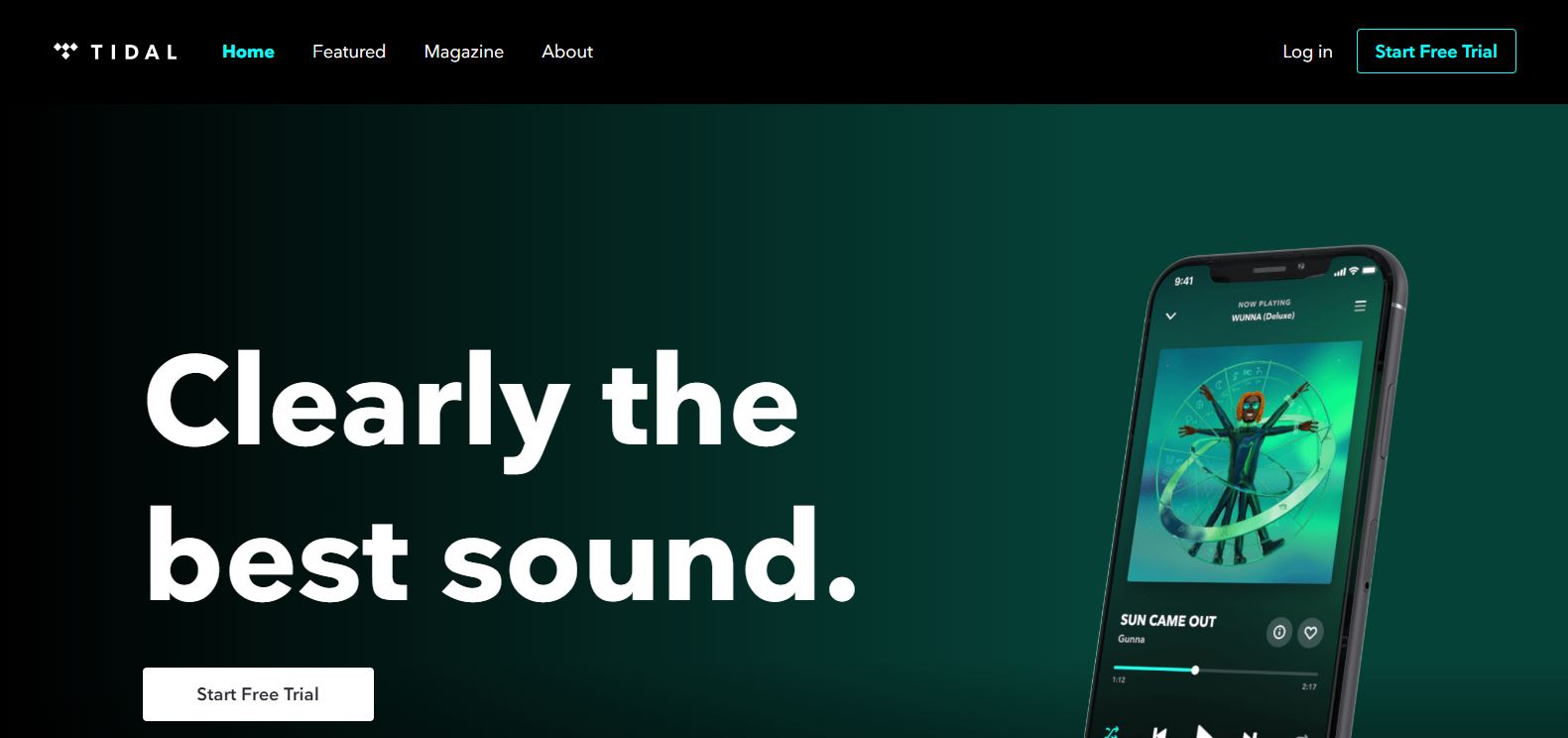
Tidal homepage enticing users to register with a free trial (Image Source).
3. Basic Calls to Action examples
CTAs can be a mere invitation. For instance, on a social media’s ad or as a shortcut to a long text. This kind of CTA is often used in blog posts or Facebooks Ads. Awakening the user’s curiosity, it is supposed to make users want to go further and learn more about a topic with messages like:
Check it out
Start here
Find out more
Learn more
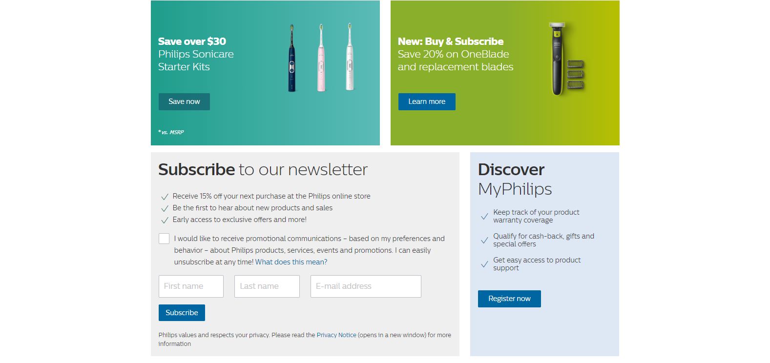
Philips USA homepage with multiple CTAs (Image Source).
4. Registering Calls to Action
This kind of CTA is often found on social media or e-commerce sites. The goal is simple: encourage your visitors to create an account and register with messages such as:
All of the above have one thing in common: they allow you to connect with your users by collecting their emails, which will be useful for your email marketing campaigns. According to what you are proposing, users can fill in their email to get something like a discount, a coupon or a free PDF. For these, you can use wordings such as:
A/B testing is the most accurate technique for CRO. This digital marketing strategy consists of making changes on your website and observing the impact of this change on a segment of users.
This is the best method to improve your conversion rate, because you can try out any feature and choose the one whose results are best. It is more reliable since users are the ones determining which feature works best. With this method, you can test your idea with your target users or potential customers.
A/B testing your CTA buttons is the best way to improve your website’s UX and your conversion rate at the same time. At AB Tasty, we offer a super quick and easy way to run these kinds of tests – our drag and drop visual editor.
How to run an A/B test for your CTA?
Here are the different steps you need to follow to A/B test your Call to Action button:
Define your test’s goal and the KPIs you want to improve
Changing your button’s feature must serve a goal. It wouldn’t make sense to change your CTA’s color, to run your test and wait for random results. Your goal can be to increase the number of users that subscribe to your newsletter, for instance.
Define the original and alternative version (A and B version)
Choose the CTA you want to run your A/B test on, let’s say the red “subscribe to newsletter” button. This red button will be your A version.
What do you want to change about it? Maybe users will be more likely to click on this button if it were blue? Then, change your button’s color. (If you’re using AB Tasty, this takes two seconds with our drag and drop editor). The blue version of the CTA button will be your B version.
Run your A/B test
Worried about exposing 50% of your website visitors to this new change? If you have enough traffic, you can run your test on a smaller percentage of your entire website audience to mitigate the risk of any potential lost conversions.
Collect data and check your analytics
Usually, A/B tests take several weeks before you get reliable results. During that period, observe your A/B testing tool reporting. Did your conversion rate increase? Did it decrease?
Hard code changes (or not)
Figures don’t lie. Based on the test’s results, change what needs to be changed and keep what needs to be kept. Step by step you will find the best combination of features for the perfect CTA.
Conclusion
CTAs are essential in your conversion rate optimization strategy, but they can’t appear randomly or look like any old button. They need to be wisely thought out, otherwise they might not have the expected effect.
Thanks to A/B testing, you will be able to find the right features in order to get the best performance out of them. Remember that visual aspects (like form, color, or size), wording, the chosen action word, and placementmatter in your CTA’s performance.
So, what’s the takeaway? An effective Call to Action can boost your website KPIs, and you can A/B test any of your website’s pages – the sky’s the limit.
Here you are. You have taken the plunge and decided to create your own site using WordPress. Even better, you want to create a landing page to attract visitors and convert them into leads or buyers.
How to create a WordPress landing page?
When creating a WordPress landing page, you have several options:
You can use a “Builder” like Divi, Beaver or Elementor. It is a solution that is easy to understand, and you are in charge of creating the design.
You can use a “Plugin” available on WordPress; plugins allow you to create pages fairly quickly but are limited in terms of functionality.
You can use your WordPress theme; this is the solution we’ll cover today.
A theme is a ready-to-use design; in our case, these are landing pages that have already been designed. You just customize the design of your choice with your company’s colors and logo. See other great examples of landing page design.
One of the major strengths of WordPress is the variety of themes available to you. There are thousands of templates, some of which are real bestsellers. They are:
Recognized by the sector
Frequently updated
Easy to use
Attractive and effective
But which WordPress theme should you choose? Before giving you our selection, we would like to draw your attention to the elements that define a good landing page.
These eight elements ensure a landing page is effective, and it is important to keep them in mind when choosing your theme. Have a look at our 2019 landing page optimization guide.
Now that you have a better idea of what makes a “good” landing page, here is our selection.
10 WordPress landing pages templates to use right now
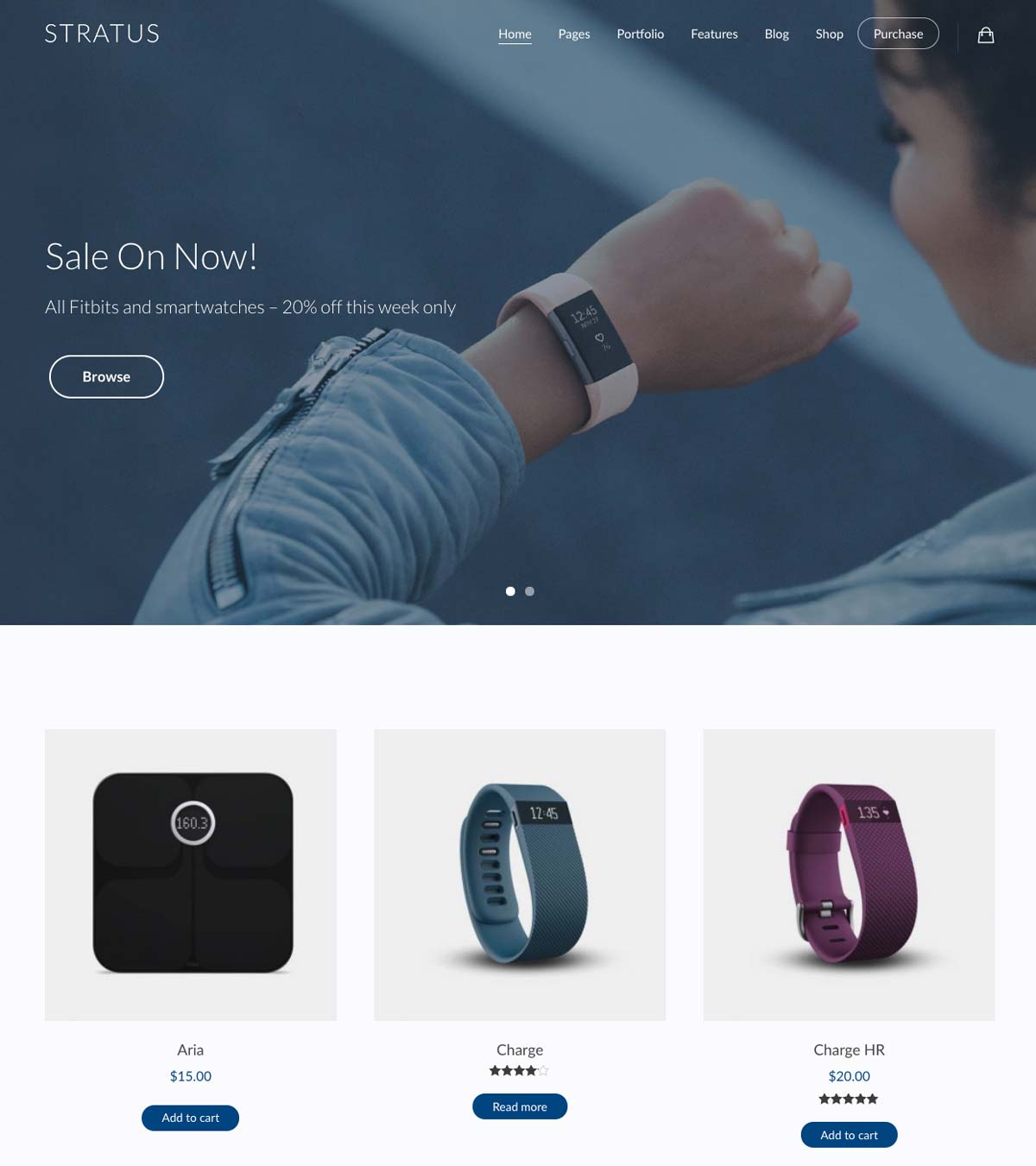
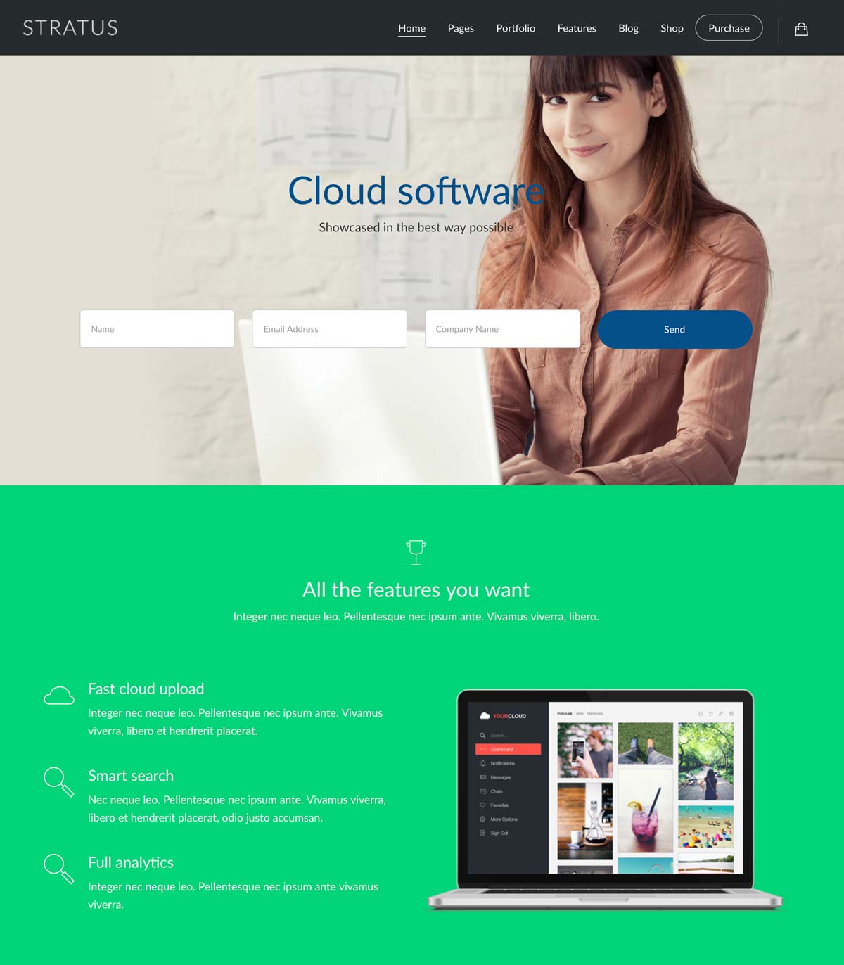
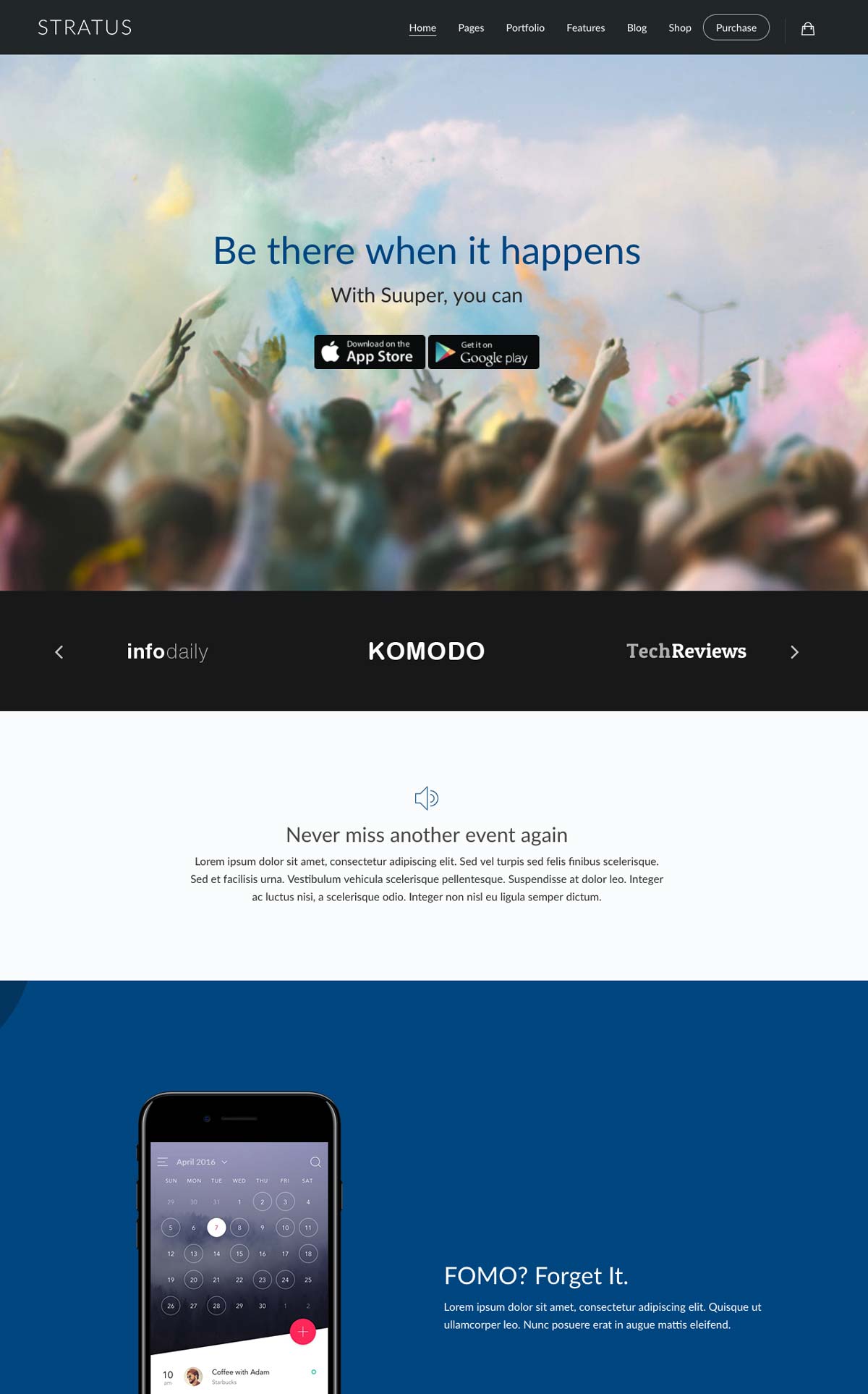
STRATUS
Stratus is a WordPress theme designed for SaaS companies, app developers or those presenting a technology product. You edit it using a “drag and drop” system which makes using and customizing your WordPress landing page easy and intuitive.
It is complete and powerful, and it meets all the criteria of a “good landing page” and contains:
40 widgets for you to personalize
20 page templates
An infinite number of possible designs
Another interesting characteristic of Stratus: its versatility. Stratus is easy to customize and already contains several types of landing pages to suit your core business: SaaS, technology products, or mobile applications.
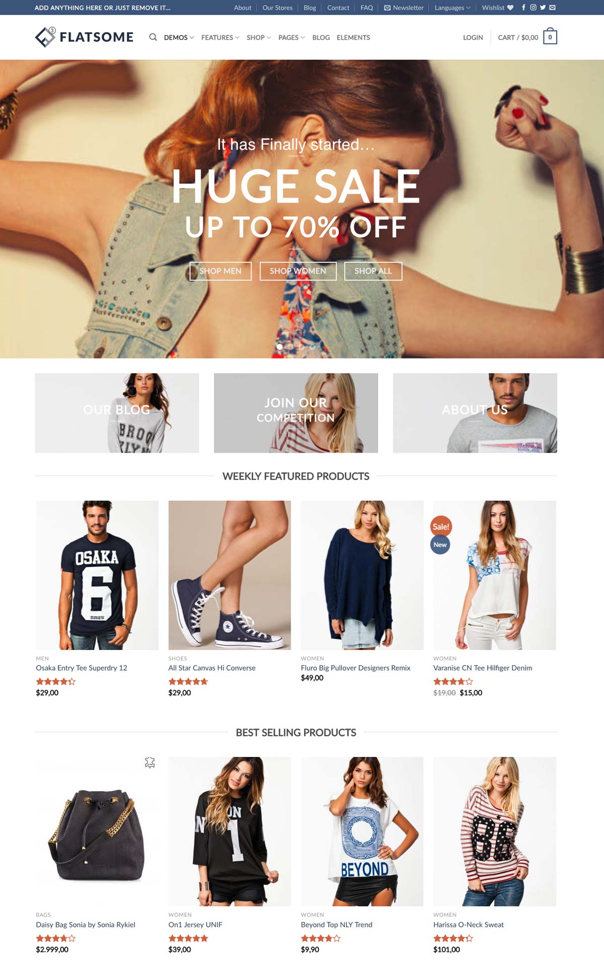
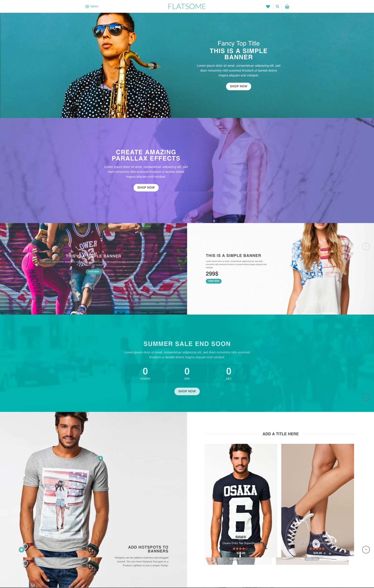
Flatsome is a WordPress E-Commerce template. This is a WooCommerce theme (which is a free e-commerce plugin for WordPress).
Flatsome is complete and intuitive and is the Swiss knife of WordPress E-commerce.
Frequently updated, it is a bestseller that has registered more than 60,000 sales since its creation: it has a community and a strong reputation among users of WooCommerce.
100% responsive, it uses an intuitive and fast-to-implement builder page that does not require programming skills.
Like for Stratus, the builder works using a “drag and drop” interface which makes the template easy to use.
The template includes nice parallax effects, countdowns, and fields to subscribe to a newsletter; these are great assets to start an e-commerce site.
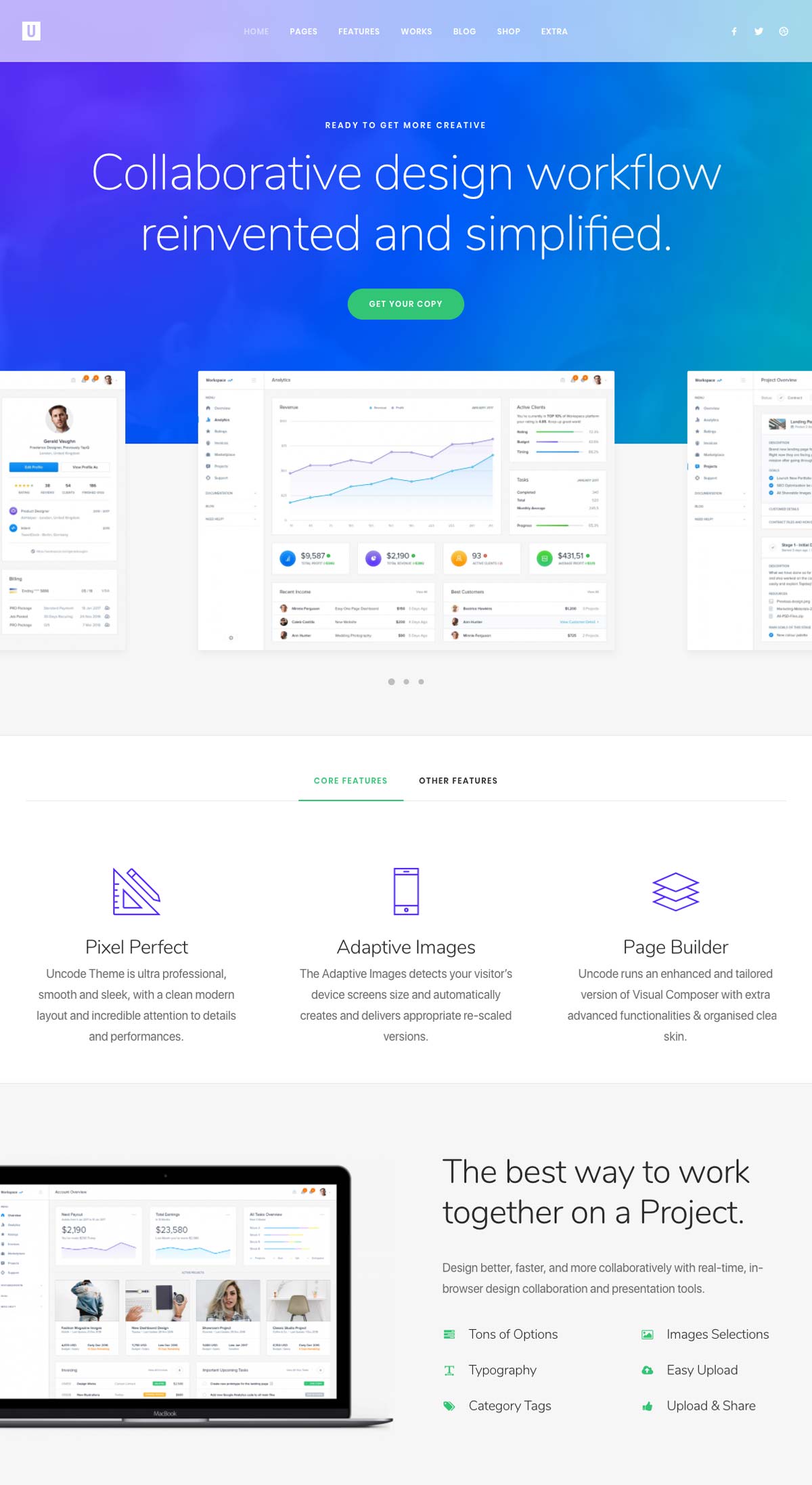
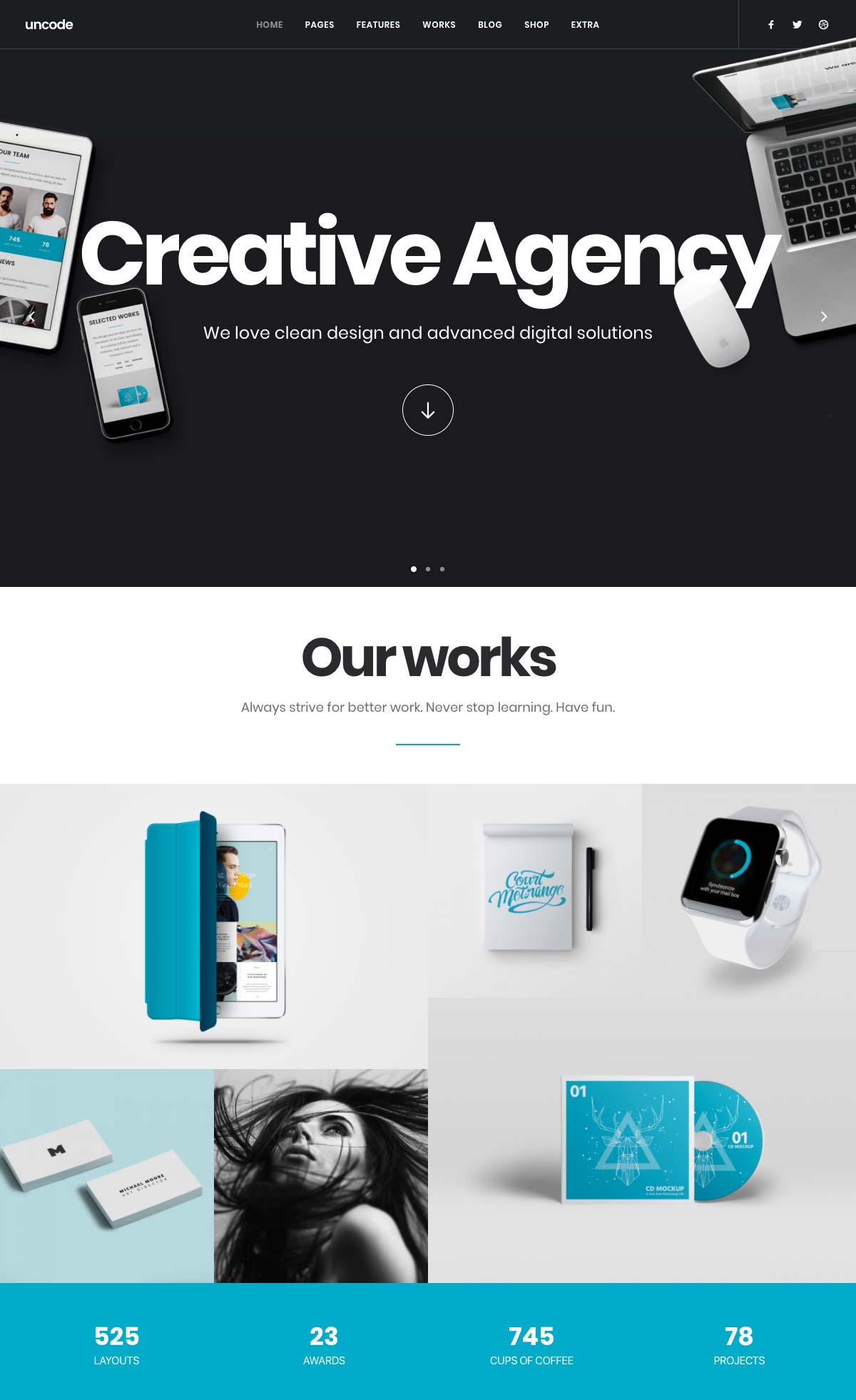
Uncode is a perfect WordPress template for agencies, freelancers, creatives, and all companies/people who want to present a project, an idea, or a portfolio.
Its impressive library of ready-to-use items makes it a must-have in the industry: Uncode easily adapts to your custom design to create a truly unique site.
Perfect for sites that want to host media, Uncode is designed to embed content from Facebook, Instagram, YouTube, SoundCloud, Spotify, and more.
Something really nice with Uncode: the design is refined and well thought out.
The color schemes are well chosen, and the blocks are in harmony with each other; we can also see that the calls to action stand out from the rest of the page.
In summary: Uncode is a very good base to start your WordPress landing page.
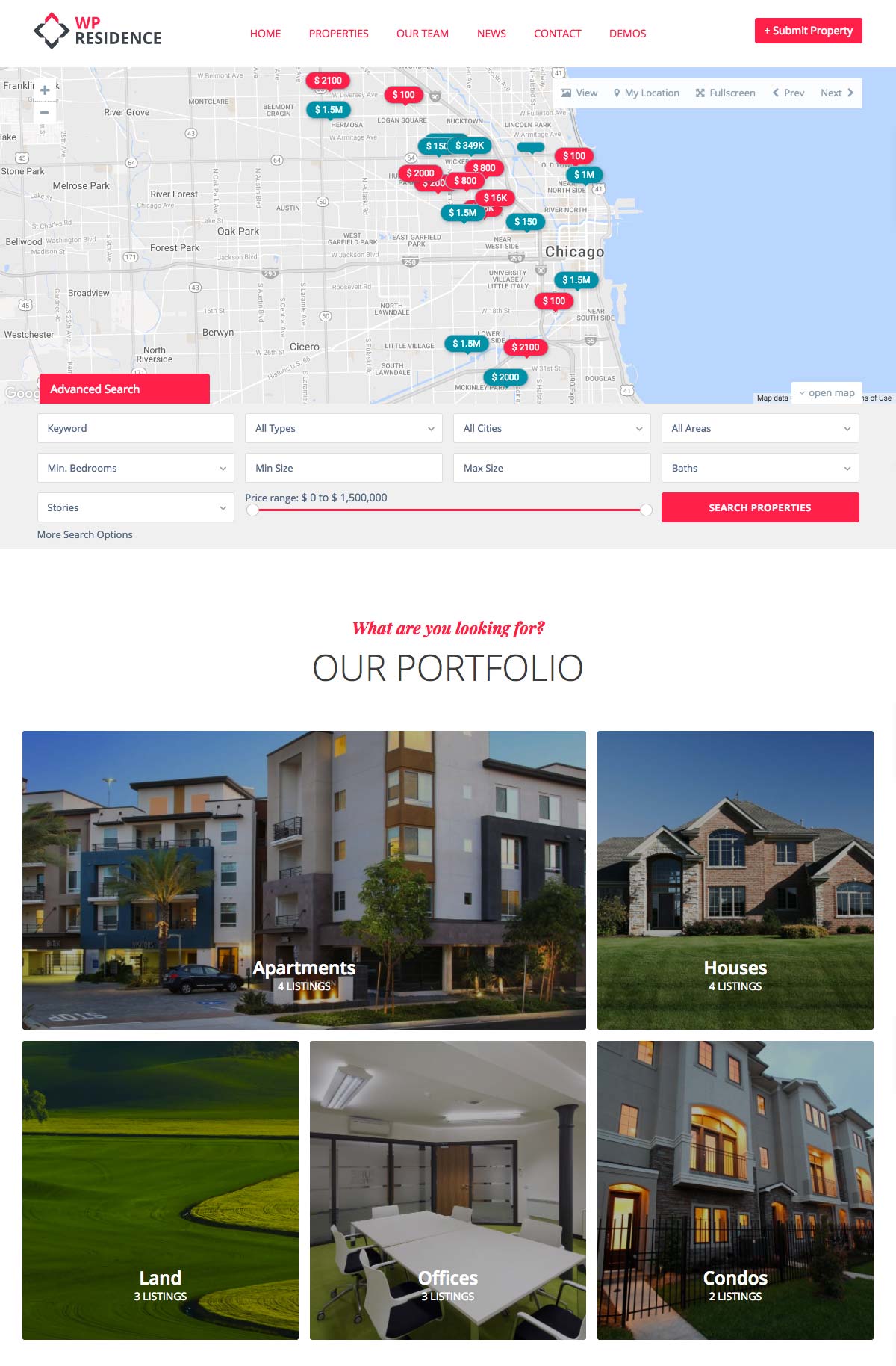
Who said that real estate companies couldn’t have a landing page? In any case, this WordPress template is the ultimate weapon for all agencies or players in real estate.
Designed to present real estate agencies or independent actors, this theme also allows visitors to submit their properties online for a flat fee, a subscription, or for free: perfect for adding to your listings!
To make your task even easier, 12 ready-to-use demos are available in the pack; you can create your agency’s website in just a few minutes.
A map is included in the basic template, which is a real plus for real estate agencies. You can easily show where the property for sale or rent is located. Your users will love it!
We can also see the “grid” layout for property listings that add clarity. The (easily customizable) color scheme highlights real estate well.
The template can include a blog and a newsletter subscription module: a must-have to develop your audience and engage with relevant news.
On this version of the “Rio” template, we love the extensive search bar with a price slider: it makes browsing easier and lets you display relevant results to visitors.
Similarly, the ability to filter property listings as the visitor desires lets the site display results adapted to each visitor faster.
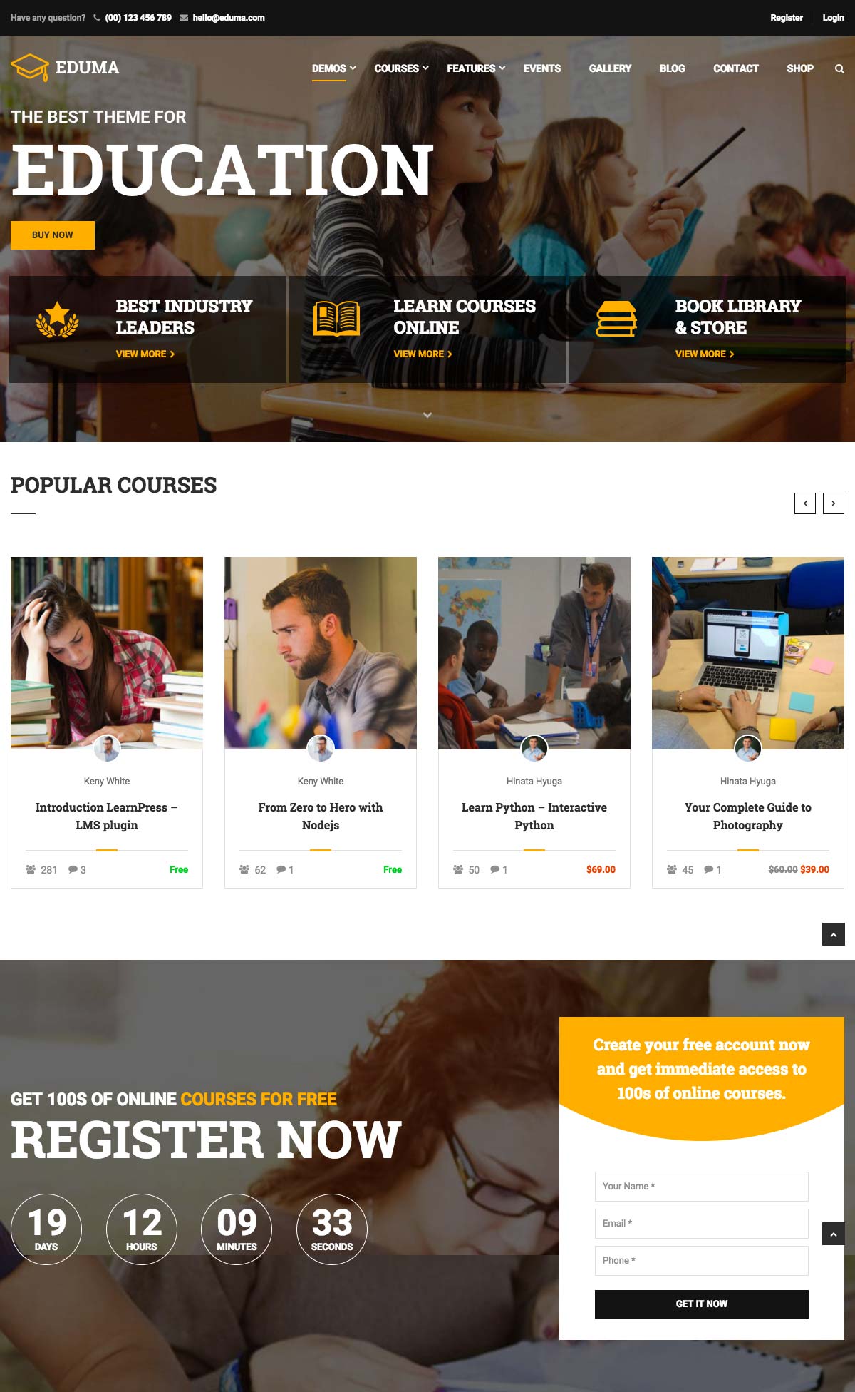
Increasingly popular, e-learning is gaining a prominent place in the world of e-commerce. Accessible and often cheap, internet users love online video courses. However, the resources needed to create an e-learning site sometimes turned entrepreneurs off. That’s over!
Education WP is an ultra-comprehensive template that lets you create your online course website quickly and without programming.
The template contains several themes adapted to the different types of education players:
Elementary/Middle/High Schools
Universities
E-learning
Training centers
Childcare centers
Using the same “drag and drop” concept as Stratus & Flatsome, the Education WP builder is intuitive and easy to use.
The template is 100% responsive, optimized for SEO and UX, and contains 10 pre-loaded themes ready to use.
Since it is a market bestseller, the template is updated very often and has community support.
We could put it in 7th place in this selection, but that might have been confusing!
“The 7” is a fully complete WordPress template. It’s so complete that you can do almost anything with it.
This is a very successful general template that lets you showcase your business easily, no matter its sector of activity.
Here are some suggestions for industries that might use “The 7”:
Corporations, big businesses
All sorts of agencies
All kinds of e-commerce sites
Small and medium businesses
Schools, education institutions
Events
Building and construction
Hair salons and small shops
etc.
Here are two possible uses (among dozens) of “The 7”:
Xstore is a high-performance e-commerce landing page template for WooCommerce, suitable for a large number of activities.
It has a variety of themes with very lively and attractive colors.
Completely responsive, Xstore is a tool to put in the hands of every SMB that wants to embark on e-commerce or renovate their site.
The special feature of Xstore is its large library of ready-to-use “blinds”: a total of more than 70 online stores are at your disposal to create the shop of your dreams.
A bestseller in its category, Xstore offers online documentation and videos, which is a major advantage compared to other templates that do not provide documentation to help you build your site.
Among other things, here are some areas of activity for which Xstore is particularly suitable for creating your future e-shop:
Restaurants
Mobile applications
Spa/Health/Fitness
Hair salons /Barbershops/Small businesses
Fashion, retail, and accessories
Lingerie, sporting goods, technology products
On Xstore, we especially appreciate the attention paid to the design of buttons, forms, and icons that are particularly refined.
The general impression is very qualitative and very impressive: the fields are well positioned, and the site architecture is well thought out.
Overall, Xstore is an excellent base for an e-commerce site.
Medical Press is a WordPress landing page template designed for companies, professionals, and clinics in the healthcare sector.
It offers several styles variations (header, body, footer) as well as several types of forms: handy to customize them to fit with your organization’s image.
The template is responsive and compatible with e-commerce; you can use it to present your activities, book appointments, and sell medical devices or services.
On the whole, Medical Press is a very good theme. We particularly like the choice of colors and buttons and the ability to include blocks for presenting practitioners and services.
The template also contains (written) documentation, which is practical for editing page content.
When you adopt continuous deployment, you take everything that you love about Agile Product Management— the rapid iterative processes, the increased product quality and market viability, the accelerated rate of collecting and incorporating customer feedback into products—and you supercharge it.
For example: If you follow a traditional Agile framework, then you are going to aim to release new product iterations every 1-2 weeks. When you upgrade to Continuous Deployment, you will start to iterate your product a few times per day by releasing code as soon as it’s been thoroughly tested and deemed ready to commit.
You get to A/B test new features in real-world environments even faster than before.
You can incorporate customer feedback into your live product in near-real-time.
You are able to create reliable products with few (if any) code-level faults.
All of these benefits directly translate into the thing you care about most— releasing high-quality products and features that align tightly to your customer’s deepest needs.
Evolving Your Agile Product Management Seems Like an Easy Sell, Right?
Well, as great as Continuous Development appears for the core work of Product Managers, there is this other thing to keep in mind before you rush to try to adopt the framework…
For better or worse, there’s a lot more to your job than just creating great products for your customers. You also need to lead your Features Team to get them to actually create those great products and features. You need to get (and keep) your Business Analysts onboard with every product and feature you want to make. And you need to give Marketing a suite of products and features that they understand and know how to share with the world.
As much as Continuous Deployment can make your life easier when it comes to releasing all those great products you manage, it can also create a lot of friction between you and all of those other people who you also need to manage as a big part of your job.
So let’s take a quick look at why you will likely face some pushback from your stakeholders if you try to evolve towards a Continuous Development framework, why the conventional wisdom for disarming their concerns doesn’t really work, and how you might actually get them to adopt Continuous Deployment alongside you.
Let’s start by taking a look at each of their concerns, one at a time.
Why Your Marketing Department Might Push Back on Continuous Deployment
Marketing departments traditionally follow a Waterfall approach to collaborating with Product Managers. They like to perform a lot of market research upfront. They like to get involved in a predefined project planning phase to incorporate their single round of customer research. And then they like to have a well-defined product with static features, benefits, and value propositions that they can easily understand and push.
Continuous Deployment dissolves all of these structures, and forces Marketing departments to become nimble, responsive, and adaptable to daily changes in the products and features they are selling. It’s a big adjustment in approach, and it’s natural for Marketing departments to feel unwilling to throw out everything they know and relearn their profession.
Why Your Business Analysts Might Push Back on Continuous Deployment
Business Analysts operate pretty similar to traditional Marketing departments. BAs like to have a lengthy discovery phase upfront. They like to extract a clean set of product requirements, and to enshrine them into a fixed document that acts as a binding agreement between “the business” and the developers. This document gives them some control over the whole process, including a fixed set of outcomes to track project success against.
Continuous Deployment blows away the concepts of fixed requirements, static product descriptions, and project success being linked to checking boxes on an internal contract. It takes control of the project away from the BAs, and places it into the hands of the product team— who are themselves being directed by the direct feedback of users. It makes sense that BAs might be reluctant to give up their control over product development.
Why Your Own Features Team Might Push Back on Continuous Deployment
If anyone should embrace Continuous Deployment with open arms, it’s your Features Team. But often they will push back more than anyone else when you try to make the shift to Continuous Deployment— even if the team already operates from a traditional Agile framework!
Some of this pushback is just inertia. Your Features Team has refined a set of workflows over the years, and they don’t see the point in adopting new tools and processes just to fix a way of doing their job that (from their perspective) isn’t broken.
But some of it runs much deeper. Continuous Deployment changes the Feature Team’s job description. Instead of building towards well-defined product milestones—and defining success by how quickly and accurately they hit those milestones—Continuous Deployment shifts Feature Teams off development and onto testing and bug fixes, while forcing them to adapt to a much more ambiguous definition of whether or not they are excelling at their jobs.
Disarming Each of These Objections (It’s Not as Simple as It Might Look)
If you’re going to adopt Continuous Deployment as a Product Manager, then you’re going to need to convince each of your stakeholder groups that it’s a worthwhile change. And—contrary to the advice you’ll find if you search through the development community’s discussions on this topic—convincing these three stakeholder groups to toss their old way of doing things and adopt Continuous Deployment is not as simple as:
“Explaining the pros-and-cons of Continuous Development.”
“Changing your organization’s culture.”
“Communicating more.”
We don’t mean to be flip here, or to poke fun at anyone who is offering genuine advice. We’d just like to point one thing out— while these actions are necessary elements of any change management program, they don’t really address the deep concerns your stakeholders feel about adopting this new Product Management methodology. No amount of pros-and-cons lists that outline why Continuous Development is great for you will address the fact that:
Your Marketing department is worried because they don’t know if they are selling a product or feature set that has already dramatically changed since you last spoke.
Your Business Analysts are worried that you are going to waste a lot of time, money, and manpower building products with no clear use case.
Your Features Team are worried that 90% of their job is going to become fixing bugs and cleaning code instead of hitting targets that they can point to during a performance review.
These are not shallow concerns that you can paper over with platitudes or educational sessions on the value of Continuous Deployment. These are deep, material issues that you need to find a way to address for your stakeholders before you can evolve your Agile Product Management with scrum and reap the benefits of Continuous Deployment.
How to Disarm Your Stakeholders’ Concerns About Continuous Deployment
The answer is simple, but not easy. You have to really dig into each of their concerns, and proactively find a way to solve their problems for them.
You need to fold Marketing into your day-to-day work so they are aware of what you are developing, what changes you have planned, and how soon you will be giving them new products and features to place their campaigns behind. You need to share the customer experience feedback that is informing your decisions, so it can inform Marketing’s messages too.
You need to bring your Business Analysts in too. You must justify the expense of adopting new tools, team members, and training protocols to develop a Continuous Deployment capability. You must then proactively quantify and report on the ways your faster iterations will create a more viable and profitable product suite that remains aligned to the business, its strategy, and its regulatory frameworks.
Most important, you need to take care of your Features Team. You must make sure they don’t miss their development milestones because they are constantly cleaning code. You must make sure they still build and deploy new features and not just new test cases. And you must give them both the training they need to adapt to Continuous Deployment methodologies, and a centralized platform that automates, streamlines, and accelerates their most critical new workflows.
Continuous Deployment represents a big leap forward in Product Management. There were growing pains when the field moved from Waterfall to Agile, and it’s wise to expect—and proactively handle—this new set of obstacles as you evolve to the next stage of Agile product lifecycle management.