Revenue Per Visitor, or RPV, is a highly effective way to measure how your online sales are performing. With so many metrics available to businesses, it is one of the most comprehensive available, covering the myriad of blind spots that are inherent in many other data metrics.
What Is Revenue Per Visitor?
Revenue Per Visitor is a way to accurately assess average revenue per visitor to your website.
The calculation is made by dividing the total income by the number of visitors during a specific time period. For example, if your income for January to March is $20,000, during which time you attracted 5,000 visitors, then your RPV would be $4.
RPV works differently from Conversion Rate (CVR), although it is a similar metric using some of the same data. As we will see, CVR is not as accurate as RPV, and can lead a business down something of a blind alley and affect both website design and marketing campaigns.
Why Use Unique Visitors?
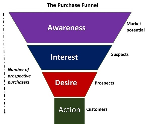
Revenue Per Visitor does not use the total number of visitors to your site in its calculations. Instead, it counts only unique visitors, with each individual counting as just one visitor. In other words, visitors, not visits. This is because almost all first-time visitors to a site, more than 99%, will not make a purchase. Typically they might want to compare prices or offers on another site, or perhaps they want to mull things over before making a purchase, particularly if it’s an expensive one.
This can skew the results considerably and provide falsely negative data on how much a company will earn per visitor. On the other hand, if you are gaining a lot of recurring buyers, you may wish to document this trend and use total buyers instead. This might depend on what it is you are selling, as well as whether you want to track individual habits as well as revenue.
Why Use Revenue Per Visitor?
RPV is a much more thorough and insightful metric for those who wish to measure online sales than Conversion Rate (CVR).
In fact, many of the metrics used in e-commerce have enormous blind spots that can lead you to make poor decisions made with accurate, but incomplete, data.
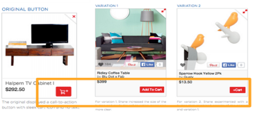
Put simply, conversion rate tracks the percentage of visitors to your site that makes a purchase. If the product or products you are selling are of one price, this would paint a complete picture of how your business is performing. Most e-commerce platforms, however, are selling products of different value. For example, a conversion rate of 3% for a fidget spinner worth $2 is very poor, but for a sofa worth $1,000 it is highly desirable. So what is needed is a metric that takes into account AOV – Average Order Value.
The average order value is the average revenue made per visitor. The aforementioned fidget spinner has an AOV of just 6p, but the sofa has an AOV of $30. So why not use this metric to calculate how much a business earns per visitor? Well just because conversion rate comes with an inherent blind spot, doesn’t mean it’s a metric without merit. If the only data you have is AOV, how are you to know if your website is performing to its full potential? Also, a low conversion rate directly affects your website’s ranking. The lower the ranking, the less likely customers are going to find it in the first place. The answer? Combine both metrics. This is how RPV came into being.
How To Improve Revenue Per Visitor
There are many methods and ideas that help improve a business’s average revenue per customer, but each tip should not automatically be considered a one size fits all deal. In fact, a lower RPV is not always a sign of a poorly performing website. For example, high traffic that garners low sales, and therefore a low RPV, can lead to higher sales over an extended period of time. It is therefore often good practice to keep every metric in proportion to other data.
Having said that, there is a little doubt about the power and insight that revenue per visitor can provide. These include:
- Upselling
- Recommendations
- Reward programs
- Basket reminders
- live chat
- Optimization
Upselling
A tried and tested method of commerce since humans began trading, upselling is the method of suggesting upgrades or add-ons to the original purchase. For example, a tech salesperson might suggest that spending an extra $50 would result in a faster processor, meaning the laptop will avoid becoming obsolete in the near future. Or perhaps the next model up, which is only $70 more, has a free upgrade for the latest operating system.
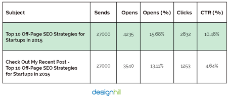
Upselling is a balance, one where it is important to make the customer feel as if they are getting something of worth, or perhaps that it would be foolish not to when spending that little bit more. According to a study from Predictive Intent, upselling increases sales by over 4% for e-commerce businesses, and is twenty times more likely to be effective than non-complimentary recommendations.
Recommendations
Despite what was said in the previous paragraph, recommendations can be a highly effective way to increase revenue. By simply suggesting other items, there is little doubt that basket totals increase. By how much will depend on the effectiveness of the recommendation engine. This can be tricky for small businesses with little or no data on their customers, the more information you have, the better recommendations work, but some common sense can work wonders here.
For example, complimentary suggestions, those related to the purchase, will likely result in higher purchase totals. If someone buys a laptop, suggesting a wireless mouse or external hard drive will likely be yield better results than stereo equipment.
Reward programs
It is hard enough finding customers in the first place, when you have their attention, creating an experience and incentives for them to return is essential. Reward programs are perfectly designed to achieve this.
Much like supermarket reward points, these systems encourage customers to return to an e-commerce website, rather than a rival business, by making it worthwhile for them to do so. Reward points are just one method of encouraging loyalty, however. Exclusive offers for returning customers have proven to be highly effective when implemented in the right way. This can be particularly useful during the Christmas period when businesses are most likely to encounter new customers.
Basket Reminders
Revenue per visit can be greatly reduced by those abandoning their purchase halfway through the process. Some estimates have the rate of abandonment at almost 70%. There are many reasons why this might happen, and some, such as the process taking too long, can be dealt with by redesigning parts of the website. Whatever the reason, it is possible to turn some of those near misses into hits.
Simple apps and email campaigns can target those easily distracted customers into big spenders, and such solutions are highly cost-effective. What’s more, setting up such apps and campaigns take the minimum of effort and can lead to loyal customers that make regular purchases.
Live Chat
Depending on the size of a business, setting up a live chat feature can increase revenue in some surprising ways. Firstly, customers are more trustful of a website that has an easy to use customer service platform, and live chat is the most convenient online source.
Secondly, particularly if it’s a major purchase, many customers seek reassurance or extra information about a product. Such reassurance not only makes it more likely a sale will occur, but that returns and unsatisfactory experiences can be greatly reduced.
There is also the opportunity for additional revenue from upselling or special offers to be presented to the customer, one to one. Don’t forget as well to A/B test your live chat solution. You may be surprised!
Optimization
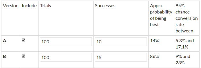
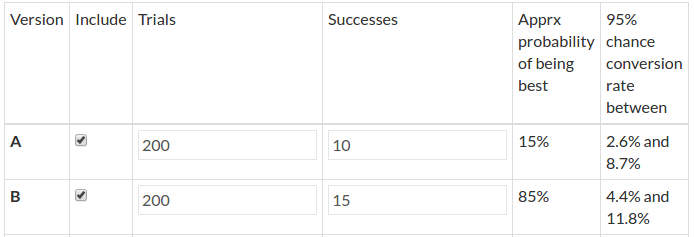
Website optimization is key to best practices in e-commerce and is the most thorough and data-driven aspect of understanding how well a website is performing. This might include heat maps, where businesses can see which part of a page’s content has been engaged with most or testing different versions of a website to ascertain which setups work best. This is known as A/B testing.
Optimization provides data beyond simple metrics and allows a business to make sense of the data at a much more profound level, putting into context what might otherwise be cold, hard numbers that lack context.
Calculating Year Over Year Revenue
Site revenue is pretty straightforward to calculate over the course of a single year. For example, in 2014 Business A’s revenue was $200, in 2015 it was $250. Subtract the $200 from the $250, leaving $50. Then divide the increased total by the original figure from 2014 (50 divided by 200), equalling 0.25. Lastly multiply that by 100, giving you the figure of 25% growth.
For year on year calculations you will need to use Excel, so as you might imagine, it isn’t so straightforward. This method works for any growth calculation beyond one year.
| Year | Revenue |
| 2014 | $200 |
| 2015 | $250 |
| 2016 | $350 |
To calculate overall growth, from 2014 to 2016, simply use the formula above, but the calculating year on year requires three steps. First using the year ending figures for 2016, divide it by the yearly figures for 2014 (350 divided by 200 = 1.75).