Article

8min read

Pushing the Right Buttons: Do Green CTAs Always Work Better?

Did you know it only takes users 90 seconds to form an opinion about your brand? What if we told you that they base the greater part of this assessment purely on the colors you employ? When it comes to call-to-action buttons, we tend to home in on three specific aspects: color, location, and copy. Today, we’ll guide you through… drum roll, please… the best hues for your CTAs!

That being said, what do Yoda, Kermit the Frog, and the wonderful Emerald City have in common? The color green, of course! Plenty of positive associations are linked to this color, transforming it into every run-of-the-mill marketer’s preferred choice when designing their websites.

Now, we know that when it comes to call-to-action best practices, nothing is ever black and white. Does green always prevail? What other alternatives produce the highest CTR rates? Is there truly one color to rule them all?

Let’s see if it’s CRO myth, fact, or fiction that green CTAs produce the best results.

The Power of Color Psychology

Any marketing professional worth their salt can rant for hours on end about how social proof, retargeting, and urgency are surefire ways to boost conversion rates. Yet the answer to which is the best hue to use for call-to-action buttons remains contentious.

Colors play an essential role in our day-to-day decisions by awakening a variety of unconscious impulses. If a debate about the hues of a dress was enough to break the Internet, it’s pretty obvious that they’re a vital element for defining your brand perception.

Are a product’s colors capable of compelling us to purchase one item over another? What about the ones in their logo? Or even the color of a call-to-action button? The answer is yes! If you play your cards right, you’ll find that guiding customers’ choices can be easier than you ever imagined.

How Color Psychology Influences Buying Decisions

Before we dive into the world of CTAs – and the hues that love them – let’s take a look at how, exactly, colors can affect users’ emotions.

“Painting is a blind man’s profession. He paints not what he sees, but what he feels, what he tells himself about what he has seen.”                                                                                                                                             

– Pablo Picasso

Color psychology explores, in a nutshell, how the different feelings and associations each color is linked to affect the decisions people make. Marketers have been in on the secret for decades, capitalizing on this knowledge to improve purchases and optimize their personalization efforts.

There’s a variety of reasons why many companies opt for green CTA buttons: due to all of the positive associations linked to the color (it represents safety, balance, trustworthiness…), many put their money on its capability to coax jittery shoppers down the purchase funnel.

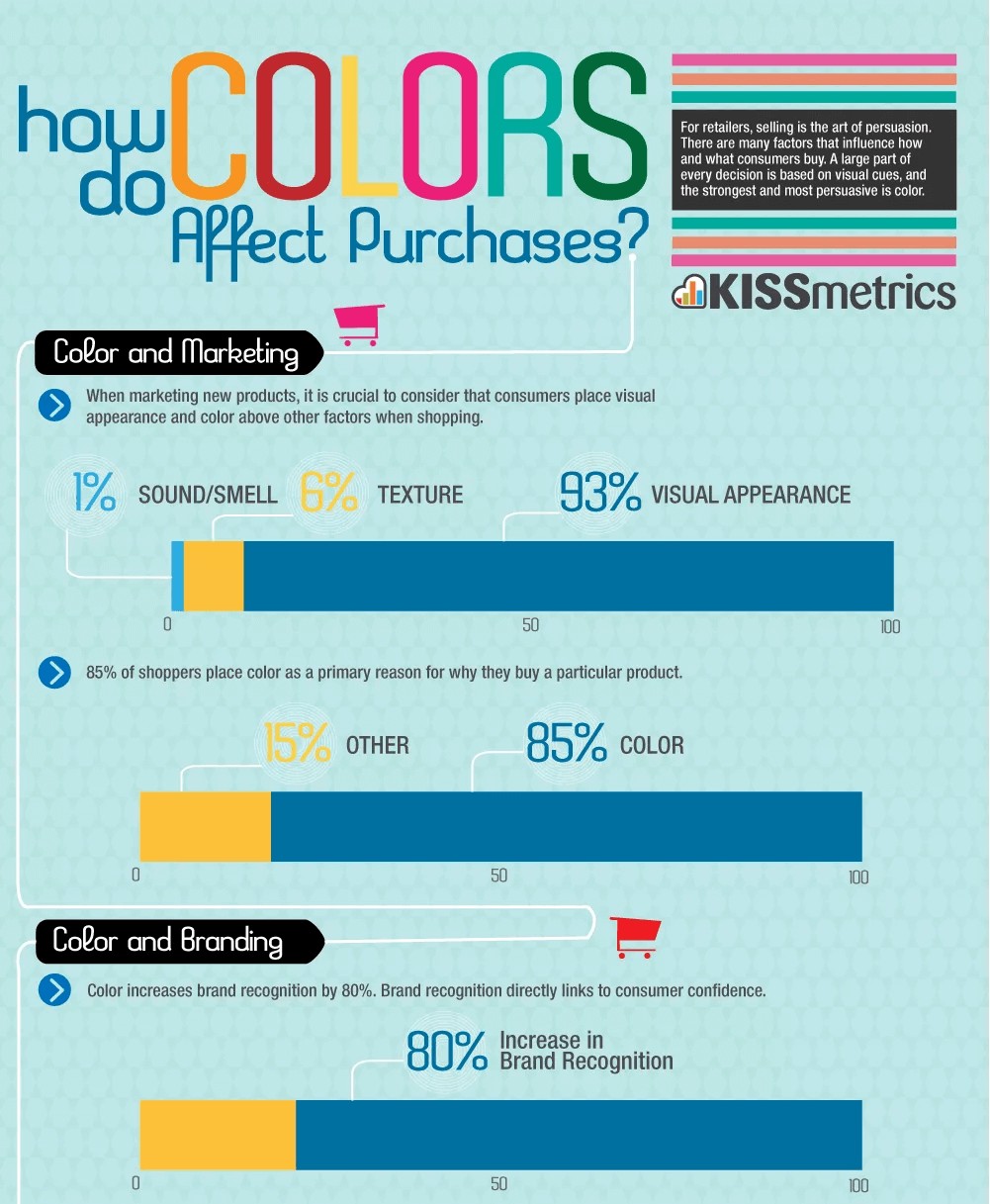
For e-commerce, persuasion is a key component for guiding users. Since we are visual creatures, a strategic design could very well be the key to a new era for your brand! This infographic from Ecommerce Nation and Kissmetrics breaks down the effect of hues on customers’ behavior:

color psychology
Source


Colors and CTAs: Best Practices

The color green rules over clickable buttons: it seems inevitable that most of the sites you visit will be littered with said shade. Day after day, we’re surrounded by constant reminders of its overwhelmingly positive associations; from traffic lights to checkmarks, users have one message drilled into their brains: in green we trust when going forward.

As we’d mentioned previously, it seems like a pretty safe bet; but before you throw caution into the wind and go with the flow, keep in mind that one size does not always fit all. Take, for example, luxury brands: when was the last time you saw a green CTA on their sites? Hard to put your finger on it, huh? That’s probably because supermarkets and discount stores transformed big green buttons into one of their main identifiers, thus forcing high-scale companies to abandon the design.

Before you take the plunge, let’s review four points to keep in mind when choosing a color for your call-to-action button:


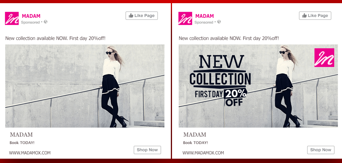
  1.  Context is king: Take a deep breath. Knowing how much is riding on this single decision makes deciding seem like a daunting task – not only does it have to be appropriate for your buyer persona, it must also fit in with your brand’s colors, the website’s design… And, on top of that, it’s nearly impossible to know whether the new CTA is behind the increase in conversions! Thankfully, you can always turn towards A/B testing to significantly optimize your efforts and get data-driven, conclusive evidence.
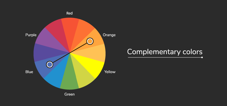
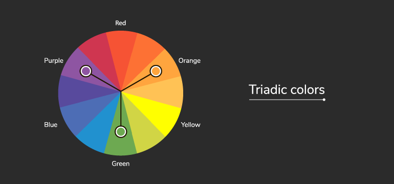
  2.  Make sure it pops: How can you catch your visitor’s eye? With a call-to-action button that stands out, of course! Increasing the contrast can be a good idea and is likely to increase conversion rates. Complementary colors (the one which is placed on the opposite side of the color wheel from your dominant color) and triadic colors (one of two placed one-third of the way from your dominant color on the color wheel) are your best bet.

color wheel complementary

color wheel triadic
Source


  1.  Coherent designs: Marketers can play with the meanings that customers associate with certain colors. One common example is the use of blue tones for hyperlinks – the link (pardon the pun ☺) between the two makes us assume, automatically, that said text will direct us to another site. Due to this, it’s crucial to follow those guidelines for every single page on your website: respect the colors employed for each action and remember that happy websites equal happy users.
  2.  Keep it simple: How many times have you encountered mismatching, aggravating and downright jarring colors on a website? These careless attempts from lazy marketers do manage to capture their users’ attention… for mere seconds, after which their design spirals into a bottomless pit of damaged credibility and brand images. Invest in your design, and watch the conversions come rolling in!

Conclusion: Which Color Converts the Best?

A call-to-action button may be one of many elements in any successful CRO strategy – but it’s a crucial one, nonetheless. Bear in mind that every website is unique – as a result, the colors which will work best for each one will vary! What may double or even triple your transactions may be a flop for your competitors. Oh, what’s a marketer to do?

Bear in mind that the basic principles of color psychology (for example, green incites feelings of confidence, health, movement…) can be used as a starting point for your hypotheses. You need to test and see if this principle applies well to your particular audience and website, taking into account your website design and graphic guidelines (will the color stand out enough? Will it clash or fit in nicely?); your brand’s context (take, for instance, the aforementioned example of green CTAs being associated with grocery stores and, as a result, being shunned by luxury brands); and your audience (each culture interprets colors differently, so it’s important to take your users into account when designing your site).

In any case, if you’re feeling a bit overwhelmed about how to use colors for your call-to-action buttons (and which ones to choose), you have nothing to fear: A/B testing has got your back! Even though it’s a myth to believe green CTAs will always work better, you can use them as a solid starting point for your tests since they can often work!


CRO Myth Busters is a mini series for conversion rate optimization professionals. We take a quick look at commonly held CRO beliefs and determine if they’re true, sometimes true, or simply CRO myths!

Subscribe to
our Newsletter

bloc Newsletter EN

We will process and store your personal data to send you communications as described in our  Privacy Policy.

Article

8min read

How to Conduct Usability Testing for Mobile Apps

Did you know that 90% of the time people spend on their phones is in mobile apps? Creating an app for your business is a great way to ensure that people can easily find your services right on their phones.

However, a lackluster app can sour your relationship and brand image. Regular usability testing of your mobile app helps you see how this handy marketing tool can be improved.

Read on to learn how you can conduct high-quality usability testing for your mobile apps.

Good Usability Testing: The Benefits  

Usability tests for mobile apps are designed to observe test-subject users while they use your app. The purpose of testing is to measure the app’s user-friendliness and learn about how it can better support your brand’s key marketing objectives.

Usability testing helps to ensure that your app is adding value to your business, as well as meeting the expectations of the final users. Ensuring you have good usability for your mobile app will help your business improve customer satisfaction, decrease time on customer support, and increase your sales and revenue.

Seven Steps to Run an Effective Usability Test

Decide on your Objectives

First and foremost, come up with specific objectives for your usability test. When designing your objectives, keep the five usability attributes in mind:


usability-attributes
Source

Once you have the big idea objectives, nail them down to specifics.

One objective could be determining what aspects users enjoy about your mobile app. Perhaps they find it easy to use, or they like the colors you’ve assigned. Another objective might be seeing if a new feature helps or hinders users from completing a specific task.

Whichever way you decide to do it, make sure you have some core objectives and some flexible ones. Core objectives should be questions you ask every time you run a usability test. Flexible objectives are ones that depend on new updates or changes that didn’t exist before.

Design the Tasks

Next, it’s time to design the tasks that you’ll ask your users to do. There are a few key guidelines you should follow when designing usability tasks.

First, even if your mobile app is still in development, remove placeholder text like “lorem ipsum” with a draft of what should be there. This will help you get a better sense of how people navigate the site and decide which information is important. If they see placeholder text everywhere, you’re not getting a good sense of how they weigh the information presented to them.

Avoid providing clues in your instructions. Offering extra hints and tips might lead them to take actions they wouldn’t have otherwise figured out. 

Before you run your test, check that there isn’t any ambiguity in your instructions. If you leave instructions up to interpretation, your results might make it seem that your app isn’t user-friendly.

Choose Between Lab Settings or Remote Testing

There isn’t one right option when choosing between a lab setting or running your test remotely. However, there are pros and cons to each choice.

You don’t need an actual lab to run a test in a lab setting. This just means that you’re running the test yourself in a controlled environment.

In Lab settings, you have the benefit of gaining extra observations. Even small things like hesitation or scrunched eyebrows can tell you a lot about their user experience. You also gain complete control over their experience and the environment in which the test is conducted.

One downside of lab settings is that you risk muddling the results with the framing effect. If you accidentally ask a question in a leading way or provide too much information, you’ll end up getting results that reflect your knowledge and experience with the app – instead of your users.

The advantage of remote testing is that you don’t need to schedule a time and place to host your users. The users do the test on their own time, and you get sent the results, which saves time for your team. And like we mentioned, remote testing is a great way to avoid the framing effect.

There is a range of testing tools available for mobile UX, so be sure you choose one that supports the measurement of your key objectives.

Ready, Set, Run the Test

Now that everything is ready, it’s time to run your test. There are a few different moderation methods you can choose from.

One option is to ask your participants to think out loud as they work through the tasks. “Oops, didn’t think it’d do that”  is great feedback. If you’re running a test remotely, this can give you extra information about their thought process. One downside to this is that having to speak out loud might be a distraction or cause the user to complete the test slower than they would otherwise.

If you’re doing a lab test, you can take advantage of being in-person to ask them questions as they progress. However, it’s important to ask questions in a non-judgmental and non-leading tone.

Finally, you can moderate retroactively. This type of moderation asks your user to watch a replay of themselves and explain their actions, or you ask users to elaborate on certain decisions they made. 

Organize and Analyze Your Data

Now that you’ve collected your usability data, it’s time to organize and analyze it. Drawing meaningful conclusions is arguably the most important step to boost the impact of your testing.

It’s best practice to review the testing sessions one at a time. Look at all the materials you have for that user, including notes on recordings, transcripts, and other info you might have.

Organize your data in an easily digestible way. Some standard categories for reporting might include the user’s name or ID number, task title, and encountered problems. You might also want to categorize problems for easy sorting – confusion, broken links, or disappointment might be some examples.

Regardless of how you choose to analyze your research, don’t forget to look at both quantitative and qualitative data. Quantitative data is great for giving your app an overall scorecard and providing summaries to higher-ups. But, keeping the qualitative data is important for remembering the details of your testing.

Work to identify positive trends and patterns, as well as challenges and roadblocks that your users faced. Be sure to cross-check your data against different metrics to help reveal if certain patterns only revealed themselves on certain devices or demographics of your audience.

Try to get in the habit of developing a standardized report so that you can easily compare changes over time. This will help ensure that you and your team can easily review progress and setbacks you’ve faced from your last usability test.

Time to Act: How to Improve Based on What You Learned

Running usability tests on mobile apps can be overwhelming. You receive so much information at once that it’s like drinking from a firehose. The first step to avoiding feeling totally overwhelmed is to prioritize your feedback.

Look at your data and choose which aspects should be the biggest priority. You can rank priorities from one to ten or categorize them from low importance to critical. Distribute these tasks in order of importance.

Take careful notes of what your team achieves and what still needs to be completed before the next test.

Which brings us to…

Plan Your Next Test

For salespeople, the slogan is “ABC – Always Be Closing.” For developers, it’s ABT – Always Be Testing.

Usability testing should happen on a regular and scheduled basis. These tests can guide choices for new design features, and updates to improve functionality.

Based on what you learned from past usability tests, you should check that major issues from before have since been resolved. Through A/B testing, you can test your newest update to your older version.

Regardless if your mobile app is in development or you’re undergoing an update, you should keep an eye on competitor mobile apps. This can help you stay ahead of the curve and keep up with usability expectations for your industry. It can also inspire changes that take advantage of the familiarity principle.

Getting feedback on the usability of your app can be a difficult pill to swallow. It’s important to remember that a lot of feedback means you ran a successful usability test, and not that your app is a failure. Every test you run will bring you closer to perfecting the user-experience and supporting larger business goals.