Article

6min read

How Does Page Speed Really Affect your Conversions

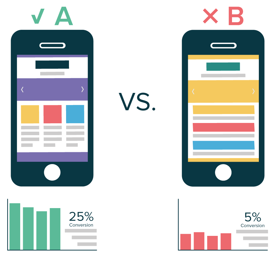
Can one single factor such as page speed make a big difference when it comes to conversions?

More than you’d have expected.

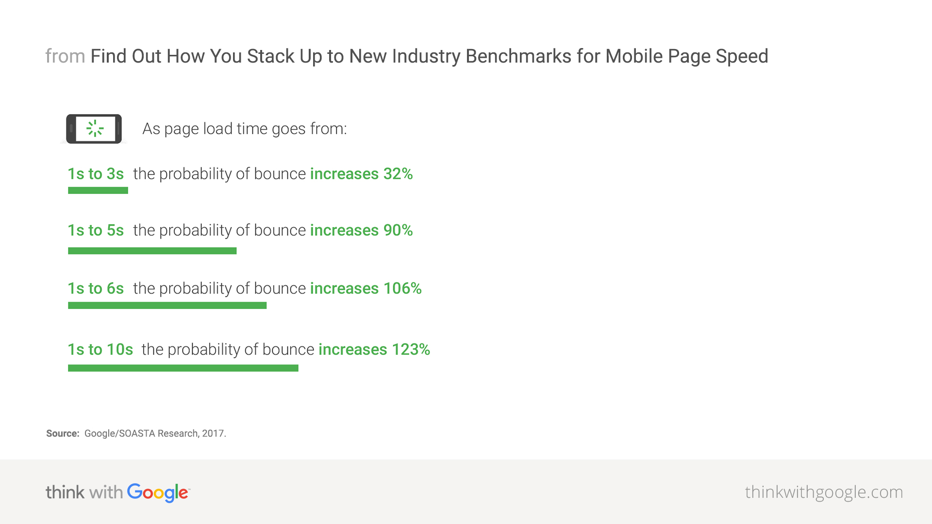
In fact, according to research led by Akamai, a two-second delay in page load time can increase bounce rate by more than 100%.

That’s right, your bounce rate can actually double, meaning you could be losing an enormous amount of visitors, right from the start.

How slow website load time can impact your conversions
This could be your website.

As if it wasn’t enough, research led by the same source pointed out that more than 40% of visitors who had a bad experience with a website’s performance would tell a friend or a family member.

In short, slow loading time doesn’t only affect your incoming visitors, it also potentially deters future visitors from shopping on your website.

The main problem that marketers face with loading time is that most of them can’t actually grasp the importance of improving page speed by a few milliseconds: it’s just not tangible enough.

In consequence, most online retailers often overlook page loading time in their annual priorities because they focus on other more “tangible” enhancements such as design, SEO, social media, paid ads…

And that’s a mistake. Research and data from industry giants and experts have all shown that page loading time directly affects conversions, page views, CPC, SEO, and direct revenues.

To help you sort it out and quantify the impact of page loading time over conversions, we prepared some additional insights that should help you better understand the stakes involved in improving page speed.

Keep reading, it’s worth it.

Page load time impacts users experience

Did we mention that online shoppers hate long loading time?

If not, here’s an interesting fact: according to stress-testing specialist Dotcom-Monitor, “75% of all users will typically bounce as page load time passes the 3-second mark.”

Aside from bounce rates, page speed also matters when it comes to satisfying your customers: Aberdeen points out that an extra second in loading time results in a staggering 16% decrease in customer satisfaction. That is just ridiculous.

Knowing this, adding just a few extra seconds to your loading time yields unbelievably negative results on your ability to engage your visitors and commit to good customer service while around 45% of all online shoppers expect a website to load within 2 seconds.

If page speed does affect how customers interact with your website: it also has a direct impact on their likeliness to purchase.

How website speed directly affects your sales

If your site is plagued with speed issues, there’s no doubt you’re losing tons and tons of potential customers on your website and thus many sales.

Adding to that point, let’s not forget what we said about dissatisfied customers: 40% of them won’t hesitate to talk poorly about their online shopping experiences.

About those same dissatisfied customers, HubSpot mentions that 80% of them are less likely to buy again from the same website: that is a huge loss in potential returning visitors.

And ecommerce players need returning visitors: it’s a key element of the Customer Lifetime Value as they represent up to 48% of all transactions according to Business Insider.

To quantify how important page speed is regarding conversions, Walmart came up with an impressive analysis regarding their online sales and how customers behaved in comparison to page loading times.

Sharp decline in conversion rate as average site load time increases from 1 to 4 seconds.

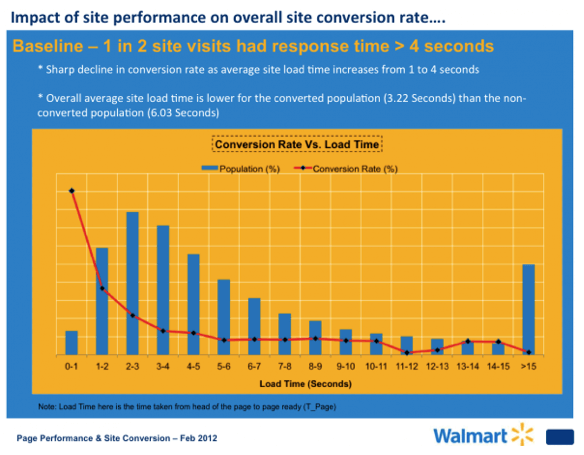
Here’s the main takeaway: they noticed a “sharp decline in conversion rate as average site load time increases from 1 to 4 seconds.”

While their conversion rates remain stable between 5 and 8 seconds loading times; notice how big of a difference it makes for users that experienced loading times under 3.5 seconds.

Of course, not all websites can match Walmart’s volume of sales and that’s totally fine.

There are still big financial benefits to draw from page speed improvements; regardless of your revenues.

Your mobile website speed influences your online visibility (SEO)

Breaking news in the small world of SEO: mobile page speed will effectively become an official ranking factor in search results, starting July 2018 (source: Search Engine Land).

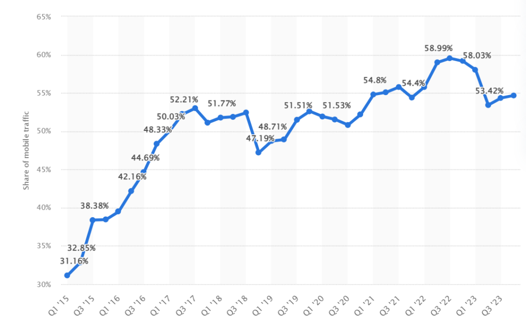
Because more than 50% of all worldwide traffic was generated through mobile phones in 2024, it’s easy to grasp how important mobile page loading times are becoming for all online businesses.

Well aware of the meteoric rise of mobile traffic, Google rolled out its Mobile-First Index in 2017, meaning that the search engine now ranks websites primarily based on mobile performance factors rather than desktop performances.

Mobile page speed now directly affects SEO game
Source: Moz

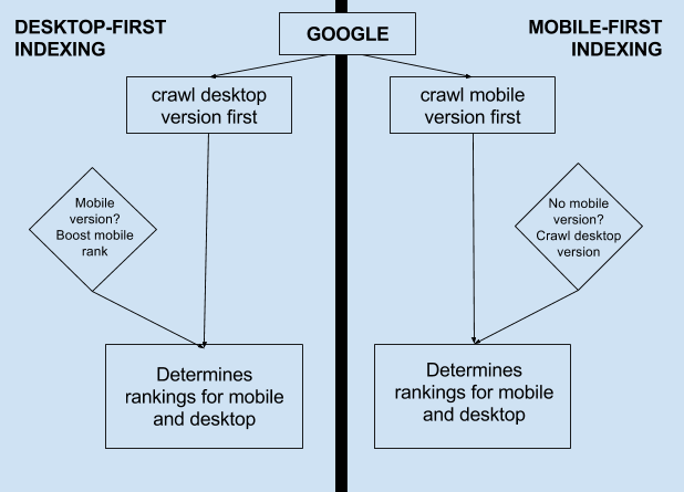
Simply put, this means that your mobile page speed now directly affects your SEO game: it could potentially hurt your rankings in the next months.

Additional resources: Mobile Optimization Guide

What’s an ideal website load time?

When it comes to reaching a perfect loading time, Google says that 53% of mobile visitors leave a site that takes longer than 3 seconds to load: this is what you should aim for.

Behind the curtain, the ugly truth is rather alarming: Google points out that the average time it takes for a mobile landing page to fully load is in the 20 seconds range: millions of websites are miles away from the ideal loading time.

3 free tools to measure your website page speed

If you’ve kept reading with us to this point, you’ll probably want a quick overview of your website speed and that’s totally fine.

To help you find out the stumbling blocks that curb your website’s loading speed, here are 3 free tools that will help you improve your page speed:

  1. Google Chrome DevTools
  2. GT Metrix
  3. PingDom

These 3 tools are free and user-friendly: just put in your URL and you’re good for a quick analysis.

If you’re looking for further page speed insights, take a look at Google’s PageSpeed Rules so that you can take action now.

Did you like this article? Feel free to share and check out our other in-depth articles on how to optimize your website and our complete guide to conversion rate optimization.

Article

7min read

How to Effectively A/B Test your Content Headlines

Breaking news: according to CopyBlogger, 80% of all readers never make it past the headline.

If you read this, you’re among our happy 20% and you shall not be disappointed.

The truth is: it’s a pretty serious issue for all publishers.

Similarly, the Washington Post reported that 6 in 10 Americans acknowledge that they don’t read past the headlines regarding any type of news.

So, should we just stop writing?

Obviously not.

In 2018, the written content is still one of the most consumed media (in competition with videos) and remains a powerful tool to:

  • Build brand awareness
  • Generate B2B Leads
  • Report news
  • Drive sales
  • Grow your audience
  • Rank on search engines

Knowing that most readers won’t spend more than 15 seconds reading an average article (source: Buffer), crafting powerful and catchy headlines has never been more important to ensure that your audience will stick around for a while and that you don’t produce content in vain.

But how do you make sure that your headlines really work?

It’s simple: you need to run some headline A/B testing.

What is headline testing?

Definition: headline testing consists of creating several title variations for the same article (or online media piece) in order to find out which one performs the best.

Based on your objectives, headline testing can be used to track several metrics such as:

How to conduct headline testing

Headline testing requires you to define a title as the “control version” in order to compare it with one or more variant.

While choosing the number of variants, bear in mind that the more variants you wish to test, the larger sample you will need in order to obtain statistically relevant results.

Once you’ve chosen your variants, you will use an A/B testing tool to run your tests and see which headline outperforms the others.

Typically, an A/B testing tool will send a percentage of your page’s traffic to each variant until it identifies a winner.

From there, the tool will allocate 100% of the traffic to the “winner” in order to maximize your page’s performance.

Sound good?

Let’s see how to come up with brilliant headline ideas that you will be able to A/B test later on.

How to brainstorm headline ideas

Headlines come in many forms depending on whether you’re writing an article, a landing page or even a product description.

Given this variety of headlines, we’ll try to help you craft various headlines through general guidelines to meet your business objectives.

Catchy content headline to test
Source: EveryDayBright

Include real data and numbers

Numbers act like candies for the brain: we just love to see them because they give us facts and figures to work on.

Overall Headline Preferences
Source: Conductor

In 2013, Conductor came up with a study that showed the impact of adding numbers to your headlines: it appears that readers do prefer headlines that include numbers.

Craft a strong value proposition

Creating a value proposition for your readers means that you need to work on including a real benefit inside your headline.

Working on your value proposition is the cornerstone of every headline creation process: it helps you address your core audience while promising something in exchange for their attention.

Depending on the content you’re working on, crafting your value proposition is a process that basically sells your content: it will determine whether or not your potential readers will click on your content.

Headline testing
Source: GoinsWriter

Here are some formulations commonly used to craft a strong value proposition:

  • Recipes for success
  • Expert opinions
  • Special offers and discounts
  • Tips and advice
  • Guides, ebooks
  • Facts, studies
  • Ideas, strategies

Trigger your readers’ curiosity

Capturing your readers’ attention is no easy task given the average level of online competition that most publishers encounter.

Raise curiosity with your content headline
Source: SmartBlogger

In order to grab your visitors’ attention from the beginning, try to avoid headlines that can easily be answered by “Yes” or “No”.

“Yes and No” headlines are dangerous because they force your visitors to form an opinion about your question or your statement; which will eventually lead to a significant share of visitors choosing not to click.

Here’s a list of formulations used to trigger curiosity:

  • “How to …”
  • “The 7 facts you didn’t know about …”
  • “How [insert_name] managed to [action] in [days]”
  • “The Complete Guide to …”
  • “What every [target] should know about [subject]”

Watch your competition

There’s no secret for marketing success: practice makes perfect.

Because most businesses typically have dozens of competitors, you should pay attention to your competitors’ headline formulations.

From there, try to identify general trends and success formulas that you could apply to your own content.

Watch headlines used by your competitors

Ideas for effective headlines from the competition can be found in:

  • Newsletters
  • Websites pages and landing pages
  • Product descriptions
  • Ebooks
  • SERPs (Search Engine Result Pages)

Keep them simple and clear

Online visitors and shoppers are over-exposed to marketing messages all day long.

Knowing this, it can be clever to keep your headlines short, simple and clear in order to deliver straightforward information to your potential readers.

Because marketers are always searching for new magic formulas, they sometimes come up with complex, tricky formulations that you should avoid.

Use a headline analyzer

Headlines analyzers are online tools that score your headlines based on a certain number of parameters.

Typically, these tools will grade your headlines on a 100 scale in order to help you craft catchier, better headlines.

They often measure the length and analyze your headline’s structure to determine optimal word order, keyword use, and formulation.

Here are 2 free tools you can use to analyze your headlines:

https://coschedule.com/headline-analyzer
Source: CoSchedule

We’ve analyzed our own headline to see what type of results we would get.

Key Takeaway: our headline “How to Effectively A/B Test your Content Headlines” scored a reassuring 72/100 because it contains a power word “effectively” and an emotional element that triggers curiosity “How to…”.

The tool even identified our main keywords, which is a good starter for search engine optimization.

Run A/B tests and compare results

Impact of Headline Testing on Pageviews
Impact of Headline Testing on Pageviews. Source: Priceonomics.com

As you know, headline testing can bring tremendous benefits to your key metrics such as page views, CTR and conversions.

To prove this point, Priceonomics came with an analysis that showed a 33% improvement on pageviews following headline testing: a major improvement that could drastically improve the way visitors behave on your website.

Now that you’ve come across our best practices for headline creation, it’s high time you start testing your own headlines variations to find out the most effective ones.

In order to do so, here’s a little checklist you can follow:

  1. Use our A/B Testing tool to set up your experimental environment
  2. Our WYSIWYG editor makes it easy to test headlines
  3. Start brainstorming headline ideas and formulate hypotheses
  4. Try to run some headline ideas through CoSchedule to measure your chances of success.
  5. Run your tests and collect results
  6. Measure your tests results and track important KPIs to monitor any change

Did you like this article? Feel free to share and check out our other in-depth articles on how to optimize your website, ecommerce and digital marketing.

Article

10min read

A Beginner’s Guide to A/B Testing your Emails

Email marketing is all about maximizing your open, click and response rates while generating as many leads and sales as possible for a given email campaign.

However, in our era of over-saturated email boxes, chances are your prospects won’t actually open your emails as they receive so many.

On average, MailChimp estimates that open rates vary from 18% to 28% depending on the industry concerned. While it’s not catastrophic, it still means that 75% to 80% of your emails will remain… unopened.

Let’s be honest: there is not a single magic formula to craft the perfect email. Otherwise, it would have largely spread over the internet and become overused in a matter of weeks.

The truth is, no one can really guess the perfect email campaign for your company – it will depend on a myriad of factors that we will cover later in this article.

As a consequence, the only way to design and write the most effective emails is to A/B test them.

Not just once, but many times.

By doing so, you’ll vastly increase your chances of uncovering magic tricks that will effectively increase your open, click-through and response rates.

Using email A/B testing, you’ll also discover what actually works on your prospects and how to address them.

Without further ado, let’s begin this guide by answering one simple question:

Why does email A/B testing matter?

Despite being one of the oldest online marketing channels, email marketing remains one of the top performing solutions to reach a broad audience and convert prospects into leads or clients.

More importantly, emailing is a marketing channel that is both:

  • Highly profitable
  • Often affordable

Return on investment of email compared to other channels
Sources: Neil Patel & EmailMarketingGold

As you can see, email marketing returns an average of $40 for every dollar spent, which is a massive improvement compared to display campaigns or banner ads for instance.

Knowing that email marketing is profitable, let’s see how email A/B testing will truly help your business:

It will improve your open and click-through rates

After a few A/B tests, your company should start to identify trends and common factors that lead to higher open and click-through rates.

This means that you will get more views but also more clicks to your website or online forms, which leads us to our second point.

It will increase conversions and generate revenues

Using a marketing automation software, you will be able to analyze your funnel and traffic sources, which is crucial to identifying how many opened emails actually resulted in leads or sales.

Knowing that, you will get a precise estimation of your email marketing ROI, which is a good start to further increase conversions and revenues.

From there, it’s up to you to conduct additional tests on your email campaigns in order to generate more revenues.

You will know what works for your audience

As we said in our introduction, not all industries are identical when it comes to email statistics.

Meanwhile, your prospects most likely have special needs and questions that need to be addressed in a specific way – which most marketers won’t be able to do on the first try.

After you’ve conducted a few conclusive tests, you’ll soon discover major differentiating factors that will account for your future email marketing campaigns success.

Using A/B tests, you’ll be able to craft tailor-made emails that will fit your prospects and generate more engagement.

You will save time and money

Although email marketing isn’t the most expensive online channel, it does cost a significant amount of money to send emails to a large audience and create adapted visuals, landing pages and forms.

Using email A/B tests, you’ll save time and money by quickly identifying the recipe for success in your given industry and by implementing incremental changes that will lead to better results.

What elements should I A/B test first in my emails?

At this point, you’re probably wondering how to set up a proper email A/B test and start gaining insights on what works and what doesn’t.

In order to help you do so, we’ve prepared a list of the 8 most important elements that could lead to significant improvements for your email campaigns.

Ready?

Subject & Preheader

A/B test email subject & preheader

Subjects lines and preheaders form the only touch point before an email is opened.

Therefore, they’re highly valuable items that require extensive attention despite their size.

Remember: your headlines and preheaders will determine whether or not your emails will be opened.

On average, optimal length for email subject lines is around 60-70 characters, no more.

You could try to tweak several parameters for your subject lines, including:

  • Word order (try reversing the order)
  • Tone (neutral, friendly, provocative)
  • Length (try shorter, try longer)
  • Personalization (try including their first name)

When it comes to preheaders, they’re usually pulled from the first line of your email. But as your email marketing senses sharpen, you could try to create intentional preheaders that most emailing tools now support.

If you can create your own preheaders, try to write complementary information and add relevant words that could trigger your prospects’ curiosity.

Different days and hours

For various reasons, email campaigns don’t perform the same depending on when you send them.

For starters, you could try to send emails on different days of the week: GetResponse reports that Tuesdays get the best open rates compared to the rest of the week, although the gap is relatively small (19.9% for Tuesdays compared to 16.9 on Saturdays).

Because studies can be biased and cultural differences can change this data, it’s important that you try different days in order to find what works best for your company.

Likewise, there are studies like MailChimp’s and HubSpot’s that tend to show a particular trend for optimal sending time around 10am to 11am.

Optimal sending time for your email campaigns
Source: MailChimp

Knowing this, you could try to adjust your campaign around different hours of the day just to see if one performs better than the others.

Length

The length of your email’s body can have a significant impact on your readers’ behavior, depending on what they have been used to.

With several studies all reporting serious decreases in our attention span, it may be worth deleting one or two paragraphs just to see if your email performs better.

One general piece of advice is to be straightforward and cut out the unnecessary, overused commercial taglines.

Of course, your emails’ ideal body length will mostly depend on your prospects’ expectations and your industry’s emailing practices.

In the fashion industry, the trend is moving towards flashy, punchy visuals with minimal copy that often features a very basic call-to-action.

On the contrary, B2B emails can purposely be long and feature bullet lists as well as multiple call-to-actions.

Visuals

Since our brain just loves visuals (read full study here), adding engaging visuals to your emails can be a very powerful tool to generate more engagement from your readers.

Add engaging visuals to your emails campaigns
House of Fraser, source: PiktoChart

Similarly to body length, visuals won’t show the same efficiency in all industries.

In fact, adding too many visuals can distract readers from the core message which often leads to having your call-to-actions ignored.

If you want to get a clear idea on whether or not images are adapted to your email marketing efforts, just try to run a Version A with no visuals (but the same subject line, body and CTAs) versus a Version B that contains visuals: you’ll see which one performs better.

Getting more personal

Adopting a friendlier, more casual tone and copy can often transform the way your readers perceive your email activities.

Using most recent emailing tools, you can dynamically add first and last names inside your emails: this will create a sense of personalization that most people like.

The copy

While there is no secret recipe to writing perfect copy (because it depends on your objectives), try running different versions through A/B tests while only changing the copy: this could lead to tremendous changes for your conversion rate.

If you’ve formulated different hypotheses about your readers’ expectations, create two different copies based on anticipated behaviors and send them to the same mailing list to see which one outperforms the other.

Call-to-actions & buttons

Whether they’re hypertext, images or buttons, your CTAs’ design and copy can have serious consequences on your readers’ likeliness to click them.

If you want to conduct in-depth CTAs A/B testing, try to compare different colors and formats to see if one stands out from the rest.

If that doesn’t deliver statistically significant results, you could try to change your value proposition; i.e the offer behind your call-to-action.

The best practices for email A/B testing

Now that we covered the main elements that can be tested through email A/B testing, let’s have a quick look at the 4 best practices to bear in mind before running email A/B tests.

Having a goal in mind

Defining objectives prior to running any A/B tests is a massive time-saver for any marketer.

In fact, it’s highly important that we as marketers formulate hypotheses based on the data we exploit.

  • You need to increase the open rate: In this case, you should mainly focus on your subject lines and preheaders: these are the two main elements that will affect this metric.
  • You need to increase your click-through-rate, downloads or subscriptions: If you want to increase engagement, then test all body-related content such as the copy, the tone, the visuals and the call-to-actions as they may all trigger an increase in clicks, subscriptions or purchases.

One vs Multiple Variables Testing

When it comes to A/B testing, adding multiple variables in your tests means that you will need an ever-increasing sample size in order to get statistically relevant results.

Besides, comparing two versions with multiple variants each will make it difficult for you to get relevant results as you won’t know which element triggered an increase or a decrease for your key metric.

If you have a small sample size, our general advice is to test one variable at a time.

However, there are cases where you will want to A/B test two completely different versions of your email: you can do so easily as the “winner” could be used for future benchmarks or as a template for your next A/B tests.

Testing at the same time vs testing at different times

Although you can absolutely A/B test your emails based on sending days and hours, try to avoid sending variants at different times: you won’t know if the changes were caused by the time or the email content.

Tracking results and building on your findings

Running email A/B tests makes no sense if you don’t actively track your campaigns results afterwards.

There are 4 main metrics that should you track in order to measure success:

  • Open Rate
  • Click-through Rate
  • Response Rate
  • Subsequent Conversion Rate

For most campaigns, open rates and click-through rates will be your basic performance indicators and you should track any sensible change, be it positive or negative.

On certain campaigns (namely lead generation and ecommerce promotional offers), you’ll also want to actively track the conversion rate associated with your call-to-action.

Simply put, you should track sales or the number of forms completed on your website derived from your email analytics in order to measure your overall return on investment.

In these scenarios, you’ll be tracking real conversions instead of the number of opened emails which will provide you with much more tangible data for your marketing analysis.

Did you like this article? Feel free to share and check out our other in-depth articles on how to optimize your website, ecommerce and digital marketing.

Article

10min read

How A Customer Journey Map Can Help You Improve User Experience

A customer journey map is a visual representation of a customer’s interaction with a business or website. It is used to define which parts of this process might not be working as smoothly as they should be, thus improving the customer’s experience. When used properly, it can engender customer loyalty, positive word of mouth and a more efficient business model.

What Is A Customer Journey Map?

The customer journey map is a (mostly) visual tool that helps businesses understand what a customer goes through when buying a product or service from them. It maps out in clear, concise, visual terms, the journey each customer is likely to experience through buyer personas and user data.

Buyer personas are at the heart of a customer journey map tool and are broad representations, presented as fictional characters, based on real-life data and customer feedback. Typically, each project will create between three and seven buyer personas, each of which will require its own customer journey map.

The point of the customer journey map is to understand, as clearly as possible, what a customer will encounter when using your service. It will also help you improve the elements that are not functioning properly, are not easy to navigate and show you how to make the entire experience more satisfying.

Each persona, and therefore the journey map itself, is not meant to be a perfect illustration of actual interactions. Rather it is a broad representation of the experience from the persona’s perspective.

The best customer journey map is a story, brought to life visually, of the customer’s experience. In essence, the best customer journey map is a story, brought to life visually, of the customer’s experience. It should be noted, however, that more complex information on the map may require text.

The map itself highlights “touchpoints, which are specific elements of the customer’s interaction with a business. Each of these touchpoints – for example, seeking a product, researching its content, buying the product, waiting for delivery and returning it if unsatisfied – can be judged as negative, neutral or positive from the customer’s perspective.

Customer journey maps require various research techniques that include hard data, customer feedback, and creative thinking. As such, no two maps are the same and each one will depend on many different factors that can’t be simplified or stereotyped as a matter of course.

Who Can Benefit From A Customer Journey Map?

There are many reasons why a customer journey map can be useful to a business. Modern day marketing is hugely focused on the individual, with personalization gaining traction in almost all sectors.

This means that customer satisfaction is more important than ever to a business and tied to loyalty to an extent that has not previously existed. Customers are more demanding, aware of their options and willing to shop around.

By mapping each of the previously mentioned touchpoints, a well-designed customer journey map template can highlight any problems that clients might experience in the process of interacting with a business and help foster a relationship with an organization, product, service or brand. This can occur across multiple channels and over a long period of time.

Once a customer journey map template has been designed, the entire enterprise can keep the customer at the forefront of the decision-making process. With a focus on the customer and their experience, or user experience (UX), any kinks, holes or brick walls within the timeline’s touchpoints can be ironed out.

Bringing Together All Aspects Of The Business

Another way in which a customer journey map can help is by bringing together departments with a focus on customer experience. To begin with, all departments can be engaged to discuss issues that customers may face when dealing with them. This is no small thing as many departments may not be used to dealing with customers, yet the decisions they take may have a profound effect on UX. By creating an understanding of how each touchpoint affects UX across the entire business, decisions can be made from an empathetic perspective.

Traditional marketing stops at the point of purchase, but customer experience does not necessarily end there. For example, perhaps the purchase was not to their satisfaction and they want to return the goods. Departments that might not typically be involved in touchpoints before purchase now have a central role to play. How easy is it for the customer to find the return information on a website? If they need information on delivery, or collection times, how likely are they to get a response that will satisfy them? This all requires forethought and a policy that keeps customer experience central to design and organization.

How To Create A Customer Journey Map

Customer journey mapping templates appear complex at first glance, but there are some tried and tested, step by step methods that can simplify the process immeasurably.

These are:

  • Building personas
  • Defining touchpoints
  • Aligning goals against each touchpoint
  • Deciding where these goals are and are not being met
  • Prioritizing changes

Building Personas

Building personas is in itself a skill, into which we won’t go into minute detail here, but broadly speaking, this is the most time-consuming part of the process. It requires detailed research, including qualitative and quantitative data, and is the foundation of the entire process. A persona is a highly relatable and rounded fictional character, generalized, but not stereotyped.

Defining Touchpoints

All customer journey mapping examples are unique. This is because every sector, every busine, s and every website is, to some degree, unique. Therefore, touchpoints on one map are unlikely to work for another. In fact, every business needs to update its buyer personas and customer journey maps as their business changes. Even quite subtle changes can have profound effects on the customer journey map template.

As previously described, touchpoints are places on the map where the customer is interacting with your business or website. These should be thought about carefully and involve all aspects of the business. There is a good chance you will be surprised by the input of seemingly irrelevant departments when it comes to UX.

Aligning Goals Against Each Touchpoint

Depending on the nature of the map, this is often considered the most difficult part of the entire process. Defining is based on the previously described data and needs to be mapped onto the previously described touchpoints. Think of it like those handheld toys where you have to align each silver ball with a hole, every time one falls into place, another pops out.

The main reason this is often a difficult process is that customer goals have been largely overlooked when designing websites, with attention grabbing elements, upselling and site engagement prioritized over ease of use and efficiency of the process. Getting this balance right is essential for a customer journey map to be effective.

Deciding Where These Goals Are And Are Not Being Met

Now you have your data, customer journey mapping template, touchpoints and goals, it’s time to put it all together and define where the UX is meeting expectation and where things can be improved. It is important to note that mapping where things are going well is almost as important as defining what isn’t. Some elements of the journey can be spread to other areas and you don’t want to throw the baby out with the bathwater.

One of the best ways of understanding where things are not going to plan is through customer feedback. This is typically done through surveys and customer support transcripts. It is a foolish business that pays little attention to what its customers are telling them.

Prioritizing Changes

No matter how positive you may think customer experience is going, the chances are you will now have highlighted more than one blind spot. At this point, it is important to prioritize which touchpoints should be acted upon. Occasionally this will be obvious, such as a convoluted check out process where customers are abandoning their carts at a higher rate than is normal, but not all roadblocks will be so easy to define or prioritize.

One of the best ways to define which parts of a website needs changing will be the cost effectiveness of a page. Tweaking aspects of the most important parts of the website, which can involve some trial and error and detailed customer feedback, based on hard data, A/B testing and other methods, can produce instant results.

Best Practices

While each website is different, depending on a variety of factors, there are some universal truths that can generally be applied to all. [click_to_tweet tweet=”Customer journey mapping definitions rarely align, but put simply, they are designed to get the customer from A to B as smoothly as possible” quote=”Customer journey mapping definitions rarely align, but put simply, they are designed to get the customer from A to B as smoothly as possible”]. Customer journey maps are therefore about simplification and the same is true for the maps themselves. The whole point of visually constructing a map is so it is easy to comprehend issues, which are easily highlighted and acted upon. These maps are not complex collages, in fact, they can be little more than color coded, linear lines with dots as touchpoints. However you construct the map, it should be easy to follow.

Customer Journey Map Examples

Customer journey map templates are varied, some appear like works of art, while others the work of a child, but as long as they are clear and concise, they can be effective.

Customer Journey Map Examples

This customer journey map for the charity ‘The Samaritans’ is a highly empathetic map, focused on the purpose of the charity itself.

Note how the text is highly visual and therefore makies it easy to relate to the image of the map itself.

Another example of customer journey map

This is an example of a map that gives the impression of a journey, rather than a linear UX. This can help push home the point that customer experience is rarely easy to define as a journey from A to B.

Article

8min read

A Beginner’s Guide to Usability & User Testing

In a digital world that mainly relies on a customer-centric approach and data-driven technologies, collecting user feedback is key to developing successful products, be they apps, websites, or services.

In order to design products and services that truly answer customers needs and expectations, effective companies use iterative design processes whose sole purpose is to constantly allow for better user experiences.

Usability testing is all about asking people and monitoring how intuitive and how easy is it to use a product.

Many people assume that usability testing only happens in the pre-launch design phase.

That’s not the case.

In fact, developing an iterative design process implies implementing repeated user tests at every stage of your product lifecycle.

Why?

Mostly because your product will undergo multiple new versions, features, and services that will all require user tests to validate assumptions.

Because digital marketers and UX researchers have long studied the methods and processes to harvest user insights, many different usability testing options have emerged in recent years.

What Exactly is Usability Testing?

Usability Testing and User Tests

Usability tests are processes designed to observe and track real users while they use a product to measure its usability and user-friendliness in order to achieve marketing objectives.

Moderated or not, your usability tests are meant to harvest user insights in order to develop an efficient user experience and design an overall better product.

Usability tests are used to confront assumptions before launching a new product or releasing a new feature.

They are also useful to measure a product’s efficiency in its current version in order to identify possible pain points and therefore solve them.

Your Objectives Behind Usability Testing

Because development and marketing teams often have to cope with tight deadlines and management pressure the temptation to skip any usability testing phase can be strong.

But this could cost you a lot.

In fact, usability testing should be included in your product development roadmap from the beginning.

That way, you’ll be certain to have time to actually carry out proper user tests.

Why is usability testing so important?

As a product developer, your job is to deliver a product or service that is:

  • Efficient
  • User-friendly
  • Profitable

In order to achieve these 3 objectives, your goal is to gather as much feedback as you can before actually releasing the product or the feature.

With this in mind, your user tests will have to deliver meaningful insights that will eventually lead to product updates.

Note: the objectives behind usability testing differ from one product to another.

However, here are some crucial objectives that can be tracked through user tests, regardless of your company’s product.

  1. Do people enjoy using your product?
  2. Are users able to successfully complete pre-determined tasks?
  3. Does the product match your core target’s expectations?
  4. How easy to use is your product?
  5. Are users pleased with the interface, colors, buttons, forms?

Now that we covered the general aspects of usability testing, let’s take a closer look at the different types of usability tests that you can implement in order to develop a better product.

Moderated & Unmoderated User Tests

a) Moderated User Tests

What are moderated user tests?

Moderated user testing consists of different tests run on users with the presence of moderators.

These moderators will guide test participants, answer their questions and harvest useful feedback.

Although moderators might interfere with the live experience, moderated tests are useful to ask precise questions at very specific stages in order to collect targeted feedback based on assumptions.

These tests are a great opportunity for companies developing prototypes that require extensive feedback in the early design phases.

Using moderated tests, you will be able to gather actionable insights that will save your company precious time and money that would otherwise have been spent on a costly inefficient prototype.

Key takeaway: moderated user tests are specifically adapted to early-stage products and services because moderators can guide participants through the process. However, be careful so that your moderators don’t actually tell users what to do: the user experience has to remain natural.

Good to know: moderated user tests can either be run remotely or with the actual presence of participants.

Naturally, having users come to you or vice versa will cost you more than remote tests.

Although both types of tests are viable, you will usually generate more reaction from the participants during a real live test than a remote test.

b) Unmoderated User Tests

As the name suggests, unmoderated user tests are led without any supervision from your side.

Generally, these types of test are run remotely without the presence of a moderator.

These tests require the use of specific tools or SaaS platforms to automatically gather user insights and record their interactions for a delayed analysis.

During unmoderated tests, users are assigned pre-determined tasks to complete and are invited to express their thoughts and struggles out loud.

Using this solution, your company will then analyze users’ reactions that have been recorded during the tests.

Key Takeaway: unmoderated tests are definitely cheaper and easier to implement. Solution providers like UserTesting can deliver ready-to-use panels tailored to your core target in a matter of hours, which is extremely convenient compared to having to manually recruit participants.

Because there’s no involvement from your side apart from designing and reviewing user tests, unmoderated tests can also be run simultaneously and on a much larger scale.

Good to know: unmoderated tests don’t necessarily replace moderated tests – they rather complete each other.

Because there will be no supervision from your side, it is highly advised to craft crystal-clear guidelines and expectations to avoid confusion among users.

Focus Groups

Focus Group

Focus groups are specific processes that consist of inviting approximately 10 participants to discuss their needs and expectations about your product.

These tests can be run both before and after a product’s release – depending on your objectives.

Contrary to moderated user tests, focus groups are used to discuss participants’ needs, expectations and feelings about your product rather than just evaluating your design’s usability.

Typically, moderators will create a set of predetermined questions that will lead to multiple discussions regarding how participants feel about your product or certain features.

Key Takeaway: focus groups are useful to gather insights about your users’ potential needs and expectations. Used in complement with moderated or unmoderated user tests, they will provide meaningful feedback that can be leveraged to create new features or rethink the user interface.

Beta Tests & Surveys

Although they truly differ from other user tests, beta tests can be extremely useful to provide your usability testing process with a more quantitative approach.

Simply put, beta tests consist in giving access to a new feature or product to a restrained number of voluntary participants.

Because beta tests require a large sample, companies can find it difficult to recruit a sufficient and representative number of beta-testers for the test to be viable.

However, beta tests can become a priceless opportunity to uncover many usability issues at once, comforted by a large variety of opinions coming from hundreds or thousands of participants.

Particularly popular in the video game industry, beta tests can also be used to test your MVP (minimum viable product) before your final product actually launches.

surveys and online questionnairesUsing the same quantitative approach, surveys and online questionnaires are a cheap, quick and semi-reliable way to gather feedback on your product.

For these to work, you will have to address the right audience if you want relevant answers to appear in your questionnaires.

Surveys are useful when it comes to quantitative comparison.

Example: Your company develops a new fashion marketplace and hesitates between two logo designs: you could send survey questionnaires to your target audience that would ask to choose between the two designs.

A/B Tests

Agreed, these tests are a bit different – but they really work.

As opposed to most of the other tests we’ve mentioned, A/B tests are run on your product’s current version in order to determine which of two design options is better.

A/B Testing and User Tests

Example: let’s say that your company runs an ecommerce website and recently created a new product page layout. Your team wants to decide between the two layouts (version A & B) without compromising on conversions: they will use A/B testing to sort this out and choose a “winner” from these two options.

A/B tests can be conveniently used to track all sorts of “goals” depending on your website or product – which is extremely convenient to gather data and boost your current product’s usability and user-friendliness.


Did you like this article? Feel free to share and check out our other in-depth articles on how to optimize your website, ecommerce and digital marketing.

AB Tasty is a complete personalization and A/B testing software integrating cutting-edge features so that you, as a marketer, can take action now and increase your website’s performance.

Article

7min read

How to A/B Test Without Jeopardizing your SEO Efforts

A/B testing is an effective way to improve your site’s user experience and its ability to convert users to clients.

While changes made to your site may impact your user’s behavior, they are also seen by search engine crawlers, especially Google. The latter is perfectly capable of interpreting JavaScript, the scripting technology behind a lot of A/B tests.

As A/B testing experts, we are often asked about the impact of A/B testing on our clients’ organic search rankings. If SEO is not taken into account, an A/B testing campaign can impact the visibility of the site, notably for tests based on URL redirects.

This post is a good opportunity to review A/B testing best practices for SEO and help you do what’s best when it comes to optimizing conversions, without jeopardizing your rankings and web traffic.

General SEO recommendations

To start, let’s review some general recommendations from Google.

Google completely accepts A/B testing and even encourages it if it’s geared towards improving user experience. Google also offers its own client-side A/B testing tool (Google Optimize) that uses JavaScript to manipulate the DOM (Document Object Model) to create page variations.

On its blog, Google shares rules to be respected so that its algorithms do not penalize your site. The main rule concerns opening your test to the search engine’s robots, who must navigate on the same version of your pages as your visitors.

So, one of the first best practices for SEO is to not exclude Google’s bot from your A/B tests. Even if your A/B testing solution offers some advanced user-targeting capabilities, like user-agent detection, do not use them to exclude Googlebot.

It is also recommended that you do not display pages that are too different from one another to your users. For one, it will be more difficult to identify which element(s) had a greater impact on the conversion rate. Second, Google may consider the two versions to be different and to interpret that action as a manipulation attempt. Losing ranking may result or, worst case scenario, your site may be completely removed.

Depending on your objectives, the A/B testing setup may differ and each way of doing things can have an impact on SEO.

Best practices for A/B tests with URL redirects

A/B testing using URL redirects, also known as split testing, is one of these methods. Instead of using a WYSIWYG (What You See Is What You Get) editor to design your variation, you redirect users to a completely separate page, often hosted on your site, that has its own URL. Using this method is justified if you have a lot of changes to make on your page; for example, when you want to test a different design or another landing page concept.

This use case is the most prone to error and can have a dramatic impact on your search engine ranking, namely your original page being removed from the Google index, and replaced by your variant page. To avoid this, remember the following points:

  • Never block Google’s bots via your site’s robots.txt file with the Disallow instruction or by adding the noindex command on your alternate pages. The first prevents bots from reading the content of targeted pages, whereas the latter prevents them from adding the pages to Google’s index. It’s a common error, as the site publisher is afraid that the alternate version will appear in results. If you respect the following instructions, there is no reason for your alternate version to “rank” instead of your original version.
  • Place a canonical attribute on the variant page and set the value to the original page. This tells Google the original page is the one it must take into account and offer to internet users. Search engine bots will understand that page B has no added value compared to A, which is the only version to be indexed. In the case of a test on a set of pages (e.g. you want to test 2 product page formats across your catalog), you must set up this matching for each page.
  • Redirect visitors via a 302 or JavaScript redirection, both of which Google interprets as temporary redirects. In other words, the search engine considers it to be a temporary modification of your site and does not modify its index accordingly.
  • When a redirect test is completed, you must put into production the changes that have been shown to be useful. The original page A is then modified to include the new elements that foster conversion. Page B, meanwhile, can either be redirected to page A with a 301 (permanent) or 302 (temporary, if the page will be used for other tests) redirection.

Best practices for standard A/B tests

Applying a JavaScript overlay is by far the most common way to conduct A/B tests. In this case, your variants are no more or less than changes applied on the fly when the page loads into the user’s browser. The A/B testing solution manages the whole process from the JavaScript code interpretation of changes you made via a graphics editor, up to data collection, by randomly assigning users to one of the variants and respecting this assignment throughout the test. In this case, your URLs do not change and changes only occur in the client browser (Chrome, Firefox, Internet Explorer, etc.).

This type of A/B test does not harm your SEO efforts. While Google is perfectly capable of understanding JavaScript code, these changes will not be a problem if you do not try to trick it by showing it an initial content that is very different from that presented to users. Therefore, make sure that:

  • The number of elements called by the overlay is limited given the overall page and that the test does not overhaul the page’s structure or content.
  • The overlays do not delete or hide elements that are important for the page’s ranking and improve its legitimacy in the eyes of Google (text areas, title, images, internal links, etc.).
  • Only run the experiment as long as necessary. Google knows that the time required for a test will vary depending on how much traffic the tested page gets, but says you should avoid running tests for an unnecessarily long time as they may interpret this as an attempt to deceive, especially if you’re serving one content variant to a large percentage of your users.

Tips:
While it’s better to avoid overlay phases that are too heavy on pages generating traffic, you have complete freedom for pages that Google’s bots do not browse or that do not have an SEO benefit (account or basket pages, purchase tunnel pages, etc.). Don’t hesitate to test new optimizations on these pages that are key to your conversion rate!

What about mobile SEO?

Using your A/B testing solution to improve the user journey on mobile devices is a use case that we sometimes encounter. This is a particularly sensitive point for SEO since Google is rolling out its Mobile First Indexing.

Until now, Google’s ranking algorithm was based primarily on the content of a site’s desktop version to position it in both desktop and mobile search results. With the Mobile First Indexing algorithm, Google is switching this logic around: the search engine will now use the mobile page’s content as a ranking signal rather than the desktop version, no matter what the device.

Therefore, it’s particularly important to not remove from mobile navigation – for UX reasons – elements that are vital to SEO, like, for example, removing page-top content that takes up too much space on a smartphone.

Can personalization impact your SEO?

Some A/B testing tools also offer user personalization capabilities. AB Tasty, for example, helps you boost user engagement via custom scenarios. Depending on your visitors’ profile or their journeys on your website, you can easily offer them messages or a personalized browsing experience that is more likely to help them convert.

Can these practices have an impact on your SEO? Like for A/B tests using JavaScript, impact from SEO is limited but some special cases should be taken into consideration.

For instance, highlighting customized content with an interstitial (pop-in) presents a challenge in terms of SEO, notably on mobile. Since January 2017, Google considers it to be harmful to the user experience since the page’s content is not easily accessible. So personalized interstitials must be adjusted to Google’s expectations. Otherwise, you take the risk of seeing your site lose ranking and the resulting traffic.

Note that Google seems to tolerate legal interstitials that take up a majority of the screen (cookie information, age verification, etc.) for which there is no SEO impact.

To learn more, download your free copy of our A/B testing 101 ebook.

Article

10min read

How to A/B Test your Landing Page: a Step-by-Step Guide

Landing pages are essential tools in your modern marketer’s toolkit.

By driving supposedly qualified visitors – who you carefully targeted on ad networks or through smart traffic acquisition strategies – to a dedicated page that shows you at your best, you increase your chances of converting them into clients or subscribers.

You’ll find numerous resources online about landing pages: how to design them, what are the best practices to follow when creating one, what you should include, what you should avoid…

But the truth is that every website has its very personal audience, with its own characteristics, that might be more sensitive to some arguments than to others. What works for your neighbors may not work for you, as they say.

Every website has its very personal audience

The only method to make sure that supposed best practices are working for you is to A/B test them.

As a reminder, A/B testing involves comparing two versions of a landing page, known as variation A and B, to see which performs better. These versions are presented randomly to users and a statistical analysis then determines which one performed better, according to predefined KPIs, such as sign up rate or click-through rate.

Pretty straightforward. But how do you actually A/B test a landing page?

As A/B testing experts, we’ve crafted this checklist to guide you through the process. We’ll use our own A/B testing software to help you visualize each step, but the process is tool agnostic and works, no matter who your vendor is.

Important considerations

Before actually setting up an A/B test, let’s tackle three important considerations.

1. What landing page should you test?

This first consideration may sound like a trivial one, especially if you only have one landing page, but most websites actually use different ones. They may have different offers and products to promote, or they may address different personas, who each have different expectations.

If you have several landing pages and a limited amount of incoming traffic on these pages, the answer is not so obvious. A/B tests take time (not to implement but to collect enough data) and require traffic. In this scenario, you should consider various parameters to select the landing pages you’ll invest in:

  • Is this landing page a strong contributor to your bottom line? (ex: net number of leads or signups)
  • Is there some issue that suggests it can perform better if solved (high bounce rate or exit rate)
  • Does it have decent traffic?

We suggest that you use methods like PIE to prioritize the landing pages that you want to test.

2. What KPI should you look at?

Once again, the answer may sound obvious. If you are promoting a web-based subscription service, like most SaaS companies do (including us :-), your sign up rate is a good candidate.

But what if you don’t attract a lot of new users and don’t get a lot of signups? Let’s say you are running a B2B business and your sales cycle is quite long. Few leads may actually go through the whole process of creating an account.

You may have to optimize for a different type of conversion. It could be micro conversions, that is to say, small steps on the path towards your primary conversion goal (macro conversion). For instance, it could be:

  • Percent of progress in the process (filling partial information like full name and email address).
  • Number of times your demo video is viewed.
  • Page scroll depth.

3. What should I test on my landing page?

This is the most common question we’ve received so far and we’ve got a lot of resources to answer it. Check it out:

Now let’s get started with actually setting up an A/B test on your landing page

1. Install the A/B testing vendor tag on your landing page

Once you’ve created an account with an A/B testing vendor, the first step is to install its JavaScript tag on your page. This simple line of code does all the magic on the client-side (your web browser): it buckets the incoming traffic to the available variations, applies your modifications through JavaScript code and sends data to collect hits to track goals. Example of AB Tasty’s code:

2. Select the type of test to run

Different type of tests to experiment on your landing pages

Most A/B testing tools let you decide on the type of test to run: standard A/B test, split test with URL redirect, multivariate test. To learn more about how to choose between these options, refer to this article.

As shown in the AB Tasty interface, you can also run server-side A/B testing which is a completely different approach used to experiment with product features, deeply tied to your back office.

3. Load the landing page inside the WYSIWYG editor

If you are a marketer and want to design your landing page variations on your own, select ‘A/B’ test during the previous step, specify the URL of the original page and just hit enter. All its content is now loaded in a graphics editor (drag and drop) for you to play with.

Edit your landing page in a WYSIWYG builder

4. Craft your landing page variations

All A/B testing tools allow for the creation of several variations per page. Create as many as you want but keep in mind that the more you have, the more traffic you’ll need to reach statistical significance (more on that later). With almost any tool, you can live edit text and styles, reorder blocks, change images, adjust element position, hide content… There are a lot of options to modify your page as you like. If you think you’ve reached a brick wall, there is still the option to edit/add custom CSS and JavaScript code.

How to setup a click tracking on a A/B test

5. Setup your goal tracking

Setting up your goals and KPIs is usually a breeze. To track CTR (click-through rates), simply point and click on the call to action to track and select the appropriate menu option. If the conversion takes place on a different page, like on a confirmation page, just enter its URL. Bonus: You can track several goals inside the same test and create advanced goals like funnel conversions or scroll page rate.

6. Setup your landing page targeting (URL targeting)

While this step may not be required if you only have one landing page and one URL, in some rare cases, you may want to extend your default targeting – the URL you specify at step 3 – to include some variants, like URL with additional tracking parameters – do utm or gclid parameters sound familiar? ;-). If your test applies the same modification on completely different pages, you can use this targeting expansion feature as well.

URL targeting during an A/B test setup

7. Narrow down your audience if necessary (audience targeting)

This step may be the most important of them all. Remember the whole purpose of a landing page? It’s to direct visitors to the page that best meets their expectations. And as you know, we all have different needs. What if you could craft a personalized landing page for your users based on what you know about their profile or characteristics (source, geolocation, cookies and much more)? This personalization feature is part of many A/B testing tools.

Target your A/B test on different user profiles

In this screenshot, you can see some of AB Tasty’s targeting options (here is the full list in case you’re wondering).

8. Select the percentage of traffic to be part of the test

By default, with 2 variations, each should get 50% of the total incoming traffic. But with most tools, you can specify a different allocation. A concrete use case would be a very sensitive test for which you don’t want to expose all your landing page traffic. You may set only 25% to see variation A, 25% variation B, leaving the remaining 50% untracked (they will see the original page).

Allocate a specific percentage of your landing page traffic to your A/B test

9. Connect with third-party tools

This step is also optional. You can send to other tools, like Google Analytics, the information regarding the test and the variation a user has been exposed to. This way, you can use any type of reporting tools to read your data.

Connetc your A/B test to third party tools

10. Review and acceptance test

Before you launch this A/B test on your landing page, take some time to verify how it renders in different environments, such as mobile website and different screen sizes. A/B testing solutions make it easy to debug tests on your landing pages with some neat features like a responsive editor and mobile previews. At AB Tasty, we’ve even developed a smart QR code feature to quickly launch your modified landing page on any mobile browser.

11. Launch and sit back

Congrats, you made it! It was not that complex with the right method and the appropriate tool for the job. After you click the play button, you’ll have to wait until you get enough data to properly analyze the results. That’s the next step.

12. Interpret results

This step is certainly the trickiest one. Until now, you felt pretty confident, because setting up the changes was easy. But as soon as we start talking about statistical significance, confidence interval or type I and type II errors, you’re not showing off anymore 😉

Fortunately, A/B testing vendors made a lot of progress to make the analysis easy for you. In the next screenshot, AB Tasty reports on the expected gain for your test. In this scenario, it may be that the variation offers very small uplift, but it is also possible that the absolute gain may reach as high as 136%. The remaining scenarios (gain < 2.8% or gain >136 %) have only a 5% chance of occurring.

13. Implement changes if you detect a winner

Once you’ve identified a winner, like in the scenario above, you can stop your A/B test and ask your technical team to hard code the changes on your landing pages. Using your A/B testing tool to permanently deliver hotfixes is not a sustainable solution and we recommend stopping your test as soon as you can.

14. Start again

There is always room for improvement and you probably just reached a local maximum. You should definitely keep A/B testing your landing pages. Remember that conversion rate optimization is a test and learn approach and that you should iterate for continuous improvements.

Still have some questions? Want to know more about how much you can change your landing pages? Contact us for a customized demo of our A/B testing solution.

Article

8min read

What Lies Behind Website Optimization?

If you run a website, then you’ll know just how important it is that the site is optimized to attract traffic and generate sales (or leads) thanks to a good conversion rate.

But what do we really mean by website optimization?

Definition: Website optimization encompasses all the technical and marketing techniques used to acquire traffic, engage visitors and then convert them into prospects or buyers using a clearly defined method which meets a number of pre-defined goals.

Beyond this definition, it’s hard to distinguish between the various constituent parts of website optimization – there are so many of them.

In reality, the topic is so vast that it involves several professions and skills needed to be able to take all the website optimization and corrective actions.

From design to development and from display speed to SEO, we take you through the basics of website optimization with a three-step approach.

1. Search engine optimization (SEO)

Search Engine Optimization

SEO is a digital marketing discipline that encompasses sub-activities linked to the creation of website content based on keywords targeted in advance in the search engine of your choice.

In the US and Europe, the vast majority of SEO focuses on Google: Yahoo and its competitors have never really managed to penetrate the markets.

And “Google” means “algorithms”: the Californian company frequently updates the algorithms underpinning the “laws” that dictate if your company can boost its ranking by using this or that keyword.

Search Engine Optimization thus means your company’s ability to boost its Google ranking in a targeted, precise way: you’re looking above all to rank on keywords that will deliver qualified visitors.

While there are lots of myths around SEO, remember that the era in which people would buy low-authority links in bulk is over: Google now penalizes websites that have external links which have no relation to their sites.

In 2018, SEO is based on 3 fundamental pillars which will enable you to boost your ranking.

Website Content

The content of your site is what drives your ranking: it is what Google “crawls” your site and parses your content in order to display results in its search engine.

More than just padding out your site, creating quality content and resources allows you to engage your visitors and sell your products and solutions: along with design, it’s the most crucial aspect of your site.

Of course, the content of your site can be presented in various forms (written, visual and video) and will contain keywords you want to use to drive your ranking.

Lastly, quality content necessarily lends itself to sharing: when your content is shared, Google interprets it as a positive sign.

On-page optimization

In SEO, on-page optimization covers all the technical aspects needed to rank in Google.

Getting down to basics:

  • Your tags must be consistent and must contain your targeted keywords.
  • Your site must load quickly.
  • Your site must be responsive.
  • Your site must be HTTP Secure (HTTPS).
  • Your site architecture must be consistent and organized.

Links

This is becoming less true but links fuel SEO. In quite an intuitive way, Google takes it as a positive sign when several sites linked to your business point to yours using an external link.

When you share content or your users share your site, you make it more likely that a site will share information or talk about you: you, therefore, create external links organically.

2. Optimizing technical performance

Page speed optimization

Technical performance is the driver of your website; on it depends on the ease with which your visitors will be able to visit and interact with your site: it is, therefore, a crucial aspect of website optimization.

Complementing SEO, technical optimization also determines performance factors which will influence your site’s Google ranking.

To get straight to the point and save you time, we’ve split this section into three:

Optimizing site speed

Site speed is one of the most critical performance indicators of all: it’s estimated that you risk losing traffic when a site takes over 2.5-3 seconds to load and that the abandon rate shoots up after 5 seconds.

A site can be slowed down for any number of reasons. However, there are several (fantastic) tools that will give you a quick appraisal of the situation:

By boosting speed, you cut abandons caused by slow loading and also help to improve your SEO.

As an example, the BBC calculated that it was losing 10% of its traffic for every extra second its pages took to load (see the study).

Display on mobiles and tablets

In 2018, 52% of global traffic is generated by mobiles, on which web browsing has improved markedly in the last five years. For some sectors (including shopping), the proportion of mobile traffic can be higher still, rising to 70-80% for some sites.

Given this high rate of mobile web browsing, it’s imperative that your website is optimized (or “responsive”) for display on mobiles and tablets.

If you build landing pages, remember there are various landing page builders which offer 100% responsive templates: a good way of saving time when creating your pages.

Making sure your site is responsive therefore means building your page so that the content displayed adapts to the size of the display window the visitor uses.

For more information, see the Google guide to creating adaptive web pages.

Page errors and hosting performance

Loading errors: we’ve all experienced them. They take the form of an HTTP protocol starting 4XX or 5XX. The most common are:

  • 404 (not found)
  • 403 (forbidden)
  • 401 (unauthorized)
  • 400 (bad request)
  • 500 (internal server error)

The problem with page errors is that visitors who encounter them, they often signal the end of their visit. Using a crawler, you can identify the page errors on your site so that you can redirect visitors to useful resources. Tools like Screaming Frog or Botify might help you with this.

When it is not your site that is causing the performance problems, they might be caused by your host: i.e. the company that hosts your site data which are loaded by internet users visiting your site.

There are two ways of solving this problem:

  • Change hosting subscription (should your traffic exceed the limits included in your package).
  • Change hosting provider (if you’re hosted by an inferior low-cost solution).

3. Optimizing conversion and user experience

Conversion Rate and UX Optimization

Optimizing conversion rates covers everything you do to give visitors to your site a better browsing and interaction experience: this is a crucial aspect for any ecommerce site.

If you improve the user experience, you will naturally also improve your site’s conversion rate: users are reassured more quickly and gain a better understanding of your added value.

As well as improving your conversion rate, a good user experience (UX) will also increase customer loyalty: your users will be more likely to return and make other purchases.

To improve your UX, you should start by identifying problems by analyzing your data. Tools like Google Analytics will help you gain crucial insights into:

Of course, there are other data you can use to understand all the UX mechanisms at play on your site, but these four will help you make a start on targeting the biggest obstacles.

To take things further, you can then use a more advanced data analysis solution like AB Tasty’s. With our A/B testing tool, you’ll be able to track your users’ behavior and understand how they interact with your site using the following features:

  • User Session Recording. Record your visitors’ sessions and then view how they interact with your site to gain more insights into their behavior.
  • Heatmaps. View clearly how your visitors interact with your site using heatmaps: you’ll know where they click and where the logjams are.
  • Surveys and user feedback. Save time and ask users how they think your site could be improved!
  • Visitor Segmentation. All your customers are different: segment your site traffic to create standard profiles to which you can push content and exclusive offers.
  • Advanced A/B testing. Use A/B testing to put your hypothesis to the test: improve your pages and compare them with previous versions to find the formula that works best.

When seeking to optimize a site, people will often focus on a single type of optimization (SEO or UX, for example): this is a common mistake which will not help you to substantially boost your revenues.

In digital marketing, we take the view that the 3 types of optimization (SEO, technical, and UX) work hand in hand: there’s no use acquiring traffic if it is not qualified and if your site cannot convert it. Conversely, a technically optimized site will be of little use if it doesn’t attract qualified traffic.

Article

8min read

Recommendation vs Personalization

Recommendation and personalization are often wrongly used as interchangeable terms relating to online marketing. They are both essential practices for almost all businesses with an online presence, however. Along with A/B testing and broad optimization techniques, these tools are the future for marketing in the 21st century. While they are complex methods of reaching and retaining customers and visitors, the premise itself is quite simple, and learning how to optimize a website and customer experience is key to helping a business reach its full potential.

The Difference Between Recommendation and Personalization

For most people, personalization and recommendation are the same things. When a business tailors its service to meet our needs it can use recommendations to personalize our interactions, so these words are synonyms, right? Well not exactly.

A recommendation is a form of personalization, but personalization is not a form of recommendation. For example, YouTube might suggest related videos based on previous viewing habits, this is a recommendation based on what other YouTube users also watched. A restaurant, however, might suggest a table by the window based on a previous booking you have made. This is personalization, as it is based on the specific habits of the individual and not a broad algorithm. The more you know about a person, not just their viewing habits, the better. In other words, a recommendation is often built around items, whereas personalization is built around individuals.

There is of course much overlap, and the more informed and well designed a recommendation engine becomes, more on that in a moment, the closer to personalization such methods become. For now, though, it is important to separate the two categories and their techniques by definition and practice to understand fully their implications, potential, and use.

Recommendations

Recommendations are best known to most as algorithms that suggest further content on media websites. The previously mentioned YouTube relies heavily on this model in order to keep users on the site for as long as possible to generate ad revenue.

But the concept of recommendations is not confined to media companies and viewing habits.

There are three main recommendation concepts. Each one of these concepts has their own advantages for specific sectors. These are:

  • Recommendation engines
  • Product recommendation
  • Rating recommendation

Recommendation Engines

Sometimes referred to as a recommender system, recommender engines are the previously mentioned algorithms that are primarily used for media sites. Netflix, for example, might use your previous viewing habits to recommend another series or film. If, for example, you have watched Star Trek, it stands to reason that it will recommend another Sci-Fi series. So far, so simple. However, by tracking the viewing habits of other customers, Netflix might well find that Star Trek viewers are also often interested in nature documentaries. What’s more, specific Star Trek releases, such as the original series, might correlate with specific nature documentaries, such as those related to large predators of the sea.

So how does Netflix find such seemingly unrelated links? By tracking every one of its many millions of viewers. In 2006 Netflix offered a reward of $1m to find the most effective algorithm in tracking and predicting user behavior. The original winners of the prize improved the system by 10%, which may not seem like a lot, but such enhancements are worth enormous sums of money. The better the system worked, the more people joined, the more people joined, the more data Netflix had to work with and the better the system became. This snowball effect has led to them becoming one of the most successful media companies in the world.

But it isn’t only media companies that use recommender engines. To some degree, search engines are recommender engines, filtering out unrelated data to make results more effective.

Product Recommendation

Product recommendations are simply an extension of the recommendation engine’s ability to filter out irrelevant items, but in this case, it is related to products. It requires it’s own category as it relates purchasing items rather than content.

E-Commerce, which also uses many other features of both recommendation and personalization, has always been an innovator in the field of recommendation engines. Most famously, Amazon uses the technique in various ways to increase its sales by a reported 35%. It should be noted that Amazon is notoriously secretive about such data, however, so this is something of an estimation.

The most successful product recommendation engines don’t just provide suggestions on site. Email conversion rates, sales garnered by links sent via emails, are known to be extraordinarily high for companies like Amazon. This is partly made possible by the data collected by recommendation engines and well-targeted campaigns.

Rating Recommendations

Rating recommendations work across all sectors, or at least they can in theory. The previously mentioned Netflix and Amazon both have rating systems that provide feedback from other customers. For Amazon, it is the ubiquitous star rating, where users rate each product out of five. For Netflix, this is a thumbs up or thumbs down rating, which also helps the recommendation engine filter out specific suggestions, making the algorithm more personalized.

Rating recommendations are sometimes referred to as “Implicit feedback” (which also includes comments). Surveys have shown that the vast majority of users, 88% according to a BrightLocal survey in 2014, are influenced as much by this feedback as a personal recommendation from a friend.

Personalization

Personalization, unlike recommendation, is only at the beginning of its potential.

This is partly because the more a company knows about a person, the more effective it becomes. What is sometimes referred to as one to one marketing, it’s ambition and scope could change the way we interact with technology forever.

In truth, right now the technology available isn’t capable of collating the individual data to reach anything like the potential businesses crave, and there are many issues relating to privacy that the Internet is still coming to terms within its relative infancy. It seems, however, that in the future businesses will likely be using some form of personalization.

It should be noted that there are two types of personalization, product, and website. These are two very different concepts.

Product Personalization

Product personalization is a much simpler concept and one that most of us have used, or at least been aware of, for some time. A common example would be choosing the color of a piece of clothing from a varied selection, such as a shoe. Sometimes product personalization can become quite detailed, allowing customers to construct a product almost from scratch.

Website Personalization

Website personalization, by contrast, uses the complex, big data. The devil is in the detail, and the detail can be minute. What sets it apart from the recommendation is this data is personal.

Age, gender, location, the shopping habits and ratings left on websites, social media likes, incentives that might have been successful from other marketing campaigns, the time of day and even how the weather is at that current moment all can be taken into consideration.

This all begs the question, how does personalization help? Firstly, people are bombarded with images and information every time they go online. Usually, at best, this vaguely relates to some interest or other, at worst it is an irrelevant distraction. As seen above, this information can help websites target offers, present the customer with the most relevant and helpful information and suggest the most likely products they might wish to purchase.

App personalization uses the same principles as website personalization. At this point, app personalization is quite some way behind website personalization in terms of its development, but the gap is narrowing as more and more businesses become aware of its advantages.

Optimization

The only way in which a business can be sure that their recommendation engine or personalization system is as effective as it can be is by A/B testing. This is part of the process of optimization called recommendation testing. AB Tasty provides recommendation tools that pinpoint optimization and filter out those that are ineffective. Every aspect of website interaction can be improved, leading to a higher return on investment. Server-side A/B testing also gives you more flexibility to test recommendation algorithms.

Advantages of optimization include:

  • Better experience for the customer, cultivating customer retention
  • Higher basket totals, more sales per visit
  • Focused recommendation for better conversion rates
  • Improved general content, better website ranking
  • Greater return on investment
  • Focused Email campaigns
  • Improved leads and ranking
  • Attracting newcomers
  • Filtering out unwanted ads (SPAM)
  • Increasing basket totals

Each and every aspect of optimization has the potential to focus the attention on what is working for a website and what can be improved upon. Several metrics, both simple and complex, can form a formidable and deeply insightful method for optimization, for all business when applies correctly.

Article

8min read

Revenue Per Visitor: Definition, Formula & Best Practices

Revenue Per Visitor, or RPV, is a highly effective way to measure how your online sales are performing. With so many metrics available to businesses, it is one of the most comprehensive available, covering the myriad of blind spots that are inherent in many other data metrics.

What Is Revenue Per Visitor?

Revenue Per Visitor is a way to accurately assess average revenue per visitor to your website.

The calculation is made by dividing the total income by the number of visitors during a specific time period. For example, if your income for January to March is $20,000, during which time you attracted 5,000 visitors, then your RPV would be $4.

RPV works differently from Conversion Rate (CVR), although it is a similar metric using some of the same data. As we will see, CVR is not as accurate as RPV, and can lead a business down something of a blind alley and affect both website design and marketing campaigns.

Why Use Unique Visitors?

Revenue Per Visitor does not use the total number of visitors to your site in its calculations. Instead, it counts only unique visitors, with each individual counting as just one visitor. In other words, visitors, not visits. This is because almost all first-time visitors to a site, more than 99%, will not make a purchase. Typically they might want to compare prices or offers on another site, or perhaps they want to mull things over before making a purchase, particularly if it’s an expensive one.

This can skew the results considerably and provide falsely negative data on how much a company will earn per visitor. On the other hand, if you are gaining a lot of recurring buyers, you may wish to document this trend and use total buyers instead. This might depend on what it is you are selling, as well as whether you want to track individual habits as well as revenue.

Why Use Revenue Per Visitor?

RPV is a much more thorough and insightful metric for those who wish to measure online sales than Conversion Rate (CVR).

In fact, many of the metrics used in e-commerce have enormous blind spots that can lead you to make poor decisions made with accurate, but incomplete, data.

Put simply, conversion rate tracks the percentage of visitors to your site that makes a purchase. If the product or products you are selling are of one price, this would paint a complete picture of how your business is performing. Most e-commerce platforms, however, are selling products of different value. For example, a conversion rate of 3% for a fidget spinner worth $2 is very poor, but for a sofa worth $1,000 it is highly desirable. So what is needed is a metric that takes into account AOV – Average Order Value.

The average order value is the average revenue made per visitor. The aforementioned fidget spinner has an AOV of just 6p, but the sofa has an AOV of $30. So why not use this metric to calculate how much a business earns per visitor? Well just because conversion rate comes with an inherent blind spot, doesn’t mean it’s a metric without merit. If the only data you have is AOV, how are you to know if your website is performing to its full potential? Also, a low conversion rate directly affects your website’s ranking. The lower the ranking, the less likely customers are going to find it in the first place. The answer? Combine both metrics. This is how RPV came into being.

How To Improve Revenue Per Visitor

There are many methods and ideas that help improve a business’s average revenue per customer, but each tip should not automatically be considered a one size fits all deal. In fact, a lower RPV is not always a sign of a poorly performing website. For example, high traffic that garners low sales, and therefore a low RPV, can lead to higher sales over an extended period of time. It is therefore often good practice to keep every metric in proportion to other data.

Having said that, there is a little doubt about the power and insight that revenue per visitor can provide. These include:

  • Upselling
  • Recommendations
  • Reward programs
  • Basket reminders
  • live chat
  • Optimization

Upselling

A tried and tested method of commerce since humans began trading, upselling is the method of suggesting upgrades or add-ons to the original purchase. For example, a tech salesperson might suggest that spending an extra $50 would result in a faster processor, meaning the laptop will avoid becoming obsolete in the near future. Or perhaps the next model up, which is only $70 more, has a free upgrade for the latest operating system.

Upselling is a balance, one where it is important to make the customer feel as if they are getting something of worth, or perhaps that it would be foolish not to when spending that little bit more. According to a study from Predictive Intent, upselling increases sales by over 4% for e-commerce businesses, and is twenty times more likely to be effective than non-complimentary recommendations.

Recommendations

Despite what was said in the previous paragraph, recommendations can be a highly effective way to increase revenue. By simply suggesting other items, there is little doubt that basket totals increase. By how much will depend on the effectiveness of the recommendation engine. This can be tricky for small businesses with little or no data on their customers, the more information you have, the better recommendations work, but some common sense can work wonders here.

For example, complimentary suggestions, those related to the purchase, will likely result in higher purchase totals. If someone buys a laptop, suggesting a wireless mouse or external hard drive will likely be yield better results than stereo equipment.

Reward programs

It is hard enough finding customers in the first place, when you have their attention, creating an experience and incentives for them to return is essential. Reward programs are perfectly designed to achieve this.

Much like supermarket reward points, these systems encourage customers to return to an e-commerce website, rather than a rival business, by making it worthwhile for them to do so. Reward points are just one method of encouraging loyalty, however. Exclusive offers for returning customers have proven to be highly effective when implemented in the right way. This can be particularly useful during the Christmas period when businesses are most likely to encounter new customers.

Basket Reminders

Revenue per visit can be greatly reduced by those abandoning their purchase halfway through the process. Some estimates have the rate of abandonment at almost 70%. There are many reasons why this might happen, and some, such as the process taking too long, can be dealt with by redesigning parts of the website. Whatever the reason, it is possible to turn some of those near misses into hits.

Simple apps and email campaigns can target those easily distracted customers into big spenders, and such solutions are highly cost-effective. What’s more, setting up such apps and campaigns take the minimum of effort and can lead to loyal customers that make regular purchases.

Live Chat

Depending on the size of a business, setting up a live chat feature can increase revenue in some surprising ways. Firstly, customers are more trustful of a website that has an easy to use customer service platform, and live chat is the most convenient online source.

Secondly, particularly if it’s a major purchase, many customers seek reassurance or extra information about a product. Such reassurance not only makes it more likely a sale will occur, but that returns and unsatisfactory experiences can be greatly reduced.

There is also the opportunity for additional revenue from upselling or special offers to be presented to the customer, one to one. Don’t forget as well to A/B test your live chat solution. You may be surprised!

Optimization

Website optimization is key to best practices in e-commerce and is the most thorough and data-driven aspect of understanding how well a website is performing. This might include heat maps, where businesses can see which part of a page’s content has been engaged with most or testing different versions of a website to ascertain which setups work best. This is known as A/B testing.

Optimization provides data beyond simple metrics and allows a business to make sense of the data at a much more profound level, putting into context what might otherwise be cold, hard numbers that lack context.

Calculating Year Over Year Revenue

Site revenue is pretty straightforward to calculate over the course of a single year. For example, in 2014 Business A’s revenue was $200, in 2015 it was $250. Subtract the $200 from the $250, leaving $50. Then divide the increased total by the original figure from 2014 (50 divided by 200), equalling 0.25. Lastly multiply that by 100, giving you the figure of 25% growth.

For year on year calculations you will need to use Excel, so as you might imagine, it isn’t so straightforward. This method works for any growth calculation beyond one year.

Year Revenue
2014 $200
2015 $250
2016  $350

To calculate overall growth, from 2014 to 2016, simply use the formula above, but the calculating year on year requires three steps. First using the year ending figures for 2016, divide it by the yearly figures for 2014 (350 divided by 200 = 1.75).