Testing as well is such a benefit from de-risking that decision making.
– Tom Shepherd, UX Lead at David Jones
Hosted by Serena Ku, Senior CSM at AB Tasty
Featuring Tom Shephard, UX Lead atDavid Jones
In the fast-paced world of digital commerce, A/B testing and continuous optimization are important processes allowing brands to refine strategies, improve customer experiences, and increase conversion rates over time.
One huge pitfall many businesses face is they look at what their competitors are doing and assume that it will work for them too. But remember, things are not always as they appear.
In this third episode of our CX Optimization Web Series, Tom Shepherd, UX Lead at David Jones joins Serena Ku, Senior Customer Success Manager at AB Tasty to discuss the importance of Continuous Optimization in A/B Testing.
Discover how a business perspective can shift from “we think” to “we know”.
Episode #3:
Why is it important for brands to run A/B tests?
The main benefits are improved content engagement, increased conversion rates and reduced bounce rates.
If you’re not A/B testing, you may already be behind your direct competitors. This by itself is a compelling motivation for why brands should start testing. Speeding up the time it takes to bring an idea or a concept to market is another benefit worth considering A/B testing.
Take note, businesses need to level up and be able to keep up with behavioral changes and look for opportunities where experiences are not achieving the results they should be.
The Role of AB Tasty to empower David Jones’ CRO strategy
In a traditional UX setting, it is quite frustrating when you invest a lot of time mocking up experiences, taking those to customers, and later finding out that they just don’t work.
The Australian luxury department store, David Jones, takes experience optimization seriously. They look closely to understand their customers in all facets. Using GA4 and FullStory, they can draw out ideas and build solutions that will make an experience more seamless, removing friction. With AB Tasty, they launch these experiences quickly and expose them to their customers to gather valuable insights.
As a discipline within the user experience team, David Jones leverages AB Tasty and analytics tools to marry quantitative data with qualitative insights delighting every customer.
Winning customer loyalty
Customer loyalty is all about the experience. Its essence in the e-commerce landscape is where the digital store has made each customer feel highly valued.
Perfecting the art of customer loyalty requires both creativity and precision.–That is why,like your local store attendant, EmotionsAI helps brands understand the emotional needs of audiences to bolster your Experience Optimization roadmap with effective messages, designs and CTAs that activate your visitors.
Factors to consider when testing?
Truly knowing your customer demographics and understanding their behaviors online will allow you to create a well-formulated hypothesis. Consider the time of the year when you launch a test. Is it an off-peak season, are you running promotions, or clearing stocks? Analyze your data and focus on where your conversion points are.
Tom suggests iterating and running as many follow-up tests as possible. If you tested something that worked, you might be up to something even greater. So test more iterations to unlock more results.
The wrap:
The strongest path to customer loyalty, higher conversion, and a customer base nobody can touch is having ‘differentiated experiences’. Start with a deeper knowledge of your industry and beyond. Know your customers and empathize with them. Be mindful that behaviors and preferences are ever-changing. Continuous optimization helps you adapt, execute strategies, and stay ahead of the game.
Talia Wolf reveals how emotional marketing can revolutionize your experimentation process and lift conversions.
Taking a customer-centric approach to marketing, founder and CEO of Getuplift, Talia Wolf, harnesses the power of emotional marketing techniques to increase visitor conversions.
Her natural interest in conversion rate optimization (CRO) and experimentation was sparked through her early work in a social media agency, later moving on to become an expert in the field – consulting for many companies on the subject, and speaking on stage at Google, MozCon and Search Love.
Guest host and AB Tasty’s Head of Growth Marketing UK, John Hughes, spoke with Talia about emotional marketing as a tool for optimization, delving into how customer research can facilitate the experimentation process, reduce the rate of failure, and earn the buy-in from company stakeholders.
Here are some of the key takeaways from their conversation.
What is emotional marketing?
Based upon the idea that emotion drives every single decision that we make in life, the emotional targeting methodology shifts the focus of your online marketing content from your solution, features, or pricing, to your customer. Rather than playing a guessing game and simply reshuffling elements on a page, this technique requires a deeper understanding of human behavior. By identifying customer intent and buying motivation, you can create an optimized experience, which meets their needs and increases conversions.
Backed by academic research, the fundamental role of emotion in our daily choices can be integrated into your strategy to better cater to your customers by figuring out a) their biggest challenges and, b) how they want to feel after finding a solution. What is their desired outcome?
With this in mind, you can optimize your digital communications with high-converting copy and visuals that speak directly to your customers’ needs. By shifting the conversation from the product to the customer, an incredible opportunity opens up to scale and multiply conversions.
How do you build and measure an emotion-based experiment?
Firstly, experimentation should be backed by research. From customer and visitor surveys, to review mining, social listening and emotional competitor analysis, Talia encourages extensive research in order to create the most likely hypothesis upon which to base an A/B test.
Once you know more about your customers, you can review the copy and visuals on your product page for example, and from your research you might discover that your content is not relevant to your target customer. You can then come up with a hypothesis based on their actual needs and interests supported by compelling social proof, and write a brief for your designer or copywriter based on the new information.
From there you can build your experiment into your A/B testing platform with a selected North star metric, whether it’s check-outs, sign-ups or add-to-carts, to prove or disprove your hypothesis. And, while we know that nine out of 10 A/B tests fail, emotional marketing facilitates the hypothesizing process, strengthening the chance of creating a winning experiment by testing variables that can actually impact the customer journey.
How to persuade stakeholders to support your experiments.
When it comes to CRO, there are often too many chefs in the kitchen, especially in smaller organizations where founders have a concrete vision of their customers and their messaging.
Talia explains that a research-based approach to experimentation can offer reassurance as part of a slow-and-steady strategy, backed by evidence. This personalized methodology involves talking to your customers and website visitors and scouring the web for conversations about your specific industry, rather than simply following your competitor’s lead.
It becomes a lot easier to propose a test to a founder or CEO when your hypothesis is supported by data and research, however, Talia recommends resisting the urge to change everything at once and rather, start small. Test the emotional marketing in your ads or send out an email sequence requiring only a copywriter, and share the results.
When you’re trying to get buy-in, you need to have a strong hypothesis paired with good research to prove that it makes sense. If this is the case, you can demonstrate the power of emotional marketing by running a couple of A/B tests: one where the control is the current solution-focused content and the variant is a customer-focused alternative, and another which highlights how customers feel right now versus how they want to feel – two important variations which help you to relate better to your customer. The key to garnering support is to take baby steps and continuously share your research and results.
What else can you learn from our conversation with Talia Wolf?
Why B2B purchases are more emotional than B2C. (15:50)
How to stand out in a crowded market by knowing your customer. (20:00)
How emotional marketing impacts the entire customer journey. (25:50)
How to relate to your customer and improve conversions. (32:40)
About Talia Wolf
Conversion optimization specialist Talia Wolf is the founder and CEO of Getuplift – a company that leverages optimization strategies such as emotional targeting, persuasive design, and behavioral data to help businesses generate more revenue, leads, engagement and sales.
Starting her career in a social media agency, where she was introduced to the concept of CRO, Talia went on to become the Marketing Director at monday.com, before launching her first conversion optimization agency, Conversioner, in 2013.
Today, with her proven strategy in hand, Talia teaches companies all over the world to optimize their online presence using emotional techniques.
About 1,000 Experiments Club
The 1,000 Experiments Club is an AB Tasty-produced podcast hosted by John Hughes, Head of Marketing at AB Tasty. Join John as he sits down with the experts in the world of experimentation to uncover their insights on what it takes to build and run successful experimentation programs.
If you ask most e-commerce marketers how to optimize your website to generate more conversions, they’ll tell you to focus on your homepage or product detail pages. While that answer is technically correct, there is a potential goldmine for clicks that even the most seasoned marketers overlook: product listing pages
While these pages are often used as a catalog for your products and services, they can offer much more than an opportunity to optimize the customer experience. Since visitors browsing your product listing pages are already engaged with your online store, they just need one final push to convert.
In this article, we’ll show you everything you need to know about product listing pages, how to optimize your PLPs, and some examples of great product listing pages.
What are product listing pages?
Product listing pages (sometimes called PLPs or category landing pages) are pages on a website that display products based on a selected category; they may also be based on applied search filters. Product landing pages lead visitors to product detail pages where they can find more information on the items they’re interested in or even add said items to their cart.
One of the main drivers for optimizing your product listing pages is the opportunity they present for optimizing your user experience, as they can be tailored to shoppers with different user intent. On the one hand, we have buyers who visit a website knowing exactly what they are looking for. These potential buyers want to view the items that are most relevant to their search or intent (e.g. a user looking for a mountain bike doesn’t want to view road bikes). On the other hand, other visitors simply love browsing and use your PLPs to sift through the list of products that suit their preferences.
Key elements of a product listing page and how to design your PLPs for better conversions
Creating an effective product listing page starts with the basics. Designing your product listing pages in an optimal way, with all the relevant elements, will increase the odds of shoppers finding the products they are looking for and making a purchase. Here’s what you should make sure to include in your product listing pages:
1. PLP page name: Descriptive title
Remember that Google will only display the first 25, 50, or 64 characters of your title, so make sure your PLP title is optimized accordingly. For example, if you are selling cell phones, you might want to structure your titles according to make, model, memory size, and color so that shoppers can see the most important information upfront.
2. Description: Keyword-rich
The product description and title have a big impact on your PLP’s SEO and product discoverability. Make sure that your descriptions are thorough and contain all the relevant keywords that will help you rank higher. Remember: the more specific, the better.
3. Breadcrumbs: Proper category name
Make sure that each product is placed in the most relevant category to both orient your shoppers and help them discover similar products. Breadcrumbs can display the parent category/subcategories so that users can jump back and forth between product listing pages with ease.
4. Imagery: Thumbnail
People process visual information faster than anything else, and your product images will be the first thing a customer sees. Use high-quality photos and be consistent (for example, use the same color background for every image). If you use various backgrounds, colors, and sizes, your customers will be distracted. Want proof? Read our case study on Hanna Andersson where they have proven that keeping all images simple, clear, and harmonized will work wonders for results.
5. Price
Make sure that your pricing is competitive. Do your research and benchmark your prices against your competitors and make amendments. Highlight any other elements that make your pricing more competitive, like free shipping, or buy-one-get-one-free offers.
6. CTAs
Call to action buttons (also known as CTAs) are items that use imperative wording to nudge your users towards the action you want them to take, like “Add to cart now!” or “Save to Wishlist” if a product is unavailable. It’s important to create an effective CTA by following design best practices and carefully testing different variations of your call to action’s copy, location and colors.
Make sure that your button is visible against the background and all the other elements on the page. This not only draws the visitor’s eye to the call to action but shows them that the button is clickable. It’s important that your button looks like a button, even if you want to adopt a more minimalistic design for your website.
Next, make sure that your call to action conveys urgency. Using phrases like “Sign up now,” “Hurry” or “Don’t delay” encourages your users to not only act, but to act fast. It’s also a good idea to utilize first-person copy so that the visitor feels more connected to the CTA.
7. Filter menu
This menu displays the filtering options available to refine searches by attributes, like pricing, color, style, availability, size, and more. This will help your customers find what they are looking for easily.
8. Sorting menu
The sorting menu presents different options for organizing products using a dropdown menu, including “Price: Low to High,” “Newest,” or “Rating: High to Low.”
Sorting options have a sole purpose: narrowing down the number of products in order to increase conversion. Your sorting options should be based on your audience’s needs and expectations regarding your products. Thinking in the minds of your customers is crucial for optimization at this point in the digital customer journey.
Let’s take WatchShop as an example.
WatchShop knows that watches come in all sorts of shapes and colors, so they created various sorting options to match visitors’ requests. This includes water resistance, strap type, case color, movement type, and so on.
It’s all tailored to match customers’ expectations – and it delivers.
10 best practices for creating and optimizing product listing pages
Now that you know how to design your product listing pages, let’s get into how to optimize them for the best results:
1. Optimize headers or banners
Headers play the “title” role of each category and listing page design.
They’re the main indication of the page’s content and should be treated as the most important thing. If the header does not properly describe the page or the category, visitors will not be able to find what they are looking for.
Headers can reinforce your branding, so use the space on the top of your page to create a great-looking banner that engages and informs without adding clutter. In addition, never forget to include your keywords inside your <h1> tags. Not only will this make them more visible on the page, but they’re also a bit part of your on-page SEO efforts that will help you appear higher in search results.
In the image below, beauty specialist Ulta bets on shiny visuals to increase its headers’ visibility. It’s a good solution to avoid “all text” headers that can seem dull at first glance.
Note: headers can also be used as promotional spaces to display featured products, special offers, and discounts.
2. Experiment with multiple layouts on your product listing display
Your product listing display has a significant impact on the way your customers interact with the products. Unfortunately, there’s no easy answer when it comes to choosing between list and grid views. In fact, it all depends on what type of products you’re selling and what experience you want to provide. The most common choices are list view or grid view:
List view
List views require a little more scrolling but can display more product information than a grid. This makes it easy for shoppers to compare product attributes, like dimensions or features. Some sites let customers toggle between a list or grid view, depending on their preferences.
The list view is better suited for products that require extensive information and specifications in order to help customers compare aspects of similar products.
It’s a great fit for technical products like TVs, computers, electronics, DVDs, hardware, etc. However, this isn’t the only time to use list view for your product pages.
If we take a look at the image below, Wine.com sells luxury wines and champagnes. In this case, it’s important that visitors take their time benchmarking the brands and “grands crus” before making a purchase decision.
Notice how they capitalize on the extra horizontal space to display ratings.
Grid view
Grid views allow customers to browse and compare products next to each other. This is a good option if your site is picture-heavy and doesn’t require a lot of description outside the product titles.
Grid view is mostly used for products that rely a lot on pictures and can be compared quickly without paying much attention to the specifications. It also allows for more visual experiences.
Amazon uses grid view to display products inside its “gift ideas” category. They also use tags to rank the bestsellers and lure visitors into clicking on the products based on their popularity.
3. Add persuasion triggers
Persuasion triggers create a sense of urgency or scarcity. You most often see this on hotel booking sites or the sales section of a fashion store (“Only 1 item left at this price!” or “Selling out fast!”). These labels trigger visitors’ fear of missing out and push them to take action, so be sure to add them to your images to nudge them into making a purchase.
ㅤ
4. Personalize the shopping experience
Personalization can dramatically increase conversions, boost engagement, and help shoppers discover relevant products by sorting them according to their individual preferences. Personalization has also been known to reduce bounce rates by 20-30% and increase customer loyalty.
One thing you can do to personalize the experience for your visitors is to display complementary products that they might be interested in. For example, customers shopping for a new bedspread might also be interested in buying pillowcases or sheets, so steer them in that direction.
5. Use recommendations
If someone is already browsing your product listing page, the chances are that they already have the intent of making a purchase. This is the best time to make suggestions and cross-sell or upsell your products:
Some customers suffer from decision fatigue when they are presented with too many options. Gently recommend popular products, others within the same category and with the same tags, or similar (but slightly pricier) alternatives.
Show customers recommended products that might be relevant to the one they are viewing. For example, clients who are interested in a technical product would appreciate a “People who purchased this product also purchased” section that shows the accessories that go along with it.
Present seasonal bestsellers to add specificity and relevance, which could lead to more clicks and conversions. We tend to think that other people’s actions are the correct ones, so if a product is tagged as “trending,” it gains additional legitimacy that could push a customer to make a decision.
Your navigation has to be tailored to help prospective customers find what they are looking for as easily as possible with as little friction as possible. There are a few tips and tricks you can try, including:
Put your best-selling items front and center: We’ve already touched on the fact that customers like knowing what items others are buying. The most popular options are often seen as the safest ones to buy. Throw in some social proof messages like user ratings to really drive the point home.
Site speed is a crucial factor for UX: Make sure that your site loads quickly on both desktop and mobile devices to ensure that customers have an enjoyable experience.
Ensure that your navigation bar is fixed to the top of the page and organizes your products in a logical fashion.
No matter the level of page depth, navigation always plays a crucial role in the user’s experience – and your product listing page should not be different. Because some products have complex specifications and require extensive sorting options, pay attention to your website’s performance when it comes to sorting products and helping customers find their perfect product.
In the image below, RevZilla does a great job of guiding customers through the endless journey of finding the right motorcycle helmet.
They use their left column to help customers sort and rank products according to several criteria (faceted search):
Color
Type
Shape
Category
Size
Gender
Bonus point: RevZilla provides visitors the opportunity to only display products that have a video review. This is a huge value proposition compared to their competitors.
7. What information to display on your PLPs?
There are tons of options regarding which information you can display on your product listing pages and category pages. Simply put, you need to display information that will effectively help and convince consumers to move down the funnel and make a purchase.
In order to help you choose, here’s a list of information that may be displayed on your product listing page:
Star ratings
Discounts
Color options
Stock availability
Best-sellers
Add to cart
New / Used
Short descriptions
As an example in the image below, BestBuy does a great job of providing useful information on its product listing page. Besides the pictures and the price, they also added: star ratings, discounts, and an add to cart button with a smart color hierarchy.ㅤ
8. Optimize SEO for product listing pages
SEO is a big deal for most e-commerce players. In fact, search engine traffic accounts for around 50% of all e-commerce traffic according to a 2023 study led by SmartInsights.
There are two main reasons that justify the dominance of product listing pages regarding SEO:
A. Product listing pages are keyword-rich
Because they contain the names, brands, prices, specifications, and descriptions of products, category pages tend to be keyword-rich. This means that they naturally rank for a lot of keywords in search engines.
B. Product listing pages are the most heavily linked to
Product listing pages are typically where you want your customers to start their journey (or alternatively on the product page itself), which is why SEO pros tend to focus their efforts on these pages. Besides this, all products within a category generally link back to that category, which is a strong internal link-building pattern.
Tips for optimizing SEO on your product listing pages:
Optimizing your title tags
Using unique and original product and meta descriptions
Linking to internal pages
Using image alt attributes and rich snippets
9. Should you use Quick View or add-to-cart buttons?
Quick View is an e-commerce function that allows visitors to generate a miniature version of the desired product page. In other words, it’s a mini product page that generally embeds a direct “add to cart” button.
Not all products require lengthy deliberation and consideration before making a purchase, especially for returning customers or others purchasing fast-moving goods like groceries. Creating add-to-cart buttons makes it easier to speed through the checkout process. You can also implement add-to-wishlist buttons for more complex or expensive items to maximize conversions.ㅤ
10. Use clear and concise CTAs
Call to action buttons can have a massive impact on your conversions. When Dutch watch brand Cluse noticed that their product listing pages had high bounce rates (and that clicks to the product display pages were low), they turned to AB Tasty to find a solution.
Cluse set up a simple test to see whether changing their CTA’s location and color would improve the results. The team’s hypothesis was correct, and the site saw a 2.39% increase in the click-through rate to the product display page and a 1.12% uplift in transactions during the three-week test.
Examples of effective product listing pages
ASOS
ASOS uses short but descriptive copy on their product listing pages.
The clothing retailer’s product listing pages are categorized by trends and style. They use extremely simple copy and appealing photographs to convince shoppers to make a purchase. Users can add items to their wishlist or cart directly from the product listing page and check out using the simple navigation banner.
Everlane
Everlane uses quick add-to-cart buttons to optimize their product listing pages
Everlane uses a number of features from the best practice guidebook, including adding product size options as an overlay in the image, easy navigation using the grid view and sidebar, and quick add-to-cart buttons.
Walmart
Walmart uses compelling headers and content on their product listing page.
Walmart puts bestsellers on top of their product listing pages, Walmart puts bestsellers on top of their product listing pages, along with engaging headers that feature collections by influencers like Sofia Vergara and Kim Kardashian. They also use quick add-to-cart buttons to make it easier to shop. The copy is clear and concise, and users are able to comfortably scroll through galleries of attractive images. Returning users are greeted with a warm, personalized message.
How many products per page and per row to display on your PLP?
If you opt for a grid view template, there’s no doubt that you’ll eventually come to the question, how many products per row?
As for choosing between list view and grid view, there’s no single answer that will fit everyone’s needs. In fact, the number of products displayed per row depends on 3 main factors:
Image size – If you choose to display big, high-resolution images; there’s no doubt that you will have a hard time squeezing more than 4-5 products in a row.
Number of products – The number of products listed per row also depends on your total number of products for a given category. If you only have 12 products to display, it’s a lot more coherent to opt for a 4X3 grid structure rather than 2X6. You need to fill the page visually.
Volume of information – Not all products are considered equal when it comes to their product description. Some products natively require more information than others. The more space they need, the fewer products you will display.
In the image below, Canada Goose, a high-quality outerwear provider, relies on a 2-products-per-row structure. This strategy highlights the visuals and delivers a more premium feeling to the user’s experience.
How to find what works best on your product listing pages?
A/B test your product listing pages.
There is no secret when it comes to Conversion Rate Optimization (CRO) – testing is what makes it work. The recipe for success doesn’t change for your product listing pages, you just have to A/B test them.
Now the question is, how can you do that? We have great news for you: we’re A/B testing specialists.
Making a good product listing page isn’t easy. You will have to identify elements that work and elements that don’t to gradually increase your conversions and offer an overall better user experience to your customers.
Want to start optimizing your product listing pages? AB Tasty is the best-in-class experience optimization platform that empowers you to create a richer digital experience – fast. From experimentation to personalization to smart search and recommendations, our solution can help you activate and engage your audience to boost your conversions.
Conclusion: The ultimate product listing page
Product listing pages can be conversion machines. When they’re properly optimized, they’re key for delivering an exceptional customer experience, helping you rise to the top of search engine results, and increasing basket size.
Whether you’re a seasoned seller or are venturing into the world of e-commerce for the first time, it may seem overwhelming to hit all the right notes – and find the best ideas to take your product listing pages to the next level!
Creating product listing pages will look a bit different depending on your market sector. However, for maximum performance, keep these best practices in mind for your e-commerce brand.
Personalization is a hypothesis that needs to be tested
Ben Combe, Data Director, Optimization & Personalization APAC at Monks
Hosted by Julia Simon, VP APAC at AB Tasty
Featuring Ben Combe, Data Director, Optimization & Personalization APAC atMonks
Conversion Rate Optimization (CRO) is a user-centric approach that emphasizes long-term benefits over just leading customers to click on certain elements or CTAs. To achieve this, understanding your data through the use of experimental and scientific methods is key. In this episode, Ben Combe, Data Director, Optimization & Personalization APAC at Monks joins Julia Simon, VP APAC at AB Tasty to discuss CRO techniques and best practices. They find answers to where companies should start, what to prioritize, which methodologies to use, and how to execute a compelling optimization roadmap.
Whether you’re just starting your CRO journey, or you’re already a CRO expert, this session is for you!
Episode #2:
Where do you start?
Ideas flow from everywhere in the business as data collection happens perpetually. Knowing what your top priorities are is where you should start. You don’t just change the color of your CTA from blue to red because it’s Valentine’s Day and you have a gut feeling.
Ben points out to first take a look at how the business is doing and where you can focus on for the most impact. Should you focus on acquisition, retention, or loyalty? Identify what and where are the pain points that need solving. Secondly, dive into your customer data by looking at your conversion points. Draw a parallel to where your customers are dropping off and mix them with your qualitative insights. Thirdly, brainstorm with your team to come up with ideas.
Prioritization Frameworks: PIE or ICE?
In CRO, time and resources are finite, therefore every experiment counts. You need clear guidelines to choose what ideas to test and what to leave behind. So it’s essential to prioritize – but should you use PIE or ICE?
If you’re just starting your experimentation journey, Ben recommends taking a look at traffic, value and ease. It’s basically like answering how many people are visiting a webpage, what is it worth in dollars, and what are your development resources. If you’re mature in CRO, a bespoke checklist tailored towards your business needs is recommended.
The importance of UX
Running A/B tests is a great way of conducting UX research while your product is live. It helps you decide on what works and what doesn’t work for your customers. By testing different design options, designers are able to gather valuable user feedback. This can then be used for design improvement that is more user-centric, and that leads to increased user engagement and satisfaction. Keeping the UX Team in the loop is essential for continuous learning and improvement.
The Quick Wins
Looking into easy, quick wins in the beginning of your experimentation strategy will bring you good results. Once you pick all the low-hanging fruit, Ben encourages you to shift your mindset towards a more innovative approach. Think outside the box, analyze your segments deeper, and iterate.
Synchronizing AB Testing and Personalization
AB testing allows you to understand the effectiveness of your personalization strategies by comparing various content, design elements, and offers. This insight allows you to deliver an experience that resonates best with customers, leading to higher engagement. It’s important to take note that no personalization goes live without being tested. Behaviors change and it’s necessary to continuously experiment in order to validate that your personalization is still relevant.
This may not come as a surprise for experienced e-marketers, but the truth is that 7 people out of 10 will actually abandon their cart and end their shopping journey without making a purchase.
This is clearly a lot of lost revenue. So, how can you bring that percentage down?
This article aims to answer that question. We will cover best practices to help you diminish the abandonment rate and optimize your e-commerce shopping cart page for conversions.
Adopt clear UX parameters for shopping cart optimization
First of all, let’s start with a firm foundation. Your shopping cart page should adopt a clear, simple, and fast UX. This simple 3-step formula (CSF) is the cornerstone of any successful cart page:
Clear – There should be nothing messy, concerning, or misleading about your cart page. It should ideally display all the important information on a single page without the need to scroll too far or visit any other page.
Simple – Your cart page should display all the information using comprehensible, crystal-clear language and a design that leaves no room for misunderstanding.
Fast – The more time visitors spend on your cart page, the more likely they will leave it. If you apply the first two critical elements (simple+clear) to your page, the resulting cart page experience should also be fast.
As there are many elements on your page that you can optimize and run tests on to find the best solution, it’s important to follow this CSF framework for harmony.
Want to get started on A/B testing for your shopping cart page?AB Tasty is a great example of an A/B testing tool that allows you to quickly set up tests with low code implementation of front-end or UX changes on your web pages, gather insights via an ROI dashboard and determine which route will increase your revenue.
Knowing these 3 crucial elements, it’s high time we dive into our 10 best practices for e-commerce shopping cart pages.
10 best practices for your shopping cart pages
1. Create a detailed product summary
Just moments before your visitors proceed to checkout, they’ll land on your cart page which has one sole mission: lead your visitors to actually pay.
For most e-commerce buyers, the cart is a page used to review their order.
In order to help them do so, your mission is to clearly display all the relevant information regarding the product.
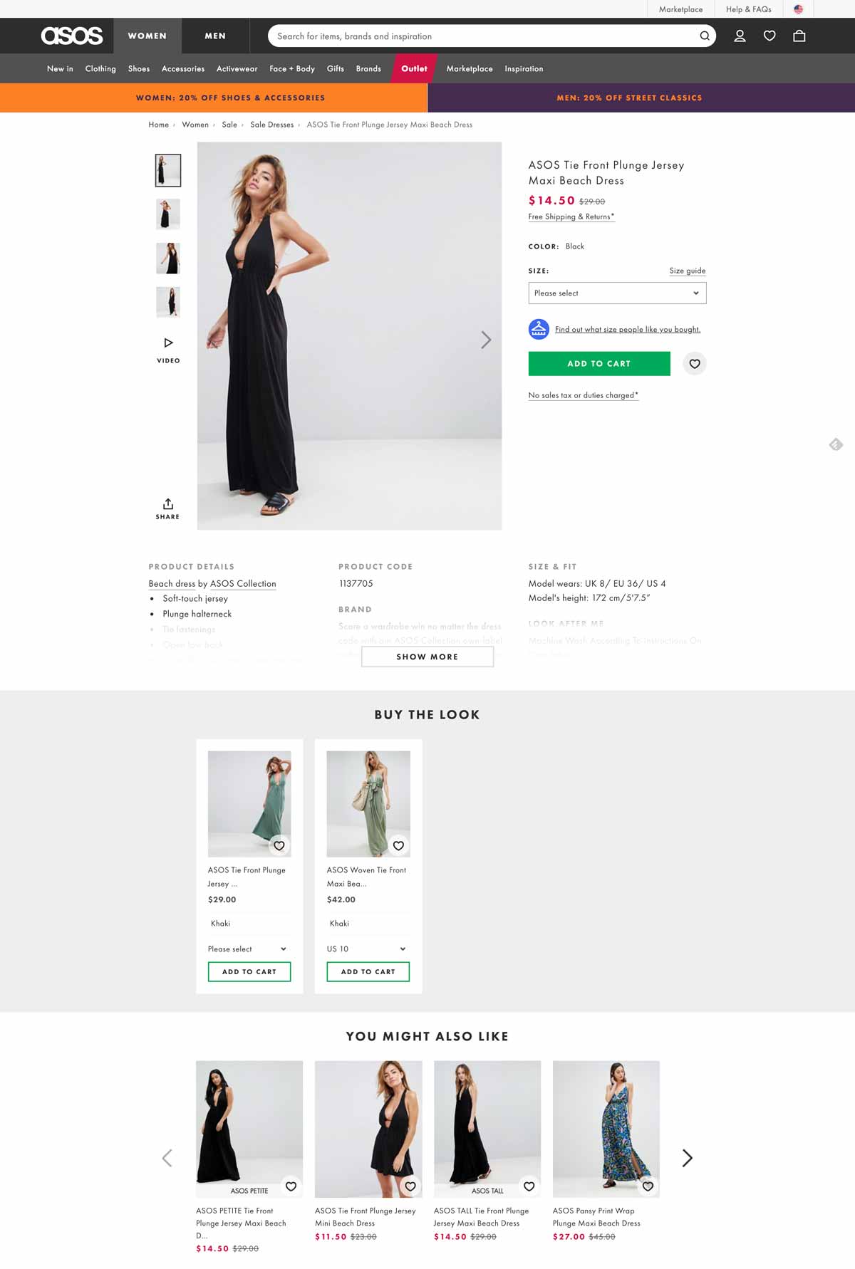
Below is a great example of a check-out page from ASOS that includes all the necessary details for a clear and easy review. Users know exactly which product they will purchase as well as the color, size, and quantity.
When crafting your cart page, be sure to follow this example and include these elements:
Having all these elements shown to your customers allows them to quickly review their order and have confidence in their purchase.
Including all relevant details will decrease the percentage of cart abandonment that is typically caused by the lack of precise information.
2. Choose a clear, user-friendly color code
There have been many studies about the psychology behind colors. However, there’s no single answer on which color will fit all websites and solve all abandonment rate problems.
One thing that we do know for sure is that visitors love harmony and clear designs when it comes to UX.
Let’s look at the luxury shoe brand Jimmy Choo. For their check-out page, they kept a simple design by using a black button that clearly stands out, making it straightforward to click.
Famous shoe-maker Jimmy Choo uses an elegant yet efficient black and white color code in order to clearly display the information on the cart page.
Notice that the checkout button efficiently stands out as the only black button on the page, making it extremely straightforward to click it.
3. Display explicit and detailed information about shipping and returns
What is the number one reason behind shopping cart abandonment in the US? Hidden shipping costs.
Online buyers despise hidden and last-minute shipping costs. As you can see in the image below from Baymard’s study, it’s by far the most popular reason for cart abandonment compared to others.
Displaying transparent shipping and return policies is a key factor in enhancing conversion and gaining customers’ trust.
4. Craft clever information hierarchy and non-competing CTAs
Information hierarchy is the structure used to display and rank information according to its importance.
While designing cart pages, pay attention to the logic behind buttons, columns and titles as they will heavily influence the users’ perception.
You can use various colors in your CTAs (preferably matching your brand) although we recommend a maximum of 3-4 colors at a time.
Colors do help you gain visitors’ attention, so use them wisely:
Highlight important information
Use a distinct color to distinguish the CTA
Use lines or columns to structure your page
In the image below, Zappos, a USA-based shoe marketplace, does a great job of providing an efficient and clean shopping experience.
The shopping cart page skillfully guides customers through the buying journey; we appreciate the neat layout emphasized by a simple 3-step color code (orange=very important; blue=important; grey=secondary).
5. Deploy payment options that your users love
Having different payment options is a necessity in today’s ultra-competitive e-commerce environment.
If you run an international e-commerce store, bear in mind that payment methods differ from one country to another: what’s used in North America isn’t necessarily the same as in Europe or in Asia.
To combat this, try to redirect customers based on their IP location to offer them a personalized experience based on the local currency and their preferred payment methods.
In the image above, Adidas provides 6 different payment methods including Paypal, VISA and Apple Pay. This is an absolute necessity for large and global stores.
6. Show security seals and reassuring elements
In the same report from Baymard, the lack of trust in the payment accounted for 18% of abandoned cart rates. Trust seals, or trust badges, are very important to show your users that your site is legitimate.
In fact, they actually matter more than peer recommendations or trustworthy design. According to Baymard, here are the badges that give visitors the highest perception of a safe and secure site:
7. Offer phone, chat or email assistance
Displaying a clear contact number and address details can impact your user’s level of trust. Shoppers want to make sure that your business is legitimate and not an online scam.
Furthermore, your visitors want to feel that there are actual humans behind your website.
Offering a live chat or phone assistance service right on the cart page is a great option to gain customers’ trust, legitimize your business and humanize your brand identity.
Wondering how to design your chatbox? Take a look at Victoria’s Secret’s page in the image below. They have chosen their most vibrant color, pink, to increase their call-to-action visibility.
8. Add a “continue shopping” option
A “continue shopping” option is a smart way to offer your visitors a way to abandon their cart without leaving your website. They’ll have the freedom to continue browsing after they’ve already added items to their cart.
As some online shoppers actually use carts as “wishlists,” they can store items that they intend on purchasing later on.
9. Display legible thumbnail images
There’s nothing more annoying than a tiny thumbnail that barely helps to identify a product.
When customers review a product, you should give them the opportunity to see it correctly in a convenient size and resolution on both mobile and desktop.
In the image above, Apple makes it very easy to distinguish the chosen product. The image used is bright and clear. Their customers will be absolutely certain that they’ve got the right item in their bag.
10. Push complementary products
Offering complementary product recommendations, or cross-selling, is nothing new in the e-commerce world.
However, displaying complementary products inside the shopping cart page is something worth testing if it could bring you a higher AOV.
An optimized shopping cart page is crucial to sales.
The shopping cart page is the last step your visitors take before their purchase. In this step of their digital user journey, it’s important to ease customer concerns in any way possible and promote a seamless checkout flow.
Every online e-commerce should be testing different elements of its cart page to find what works best for converting passive visitors into active customers.
The conversion rate on e-commerce homepages is around 2-2.5% on average, according to a study from Adobe Business, while the conversion rate for visitors who land directly on a product page is around 7%.
Can you see the difference between these two types of pages?
Product pages are one of the most essential pages to continually optimize if you want to focus on boosting your e-commerce conversions.
In this article, we will be touching on what a successful e-commerce page looks like, five elements to focus on while optimizing your pages, and ten examples of effective product pages in action.
Let’s dive in.
What does a successful e-commerce product page look like?
Across all industries, the average user spends less than 54 seconds on any given page, according to a digital report from Contentsquare.
You have less than one minute to create a memorable experience and clearly display your information. For product pages, it’s clear to see why they need to be captivating.
The truth is that every second matters in the conversion journey.
So in order to capture your visitors’ attention, you’ll have to capitalize on five elements. Perfecting these elements will require testing and patience.
Want to get started on A/B testing for your product pages?AB Tasty is a great example of an A/B testing tool that allows you to quickly set up tests with low code implementation of front-end or UX changes on your web pages, gather insights via an ROI dashboard, and determine which route will increase your revenue.
The 5 mandatory elements of an effective e-commerce product page.
1. Eye-catching, engaging visuals
It’s no secret that our brains love visuals since they process images much easier and faster than text. Images give us more context.
In fact, visuals are so deeply entrenched in our decision-making mechanisms that they should be a priority for any e-commerce website.
In order to provide your visitors with some eye-catching visuals for your products, here are a few tips:
Humanize the product
People love to envision themselves wearing or using a product. It gives them an idea of whether or not the product is a good fit for them. Thus, it’s important to remember to humanize the product to allow visitors to see themselves as potential customers.
Use whitespace
Whitespace has many uses in graphic design, but most importantly, it helps the eye focus on what matters the most.
Adding whitespace strategically around your picture will help reduce noise and increase clarity when it comes to showcasing a complex product.
Less can be more.
Only use HD
It goes without saying that high-definition visuals are incredibly important.
Your potential customers should be able to fall in love with your product on any screen resolution. Give them your best!
Allow for zoom-in and zoom-out features
Many people are interested in details, especially when it comes to complex or expensive products.
Whether they’re looking for a closer glance at that little button on the side of the jacket, the texture, or the matte finish – allow your potential customers to zoom in and out on your products.
Add videos
More engaging than photos, videos also help you tell your customers a story.
Videos can help depict why your product is superior and what they get for $200. With that being said, video-making can be costly and time-consuming, so focus your efforts on your best-sellers.
An astounding average of 56% of web traffic worldwide comes from mobile devices.
Mobile optimization has shifted from just an idea to a top priority. It’s essential to make sure that your product images and descriptions are responsive on all mobile devices.
2. A unique, awesome product description
A study led by Shotfarm showed that “detailed descriptions” ranked first in the top 3 factors that influence a customer’s decision to buy, higher than “reviews” (in the 2nd position) and “price” (in the 3rd position).
Simply put, your product descriptions should focus on their unique value proposition, i.e. their main benefit.
As you already know, an average visitor doesn’t spend too long on one page, so it’s important to be impactful.
As Neil Patel puts it, you have to sell benefits, not just features. This means that you have to emphasize the result, not the product.
Clearly, buyers are expecting to gain something from your product, and it’s your task to convince them that they will.
Let’s look at an example from Innocent:
In their product descriptions, Innocent emphasizes the few elements that make their smoothies “great” and “healthy.”
In the image above, you can see that they even highlighted in green that their smoothie is, “a source of vitamins C, B2, B3 and B6 which can help reduce tiredness and fatigue…”
3. Viral social proof
Social proof comes in many forms: reviews, customer testimonials, videos, ratings, etc.
It doesn’t matter what type of social proof you use, as long as it’s relevant to your audience.
Reviews and classic star ratings typically work well for most e-commerce websites as long as they are real and genuine, as most internet buyers are able to spot fake reviews.
4. Addictive product suggestions
Product suggestions are a great way to increase the average order value, cross-sell, upsell, and allow users to explore your products.
Therefore, it’s extremely important to display additional products on your product pages in case your visitors want to see something else.
Otherwise, you may land unqualified visitors on your product pages without giving them the opportunity to discover other products that would fit their needs.
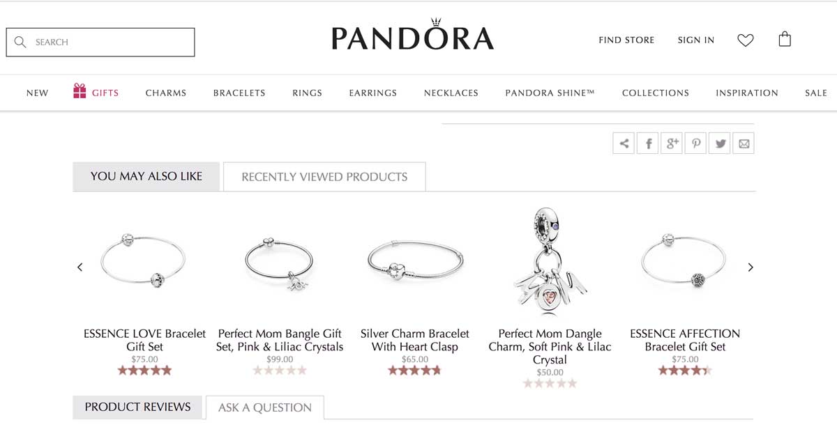
In the image below, you can see that Pandora does a great job of suggesting related products for its customers. The outline is clear and evocative.
Jewelry maker Pandora does a great job at suggesting related products for its customers. The outline is clear and evocative.
5. Resourceful guidance & help
Can you guess the number one source of frustration for online buyers?
Not being able to touch or interact with the product.
To help overcome this lack of physical touch in an online buyer journey, your website should display clear information about:
Size guides
Specific materials
Refund policy
Shipping fees
Prices and VAT
Knowing this stumbling block for many online shoppers, it’s recommended for e-commerce brands to implement a live chat feature, or at least a very detailed Q&A, to help increase conversion rates and decrease abandon cart rates.
Now that you’ve been through the best practices of e-commerce product pages, it’s time to get inspiration by browsing our selection of effective e-commerce product pages.
Note: we’ll cover examples from various industries so that you, as a leader or marketer, can find inspiration for your field.
Let’s dive into our top picks for inspiring successful e-commerce product pages.
10 of the most successful e-commerce product pages
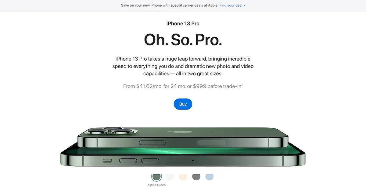
1. Apple – Technology Industry
When it comes to technology, Apple is a world-class example of best practices for e-commerce product pages.
What we love:
Clean and refined design
The use of whitespace and large pictures
Lovely CSS animations
Good emphasis on benefits as you scroll down (not pictured above)
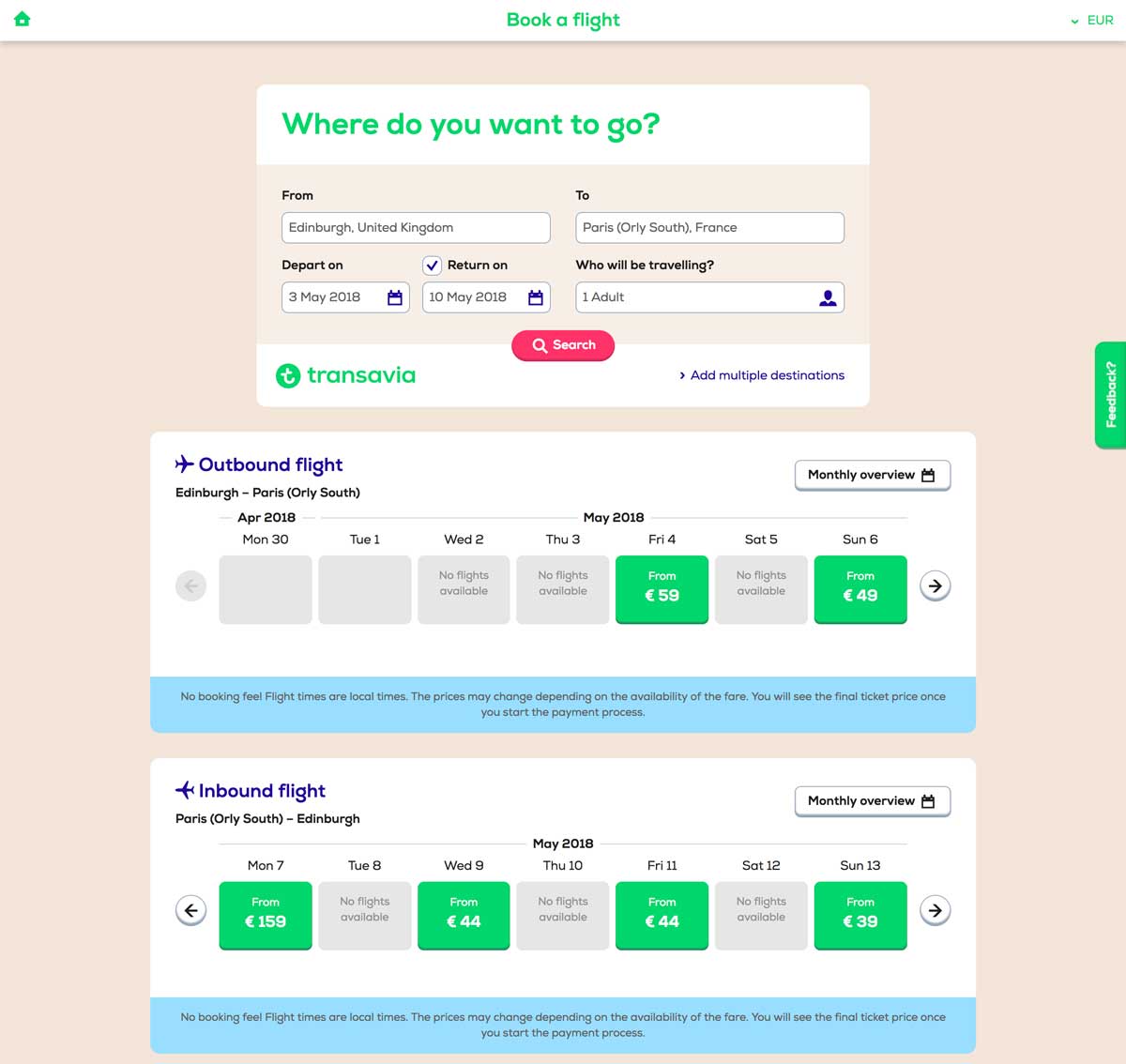
2. Transavia – Travel Industry
Transavia is a Dutch low-cost airline that is a subsidiary of the Air France-KLM group.
Their website showcases a lot of best practices to be applied to travel and airline companies.
While they’re many websites on the market, Transavia does a great job of converting visitors into travelers. Their website uses clever paths and UX design to lead you through your buyers’ journey.
What we love:
Engaging “3 parts” structure for clarity’s sake
Simple visual brand identity (green and blue)
Smart information hierarchy
User-friendly simplified search engine
TripAdvisor’s reviews integration
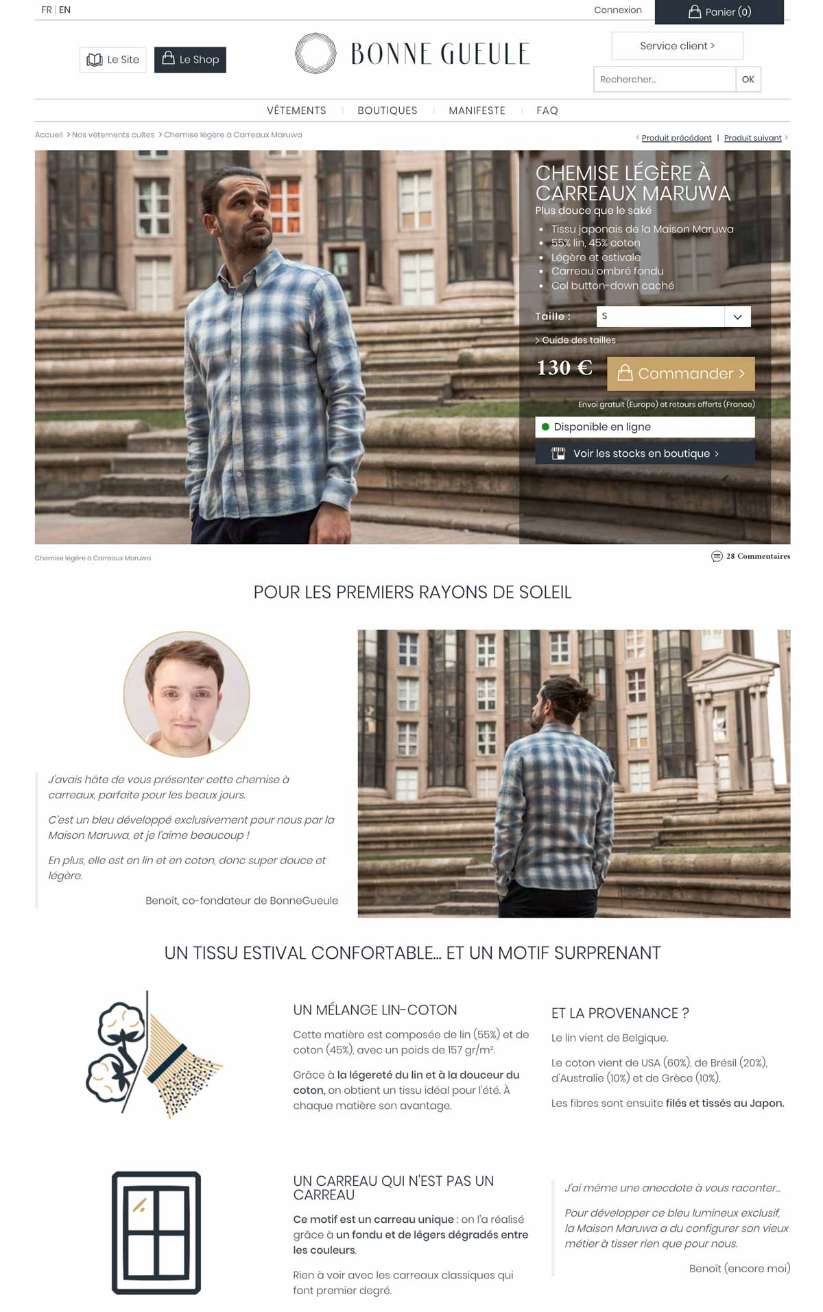
3. Bonnegueule – Fashion / Retail
BonneGueule is a French company specializing in men’s fashion.
While the company is still fairly young, it has rapidly grown into a 1M+ visitors/month e-commerce website, thanks to its amazing content marketing strategy and jaw-dropping e-commerce product pages.
Simply put, they use extremely long product pages where they cleverly use storytelling techniques, photos, and videos to justify the hefty price at which they sell their products.
What we love:
They display in-store availability
The clever size guide
The use of “context” photos
Amazing storytelling and videos
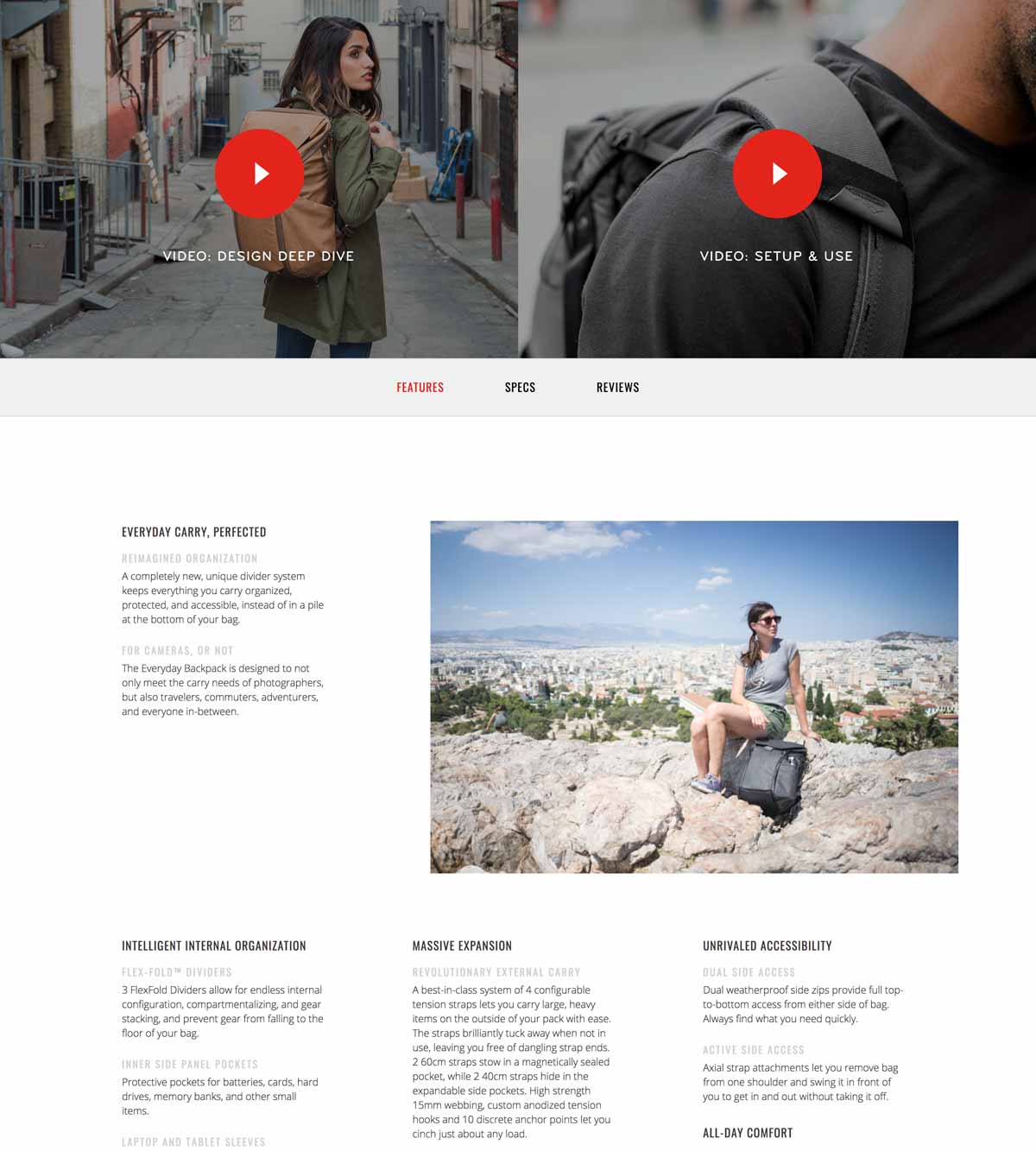
4. Peak Design – Fashion / Travel Accessories
Peak Design is an American e-commerce company that has successfully raised over $14M since 2011 thanks to its clever bags, pouches and travel kits made famous on Kickstarter.
Notice how clear and detailed their photos are, enhanced by the use of white space and a clear color code on the product page (black/red combo).
What we love:
A clear and clever layout
Generous photo gallery
In-depth, 6-minute-long product video
The emphasis put on benefits
What could be improved:
Large text paragraphs
Unclear information hierarchy
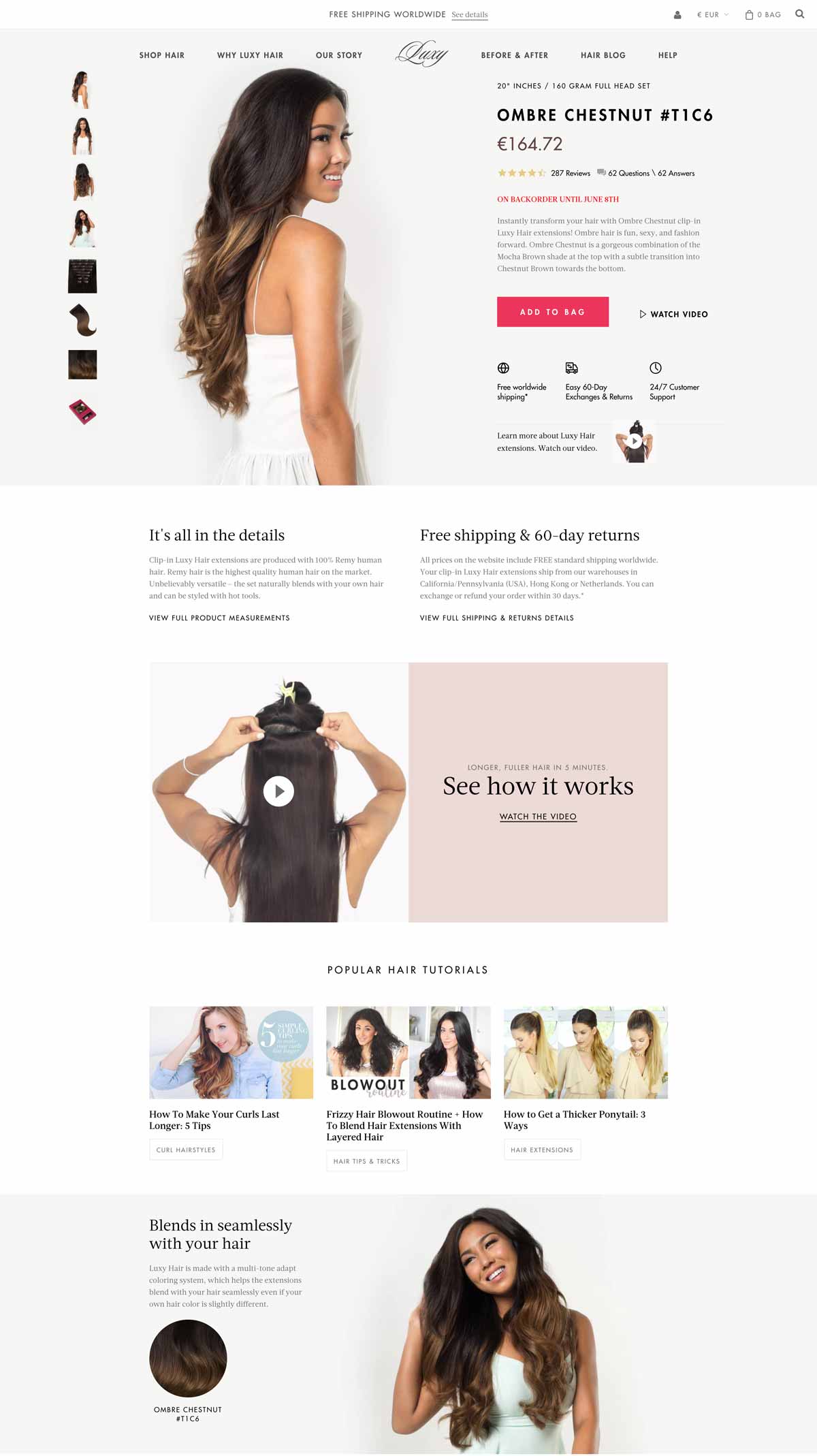
5. Luxyhair – Beauty
Luxyhair is an e-commerce website specializing in hair extensions – and it nails it.
The team cleverly uses a 3-step funnel prior to landing on their product page: First, you’ll start by choosing your collection, then your hair thickness, and finally your hair color.
This 3-step mechanism is a brilliant way to increase conversions by offering just the right product for any visitor.
What we love:
Seamlessly integrated product pictures
Useful information about shipping/return policy
Effective use of product video
Smooth integration of additional content (tutorials)
Complete FAQ
Amazon-like customer reviews and Q&A
Live-chat
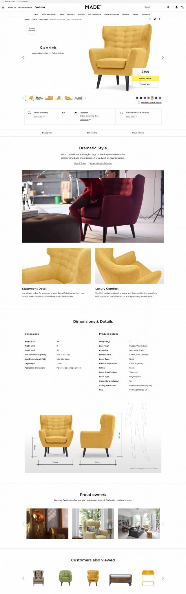
6. Made.com – Home / Furniture
Made.com is a British home furniture e-commerce website renowned for its bold designs and web-to-store experience.
At first glance, you can tell that their visuals flawlessly blend with the product page. They’ve also added context-related pictures so that you can immerse yourself in the product.
What we love:
Clear shipping/return policy
Stunning visuals
Size comparison
Smart product video
Pictures from customers
What could be improved:
Adding instructions for product maintenance
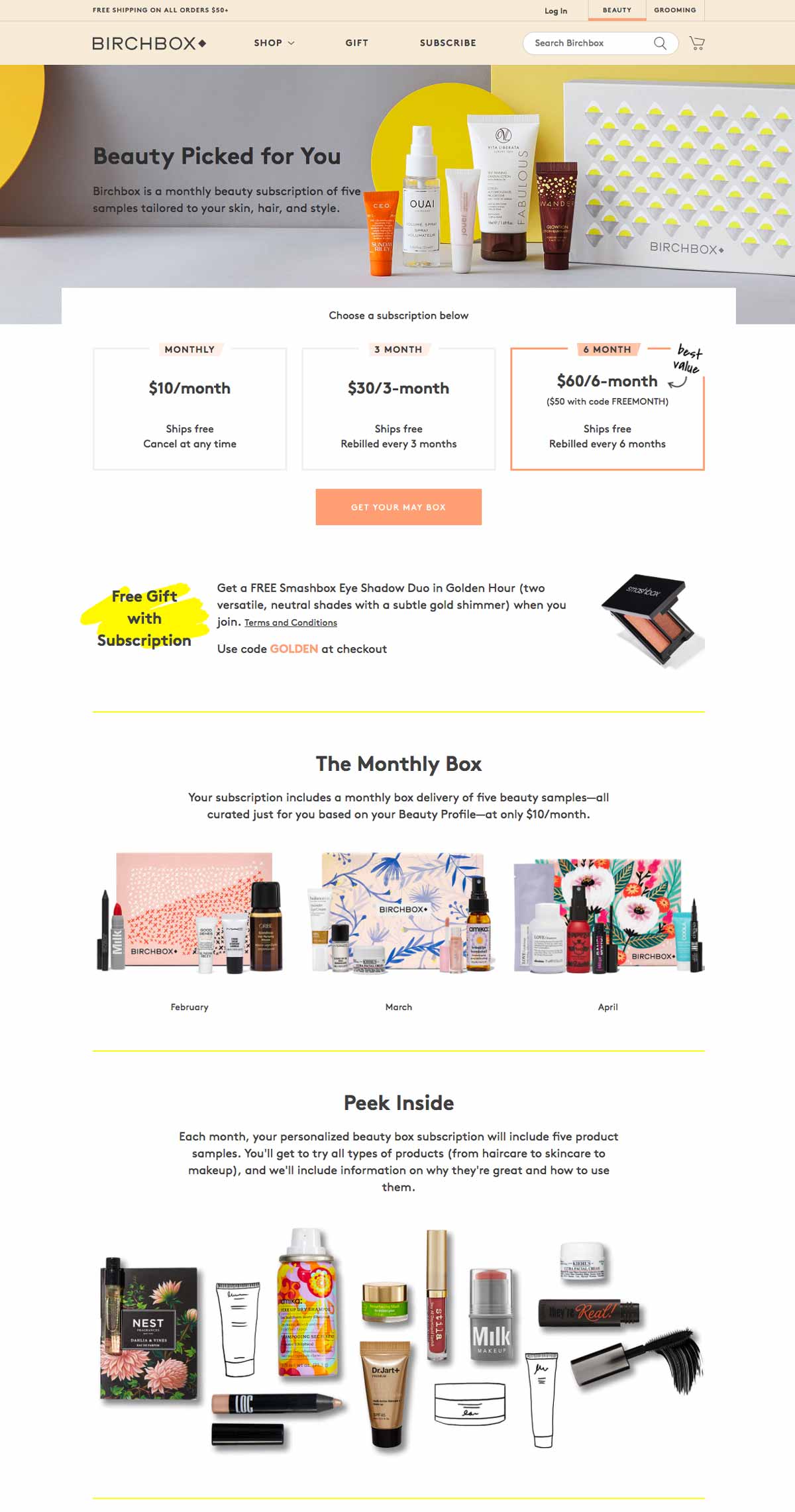
7. Birchbox – Beauty / Makeup
This famous, subscription-based French-American website sells monthly beauty boxes delivered to your home with personalized products based on your preferences inside.
What we love:
Simple and clean visuals
Attractive layout and colors
Free gift offered with subscription
Complete FAQ
Instagram integration: good social proof
8. Asos – Fashion / Apparel
Asos is a UK-based company that also operates in the US and in Europe.
Their pledge to provide affordable designs and fashion helped them reach significant market shares in the fashion industry in several countries.
They opted for a rather simple but neat outline that successfully conveys their brand image.
What we love:
Distinctive, stary green call-to-action
Sober yet effective design
Plenty of context photos and a video
Product recommendations
Information about shipping & returns
Size guide
What could be improved:
Adding customer reviews on their product pages
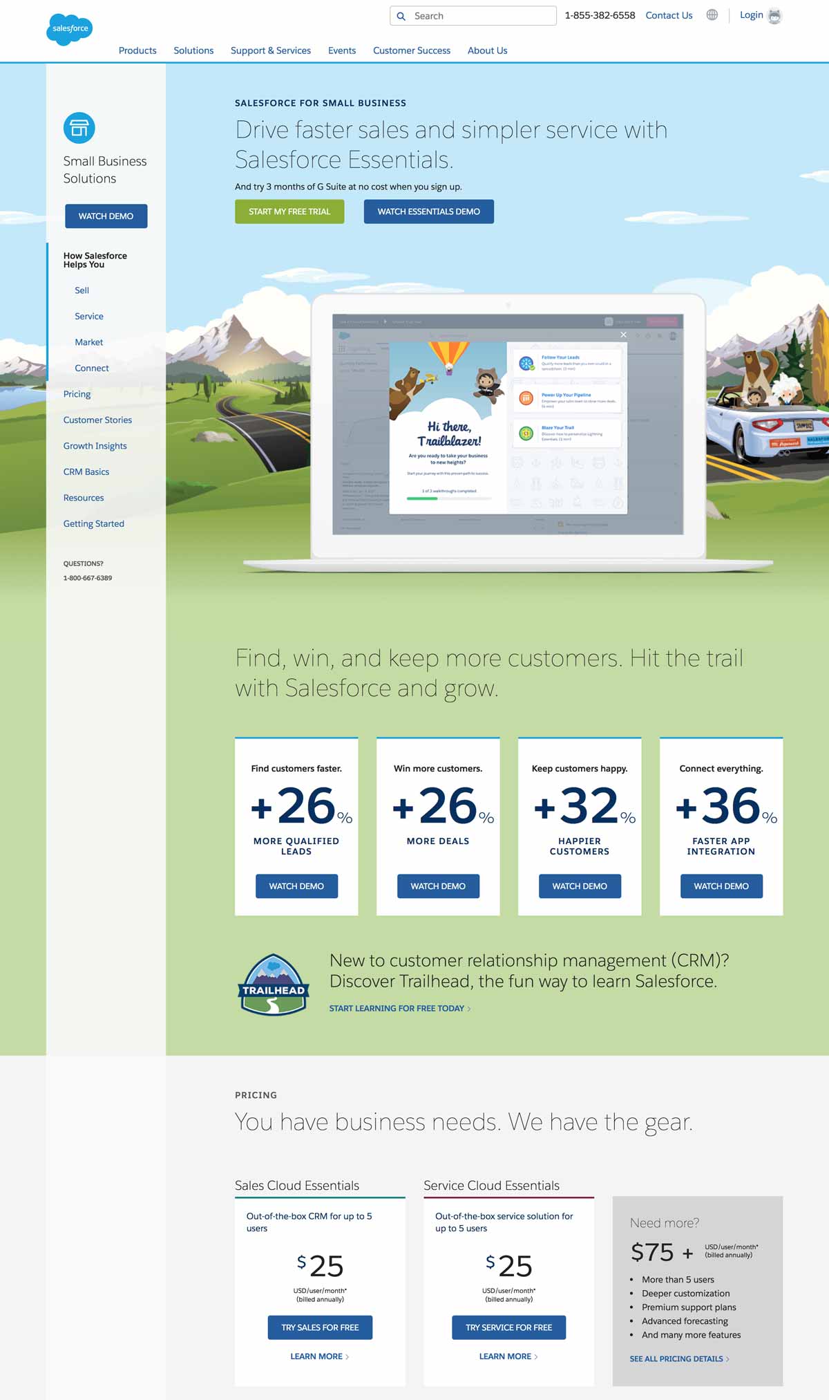
9. Salesforce – Software, CRM, Business Solutions
We couldn’t end this article without mentioning at least one notable business solutions provider.
Salesforce is undoubtedly one of the most commonly used, famous CRM and sales management tools.
Their small business solutions product page quickly emphasizes the benefits over the features, such as: “Drive faster sales and simpler service with Salesforce Essentials.”
They also display actual results for their customers so as to convince them, even more, to subscribe: “+26% more deals, +32% happier customers.”
What we love:
Catchy, original designs
Real emphasis on actual benefits
Free trial
Video demo
Clear, straightforward pricing plans
Online chat + phone assistance
Genuine customer testimonials
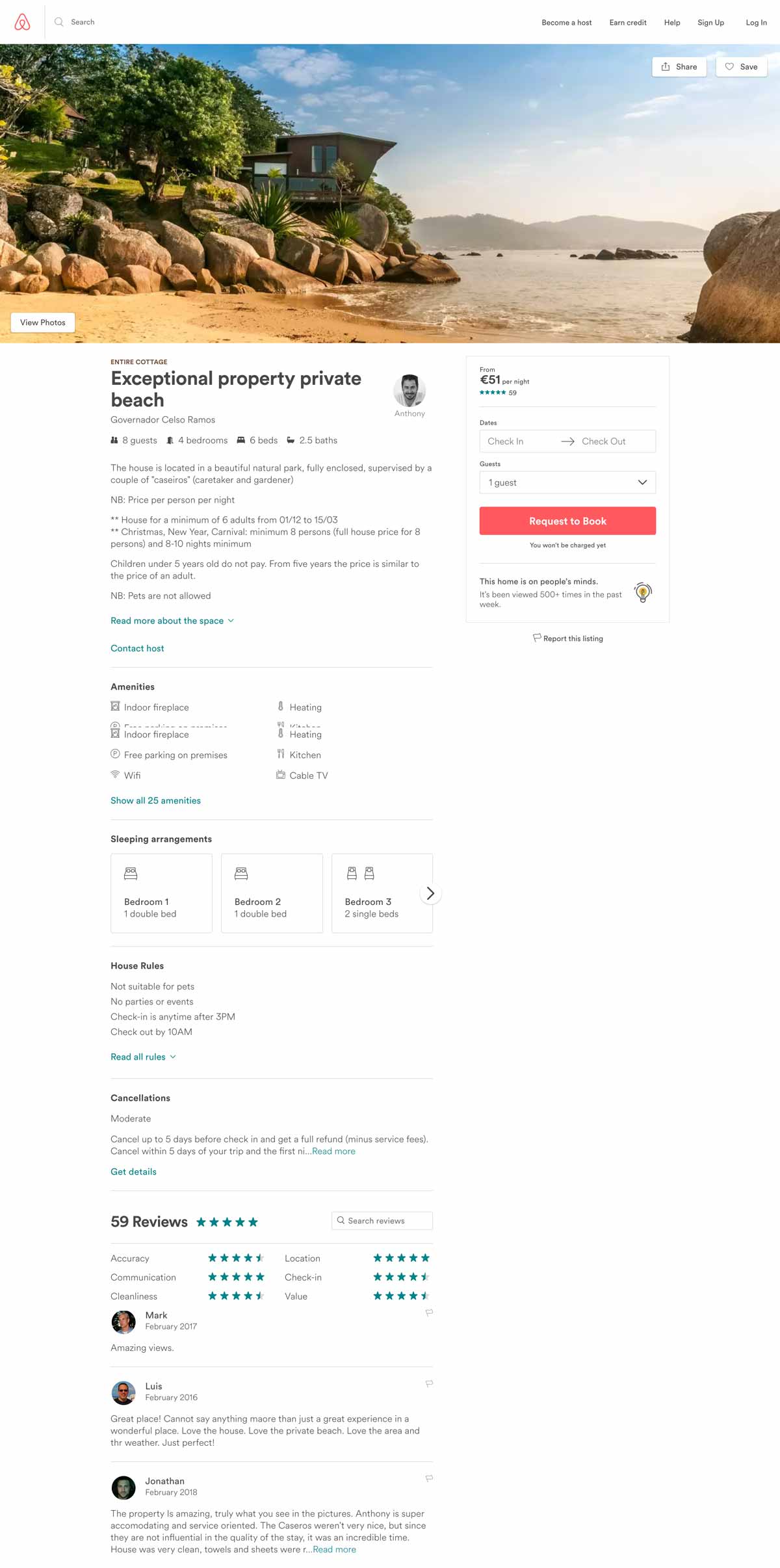
10. Airbnb – Travel / Hotel / Accommodation
Airbnb remains a masterclass of UX design and product page efficiency from which a lot of travel or tourism-related websites can seek inspiration.
First of all, they kept an insanely simple and efficient page layout that makes it really intuitive to browse.
Then, notice how they’ve put the photo gallery at the top of the page? Airbnb knows that photos are the most important aspect of any travel website: visitors need to envision themselves swimming in that paradisiac pool.
Finally, Airbnb successfully mastered the art of utilizing customer reviews: they are deeply integrated into each product page (except when there are no reviews, of course…) so that their role as social proof is maximized: people just love to read reviews.
What we love:
Clear design, good information hierarchy
Flashy call-to-action
Seamless integration of travelers’ reviews
Convenient map at the bottom of the page
Similar listings to jump from one house to the other
Conclusion
After reading through this article, you see why e-commerce product pages are such a big deal. What works well in one industry may not have the same success rate in others. Due to this, it’s essential to know your customers and test different UX designs to see what gives you optimal results.
Optimizing these types of pages to suit your customers’ needs better is the best way to increase your conversions.
“Failure” can feel like a dirty word in the world of experimentation. Your team spends time thinking through a hypothesis, crafting a test, and finally when it rolls out … it falls flat. While it can feel daunting to see negative results from your a/b tests, you have gained valuable insights that can help you make data-driven, strategic decisions for your next experiment. Your “failure” becomes a learning opportunity.
Embracing the risk of negative results is a necessary part of building a culture of experimentation. On the first episode of the 1,000 Experiments Club podcast, Ronny Kohavi (formerly of Airbnb, Microsoft, and Amazon) shared that experimentation is a time where you will “fail fast and pivot fast.” As he learned while leading experimentation teams for the largest tech companies, your idea might fail. But it is your next idea that could be the solution you were seeking.
“There’s a lot to learn from these experiments: Did it work very well for the segment you were going after, but it affected another one? Learning what happened and why will lead to developing future strategies and being successful,” shares Ronny.
In order to build a culture of experimentation, you need to embrace the failures that come with it. By viewing negative results as learning opportunities, you build trust within your team and encourage them to seek creative solutions rather than playing it safe. Here are just a few benefits to embracing “failures” in experimentation:
Encourage curiosity: With AB Tasty, you can test your ideas quickly and easily. You can bypass lengthy implementations and complex coding. Every idea can be explored immediately and if it fails, you can get the next idea up and running without losing speed, saving you precious time and money.
Eliminate your risks without a blind rollout: Testing out changes on a few pages or with a small audience size can help you gather insights in a more controlled environment before planning larger-scale rollouts.
Strengthen hypotheses: It’s easy to fall prey to confirmation bias when you are afraid of failure. Testing out a hypothesis with a/b testing and receiving negative results confirms that your control is still your strongest performer, and you’ll have data to support the fact that you are moving in the right direction.
Validate existing positive results: Experimentation helps determine what small changes can drive a big impact with your audience. Comparing negative a/b test results against positive results for similar experiments can help to determine if the positive metrics stand the test of time, or if an isolated event caused skewed results.
In a controlled, time-limited environment, your experiment can help you learn very quickly if the changes you have made are going to support your hypothesis. Whether your experiment produces positive or negative results, you will gain valuable insights about your audience. As long as you are leveraging those new insights to build new hypotheses, your negative results will never be a “failure.” Instead, the biggest risk would be allowing a status quo continuing to go unchecked.
“Your ability to iterate quickly is a differentiation,” shares Ronny. “If you’re able to run more experiments and a certain percentage are pass/fail, this ability to try ideas is key.”
Below are some examples of real-world a/b tests and the crucial learnings that came from each experiment:
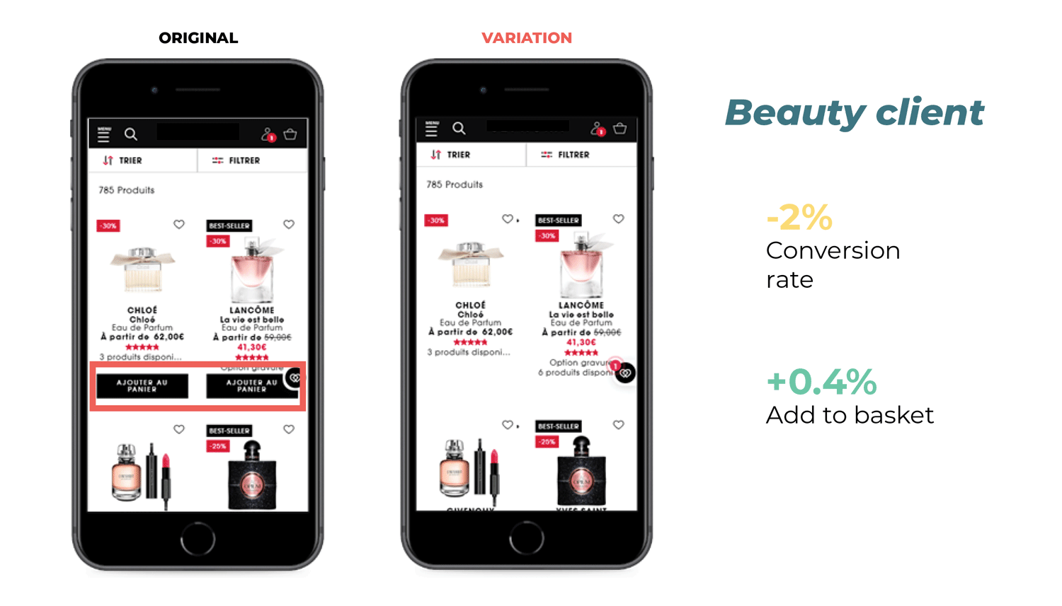
Lesson learned: Removing “Add to Basket” CTAs decreased conversion
In this experiment, our beauty/cosmetics client tested removing the “Add to Basket” CTA from their product pages. The idea behind this was to test if users would be more interested in clicking through to the individual pages, leading to a higher conversion rate. The results? While there was a 0.4% increase in visitors clicking “Add to Basket,” conversions were down by 2%. The team took this as proof that the original version of the website was working properly, and they were able to reinvest their time and effort into other projects.
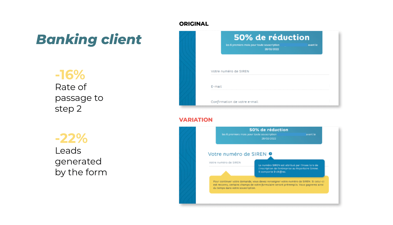
Lesson learned: Busy form fields led to decreased leads
A banking client wanted to test if adjusting their standard request form would drive passage to step 2 and ultimately increase the number of leads from form submissions. The test focused on the mandatory business identification number field, adding a pop-up explaining what the field meant in the hopes of reducing form abandonment. The results? They saw a 22% decrease in leads as well as a 16% decrease in the number of visitors continuing to step 2 of the form. The team’s takeaways from this experiment were that in trying to be helpful and explain this field, their visitors were overwhelmed with information. The original version was the winner of this experiment, and the team saved themselves a huge potential loss from hardcoding the new form field.
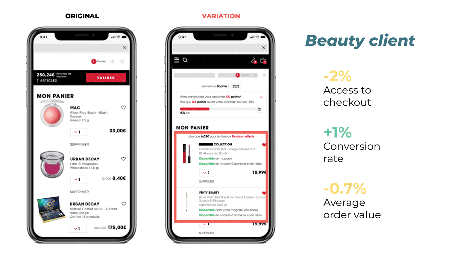
The team at this beauty company designed an experiment to test whether displaying a message about product availability on the basket page would lead to an increase in conversions by appealing to the customer’s sense of FOMO. Instead, the results proved inconclusive. The conversion rate increased by 1%, but access to checkout and the average order value decreased by 2% and 0.7% respectively. The team determined that without the desired increase in their key metrics, it was not worth investing the time and resources needed to implement the change on the website. Instead, they leveraged their experiment data to help drive their website optimization roadmap and identify other areas of improvement.
Despite negative results, the teams in all three experiments leveraged these valuable insights to quickly readjust their strategy and identify other places for improvement on their website. By reframing the negative results of failed a/b tests into learning opportunities, the customer experience became their driver for innovation instead of untested ideas from an echo chamber.
Jeff Copetas, VP of E-Commerce & Digital at Avid, stresses the importance of figuring out who you are listening to when building out an experimentation roadmap. “[At Avid] we had to move from a mindset of ‘I think …’ to ‘let’s test and learn,’ by taking the albatross of opinions out of our decision-making process,” Jeff recalls. “You can make a pretty website, but if it doesn’t perform well and you’re not learning what drives conversion, then all you have is a pretty website that doesn’t perform.”
Through testing you are collecting data on how customers are experiencing your website, which will always prove to be more valuable than never testing the status quo. Are you seeking inspiration for your next experiment? We’ve gathered insights from 50 trusted brands around the world to understand the tests they’ve tried, the lessons they’ve learned, and the successes they’ve had.
Any business selling products or services online has a conversion funnel — but not everyone realizes it. If you’re unsure what a conversion is or how you can refine yours to sell more online, you’re in the right place. In this post, we’re going to take you through everything you need to know about conversion funnels. We’ll start with the basics — what conversion funnels are and the three key stages — before moving on to some of the most effective strategies to improve your funnels to increase sales. Let’s get stuck in!
In this article, we’ll cover:
[toc]
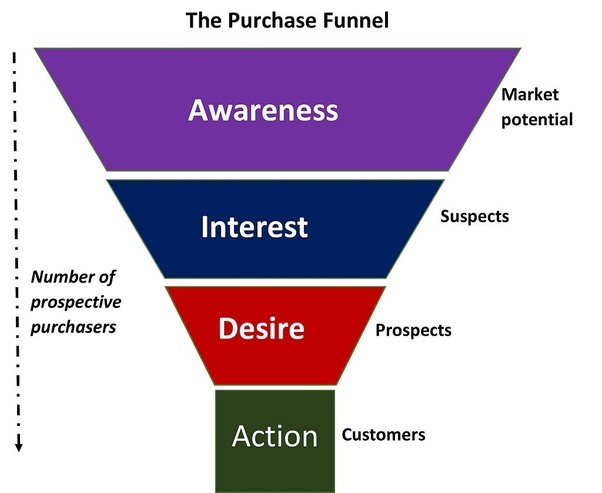
What is a conversion funnel?
A conversion funnel is a process that takes potential customers on a journey towards buying your products or services. They’re the cornerstone of all e-commerce business models, guiding potential customers from the moment they first become aware of your brand to the moment they make a purchase and beyond.
If you’re new to conversion funnels, think about the shape of a funnel — it’s wider at the top and narrower at the bottom. This represents the flow of people through your marketing strategy. Not everyone who becomes aware of your business will go on to become a paying customer. It’s like brewing coffee using a drip filter — a large volume of coffee grounds go into the top of the brewing equipment and then the funnel filters the high-quality stuff out of the bottom into your mug. A sales funnel works in the same way. The goal is to get as many relevant leads into the top of the funnel as possible, filtering out unsuitable prospects to leave your ideal customers ready to buy from you.
When you optimize your conversion funnel, you maximize the impact of your online marketing strategy and boost sales. This isn’t a once-and-done exercise, but something you need to continually refine throughout your business life. Do you want to know how to do it?
What’s the difference between a conversion funnel and a sales funnel?
The terms conversion funnel and sales funnel are often used interchangeably, but are they the same thing? The answer to this question is no, although they are closely related. A sales funnel typically starts when a potential customer enters the sales pipeline. This can happen online (in an e-commerce environment) as well as offline. However, a prospect typically doesn’t enter your sales funnel until they’re already familiar with your brand and your products or services.
It can take a while to get to this point in the online world, particularly if you’re targeting people who have never heard of your brand before. It takes time to build a connection and trust with your audience.
This is where a conversion funnel comes in. Here, the focus isn’t just on making a sale. It’s about making a connection with your audience, generating leads, and then taking those leads on a journey with your company. Potential customers might come into your funnel cold, without much awareness of who you are or what you do. Over time, your funnel will warm them up, build trust in your offer, and get them ready to buy. It encapsulates the whole process — from the first contact through to purchasing.
The three conversion funnel stages
There are many different conversion funnel models out there. All of them broadly suggest the same thing: breaking the process down into several conversion funnel stages the leads must travel through before making a purchase. Although a customer may enter or exit the funnel at any stage, your personalized model sets out how you intend customers to connect with your business.
The exact model will look different for every organization, but here are the three stages we suggest you follow.
Stage 1: Building awareness at the top of the funnel
The top of the funnel is all about making people aware of your brand and capturing leads. This stage is arguably the most crucial. If you don’t get people into your funnel, how are you going to sell to them? This critical step is often referred to as the awareness stage, and the exact strategy you use to do this will depend on your ideal customer. Who are they? Where do they hang out? What are their fundamental problems and challenges? Why would they be interested in what you have to offer them? The answers to these questions can provide useful directions during the awareness stage. Remember: this isn’t about you; it’s about the customer. Here are a few things that should be happening at the top of the funnel.
Content marketing
To grab attention online, you’re going to need content. This content can take many forms, so it’s essential to think about the types of content your audience is most likely to consume. For example, TikTok videos will likely appeal to 18 to 24-year-olds, but they might not be the best option if you’re targeting an older demographic.
You should consider both onsite and offsite content when outlining your content marketing strategy. An effective conversion funnel needs both. Offsite content helps capture attention and attract people to your website. In contrast, onsite content engages your audience and encourages them to take the next step, such as signing up for your mailing list.
Marketing campaigns
Alongside your content marketing strategy, you should also consider the marketing campaigns you will be running to get people to engage with this content. How will you get your content seen? How will you capture users’ attention? Are you only operating online, or will you use offline marketing to generate leads?
Often, e-commerce businesses are quick to dismiss offline marketing campaigns as irrelevant. However, highly targeted offline campaigns can be extremely useful. The online marketplace is crowded! If you can think of innovative ways to reach your audience offline and direct them to your online content, it could turn out to be a cost-effective way to generate leads for your conversion funnel.
You could also consider how you might automate some of your marketing campaigns. Creating evergreen campaigns that can run in the background while you and your employees focus on other tasks is useful to maximize profits. In essence, it means you can be generating leads for your business while you sleep.
Lead capture
Lead capture is the final step of the awareness stage. It’s where you move your prospects from the top of your conversion funnel to the middle. Once you’ve directed a potential customer to your website and encouraged them to engage with your content, what’s next? Each piece of content your audience engages with on your website should have a call to action — something that tells them what action to complete next.
To achieve this, you might want to consider a lead magnet. This can be something as simple as a discount code. But, for maximum results, you could develop something that helps solve a problem directly related to the product or service you’re offering.
Not only does this ensure you’re capturing highly qualified leads, but it also means people are likely to sign up even when they’re not ready to make a purchase. Given the point of a conversion funnel is to get them ready to buy from you, this is a vital point to consider when outlining your content marketing strategy.
Once you have that email address, it’s time to move on to the second stage of the conversion funnel: nurturing your audience to build desire for your products or services.
To maximize the number of leads you’re capturing, you should focus your stage one activities across a range of digital marketing channels. Here are some of the most popular options:
Social media
Given there are almost 4 billion social media users worldwide (over half the world’s population), it’s no surprise social media marketing is one of the most popular ways to generate leads. That said, it’s important to note it isn’t an easy option! Many business owners expect social media to be a fast and cheap way to grow an audience. Still, it takes time and persistent effort to get results — just like any other marketing strategy.
Work with a professional to develop a social media marketing plan that helps you stand out from the crowd. Many businesses use social media to attract people into their conversion funnel, but few do it well.
Paid search
What’s the first place you turn to when you need information? It’s estimated there are around 2 trillion Google searches every year — so advertising your content on Google could potentially be very lucrative! Unlike social media marketing, people using search engines are actively looking for the information you’re providing. To get the best click-through rate, make sure the phrases you’re targeting are directly relevant to the content. And test campaigns with a small budget before increasing your spending.
Organic search
It’s also a good idea to optimize your content for organic search. While this isn’t a short-term strategy, Search Engine Optimization (SEO) can deliver large volumes of traffic to your website over time. Focus on creating evergreen content — content that doesn’t become irrelevant or outdated and can appear in organic searches for many years to come. When you gain website visitors organically from search engines, you improve your ability to build a list of qualified leads, improving the quality of people entering your conversion funnel.
Stage 2: Nurturing your audience
Many online businesses make the fundamental mistake of pushing for a sale too soon. While you can (and should) always have an option for potential customers to buy from you on their terms, you should design your conversion funnel to nurture your leads, building trust with your brand before moving them into the sales pipeline.
Staying in contact
Once a potential customer has told you they want to hear more from you, it’s essential to stay in touch with them. If you can, you should aim to use multiple channels to do this. Encourage them to follow you on social media, re-target them with relevant online content, and send them regular emails. Research consistently shows the more opportunities a potential customer has to engage with your brand online, the more likely they will buy from you.
In short, it’s not enough to let people know you exist. If you want to sell to them, you need to put in the work to keep them engaged!
Positioning your products and services
As you stay in touch and nurture your audience, you should also ensure each lead is familiar with your products and services. This step isn’t about pushing for the sale — we’ll come back to this in the next stage — but you should be introducing your offering interestingly and engagingly. Essentially, we need your leads to be ready to make a purchase when you deliver your sales pitch. To get to this stage, they need to know what you’re selling.
Building a desire to buy
And finally, throughout the nurturing stage, you should be gearing up your audience to perform the desired action. In most cases, this is completing a purchase. How do you do this? Use emotion.
Humans are emotional beings. Remember earlier when we discussed the problems and challenges your product or service can solve for your customers? What are the emotions behind that problem? Aim to appeal to these emotions when engaging with your audience, and make it clear that you’re here to help them overcome these feelings to foster more positive and desirable emotions. How will your product or service make them feel? Can you impart some of these feelings with your content?
As well as feeling emotion, people have an inbuilt desire to be understood. The more you can show them you understand them, the more they will connect with your brand, and the more desire they will have to do business with you.
Throughout this step, you should be keeping your competitors in mind, especially if you’re operating in a competitive niche. Why should your audience choose you above your competition?
Stage 3: Convert potential customers into paying customers
Stage three is what it’s all about — securing the sale. Without this stage, your business is nothing — without paying customers, you have no profits. But we hope you now appreciate why it’s important to take your audience on a journey through the preceding stages before you attempt to convert them. Once you’ve optimized your funnel, your leads will now be ready to buy from you.
Continue to nurture leads
It’s crucial to be aware of this: you don’t stop nurturing your prospects once you get them to the end of your funnel. This stage should continue as long as your leads — and eventual customers — are in contact with your business.
Work at your potential customer’s pace
It’s also important to remember your potential customers will all travel at their own pace. Some will be ready to make a purchase sooner than others. For this reason, you should think of your conversion funnel as a process. It isn’t about throwing leads in at one end and spitting them out at the other side but about fostering connections that will help your organization thrive over time.
If you attempt to trigger a sale, but your customers aren’t ready, you should continue to engage and nurture them — and try again further down the line. Similarly, if none of your prospects are buying from you at this stage in your conversion funnel, it’s a sign something needs tweaking — we’ll get back to this in a little while.
Trigger a Sale
Now it’s time to encourage your leads to become paying customers, but how should you do it? As always, there are many options here. Finding the right approach will likely involve some trial-and-error. It’s a good idea to test out a few sales tactics and see what works. For some, a simple email or retargeting campaign on social media might do the trick. But for other businesses, you might need to come up with something more personal or creative.
What makes a good call-to-action?
Calls-to-action are the lifeblood of any effective conversion funnel. But how can you make sure yours are effective? Here are some tips to get you started.
Be clear and concise
Your call-to-action shouldn’t be too wordy. It would be best if you were direct. Use short sentences and tell your audience exactly what you want them to do. Use verbs like “buy,” “shop,” or “download.” Telling someone to “shop the new collection” is likely to result in more sales than something like “our new collection is now live on our website.”
Ask yourself why
As you develop your call-to-action, put yourself in your potential customer’s shoes. Why should they do what you’re asking them to? This is where the copy in the rest of your sales pitch comes in. The call-to-action is the final piece of the puzzle. By the time your lead gets to this part of your content, they should already be ready to hit that button. Make it a no-brainer for them.
The role of the shopping cart
The shopping cart on your website can be one of your biggest assets for driving sales. Did you know you can follow up on abandoned carts with your email subscribers? If not, you’re missing out on one of the most effective conversion tools available to e-commerce businesses. Research suggests around 70% of all shopping carts are abandoned online. Think about it: these are leads that have been through the conversion funnel and are almost ready to make a purchase. What is it that stopped them? It might have been something as simple as an interruption. Get back in touch and ask them if they’re ready to complete their purchase. The results may surprise you.
Evaluating your funnel with conversion funnel metrics
As we mentioned at the start of this post, a conversion funnel isn’t something you can create and then forget about. It’s an ongoing, interactive process that you must refine over time. The digital marketing world is dynamic and ever-changing — and your conversion funnel will need to evolve alongside industry trends and technological advances. Evaluating your funnel is an essential part of this, enabling you to improve each stage of the process to generate more qualified leads and convert more of them into paying customers.
Your first step should be to set up Google Analytics to track your conversion funnel. When you do this, you can track a lead from the moment they join your funnel until they make a purchase. This gives you an overview of how well your funnel is performing, as well as helping you access some of the key conversion funnel metrics that help you decide what to focus on next, such as:
Cost per acquisition (CPA)
Marketing costs money and the expenses associated with your conversion funnel can quickly mount up. It’s vital to understand the benefit these investments bring. What is the return on investment (ROI) associated with your conversion funnel? To understand this, you need to calculate your cost per acquisition. To calculate this, divide the costs associated with your conversion funnel by the number of paying customers the funnel generated in the same time period. For example, if you invested $500 and generated 10 paying customers, your CPA would be $50.
You can then compare this with the average spend to figure out whether your conversion is profitable or not. Using the example above, if the average customer spends $200, your funnel is profitable. On the other hand, if the average lifetime spend is $20, the funnel is operating at a loss.
Conversion rate
Google Analytics calculates your funnel’s conversion rate by working out how many of the visitors went to the goal page (e.g., “thank you for your purchase”) as well as one of the pages associated with the earlier stages of your conversion funnel. This provides you with useful insight into how well your funnel is working over time, which can help you evaluate any changes that you make to optimize the funnel.
Are you ready to optimize your funnel?
In summary, conversion funnels are an essential asset to all e-commerce businesses. If you want to improve sales, optimizing your funnel is often the best place to start. What steps will you take after reading this post?
When it comes to using A/B testing to improve the user experience, the end goal is about increasing revenue. However, we more often hear about improving conversion rates (in other words, changing a visitor into a buyer).
If you increase the number of conversions, you’ll automatically increase revenue and increase your number of transactions. But this is just one method among many…another tactic is based on increasing the ‘average basket size’. This approach is, however, much less often used. Why? Because it’s rather difficult to measure the associated change.
A Measurement and Statistical Issue
When we talk about statistical tests associated with average basket size, what do we mean? Usually, we’re referring to the Mann-Whitney-U test (also called the Wilcoxon), used in certain A/B testing software, including AB Tasty. A ‘must have’ for anyone who wants to improve their conversion rates. This test shows the probability that variation B will bring in more gain than the original. However, it’s impossible to tell the magnitude of that gain – and keep in mind that the strategies used to increase the average basket size most likely have associated costs. It’s therefore crucial to be sure that the gains outweigh the costs.
For example, if you’re using a product recommendation tool to try and increase your average basket size, it’s imperative to ensure that the associated revenue lift is higher than the cost of the tool used….
Unfortunately, you’ve probably already realized that this issue is tricky and counterintuitive…
Let’s look at a concrete example: the beginner’s approach is to calculate the average basket size directly. It’s just the sum of all the basket values divided by the number of baskets. And this isn’t wrong, since the math makes sense. However, it’s not very precise! The real mistake is comparing apples and oranges, and thinking that this comparison is valid. Let’s do it the right way, using accurate average basket data, and simulate the average basket gain.
Here’s the process:
Take P, a list of basket values (this is real data collected on an e-commerce site, not during a test).
We mix up this data, and split them into two groups, A and B.
We leave group A as is: it’s our reference group, that we’ll call the ‘original’.
Let’s add 3 euros to all the values in group B, the group we’ll call the ‘variation’, and which we’ve run an optimization campaign on (for example, using a system of product recommendations to website visitors).
Now, we can run a Mann-Whitney test to be sure that the added gain is significant enough.
With this, we’re going to calculate the average values of lists A and B, and work out the difference. We might naively hope to get a value near 3 euros (equal to the gain we ‘injected’ into the variation). But the result doesn’t fit. We’ll see why below.
How to Calculate Average Basket Size
The graph below shows the values we talked about: 10,000 average basket size values. The X (horizontal) axis represents basket size, and the Y (vertical) axis, the number of times this value was observed in the data.
It seems that the most frequent value is around 50 euros, and that there’s another spike at around 100 euros, though we don’t see many values over 600 euros.
After mixing the list of amounts, we split it into two different groups (5,000 values for group A, and 5,000 for group B).
Then, we add 3 euros to each value in group B, and we redo the graph for the two groups, A (in blue) and B (in orange):
We already notice from looking at the chart that we don’t see the effect of having added the 3 euros to group B: the orange and blue lines look very similar. Even when we zoom in, the difference is barely noticeable:
However, the Mann-Whitney-U test ‘sees’ this gain:
More precisely, we can calculate pValue = 0.01, which translates into a confidence interval of 99%, which means we’re very confident there’s a gain from group B in relation to group A. We can now say that this gain is ‘statistically visible.’
We now just need to estimate the size of this gain (which we know has a value of 3 euros).
Unfortunately, the calculation doesn’t reveal the hoped for result! The average of group A is 130 euros and 12 cents, and for version B, it’s 129 euros and 26 cents. Yes, you read that correctly: calculating the average means that average value of B is smaller than the value of A, which is the opposite of what we created in the protocol and what the statistical test indicates. This means that, instead of gaining 3 euros, we lose 0.86 cents!
So where’s the problem? And what’s real? A > B or B > A?
The Notion of Extreme Values
The fact is, B > A! How is this possible? It would appear that the distribution of average basket values is subject to ‘extreme values’. We do notice on the graph that the majority of the values is < 500 euros.
But if we zoom in, we can see a sort of ‘long tail’ that shows that sometimes, just sometimes, there are values much higher than 500 euros. Now, calculating averages is very sensitive to these extreme values. A few very large basket size values can have a notable impact on the calculation of the average.
What’s happening then? When we split up the data into groups A and B, these ‘extreme’ values weren’t evenly distributed in the two groups (neither in terms of the number of them, nor their value). This is even more likely since they’re infrequent, and they have high values (with a strong variance).
NB: when running an A/B test, website visitors are randomly assigned into groups A and B as soon as they arrive on a site. Our situation is therefore mimicking the real-life conditions of a test.
Can this happen often? Unfortunately, we’re going to see that yes it can.
A/A Tests
To give a more complete answer to this question, we’d need to use a program that automates creating A/A tests, i.e. a test in which no change is made to the second group (that we usually call group B). The goal is to check the accuracy of the test procedure. Here’s the process:
Mix up the initial data
Split it into two even groups
Calculate the average value of each group
Calculate the difference of the averages
By doing this 10,000 times and by creating a graph of the differences measured, here’s what we get:
X axis: the difference measured (in euros) between the average from groups A and B.
Y axis: the number of times this difference in size was noticed.
We see that the distribution is centered around zero, which makes sense since we didn’t insert any gain with the data from group B. The problem here is how this curve is spread out: gaps over 3 euros are quite frequent. We could even wager a guess that it’s around 20%. What can we conclude? Based only on this difference in averages, we can observe a gain higher than 3 euros in about 20% of cases – even when groups A and B are treated the same!
Similarly, we also see that in about 20% of cases, we think we’ll note a loss of 3 euros per basket….which is also false! This is actually what happened in the previous scenario: splitting the data ‘artificially’ increased the average for group A. The gain of 3 euros to all the values in group B wasn’t enough to cancel this out. The result is that the increase of 3 euros per basked is ‘invisible’ when we calculate the average. If we look only at the simple calculation of the difference, and decide our threshold is 1 euro, we have about an 80% chance of believing in a gain or loss…that doesn’t exist!
Why Not Remove These ‘Extreme’ Values?
If these ‘extreme’ values are problematic, we might be tempted to simply delete them and solve our problem. To do this, we’d need to formally define what we call an extreme value. A classic way of doing this is to use the hypothesis that the data follow ‘Gaussian distribution’. In this scenario, we would consider ‘extreme’ any data that differ from the average by more than three times the standard deviation. With our dataset, this threshold comes out to about 600 euros, which would seem to make sense to cancel out the long tail. However, the result is disappointing. If we apply the A/A testing process to this ‘filtered’ data, we see the following result:
The distribution of the values of the difference in averages is just as big, the curve has barely changed.
If we were to do an A/B test now (still with an increase of 3 euros for version B), here’s what we get (see the graph below). We can see that the the difference is being shown as negative (completely the opposite of the reality), in about 17% of cases! And this is discounting the extreme values. And in about 18% of cases, we would be led to believe that the gain of group B would be > 6 euros, which is two times more than in reality!
Why Doesn’t This Work?
The reason this doesn’t work is because the data for the basket values doesn’t follow Gaussian distribution.
Here’s a visual representation of the approximation mistake that happens:
The X (horizontal) axis shows basket values, and the Y (vertical) axis shows the number of times this value was observed in this data.
The blue line represents the actual basket values, the orange line shows the Gaussian model. We can clearly see that the model is quite poor: the orange curve doesn’t align with the blue one. This is why simply removing the extreme values doesn’t solve the problem.
Even if we were able to initially do some kind of transformation to make the data ‘Gaussian’, (this would mean taking the log of the basket values), to significantly increase the similarity between the model and the data, this wouldn’t entirely solve the problem. The variance of the different averages is just as great.
During an A/B test, the estimation of the size of the gain is very important if you want to make the right decision. This is especially true if the winning variation has associated costs. It remains difficult today to accurately calculate the average basket size. The choice comes down soley to your confidence index, which only indicates the existence of gain (but not its size). This is certainly not ideal practice, but in scenarios where the conversion rate and average basket are moving in the same direction, the gain (or loss) will be obvious. Where it becomes difficult or even impossible to make a relevant decision is when they aren’t moving in the same direction.
This is why A/B testing is focused mainly on ergonomic or aesthetic tests on websites, with less of an impact on the average basket size, but more of an impact on conversions. This is why we mainly talk about ‘conversion rate optimization’ (CRO) and not ‘business optimization’. Any experiment that affects both conversion and average basket size will be very difficult to analyze. This is where it makes complete sense to involve a technical conversion optimization specialist: to help you put in place specific tracking methods aligned with your upsell tool.
To understand everything about A/B testing, check out our article: The Problem is Choice.
Gone are the days when shops and retailers could measure sales conversions by counting the physical customers in their shop and dividing it by the number of sales that went through the till, as the change in shopping behaviors and the huge shift to online shopping has meant retailers need to adapt, too.
The one major online retail site that sellers are eager to have a presence on, and as one of the most visited websites in the world, Amazon Marketplace offers great exposure to 12 markets around the globe. Whether you’ve just started selling or you’re an established presence in the marketplace, conversion rates are a very important metric for any retailer, as it is often considered a measure of how successful their business is. With more retailers looking to understand the secret to increasing their conversions on the e-commerce giant, we explore what a ‘good’ Amazon conversion rate looks like, and how you can optimize your listings to increase conversion rates – something all budding Amazon sellers will be keen to invest in!
First, let’s cover conversion rates and what ‘good’ looks like:
What is Conversion Rate?
Conversion rate is calculated by dividing the number of sales by the number of times people have visited a product. Conversion rates apply to any sales made – both on and offline- and they are often affected by things like the volume of people clicking through to the advert or from visiting the store, the competition level from other sellers as well as price comparison and seasonal discounts, etc.
What is an Amazon Conversion Rate?
Amazon conversion rate is the same, but focuses just on sales made through the platform. It is automatically calculated by the retail giant and can be accessed by logging into your ‘Sellers Central Business Reports’, under the header ‘Business Report’. Within this section, there is a row called ‘Order Item Session Percentage’, which is the conversion rate Amazon attributes to each item.
Amazon breaks conversion rate down for sellers to see the conversion rate of each product, by viewing the ‘By ASIN’ reports.
Whilst those figures look impressive, there are a few other factors at play to help increase conversion rates on Amazon. Our tips look to optimize Amazon listings to help increase conversion as well as improve the ranking of listings on the digital marketplace.
Strengthening Your Amazon SEO
When looking to improve conversion rates on Amazon, the first thing to review is the keywords you are targeting and the placement of these words within your product listing. Amazon SEO is a relatively new concept for online retailers but is a very important part of achieving success on the world’s biggest-selling site. Conduct keyword research before writing any listing, make sure you are aware of what people are looking for when it comes to your products and target the most relevant search terms. In a previous article, we cover how to conduct keyword research using some free tools that are widely available – so there’s no excuse for poorly performing listings. There are several opportunities to use keywords when creating a product listing, so make sure these terms feature in the product title, features, description as well as the URL of the item.
Write Accurate and Engaging Product Descriptions
In order to potentially increase conversion rate, you need to increase the click-throughs on a listing, which means creating engaging and descriptive titles that encourage users to click and learn more. Remember, conversion rates are calculated based on the number of people viewing, or clicking your listing, so get writing those ‘click-worthy’ headings. Make sure to accurately describe your product too, don’t be vague or mislead potential customers, as this will affect your opportunity to rank higher in search on Amazon which will directly affect your conversion rates, too.
Offer Competitive Pricing and Other Perks
This is particularly important for sellers who are in a highly competitive market, as offering competitive pricing can make the difference between people clicking through or not. If you are able to do this, offer reduced shipping – or even free delivery. If you are the only seller offering free delivery, people will be far more likely to convert. Often, sellers who have sales on products or offer discount codes see an increase in conversions, so try experimenting with a sale or offering money off for returning customers. Of course, the most prominent perk for Amazon sellers is joining the FBA, as this automatically makes your products eligible for Prime; the next-day subscription delivery service Amazon offers paid subscribers. As one of the most successful subscription models online, Amazon Prime significantly increases conversions as Prime members are much more likely to convert each time they visit the website.
Trial Amazon Pay Per Click
Another great way to potentially increase conversion rates is to secure the top spot, by paying for an advert. Amazon pay per click, or PPC, is identical to search giant’s Google in that sellers can pay to secure the top spot with relevant adverts. By targeting known search terms, sellers have the opportunity to buy the search space and appear in relevant results, with listings that are marked as ‘sponsored’.
Upsell Relevant Items
Upselling items by offering related or complementary products that people may find useful when they are looking to buy will increase the potential of selling further products. By making ‘suggested’ or related items visible at the ‘add to basket’ stage, customers will be more inclined to add more products. Upselling relevant items will not only have a positive impact on conversion, but it will also encourage repeat purchases and indicates your online store has further products to explore.
Link to Products From Other Online Places
Be sure to share your products on other online channels such as social media and websites. Featuring products on other selling sites such as eBay and Gumtree will target a wider audience. If you are exclusively selling on Amazon Marketplace, consider using targeted adverts across relevant websites online, using cookie data to retarget people who have viewed or previously purchased from you. Increasing the exposure of your products via banner adverts and sponsored listings on social feeds can significantly increase conversion rates.
Trial and Error Testing!
These tips are some great options to help improve conversion rates whilst making sure listings are well optimized, however, there is no real magic ingredient to producing high-converting product listings on the world’s biggest marketplace. We highly recommend testing what works well for you as an individual seller. From tweaking product descriptions, using shorter or longer titles and even including emoji’s to entice readers to click through- try testing subtle differences with product listings to find something that works for you.
Key Takeaways
Whilst there are many ways to optimize your Amazon listings with the view to increase conversion rates, there is no real magic recipe that fits for every business. Some optimization techniques may work really well for some retailers, whilst others have found their success through trial and error. Applying just one change won’t make a difference to conversion rate so try to work on a few different elements of your product listings. For this, A/B tests are an excellent way to find out what does and doesn’t work.
Conversion rates are an excellent way to measure success, and by looking to make some or all of the changes listed above, sellers will also automatically benefit from increased visibility on the platform, as the Amazon A9 algorithm appears to consider sales velocity and conversion rate as two of the most important factors when it comes to ranking well on the digital marketplace. With the opportunity to rank your products higher in Amazon search, potentially increase click-through rates and ultimately increase conversions, there are some great reasons to optimize on Amazon and reap the rewards via a better click-through rate and hopefully higher conversions.


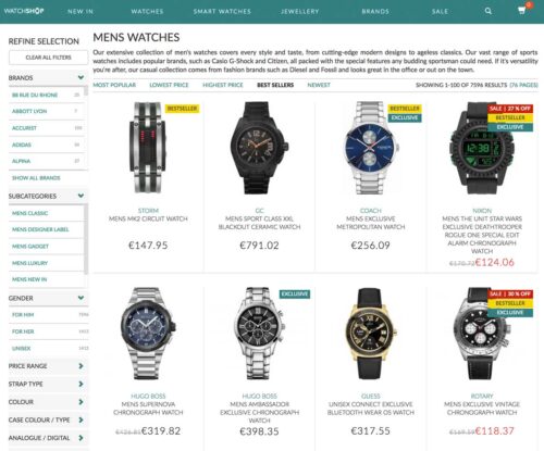
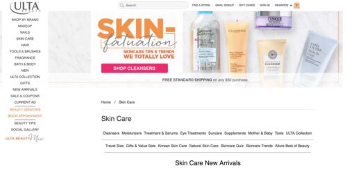
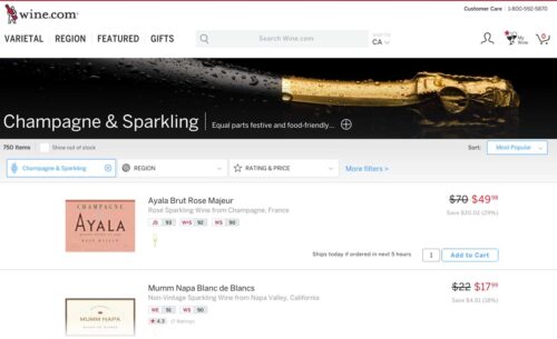
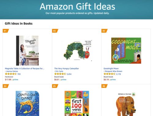
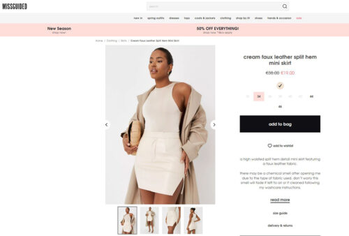

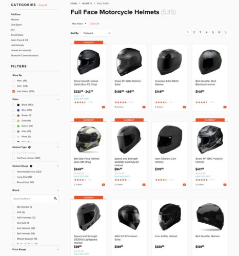
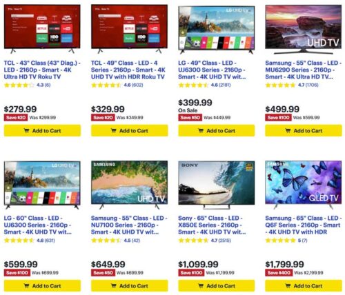
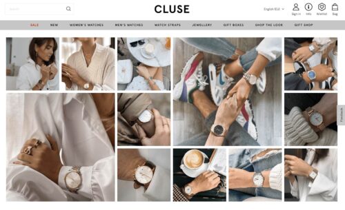
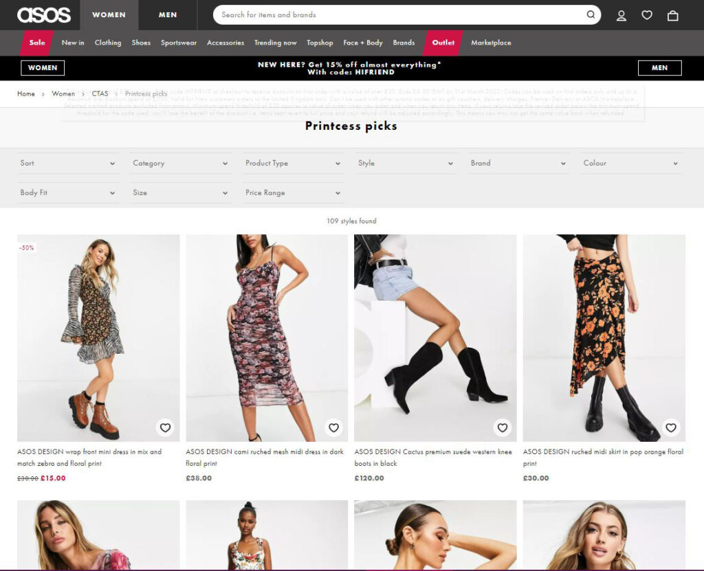
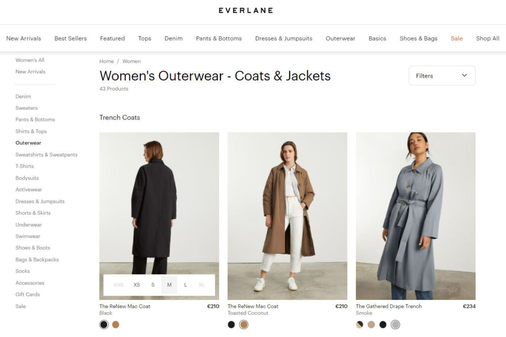
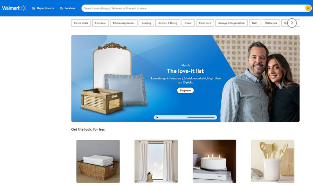
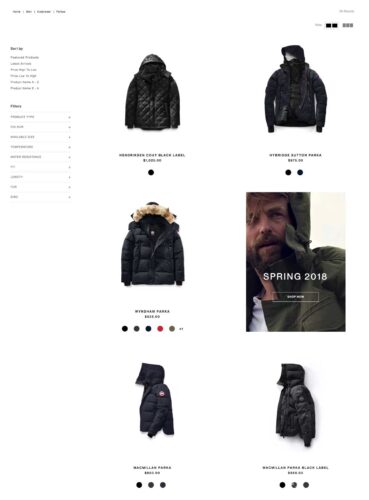


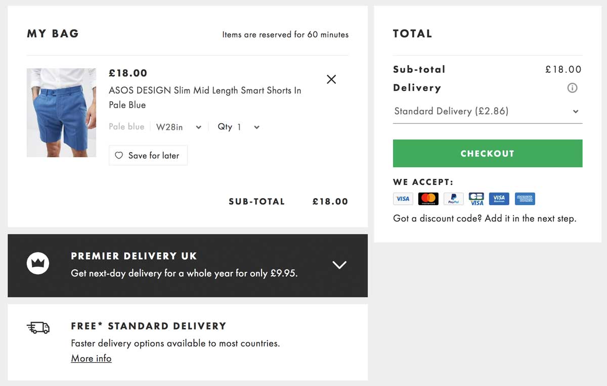
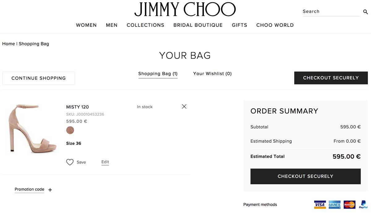
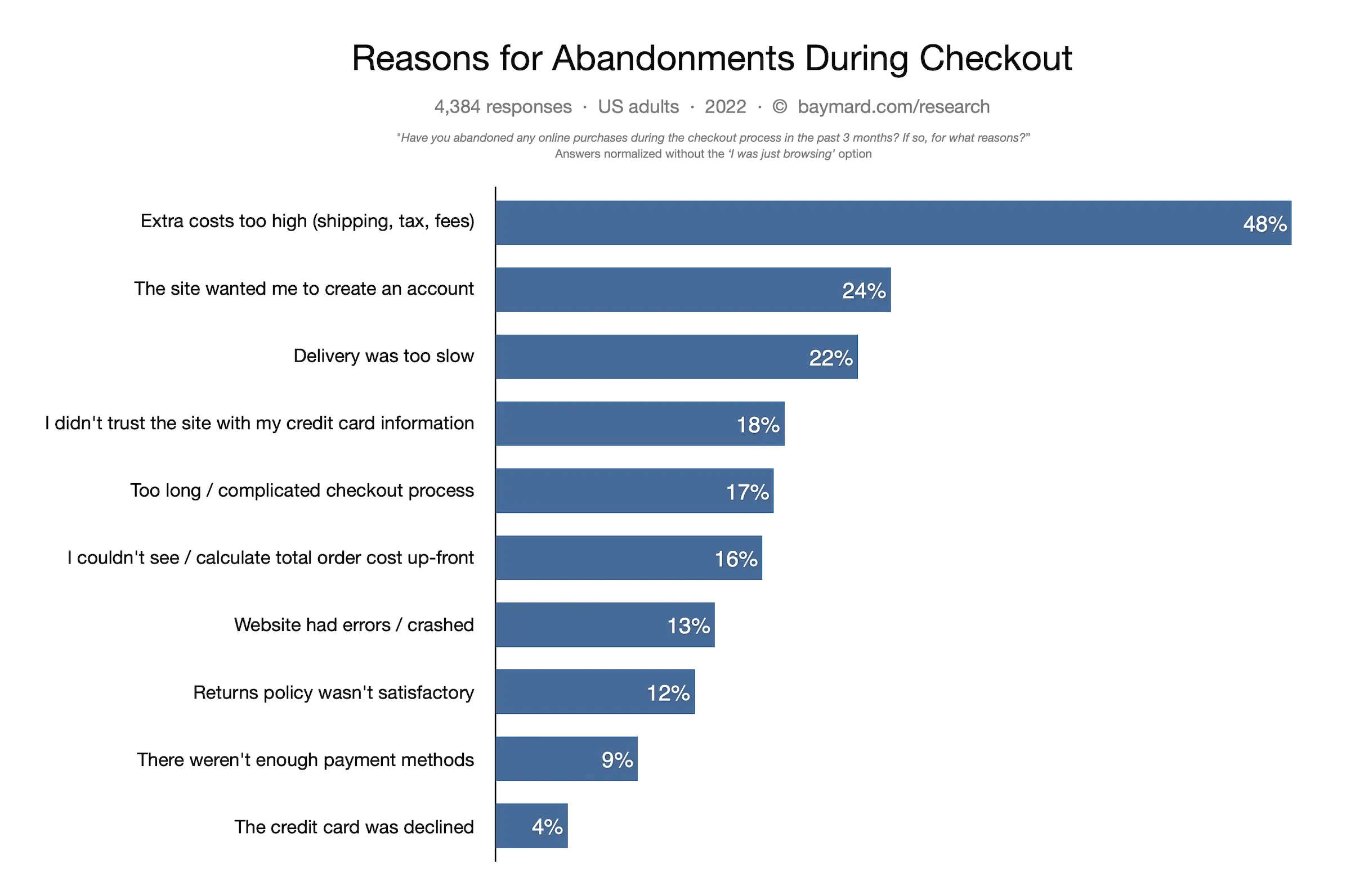
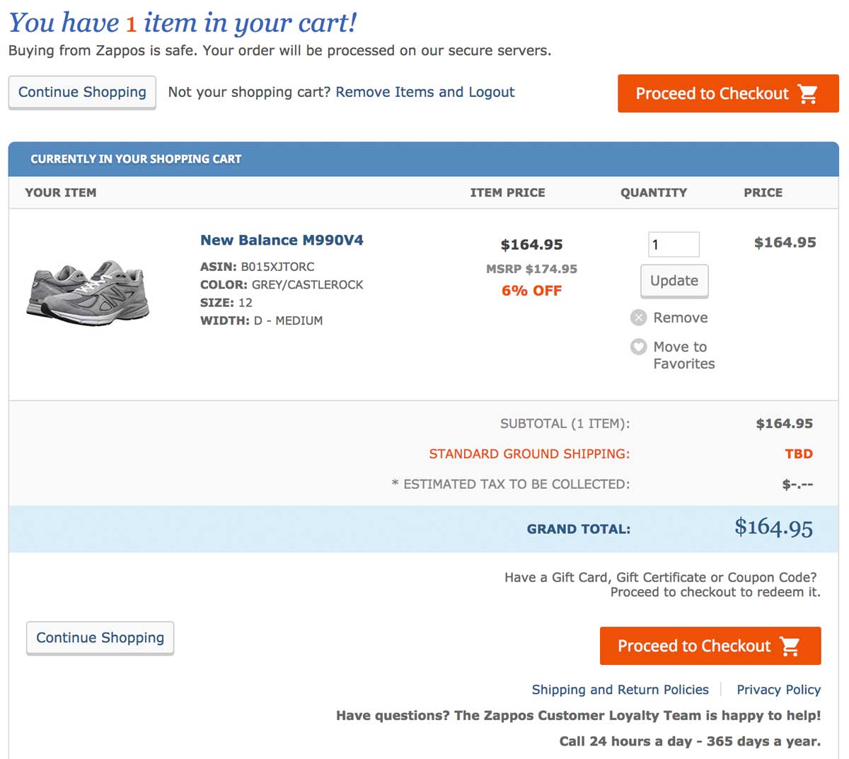
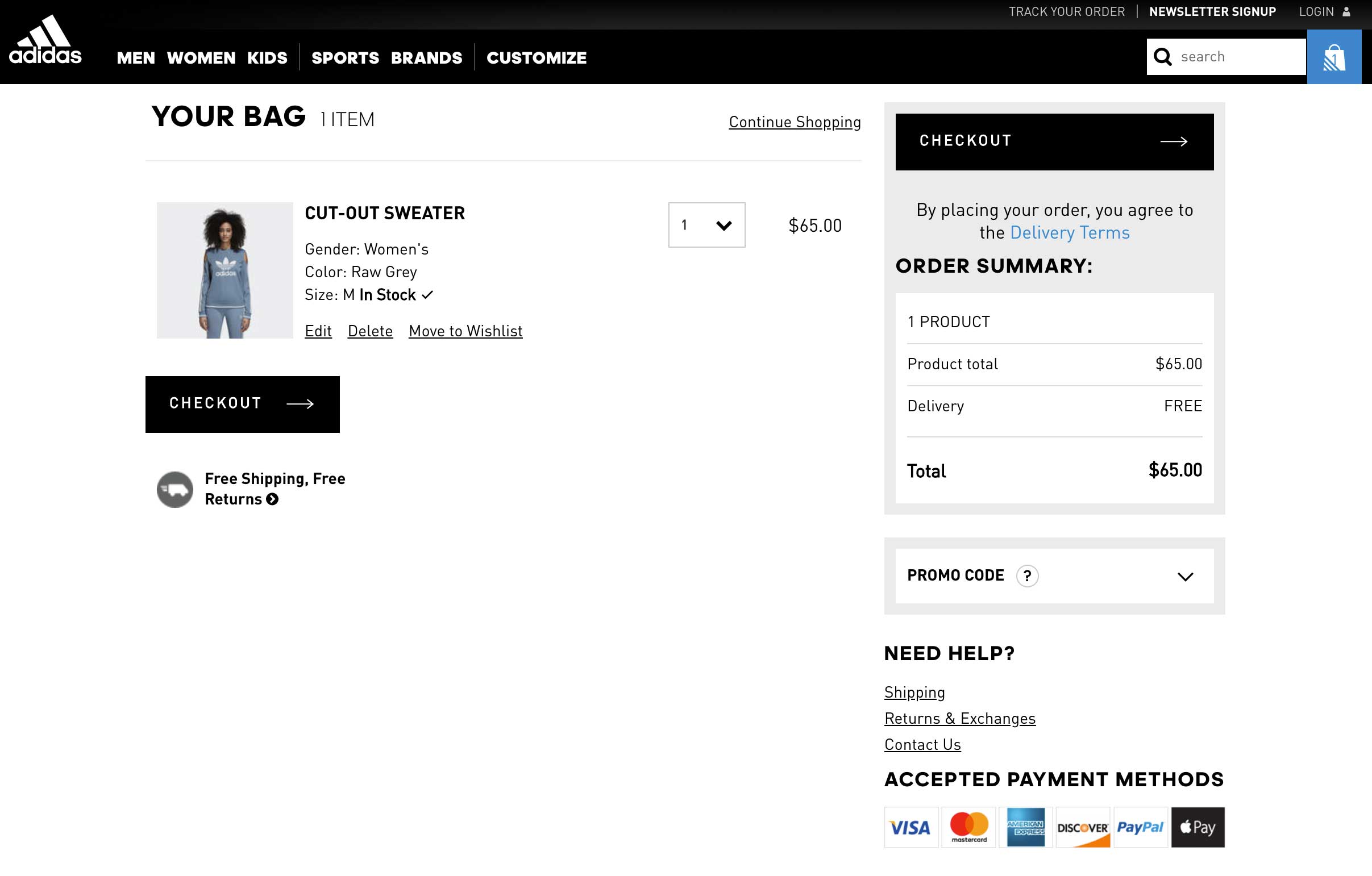
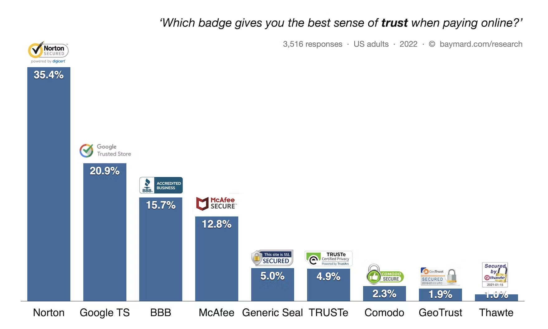
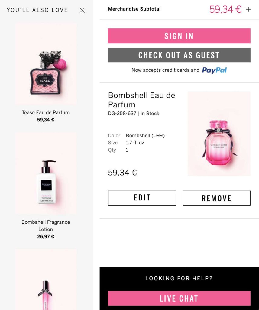
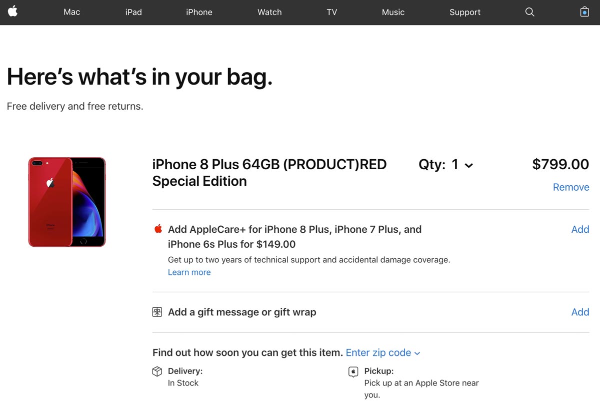
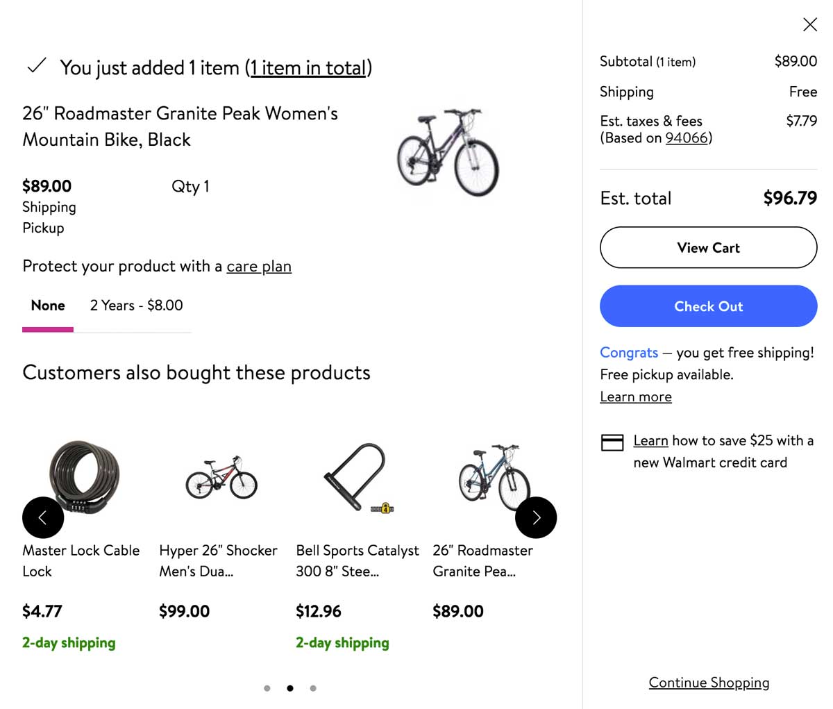

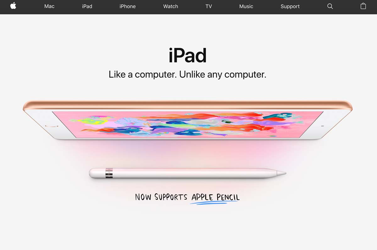
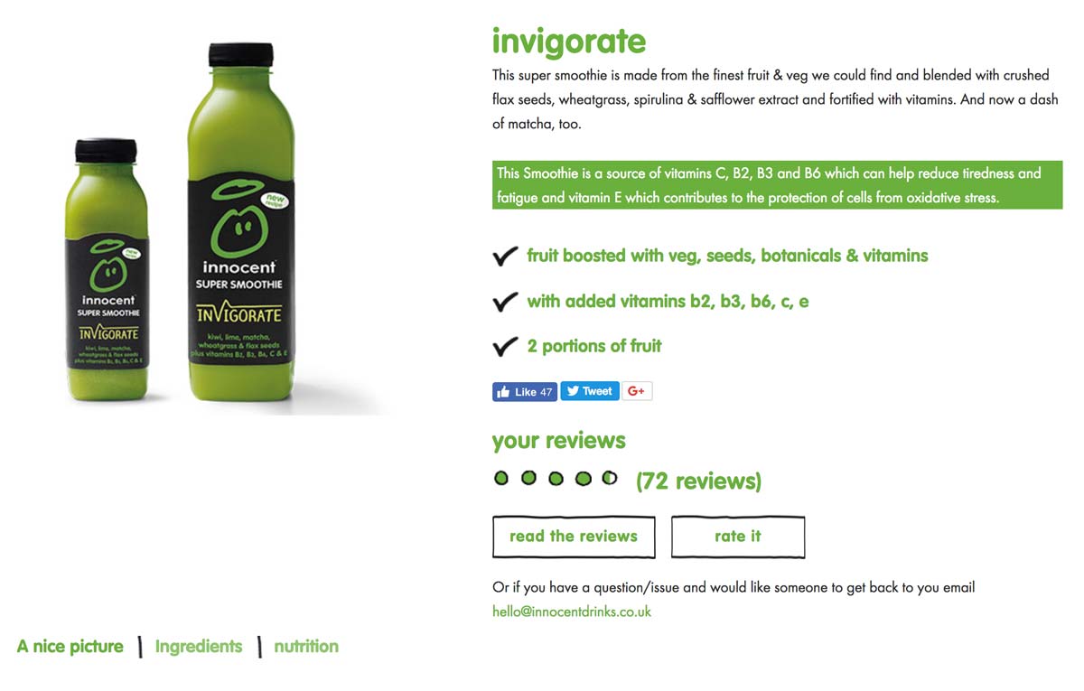 In the image above, you can see that they even highlighted in green that their smoothie is, “a source of vitamins C, B2, B3 and B6 which can help reduce tiredness and fatigue…”