If you’ve ever wondered what to test next, struggled to get developer time, or felt overwhelmed by reporting dashboards, you’re not alone.
These are the frustrations experimentation teams face daily. That’s why we built AB Tasty AI—a suite of AI designed not to add hype to your workflow, but to genuinely help you move faster, test smarter, and get real business impact from your experimentation program.
With AB Tasty AI, those roadblocks disappear. Our AI guides you through ideation, building, personalization, and analysis—so you can focus less on the “what ifs” and more on the results that matter.
Let’s walk through how it works.
AI that crushes your “We’re guessing what to test next” problem
Step 1: Ideation generation
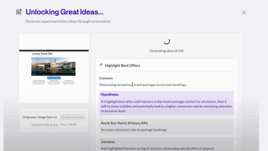
Every experimentation program begins with the same hurdle: what should we test next?
In many organizations, idea generation depends on gut feelings or endless whiteboard sessions that rarely produce actionable outcomes. That’s where AB Tasty AI steps in.
Our platform scans your pages and surfaces data-backed test ideas that are proven to make an impact. Instead of guessing, you get a prioritized list of opportunities aligned with your business goals. It’s like having an intelligent co-pilot who not only brainstorms with you but also brings evidence to the table.
AI that eliminates your “Our hypotheses are hunches” frustration
Step 2: Develop a hypothesis
A test idea is only as strong as the hypothesis behind it. Yet many teams struggle to move from fuzzy thinking to clear, structured hypotheses with measurable objectives.
AB Tasty AI eliminates the guesswork by helping you sharpen your hypotheses. You can turn casual “what if we tried this?” conversations into formal statements that define the change, predict the impact, and set up the right metrics for evaluation.
This structured approach not only improves your test quality but also boosts team confidence and stakeholder trust.
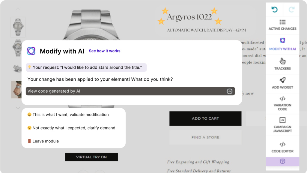
AI that annihilates your “I can’t build what I’m thinking” roadblock
Step 3: Start building
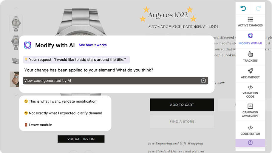
One of the biggest blockers in experimentation is the dependency on developer resources. Great ideas often languish in backlogs because the dev team is focused on other priorities.
With AB Tasty AI, you can instantly transform ideas into buildable experiments—no coding required. Whether you want to tweak a button, test a new layout, or launch a more complex variation, our AI makes it possible to build, preview, and launch without waiting weeks for a developer.
This shift not only accelerates testing velocity but also democratizes experimentation, empowering marketers, product managers, and designers to run with their ideas.
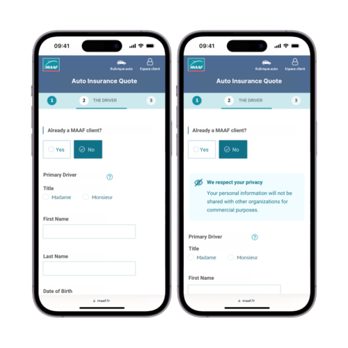
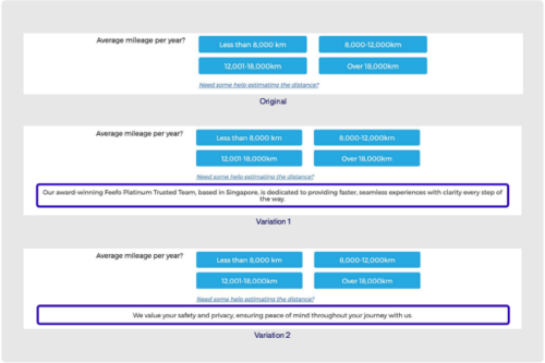
AI that ends your “Our personalization feels robotic” paralysis
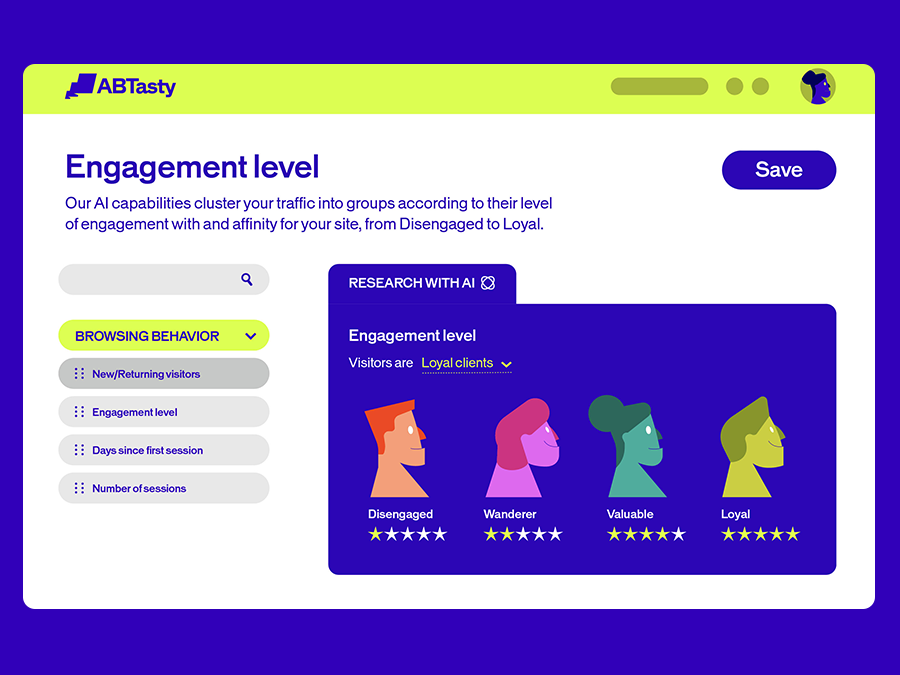
Step 4: Understand your audience
Many brands struggle with personalization that feels forced, generic, or robotic. Visitors sense it, and the results often disappoint.
AB Tasty AI introduces EmotionsAI Insights, giving you a window into the emotional triggers that shape customer behavior. Instead of relying only on demographic or behavioral data, you get deeper visibility into what truly motivates your audience.
It’s personalization with empathy—designed to feel natural, human, and meaningful.
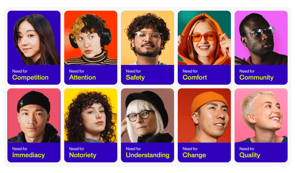
AI that solves your “I don’t know why visitors convert” mystery
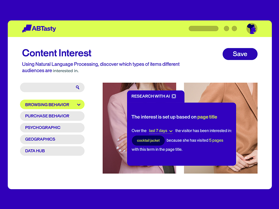
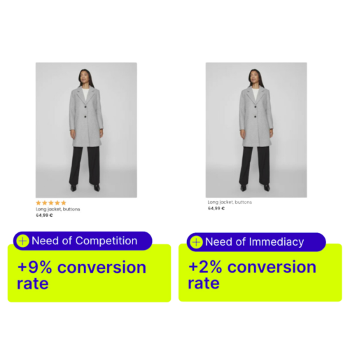
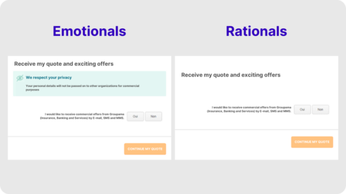
Step 5: Personalize the customer journey
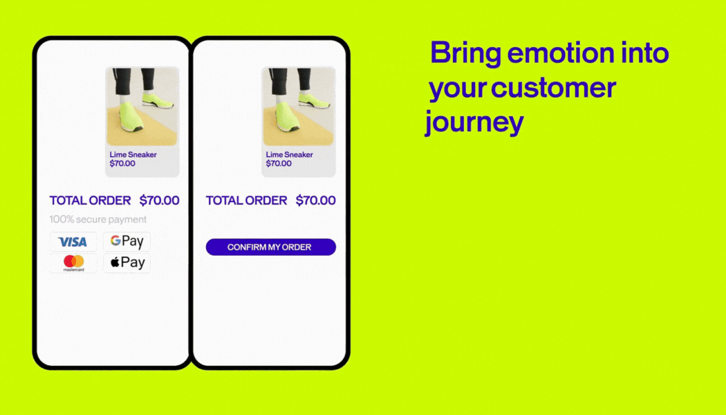
Understanding emotional drivers is just the start. With EmotionsAI Segments, you can act on those insights by creating experiences tailored to specific motivations.
For example, one group of visitors might be motivated by security and reassurance, while another thrives on novelty and excitement. AB Tasty AI combines emotional, behavioral, and contextual data to reveal these distinctions, allowing you to craft experiences that resonate at a deeper level.
The result? More conversions, stronger loyalty, and a customer journey that feels less like a funnel and more like a personalized conversation.
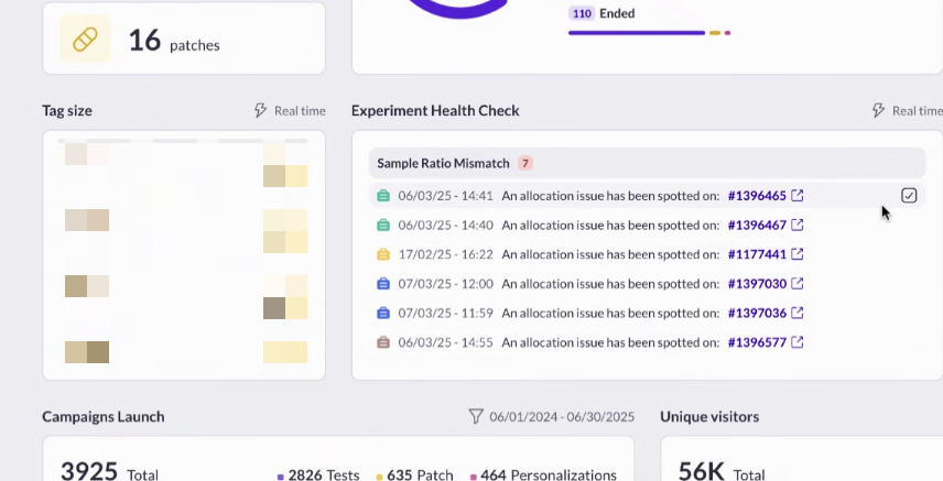
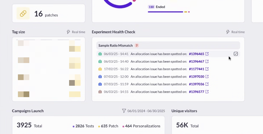
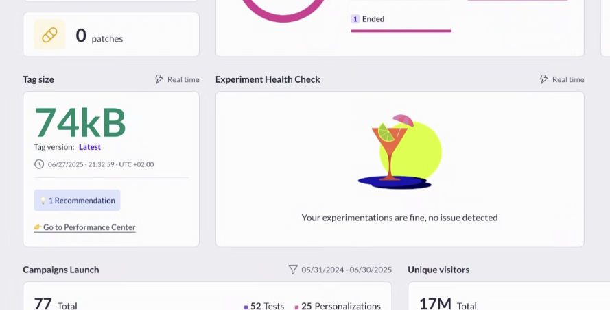
AI that crushes your “I don’t understand this report” problem
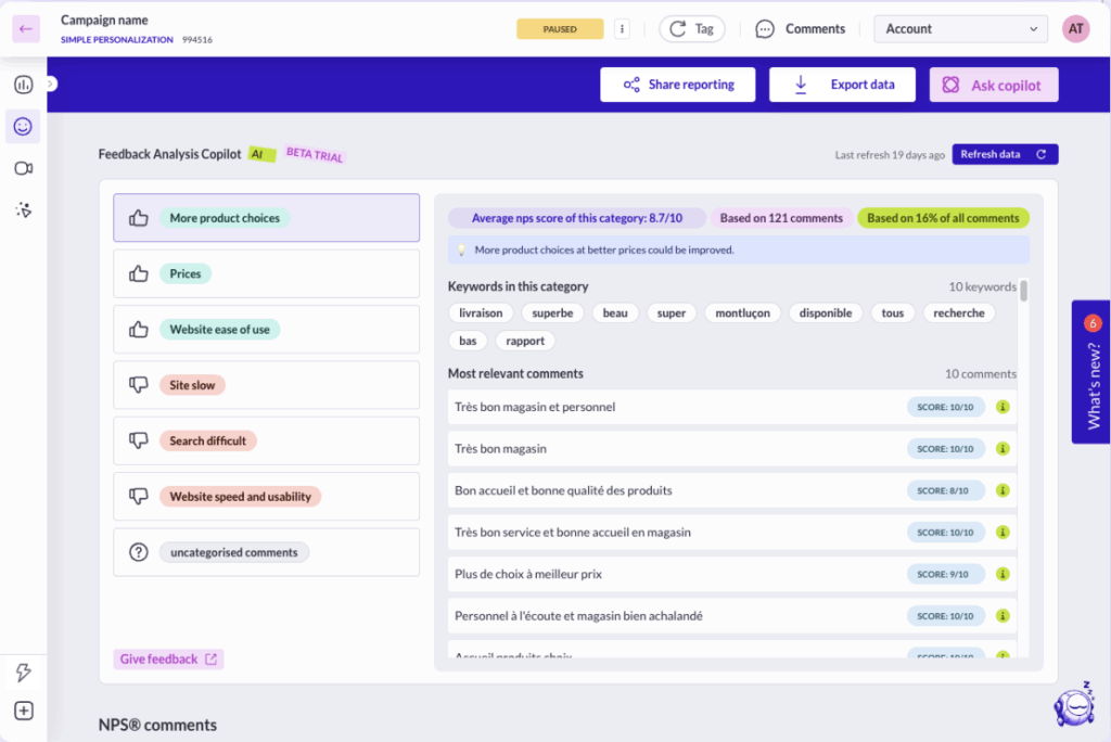
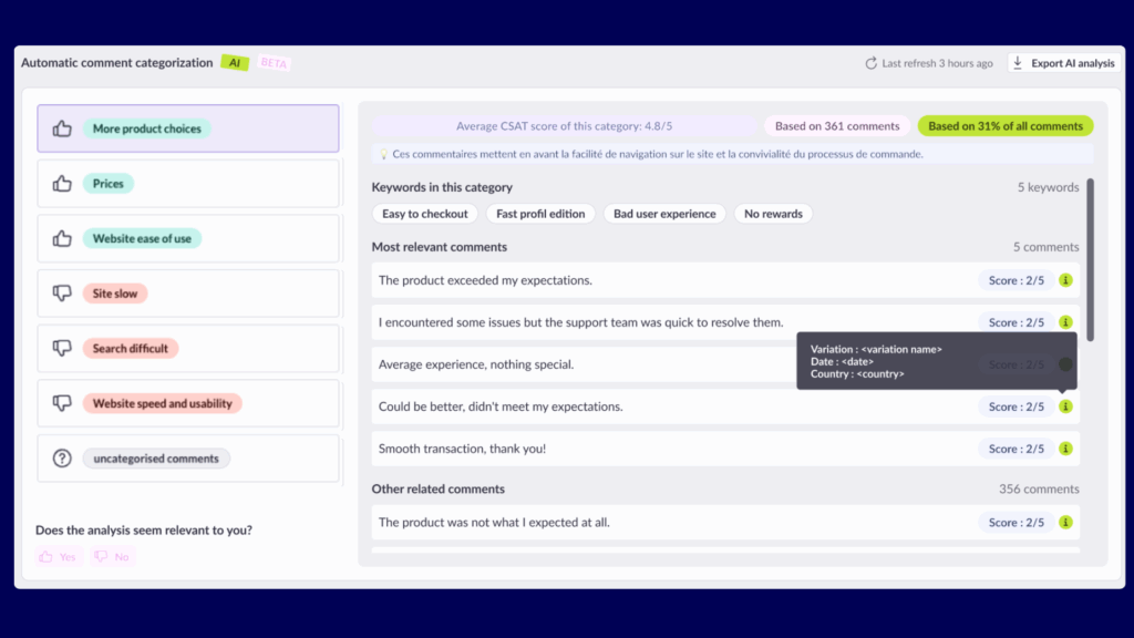
Step 6: Analyze your reports
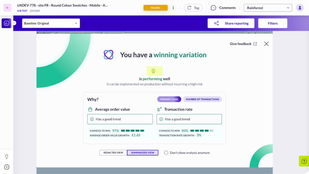
Once experiments are running, the next challenge is often reporting. Traditional dashboards can be dense, and interpreting results takes time—especially if stakeholders want quick answers.
AB Tasty AI simplifies the process with natural language analysis. You can ask plain-English questions like “Which variation performed best with mobile visitors?” and get clear, actionable answers instantly.
This not only saves hours of manual analysis but also democratizes data, empowering non-technical teams to explore results with confidence.
Why AB Tasty AI Stands Out
The market is full of AI solutions, many of which promise more than they deliver. AB Tasty AI is different. We’ve designed it to remove the real blockers experimentation teams face every day:
- No more guessing what to test
- No more hunch-based hypotheses
- No more dev backlog bottlenecks
- No more robotic personalization
- No more confusing reports
- No more lost learnings
In short, AB Tasty AI moves your experiments from start to success.
FAQs about AI in digital experimentation
What type of AI does AB Tasty offer?
AB Tasty offers practical, experimentation-focused AI that supports the full testing journey. This includes AI for idea generation, hypothesis creation, no-code experiment building, emotional personalization (EmotionsAI), natural language reporting, and more.
How does AB Tasty AI help with personalization?
AB Tasty AI uses EmotionsAI to uncover visitor motivations and segment audiences based on emotional, behavioral, and contextual data. This allows businesses to create experiences that feel more human and relevant.
Can AB Tasty AI help non-technical teams run experiments?
Yes. AB Tasty AI empowers marketers, product managers, and designers to launch tests without relying on developers, thanks to its no-code experiment builder.
What makes AB Tasty AI different from other AI solutions on the market?
AB Tasty AI is designed to deliver practical, business-ready solutions. While many AI tools focus on hype, AB Tasty AI helps teams move from “what if” to “what works” by providing tangible results at every stage of the experimentation cycle.