AB Tasty is a complete tool for website and conversion rate optimization. We serve as your digital lab, equipped with everything you need to create experiments that will help you to better understand your users and customer journeys so that you can create the clearest and most engaging user experience possible, ensuring your website performs well and yields the maximum results.
2019 is officially a wrap. To get 2020 off to a good start, we wanted to highlight some of the best personalization campaigns we’ve seen over the past few years. Some are oldies but goodies, others hot off the press. From the travel to media industries and more, here are some great ideas to help you bring even more relevant experiences to your customers.
SaaS: Spotify Still at the Top
Spotify has gotten a reputation – like Netflix and Amazon – for being at the top of the personalization game, and with good reason. Their personalized lists of music, not to mention their hilarious ads, are savvy uses of consumer preferences and data.
In 2019, they didn’t disappoint. A nicely curated ‘Your Top Songs 2019’ list appeared at the end of the year on the app, to help ring in the New Year with just the right tunes.
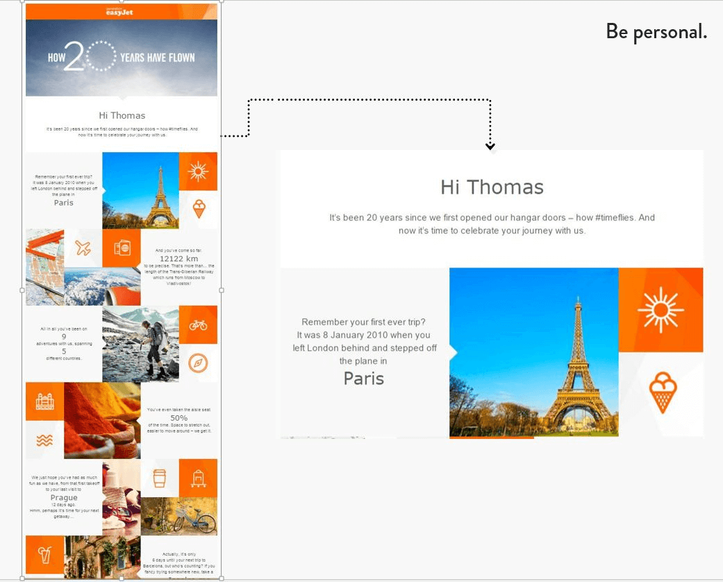
Travel: EasyJet Tells Personalized Client Stories
2015 was a big year for the airline easyJet, as it marked their 20th anniversary. If you’d flown with the company, you may have received an email like the one below. It outlined all of the destinations easyJet had taken you to, and suggested some for the future, like a visual scrapbook:
We like this kind of personalization approach – it tells a pleasant story, reminds you of all the good times you had with the brand, and is very social media friendly.
Recently, easyJet announced more personalization plans for their new package holiday plan to be rolled out in 2020.
Digital director for easyJet and easyJet Holidays, James Hardy, told Marketing Week, “We will also be launching a raft of new features over the next six months, with the aim to be the most personalised booking site in travel.” We can’t wait to see what they’ll be offering!
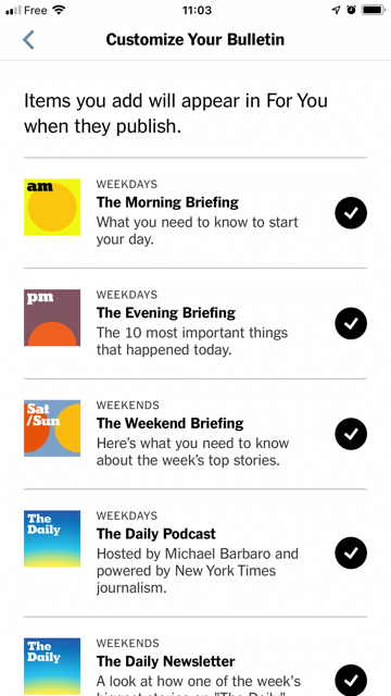
Media: The New York Times Perfects its Personalization
This past spring, according to Nieman Lab, the NYTimes went a step further than ever before in the name of personalizing the experience of their readership. The creation of their ‘For You’ section – at launch, only available on iOS – aimed to make it simple for readers to access more of the content they’re interested in. The benefits of this kind of personalization range from creating more engaged readers (which equals more subscriptions and sales), as well as potentially exposing them to a wider range of journalism. In other words, “consider For You one effort to widen the reader’s awareness of stories that would otherwise seem hidden…”
What we like about this campaign is its conscious effort to avoid ‘filter-bubbles’, and the fact that it’s based on active personalization. The judgment of journalists is still taken into account, and the preferences of readers, used to determine the content shown in ‘For You’, is based for the most part on what they purposely choose:
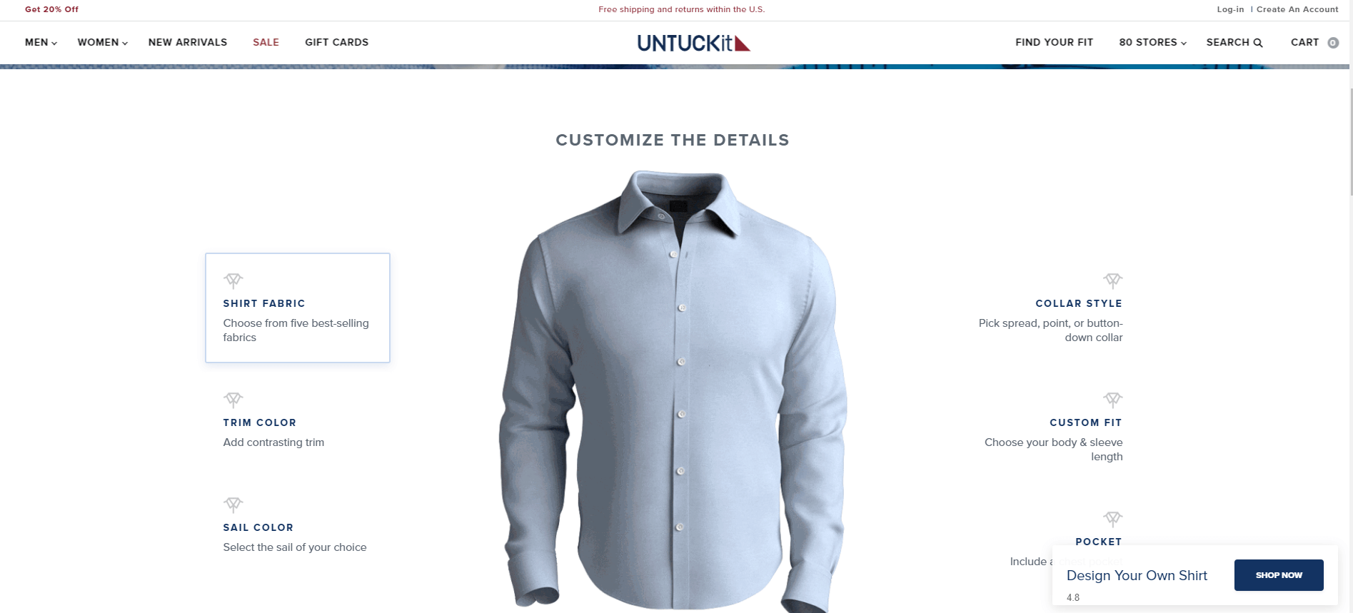
Fashion: UNTUCKit Knows how to Customize
More of a product customization approach than a standard personalization campaign, the fashion brand UNTUCKit lets you build your own shirt on their site. With their simple sizing approach and online customer profile, the store already makes it easy to find exactly the right match for you. But if you want to go a step further and build a shirt to your particular specifications – from fabric to styling to pockets – they make this easy, too.
Want to make that purchase extra special? The company even offered free (limited time) monogramming. We like the simple, no-frills approach to customization from a brand that’s all about helping customers get the right look and feel for them.
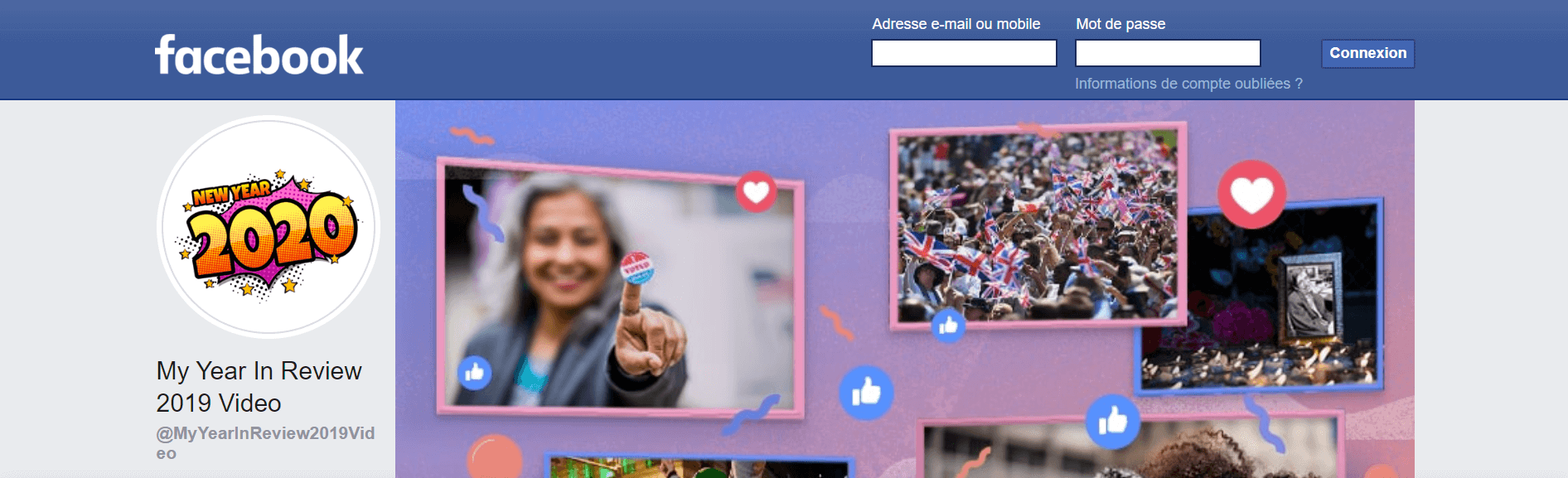
Social Media: Facebook Year in Review
Like the easyJet example above, Facebook has for a while now offered a nice overview of users’ top moments showcased on the platform, called the Year in Review.
You can access a nice video of the highlights of the year that you can share on your wall if you like. With many people using Facebook and other social media sites as personal scrapbooks, this is a simple, feel-good way to round of the year that we can get into.
Takeaway
Personalization doesn’t have to be overly complex or ridiculously data heavy. Even simple ideas can go a long way in increasing brand awareness, loyalty, engagement and sales. It can also just be pure fun. Whatever your business, we’re sure you can find some inspiration in these examples and get your personalization strategy flowing in 2020.
5 Website Optimization Tools that Every Marketer Needs
AB Tasty
A fully optimized website is imperative if you want to rank in the search results, attract website visitors, and generate valuable leads or revenue from sales.
Simply put, website optimization is essential for your website to thrive.
But what is website optimization?
Website optimization means improving all of the elements on your website used to “acquire traffic, engage visitors and then convert them into prospects or buyers using a clearly defined method which meets a number of predefined goals.” (AB Tasty)
As it encompasses factors affecting both the traffic your website receives and the conversions your website generates, website optimization covers a wide range of specialties, including the following:
Search engine optimization: website content, on-page SEO, and backlinks
Technical performance optimization: speed, mobile optimization, page errors, and hosting performance
To generate traffic, you need to make sure that your website is properly optimized for SEO.
To generate conversions, you need to make sure that any traffic that lands on your website is compelled to take action.
Each one complements the other and they both work hand in hand to improve the performace of your website in terms of your business goals.
Why are Website Optimization Tools Important?
With such a wide range of skills required and the growing complexity of modern websites, it’s no longer possible to manually optimize websites.
Website optimization tools automate the process of making your website more visible in search engines and make customers more likely to convert.
Tools range from website speed tests and mobile-friendly analyzers to A/B testing tools and data insights as to how you can improve your website to ensure that it’s successful.
For instance, a mobile-friendly tool helps you uncover which fonts are illegible on smaller screen sizes and which page elements are not displayed fully on the screen.
A/B testing tools allow you to compare two versions of a page against each other to determine which one performs better.
The list goes on.
There are a wealth of tools available that can help you improve your website and generate more traffic and conversions.
The tools allow you to see what’s working and what’s not — and offer recommendations to improve your processes.
With so many tools available, which one should you use to make your website rank higher in the search engines and convert more visitors into paying customers?
Let’s find out.
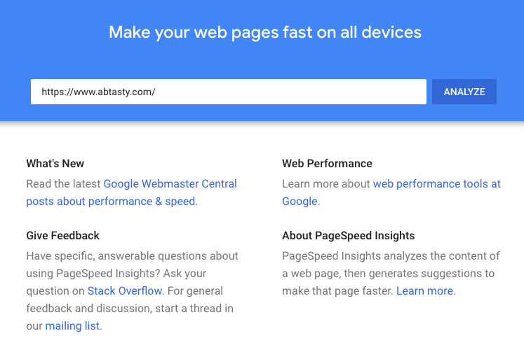
#1 PageSpeed Insights
Google’s Speed Update was released in January 2018. While desktop speed was already a ranking factor, the update meant that a website’s speed on mobile was also taken into account.
Many studies have shown that a faster page speed means a better conversion rate, but how quickly should your website load?
Google aims for a website load speed of less than half a second and it states that two seconds is the absolute maximum for e-commerce websites.
Studies by AI healthcare software company mPulse Mobile found that:
pages that loaded in 2.4 seconds had a 1.9% conversion rate;
at 3.3 seconds, the conversion rate was 1.5%;
at 4.2 seconds, the conversion rate was less than 1%; and
at 5.7+ seconds, the conversion rate was 0.6%.
Fortunately, Google offers a PageSpeed Insight tool which allows you to test your website load speed, as well as offering actionable recommendations.
Enter your domain name into the search bar and hit ‘Analyze.’
The tool allows you to analyze your website speed on mobile and desktop and provides a list of recommendations to improve your results, such as minimize main-thread work, remove unused CSS, and so on.
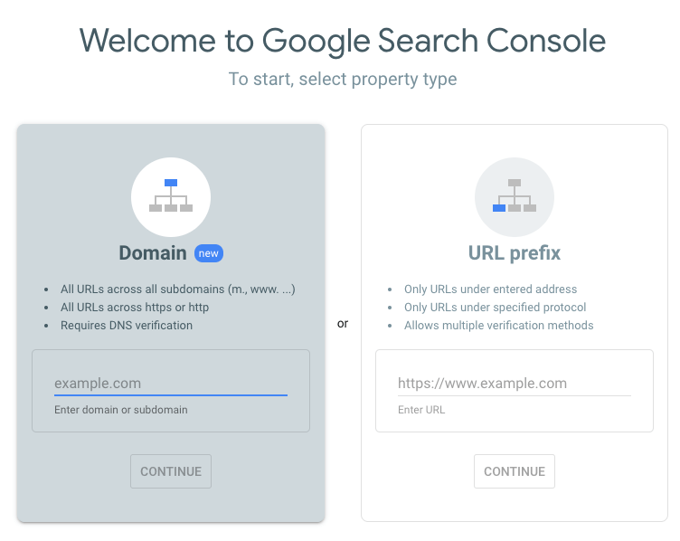
#2 Google Search Console
The Google Search Console (formerly Webmaster Tools) offers a wealth of information to optimize your website.
The console is a free tool to monitor how Google views your website and provides recommendations to optimize its organic presence.
The platform shows you how many referring domains link to your website, how your website performs on mobile, your search queries, and your highest traffic pages.
In order to set up Google Search Console, follow these simple steps:
Log in to your existing Google account
Go to Google Webmaster Tools
Click “Add property now”
Click “Add property”
Enter the URL of the website you would like to add
Choose a way to verify that you own your website:
HTML file upload
Domain name provider
HTML tag
GA tracking code
GTM container snippet
If your site supports both http:// and https://, add both as separate sites
One of the most useful elements of the Search Console is its mobile usability test. It quickly checks that all pages and posts on your website are responsive, quick to load, and that the elements fit on the page and the fonts are legible on mobile screen sizes.
Once you’ve analyzed your website in the Google Search Console and worked through the recommendations, make sure to hit “Validate Fix” and re-run the test.
Once your pages are fixed, you can provide a better mobile experience for visitors and, of course, increase the chances of your pages ranking higher in search results.
#3 AB Tasty
A/B testing is the process of experimenting with different page variations on a website to test which pages get the best results.
In other words, it tests which version gets the most conversions for your business, such as quote requests, appointments scheduled, more traffic, sales, and so on.
In order to optimize your website, you need to understand what works for your audience, website, and business goals.
This means understanding your customers’ behaviors, how they interact with your website, and where in your funnel they drop off.
AB Tasty – that’s us! – allows you to understand your website visitors’ behavior. (Along with a range of other CX optimization options), you can build A/B tests, split tests, multivariate tests, and funnel tests with our visual editor.
It’s also possible to conduct advanced targeting to test other criteria like website URL, location, user demographics, the weather, and more.
Finally, it’s also easy to use. Once you sign up, you can begin running tests as soon as you’ve installed the AB Tasty tag on your website, which you can do in minutes flat.
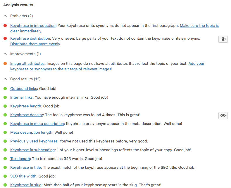
#4 Yoast SEO
Yoast SEO is an easy-to-use tool for optimizing the on-page SEO on your website. It’s a WordPress plugin which offers a traffic light system to ensure that you’ve correctly optimized your pages and posts.
The first step is to install Yoast on your WordPress website and then activate it. Once that’s complete, every time you create a new page or blog post, you will get an SEO rating of the page.
By entering your focus keyword and synonyms, Yoast will tell you whether the page is well optimized or even over-optimized.
The plugin also gives you the following recommendations to improve your SEO rating:
Add your keyword to your SEO title
Add your keyword to your meta description
Increase or decrease the number of times your keyword is mentioned in the text
Add internal or external links
It’s so simple to use and allows you to stay on top of your SEO optimization for individual pages – it’s really a no-brainer.
#5 SumoMe
Conversion rate optimization is a huge part of the website optimization process. If traffic doesn’t convert, then there’s little point getting more traffic to your website.
Building an email list is important for most businesses nowadays. Whether it’s to generate a lead for a service or to build a list to market to at a later date, SumoMe can help.
Use SumoMe to gather email addresses from website visitors using exit intent popups, lead magnets, discount codes, scroll boxes, CTA popups, and more.
The paid version also offers A/B testing and data insights, but it’s to a much lesser extent than a dedicated tool (like AB Tasty).
Where SumoMe excels is by retargeting your website traffic. For example, if someone browsed your store but wasn’t in a position to buy, then you could send them an email with a discount code a few days later, and that could be enough to encourage them to convert.
Best Website Optimization Tools for 2020
If you want to attract more traffic to your website and convert it to a lead or sale, you need to optimize your website. Make sure you’re working on SEO and CRO – you need both to thrive online.
Website optimization tools make your life easier by automating many of the backend tasks. While the tools are designed to automate many of the tasks, most of them require input, so schedule a regular routine to check the tools, run reports, and make updates.
And most importantly, use your findings to improve your website. With the help of a handful of tools, you can attract and convert more traffic than ever.
How to Get More Instagram Followers for your Travel Brand
AB Tasty
It’s no secret that social media has changed the way businesses conduct their marketing strategy. These platforms are excellent ways to influence potential customers, spread brand awareness, and share their expertise in their market.
Instagram particularly can be especially advantageous for businesses. Currently, over 25 million companies use Instagram, and about 200 million people visit at least one company page every day.
Not only does Instagram have less competition, but it also maintains some of the highest audience engagement of any platform.
Brands are more likely to succeed when more people know about them, so cultivating an online following is essential. Not only will it attract new customers through word of mouth, but it will also build brand loyalty.
For travel brands, a photo-centric platform like Instagram may be the best thing ever to happen. It’s the perfect way to capitalize on visual connections that inspire and motivate people to explore new places.
With so many people using Instagram to explore interests and find inspiration, there’s a lot of opportunities for travel brands to connect with more followers.
Here’s how to get more Instagram followers for your travel brand.
Use Hashtags to Attract New Followers
Just like retail brands, travel businesses can also use hashtags to reach new users and get more Instagram followers.
Hashtags make it easier for users to search and explore, so using the right keywords is crucial.
Websites like IconoSquare make it easier to find hashtags that will help get your company noticed in search results.
By making an Iconosquare account and connecting your company’s Instagram account, you can search the hashtag you want to use and check its relevance and popularity against other posts while suggesting other terms.
Use a spreadsheet to keep search results organized and easy to track later on.
Travel brands can begin by making a unique hashtag for their business included in every post.
The next step is creating a marketing campaign with a hashtag that entices people to participate and engage with your brand. Promoting a special offer and inviting followers to use the hashtag in relevant photos and videos is one way to get your brand’s hashtag noticed.
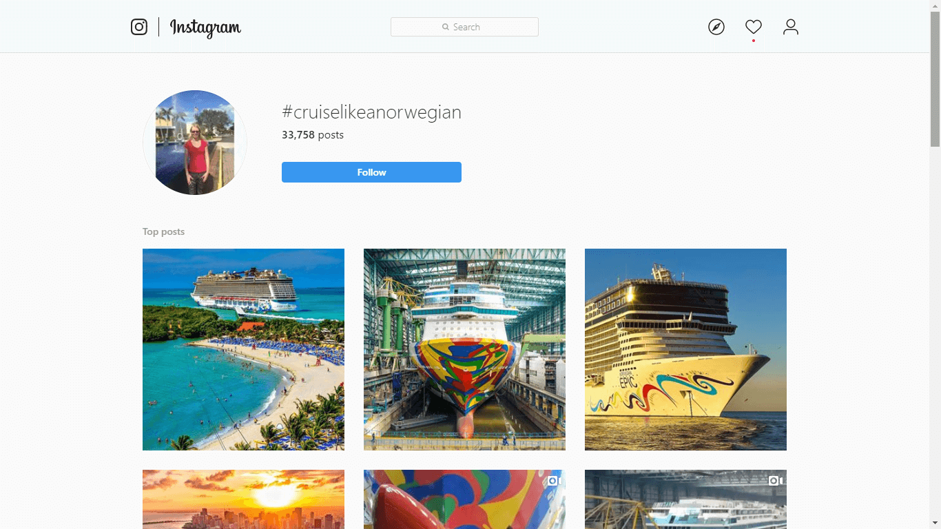
An example of an effective Instagram campaign is the #CruiseLikeANorweign from Norwegian Cruise Line. Currently, it has 37,758, all of which advertise this company and boosts its visibility across Instagram.
Know When and What to Post
Even if your company masters the hashtag, your brand may not appear in searches because of post timing.
When trying to get more Instagram followers, an important step is finding social media monitoring tools that help you review post history and see what worked and what didn’t.
Sites like IconoSquare have tools to break down how well older posts have done for engaging users. There, you can also optimize the best times to post down to the time of day.
Make a monthly posting calendar that includes the day, time, and week for each post. It will help keep you from publishing duplicate or similar content and track engagement for each type of post.
Scheduling posts in advance is a great way to keep your profile relevant. It makes it more likely to appear in searches, and lets followers regularly know what you can offer them.
Also, make sure to keep the content high-quality. Followers want to see things that are new and interesting, so try to create entertaining posts.
Consider learning about storytelling as a tool for digital marketing. Doing so will help you make content that doesn’t just appeal to your Instagram followers–it resonates with them.
This type of high-quality content will get users to pay attention and eventually follow your profile.
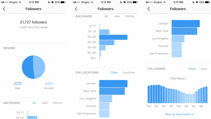
Additionally, there are many free analytics tools for businesses, both from Instagram and other websites.
Many travel brands have the luxury of appealing to a broad audience. Not only do many people rely on travel companies when planning trips, but the desire to travel is something that appeals to many users.
However, forming an effective social media strategy to gain more Instagram followers still needs to appeal to the right audience.
Your brand might get a lot of online engagement with young adults, but they might not be the ones buying your products.
Using analytics resources is helpful for travel brands to find which users are more likely to purchase products as well as engage with posts and hashtags.
Once you identify the target audience, it will be easier to curate content that incentivizes them to look into your offers. 48% of consumers expect brands to know them, but with the right outreach strategy, it will be easy to meet that order.
If your company is still in the beginning stages and hasn’t yet gained much brand awareness, mass following is one way to pull in more Instagram followers.
While this method isn’t for everyone, it is one way to get the ball rolling and start building that follower count.
Instead of blindly following other accounts, use it to your advantage by studying how other travel brands interact with their followers and what posts create the most buzz.
Taking note of travel trends and following popular influencers will help your brand stay relevant.
It’s a good idea to follow smaller accounts, as they are more likely to check their notifications and follow back. Comment and connect with their posts to boost your visibility.
As you start to gain a fair number of followers, it will boost your company’s credibility and encourage others to follow as well.
It also doesn’t hurt to ask for more followers occasionally. Just like YouTube content creators request viewers to subscribe to their channel, travel brands can invite users to follow them, so they don’t miss out on new products, offers, and more.
Use Geotags
Like hashtags, geotags highlight any Stories, photos, or videos you post by including your location.
Geotags can be particularly beneficial for travel companies because it strengthens the visual connection that users see between the brand and the country, city, or venue they could discover with your business.
Also, using geotags allows you to contribute to that location’s Story and elevate your brand to other users.
Hashtags and geotags are two ways to make it easy for people to discover your company on Instagram.
If you are also using other platforms, use those to raise awareness about your Instagram profile.Share a link while providing an incentive for users to click it, such as a unique offer code.
Take it to the next step by adding a link to your account in newsletters, on the company webpage, or in your email signature.
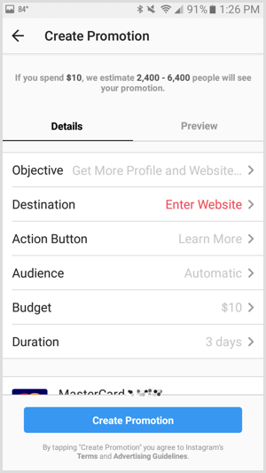
In the same vein, Instagram for company profiles has the option for sponsored advertisements that are useful for promoting your travel brand and getting more Instagram followers.
Photo, video, carousel ads, and Stories are all effective formats for advertising and building brand visibility.
Consider reaching out to influential users who can alert their followers to your brand. Begin by making a list of accounts that are relevant to travel and following them.
Look for a large following and an email address in the profile description. These are a good indication that the influencer is willing to do sponsored posts or give your brand a shoutout.
Even paid promotions are likely to be positively received by followers if the post appears more natural and genuine.
45% of people say they are more likely to unfollow brands that talk too much about their products, but striking the right balance with engaging content will help keep their interest.
Photos are one of the best ways to get people excited about traveling, and Instagram is perfect for connecting users to travel companies looking to expand awareness about their brand.
There are many ways to get more Instagram followers for your travel brand.
Using the right hashtags will help your brand stay relevant and connected to the latest trends. It will also help your profile appear in more search results.
Posting at the right time will ensure that when you publish a video, photo, or Story, people will see it. No matter how much content a profile produces, posting at the wrong time means no one will see the content.
Using analytics tools to find your target demographic will help you learn which content is more relevant to users and what leads to the highest engagement with your brand.
Following other travel brands, as well as popular influencers, will help you stay in the know when it comes to what’s trending.
Geotags, like hashtags, are beneficial because they help companies become more discoverable. They are an excellent way to stay relevant and boost engagement with existing followers.
Pushing the Right Buttons: Do Green CTAs Always Work Better?
AB Tasty
Did you know it only takes users 90 seconds to form an opinion about your brand? What if we told you that they base the greater part of this assessment purely on the colors you employ? When it comes to call-to-action buttons, we tend to home in on three specific aspects: color, location, and copy. Today, we’ll guide you through… drum roll, please… the best hues for your CTAs!
That being said, what do Yoda, Kermit the Frog, and the wonderful Emerald City have in common? The color green, of course! Plenty of positive associations are linked to this color, transforming it into every run-of-the-mill marketer’s preferred choice when designing their websites.
Now, we know that when it comes to call-to-action best practices, nothing is ever black and white. Does green always prevail? What other alternatives produce the highest CTR rates? Is there truly one color to rule them all?
Let’s see if it’s CRO myth, fact, or fiction that green CTAs produce the best results.
The Power of Color Psychology
Any marketing professional worth their salt can rant for hours on end about how social proof, retargeting, and urgency are surefire ways to boost conversion rates. Yet the answer to which is the best hue to use for call-to-action buttons remains contentious.
Colors play an essential role in our day-to-day decisions by awakening a variety of unconscious impulses. If a debate about the hues of a dress was enough to break the Internet, it’s pretty obvious that they’re a vital element for defining your brand perception.
Are a product’s colors capable of compelling us to purchase one item over another? What about the ones in their logo? Or even the color of a call-to-action button? The answer is yes! If you play your cards right, you’ll find that guiding customers’ choices can be easier than you ever imagined.
How Color Psychology Influences Buying Decisions
Before we dive into the world of CTAs – and the hues that love them – let’s take a look at how, exactly, colors can affect users’ emotions.
“Painting is a blind man’s profession. He paints not what he sees, but what he feels, what he tells himself about what he has seen.”
– Pablo Picasso
Color psychology explores, in a nutshell, how the different feelings and associations each color is linked to affect the decisions people make. Marketers have been in on the secret for decades, capitalizing on this knowledge to improve purchases and optimize their personalization efforts.
There’s a variety of reasons why many companies opt for green CTA buttons: due to all of the positive associations linked to the color (it represents safety, balance, trustworthiness…), many put their money on its capability to coax jittery shoppers down the purchase funnel.
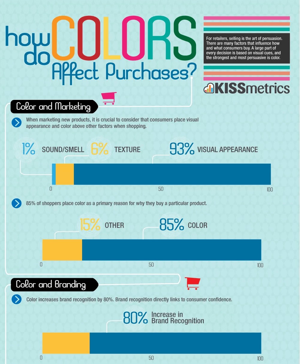
For e-commerce, persuasion is a key component for guiding users. Since we are visual creatures, a strategic design could very well be the key to a new era for your brand! This infographic from Ecommerce Nation and Kissmetrics breaks down the effect of hues on customers’ behavior:
The color green rules over clickable buttons: it seems inevitable that most of the sites you visit will be littered with said shade. Day after day, we’re surrounded by constant reminders of its overwhelmingly positive associations; from traffic lights to checkmarks, users have one message drilled into their brains: in green we trust when going forward.
As we’d mentioned previously, it seems like a pretty safe bet; but before you throw caution into the wind and go with the flow, keep in mind that one size does not always fit all. Take, for example, luxury brands: when was the last time you saw a green CTA on their sites? Hard to put your finger on it, huh? That’s probably because supermarkets and discount stores transformed big green buttons into one of their main identifiers, thus forcing high-scale companies to abandon the design.
Before you take the plunge, let’s review four points to keep in mind when choosing a color for your call-to-action button:
Context is king: Take a deep breath. Knowing how much is riding on this single decision makes deciding seem like a daunting task – not only does it have to be appropriate for your buyer persona, it must also fit in with your brand’s colors, the website’s design… And, on top of that, it’s nearly impossible to know whether the new CTA is behind the increase in conversions! Thankfully, you can always turn towards A/B testing to significantly optimize your efforts and get data-driven, conclusive evidence.
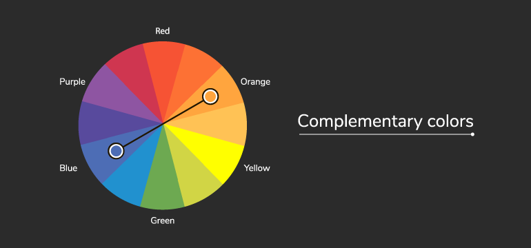
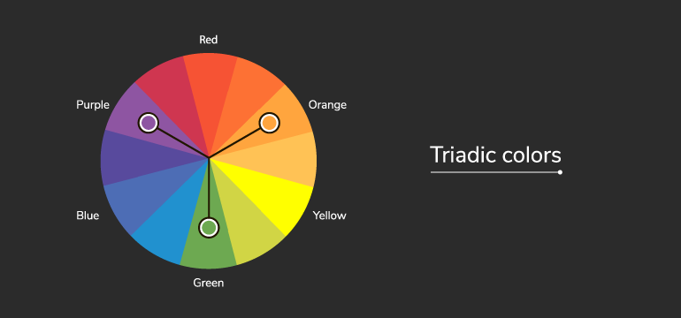
Make sure it pops: How can you catch your visitor’s eye? With a call-to-action button that stands out, of course! Increasing the contrast can be a good idea and is likely to increase conversion rates. Complementary colors (the one which is placed on the opposite side of the color wheel from your dominant color) and triadic colors (one of two placed one-third of the way from your dominant color on the color wheel) are your best bet.
Coherent designs: Marketers can play with the meanings that customers associate with certain colors. One common example is the use of blue tones for hyperlinks – the link (pardon the pun ☺) between the two makes us assume, automatically, that said text will direct us to another site. Due to this, it’s crucial to follow those guidelines for every single page on your website: respect the colors employed for each action and remember that happy websites equal happy users.
Keep it simple: How many times have you encountered mismatching, aggravating and downright jarring colors on a website? These careless attempts from lazy marketers do manage to capture their users’ attention… for mere seconds, after which their design spirals into a bottomless pit of damaged credibility and brand images. Invest in your design, and watch the conversions come rolling in!
Conclusion: Which Color Converts the Best?
A call-to-action button may be one of many elements in any successful CRO strategy – but it’s a crucial one, nonetheless. Bear in mind that every website is unique – as a result, the colors which will work best for each one will vary! What may double or even triple your transactions may be a flop for your competitors. Oh, what’s a marketer to do?
Bear in mind that the basic principles of color psychology (for example, green incites feelings of confidence, health, movement…) can be used as a starting point for your hypotheses. You need to test and see if this principle applies well to your particular audience and website, taking into account your website design and graphic guidelines (will the color stand out enough? Will it clash or fit in nicely?); your brand’s context (take, for instance, the aforementioned example of green CTAs being associated with grocery stores and, as a result, being shunned by luxury brands); and your audience (each culture interprets colors differently, so it’s important to take your users into account when designing your site).
In any case, if you’re feeling a bit overwhelmed about how to use colors for your call-to-action buttons (and which ones to choose), you have nothing to fear: A/B testing has got your back! Even though it’s a myth to believe green CTAs will always work better, you can use them as a solid starting point for your tests since they can often work!
CRO Myth Busters is a mini series for conversion rate optimization professionals. We take a quick look at commonly held CRO beliefs and determine if they’re true, sometimes true, or simply CRO myths!
Did you know that 90% of the time people spend on their phones is in mobile apps? Creating an app for your business is a great way to ensure that people can easily find your services right on their phones.
However, a lackluster app can sour your relationship and brand image. Regular usability testing of your mobile app helps you see how this handy marketing tool can be improved.
Read on to learn how you can conduct high-quality usability testing for your mobile apps.
Good Usability Testing: The Benefits
Usability tests for mobile apps are designed to observe test-subject users while they use your app. The purpose of testing is to measure the app’s user-friendliness and learn about how it can better support your brand’s key marketing objectives.
Usability testing helps to ensure that your app is adding value to your business, as well as meeting the expectations of the final users. Ensuring you have good usability for your mobile app will help your business improve customer satisfaction, decrease time on customer support, and increase your sales and revenue.
Seven Steps to Run an Effective Usability Test
Decide on your Objectives
First and foremost, come up with specific objectives for your usability test. When designing your objectives, keep the five usability attributes in mind:
Once you have the big idea objectives, nail them down to specifics.
One objective could be determining what aspects users enjoy about your mobile app. Perhaps they find it easy to use, or they like the colors you’ve assigned. Another objective might be seeing if a new feature helps or hinders users from completing a specific task.
Whichever way you decide to do it, make sure you have some core objectives and some flexible ones. Core objectives should be questions you ask every time you run a usability test. Flexible objectives are ones that depend on new updates or changes that didn’t exist before.
Design the Tasks
Next, it’s time to design the tasks that you’ll ask your users to do. There are a few key guidelines you should follow when designing usability tasks.
First, even if your mobile app is still in development, remove placeholder text like “lorem ipsum” with a draft of what should be there. This will help you get a better sense of how people navigate the site and decide which information is important. If they see placeholder text everywhere, you’re not getting a good sense of how they weigh the information presented to them.
Avoid providing clues in your instructions. Offering extra hints and tips might lead them to take actions they wouldn’t have otherwise figured out.
Before you run your test, check that there isn’t any ambiguity in your instructions. If you leave instructions up to interpretation, your results might make it seem that your app isn’t user-friendly.
Choose Between Lab Settings or Remote Testing
There isn’t one right option when choosing between a lab setting or running your test remotely. However, there are pros and cons to each choice.
You don’t need an actual lab to run a test in a lab setting. This just means that you’re running the test yourself in a controlled environment.
In Lab settings, you have the benefit of gaining extra observations. Even small things like hesitation or scrunched eyebrows can tell you a lot about their user experience. You also gain complete control over their experience and the environment in which the test is conducted.
One downside of lab settings is that you risk muddling the results with theframing effect. If you accidentally ask a question in a leading way or provide too much information, you’ll end up getting results that reflect your knowledge and experience with the app – instead of your users.
The advantage of remote testing is that you don’t need to schedule a time and place to host your users. The users do the test on their own time, and you get sent the results, which saves time for your team. And like we mentioned, remote testing is a great way to avoid the framing effect.
There is a range of testing tools available for mobile UX, so be sure you choose one that supports the measurement of your key objectives.
Ready, Set, Run the Test
Now that everything is ready, it’s time to run your test. There are a few differentmoderation methods you can choose from.
One option is to ask your participants to think out loud as they work through the tasks. “Oops, didn’t think it’d do that” is great feedback. If you’re running a test remotely, this can give you extra information about their thought process. One downside to this is that having to speak out loud might be a distraction or cause the user to complete the test slower than they would otherwise.
If you’re doing a lab test, you can take advantage of being in-person to ask them questions as they progress. However, it’s important to ask questions in a non-judgmental and non-leading tone.
Finally, you can moderate retroactively. This type of moderation asks your user to watch a replay of themselves and explain their actions, or you ask users to elaborate on certain decisions they made.
Organize and Analyze Your Data
Now that you’ve collected your usability data, it’s time to organize and analyze it. Drawing meaningful conclusions is arguably the most important step toboost the impact of your testing.
It’s best practice to review the testing sessions one at a time. Look at all the materials you have for that user, including notes on recordings, transcripts, and other info you might have.
Organize your data in an easily digestible way. Some standard categories for reporting might include the user’s name or ID number, task title, and encountered problems. You might also want to categorize problems for easy sorting – confusion, broken links, or disappointment might be some examples.
Regardless of how you choose to analyze your research, don’t forget to look at both quantitative and qualitative data. Quantitative data is great for giving your app an overall scorecard and providing summaries to higher-ups. But, keeping the qualitative data is important for remembering the details of your testing.
Work to identify positive trends and patterns, as well as challenges and roadblocks that your users faced. Be sure to cross-check your data against different metrics to help reveal if certain patterns only revealed themselves on certain devices or demographics of your audience.
Try to get in the habit of developing a standardized report so that you can easily compare changes over time. This will help ensure that you and your team can easily review progress and setbacks you’ve faced from your last usability test.
Time to Act: How to Improve Based on What You Learned
Running usability tests on mobile apps can be overwhelming. You receive so much information at once that it’s like drinking from a firehose. The first step to avoiding feeling totally overwhelmed is to prioritize your feedback.
Look at your data and choose which aspects should be the biggest priority. You can rank priorities from one to ten or categorize them from low importance to critical. Distribute these tasks in order of importance.
Take careful notes of what your team achieves and what still needs to be completed before the next test.
Which brings us to…
Plan Your Next Test
For salespeople, the slogan is “ABC – Always Be Closing.” For developers, it’s ABT – Always Be Testing.
Usability testing should happen on a regular and scheduled basis. These tests can guide choices for new design features, and updates to improve functionality.
Based on what you learned from past usability tests, you should check that major issues from before have since been resolved. ThroughA/B testing, you can test your newest update to your older version.
Regardless if your mobile app is in development or you’re undergoing an update, you should keep an eye on competitor mobile apps. This can help you stay ahead of the curve and keep up with usability expectations for your industry. It can also inspire changes that take advantage of thefamiliarity principle.
Getting feedback on the usability of your app can be a difficult pill to swallow. It’s important to remember that a lot of feedback means you ran a successful usability test, and not that your app is a failure. Every test you run will bring you closer to perfecting the user-experience and supporting larger business goals.
Should you Make the Main CTA on Mobile ‘Stick-to-Scroll’?
AB Tasty
“Oh man, sorry, my big thumbs!” my friend says, half laughing next to me. “Oh my god, now I’ve lost it!” I peer over my shoulder to glance at her screen – the film we want to see is starting in two minutes, and we’ve spent the last 10 trying to buy the tickets on her phone.
“We’re definitely going to miss the previews -” I start to say. “Sorry, walking and scrolling is hard!” She says huffily.
I see her scrolling and pinching the screen, presumably trying to find the ‘confirm payment’ button she’d been having trouble with earlier.
“Ok seriously, where is the stupid button?” She hits the back arrow.
“Oh nooo, don’t do that!” I say. “You’re going to have to enter your card details all over again!” “Let’s just buy the tickets when we get there at the counter. I know there’ll be a line, but this site is useless.”
“Ok fine,” my friend says, pocketing her phone. We both sprint to the cinema.
This little scenario begs the question – could that user experience have been better by simply adding a stick-to-scroll CTA? The short answer: Yes.
The Mobile Mind Shift, Thumb Zone and Thinking Contextually
“Our lives have become a collection of mobile moments in which we pull out a mobile device to get something done immediately wherever we are.”
Forrester Research’s Ted Schadler wrote these words when describing his idea of the ‘mobile mind shift’ back in 2014.
He was describing the impact of mobile technology on our daily lives, and what people all over the world have come to expect from their tablets and smartphones – and brands at large – namely:
Usability, accessibility, availability
Convenience and agility
Contextuality
These are big concepts that need to be applied to an entire business model, of course.
Zooming in on the micro-context of UI design, applying the principles of the ‘mobile mind shift’ can mean something as simple as making a main CTA easy-to-use, accessible and contextual.
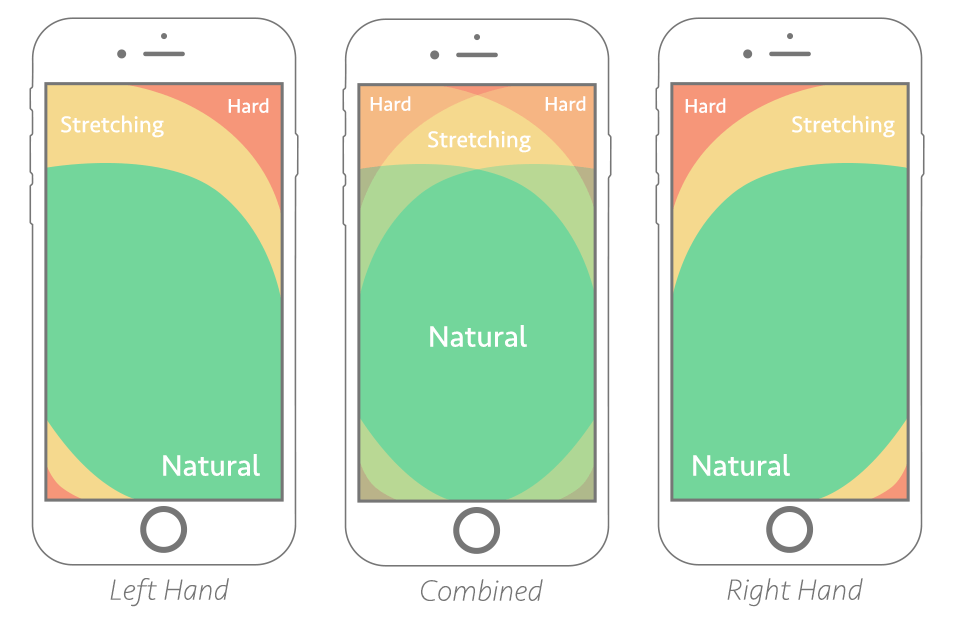
Above is an illustration of Steven Hoober’s notion of ‘the thumb zone’, or “the most comfortable area for touch with one-handed use.”
Chances are, if your main CTA doesn’t fall within the ‘natural’ reach zone, it’s going to cause frustration.
What’s worse is when your website or mobile app visitor starts scrolling and actually loses sight of your CTA – as we know, real estate on mobile is hard to come by, and every millimeter needs to be carefully thought through.
Browsing or goal-oriented searching on mobile is not the same as on desktop. When we’re looking to buy a movie ticket on mobile, we’re very likely walking around, multitasking or in a hurry. When we’re buying one on desktop, we’re likely to be less distracted, and can take our time.
On mobile, we’re in the moment. The UX and UI needs to take into account this context. Enlarged, stick-to-scroll CTAs – at least the main ones – can help an end user who’s in a hurry, distracted, using their phone with one hand while buying a metro ticket with the other, and who’s phone screen is a fraction of the size of their laptop’s.
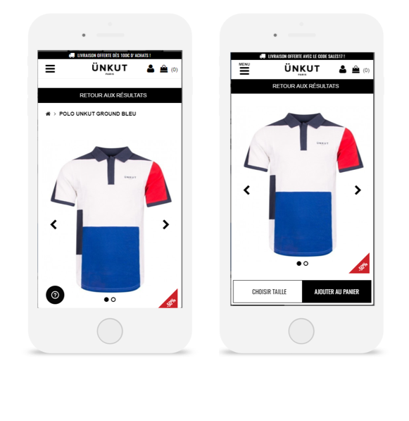
The French fashion retailer Ünkut saw the effectiveness of a sticky CTA firsthand after running an A/B test on its mobile product pages. From this test, CTA clicks increased by 55%, and transactions grew by 7%.
The French fashion retailer Ünkut saw the effectiveness of a sticky CTA firsthand after running an A/B test on its mobile product pages. From this test, CTA clicks increased by 55%, and transactions grew by 7%.
That’s why, by and large, the usefulness of stick-to-scroll CTAs on mobile for increasing conversions is no myth – we’ve collected countless use cases, from e-commerce to telecommunications, that prove its effectiveness. So we’re ready to label this ‘myth’ true – and if you have questions on how to apply a stick-to-screen element, don’t hesitate to reach out.
CRO Myth Busters is a mini series for conversion rate optimization professionals. We take a quick look at commonly held CRO beliefs and determine if they’re true, sometimes true, or simply CRO myths!
A recent study by Orbis Research projects that the global cosmetics market will reach 805.61 billion dollars by 2023.
That’s a huge potential for beauty brands to tap into.
It also begs the question – by 2023, what will shoppers expect these brands to deliver? What does the future of the digital customer experience look like?
What’s Working Today
To figure out what might work tomorrow, it’s best to start with what’s working well today.
To that end, here are a few of our most successful tests from our clients in the cosmetics industry.
Freebies
Many of the brands we work with have experienced big gains through better showcasing freebies – whether it’s a complimentary gift, free shipping or a discount.
Let’s take the iconic beauty brand, Sephora. They ran a test on their Portuguese website in which they added a progress bar to their basket pages and pop-ins, indicating how much more a shopper would need to spend before getting free shipping. This little nudge definitely motivated their audience! Average order value shot up by 8%, with 16% more clicks to ‘Continue to Purchase’.
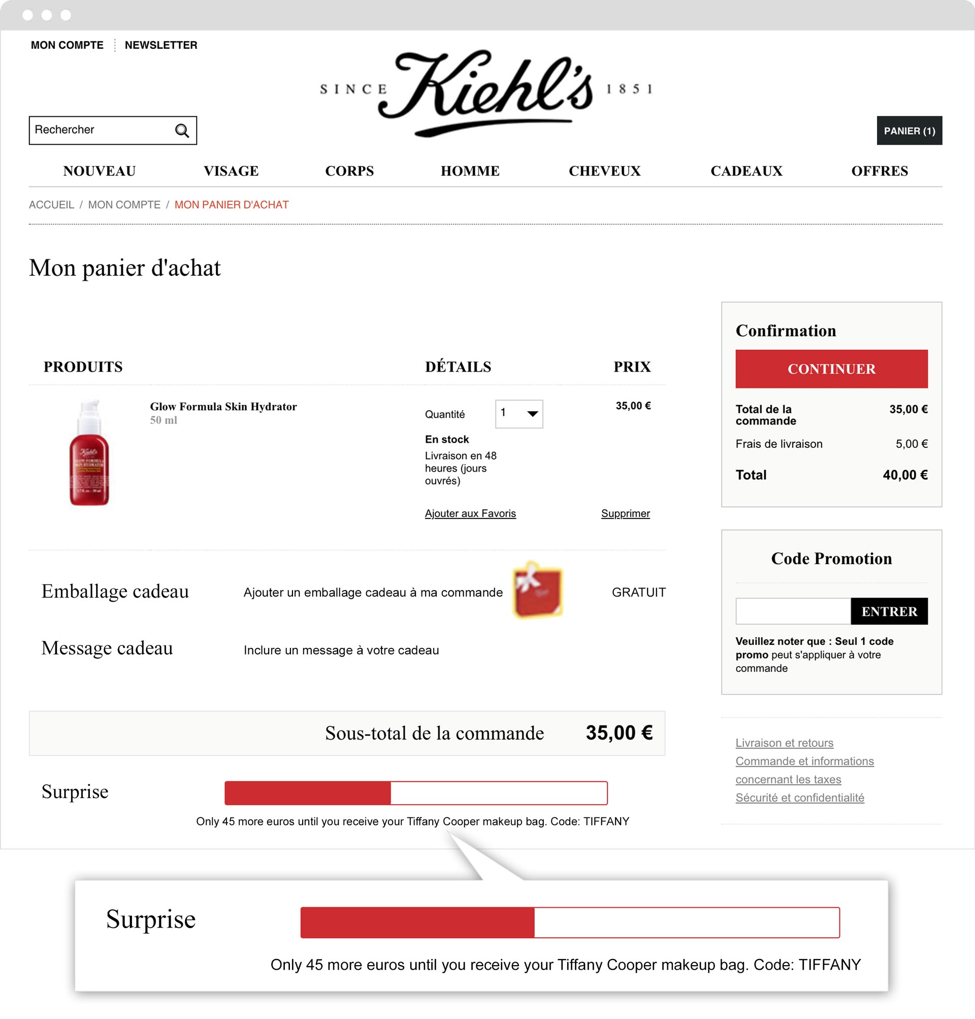
Kiehl’s ran a similar test on their French site, with equally impressive results. By adding a progress bar showing how much more a shopper needed to spend to get a free gift, they increased revenue by 31%.
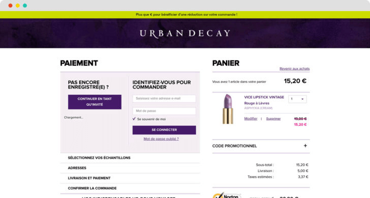
Still not convinced? Check out this example from Urban Decay. By simply pushing a banner on their basket pages showing how much more shoppers needed to spend before getting a discount, they increased their revenue by 7% during the duration of the test.
Social Proof
Along with gifts, discounts and free shipping, the use of social proof messaging is especially powerful when it comes to cosmetics. After all, there’s a big element of ‘following the herd’ when it comes to beauty products. If 100 other people bought this mascara in the past hour, it couldn’t possibly be clumpy! If 130 people are looking at this bright red lipstick, it must be flattering.
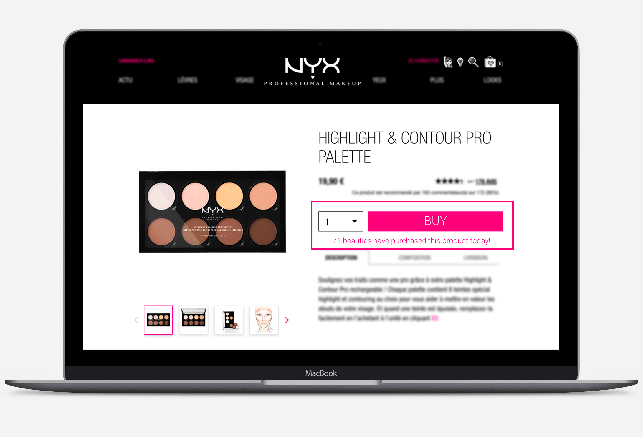
NYX Professional Makeup put this idea to the test – and doubled their transactions.
Emerging Trends
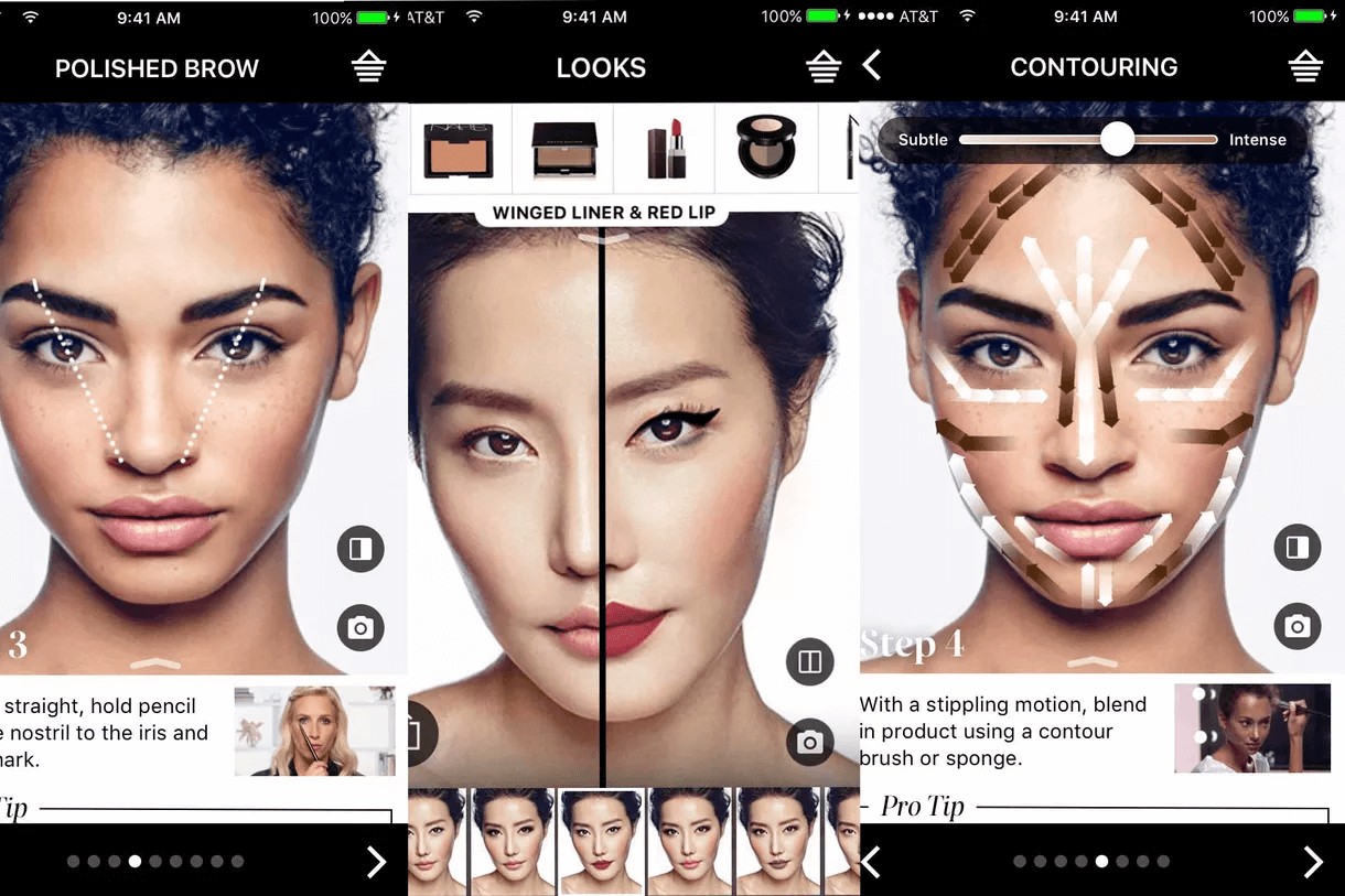
Virtual Try-Ons
The flip side of the ‘social proof’ coin is the idea of personalization. Yes, consumers want to be ‘in vogue’, and knowing what their peers are shopping for can stimulate trends and reassure browsers. But beauty products are also extremely personalitems. They tap into our feeling of being unique, of our desire to express ourselves. Of the thousands of shades of red lipstick, shoppers want to find the one that will look the best on them.
Virtual try-ons – the ability to use AR technology to simulate what a particular cosmetic will look like on you – is a fast-emerging trend that addresses this need.
The allure of a virtual try-on is multifaceted: not only can you experiment with looks at home or on the go, you don’t have to bother with endless cotton balls and makeup remover, like when you actually try them on physically in a store.
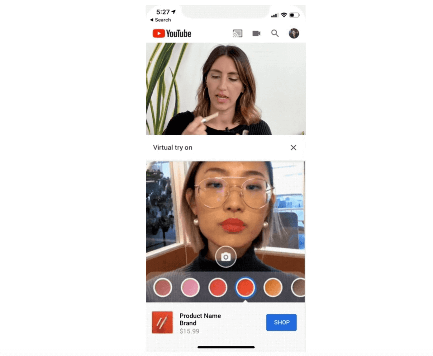
YouTube is currently experimenting with their own AR beauty try-on capability:
“Called AR Beauty Try-On, the feature is designed to be used in a split-screen experience while YouTube viewers watch the makeup tutorial. When available, the YouTube makeup review or tutorial video plays at the top of the screen, with a stream from your own front-facing camera below. Here, a YouTube viewer could access a palate of colors — like new lipstick shades, for example — and tap to apply them to their own face while the video plays above.” TechCrunch
Virtual try-ons continue to blur the lines between the physical and digital, in-store and online customer experiences, offering more flexibility, personalization and ‘on-demand’ experiences for consumers.
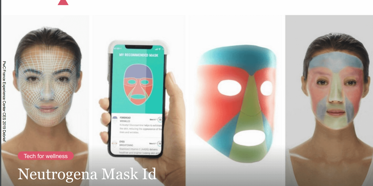
Beauty Tech
“According to Jean-Paul Agon, president and CEO of L’Oréal, the impact of new technologies, AI and the consumer experience will be stronger within the beauty industry than in any other consumer sector.” Peclers Paris
Many beauty brands already harness the notion of ‘science’ to legitimize and empower their products. Now, they’re going a step further to innovate technology that addresses their customers’ pain points.
Neutrogena, for example, showcased their ‘Mask ID’ at this year’s CES event. After you scan your facial skin in order to have an in-depth understanding of your skin type, Neutrogena then sends you your hyper-personalized mask.
CareOS even taps into the realm of fairytale with their smart (magic?) mirror. The aim? “Help people meet their personal health and wellness goals, experiment with new products and practices.”
Takeaway
The cosmetics industry is booming, and is only slated to grow. Beauty brands are already improving the customer experience – and business results – through freebies, social proof messaging and other tried-and-true tactics. For these brands, the future of customer experience will be based on even more novel ways to personalize the user experience, harness emerging technology and blur the lines between physical and digital experiences.
Want more tips and experimentation ideas? Download our beauty book based on our client success stories.
There are several elements that go into creating a successful marketing plan for our digital era—with two important tactics being lead generation and SEO.
Lead generation is the process of cultivating an interest in your business to build an ongoing list of potential clients (or ‘leads’). As I mentioned in a previous article on B2C and B2B lead generation—all businesses need a steady stream of leads to grow and survive.
SEO, or search engine optimization, is the practice of refining web pages to ultimately improve their ranking on search engine results pages. The goal here is to have search engines (like Google) return links to your website when a user types in a relevant question or query. The higher your website ranks, the higher the likelihood that users will click, which not only increases the organic traffic to your website but your company’s online visibility.
At this point, you may be wondering what the connection is between these two strategies. First, it’s important to clarify that SEO and lead generation are not one and the same. SEO is focused on increasing web traffic. Lead generation is focused on increasing the number of clients/potential clients for your business. However, SEO can complement lead gen efforts by driving awareness for your company via organic traffic to the site.
In this guide, we’ll cover the ways in which you can effectively utilize SEO to help with your lead generation efforts, as listed below:
Audit Your Website
Perform Keyword Research
Update Existing On-page Content
Benchmark Your Competitors Performance
Create An Ongoing Content Strategy
Create a Backlink Strategy
Let’s begin.
Audit Your Website
Auditing your website is necessary to know which web pages are performing well and which need improvement. Which is why we suggest crawling your site as the first step. Luckily, there are various tools available to help with this.
For instance, Screaming Frog is a UK based search marketing agency that offers a free version of its website crawler. This tool can crawl your website and find broken links (404 errors), titles and meta descriptions that are over the recommended character limit (or even worse: missing), duplicate content, and so on—so you can fix these issues that are negatively impact ranking.
Check for Speed
Fast-loading pages aren’t just important for the user experience. Slow load times on desktop and mobile devices can negatively impact a site’s ranking as well, and contribute to high bounce/exit rates.
Try usingGoogle’s PageSpeed test to analyze specific web pages on your site for speed. It’s a free tool that also offers suggestions on how to improve the performance of those pages—a win-win.
Perform Keyword Research
As mentioned above, a central element of SEO is having your content surface for relevant keywords. Which is why keyword research is so important for steering SEO strategy and understanding topics of interest for your target audience.
Don’t create content based on assumptions or abstract terminology that people aren’t searching for—it’s a shot in the dark that more often than not, won’t work.
Identify the main keyword(s) for your business and build out a list of related terms and queries from there. These keywords should be the building blocks for an SEO content strategy. SEMRush Magic Keyword finder is a great tool, or there are free options like UberSuggest that analyze keywords and generate similar terms to help with this.
The relevant keyword for an article or blog post should be one of the first (if not the first) word in the titles and meta-description of your content so it’s recognized by search engine crawlers.
Update Existing On-Page Content
People want to read content that’s useful, engaging, and accessible. While SEO helps drive people to your website, it’s the quality of the content and the user experience that will get people to stay.
So, take a look at the existing content on your website. Is the language clear and concise? Does it offer insight or value to readers? A few SEO tips for website content: organize sections with headers and focus on a healthy blend of context and scannability (bullet points, numbered lists, etc.) and include images with alt descriptions, which will help search engines crawling.
Also, analyze page performance with your analytics tool (e.g. Google Analytics) and identify areas of your site that have high bounce rates (anything over 60%). These are the areas that should be prioritized when refining existing content.
Benchmark Your Competitors Performance
It may seem like a rather complicated task—analyzing your competitors’ performance with SEO lead generation—but it doesn’t have to be.
Keep a record of your competitor’s positions in search for the same or similar queries and analyze how well that page performs. If a competitor is performing better than you for the same search terms, dig into why this may be. Consider the structure of their posts, how they’re written, backlinks, and so on in this evaluation.
Understanding how similar content performs will help you parse out effective strategies for your own efforts—and can highlight aspects of your current strategy that may be dated and need updating, or even technical issues that are hindering your ranking.
Create an Ongoing Content Strategy
A steady stream of content that provides value to your target audience is key for lead generation. Once visitors realize that your insight can be of use to them in their day-to-day, they’ll be more willing to sign up for regular newsletters or fill out forms to access gated content.
This is why it’s important to create a content calendar to help your team stay organized and on a regular publishing schedule. Organize articles and topics by theme based on your keyword research. This will make sure you’re putting out content that people are looking for, which means a larger, more engaged audience.
An ongoing content strategy, combined with keyword research, will significantly assist any SEO lead generation campaign as creating content people are looking for will increase brand presence in search and bring in those all-important leads.
Create a Backlink Strategy
Backlinks are created when different websites link to one another. These links are crucial in improving ranking, as it’s seen as a vote of credibility for your content by search engines. However, not all backlinks are ranked the same. These inbound links need to make sense (not just linking to a random, unrelated piece of content). Getting a backlink from a trustworthy site with a high domain authority is key.
Also, for a backlink to have a positive impact on your web page ranking, it needs to have the tag ‘rel=follow.’ This essentially is a signal to site crawlers that they should follow this link to the corresponding website. No follow links (that have the tag ‘rel=nofollow’) tell search engine crawlers the opposite, and prevent the link equity from being passed through.
While backlinks are a huge component of SEO, building these inbound links can be tougher than it sounds. Remember that Google is highly suspicious of any artificial linking activities and will penalize sites that have backlinks that don’t appear to be organic or link to irrelevant content—we do not recommend buying links or resorting to shady strategies when it comes to inbound links. More likely than not, it will backfire and hurt your ranking.
Instead, look at your website’s current backlink profile and see if there are any broken links that need to be fixed—this is an easy way to improve SEO while you work on getting high domain authority backlinks from other sites. On that end, consider existing relationships your brand has and if there are any opportunities for there to gain a backlink—perhaps with a guest post or if you spot an article of theirs that could benefit from linking to one of your site’s articles (to provide additional context to the topic).
Key Takeaways
Creating an SEO lead generation campaign is not only going to ensure your ongoing marketing efforts stand a great chance of succeeding in an oversaturated market, but it will also help future-proof your web content by maximizing the opportunities to gain new leads with a strong online presence and a great user experience.
As well as simply conveying the core message of the email, adding “video” to the subject line piques a reader’s interest, compelling them to open the email.
Simply put, they want to know what’s in the video.
#3 Build Trust and Authenticity
Using videos is a great way to build trust and to establish a connection with your audience.
It puts a face and a personality to your brand, allowing your audience to get a feel for the person or team it is dealing with.
You can establish trust by sharing tips, insight into your business operations, or just fun videos to build rapport. It’s also a great way to warm up your audience to a product or service.
To build trust using videos, consider implementing the following tips:
Have the same person present the videos consistently: Over time your audience will start to feel like they know that person. This helps to establish a personal connection to and trust of your brand.
Create useful and free video content for your target audience: You’re perceived as a credible and authoritative expert in your industry, which builds deeper trust and creates a (future) desire to pay for your expertise.
Create videos that show positive and negative brand experiences: Consider using personal stories or a sneak peek of your office. Be genuine and human and you’ll earn people’s respect and trust.
#4 Social Media Shares and Boosts to SEO
A huge bonus of using video email marketing is its indirect effect on your search engine rankings.
This increases your social engagement, which in turn boosts your brand in the search engines.
While social media engagement itself is not a ranking factor for Google (it is for Bing, however), it does amplify other ranking factors that Google does use.
Social sharing increases the visibility of your content. The more people that view your content, the more likely it is to get shares.
Nowadays people live busy (and distracted) lives. Plenty of people would rather watch a one-minute video than spend 15 minutes reading a long-form article.
A benefit of videos is that they can quickly and easily get across your core message and grab the attention of viewers. Even complex subjects can be made easier to understand.
Videos are more interesting and engaging (when compared to text alone) and can have a bigger impact on your readers.
Videos can go viral quickly and viewers respond more positively to a product after watching related videos.
#6 Stay Out of the Trash
There’s nothing worse than spending hours of your valuable time building an email campaign for it not to be read, chucked unceremoniously in the trash, or worse still, marked as spam.
Luckily, good-quality, interesting, and engaging videos capture the attention of the reader and reduce the likelihood that your email will go straight into the trash.
When done well, it’s also a valuable opportunity to give an excellent impression of your service or product.
How to Incorporate Video Content into Emails
Now you know the benefits of using videos in your emails, here’s how to add videos to your email marketing campaigns.
Technique 1: Embed Videos into Emails
You can embed videos directly into emails.
The reader should be able to view a playing video without leaving their inbox, which, in theory, sounds like a great user experience.
But despite the fact this technology has been around since the ‘90s, videos embedded into emails come with a host of serious flaws.
Due to spam and security precautions, many email clients do not support embedded videos.
Not all email clients (even the big guys like Gmail, Hotmail, or Outlook) can support the more recent video format, HTML5.
In other words, when you embed a video directly into an email, there’s a chance that the reader won’t be able to view it as you intended.
Does that mean you should abandon using videos in your emails? No, the benefits of using them are too high.
Rather, you need to use a technique that is guaranteed to work, every time.
Technique 2: Use a Video Thumbnail Image
To counter the inherent downsides of videos embedded into emails, marketers often use a video thumbnail image within the email which links to a landing page where the video lives.
Inside the email, create an image that looks like a video. When the image is clicked the reader is taken to your website or YouTube to view the video.
The video isn’t hosted in the email, which actually comes with some powerful benefits:
The video will definitely work (unlike Technique 1)
The video can be set to autoplay on YouTube or your website, meaning as soon as the user clicks the video, it plays
More traffic is converted from your email to your website, meaning more page views and more website interactions
By adding CTAs on the video landing page, you can move the reader through the sales funnel
Types of Video Email Marketing Campaigns
Data shows that video in email is effective and hosting a video on YouTube or your website is so easy to set up, what are you waiting for?
Here are some effective ways to start incorporating more video content into your marketing emails today.
Personalized Emails for Sales
Creating personalized videos is an excellent way for sales teams to convert leads. Plus, with tools like Wistia, it only takes a minute or two to record, edit, and send a video.
Wistia’s Google Chrome extension allows you to record your screen and yourself at the same time, edit the video, and then easily send it over to your customer or prospect.
You can add a personal greeting to the recipient, allowing you to personalize your sales efforts and significantly increase your response rates.
Plus, with companies finding a 36.9% higher close rate when using personalized videos with email, it’s got to be worth a try.
Use Videos to Tell Customer Stories
Take a moment to consider what is more genuine:
your brand telling a customer why they should buy, or
a customer talking about their positive experience with the brand.
It’s a no-brainer. Potential customers are far more likely to trust customers than the brand itself.
Some 76% of people believe that content posted by customers is more trustworthy than brand content.
Using an existing customer to explain their experience on video is an excellent way to sell your services or products. It’s genuine, personal, and highly trustworthy.
To increase conversion rates, go one step further and include these videos in your email marketing campaigns.
Consider Using GIFs As Well As Videos
In general, videos perform best when they are short and sweet.
Consider your audience and your product or service. Is your audience younger and tech savvy?
If so, it could be worth considering using a short GIF instead of a full-blown video.
GIFs are easy to insert into emails, quicker than videos to make, and can be equally engaging.
Consider these questions before adding GIFs to your campaigns:
Does it reinforce your message?
Does it highlight the most important parts of your email?
Does it emphasize the features of your product or service?
Does it add some fun or excitement to your message?
Does it offend your audience?
If you do decide to use GIFs, make sure you don’t overdo it. They can be distracting and annoying, so a general rule of thumb is to only include one or two per email.
In the example below, the GIF makes the email design more interesting, grabs the attention of the reader, and delivers emotions in a more personal way.
Over to You
Now we’d like to hear from you.
Are you going to use embedded videos or send readers to your website?
Either way, let me know by leaving a comment right now.
But, appealing to the modern consumer has become increasingly difficult. Lead generation needs to be personalized, innovative and focused on providing value to your target audience. It’s about cultivating a relationship with people that gradually convinces them that your product or service is exactly what they’ve been looking for.
That is how brands will stand out against the competition and pique interest among consumers who’ve become quite good at glazing over messages and advertisements that aren’t immediately recognized as being relevant.
Unlike B2B lead generation, which is generally marked by longer sales cycles and involves multiple decision-makers, B2C lead generation deals with the individual consumer. This means the lifespan of a sales cycle is generally shorter, and is more prone to decision-making that’s rooted in emotion.
We outlined four great strategies to kickstart your B2C lead generation strategy below. (If you’re more focused or interested in B2B lead generationclick here.)
1. Connect Your Email Marketing and Social Channels
When it comes to creating an innovative strategy for B2C lead generation, a great place to start is your company’s social channels and email marketing.
Social media and email have the ability to reach a large audience or customer base with relevant messaging that appeals to user interests. Work on connecting these two ecosystems to ensure that regular visitors to your site are following you on social media (and vice versa).
When it comes to generating some great new leads in an over-saturated consumer market, having a water-tight content strategy is the key to success. Any content you create—whether it’s email marketing, social posts, blog articles-—needs to be of the highest-quality to really help accelerate your lead gen strategy.
Informative, polished, content helps build trust in your brand among current and potential clients. Using personalization to put the right content in front of the right person will elevate your efforts even further.
Be sure to incorporate SEO into your strategy to make sure your content is surfacing on top Google search results pages for increased visibility. Perform keyword research to understand what your customers and target audience are looking for, and build out content topics from there. These keywords should be present in the title and throughout the body of the article (when appropriate), and content should be organized into sections with headers for better indexing.
And above all, focus on creating informational and engaging content, not something that’s overly promotional or pushy, as this may put off users in the early stages of interacting with your brand. The goal here is visibility, establishing your company as a leader in its field, and showing how you’re a resource for customers’ needs.
3. Invest In Your Website
To ensure your brand stays relevant and engages the modern consumer, your website needs to be optimized to create a seamless customer journey. Remember to design with the user in mind.
Consumer behavior has shifted dramatically in recent years with the growing advancement of digital platforms. People are increasingly reliant on their smartphones to research products (at home and in-store) and expect to have the same quality experience as they would on a desktop or tablet. Fast loading times (across devices) and a responsive website are necessities for B2C lead gen. In fact, according to Think With Google, once web pages take more than 3 seconds to load, the bounce rate spikes dramatically.
Continued testing will ensure your website remains aligned with visitor interest and is easy to navigate. Even small changes (e.g. reordering or renaming headers in the navigation bar) can have a huge impact on the overall user experience—and your lead generation.
4. Cross-Channel Paid Adverts
Cross-channel advertising is when a company runs paid advertisements that appear across channels and on various devices (you’ve likely seen paid adverts from companies on social media, search results pages, and even on third-party sites).
Social media channels such as Instagram and Facebook are great channels for reaching customers with targeted based on user interests. Personalized adverts use artificial intelligence gathered from social media channels, allowing companies to then create customer profiles for more precise targeting. By funneling a potential lead through an advert that appeals to them, the brand can then gain more details about the user through a simple form, sign-up notification or email pop-up box, before the person continues on their journey to the site.
Google paid adverts, also known as PPC ads, ‘buy’ a place at the top of relevant search results which means: high-visibility. Again, paid traffic can be funneled directly through to a landing page with a form or some kind of email capture, before the visitor is redirected to the website.
Paid campaigns are quite effective, even on the smaller budgets, but they do rely on as much data as possible to better target high-quality leads that have a greater likelihood of becoming customers. The ‘cost per click’ vs. the ‘cost per lead’ will need to be closely monitored to ensure you aren’t paying high advertising costs for a lower return on investment. If you’re considering using paid advertising for your next lead generation strategy, invest in a campaign tool to help obtain details from potential customers and target them with highly-relevant content to help them remember (and continue to interact) with your brand.
Conclusion
Whilst these strategies work really well in isolation when it comes to gaining some great new leads for any B2C brand, they also complement each other’s strategy and can work really well as a combined approach too. When it comes to improving your brand presence and attracting new contacts, being creative with your approach is imperative. As B2C marketing becomes more personalized, driven by data obtained from the user and their behavior online, there is more emphasis on brands to come up with new and clever campaigns to engage with consumers.
As with any marketing campaign, we are always in favor of A/B testing each of these strategies as it will give you much more insight into what potential leads respond best to. Whether it’s A/B testing your paid social adverts, changing the language in your email campaigns or creating versions of the same landing pages and A/B testing language, colors and even the positions of the call to actions- the possibilities are endless when it comes to testing. Gaining as much data about your unknown leads will help your brand appeal to their interests, allowing you to target them on platforms they frequent with personalized content that is likely to generate a lead.
Combining marketing tools with your next lead generation campaign strategy will ensure your brand stays ahead of the competition and keeps up with marketing, using a data-led approach in a digitally-focused industry.