Think back to earlier today: do you remember the banner which adorned the news site you eyed on your way to work? Or which brand’s commercial played while you waited for your video to load? Chances are, you’ll struggle to put your finger on the advertiser…
If even us marketers hardly pay any attention to these messages, then how can we expect your average Joe to do so? Enter: storytelling applied to digital marketing.
– Seth Godin
Digital marketing has left behind the days where it focused on relentlessly pelting users with the same message, again and again, until their jingles were drilled into their brains. Instead, marketers are aspiring to offer consumers unique experiences, getting users to seek them out, hoping to see their latest creations.
.
The Fundamentals of Storytelling
Storytelling activates the part of the brain responsible for feelings; as buyers, those emotions influence how we perceive the brand. Repeat after me: Consumers should not be reduced to numbers on a spreadsheet! Return to your roots as a storyteller and connect with their emotions. Create something so stunning that it drives viewers to rush to their friends and exclaim, “Hey! Have you seen this brilliant new advertisement?”
Tell people who you are, what you represent, and why you exist. Even though your story will most likely be linked to your product, the most important thing is to get clients to pay attention to you. Your goal should be for them to seek you out willingly, instead of “forcing” them to read, listen to, or see your message.
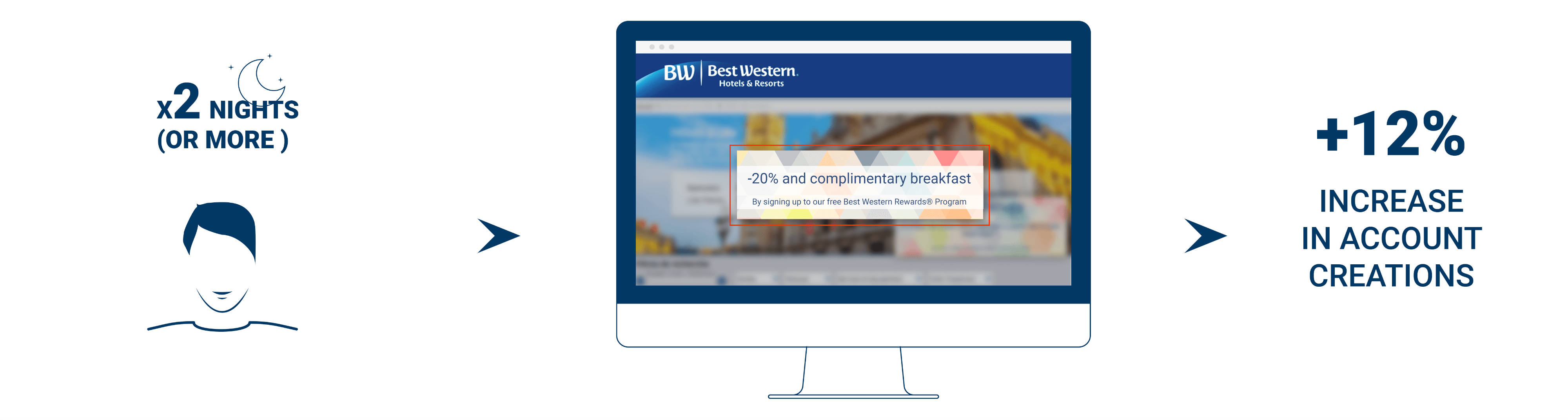
When Old Spice’s sales slumped, they responded by creating a series of side-splitting commercials, aimed not at men… but at women. How could this be, since they sell masculine products? After multiple surveys, the brand had discovered that it was the latter who usually shopped for their partner’s shampoo. The ads had a spectacular impact on their target audience, to the point where a surge of memes and other parodies started popping up – even Oprah Winfrey joined in on the fun!
.
Why Do We Tell Stories?
Every single person, from the most seasoned executive to the freshest intern, can tell a story. But where does this love for narrative originate?
There are a hundred reasons to tell stories: from entertaining, to selling, to educating… They’re our way of sharing information. In the interest of saving time, we’d like to highlight the following three:
- Connecting with your audience: Consumers usually conceive of brands as untouchable entities which preside over the “common folk” (a.k.a., any consumer without a cushy Swiss bank account). As a result, companies usually come off as foreign and unrelatable, hindering the marketer’s efforts to make them appear authentic. Stories tap into people’s feelings, inspiring them to engage with the brand, and creating an emotional bond between them. Win buyers over by creating a narrative around your brand!
. - Simplifying complex messages: How can you capture a user’s attention in a few seconds? With the fast-paced environment they move in, you have a very, very limited window of opportunity to express your idea! Stories provide a way to sidestep this barrier, bringing the concept down to earth.
. - Bringing people together: All around the world, people from all cultures understand the concept of a hero, a quest and victory. Stories are a universal language which builds a sense of community among all sorts of people. Take Gillette, for example: by targeting fathers who are welcoming newborns into their homes, the brand has created a movement which boosted their sales, by consolidating a community which sees that the brand cares.
.
What Makes a Good Story?
The good, the bad, the ugly… these words are all relative to the reader’s opinion. Nonetheless, there’s a handful of non-negotiable elements which make for an exceptional storytelling experience.
The ‘best’ stories stand out for being…
- …universal: All readers can relate to the characters and are able to step into their shoes as they adventure deeper into their quests.
. - …enduring: They’re sure to be passed on from one person, and one generation, to the next, be it because of the story’s defining hilarity, brashness or sheer emotion.
. - …compelling: Keep the reader hooked! What will happen next?
.
- … well-structured: They manage to convey the clearly-defined core message, helping readers drink it in.
Be sure to check out HubSpot Academy’s Power of Storytelling course, where you can discover the three elements that make up a good story!
|
The Storytelling Process
Storytelling is an art. Like all artists, storytellers require skill, creativity, and a lot (and we do mean a lot) of practice. Introducing: the grand storytelling process:
- Define your key message: Before letting your imagination run free with formats, length, and design ideas, you must define the core message of your story. Just as a house is built upon a foundation, be sure to have a clear idea of what will hold up your narrative – work on summarizing the concept in 7-10 words; if you can’t, then the message isn’t clear yet.
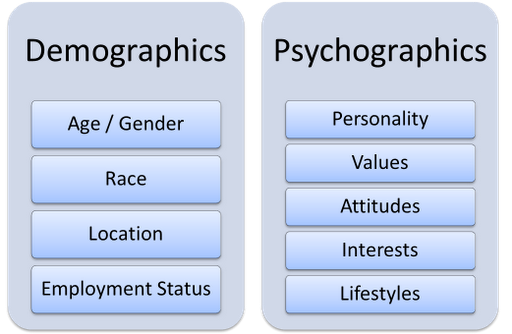
. - Know your audience: Start by digging into your data. Who would want to hear your story? How would they react to the message? Study your target market, define your buyer personas, and show each story to the right audience segment.
. - Decide what story you’ll tell: Weave your story together while keeping in mind the reaction you wish to see in your users. What is your goal?
. - Fostering a sense of community: spin a tale which inspires readers to share your story with others by employing relatable situations and characters.
. - Conveying your brand values: This is particularly relevant when promoting values which some users might not share or comprehend; use familiar characters and plots to facilitate showing how the story applies to their own experiences.
. - Inciting action: Narrate how your characters successfully completed a task, and how readers might do the same.

- Choose the most effective medium: A storyteller’s tale can take many forms: some stories are read, others are listened to, and others are watched. The medium you select will most likely depend on the story itself, as well as the available resources (namely, time and money). Some of the most popular are:
– Written stories are told through blog posts, articles… Since these stories require no more than a word processor (Google Docs is a popular free option), this method is the most affordable.
– Visual stories are open to a wide range of media, including videos, games and even interactive stories.
– Oral stories (such as podcasts, radio appearances, and even live events) are, naturally, told “live”. Since they are shared in person, they are characterized by their unedited nature, for which the storyteller shall require more practice and skill in order to convey the correct messages, and elicit an emotional response in the audience.
Take a step further, and figure out their favorite social platforms, where (and when) they typically share content, and what they like to engage with. Additionally, consider device ownership and usage: this will boost your optimization efforts.
- Establish your CTA: Give thought to which action you’d like your audience to take when they receive your message. Should they subscribe to a newsletter, purchase an item, donate to a charitable cause?
. - Share your story: Be sure to promote your story! Remember that creating the tale is only half the battle – sharing it over dinner with friends is great, but is that really all that it deserves? Remember that the more ground you cover (in other words, the more platforms you use to share your story), the more engagement you’ll find!
.
Powerful Brand Storytelling Tips
How many times have you been drawn to a post’s title, hooked by the opening paragraph… and then felt your eyes glaze over because you discovered a bland, mechanical example of ill-disguised self-promotion? Don’t fret – it’s happened to the best of us.
Knowing your audience may seem like the final destination for many marketing professionals, who wrap up their campaign convinced that their presence on the sites their target groups most frequently visit is enough to have consumers riding off into the sunset with their brand.
But there’s a pinch more to add to that recipe: namely, finding how to make your storytelling efforts attractive for the customer. Because if they’re not getting anything out of it, then what’s the use?
.
Discover the Hero’s Journey
Marketers must clearly identify the three core elements in their message before spinning their tale: the introduction, the narrative arc, and the resolution. Take a step further, and adopt the classic storytelling technique which had stood the stop of time: the Hero’s journey. Developed back in 1949 by Joseph Campbell, it was immediately adopted all around the world, defining how the main character undergoes a specific series of events which make them address their inner heroic potential and change their world forever.
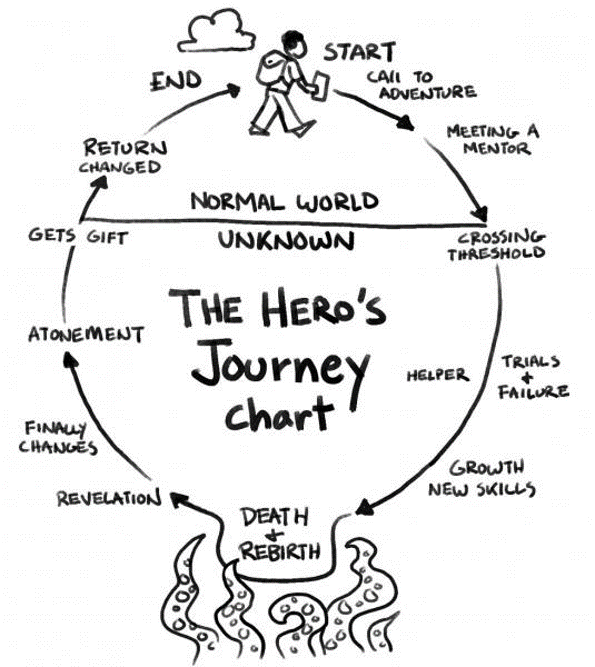
This all sounds peachy, but how can you use this for brand storytelling? In a nutshell, your target customer (a.k.a., our daring hero) embarks on a quest to overcome trials and, finally, returns triumphantly with their justly earned prize (your product or service).
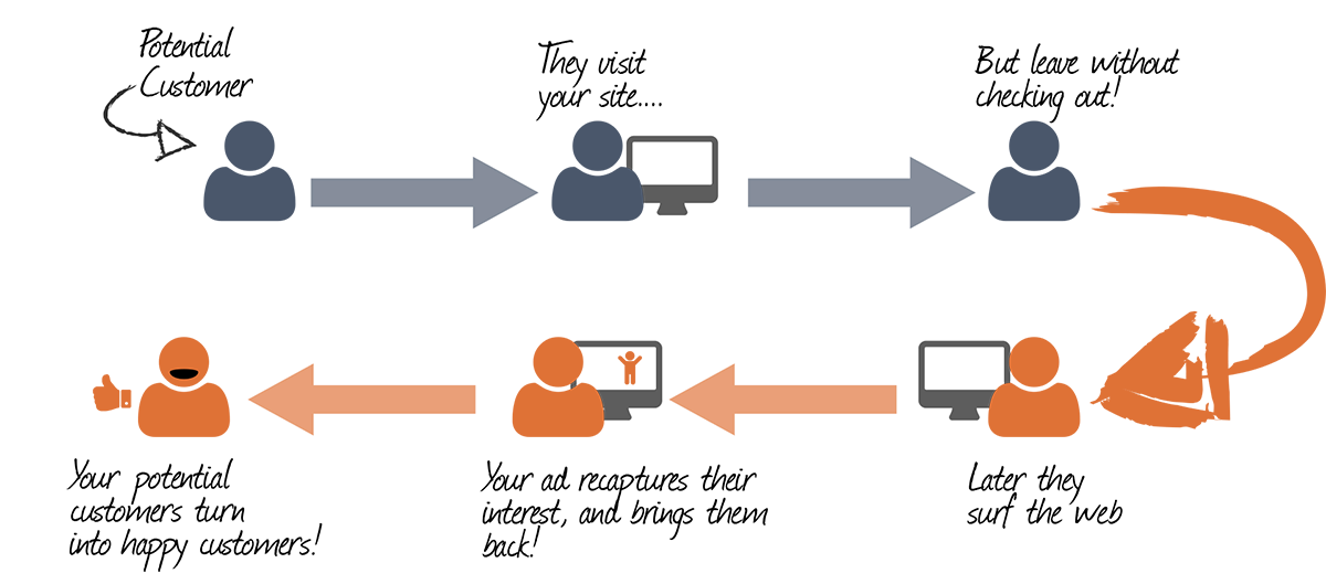
Given that consumers would rather discover the products themselves rather than be flooded by advertisements, due to a surge of skepticism regarding commercial messages, marketers let customers fill the hero’s shoes, thus building an emotional bond between the brand and its users – making them want to come back, again and again. Try inviting celebrities to tell your story, and make sure it’s a hit!
The Hero’s Journey is broken into 12 stages and split equally between two halves: the top area is the “Normal world”, where our Hero lives as a mild-mannered customer; while the bottom part is the “Unknown”, that is, the brand new world which unfolds before their eyes when they embark on their quest. Every single prospect you come across will fall into one of these stages – your goal, as a marketing professional, is to identify where they are now, and define a strategy to transform the client into the story’s Hero. Show them how your product is the ultimate gratification!
– Joseph Campbell, The Hero With a Thousand Faces
Let us sum up the main takeaways of the Hero’s Journey, applied to Digital marketing:
- Your Hero is on an adventure: Your visitor may not have a kingdom to save, but they do have to find the right pair of hiking boots for their upcoming adventure trek with their brother-in-law, even though they never really exercise, and were really looking forward to simply lounging in the sun all day, AND HOW COULD THIS POSSIBLY LAST A WHOLE WEEK?! … So it’s safe to say that the kingdom can wait.
. - Your Hero will face hardships on their quest: What obstacle is standing between your customer and what they want (a.k.a. your product)? Take a long, hard look at these hurdles, since your Champion will have to defeat each and every single one! Which impediments can you work to overcome? How many are directly related to your brand or product? How can you guide the client through them so they can discover your true value? What can you do to keep them after that initial purchase?
. - Your Hero’s foe is yours as well: According to James Fahy, “Nothing unites humans like a common enemy”, a lesson which merges seamlessly with the Hero’s Journey, as applied to Digital Marketing. Find a common foe, prove your valor, and watch your customer’s loyalty to you skyrocket.
Your customers will feel valued (they are the Heroes in your story, after all!), encouraging them to talk wonders about your product and brand!
When to Use A/B Testing and Storytelling
Every single marketing professional dreams of boosting their conversion rates and utilizing A/B testing and personalization strategies to improve their results. Yet many overlook the opportunity to combine the two tools.
Marketing professionals are increasingly turning to A/B testing and AI when crafting stories for brands’ target audiences. Artificial Intelligence is smart enough to determine the needs of each segment, and A/B tests step in to sniff out the ideal alternative for each and every one.
The use of this tool can range from large scale modifications on a whole online platform, to the smallest details on a single page. Take, for example, the CTAs on the site or in the email’s subject lines: Which colors should you use? Which wording, font, size? Did users with the first version of the subject line open more emails than those with the second one? Which version of the CTA received more clicks from your clients?
As for A/B testing applied to storytelling for digital marketing, the norms remain the same: its efforts should always be aligned with your company goals. Have fun and experiment! Which designs and messages lead to more sales?
For all the data your enterprise may collect, there will always be the eternal matter of employing it well – even if you know your target audience like the back of your hand, trends shift, users evolve, and each segment might react differently to each message than another group!
Optimize your digital experiences with A/B testing – offer your users nothing but the best, and watch it pay off in the long run.
Going a Step Ahead
Big data has ushered in personalized messaging, and it’s quickly become the norm in this new, data-saturated society. The rate at which businesses collect information nowadays is unparalleled; yet, despite this inconceivable wealth of solutions, companies are still struggling to fully grasp the groundbreaking opportunities which are now within their grasp.
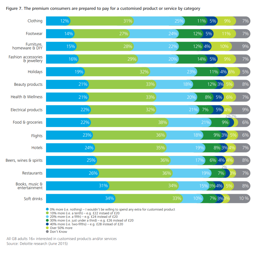
The best marketers know that creating personalized experiences is all about the data, and the way you use it. Look no further than the brands which are making the most out of personalized marketing, offering individualized products, experiences, and messages to their users. According to Salesforce, most clients (particularly Generation X and millennial shoppers) are open to offering personal information in exchange for personalization.
Marketers continue to hatch ingenious ways to employ this abundance of data, but there is so much left to be explored! How could they possibly begin to transform this treasured resource into profit?
The answer is right in front of you: adopt a personalized storytelling culture!