How many first-time visitors on your website convert into paying customers?
For most, the answer to this question won’t be too impressive. Thanks to lead generation landing pages, we don’t have to let this traffic get away.
Landing pages that generate leads are a great way to further nurture your well-deserved website traffic and share compelling content with them until they are ready to convert into customers. But, how can you get your visitors to interact with your landing page?
In this article, we aim to answer this question and provide you with 10 tips to increase your lead generation by optimizing your website’s landing pages.
Let’s get started!
What is a lead generation landing page?
A lead generation landing page is used to collect personal information and establish contact points to create as many leads (or prospects) for your business as you can.
Unlike a click-through landing page which serves as a “warm-up” stage before an action such as selling a product or service, the lead generation page is there to maximize the interactions between your visitors and your page in order to establish contact.
The main objective of a page like this is to collect personal information such as:
- First and last name
- Email address
- Telephone number
For many activities, leads are crucial to business. No leads, no sales. Do you see where we are going with this?
And yet, many websites don’t focus enough of their efforts on attracting new leads.
This article will cover 10 tips to help you create top lead generation landing pages to allow you to stand out from the competition and to continuously attract prospects WITHOUT using AdWords.
10 tips to create top lead generation landing pages
1. Pay attention to your design
As we all know: a rough design does not inspire visitors to have confidence in your website.
If you want to generate more leads, you will have to start by working on your landing page’s design.
Your landing page design should be clear and understandable for everyone.
To create an impactful design:
- Harmonize your theme’s colors
- Clearly differentiate the “titles” of your paragraphs
- Play on shapes and symmetry
- Remember to let your text breathe to make it easy to read
If you are presenting several distinct offers, one tip is to highlight one in relation to others: focus your leads’ attention on a particular offer.
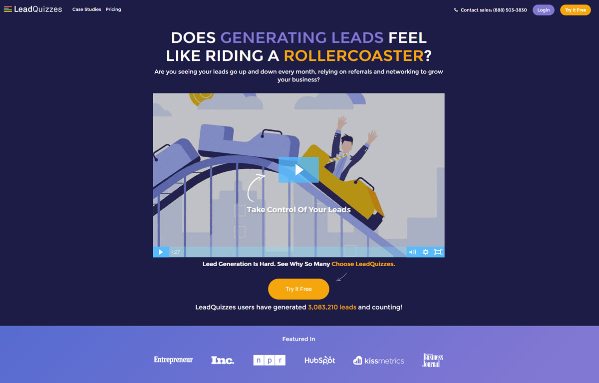
As an example, you can see in the image below that the LeadQuizzes website has created a landing page dedicated to their free trial. They use a green banner to highlight their intermediary offer to attract visitors’ attention to that offer as well as the free trial.
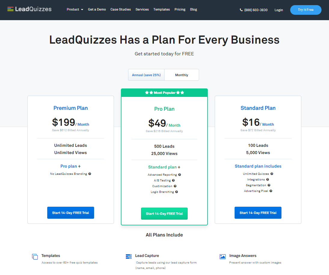
However, the LeadQuizzes landing page remains clear and easy to navigate: the value proposition is shown in one sentence and the service’s characteristics are highlighted under the 3 offers.
2. Work on your call-to-action
The call-to-action is one major thing you need to pay attention to when working on your landing page.
As a reminder, a call-to-action is an element of your landing page that aims to trigger an action.
What does this mean exactly? Here are some call-to-action examples:
- Subscribing to a newsletter
- Completing a registration form
- Signing up for a free trial
- Buying a service/product
- Reserving a service
- Asking for a callback/contact
A call-to-action must be seen as the culmination of your business proposal. It is introduced by sales pitches and highlighted in relation to the rest of your page.
For example, in the image below, you can see the Trello site. Their landing page was designed to be as simple and as impactful as possible. There are two paragraphs of text, the first of which contains the value proposition in bold. Then, you can see the CTA in bright green that resonates with the “Sign Up” button that we can see in the upper right corner.
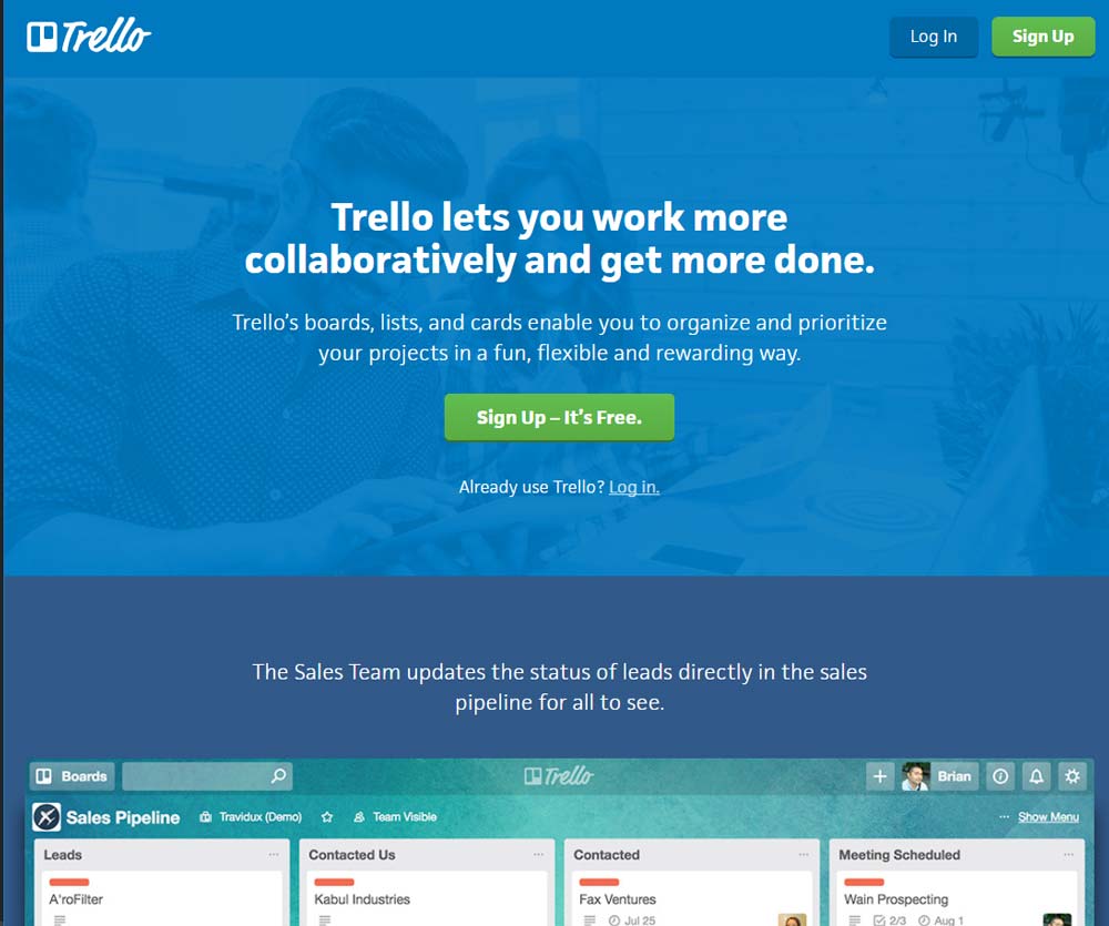
For the call-to-action, we can see two elements:
- The use of the imperative: “Sign up”
- The presence of an argument: “It’s free”
Using the imperative is a method that often comes up when writing CTAs. The visitor will feel that they are being spoken to directly, which is more personal than the traditional approach of using the copy “Registration”.
3. Look after your forms
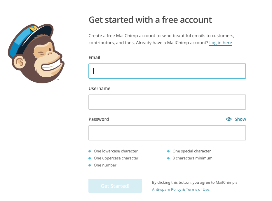
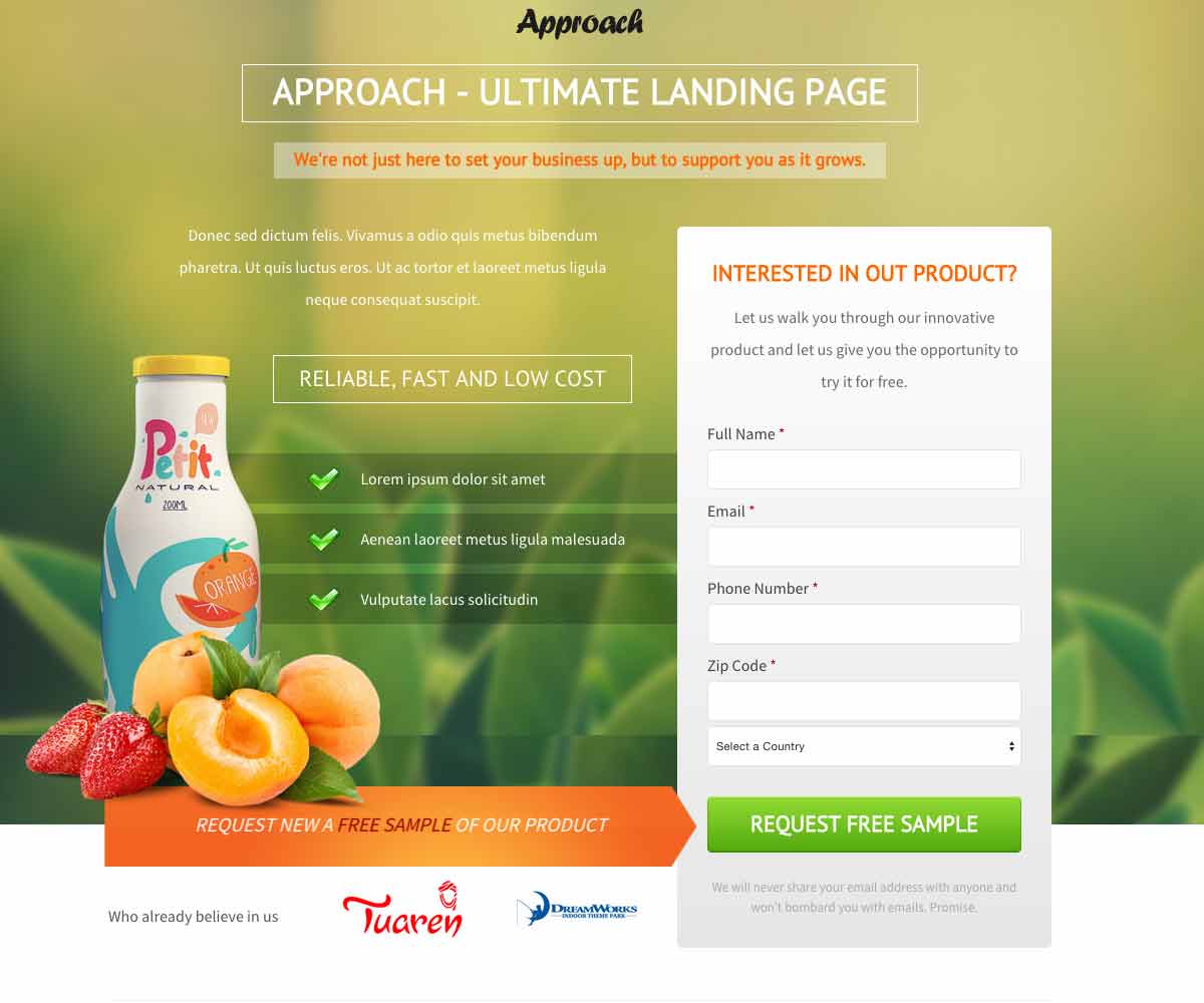
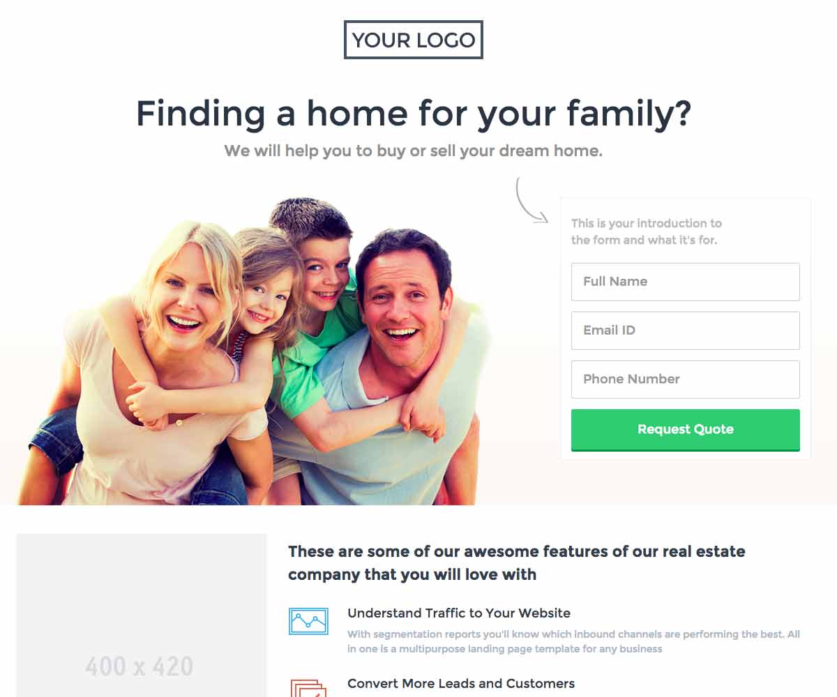
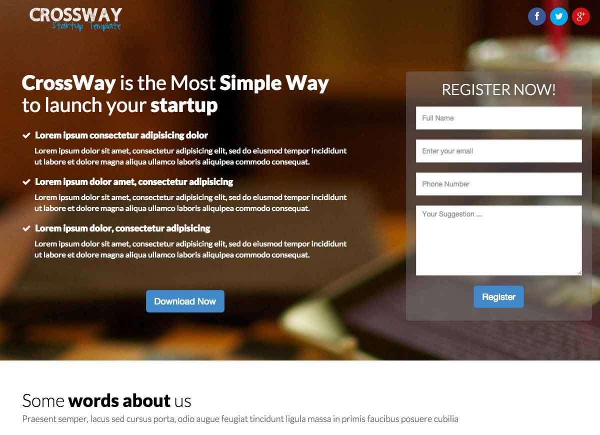
When it comes to landing pages to generate leads, the sign-up form is the final step to capture your lead. The quality of the form will determine if your visitors will be happy to leave their personal information.
The secret recipe for creating a great form that produces conversions is pretty similar to a good call-to-action.
Here are a few tips to help you create a form that converts:
- Only ask for the minimum
Minimize the length of your forms. It is counterproductive to ask for too much information from your visitors as it can actually turn them away. A good form only asks for information that is really necessary for the rest of the process such as an email address, phone number, and first and last name.
- Use buttons and checkboxes
Visitors do not like to write, especially if they are in a hurry. To maximize your lead generation, you can replace some fields with checkboxes. By using this method, you can choose the answers to check beforehand which will allow you to get better quality leads while increasing your lead count.
- Focus on the benefits
Just like CTAs, highlight the benefits that your visitors will get if they sign up or give their personal information. Without a relevant value proposition, your visitors will not be as inclined to share their personal data. To increase your number of leads, don’t hesitate to offer a real counterpart such as an e-book, a newsletter, or even a free trial.
When visitors browse your landing page, they want to see what value they can receive from your product or service.
Many sites create landing pages explaining “what they do” but forget to talk about “what will change for their customers.”
Therefore, to generate more leads, focus on highlighting the strengths and benefits of your services. We often talk about the value proposition.
By formulating your offer in this way, you explain to visitors what will change for them and how you will make their lives easier. Nothing is more effective to convince them to try your offer.
While the proportion varies by industry, many websites see half or more of their traffic arriving from mobile devices.
If you create a form, make sure that it’s responsive and that the mobile view is optimal. For more results, you can also create forms specifically designed for mobile devices.
- A/B test your forms
Implementing changes to improve your forms is a good thing. But how will you know which changes are worth it?
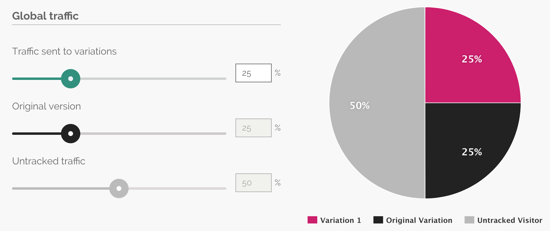
For this, we recommend that you do A/B testing on your forms. An A/B test will allow you to compare two versions of the same landing page to find which one performs the best with your audience.
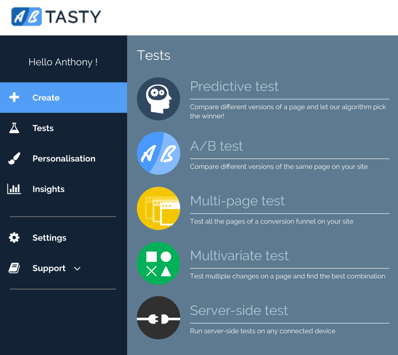
Want to get started on A/B testing for your website? AB Tasty is a great example of an A/B testing tool that allows you to quickly set up tests with low code implementation of front-end or UX changes on your web pages, gather insights via an ROI dashboard, and determine which route will increase your revenue.
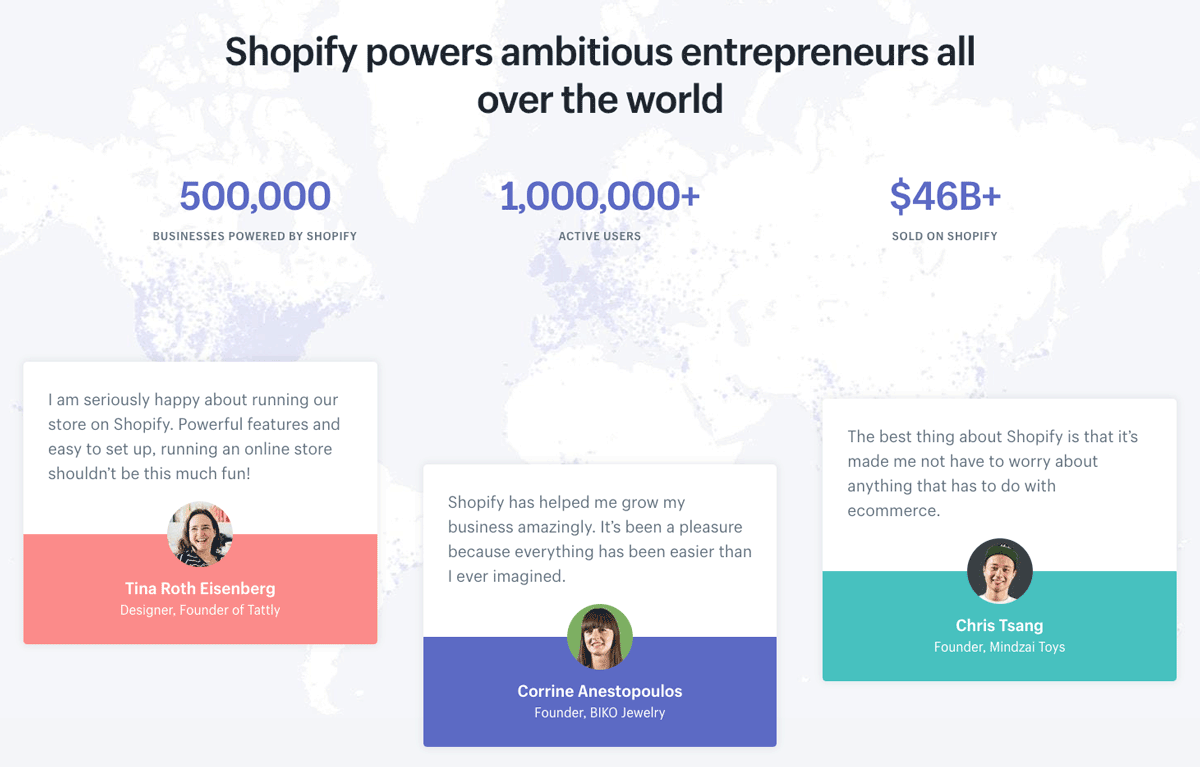
4. Add testimonials from real customers
Customer testimonials work as social proof – the more you leverage social proof, the more you reassure visitors of the benefits other customers have received from your product or service
Consumers are inherently influenced by trends and social norms when it comes to making decisions. Reviews, recommendations, influencers, and celebrity endorsements play a huge part in moving buyers down the purchasing funnel.
Related: See how NYX makeup scored big by using social proof in this LinkedIn post
5. Create limited offers
Creating a sense of scarcity and urgency is a great way to boost conversions. To increase your conversions easily, there is a trick of creating offers limited in time or quantity.
The purpose of a limited offer is to create a deadline to push visitors to take advantage of a tempting offer. This way, your visitors will need to make decisions more quickly while they discover your services.
On the Udemy site in the image below, the banner above the menu highlights a limited-time promotion: it says that a previous offer has been extended and expires in 20 hours.
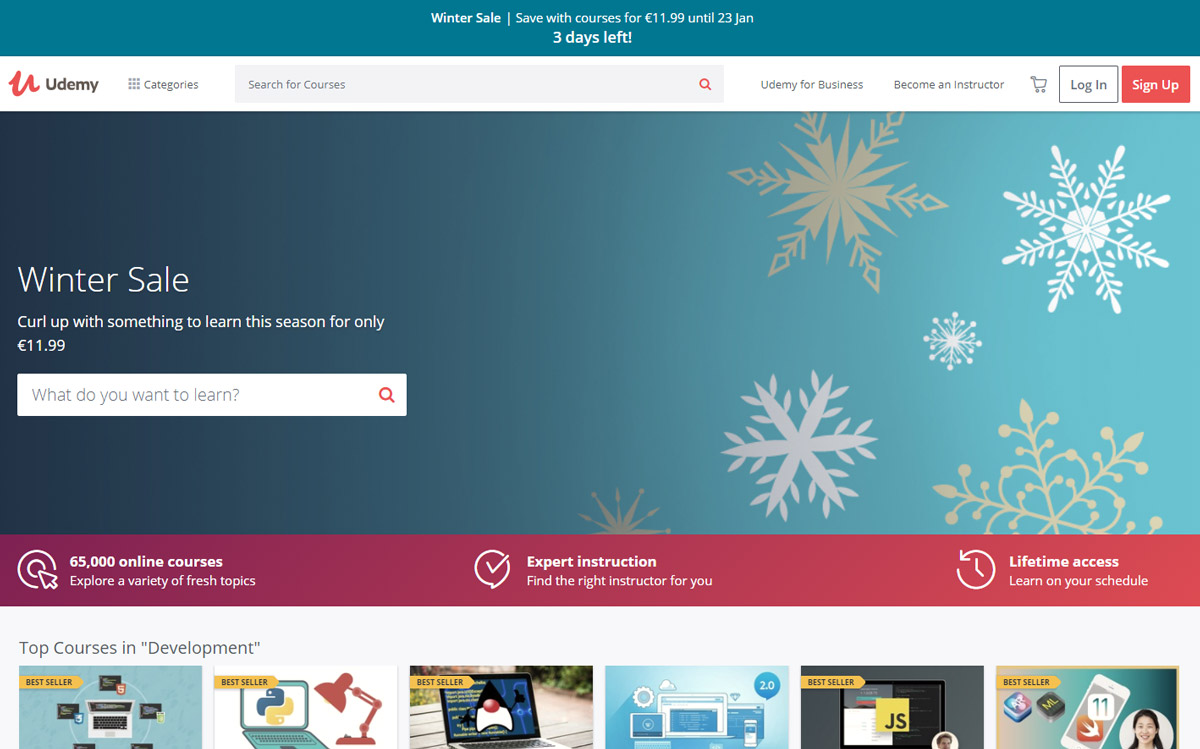
On the Udemy site, the banner above the menu highlights a limited-time promotion: it says that a previous offer has been extended and expires in 20 hours.
6. Pay attention to your conversion funnel
A conversion funnel represents all of the preliminary steps to a visitor’s action. In other words, it includes the whole process that turns a visitor into a lead or into a customer.
If you have a landing page or are planning to create one, we recommend that you read our guide to know everything about conversion funnels.
The general idea is to create a relevant conversion funnel from your acquisition channels to your landing pages. Here are some examples of simple conversion funnels:
- A Google AdWords campaign targeted on a keyword that points to a landing page optimized for the same keyword.
- A free e-book exchanged for an e-mail address that contains links pointing to one or more landing pages created specifically for your e-book’s theme.
- A Facebook advertisement that targets a specific segment that directs to a landing page optimized for this segment of customers.
When working on your shopping funnel, pay attention to the consistency between your acquisition channels (the advertisements displayed) and your landing pages.
To maximize conversions, it’s important that the marketing message remains consistent throughout the conversion funnel.
7. Create relevant resources tailored to your target
There are many landing pages that just hit the mark. But those that stand out the most are those that provide their visitors with quality content adapted for their audience.
Providing resources tailored to your audience in exchange for their information is a great way to reinforce your authority in this area.
The creative possibilities are endless and varied depending on your topic, but the most common pieces of content to offer your visitors are:
- Videos
- Infographics
- Guides
- E-books
- PDFs
- Articles
8. Be bold: create a page for each customer type
If there is one mistake that shouldn’t be made when trying to generate leads, it’s believing that all segments of visitors to your site are the same and that they should be treated the same.
Personalizing the user experience is now key to standing out.
The first step in creating separate landing pages based on your customer segments is to understand which segments of visitors are browsing your site.
For this, Google Analytics can supply you with more information in the “Audience> Demographics” tab. You will obtain detailed information on the number of sessions categorized by age, sex, geographical origin, etc.
Once you have studied this aspect, all you have to do is create pages adapted to the different segments.
For example, if you know that part of your customer base is made up of seniors interested in buying second homes in Spain, create a landing page for them!
To find out more about personalization in e-commerce, download our e-book full of step-by-step personalization strategies.
9. A/B test your ideas to improve your conversion rate
A/B testing allows you to quantify your page’s performance by comparing two versions of the same page:
- Page “A” – also known as “the control”
- Page “B” – also known as “the variant” whose performance you want to measure.
Specifically, you have landing page A already, but you want to change the form’s CTA to increase the number of leads.
To accomplish this, you can use an A/B testing tool to create a variant of your landing page that will contain the CTA. Some of the traffic will be directed to page A and another to page B. After a few days or weeks, you get the results to see if page B has given you more leads.
10. Understand how your users behave
If despite using all of these tactics, your landing pages still do not convert more, it is possible that you have reached a ceiling. To break through, you will have to use new methods to understand what is preventing your visitors from converting.
You can use tools like heat maps or session recordings that help you visualize how people interact with your pages.
Heatmaps use color to show what elements or areas are most clicked, while session recordings record all your users’ actions as video. This way you see where they click, their mouse’s movements, on what areas of your site they are hesitating, or how they interact with your forms.
These tools are a great help to continue optimizing your conversions and make your landing pages true lead-generating machines. Want to find out more? See our article full of best practices to optimize your landing pages.
How to generate more leads on a website landing page?
Unfortunately, there is no strict formula that will produce an instant boost in leads, which is why we recommend A/B testing to see what brings you the best results overall. However, evaluating your website’s landing pages and implementing these tips are a good starting point on your journey to generating more leads.


