Article

9min read

A/B, Split or Multivariate Test: How to Choose the Right One

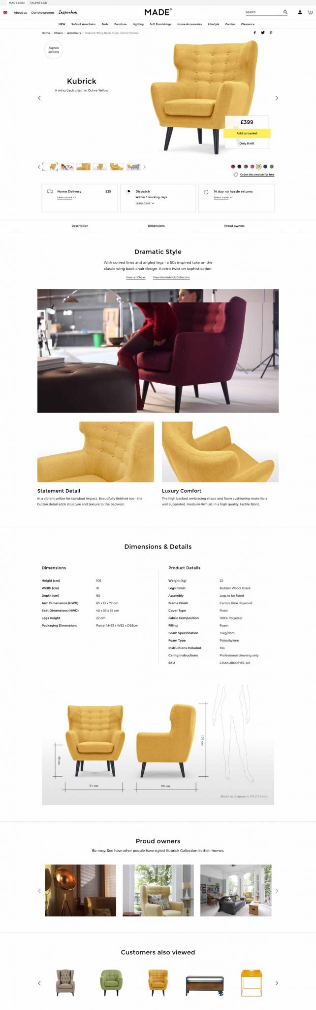
In the fast-paced world of digital marketing, settling for anything less than the best user experience is simply not an option.

Every marketing strategy has room for improvement and unlocking more comes from recognizing hidden opportunities.

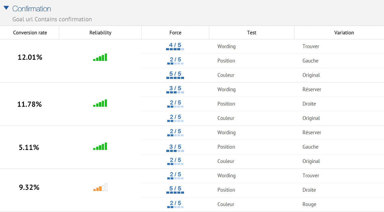
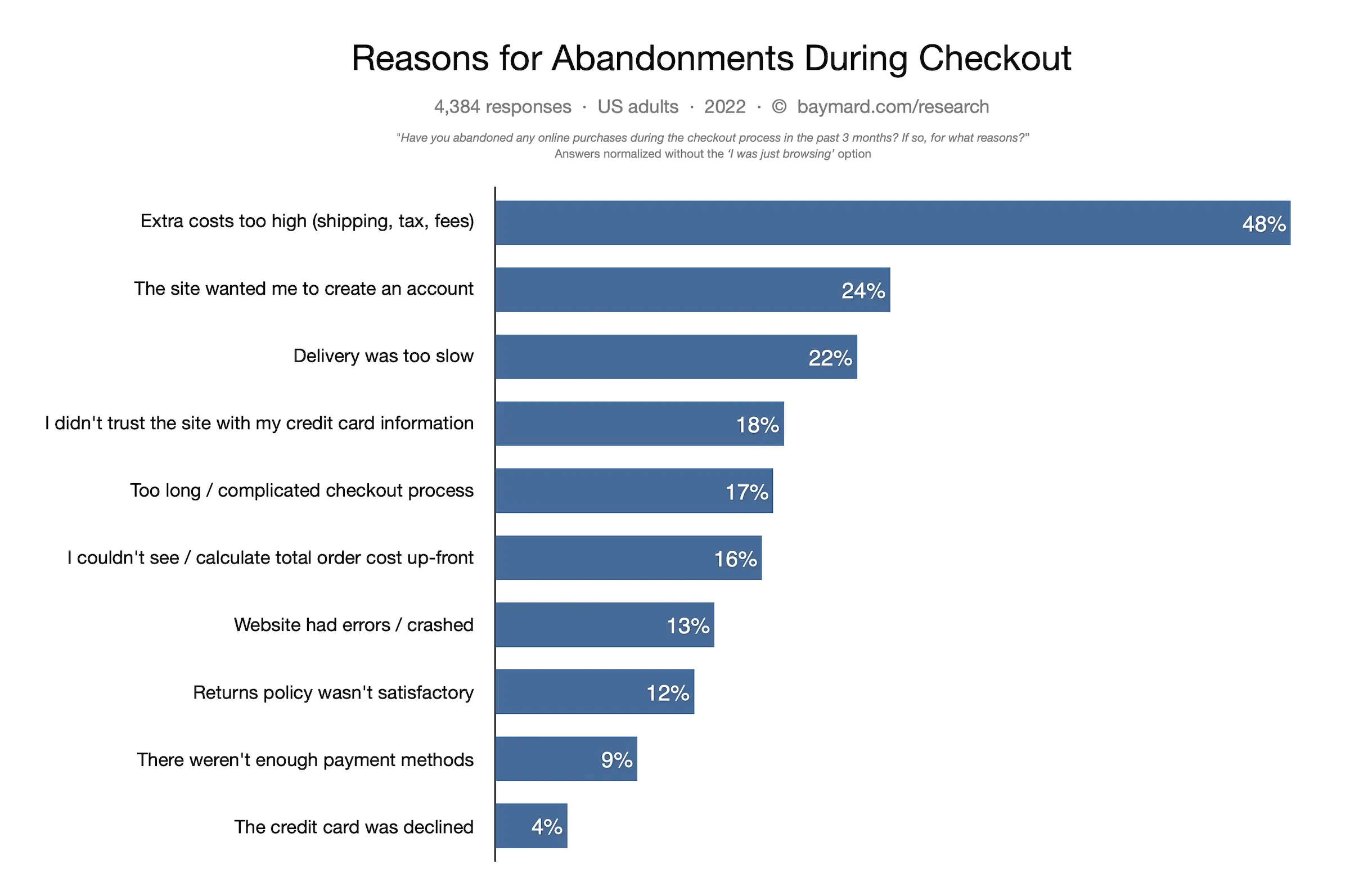
With analytics data and a little bit of creativity, you can uncover some valuable insights on how to optimize your conversion rate on your website or campaign landing pages. However, achieving structured and streamlined data from your assumptions requires diligent testing.

Marketing professionals have steadily used different testing methodologies such as A/B testing, split testing, multivariate testing and multipage testing to increase conversion rates and enhance digital performance.

Experimenting and testing are essential as they eliminate opinions and bias from the decision-making process, ensuring data-driven decisions.

With the availability of many diverse testing options, it can be challenging to find your starting point. In this article, we’ll dive into the specifics of different forms of testing to help you navigate this testing landscape.

What is A/B testing?

flowers-366155_1280

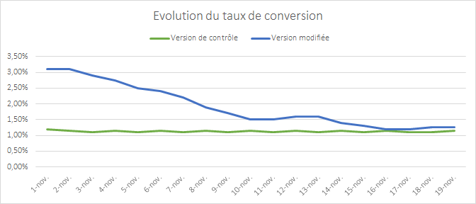
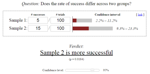
A/B testing is a method of website optimization where you are comparing two versions of the same page: variation A and variation B.  For the comparison, it’s common to look at the conversion rates and metrics that matter to your business (clicks, page views, purchases, etc) while using live traffic.

It’s also possible to do an A/B/C/D test when you need to test more than two content variations. The A/B/C/D method will allow you to test three or more variations of a page at once instead of testing only one variation against the control version of the page.

When to use A/B tests?

A/B tests are an excellent method to test radically different ideas for conversion rate optimization or small changes on a page.

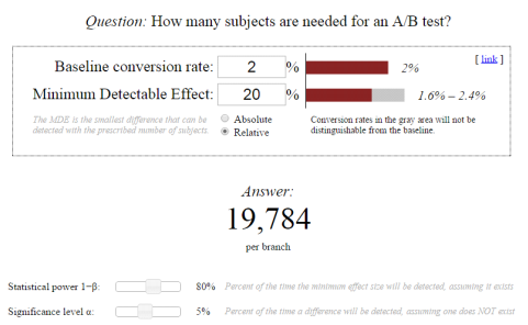
A/B testing is the right method to choose if you don’t have a large amount of traffic to your site. Why is this? A/B tests can deliver reliable data very quickly, without a large amount of traffic. This is a great approach to experimentation to maximize test time to achieve fast results.

If you have a high-traffic website, you can evaluate the performance of a much broader set of variations. However, there is no need to test 20 different variations of the same element, even if you have adequate traffic. It’s important to have a strategy when approaching experimentation.

Want to start testing? AB Tasty is the best-in-class experience optimization platform that empowers you to create a richer digital experience – fast. From experimentation to personalization, this solution can help you activate and engage your audience to boost your conversions.

Split testing vs A/B testing

A/B tests and split tests are essentially the same concept.

“A/B” refers to the two variations of the same URL where changes are made “live” using Javascript on the original page. SaaS tools that provide you with a visual editor, like AB Tasty, allow you to create these changes quickly without technical knowledge.

Meanwhile, “split” refers to the traffic redirection towards one variation or another, each hosted on its own URL and fully redesigned in the code.

You can consider A/B tests to work the same as split tests.

The variation page may differ in many aspects depending on the testing hypothesis you put forth and your industry goals (layout, design, pictures, headlines, sub-headlines, calls to action, offers, button colors, etc.).

In any case, the number of conversions on each page’s variation is compared once each variation gets enough visitors.

In A/B tests, the impact of the design as a whole is tracked, not individual elements – even though many design elements might be changed on variations simultaneously.

TIP: Keep in mind that testing is all about comparing the performances of variations. It’s recommended not to make too many changes between the control and variation versions of the page at the same time. You should limit the number of changes to better understand the impact of the results. In the long term, a continuous improvement process will lead to better and lasting performance.

What is multivariate testing?

magic-cube-378543_1280

Multivariate tests or multi-variant tests are the same as A/B tests in their core mechanism and philosophy. The difference is that multivariate testing allows you to compare a higher number of variables and the interactions between each other. In other words, you can test and track changes to multiple sections on a single page.

For multivariate testing, you need to identify a few key page sections and then create variations for those sections specifically. You aren’t creating variations of a whole page as you do while A/B testing.

TIP: Use multivariate testing when several element combinations on your website or landing page are called into question.

Multivariate testing reveals more information about how these changes to multiple sections interact with one another. In multivariate tests, website traffic is split into each possible combination of a page – where the effectiveness of the changes is measured.

It’s very common to use multivariate testing to optimize an existing website or landing page without making a significant investment in redesign.

Although this type of testing can be perceived as an easier way of experimentation – keep in mind that multivariate testing is more complicated than traditional A/B testing.

Multivariate tests are best suited for more advanced testers because they give many more possibilities of combinations for visitors to experience on your website. Too many changes on a page at once can quickly add up. You don’t want to be left with a very large number of combinations that must be tested.

Multivariate test example

Let’s say that you’ve decided to run a multivariate test on one of your landing pages. You choose to change two elements on your landing page. On the first variation, you swap an image for a video, and on the second variation, you swap the image for a slider.

For each page variation, you add another version of the headline. This means that now you have three versions of the main content and two versions of the headline. This is equal to six different combinations of the landing page.

Image Video Slider
Headline 1 Combination 1 Combination 2 Combination 3
Headline 2 Combination 4 Combination 5 Combination 6

After only changing two sections, you quickly have six variations. This is where multivariate testing can get tricky.

When to use multivariate testing?

Multivariate tests are recommended for sites with a large amount of daily traffic. You will need a site with a high volume of traffic to test multiple combinations, and it will take a longer time to obtain meaningful data from the test.

mvt
AB Tasty’s reporting allows you to weigh up each element’s impact on the conversion rate

The multivariate testing method will allow you to incrementally improve an existing design, while the test results can be used to apply to a larger website or landing page redesign.

What is multipage testing?

Multipage testing is an experimentation method similar to standard A/B testing. As we’ve discussed, in A/B testing, changes can be made to one specific page or to a group of pages.

If the changed element appears on several pages, you can choose whether or not to change it on each page. However, if the element is on several pages but it’s not identical, appears at a different place or has a different name, you’ll have to set up a multipage test.

Multipage tests allow you to implement changes consistently over several pages. 

This means that multipage tests allow you to link together variations of different pages and are especially useful when funnel testing.

In multipage tests, site visitors are funneled into one funnel version or the other. You need to track the way visitors interact with the different pages they are shown so you can determine which funnel variation is the most effective.

You must ensure that the users see a consistent variation of changes throughout a set of pages. This is key to getting usable data and allows one variation to be fairly tested against another.

Multipage test example

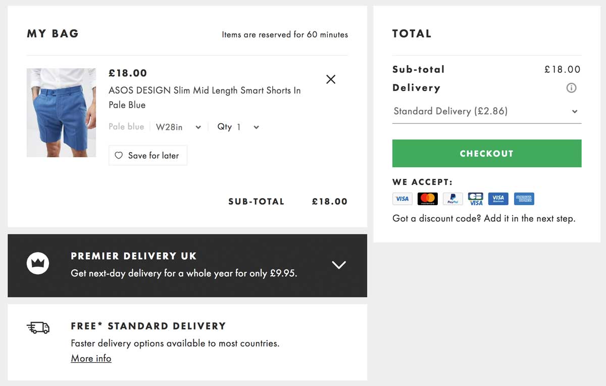
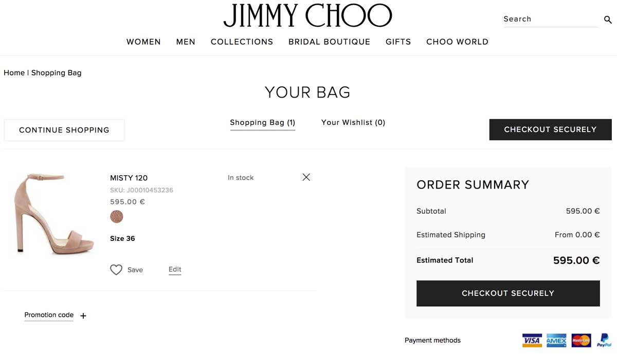
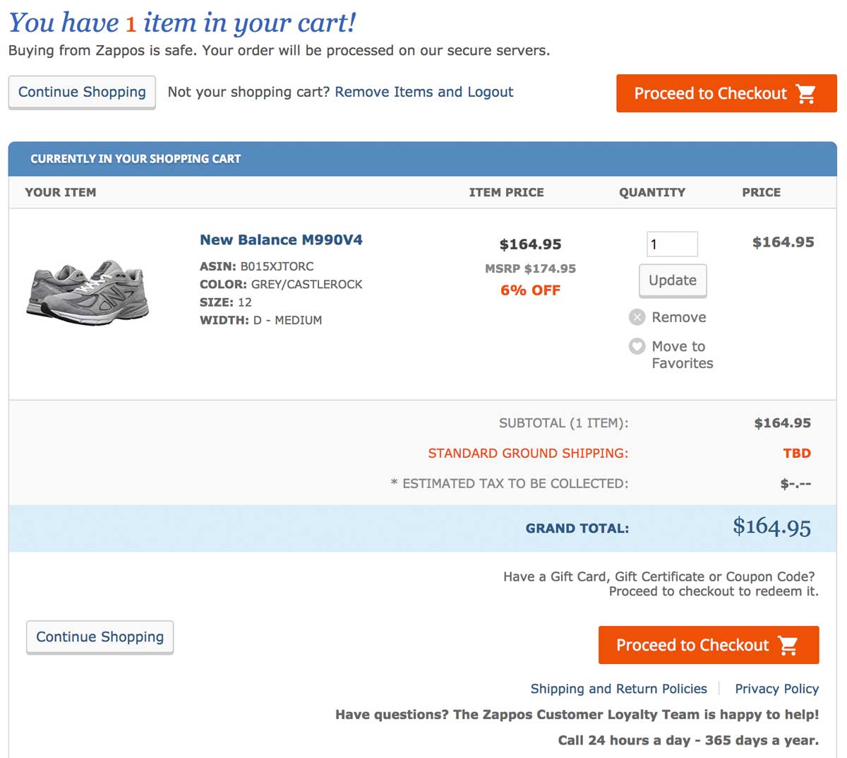
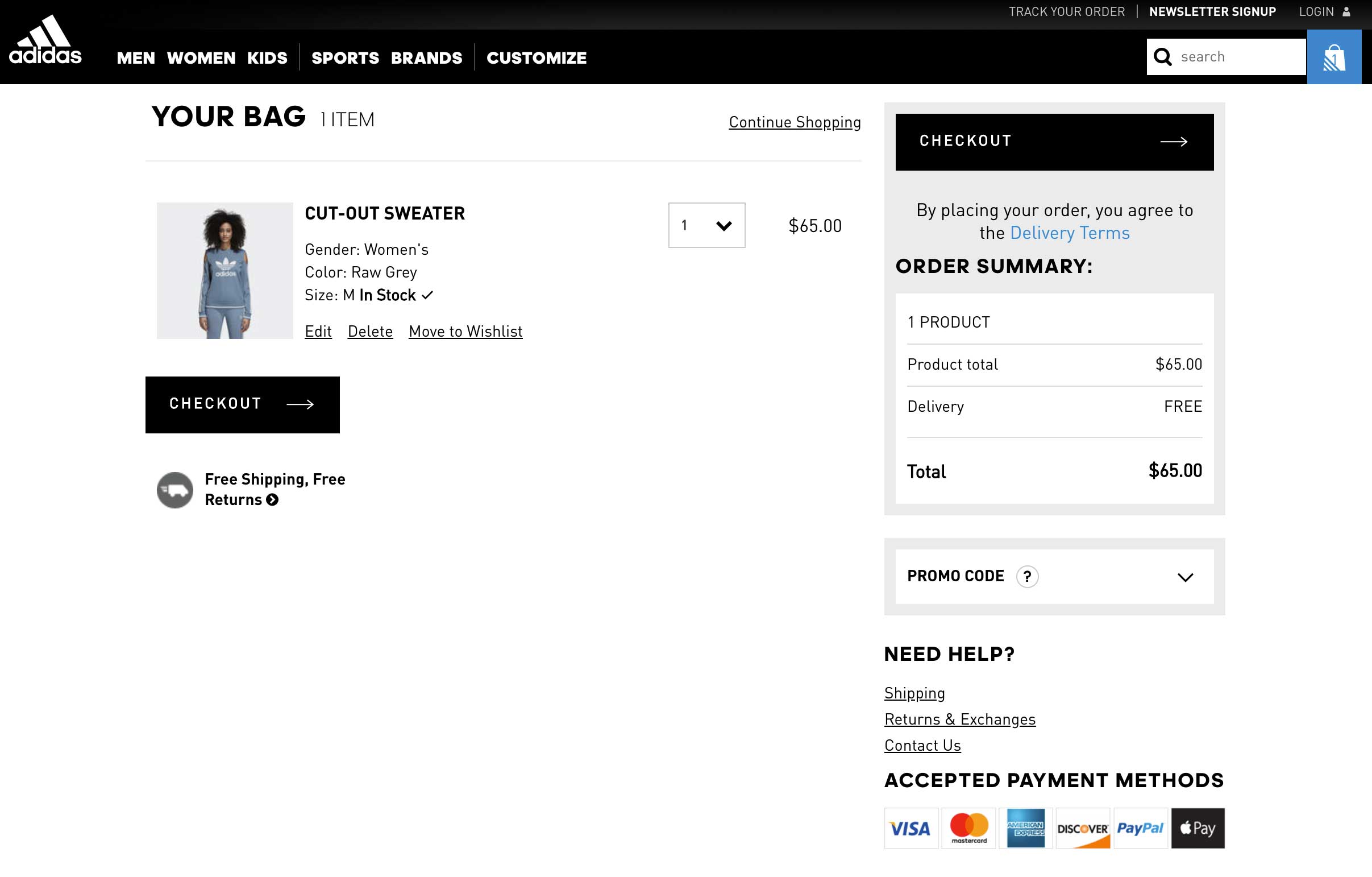
Let’s say you want to conduct a multipage test with a free shipping coupon displayed in the funnel at different places. You want to run the results of this test against the original purchase funnel without a coupon.

For example, you could offer visitors a free shipping coupon on a product category page – where they can see “Free shipping over €50” as a static banner on the page. Once the visitor adds a product to the shopping cart,  you can show them a new dynamic message according to the cart balance – “Add €X to your cart for free shipping”.

In this case, you can experiment with the location of the message (near the “Proceed to checkout” button, near the “Continue shopping” button, near the shipping cost for his order or somewhere else) and with the call-to-action variations of the message.

This kind of test will help you understand visitors’ purchase behavior better – i.e. how does the placement of a free shipping coupon reduce shopping cart abandonment and increase sales? After enough visitors come to the end of the purchase funnel through the different designs, you will be able to compare the effect of design styles easily and effectively.

How to test successfully?

Remember that the pages being tested need to receive substantial traffic so the tests will give you some relevant data to analyze.

Whether you use A/B testing, split testing, multivariate testing or multipage testing to increase your conversion rate or performance, remember to use them wisely.

Each type of test has its own requirements and is uniquely suited to specific situations, with advantages and disadvantages.

Using the proper test for the right situation will help you get the most out of your site and the best return on investment for your testing campaign. Even though testing follows a scientific method, there is no need for a degree in statistics when working with AB Tasty.

Related: How long you should run a test and how statistics calculation works with AB Tasty

Article

10min read

How Long Should You Run an A/B Test?

One of the most popular questions when starting with experimentation is: How long should an A/B test run before you can draw conclusions from it?

Determining the ideal A/B test duration can be a challenge for most businesses. You have to factor in your business cycles, traffic flow, the sample size needed and be aware of other business campaigns.

Even if you reach your sample size in a few days… is it okay to end your test then? How long should you really wait?

In this article, we will discuss potential mishaps if your testing cycle is too short, give insights into which factors you need to consider and share advice on finding the best duration for your A/B tests.

Looking for fast statistical reliability? At AB Tasty, we provide a free A/B test duration calculator, which also has capabilities for a sample size calculator.

What happens if you end an A/B test too soon?

The underlying question is a crucial one and can be summed up as follows: At what point can you end a test that appears to be yielding results?

The answer depends on the relevance of the analysis and on the actual benefits of the test.

In fact, it’s not all that unusual to see tests yield good results during the trial phase and no longer see those results once the modifications are introduced.

In most cases, a disappointing observation of this nature comes down to an error during the trial phase: the test was ended too soon and the results at that point were misleading.

Let’s look at an example that illustrates the nature of the problem.

How long to run an A/B test

The graph above shows the change in the conversion rate of two versions of a page that were the subject of a test. The first version appears to break away and perform extremely well. The discrepancy between the two versions is gradually eroded as time goes by – two weeks after the starting point there’s hardly any observable difference at all.

This phenomenon where the results converge is a typical situation: the modification made does not have a real impact on conversion.

There is a simple explanation for the apparent outperformance at the start of the test:  it’s unusual for the samples to be representative of your audience when the test starts. You need time for your samples to incorporate all internet user profiles, and therefore, all of their behaviors.

If you end the test too soon and allow your premature data to be the deciding factor, your results will quickly show discrepancies.

How to determine the duration of your A/B test

Now that the problem has been aired let’s have a look at how you can avoid falling into this trap.

The average recommended A/B testing time is 2 weeks, but you should always identify key factors relevant to your own conversion goals to determine the best length for a test that will meet your goals.

Let’s discuss several criteria you should use as a foundation to determine when you can trust the results you see in your A/B testing:

  • The statistical confidence level
  • The size of the sample
  • The representativeness of your sample
  • The test period and the device being tested

1.  The statistical confidence level

All A/B testing solutions show a statistical reliability indicator that measures the probability of the difference in the results observed between each sample not being a matter of chance.

This indicator, which is calculated using the Chi-squared test, is the first indicator that should be used as a basis. It is used by statisticians to assert that a test is deemed reliable when the rate is 95% or higher.  So, it is acceptable to make a mistake in 5% of cases and for the results of the two versions to be identical.

Yet, it would be a mistake to use this indicator alone as a basis for assessing the appropriate time to end a test.

For the purposes of devising the conditions necessary to assess the reliability of a test, this is not sufficient. In other words, if you have not reached this threshold then you cannot make the decision. Additionally, once this threshold has been reached, you still need to take certain precautions.

It’s also important to understand what the Chi-squared test actually is: a way of rejecting or not rejecting what is referred to as the null hypothesis.

This, when applied to A/B testing, is when you say that two versions produce identical results (therefore, there’s no difference between them).

If the conclusion of the test leads you to reject the null hypothesis then it means that there is a difference between the results.

However, the test is in no way an indication of the extent of this difference.

Related: A/B Test Hypothesis Definition, Tips and Best Practices

2. The size of the sample

There are lots of online tools that you can use to calculate the value of Chi-squared by giving, as the input parameters, the four elements necessary for its calculation (within the confines of a test with two versions).

AB Tasty can provide you with our own sample size calculator for you to find the value of Chi-squared.

By using this tool, we have taken an extreme example in order to illustrate this exact problem.

Sample size required for A/B testing

In this diagram, the Chi-squared calculation suggests that sample 2 converts better than sample 1 with a 95% confidence level. Having said that, the input values are very low indeed and there is no guarantee that if 1,000 people were tested, rather than 100, you would still have the same 1 to 3 ratio between the conversion rates.

It’s like flipping a coin. If there is a 50% probability that the coin will land heads-up or tails-up, then it’s possible to get a 70 / 30 distribution by flipping it just 10 times. It’s only when you flip the coin a very large number of times that you get close to the expected ratio of 50 / 50.

So, in order to have faith in the Chi-squared test, you are advised to use a significant sample size.

You can calculate the size of this sample before beginning the test to get an indication of the point at which it would be appropriate to look at the statistical reliability indicator. There are several tools online that you could use to calculate this sample size.

In practice, this can turn out to be difficult, as one of the parameters to be given is the % improvement expected (which is not easy to evaluate). But, it can be a good exercise to assess the pertinence of the modifications being envisaged.

Pro Tip: The lower the expected improvement rate, the greater the sample size needed to be able to detect a real difference.  

If your modifications have a very low impact, then a lot of visitors will need to be tested. This serves as an argument in favor of introducing radical or disruptive modifications that would probably have a greater impact on the conversion.

img_548ab40f4fb20

3. The representativeness of your sample

If you have a lot of traffic, then getting a sufficiently large sample size is not a problem and you will be able to get a statistical reliability rate in just a few days, sometimes just two or three.

Related: How to Deal with Low Traffic in CRO

Having said that, ending a test as soon as the sample size and statistical reliability conditions have been met is no guarantee that results in a real-life situation are being reproduced.

The key point is to test for as long as you need to in order for all of your audience segments to be included.

Actually, the statistical tests operate on the premise that your samples are distributed in an identical fashion. In other words, the conversion probability is the same for all internet users.

But this is not the case: the probability varies in accordance with different factors such as the weather, the geographical location and also user preferences.

There are two very important factors that must be taken into account here: your business cycles and traffic sources.

Your business cycles 

Internet users do not make a purchase as soon as they come across your site. They learn more, they compare, and their thoughts take shape.  One, two or even three weeks might elapse between the time they are the subject of one of your tests and the point at which they convert.

If your purchasing cycle is three weeks long and you have only run the test for one week, then your sample will not be representative. As the tool records visits from all internet users, they may not record the conversions of those that are impacted by your test.

Therefore, you’re advised to test over at least one business cycle and ideally two.

Your traffic sources 

Your sample must incorporate all of your traffic sources including emails, sponsored links and social networks. You need to make sure that no single source is over-represented in your sample.

Let’s take a concrete situation:  if the email channel is a weak source of traffic but significant in terms of revenue and you carry out a test during an email campaign, then you are going to include internet users who have a stronger tendency to make a purchase in your sample.

This would no longer be a representative sample. It’s also crucial to know about major acquisition projects and, if possible, not to test during these periods.

The same goes for tests during sales or other significant promotional periods that attract atypical internet users. You will often see less marked differences in the results if you re-do the tests outside these periods.

It turns out that it’s quite difficult to make sure that your sample is representative, as you have little control over the kind of internet users who take part in your test.

Thankfully, there are two ways of overcoming this problem.

  • The first is to extend the duration of your test more than is necessary in order to get closer to the normal spread of your internet users.
  • The second is to target your tests so that you only include a specific population group in your sample. For example, you could exclude all internet users who have come to you as a result of your email campaigns from your samples, if you know that this will distort your results. You could also target only new visitors so that you do not include visitors who have reached an advanced stage in their purchasing process (AKA visitors who are likely to convert regardless of which variation they see).

4. Other elements to keep in mind

There are other elements to bear in mind in order to be confident that your trial conditions are as close as they can be to a real-life situation: timing and the device.

Conversion rates can vary massively on different days of the week and even at different times of the day. Therefore, you’re advised to run the test over complete periods.

In other words, if you launch the test on a Monday morning then it should be stopped on a Sunday evening so that a normal range of conversions is respected.

In the same way, conversion rates can vary enormously between mobiles, tablets and desktop computers. So with devices, you’re advised to test your sites or pages specifically for each device. This is easy to accomplish by using the targeting features to include or exclude the devices if your users show very different browsing and purchasing behavior patterns.

These elements should be taken into account so that you do not end your tests too soon and get led astray by a faulty analysis of the results.

They also explain why certain A/A tests carried out over a period of time that is too short, or during a period of unusual activity, can present differences in results and also differences in statistical reliability, even when you may not have made any modifications at all.

The ideal A/B test duration

Running and A/B testing requires a thorough consideration of various factors such as your personal conversion goals, statistical significance, sample size, seasonality, campaigns, traffic sources, etc. All factors deserve equal attention when determining the best practices for your business.

Just remember to be patient, even if you reach your sample size early. You may be surprised by the ending results.

As A/B testing is an iterative process,  continuous experimentation and conversion rate optimization will lead to better results over time.

Article

9min read

10 Best Practices for Shopping Cart Page Optimization

Did you know that 70% of online shoppers abandon their carts?

According to the Baymard Institute, this number comes from an in-depth analysis that benchmarked 48 different studies on shopping cart abandonment rates.

This may not come as a surprise for experienced e-marketers, but the truth is that 7 people out of 10 will actually abandon their cart and end their shopping journey without making a purchase.

This is clearly a lot of lost revenue. So, how can you bring that percentage down?

This article aims to answer that question. We will cover best practices to help you diminish the abandonment rate and optimize your e-commerce shopping cart page for conversions.

Adopt clear UX parameters for shopping cart optimization

First of all, let’s start with a firm foundation. Your shopping cart page should adopt a clear, simple, and fast UX. This simple 3-step formula (CSF) is the cornerstone of any successful cart page:

  • Clear – There should be nothing messy, concerning, or misleading about your cart page. It should ideally display all the important information on a single page without the need to scroll too far or visit any other page.
  • Simple – Your cart page should display all the information using comprehensible, crystal-clear language and a design that leaves no room for misunderstanding.
  • Fast – The more time visitors spend on your cart page, the more likely they will leave it. If you apply the first two critical elements (simple+clear) to your page, the resulting cart page experience should also be fast.

As there are many elements on your page that you can optimize and run tests on to find the best solution, it’s important to follow this CSF framework for harmony.

Want to get started on A/B testing for your shopping cart page? AB Tasty is a great example of an A/B testing tool that allows you to quickly set up tests with low code implementation of front-end or UX changes on your web pages, gather insights via an ROI dashboard and determine which route will increase your revenue.

Knowing these 3 crucial elements, it’s high time we dive into our 10 best practices for e-commerce shopping cart pages.

10 best practices for your shopping cart pages

1. Create a detailed product summary

Just moments before your visitors proceed to checkout, they’ll land on your cart page which has one sole mission: lead your visitors to actually pay.

For most e-commerce buyers, the cart is a page used to review their order.

In order to help them do so, your mission is to clearly display all the relevant information regarding the product.

Below is a great example of a check-out page from ASOS that includes all the necessary details for a clear and easy review. Users know exactly which product they will purchase as well as the color, size, and quantity.

Detailed product summary on shopping cart page

When crafting your cart page, be sure to follow this example and include these elements:

  • Item thumbnail
  • Exact name
  • Item specifications (size, power, capacity, memory, features…)
  • Quantity of items in cart
  • Item color

Having all these elements shown to your customers allows them to quickly review their order and have confidence in their purchase.

Including all relevant details will decrease the percentage of cart abandonment that is typically caused by the lack of precise information.

2. Choose a clear, user-friendly color code

There have been many studies about the psychology behind colors. However, there’s no single answer on which color will fit all websites and solve all abandonment rate problems.

One thing that we do know for sure is that visitors love harmony and clear designs when it comes to UX.

Let’s look at the luxury shoe brand Jimmy Choo. For their check-out page, they kept a simple design by using a black button that clearly stands out, making it straightforward to click.

Clean color code on shopping cart page

Famous shoe-maker Jimmy Choo uses an elegant yet efficient black and white color code in order to clearly display the information on the cart page.

Notice that the checkout button efficiently stands out as the only black button on the page, making it extremely straightforward to click it.

3. Display explicit and detailed information about shipping and returns

What is the number one reason behind shopping cart abandonment in the US? Hidden shipping costs.
Online buyers despise hidden and last-minute shipping costs. As you can see in the image below from Baymard’s study, it’s by far the most popular reason for cart abandonment compared to others.

cart-abandonment-stats

Displaying transparent shipping and return policies is a key factor in enhancing conversion and gaining customers’ trust.

4. Craft clever information hierarchy and non-competing CTAs

Information hierarchy is the structure used to display and rank information according to its importance.

While designing cart pages, pay attention to the logic behind buttons, columns and titles as they will heavily influence the users’ perception.

You can use various colors in your CTAs (preferably matching your brand) although we recommend a maximum of 3-4 colors at a time.

Colors do help you gain visitors’ attention, so use them wisely:

  • Highlight important information
  • Use a distinct color to distinguish the CTA
  • Use lines or columns to structure your page

In the image below, Zappos, a USA-based shoe marketplace, does a great job of providing an efficient and clean shopping experience.

Shopping cart page with clear information hierarchy

The shopping cart page skillfully guides customers through the buying journey; we appreciate the neat layout emphasized by a simple 3-step color code (orange=very important; blue=important; grey=secondary).

5. Deploy payment options that your users love

Having different payment options is a necessity in today’s ultra-competitive e-commerce environment.

If you run an international e-commerce store, bear in mind that payment methods differ from one country to another: what’s used in North America isn’t necessarily the same as in Europe or in Asia.

To combat this, try to redirect customers based on their IP location to offer them a personalized experience based on the local currency and their preferred payment methods.

Various payment options on shopping cart page

In the image above, Adidas provides 6 different payment methods including Paypal, VISA and Apple Pay. This is an absolute necessity for large and global stores.

6. Show security seals and reassuring elements

In the same report from Baymard, the lack of trust in the payment accounted for 18% of abandoned cart rates. Trust seals, or trust badges, are very important to show your users that your site is legitimate.

In fact, they actually matter more than peer recommendations or trustworthy design. According to Baymard, here are the badges that give visitors the highest perception of a safe and secure site:

trust-seals-online-payments

7. Offer phone, chat or email assistance

Displaying a clear contact number and address details can impact your user’s level of trust. Shoppers want to make sure that your business is legitimate and not an online scam.

Furthermore, your visitors want to feel that there are actual humans behind your website.

Offering a live chat or phone assistance service right on the cart page is a great option to gain customers’ trust, legitimize your business and humanize your brand identity.

Wondering how to design your chatbox? Take a look at Victoria’s Secret’s page in the image below. They have chosen their most vibrant color, pink, to increase their call-to-action visibility.

Live chat integration on shopping cart

8. Add a “continue shopping” option

A “continue shopping” option is a smart way to offer your visitors a way to abandon their cart without leaving your website. They’ll have the freedom to continue browsing after they’ve already added items to their cart.

As some online shoppers actually use carts as “wishlists,” they can store items that they intend on purchasing later on.

9. Display legible thumbnail images

There’s nothing more annoying than a tiny thumbnail that barely helps to identify a product.

When customers review a product, you should give them the opportunity to see it correctly in a convenient size and resolution on both mobile and desktop.

Live chat integration on shopping cart

In the image above, Apple makes it very easy to distinguish the chosen product. The image used is bright and clear. Their customers will be absolutely certain that they’ve got the right item in their bag.

10. Push complementary products

Offering complementary product recommendations, or cross-selling, is nothing new in the e-commerce world.

However, displaying complementary products inside the shopping cart page is something worth testing if it could bring you a higher AOV.

For more testing ideas, check out our e-book: 50 Tests You Should Know For Website Optimization

Complementary products displayed on shopping cart page

Why optimize your shopping cart page?

An optimized shopping cart page is crucial to sales.

The shopping cart page is the last step your visitors take before their purchase. In this step of their digital user journey, it’s important to ease customer concerns in any way possible and promote a seamless checkout flow.

Every online e-commerce should be testing different elements of its cart page to find what works best for converting passive visitors into active customers.

Read more: Go one step further and improve your e-commerce product page performance to push your visitors to the cart page.

Article

11min read

Enrich Tech Teams’ Software Delivery Processes With Feature Flags

Let’s face it, continuous delivery can put a lot of pressure on technical teams. 

Release cycles are short, workloads are heavy, yet the results must perform optimally. 

A small but powerful technique can help tech teams avoid delivery bottlenecks and safely release new features and that’s through feature flags.

Let’s talk more about feature flagging and how a feature management solution for tech teams can help streamline release processes. 

What are feature flags, and why use them?

Feature flags are part of feature management and enable tech teams to manage a feature throughout its entire lifecycle. 

You can use feature flags to separate feature release from code deployment and to turn features on and off at any time. This gives you full control over the release process allowing you to ship features to subsets of users and avoid the risky big bang release. 

Therefore, there are many benefits to using feature flags, among them include the following three key benefits:

  • They are emergency switches. Have you ever seen the red buttons on big machinery labeled “Emergency Stop”? Feature flags are like these buttons for your software. Let’s say a new feature causes damage to your server. The solution: Deactivate the function using its feature flag without having to deploy any code.
  • They help reduce risks. Do you have a new idea for a feature but don’t know whether your users will like it? Use a feature flag to enable the feature only for a defined set of users. But there’s more you can do as feature flags can be used alongside a number of deployment strategies, such as canary deployments, beta programs, and A/B testing. They all help ensure a feature’s quality and performance before releasing it to your user base.
  • They support continuous delivery. Suppose your next release is imminent. Yet, one of the features is still under development. Sure, you could use complex feature branching and make sure they don’t go into production. But it would be a lot easier to only have the main branch, wrap the unfinished feature in a feature flag, disable it and still deliver your new release.

The role of feature flags in the bigger picture of product development

Some tech teams aren’t sure if the time invested in creating and maintaining feature flags is worth it. 

Yet, feature flags reveal their true potential only when you combine them with other techniques. Thanks to progressive rollouts and server-side experimentation, you can ensure that your product meets users’ needs in the right way. 

In the end, they allow tech teams to do their jobs more efficiently. Developers don’t need to worry about unpleasant surprises and the final ramifications of a release. 

Other teams besides development teams can also reap their benefits as feature flags can be used across a number of use cases to suit each teams’ needs.

This is especially the case when you have an advanced feature management solution which gives all teams more control and flexibility over the release process. 

Why is the need for dedicated feature management solutions rising?

More and more people around the world rely on software for their personal and professional lives. 

The increasing demand also means that more software companies jump into existence, and the market is becoming denser. 

You aim to continuously deliver products, updates, and new features to stay relevant and keep up with your niche competition. However, tech teams need reliable workflows and tools to get the desired results in this fast-paced environment.

While many companies did not have organized release processes in place a few years ago, the situation has changed since then. Today, many use continuous development and delivery to respond to rapidly changing consumer demands.

By integrating feature management techniques, you can further optimize these processes. But how can you use feature flags for your purposes? And how can you combine them with experimentation and progressive rollouts?

Yes, you guessed it: invest in a dedicated feature management solution. You have three options depending on your needs and resources: 

1) Build a tool yourself from scratch

2) Create a platform based on adequate open-source projects

3) Use an existing third-party solution

In theory, you could build the platform yourself. But do you want to burden your tech teams with this complicated task? 

You also need to consider whether you have the right expertise and resources available, and you will have to worry about ongoing maintenance. There’s a lot you have to think about, including the points highlighted below when it comes to the build vs buy debate

The next section will look into how opting for an advanced third-party solution can help streamline your teams’ delivery and release processes.

Tackle the challenges of continuous delivery with a feature management platform

The challenges that tech teams have to face on a daily basis are manifold. But what difficulties do these teams meet in their day-to-day work with feature management? And how can a dedicated solution like AB Tasty help them? Let’s find out!

AB Tasty’s flagging functionality eliminates the risks of future releases by separating code deployments from feature releases so you can safely deploy new features anytime to anyone you choose. The platform is packed full of features and was especially built to cater to the needs of both development and product teams. 

Product teams 

Product managers often have great ideas but often, such ideas come with great risk. Feature flags are a great way for product managers and their teams to test out these ideas safely while collecting valuable feedback from real-world users.

In particular, feature flags provide value for product managers in two key ways:

Feature flags & progressive rollouts

You may be familiar with the following situation: Before you release a new feature, you want to test it with QA and a small group of users

Since the tests produce good results, you push the new component into production. Unfortunately, the feature and your server configuration don’t play well together. Your server crashes. As a result, you may break SLA agreements with customers, lose money, and damage your reputation.

This is where feature flags can come to the rescue. 

Once you notice the damage, you can disable the malfunctioning feature in seconds – without deploying any code – to avoid any major negative impact. 

However, keep in mind that progressive rollouts can actually prevent this situation from happening in the first place. 

With progressive rollouts, as the name implies, you can progressively release a feature to a specific audience directly from the AB Tasty dashboard by choosing each deployment step and the proportion of traffic allocated to your users.

This way, teams can identify any problems earlier when the feature is still being served to a limited number of users. Then they have the chance to react to this malfunction and avoid application downtime.

Feature flags & experimentation

Let’s imagine another situation. Your customers and stakeholders have a lot of feature requests and feedback on your product. 

But even after you’ve categorized these inputs and boiled them down to a minimum, there are still plenty of different ways to turn them into reality. You’re also not quite sure which solutions will bring the best results. But, you are under pressure to act and have to deliver.

Experimentation helps you master this challenge. 

With experimentation, product teams can compare different variations of features with users to reveal which one has the best positive impact. Afterwards, the better performing variation can be rolled out to the rest of your users.

Thus, experiments are a great way to help product teams to learn and prioritize resources allowing them to focus on what to optimize for the best outcomes.

Feature flags give you more control over the release process by running experiments on developed or modified features with a small subset of live users in order to see whether they’re performing as intended before going for a big bang release.

AB Tasty, in particular, offers server-side experimentation allowing you to run more sophisticated tests and advanced experiment capabilities. You can then conduct safe experiments for your features by setting up user-targeting and KPIs to track putting you on the road to quicker and safer releases.


CTOs & IT teams

CTOs want high-performing development teams to continuously deliver high-quality software. They likely have several teams under their wings that they expect to act independently and ensure release quality. 

Modern software contains many feature flags that must be maintained over a long time. But how can CTOs keep track of things? A tool to collaborate with tech teams on release management would help CTOs save time and diminish costly misunderstandings.

Yet, the successful implementation and integration of such a complex tool into the IT landscape can represent a significant hurdle. 

IT teams must have enough resources and expertise. In the long term, they have to spend a lot of time monitoring and maintaining the platform. Apart from that, IT teams already have their hands full with tasks for their company’s digital transformation. 

A dedicated feature management tool brings all teams together on a common platform. 

In this way, you can optimize the release times and minimize risks thanks to more efficient and effective collaboration and feature management. 

Since AB Tasty is a managed SaaS, IT professionals don’t need to spend resources on maintenance. We take care of things for you and develop our server-side solution further so that you can always work with a secure and state-of-the-art solution.

Data teams

For data-driven product development, teams need to access relevant analytics data to check a feature’s performance. 

For example, they need to analyze and assess user behavior in detail after a new feature has been integrated into a product. When testing new features, they need to activate and deactivate them and control what to test when and with whom. 

Unfortunately, it is often impossible to simulate an identical copy of the production environment. This leads to inaccurate results, and lets teams make imprecise data-driven decisions.

With AB Tasty, data teams can comfortably analyze feature performance in a visual dashboard, set goals, and track them with real-time reports. 

This way, they can ensure that the results align with business goals and find new ways to improve the product. 

Finally, feature flags and progressive rollouts eliminate the need for staging servers and prevent inaccurate data. As a result, data teams can fruitfully improve the software by making appropriate data-driven decisions.

Development teams

Software developers should focus on building functionality, not fixing bugs from previous versions, and doing rollbacks.

Working with feature flags can also be very time-consuming, as software engineers shouldn’t lose track of the flags’ status. Moreover, the risk of unnecessary errors creeping into the software increases when working with large teams. As a result, developers may be discouraged from using feature flags due to the time pressure and perhaps no longer use them at all. 

Additionally, bottlenecks in development can affect release times. Poorly structured release processes can also hinder development by preventing engineers from developing new features. 

Finally, if there’s no suitable solution, these issues can affect the duration and regularity of release cycles.

Hence, development teams need a framework that allows them to enforce feature flag best practices, stay in control, and collaborate effectively with team members. 

We understand that feature development and feature releases are two sides of the same coin. As a result, AB Tasty aims to bring teams closer together by collaborating on common matters in a shared tool. 

To do this, they have access to all essential feature management tools by default. So there’s no need to invest manpower in building a solution themselves. We also make things easier for them by providing a visual dashboard for creating and managing feature flags with simple clicks – no code deployments required.

And since we have developed our server-side tool for developers, we offer them everything they need to work with the tool including:

  • Easy-to-use SDKs 
  • Comprehensive documentation 
  • API references 
  • Other useful developer resources like this blog

QA & release teams

Without proper workflows, tech teams struggle to conduct controlled releases and experiments. DevOps spend a lot of time managing staging servers and keeping their configurations similar to production. Nevertheless, there’s a higher risk that tests run on staging servers will yield inaccurate results that lead to incorrect conclusions.

Yet, QA specialists and DevOps teams rely on A/B tests, canary releases, and beta programs to ensure that they deploy high-quality features securely. Often they don’t know about the current status or the use of a feature flag in the code either. Especially if they don’t have access to an overview of existing feature flags. As a result, it gets trickier to keep track of ongoing tests and deployments, and who can see which features at what times.

We designed our feature flagging platform to meet today’s demands for fast and continuous delivery. Our solution enables tech teams to collaborate in one place, monitor issues, and control each deployment in a visual dashboard. Release teams can thus keep full control over deployments and take full advantage of progressive rollouts.

Additionally, DevOps teams can focus on more important things than managing staging servers. That’s because AB Tasty eliminates the need to use these environments in the first place. Using feature flags in production, QA can always see how a feature works in its real-world environment and get accurate test results to work with.

The power of feature flags is at your fingertips

Feature flags are an integral part of modern product development, including experimentation and progressive rollouts. This simple technique is vital if you want to provide stable, high-quality functionality to your users.

Using a feature management solution, your tech teams can use a single tool to streamline workflows and communication. Regardless of a team’s tasks or focus, our feature management service has everything it takes to deliver the right features in the right way.

Article

13min read

10 Examples of Successful E-commerce Product Pages

The conversion rate on e-commerce homepages is around 2-2.5% on average, according to a study from Adobe Business, while the conversion rate for visitors who land directly on a product page is around 7%.

Can you see the difference between these two types of pages?

Product pages are one of the most essential pages to continually optimize if you want to focus on boosting your e-commerce conversions.

In this article, we will be touching on what a successful e-commerce page looks like, five elements to focus on while optimizing your pages, and ten examples of effective product pages in action.

Let’s dive in.

What does a successful e-commerce product page look like?

Across all industries, the average user spends less than 54 seconds on any given page, according to a digital report from Contentsquare.

You have less than one minute to create a memorable experience and clearly display your information. For product pages, it’s clear to see why they need to be captivating.

The truth is that every second matters in the conversion journey.

So in order to capture your visitors’ attention, you’ll have to capitalize on five elements. Perfecting these elements will require testing and patience.

Want to get started on A/B testing for your product pages? AB Tasty is a great example of an A/B testing tool that allows you to quickly set up tests with low code implementation of front-end or UX changes on your web pages, gather insights via an ROI dashboard, and determine which route will increase your revenue.

The 5 mandatory elements of an effective e-commerce product page.

1. Eye-catching, engaging visuals

It’s no secret that our brains love visuals since they process images much easier and faster than text. Images give us more context.

In fact, visuals are so deeply entrenched in our decision-making mechanisms that they should be a priority for any e-commerce website.

In order to provide your visitors with some eye-catching visuals for your products, here are a few tips:

  • Humanize the product

People love to envision themselves wearing or using a product. It gives them an idea of whether or not the product is a good fit for them. Thus, it’s important to remember to humanize the product to allow visitors to see themselves as potential customers.

Ecommerce Product Page

  • Use whitespace

Whitespace has many uses in graphic design, but most importantly, it helps the eye focus on what matters the most.

Adding whitespace strategically around your picture will help reduce noise and increase clarity when it comes to showcasing a complex product.

Less can be more.

Ecommerce Product Page Design Whitespace

  • Only use HD

It goes without saying that high-definition visuals are incredibly important.

Your potential customers should be able to fall in love with your product on any screen resolution. Give them your best!

  • Allow for zoom-in and zoom-out features

Many people are interested in details, especially when it comes to complex or expensive products.

Whether they’re looking for a closer glance at that little button on the side of the jacket, the texture, or the matte finish – allow your potential customers to zoom in and out on your products.

  • Add videos

More engaging than photos, videos also help you tell your customers a story.

Videos can help depict why your product is superior and what they get for $200. With that being said, video-making can be costly and time-consuming, so focus your efforts on your best-sellers.

An astounding average of 56% of web traffic worldwide comes from mobile devices.

Mobile optimization has shifted from just an idea to a top priority. It’s essential to make sure that your product images and descriptions are responsive on all mobile devices.

2. A unique, awesome product description

A study led by Shotfarm showed that “detailed descriptions” ranked first in the top 3 factors that influence a customer’s decision to buy, higher than “reviews” (in the 2nd position) and “price” (in the 3rd position).

Simply put, your product descriptions should focus on their unique value proposition, i.e. their main benefit.

As you already know, an average visitor doesn’t spend too long on one page, so it’s important to be impactful.

As Neil Patel puts it, you have to sell benefits, not just features. This means that you have to emphasize the result, not the product.

Clearly, buyers are expecting to gain something from your product, and it’s your task to convince them that they will.

Let’s look at an example from Innocent:

In their product descriptions, Innocent emphasizes the few elements that make their smoothies “great” and “healthy.”

Ecommerce Product Description
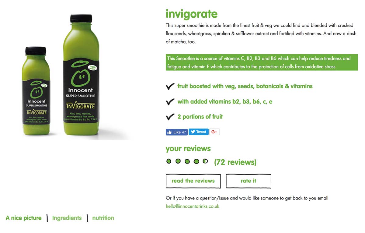
In the image above, you can see that they even highlighted in green that their smoothie is, “a source of vitamins C, B2, B3 and B6 which can help reduce tiredness and fatigue…”

3. Viral social proof

Social proof comes in many forms: reviews, customer testimonials, videos, ratings, etc.

It doesn’t matter what type of social proof you use, as long as it’s relevant to your audience.

Reviews and classic star ratings typically work well for most e-commerce websites as long as they are real and genuine, as most internet buyers are able to spot fake reviews.

4. Addictive product suggestions

Product suggestions are a great way to increase the average order value, cross-sell, upsell, and allow users to explore your products.

Therefore, it’s extremely important to display additional products on your product pages in case your visitors want to see something else.

Otherwise, you may land unqualified visitors on your product pages without giving them the opportunity to discover other products that would fit their needs.

In the image below, you can see that Pandora does a great job of suggesting related products for its customers. The outline is clear and evocative.

Related products on ecommerce product page

Jewelry maker Pandora does a great job at suggesting related products for its customers. The outline is clear and evocative.

5. Resourceful guidance & help

Can you guess the number one source of frustration for online buyers?

Not being able to touch or interact with the product.

To help overcome this lack of physical touch in an online buyer journey, your website should display clear information about:

  • Size guides
  • Specific materials
  • Refund policy
  • Shipping fees
  • Prices and VAT

Knowing this stumbling block for many online shoppers, it’s recommended for e-commerce brands to implement a live chat feature, or at least a very detailed Q&A, to help increase conversion rates and decrease abandon cart rates.

Now that you’ve been through the best practices of e-commerce product pages, it’s time to get inspiration by browsing our selection of effective e-commerce product pages.

Note: we’ll cover examples from various industries so that you, as a leader or marketer, can find inspiration for your field.

Let’s dive into our top picks for inspiring successful e-commerce product pages.

10 of the most successful e-commerce product pages

1. Apple – Technology Industry

When it comes to technology, Apple is a world-class example of best practices for e-commerce product pages.

apple product page

What we love:

  • Clean and refined design
  • The use of whitespace and large pictures
  • Lovely CSS animations
  • Good emphasis on benefits as you scroll down (not pictured above)

2. Transavia – Travel Industry

Transavia is a Dutch low-cost airline that is a subsidiary of the Air France-KLM group.

Their website showcases a lot of best practices to be applied to travel and airline companies.

While they’re many websites on the market, Transavia does a great job of converting visitors into travelers. Their website uses clever paths and UX design to lead you through your buyers’ journey.

E-travel product page

What we love:

  • Engaging “3 parts” structure for clarity’s sake
  • Simple visual brand identity (green and blue)
  • Smart information hierarchy
  • User-friendly simplified search engine
  • TripAdvisor’s reviews integration

3. Bonnegueule – Fashion / Retail

BonneGueule is a French company specializing in men’s fashion.

While the company is still fairly young, it has rapidly grown into a 1M+ visitors/month e-commerce website, thanks to its amazing content marketing strategy and jaw-dropping e-commerce product pages.

Simply put, they use extremely long product pages where they cleverly use storytelling techniques, photos, and videos to justify the hefty price at which they sell their products.

Fashion Ecommerce Product Page Fashion Ecommerce Product Page 2What we love:

  • They display in-store availability
  • The clever size guide
  • The use of “context” photos
  • Amazing storytelling and videos

4. Peak Design – Fashion / Travel Accessories

Peak Design is an American e-commerce company that has successfully raised over $14M since 2011 thanks to its clever bags, pouches and travel kits made famous on Kickstarter.

Notice how clear and detailed their photos are, enhanced by the use of white space and a clear color code on the product page (black/red combo).

Peak Design Online Product PageTravel Accessories Product Page

What we love:

  • A clear and clever layout
  • Generous photo gallery
  • In-depth, 6-minute-long product video
  • The emphasis put on benefits

What could be improved:

  • Large text paragraphs
  • Unclear information hierarchy

5. Luxyhair – Beauty

Luxyhair is an e-commerce website specializing in hair extensions – and it nails it.

The team cleverly uses a 3-step funnel prior to landing on their product page: First, you’ll start by choosing your collection, then your hair thickness, and finally your hair color.

This 3-step mechanism is a brilliant way to increase conversions by offering just the right product for any visitor.

Beauty Ecommerce Product Page

What we love:

  • Seamlessly integrated product pictures
  • Useful information about shipping/return policy
  • Effective use of product video
  • Smooth integration of additional content (tutorials)
  • Complete FAQ
  • Amazon-like customer reviews and Q&A
  • Live-chat

6. Made.com – Home / Furniture

Made.com is a British home furniture e-commerce website renowned for its bold designs and web-to-store experience.

At first glance, you can tell that their visuals flawlessly blend with the product page. They’ve also added context-related pictures so that you can immerse yourself in the product.

Made.com: Furniture Ecommerce Product Page

What we love:

  • Clear shipping/return policy
  • Stunning visuals
  • Size comparison
  • Smart product video
  • Pictures from customers

What could be improved:

  • Adding instructions for product maintenance

7. Birchbox – Beauty / Makeup

This famous, subscription-based French-American website sells monthly beauty boxes delivered to your home with personalized products based on your preferences inside.

Birchbox Online Product Page

What we love:

  • Simple and clean visuals
  • Attractive layout and colors
  • Free gift offered with subscription
  • Complete FAQ
  • Instagram integration: good social proof

8. Asos – Fashion / Apparel

Asos is a UK-based company that also operates in the US and in Europe.

Their pledge to provide affordable designs and fashion helped them reach significant market shares in the fashion industry in several countries.

They opted for a rather simple but neat outline that successfully conveys their brand image.

Online Fashion Product Page

What we love:

  • Distinctive, stary green call-to-action
  • Sober yet effective design
  • Plenty of context photos and a video
  • Product recommendations
  • Information about shipping & returns
  • Size guide

What could be improved:

  • Adding customer reviews on their product pages

9. Salesforce – Software, CRM, Business Solutions

We couldn’t end this article without mentioning at least one notable business solutions provider.

Salesforce is undoubtedly one of the most commonly used, famous CRM and sales management tools.

Their small business solutions product page quickly emphasizes the benefits over the features, such as: “Drive faster sales and simpler service with Salesforce Essentials.”

They also display actual results for their customers so as to convince them, even more, to subscribe: “+26% more deals, +32% happier customers.”

Software & CRM Solution - Product Page

What we love:

  • Catchy, original designs
  • Real emphasis on actual benefits
  • Free trial
  • Video demo
  • Clear, straightforward pricing plans
  • Online chat + phone assistance
  • Genuine customer testimonials

10. Airbnb – Travel / Hotel / Accommodation

Airbnb remains a masterclass of UX design and product page efficiency from which a lot of travel or tourism-related websites can seek inspiration.

First of all, they kept an insanely simple and efficient page layout that makes it really intuitive to browse.

Then, notice how they’ve put the photo gallery at the top of the page? Airbnb knows that photos are the most important aspect of any travel website: visitors need to envision themselves swimming in that paradisiac pool.

Finally, Airbnb successfully mastered the art of utilizing customer reviews: they are deeply integrated into each product page (except when there are no reviews, of course…) so that their role as social proof is maximized: people just love to read reviews.

AirBnB Product Page

What we love:

  • Clear design, good information hierarchy
  • Flashy call-to-action
  • Seamless integration of travelers’ reviews
  • Convenient map at the bottom of the page
  • Similar listings to jump from one house to the other

Conclusion

After reading through this article, you see why e-commerce product pages are such a big deal. What works well in one industry may not have the same success rate in others. Due to this, it’s essential to know your customers and test different UX designs to see what gives you optimal results.

Optimizing these types of pages to suit your customers’ needs better is the best way to increase your conversions.

Article

11min read

The Complete Guide to Generating Leads on Your Landing Page

How many first-time visitors on your website convert into paying customers?

For most, the answer to this question won’t be too impressive. Thanks to lead generation landing pages, we don’t have to let this traffic get away.

Landing pages that generate leads are a great way to further nurture your well-deserved website traffic and share compelling content with them until they are ready to convert into customers. But, how can you get your visitors to interact with your landing page?

In this article, we aim to answer this question and provide you with 10 tips to increase your lead generation by optimizing your website’s landing pages.

Let’s get started!

What is a lead generation landing page?

A lead generation landing page is used to collect personal information and establish contact points to create as many leads (or prospects) for your business as you can.

Unlike a click-through landing page which serves as a “warm-up” stage before an action such as selling a product or service, the lead generation page is there to maximize the interactions between your visitors and your page in order to establish contact.

The main objective of a page like this is to collect personal information such as:

  • First and last name
  • Email address
  • Telephone number

For many activities, leads are crucial to business. No leads, no sales. Do you see where we are going with this?

And yet, many websites don’t focus enough of their efforts on attracting new leads.

This article will cover 10 tips to help you create top lead generation landing pages to allow you to stand out from the competition and to continuously attract prospects WITHOUT using AdWords.

10 tips to create top lead generation landing pages

1. Pay attention to your design

As we all know: a rough design does not inspire visitors to have confidence in your website.

If you want to generate more leads, you will have to start by working on your landing page’s design.

Your landing page design should be clear and understandable for everyone.

To create an impactful design:

  • Harmonize your theme’s colors
  • Clearly differentiate the “titles” of your paragraphs
  • Play on shapes and symmetry
  • Remember to let your text breathe to make it easy to read

If you are presenting several distinct offers, one tip is to highlight one in relation to others: focus your leads’ attention on a particular offer.

As an example, you can see in the image below that the LeadQuizzes website has created a landing page dedicated to their free trial. They use a green banner to highlight their intermediary offer to attract visitors’ attention to that offer as well as the free trial.

Pricing Page LeadQuizzes

However, the LeadQuizzes landing page remains clear and easy to navigate: the value proposition is shown in one sentence and the service’s characteristics are highlighted under the 3 offers.

2. Work on your call-to-action

The call-to-action is one major thing you need to pay attention to when working on your landing page.

As a reminder, a call-to-action is an element of your landing page that aims to trigger an action.

What does this mean exactly? Here are some call-to-action examples:

  • Subscribing to a newsletter
  • Completing a registration form
  • Signing up for a free trial
  • Buying a service/product
  • Reserving a service
  • Asking for a callback/contact

A call-to-action must be seen as the culmination of your business proposal. It is introduced by sales pitches and highlighted in relation to the rest of your page.

For example, in the image below, you can see the Trello site. Their landing page was designed to be as simple and as impactful as possible. There are two paragraphs of text, the first of which contains the value proposition in bold. Then, you can see the CTA in bright green that resonates with the “Sign Up” button that we can see in the upper right corner.

Call to Action Landing Page

For the call-to-action, we can see two elements:

  • The use of the imperative: “Sign up”
  • The presence of an argument: “It’s free”

Using the imperative is a method that often comes up when writing CTAs. The visitor will feel that they are being spoken to directly, which is more personal than the traditional approach of using the copy “Registration”.

3. Look after your forms

When it comes to landing pages to generate leads, the sign-up form is the final step to capture your lead. The quality of the form will determine if your visitors will be happy to leave their personal information.

The secret recipe for creating a great form that produces conversions is pretty similar to a good call-to-action.

Here are a few tips to help you create a form that converts:

  • Only ask for the minimum

Minimize the length of your forms. It is counterproductive to ask for too much information from your visitors as it can actually turn them away. A good form only asks for information that is really necessary for the rest of the process such as an email address, phone number, and first and last name.

  • Use buttons and checkboxes

Visitors do not like to write, especially if they are in a hurry. To maximize your lead generation, you can replace some fields with checkboxes. By using this method, you can choose the answers to check beforehand which will allow you to get better quality leads while increasing your lead count.

  • Focus on the benefits

Just like CTAs, highlight the benefits that your visitors will get if they sign up or give their personal information. Without a relevant value proposition, your visitors will not be as inclined to share their personal data. To increase your number of leads, don’t hesitate to offer a real counterpart such as an e-book, a newsletter, or even a free trial.

When visitors browse your landing page, they want to see what value they can receive from your product or service.

Many sites create landing pages explaining “what they do” but forget to talk about “what will change for their customers.”

Therefore, to generate more leads, focus on highlighting the strengths and benefits of your services. We often talk about the value proposition.

By formulating your offer in this way, you explain to visitors what will change for them and how you will make their lives easier. Nothing is more effective to convince them to try your offer.

While the proportion varies by industry, many websites see half or more of their traffic arriving from mobile devices.

If you create a form, make sure that it’s responsive and that the mobile view is optimal. For more results, you can also create forms specifically designed for mobile devices.

  • A/B test your forms

Implementing changes to improve your forms is a good thing. But how will you know which changes are worth it?

For this, we recommend that you do A/B testing on your forms. An A/B test will allow you to compare two versions of the same landing page to find which one performs the best with your audience.

Want to get started on A/B testing for your website? AB Tasty is a great example of an A/B testing tool that allows you to quickly set up tests with low code implementation of front-end or UX changes on your web pages, gather insights via an ROI dashboard, and determine which route will increase your revenue.

4. Add testimonials from real customers

Customer testimonials work as social proof – the more you leverage social proof, the more you reassure visitors of the benefits other customers have received from your product or service

Consumers are inherently influenced by trends and social norms when it comes to making decisions. Reviews, recommendations, influencers, and celebrity endorsements play a huge part in moving buyers down the purchasing funnel.

Related: See how NYX makeup scored big by using social proof in this LinkedIn post

5. Create limited offers

Creating a sense of scarcity and urgency is a great way to boost conversions. To increase your conversions easily, there is a trick of creating offers limited in time or quantity.

The purpose of a limited offer is to create a deadline to push visitors to take advantage of a tempting offer. This way, your visitors will need to make decisions more quickly while they discover your services.

On the Udemy site in the image below, the banner above the menu highlights a limited-time promotion: it says that a previous offer has been extended and expires in 20 hours.

Landing Page with Time Limited Offer

On the Udemy site, the banner above the menu highlights a limited-time promotion: it says that a previous offer has been extended and expires in 20 hours.

6. Pay attention to your conversion funnel

A conversion funnel represents all of the preliminary steps to a visitor’s action. In other words, it includes the whole process that turns a visitor into a lead or into a customer.

If you have a landing page or are planning to create one, we recommend that you read our guide to know everything about conversion funnels.

The general idea is to create a relevant conversion funnel from your acquisition channels to your landing pages. Here are some examples of simple conversion funnels:

  • A Google AdWords campaign targeted on a keyword that points to a landing page optimized for the same keyword.
  • A free e-book exchanged for an e-mail address that contains links pointing to one or more landing pages created specifically for your e-book’s theme.
  • A Facebook advertisement that targets a specific segment that directs to a landing page optimized for this segment of customers.

When working on your shopping funnel, pay attention to the consistency between your acquisition channels (the advertisements displayed) and your landing pages.

To maximize conversions, it’s important that the marketing message remains consistent throughout the conversion funnel.

7. Create relevant resources tailored to your target

There are many landing pages that just hit the mark. But those that stand out the most are those that provide their visitors with quality content adapted for their audience.

Providing resources tailored to your audience in exchange for their information is a great way to reinforce your authority in this area.

The creative possibilities are endless and varied depending on your topic, but the most common pieces of content to offer your visitors are:

  • Videos
  • Infographics
  • Guides
  • E-books
  • PDFs
  • Articles

8. Be bold: create a page for each customer type

If there is one mistake that shouldn’t be made when trying to generate leads, it’s believing that all segments of visitors to your site are the same and that they should be treated the same.

Personalizing the user experience is now key to standing out.

The first step in creating separate landing pages based on your customer segments is to understand which segments of visitors are browsing your site.

For this, Google Analytics can supply you with more information in the “Audience> Demographics” tab. You will obtain detailed information on the number of sessions categorized by age, sex, geographical origin, etc.

Once you have studied this aspect, all you have to do is create pages adapted to the different segments.

For example, if you know that part of your customer base is made up of seniors interested in buying second homes in Spain, create a landing page for them!

To find out more about personalization in e-commerce, download our e-book full of step-by-step personalization strategies.

9. A/B test your ideas to improve your conversion rate

A/B testing allows you to quantify your page’s performance by comparing two versions of the same page:

  • Page “A” – also known as “the control”
  • Page “B” – also known as “the variant” whose performance you want to measure.

Specifically, you have landing page A already, but you want to change the form’s CTA to increase the number of leads.

To accomplish this, you can use an A/B testing tool to create a variant of your landing page that will contain the CTA. Some of the traffic will be directed to page A and another to page B. After a few days or weeks, you get the results to see if page B has given you more leads.

10. Understand how your users behave

If despite using all of these tactics, your landing pages still do not convert more, it is possible that you have reached a ceiling. To break through, you will have to use new methods to understand what is preventing your visitors from converting.

You can use tools like heat maps or session recordings that help you visualize how people interact with your pages.

Heatmaps use color to show what elements or areas are most clicked, while session recordings record all your users’ actions as video. This way you see where they click, their mouse’s movements, on what areas of your site they are hesitating, or how they interact with your forms.

These tools are a great help to continue optimizing your conversions and make your landing pages true lead-generating machines. Want to find out more? See our article full of best practices to optimize your landing pages.

How to generate more leads on a website landing page?

Unfortunately, there is no strict formula that will produce an instant boost in leads, which is why we recommend A/B testing to see what brings you the best results overall. However, evaluating your website’s landing pages and implementing these tips are a good starting point on your journey to generating more leads.

Article

9min read

5 Clever Scarcity and Urgency Examples to Boost Your Conversions

We’ve all been there: Mother’s Day is in a few days and you need to buy the perfect gift before it’s too late.

But there’s a major problem: you don’t know when you should place an order and who you should order from. You’re browsing a couple of websites and you see a gorgeous flower bouquet. You scroll down a bit and promptly read:

Mother’s Day: Order now for on-time delivery.

That’s it – you need to order now for the bouquet to be delivered before Mother’s Day.

That pressure you just felt? It’s called urgency.

Urgency and scarcity are widely used across marketing campaigns to increase engagement and boost conversions, because it works.

Take Black Friday for example: according to Adobe Digital Insights, that day alone racked up almost $9B dollars in sales in 2021.

Basically, urgent situations push us to act fast and scarcity triggers purchase anxiety, forcing us to act promptly. Put into the right hands, these tools can help e-commerce and online businesses boost their conversions and increase sales.

Before we look into the best practices, let’s take a quick look at the psychology behind scarcity and urgency.

Understand the psychology behind urgency

Urgency is a psychological trigger that is deeply rooted inside our brain: it relates to the human loss aversion or the so-called “fear of missing out” (FOMO).

Scientifically speaking, urgency is a time-based concept that prompts us to act quickly.

Similar to the scarcity principle, FOMO is a kind of social anxiety defined by wanting to stay connected with everyone around you and continually keep up with what they are doing.

When faced with a limited-time offer (e.g. a discount), we automatically start to evaluate if we’re comfortable letting this opportunity get away. In other words, the fear of missing out grows.

Understand the psychology behind scarcity

Similar to urgency, scarcity is a psychological trigger that uses quantity to compel us to act quickly. Scarcity triggers a thought that pushes us to place a higher value on objects that are scarce or rare.

Scarcity also triggers our FOMO instinct: if something was running out of stock, we’d also consider the pros and cons of buying it before it’s too late.

Now that we covered the psychological basis behind urgency and scarcity, here are the best practices to apply them in real-life marketing cases.

Scarcity and urgency best practices for marketers

Scarcity and urgency are undoubtedly powerful techniques to increase conversions.

However, they should be used with caution because pushy methods can rapidly become risky for your brand loyalty.

Avoid fake urgency and scarcity

Creating urgency is good, but abusing it is bad.

Some stores go all out and put everything on sale all year long, creating the feeling that everything is a bargain.

In the image below, you can see that the page gives the impression that every item is on sale. When everything is on sale, your customers realize that nothing really is and you’ll lose credibility.

Scarcity tactics don’t perform well when perceived as manipulative.

Fake urgency doesn't work

As a rule of thumb, only display genuine offers and don’t abuse them. Occasional sales are enough and generally more powerful.

Use the right vocabulary

As we’re exposed to sales and promotional offers all the time, sometimes it’s hard to distinguish fake sales from real bargains.

To avoid sounding too pushy, try not to use too many flashing banners—your visitors should be able to sense a real bargain at first glance.

Create powerful CTAs

Similar to the carefully chosen vocabulary, your call-to-action should state a real benefit and emphasize the urgency/scarcity.

For example, it’s a common practice to indicate the remaining stock in order to trigger the scarcity instinct.

You can see in the image below that Walmart is using this tactic by displaying “only 3 left!” below the price.

Add urgency or scarcity message to your CTAs

Personalize your messages

Crafting personalized messages is a major trend we see in digital marketing.

Whether in B2C or B2B, 1:1 personalization yields major benefits and overall better conversions.

Because it’s so efficient, adding hints of scarcity and urgency to your personalized messages could dramatically increase your sales.

Here are a few tips that you could use to implement scarcity-based personalized messages:

  • Additional personalized product suggestions
  • Dynamic text insertion
  • Email campaigns using marketing automation
  • Contextual Targeting

Want to get started on personalizing your content? AB Tasty is the complete platform for personalization and experimentation equipped with the tools you need to create a richer digital experience for your customers — fast. With embedded AI and automation, this platform can help you achieve omnichannel personalization and revolutionize your brand and product experiences.

5 Real-life examples of scarcity and urgency tactics used to increase conversions

Now that we’ve covered the best practices in scarcity marketing and urgency marketing tactics, let’s see some real-life examples.

Booking.com

Booking.com does an outstanding job of triggering a sense of urgency among its visitors. In the image below, you can see that they indicate how many times a given hotel was booked in a 12 or 24-hour period.

How Booking.com is using urgency marketing

On top of that, they use messaging to enhance this sense of urgency such as: “Don’t Miss This” or “In High Demand!”

Using scarcity methods, Booking.com can boost internal competition in order to provide a superior service to its customers.

OnePlus

OnePlus is a smartphone company that became popular in a matter of months by playing solely on the scarcity tactic. They created a smartphone that you could only buy if you were invited.

It was impossible to buy this smartphone from any store and you could only order it directly from their website.

By creating a sense of exclusivity, OnePlus triggered a massive fear-of-missing-out effect that spread within the tech-savvy community.

Their daring marketing campaign was mostly based on the scarcity principle and led to a massive 1M unit sales and 25 million visits to their website.

Sushi Shop

In the food delivery industry, avoiding late deliveries is a tremendous challenge, considering that the average worker only dedicates half an hour for lunch breaks.

Marketers at SushiShop (a French leader in sushi delivery) wanted to test an urgency marketing tactic to see if it could yield any positive results.

Having this in mind, AB Tasty helped the brand introduce a stress marketing tactic based on the urgency principle.

Sushi Shop

In order to do so, we implemented a sticky banner at lunchtime on their mobile app to urge customers to pre-order. The idea was that they could pre-order to guarantee a satisfying delivery time and avoid late deliveries.

The results were very positive. They saw a 3% increase in cart order confirmations.

Amazon

As the largest e-commerce company in the world, Amazon is an obvious choice when it comes to scarcity and urgency examples.

On top of their nearly perfect product pages and listing pages, Amazon also has a “Today’s Deals” section where limited offers are displayed.

Amazon highlights "today's" deals to create a sense of urgency

Amazon shows how many other customers claimed the offer

Their product listing cleverly displays your savings in order to highlight the price difference.

Furthermore, some products come in a limited quantity: Amazon uses this scarcity method to display the remaining stock.

In this case, 33% have already been claimed.

Using this strategy, Amazon manages to create a real sense of scarcity and urgency while not being too pushy in the process.

Basecamp

Basecamp is a famous communication and project management software known for making teams’ lives easier.

Besides its fancy visual identity, this company uses clever urgency tactics to make you feel like you’re missing out on something if you don’t use Basecamp.

Urgency marketing example from Basecamp

By quoting real numbers from clients’ statistics, Basecamp clearly illustrates the benefits of using their product.

They even mention how many businesses have signed up in the last week.

Social proof example from Basecamp

On its “Real Results” page, Basecamp displays a huge number of customer reviews. Seeing all of these reviews could make you feel like the whole planet is using it, and that’s exactly what they want: The end goal is to trigger your FOMO.

Benefits of scarcity and urgency marketing tactics

In the hypercompetitive marketplace today, brands need to focus on winning customer attention in order to increase conversions.

Scarcity and urgency marketing are two very important approaches that can help increase the conversions that you’re after, gather new leads and close more deals. Just remember to apply urgency and scarcity responsibly – you don’t want your visitors to lose trust in your company.

These tactics can help you avoid the overuse of pushy advertisements on your website but still add light pressure on visitors to complete their purchases.

Encourage your visitors by using some of the urgency or scarcity tactics highlighted in the article above to see your conversion rate skyrocket.

Article

12min read

10 Best Practices to Creating Powerful Sign-up Forms

We’ve all been through the pain of filling out never-ending forms where we eventually gave up because it was so complicated.

Simple or complex, sign-up forms are everywhere. You are either the one creating the forms or the one filling them out. From e-commerce to SaaS and media platforms, there is no way to escape them. They’re a part of our everyday digital life.

Because consumers are used to filling out sign-up forms, the smallest mistakes in design or the information you’re asking for can have huge consequences on your conversions.

In this article, we’ll cover the basics, the different types of sign-up forms, and 10 best practices for designing powerful sign-up forms that convert.

What is a sign-up form?

A sign-up form is a webpage, questionnaire, document or popup that visitors must fill out with their personal data in order to access specific content or subscribe to a service.

What is a sign up form
Source: SoundCloud

Sign-up forms can have multiple purposes, but typically share a common goal: acquire personal consumer information, such as their name and email, in exchange for access to top-notch information or services.

For many websites, sign-up forms can also represent the entry point that makes all further conversions possible. This is particularly true for freemium or subscription-based models.

E-commerce websites also rely heavily on these forms because they’re a mandatory step prior to any purchase.

Why do sign-up forms matter so much?

Sign-up forms are where conversions happen. In other words, sign-up forms create business.

In our digital era, forms are how companies can get up close and personal with their potential customers. This is the beginning of their interactions where they collect emails, basic user information, leads and deliver content.

In short, forms are at the center of many digital interactions:

  • For the service industry, forms are where leads are made.
  • For the e-commerce industry, forms are where purchases are made.
  • For the SaaS industry, forms are where you acquire customers.

As you can see, sign-up forms are the central piece of the puzzle.

Knowing this, it’s no surprise that neglecting forms is detrimental to any business. In fact, even a single mistake can promptly cost big companies millions in lost revenues.

For example, travel company Expedia found out that adding one extra line in their registration form had cost them over 12M$ per year, as measured with analytics after correction.

Finding out what’s wrong with a form takes time. It requires your team to test out your sign-up forms using A/B testing to see what is the most appealing for your users.

AB Tasty is an example of an A/B testing tool that allows you to quickly test elements of your sign-up form or different portions of your web page. With AB Tasty’s low-code solution, you can get these tests launched with ease, gather insights via an ROI dashboard, and start increasing your conversions.

4 main types of sign-up forms

1. Email sign-up forms

Emails are a precious touchpoint that shouldn’t be neglected.

These are forms aimed at harvesting email addresses to enhance your email list and generate potential leads.

In the image below, we can see an example of Hubspot using FOMO (fear of missing out) to promote their Service Blog by asking for only one email address.

By keeping the sign-up simple and offering some value through your email content, you’re encouraging your prospects to engage in a short, informational exchange.

Email sign-up form example
Source: HubSpot

2. Product sign-up forms

Product sign-up forms are crucial to e-commerce websites because they’re the last barrier before any purchase is made.

For product sign-up forms, it’s best practice to show the actual product, be very clear, and display security elements to give your customer peace of mind.

While there’s no consensus around the question, we think that e-commerce product forms should be reduced to the bare minimum to decrease the shopping cart abandonment rate.

In any case, delivery and payment options can be separated in order to streamline the checkout process.

3. Subscription sign-up forms

Subscription sign-up forms are a central piece of any subscription-based digital business; it’s where the conversions happen.

However, converting someone into a paying user isn’t always so simple.

Typically, SaaS and subscription-based businesses need time to educate their potential customers, which is why their subscription forms are key for them.

For subscription forms, it’s always important to remember the key information that you’re looking for and to provide value by offering a demo or a free trial.

See how Lancôme increased revenue by 15% by optimizing their account sign-up pathway.

4. Service sign-up forms

Service sign-up forms differ from subscription forms as they do not necessarily bind the user through a subscription.

Service sign-up forms, like Spotify in the image below, are typically aimed at converting a maximum number of visitors into users. For that to happen, one of the best tools that you can use is a social media sign-up process.

Service sign-up form example
Source: Spotify

Offering users a quick alternative way to register with social media or Google could multiply your conversion rate.

10 Expert Sign-up Forms Best Practices

1. Make it contextual and obvious

Your forms only serve one purpose: to be filled out by your visitors.

For that reason alone, make sure that your forms are easily found on your website with distinctive colors.

However, it’s great to keep in mind that making your sign-up forms obvious doesn’t mean that you should display them everywhere. Context really matters when it comes to asking your visitors for their personal data.

Let’s take a look at Lever in the example below. Lever offers gated content on specific HR subjects that requires you to register. It uses a clear call-to-action and offers a brief summary that helps them “sell” their content before visitors fill out their personal information.

It's all about context for successful sign-up form
Source: Lever.co

2. Multi-Step vs Single-Step forms

According to VentureHarbour, multi-step forms tend to outperform single-step forms when it comes to lead generation.

Multi-step forms leave a less intimidating impression on visitors because they only ask for sensitive information at the very end of the form. This method generally leads to better results.

However, when it comes to product and subscription sign-up forms, we’d recommend a clear single-step sign-up form as long forms can discourage even the bravest visitors.

3. Keep your forms simple and easy

There’s a lot of debate when it comes to measuring our online attention span but one thing’s for sure: if your online content isn’t attractive and sharp, you’ll lose potential customers.

In fact, your form length mostly depends on the context. Some industries benefit from longer forms because it gives their websites more credibility, while others see a better return from shorter forms.

Here is one example of a truly simple sign-up form:

Simple sign-up forms are best
Source: Asana

Asana does an awesome job at keeping the registration process easy – they only ask for your email address in exchange for a free subscription. Of course, Asana’s team knows that more information is required to properly use their solution. However, they wait until the onboarding process to ask for more user information later on.

On a larger scale, several studies report that shorter forms (fewer fields) tend to yield better results (more conversions).

With every additional field, there’s more of a potential to lose leads or customers. For e-commerce stores, our advice is to reduce the number of fields to the bare minimum. Your goal is to offer a slick and swift buying process.

It’s important to keep in mind that a simple form doesn’t mean removing all fields. A simple form means that you only focus on mandatory information that helps you meet your business objectives like the users’ name and email address.

4. Provide some real value

Visitors are asked about their personal information almost everywhere, and data privacy is becoming a prominent concern for many internet users.

With this issue in mind, it’s important to design your sign-up forms in a way that provides value for your visitors in exchange for them filling out the form.

To accomplish this goal, the most popular option is to craft a powerful value proposition to sell your form. This value proposition doesn’t have to be long and detailed – it can be effective by getting straight to the point.

In the example below, outdoor gear specialists REI keeps it very simple with a clear value proposition in their email subform: “co-op offers, events & cool new gear.” When you put your email in the box, you have a very clear idea of what you’re signing up for.

Highlight your value proposition in your sign-up form
Source: Rei.com

5. Leverage your social proofs

Social proofs help you sell your services and products because it plays on our deeply rooted social nature.

Showing your visitors that many people did the same before gives them comfort in trusting your product or service. This also enhances your brand credibility and helps you achieve higher conversion rates.

It’s all about convincing your visitors to go through the next steps.

In the example below, you can see how Slack leverages social proof by displaying customer testimonials from famous tech companies just above their sign-up form.

Leverage social proof in your sign-up form
Source: Slack

6. Make it mobile friendly

As more than half of web traffic comes from mobile devices, mobile friendliness is becoming more important each year.

Knowing that more than half your visitors browse your website with their smartphone, you need to ensure that you pay close attention to your sign-up forms’ mobile layout.

The screen size adaptability of your form could play a decisive role in improving your conversion rate.

7. Don’t ask for password confirmation

Password confirmation typically doesn’t help with conversions. In fact, it slows down the process and actually increases the chances of a user misspelling their password.

Rather than asking for confirmation, allow your visitors to see what they just typed with an icon that unmasks their password. This will give them peace of mind knowing that their password is correct without the frustration of misspelling it.

Avoid password confirmation in your sign-up forms

8. Avoid using Captchas

Although spam is a real issue, you might want to consider avoiding the addition of an anti-spam solution on your visitors’ shoulders.

Captchas, like the one displayed in the image below, can sometimes get messy and irritating, which is why they shouldn’t be overused when it comes to building efficient sign-up forms.

Captchas could have you lose potential customers

However, if your team feels more comfortable having an anti-spam solution,  there are better alternatives to captchas to prevent spam.

9. Allow for social sign-ups

As we’ve mentioned a few times in this article, social sign-ups significantly reduce the time it takes for visitors to sign-up thanks to Google or Facebook’s auto-fill.

Implementing social sign-ups makes it easy to subscribe and gives your brand some much-needed credibility. People generally assume that Facebook and Google sign-ups are more secure.

With just one click, it’s an excellent tool to quickly generate leads and improve sign-up conversions.

10. Optimize and test your sign-up forms

Implementing best practices is a good practice in itself. But measuring the changes and their improvements is even better.

Do three fields perform better than six? Is implementing a social media sign-up worth it? Does social proof really give visitors the extra push to fill out your form? Tracking your sign-up form experimentation is the only way to find out.

Your marketing team should test several variations. Using an A/B testing solution, you’ll be able to:

  • Create assumptions based on your analytics
  • Test several variations and find a winner
  • Measure your conversion gains at every stage

Want to get started on A/B testing for your website? AB Tasty is a great example of an A/B testing tool that allows you to quickly set up A/B tests with low code implementation of front-end or UX changes to sign-up forms on your web pages, gather insights via an ROI dashboard, and determine which route will increase your revenue.

AB Tasty Demo Banner

Conclusion

As the conversion opportunities for the subscription service industry continue to skyrocket, so does the competition. Online customers are overwhelmed with choices – and often many good ones.

To convert online visitors to your website, you have to have a very consumer-friendly and optimized page. To find what turns your visitors into subscribers, get started on A/B testing your sign-up forms today.

Article

8min read

Above the Fold vs. Below the Fold: Does it Still Matter in 2024?

Above the fold remains an important part of website design, even though it’s become more and more complex with each passing year.

While it may not be seen as consequential as it once was before it became a digital standard, it still requires understanding and consideration for all websites seeking to present an engaging experience for their visitors.

What is above the fold?

The concept of above the fold goes back to the beginning of the printing press. Due to the way they were printed on large sheets of paper, newspapers were folded in half once they hit the newsstands. This led to only the top half of the paper being visible to anyone passing by.

The newspaper industry quickly concluded that in order to attract an audience, they must present attention-grabbing headlines, content, and imagery on the top half of the page.

If no one could see the hidden content below the fold– above the fold content needed to be the most eye-catching story hot off the press.

This basic principle also applies to digital content.

Of course, websites do not have a physical fold like newspapers; the fold in this regard relates to the scrollbar. We could also consider a website’s “above the fold” as above the scroll.

Anything that isn’t visible immediately and requires scrolling is considered below the fold. Unfortunately, the digital version of the “above the fold” concept isn’t quite as simple as the print version.

Above the fold example

Where is the “fold” on a webpage?

The “fold” of a website is considered to be at the bottom of the screen. Anything above the fold is immediately visible to the reader as soon as the page loads and anything below the fold requires scrolling.

The exact location of the fold will depend on the device that the visitor is using to load the page. As we all know too well, desktops, tablets, and mobile devices have different screen sizes and resolutions, so all content must be formatted differently to be appealing to all users.

Online tools for defining above the fold placement

There are many free online tools you can use to visually test and place different aspects of your website relating to its “Fold”.

While these are extremely helpful to help you get a physical idea of the layout, they can only provide a superficial presentation of the website and not an in-depth analysis. For this reason, it is recommended that a full website optimization is carried out.

Testing above the fold designs

It’s important to know what designs will work best for your audience. How will you know if you are displaying the right information in the right place or if your design is attractive and clear enough to convert visitors? The easy answer is to implement experimentation.

One of the best ways to be sure that your above the fold content is getting you the best conversions is to use software to test the performance of your content and compare it to the original versions or perform an AB Test.

AB Tasty is a great example of a tool that allows you to test elements of your web page from headline CTA, to hero image, to web copy to see the best outcome. With AB Tasty’s low-code solution, you can get these tests launched with ease and start increasing your conversions.

Best practices

While it is true there are no hard and fast rules for above the fold placement, some best practices often work as helpful guidelines.

The number one best practice when it comes to above the fold content is to make sure that the most engaging content is above the fold.

It is also important to never assume that following the best practices means one size fits all.

For many years, websites have been designed like newspaper front pages in a sense. By this, we mean that there has been a “templatization” methodology that leaves the majority of sites looking the same.

Having the same layout on every webpage you visit will lead visitors to experience some fatigue. Having a unique and innovative landing page template will help the digital experience feel a lot more natural as opposed to all websites following a cookie-cutter structure.

Some websites have done away with the fold altogether, designing pages with no below the fold content and eliminating the problem entirely. These “compact” designs are aesthetically pleasing to the eye and are able to fit all screen sizes.

On the contrary, one of the worst things a website can do is present a “false bottom to the page. This is where a site has further information that requires scrolling, but it seems like there is nowhere else to scroll. In other words, its existence is not apparent to the visitor.

A fold shouldn’t be an obstacle; it should flow naturally and draw the visitor in to look for more information.

Above the fold tendencies have changed

User habits have changed enormously from the early days of the Internet and they will continue to change as technology evolves.

During the 90s, it was common for most visitors to rarely read anything below the fold due to slow connection speeds and ponderously slow websites. But now, users are far more likely to use the scroll function to get more information.

This had some companies resort to cramming information above the fold and over-stuffing the visitor with too much content. Thankfully, now it’s far more common to be greeted with minimalist and elegant designs that allow the visitor to discover what the site has to offer.

Before 2010, there were no iPhones, Samsung Galaxy phones, Google Pixels phones, tablets, etc. This means that over 10 years ago, the above the fold line was more consistent due to the lack of variation in screen size.

However,  we are now seeing more devices on the market every year and need to pay close attention to the responsiveness of above the fold UX designs to be compatible with different devices.

heeader-41

Call to actions above or below the fold?

One of the myths about above the fold designs is that it is always best practice to have a clear Call To Action (CTA) viewed instantly. This is an oversimplification of the concept.

Where  you place the call to action depends on several factors:

  • “Certain” visitors (visitors with a clear intent to convert)
  • Uncertain visitors that are familiar with your product
  • Uncertain visitors that are presented with a complex proposition

“Certain” visitors are those who are likely to react to the call to action as they have largely made their minds up about purchasing, signing up, or downloading content before visiting the site.

This is where known brands have an advantage because there is little for this type of visitor to learn about their product or service. In these cases, placing a call to action above the fold is only a matter of convenience.

For visitors who are not certain of their intent, placing the call to action above the fold is generally the best practice. It’s also important here to provide as much informative and relevant content as possible.

For uncertain visitors that are presented with a complex proposition, such as a product or service that isn’t obviously beneficial to them, placing the call to action above the fold will not suffice. For these situations, you’ll need to provide a more in-depth explanation of why your call to action should be acted upon. In fact, placing your call to action up front can appear a little pushy.

In any case, the call to action should be placed in a position where the visitor is most likely to convert and perform the desired action.

Placement of Ads

No matter how tactically you design your site, most of the attention will still be focused above the fold. It’s human nature to focus your attention on the first thing that is presented to you. Therefore, shouldn’t you maximize your engagement and flood the area with ads?

Unfortunately, the answer isn’t so simple.

Google algorithms (2014 release) pay close attention to the balance between the amount of content above the fold in relation to the number of advertisements in this area. If your advertisement content is clearly overpowering normal content in the directly visible area of your webpage, Google can severely penalize this practice and harm your website’s ranking if you’re not careful.

Ad placement is a complex balance that requires knowledge of the bounce rate, engagement analysis, and user behavior. Ad placement decisions are best made when considering the right data, the balance of content, and your audience.

The importance of above the fold

The importance of above the fold design is not only essential for getting your most relevant content seen but very complex to properly show content to all users.

As a result, it’s wise to be wary of any advice that deals with absolute truths and strict instructions. Maximizing above the fold UX design and content to make your visitors convert is not a simple equation as visitors have different intents and needs depending on the site they are visiting.

Article

10min read

15 Free Bootstrap Landing Page Templates

It’s hard to go on the web without stumbling across an eye-catching page that asks for our email address, a subscription, or a contact.

Because landing pages are everywhere, it’s hard to know which solutions offer the quickest and best way to create successful bootstrap landing page templates

Landing pages have been and will always be one of the best ways to generate qualified leads. This is why it’s so important to find the right solution.

As a reminder, a landing page is a page of your website on which your visitors “land” and it is specially designed to convert for a particular purpose: a sale, giving an email address, registration, watching a video, etc. This is why it’s so important to find the right solution.

AB Tasty is a great example of a tool that allows you to test elements of your web page from headline CTA, to hero image, to web copy. With AB Tasty’s low-code solution, you can get these tests launched with ease and start increasing your conversions.

At a time when A/B testing has become essential to quickly test your ideas and concepts to immediately see if visitors’ responses are good, landing pages have become a vital tool for generating sales quickly.

Because we want to save you time, here is a selection of 15 free bootstrap landing page templates to build your landing pages quickly and easily.

If you use a CMS, we have also set up a selection of WordPress landing page templates and listed other landing page designs.

Multi-Purpose Landing Page Template: Regna

One page bootstrap landing page template

Regna is a bootstrap-based landing page template that is clean and easy to customize.

Ideal for all types of agencies and business services, it is an easy-to-use one-page site. The already-built menu can be quickly customized according to your business.

The general presentation of this template is clear and direct which is perfect for companies that want an accessible site that goes straight to the point to present its services, customers, team, etc.

As a bonus, browsing is smooth and perfectly responsive on all devices.

Preview Regna

Download Regna Free

Corporate Landing Page Template: Sailor

Corporate bootstrap landing page template

Sailor is a perfect bootstrap template for corporate business landing pages.

The design is customizable, and it has many easy-to-use features such as transition animations, pre-integrated color palettes, etc.

Perfectly responsive on all platforms, it is the ideal template to introduce your company, your client portfolio, your history and more!

Preview Sailor

Download Sailor Free

Multi-Purpose Landing Page Template: Bell

Quick start your bootstrap landing page template

Bell is the ultimate all-around template to get you started on creating your new landing page quickly.

Easy to manage and 100% mobile-friendly, it adapts to almost all types of projects (excluding e-commerce) such as agencies, real estate, industry, construction, finance, consulting, household services, etc.

The design is modern and elegant, with finely tuned transitions and scroll animations. In summary, it’s a must-have!

Preview Bell

Download Bell Free

Medical Landing Page Template: MediLab

Bootstrap landing page template for medical industry

MediLab is a worthwhile landing page for companies in the medical sector, clinics, and all activities related to healthcare and medicine.

Easy to customize, this bootstrap template is 100% responsive and contains all the functionalities the medical sector needs: making appointments, displaying patient testimonials, displaying maps, opening hours, etc.

Preview MediLab

Download MediLab Free

Photography Landing Page Template: Laura

Bootstrap landing page template for photographs

Laura is a particularly interesting template for photographers, web designers, start-ups, and companies who want to communicate visually by incorporating storytelling on their landing pages.

The bootstrap template is easy to learn, customizable, and mobile-friendly, no matter the device. 

The customizable color schemes and smooth navigation make this landing page easy to browse and clear in its value proposition.

Preview Laura

Download Laura Free

Upcoming Product Landing Page Template: Maundy

Coming soon bootstrap landing page template

Maundy is a simple landing page template specially designed for anything “Coming Soon.”

It’s a perfect option for when you are working on an upcoming product (for example, a crowdfunding campaign) but you still want to have a landing page to collect email addresses, registrations, etc.

Clear, simple, and elegant, this template has the perfect countdown feature to announce an upcoming event or the release of your future service/product to the general public.

Preview Maundy

Download Maundy Free

Minimalist Landing Page Template: Bethany

Modern bootstrap landing page template

Bethany is an easy-to-use, modern and minimalist bootstrap template.

It is ideal for web designers, creative agencies, content creators, and professionals in industries related to photography or development.

It is compact, 100% responsive, and integrates internal templates to create forms, buttons, and custom navigation.

Preview Bethany

Download Bethany Free

Freelancer Landing Page Template: Instant

Bootstrap landing page template for freelances

Instant is a perfect bootstrap WordPress theme for freelancers.

Simple and elegant, it contains 3 pages that allow you to quickly create a homepage, a contact page for information, and a portfolio page to present your creations.

It is easy to customize and allows freelancers to have a site to showcase their activities.

Preview Instant

Download Instant Free

Freelancer Landing Page Template: Stylish Portfolio

Bootstrap landing page template for portfolio

Stylish Portfolio is an ultra-modern template and design to present your creations.

Smooth and clear, this landing page template is ideal for agencies and freelancers of all kinds (web, photography, design, etc.) wanting to have a showcase for their creations.

100% responsive, it has a scroll improved by jQuery. Another benefit to this template is that its footer includes a Google Maps module–  perfect for showing your location to your customers.

Preview Stylish Portfolio

Download Stylish Portfolio

Mobile App Landing Page Template: New Age

Bootstrap landing page template for mobile app

New Age is the perfect bootstrap template for all mobile app creators.

Specifically designed to present an app’s features, the template is 100% mobile-friendly, and the browsing function is smooth and intuitive.

It contains ready-made “App Store” and “Play Store” buttons as well as calls to action to encourage your visitors to download the application.

The sleek and modern design can be easily customized to fit your app’s colors, company logo, and other custom features quickly. 

All in all: a must-have for any mobile-based business.

Preview New Age

Download New Age

Blogger Landing Page Template: Clean Blog

Bootstrap landing page template for blogging

Clean Blog is a template created with Bootstrap 4.

Perfect for starting a blog, Clean Blog has easily customizable elements and is 100% responsive.

This template is easy to use, edit, and is the perfect asset for bloggers who want a reliable and highly editable base to start their blog.

It contains a contact form in PHP with a sending confirmation function and a footer with links to social networks already integrated.

Preview Clean Blog

Download Clean Blog Free

SaaS Landing Page Template: Butterfly

Bootstrap landing page template for SaaS startup

Butterfly is an ultra-complete template for start-ups and companies that offer software or SaaS solutions.

In addition to its smooth and serious navigation, the template includes sub-pages of services and a presentation of the portfolio, the team, and customer testimonials all on one page.

It contains ready-made contact forms and powerful call-to-action designs to attract future customers.

Its modern and elegant design makes presenting your offer ultra-clear and precise.

Preview Butterfly

Download Butterfly Free

Multi-Purpose Template: Tempo

Bootstrap landing page template example

Tempo is a simple but effective landing page template.

Tempo contains easy-to-change color schemes and all the features expected of a user-friendly landing page to present your solution and services to customers and to make contact with prospects.

Completely responsive, it adapts well to tablet and mobile platforms and includes advanced features like image sliders, etc.

Preview Tempo

Download Tempo Free

Multi-Purpose Template: Company

Bootstrap landing page template for SMBs

Company is a generalist template perfectly suited to small and medium businesses in all industries.

Easy to edit, it is 100% responsive and allows you to present your services easily and with great impact.

It’s an ideal choice for industries like plumbing, law, and personal services.

It includes advanced contacting features and allows you to create an in-house blog and a news page. These features are perfect for acquiring new customers or talking about your brand.

Preview Company

Download Company

Restaurant Landing Page Template: Delicious

Bootstrap landing page template for restaurant

We could not finish this article without leaving a reliable and easy-to-set-up solution for restaurant owners!

Delicious is the perfect template for restaurants, bars, catering, and wine businesses.

The Delicious template works in HTML 5, CSS 3, and bootstrap 3 and includes advanced features to create dynamic effects.

Creative and modern, its elegant design recreates your restaurant’s atmosphere and easily presents your menus.

A paid option, at €9 for life, allows you to integrate a reservation module that works perfectly in PHP/Ajax.

Preview Delicious

Download Delicious

Choosing Your Bootstrap Landing Page

As far as free landing page templates go, you have a variety of well-chosen templates listed above that are sure to help you find a format that can generate leads. 

Don’t forget that no matter which template you choose, it’s vital to test your bootstrap landing page to see if there is a positive impact on your conversions. If you are not familiar with A/B testing, check out our complete guide to A/B testing.

Have you found your ideal landing page template yet? Let us know in the comments below!